


![Company Succession Planning: Understanding its Process & Documentation [Including Templates]](https://visme.co/blog/wp-content/uploads/2023/11/Company-Succession-Planning-Understanding-its-Process-Documentation-Thumbnail-500x280.jpg)
Company Succession Planning: Step-by-Step Guide & Templates

Corporate workplaces have evolved but hierarchy remains embedded in the fabric of every company's structure.
Ignore it and things spiral—roles get blurred, communication breaks down and productivity takes a hit. It’s no surprise that 86% of employees cite poor communication as the root of workplace failures.
Whether your company follows a strict chain of command or a flexible structure, a clear hierarchy chart keeps teams organized and eliminates bottlenecks before they slow things down.
Besides mapping out reporting lines in a company, you can use it to outline roles in a project team or visualize family trees.
In this article, I'll walk you through how to create a hierarchy chart, plus the best tools and templates to make the process easy.
Let's dive in.
*Disclaimer: The comparisons and competitor ratings presented in this article are based on features available as of February 21, 2025. We conduct thorough research and draw on both first-hand experience and reputable sources to provide reliable insights. However, as tools and technologies evolve, we recommend readers verify details and consider additional research to ensure the information meets their specific needs.
A hierarchy chart is a visual representation of a company's structure or system in a top-down format. It illustrates the flow of authority, responsibility or information from higher levels to lower levels.
At the top of a hierarchy chart, you’ll typically find the highest ranking positions (e.g., the CEO or manager) with the lower ranking roles (e.g., entry-level and lower-level employees) branching out below them.
Like other types of org charts, hierarchy charts provide a clear snapshot of various roles within an organization, how they relate to each other and where responsibilities lie.
But other structures may work differently. For instance, a flat structure has less emphasis on hierarchy. The matrix or network-style org chart focuses more on relationships rather than authority.
With the hierarchical structure, the chain of command is clearly defined. Each role has a job description and specific supervisors they report to.
You can easily create a hierarchy chart by following these steps:
With the right tools and clear thought, you can easily create these types of flowcharts. As for which software you should be using, you'll be able to decide in the guide below.
Creating an organizational chart shouldn’t feel like a chore—or worse, leave you with a dull, uninspiring design.
With our hierarchy chart maker, companies and HR teams can transform corporate hierarchy into an engaging, interactive experience.
The best part is that no professional design skills are needed.
Our intuitive interface and drag-and-drop editor make customizing your chart a piece of cake.
Let’s walk you through the process.
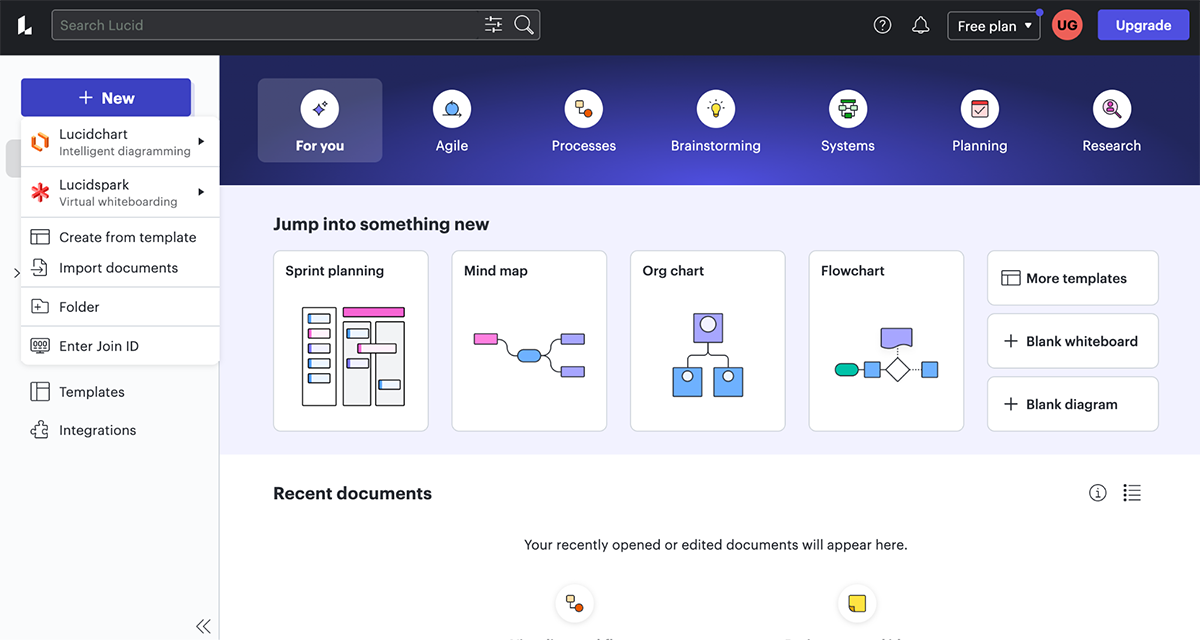
First things first—log into your Visme account (or create one if you haven’t already). Next, click "Create New > Project" and then select Infographics.
Search for "Hierarchy Chart" or "Organizational Chart" and pick a professionally designed template that fits your process or company needs.
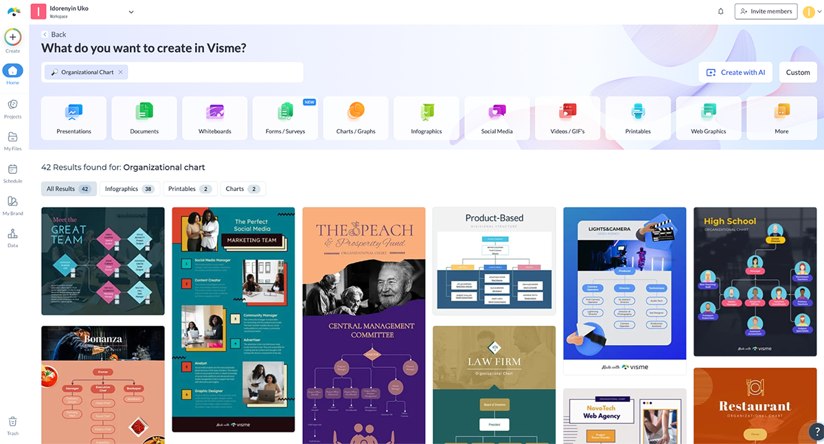
Click “Preview” to get a close-up view of the template and then "Edit" to start customizing.
You can also create a custom-sized canvas if you want full design control and prefer to build from scratch. You can even add extra pages to capture other teams or departments.
Now comes the fun part—personalizing your chart to match your team’s structure.
Replace the placeholder names, job titles and images with your own.
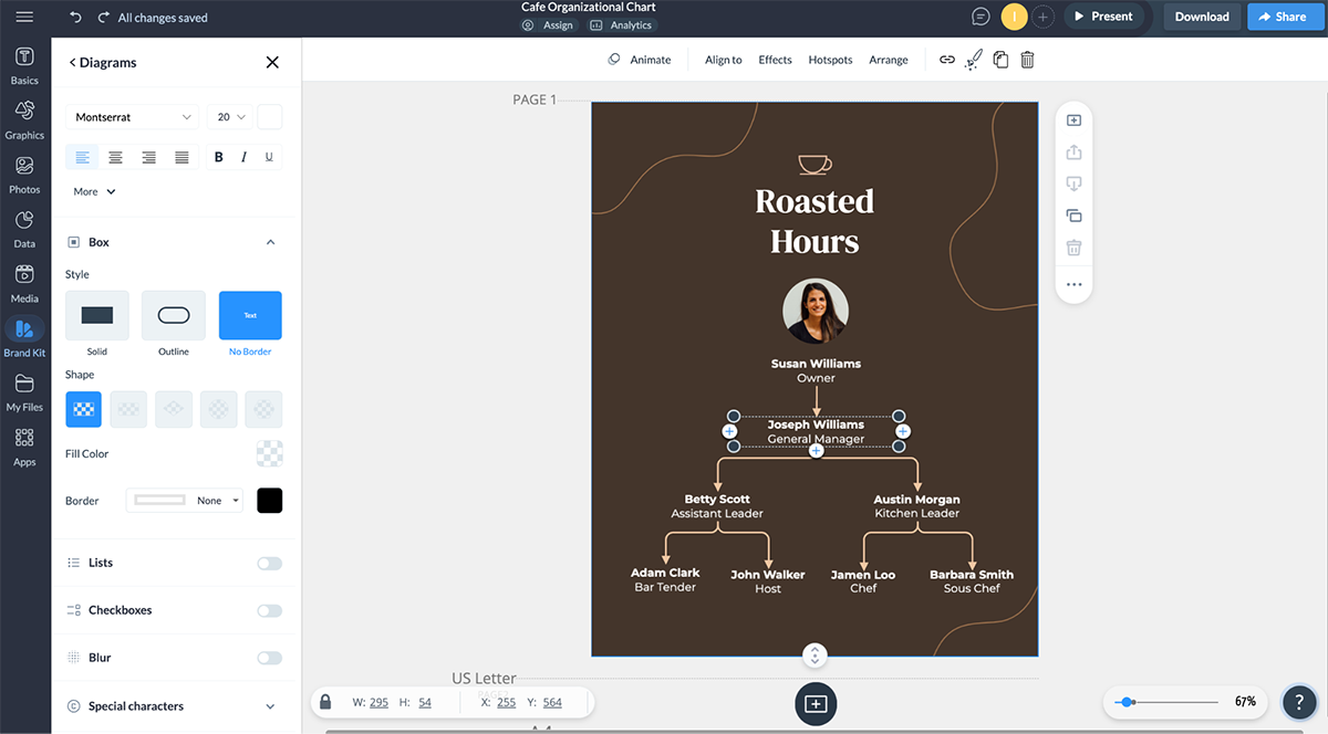
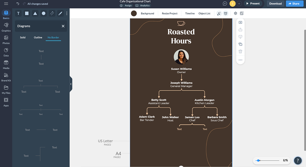
Visme give you a range of options when it comes to shapes, connectors and fonts.
To modify shapes and connectors, use pre-made content blocks. Click Basics > Diagrams to quickly insert hierarchy blocks.
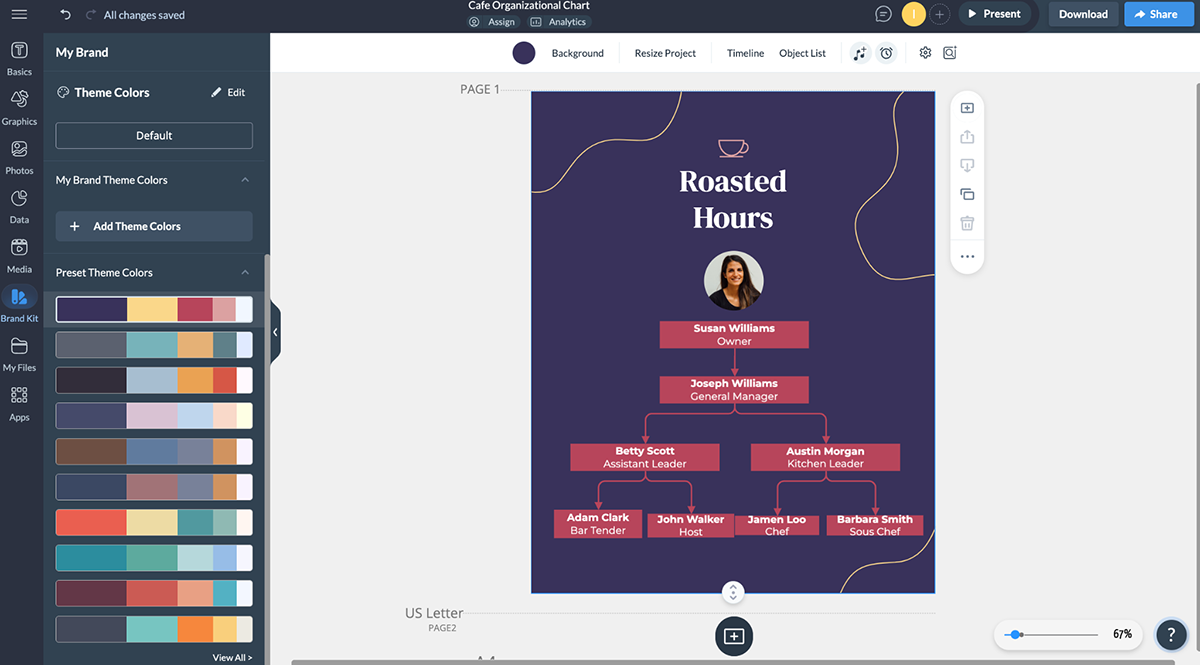
For a unique touch, apply your company branding—colors, fonts, logos and design elements using our Brand Kit.
The next step is to enhance your chart with icons and images. Visme comes loaded with millions of design assets, including icons, shapes, widgets and characters (or you can easily upload yours) to make your chart visually captivating.
Upload profile photos for each team member or choose from our stock images and icons to create a polished look. Drag and drop icons from Graphics > Icons to visually represent roles or departments.
Better yet, create captivating 3D characters that represent team members or generate unique images using our AI image generator.
P.S. You can easily resize and reposition every element for a sleek, professional design.
Adding interactive elements can elevate from a mere static diagram to a captivating, dynamic experience that engages and informs.
Here’s how to use Visme's interactive content tool. Click on any element (name, shape or icon) and choose from these interactive options:
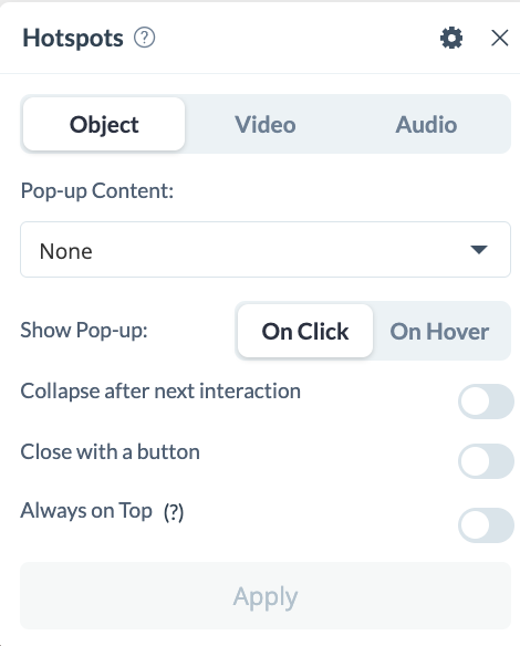 Pro Tip: Instead of overwhelming viewers with too much information, use popups and hover effects to reveal hidden details like work schedules, job descriptions or reporting structures. This keeps your chart clean while providing deeper insights on demand.
Your company structure isn’t static—it evolves as your business grows. And that means your chart should evolve, too!
With this real-time collaboration tool, your entire team can edit, annotate, comment, leave feedback or update the hierarchy in real time or asynchronously.
All you need to do is create a shared workspace and invite team members. People in your workspace can tag each other, reply to comments and resolve updates instantly.
Every change is auto-saved and instantly reflected for all users. You’ll also be able to track, review, rename and restore the previous design version of your project.
Pro Tip: Need input from leadership? Generate a secure, shareable link so stakeholders can review and approve changes without emailing files back and forth. If you’re brainstorming this chart with your team, use the timer feature to keep your sessions on track.Once your structure chart is ready, Visme has multiple options for sharing your project.
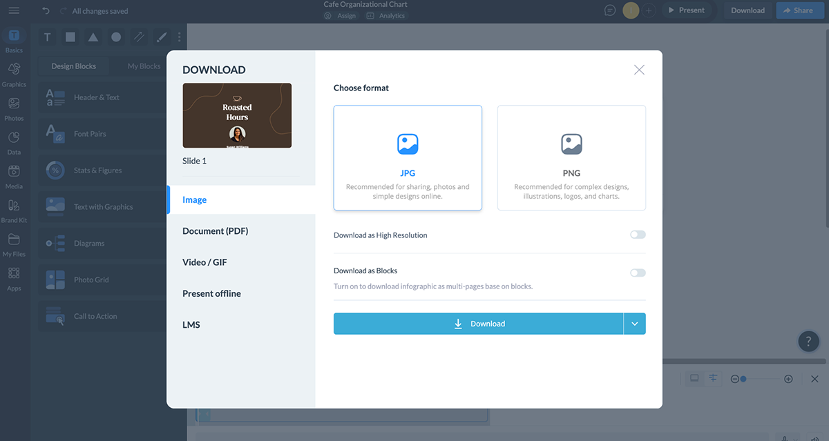
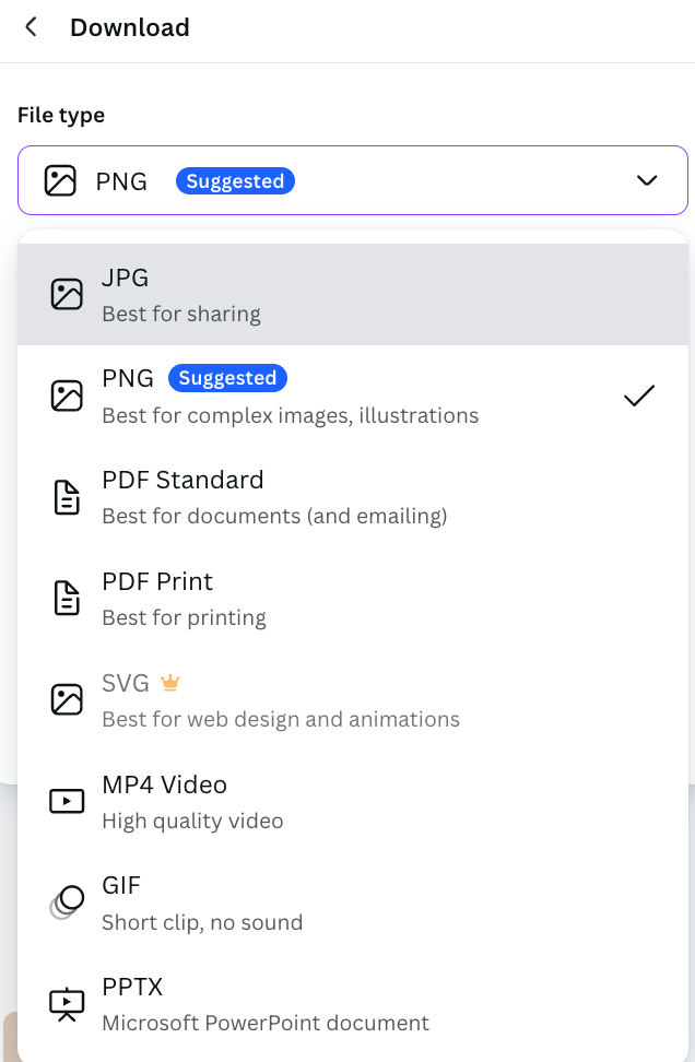
Download your chart as:
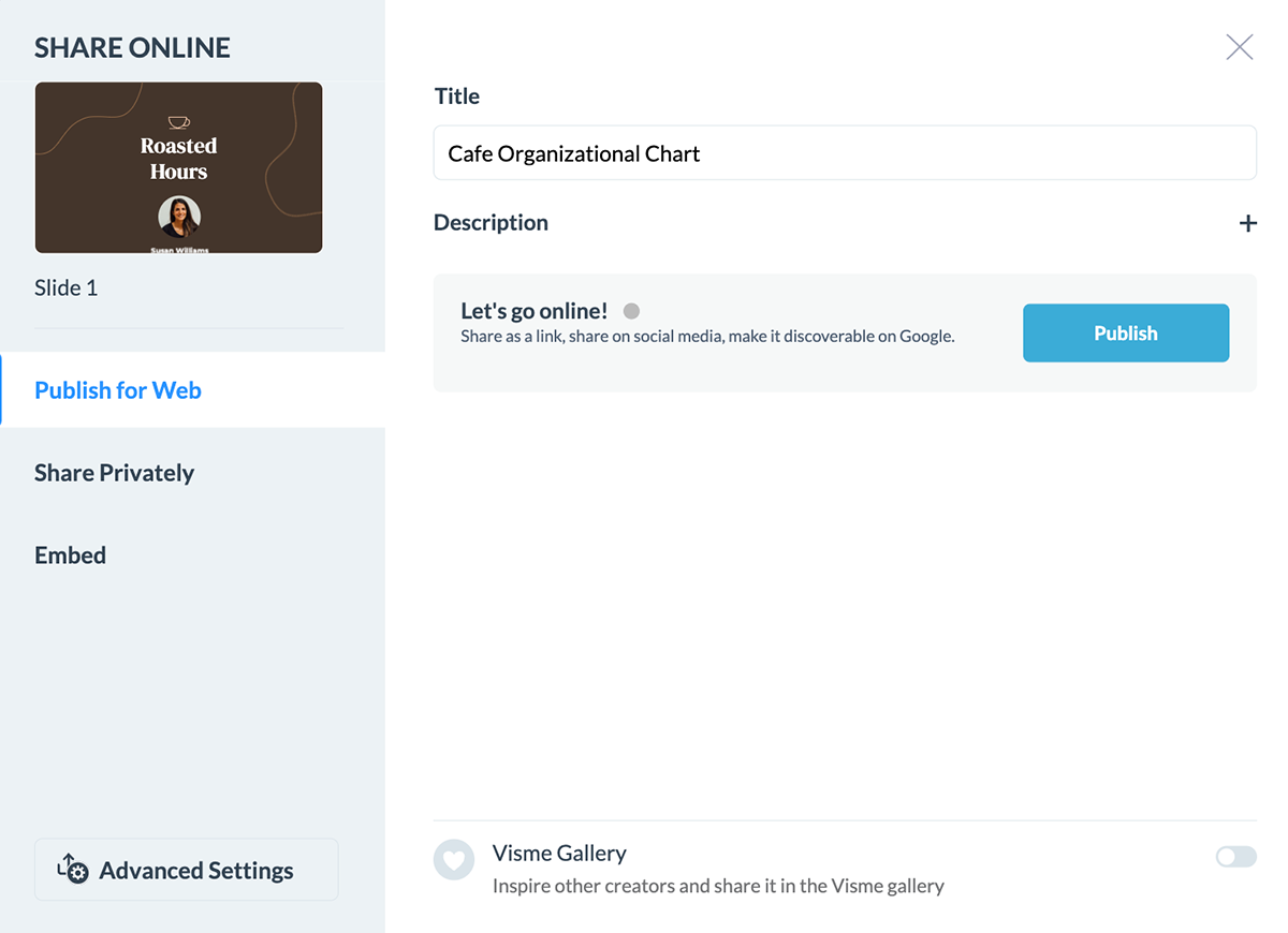
You also have the option of sharing your chart online using the methods below:
Microsoft Word may be best known for word processing, but it’s also a handy tool for creating basic hierarchy charts.
Whether you’re mapping out a company structure, a project team or any other ranked system, Word’s SmartArt feature makes it simple to visualize relationships and reporting lines.
Here’s how to do it:
Open your Word document and head to the Insert tab. Click on SmartArt to open the SmartArt Graphic menu.
On the left panel, select Hierarchy, then choose a layout that best fits your needs.
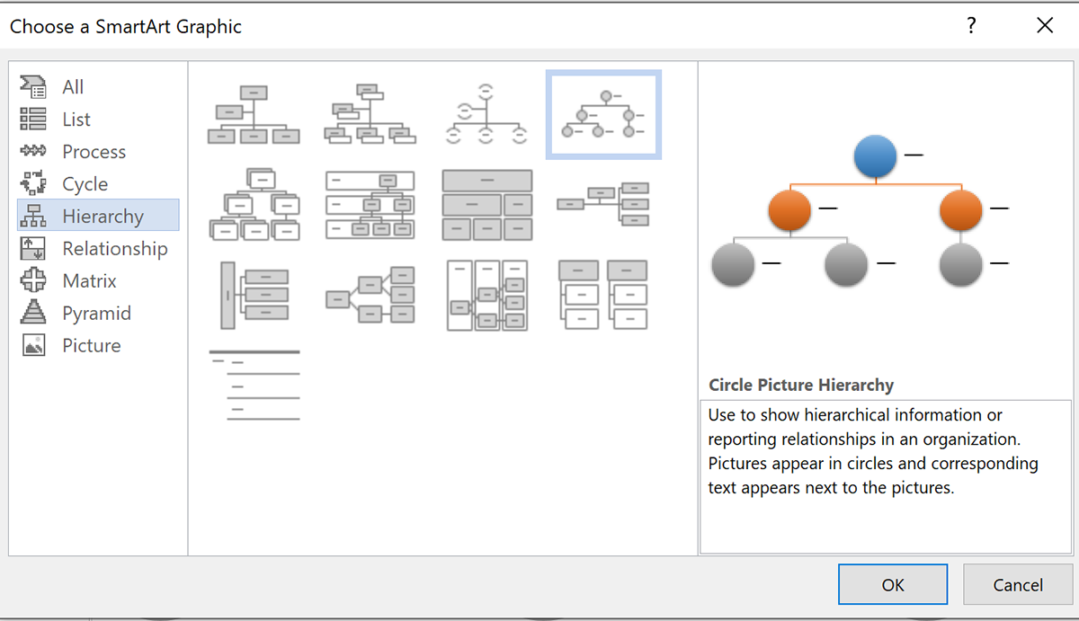
Some options include the Organizational Chart and Labeled Hierarchy, both of which work well for structured hierarchies.
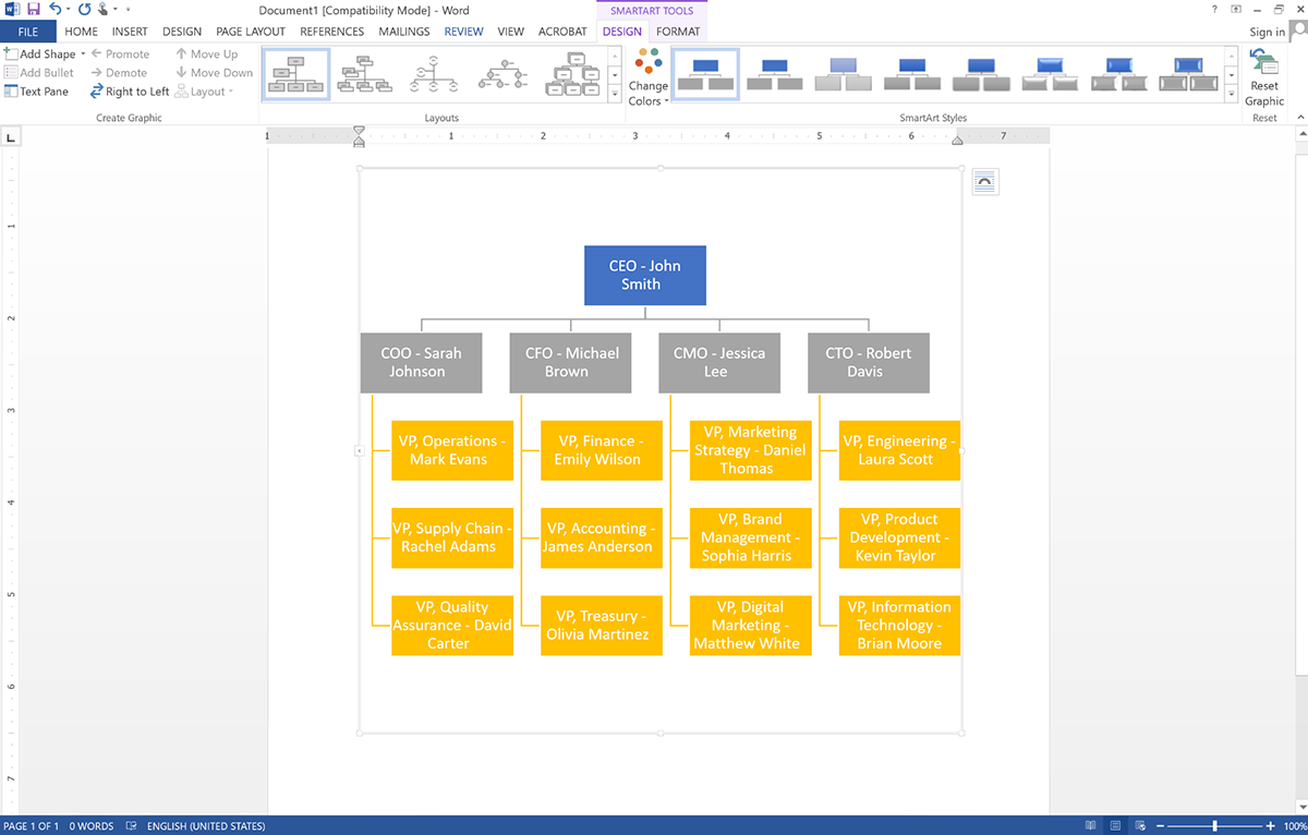
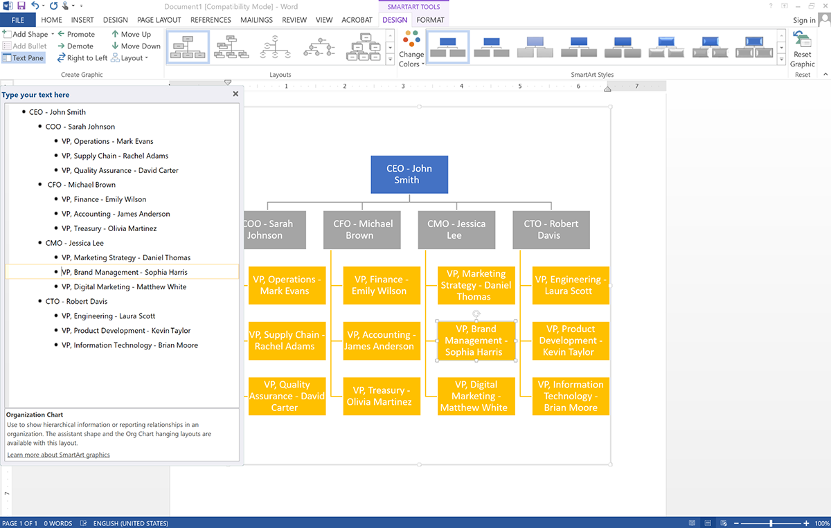
Once you’ve selected a hierarchy template, a text pane will appear where you can input names or roles for each level. Each shape in the chart represents a position in your hierarchy.
Before diving in, it’s a good idea to organize your information so you don’t miss anyone.
Keep in mind that Word has text limitations per shape, so if you need a more detailed chart, you should explore specialized diagramming tools like Visme or Lucidchart.
Hierarchy charts are all about structure, so you may need to move roles up or down. In Word, adjusting levels is simple:
Alternatively, you can make changes through the SmartArt Design tab.
Let’s say Sarah is the Chief Operating Officer and three new VPs—David, Mark and Rachel—join her department. Select each of their names in the text pane and press Tab to move them under Sarah in the hierarchy.
If a new VP is at the same level, simply enter his name in the same section without adjusting the levels.
Most SmartArt hierarchy templates start with five shapes, but real-world hierarchies often need more. To add positions:
To remove a position, simply click the shape and press Delete.
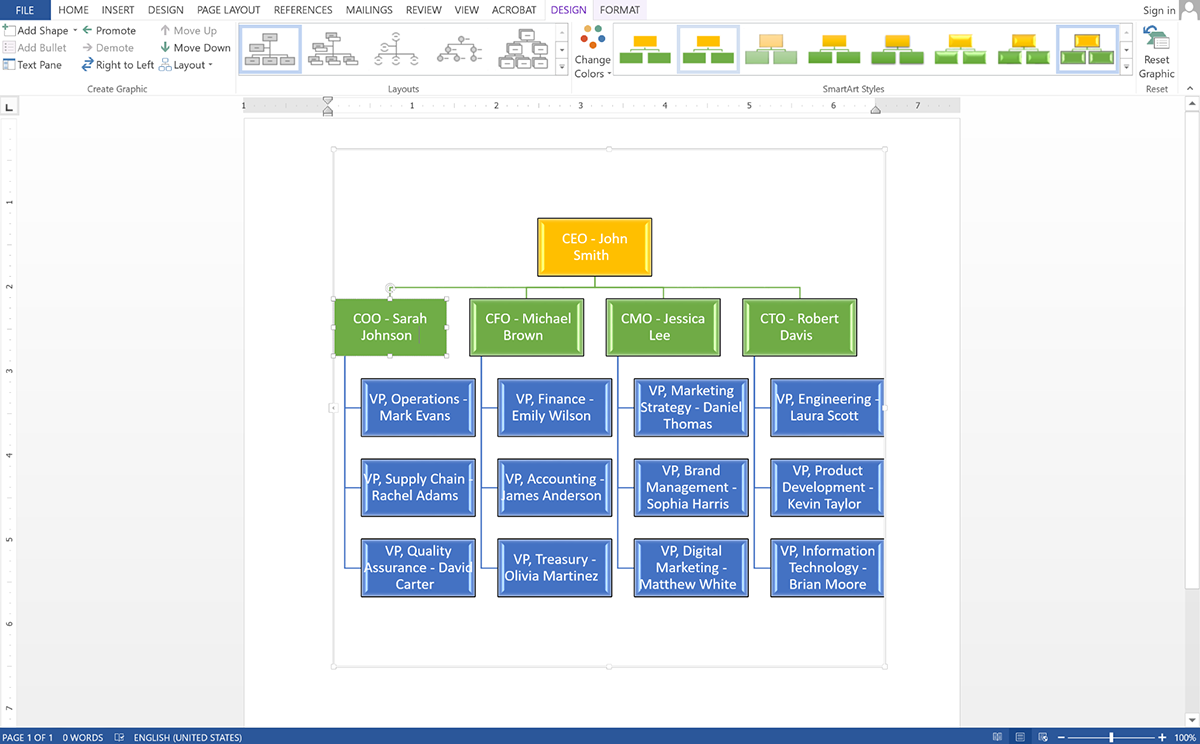
A well-designed chart makes information easier to digest. Once your hierarchy is in place, customize it to improve readability:
Here’s a comparison table highlighting the differences between Microsoft Word and Visme for creating hierarchy or org charts:
| Feature | Microsoft Word | Visme |
| Ease of Use | Basic chart tools, but manual adjustments required | Drag-and-drop editor with intuitive controls for easy chart building |
| Customization | Limited design flexibility | Fully customizable with fonts, colors, branding and styles |
| Templates | Few built-in templates, mostly simple | Professionally designed templates for different hierarchy structures |
| Visual Appeal | Basic shapes and lines | Stunning visuals with millions of design assets, 3D characters and a character creator |
| Collaboration & Workflow | No real-time collaboration; requires file-sharing | Seamless online collaboration with team members, plus workflow management for approvals and edits |
| Interactivity | Static charts with no interactive features | Clickable elements, hyperlinks and multimedia integration for dynamic org charts |
| Animation | No animation features | Advanced animations and transitions to bring charts to life |
| AI-Powered Tools | Not available | AI-powered tools including AI text generator, AI image generator, AI edit tools and more |
| Export & Sharing | Exports as DOCX or PDF | Download as PNG, PDF, or PPT, share via URL, or generate an embed code for websites and landing pages |
| Best For | Simple org charts with minimal design needs | Professional, interactive charts with powerful collaboration and sharing options |
Creating a hierarchy chart in Canva is simple and doesn’t require design expertise. Here’s a step-by-step guide to help you create a professional and visually appealing chart for your team or organization.
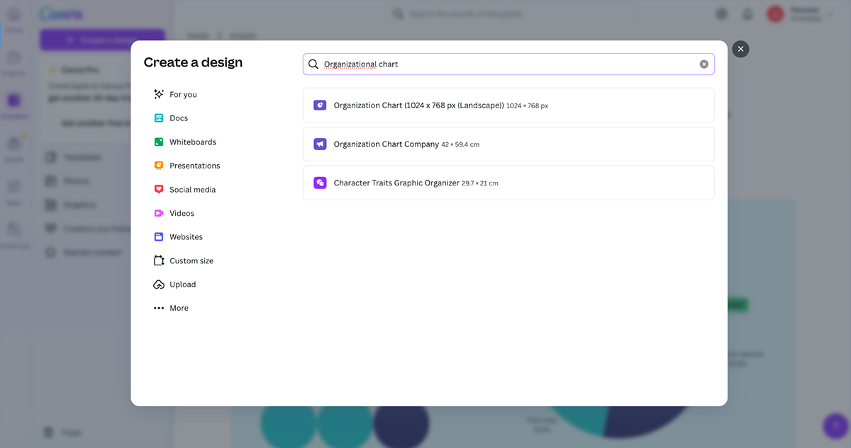
Go to Canva and log in to your account (or sign up if you’re new). Click on "Create a design", then type "Hierarchy Chart" or "Organizational Chart" in the search bar.
Choose from the available templates or start with a blank canvas if you prefer a custom design.
If you want to build your chart from scratch, choose a custom canvas size.
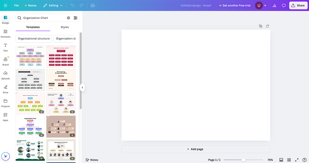
Or browse through Canva’s pre-designed hierarchy chart templates on the left pane to select one that matches your needs.

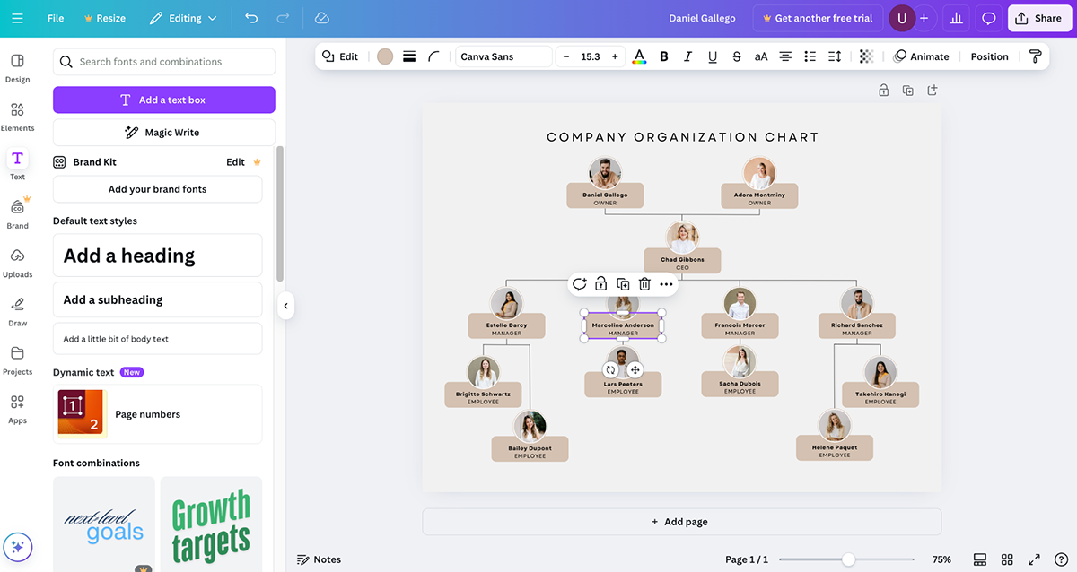
Now, it’s time to personalize your chart by adding details:
Click "Text" in the sidebar and choose a text style to add employee names and job titles.
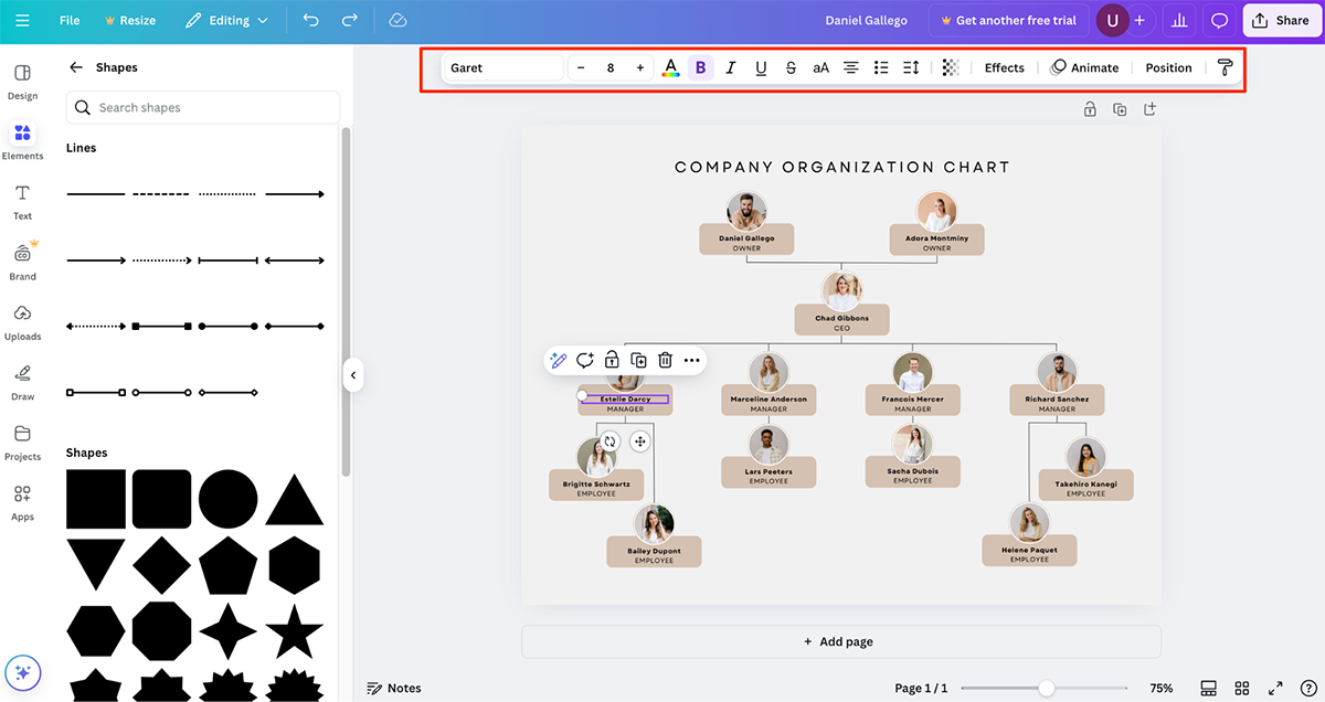
Then go to Elements > Shapes and select rectangles, circles or other shapes to represent different levels in the hierarchy. Resize and arrange them logically to reflect reporting relationships.
To connect with lines and arrows, click the “Elements” tab. Drag and position them to show relationships between team members (e.g., solid lines for direct reports and dashed lines for indirect reports).
Click on elements to change colors, fonts and sizes to match your company's branding. Add profile pictures for each person by uploading their photos and free icons to make it visually engaging.
If you’re working with a team, Canva allows real-time collaboration. Click "Share" to invite teammates to edit, comment or view the chart. Enable Canva’s Version History (if using Canva Pro) to track changes made by other collaborators.
Once your chart is finalized, export it in different formats, including JPG or PNG, PDF, SVG or generate a public or private link for your team.
Here’s a detailed comparison of Visme vs. Canva for creating hierarchy or org charts:
| Feature | Visme | Canva |
| Ease of Use | Drag-and-drop editor with intuitive controls | User-friendly interface with drag-and-drop functionality |
| Customization | Full control over fonts, colors, branding and styles | Customization options, but some design elements are locked behind premium plans |
| Templates | Professionally designed hierarchy chart templates in various styles | Good selection of templates, but more focused on general design rather than org charts |
| Visual Assets | Millions of design assets, 3D characters and a character creator | Large asset library, but lacks 3D characters and character creation features |
| Collaboration & Workflow | Workflow management, role-based access and real-time collaboration | Real-time collaboration but lacks advanced workflow management features |
| Interactivity | Clickable elements, hyperlinks and multimedia integration | Mostly static charts with limited interactive features |
| Animation | Advanced animations and transitions to bring charts to life | Basic animations available, but not tailored for org charts |
| AI-Powered Tools | AI text generator, AI image generator, AI edit tools, AI resize, AI text-to-speech generator | AI tools for design enhancements, but lacks AI text-to-speech and AI-powered workflow automation |
| Export & Sharing | Download as PNG, PDF, PPT; share via URL; embed on websites and landing pages | Download as PNG, PDF, or share a link; limited embed options |
| Best For | Businesses, HR teams and organizations that need structured, interactive and visually engaging hierarchy charts | Individuals and small teams looking for simple, stylish org charts without advanced interactivity |
Unlike Microsoft Word, which has limited customization options, Lucidchart offers a dynamic and collaborative platform.
Follow these steps to build your hierarchy chart in Lucidchart:
Start by logging into your Lucidchart account. If you don’t have one, you can sign up for free. Once inside the dashboard, click + New and select Lucidchart (Intelligent Diagramming).
You can either start from a Blank Document or choose a pre-made chart template by just clicking on the org chart in the “Jump into something new” section.
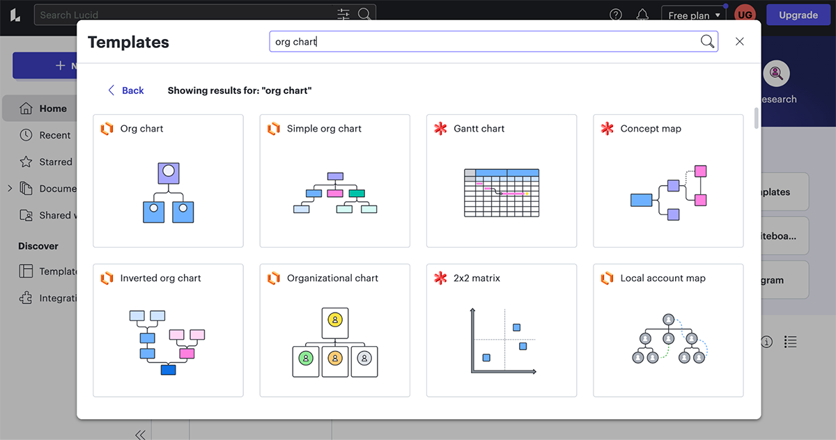
For a quick start, go to Templates and search for "Hierarchy Chart" or "Organizational Chart".
Select a template that best fits your structure, then click “Use Template” to open it in the editor. If you prefer a custom design, simply drag and drop shapes from the Shapes panel on the left.
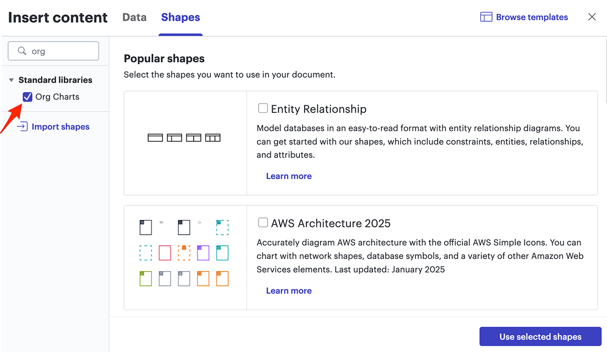
Before you proceed, you’ll have to enable the “Org Charts” shape library. To do this, click on the “+ Shapes” button on the left side of your workspace and ensure “Org Charts” is checked.
Each box in the hierarchy represents a position or individual.
To build your structure:
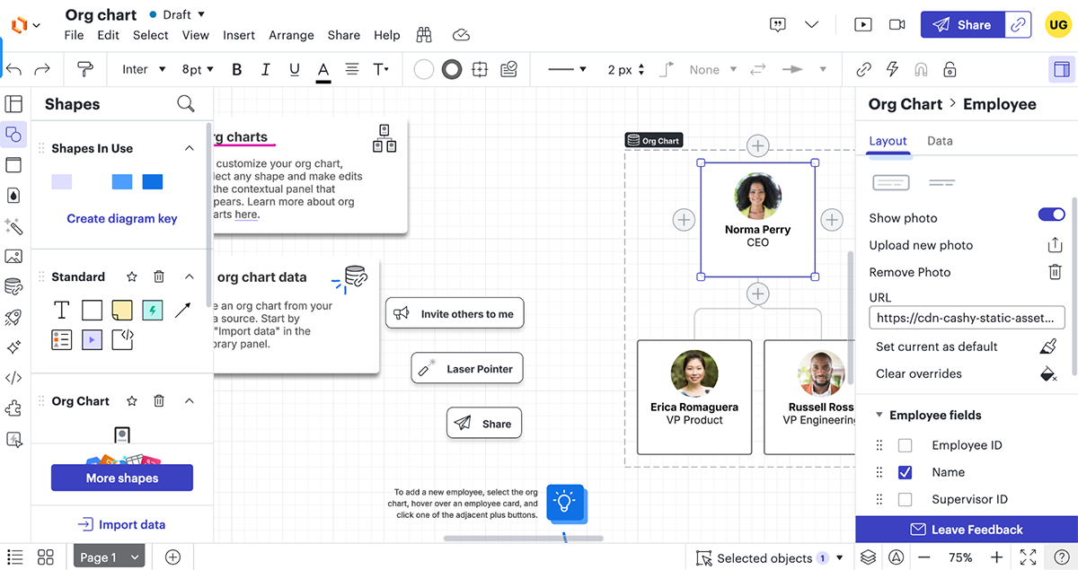
To add more shapes to an org chart in Lucidchart, you can either click the gray “+” buttons next to the existing shapes or navigate to the context panel and select Data > List View to add employees in list format.
For example, if you’re mapping out a marketing department, you might have:
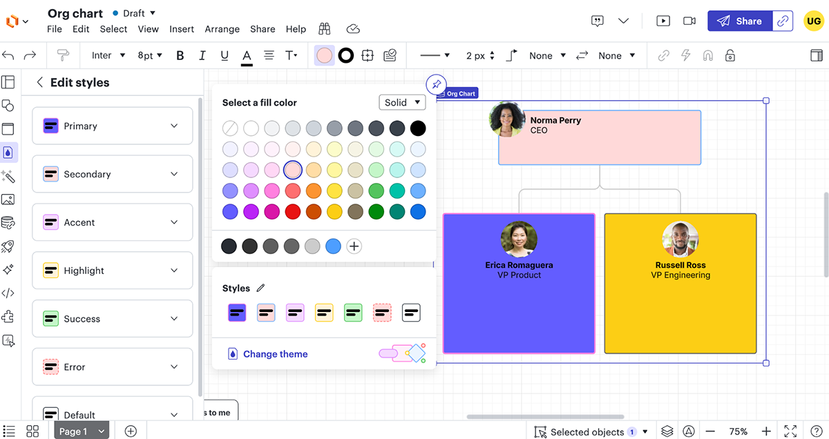
Lucidchart allows for extensive customization to enhance readability:
To expand your hierarchy:
One of Lucidchart’s biggest strengths is real-time collaboration. You can invite team members to view or edit the chart via email or use comments to discuss changes within the chart.
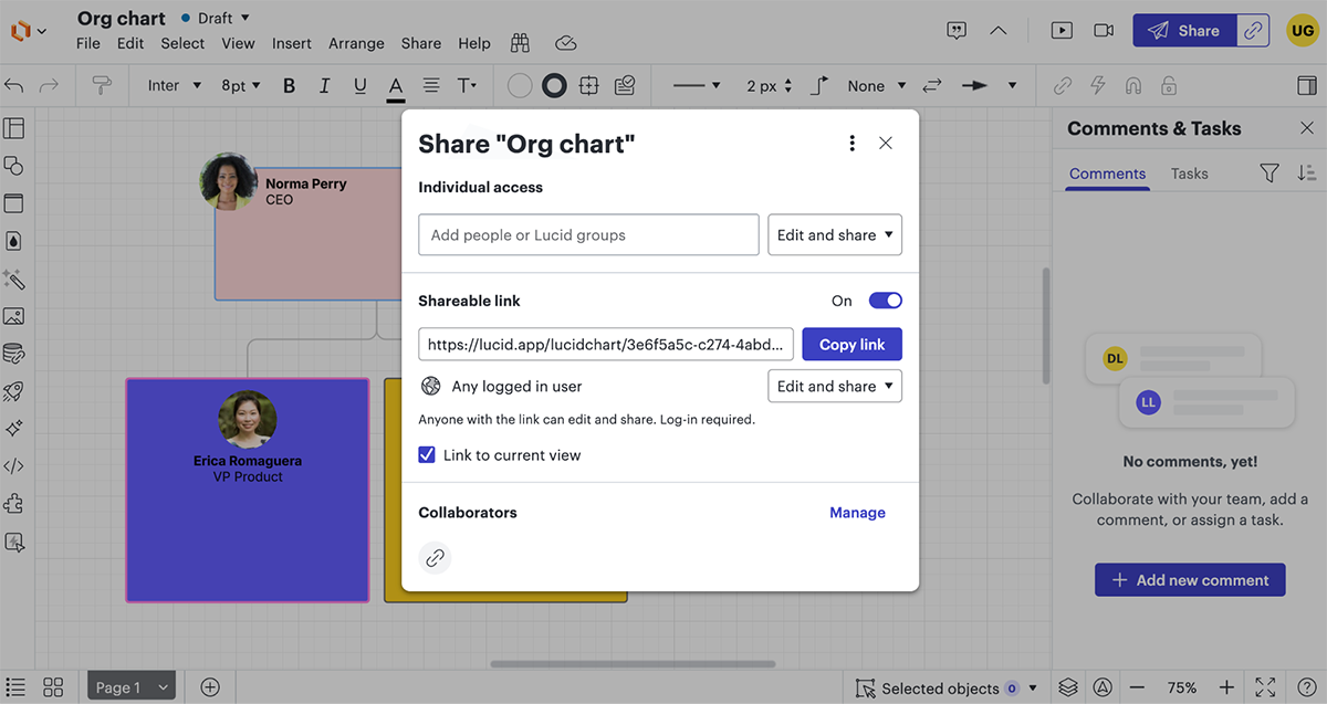
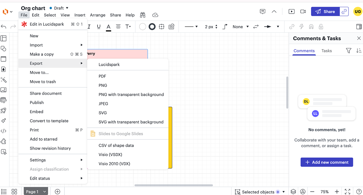
Next, Export the final hierarchy as a PDF, PNG or embed it in presentations and reports. To do this, click File> Export> Select your preferred file format.
Here’s a table that compares Visme vs. Lucidchart for building hierarchy or org charts:
| Feature | Visme | Lucidchart |
| Ease of Use | Drag-and-drop interface with intuitive controls | Designed for technical users; may have a learning curve for beginners |
| Customization | Full control over fonts, colors, branding and styles | Customization available, but limited by flowchart-focused designs |
| Templates | Professionally designed hierarchy chart templates in various styles | Pre-built templates, but mostly structured for flowcharts and diagrams |
| Visual Assets | Millions of design assets, 3D characters and a character creator | Basic icons and shapes; lacks 3D characters and extensive design assets |
| Collaboration & Workflow | Workflow management, role-based access and real-time collaboration | Strong collaboration with team commenting and version history |
| Interactivity | Clickable elements, hyperlinks, multimedia integration | Limited interactivity, primarily static diagrams |
| Animation | Advanced animations and transitions to bring charts to life | No animation features |
| AI-Powered Tools | AI text generator, AI image generator, AI edit tools, AI resize, AI text-to-speech generator | No AI-powered design tools |
| Export & Sharing | Download as PNG, PDF, PPT; share via URL; generate embed code for websites and landing pages | Export as PNG, PDF, SVG, or embed online |
| Best For | Businesses, HR teams and organizations that need visually engaging and interactive hierarchy charts | Technical teams that need structured, process-driven flowcharts and diagrams |
Skip the guesswork and get straight to a polished, professional hierarchy chart with our ready-made templates.
Whether you need a classic org chart, a modern flowchart or a team structure diagram, these templates make it easy to visualize roles and relationships in minutes.
Just pick one of these designs or head over to our massive template library, customize them to fit your needs and share it effortlessly using the steps I shared with you earlier.
Make your company’s hierarchy crystal clear with this sleek, easy-to-follow infographic template!
One of the best things about a hierarchy chart is that it brings clarity. It helps your team and outsiders instantly understand who’s who, who reports to whom and how everything fits together. Whether you’re onboarding new employees, impressing investors or giving clients a behind-the-scenes look at your team, this hierarchy flowchart makes it super simple.
This template’s dark background with colorful icons and text overlays creates a dynamic, visually appealing structure that stands out. The bold red name tags highlight managers, directors and team leads, making it easy for anyone to spot key roles. Plus, you can add employee photos and contact details to give it that personal touch.
You can use it in presentations, share it on social media or embed it on your website. It's the perfect way to give clients, partners and employees a quick, clear snapshot of your organizational structure. The best part? You can tweak it to fit your company’s unique structure in just a few clicks!
A hierarchy chart is a great way to help new hires get familiar with the team faster. They can quickly see who they report to, who their colleagues are and how different departments connect. It makes onboarding smoother and helps everyone feel more at home in the company.
This aesthetic template brings that idea to life, letting you showcase your creative team’s structure in style. The CEO stands out at the top with a unique colored icon, while top-level management is highlighted in another distinct color. Lower-level employees are neatly placed in transparent rectangular boxes, clearly displaying their names and roles without clutter.
The bold purple background, paired with bright, colorful shapes and fonts, gives the design a lively, modern look that’s easy on the eyes. Plus, it’s fully customizable—swap in your logo, update names and roles and tweak the text to fit your team perfectly.
Do you have a large team? No problem! You can adjust the size, add more tiers or levels or even create extra pages to include everyone. No matter how big or small your company is, this chart can be adapted to your needs.
A well-structured hierarchy chart helps leaders quickly identify key decision-makers at different levels. It clarifies the delegation of authority, ensuring that approvals and responsibilities flow smoothly without bottlenecks slowing down workflows. When everyone knows who’s in charge of what, decisions get made faster and more efficiently.
With this template, you get a clean, top-down structure that makes team roles and reporting relationships easy to grasp at a glance. Each position is neatly placed in boxes or rectangles, connected by lines that clearly define the chain of command. It’s straightforward, intuitive and built for clarity.
The plain gray background keeps things professional, while the vibrant colors make important details stand out. Want to add a personal touch? Include pictures of each team member to make the chart even more engaging and memorable.
And if you’re looking to level up, you can enhance this chart with interactive pop-ups or hover effects. Imagine clicking on a name to reveal job descriptions, work experience or even fun facts about your team—it’s an effortless way to add depth while keeping things visually dynamic.
A hierarchy chart isn’t just about showing who reports to whom—it’s a smart way to plan for the future. It helps you spot gaps in leadership, see where your team needs to grow and make sure you’re always a step ahead as your company evolves.
This template makes that process effortless. Each role stands out with a different colored shape, making it easy to see who’s who at a glance. Names and titles are front and center, with built-in social media icons so team members can connect with each other instantly.
Need to add more details? No problem. You can include extra info without cluttering the design, keeping everything sleek and easy to read. Want to make it even more engaging? Swap out the background, update colors or add hover effects to reveal more details when needed.
Whether you’re mapping out a growing team or refining an established structure, this template gives you the flexibility to create an org chart that works now and scales with you in the future.
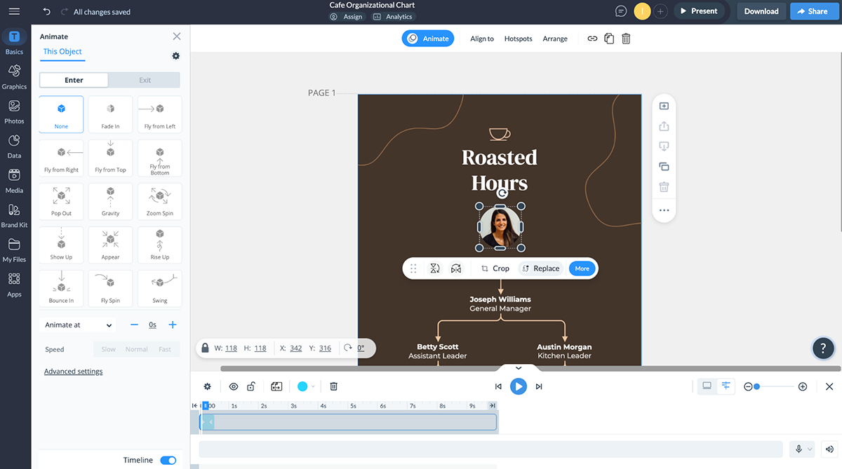
If you run a coffee shop, restaurant or eatery, this café-themed organizational chart is a perfect fit. The rich brown color scheme, paired with cream text and connector lines, creates a warm and inviting visual that reflects your brand’s personality.
Just like the owner's headshot at the top, you can showcase your team members with their photos, making the chart more personal and engaging. Plus, with access to thousands of icons, characters, illustrations, gestures and other design elements, you can fine-tune every detail to match your brand’s aesthetic.
A hierarchy chart isn’t just for corporate offices—it’s a versatile tool that adapts to any industry, from business and education to government and healthcare. Whether you need an org chart, a decision-making hierarchy, a family tree or a product structure, this template can be adapted for that purpose.
Want to speed up the design process? Use our workflow management tool to assign sections to your team, leave instructions, set deadlines and track progress—all in one place. It’s an easy way to create a polished, professional org chart while keeping everyone on the same page.
Give your construction team a clear roadmap of roles and responsibilities with this well-structured organizational chart template. It not only highlights who reports to whom but also showcases task dependencies, making it easier to manage large-scale projects with multiple moving parts. By defining responsibilities at every level, this chart ensures accountability and keeps performance tracking simple.
This template takes a fresh approach to hierarchy visualization. Instead of the traditional top-down layout, it flows from left to right, making it more intuitive for teams to follow. Modern icons, stylish text and bold color combinations make everything easy to read at a glance. Plus, you can customize text boxes and shapes to define levels—whether it’s the board and executive team or managers and entry-level staff.
Once your org chart is live, take it a step further with our built-in analytics tool. See how team members interact with it, track engagement and ensure everyone is on the same page.
Make the most of your team’s strengths with a clear, easy-to-follow departmental org chart. When everyone knows who does what and where they fit in, work flows more smoothly and nothing slips through the cracks. Plus, managers can spot gaps, balance workloads and keep everything running efficiently.
This chart keeps it simple but effective. Each level of management stands out with different shapes and colors, so it’s easy to see the hierarchy at a glance.
The publisher sits at the top in a round rectangle, middle management pops with a bold neon green shape and lower-level roles are neatly organized in square and rectangular boxes.
You can make it your own in just a few clicks with Visme. Change colors, swap shapes, add icons and even throw in illustrations to bring more clarity.
Whether you’re starting from scratch or just making a few tweaks, this template gives you everything you need to create an org chart that works for your team. Embed it in training documents or HR manuals to keep your company’s structure transparent and accessible.
This organizational chart template offers a sleek, well-organized layout that makes your company’s structure easy to understand. It features cool colors, high-quality icons and space for images—creating a professional yet engaging look.
Each role includes a name, title and image, making the chart more engaging and personal. No employee photos? No worries! Swap them out for eye-catching 3D characters using our character creator. Just pick a character, tweak the details—like hairstyle, clothing and skin tone—and choose a pose or animation. In no time, your hierarchy chart will be polished, professional and ready to go!
This template isn’t just for internal use; it’s perfect for presentations, company websites, investor decks and onboarding materials. Use it to introduce new hires to your team, showcase leadership to clients and stakeholders or even map out project teams for better collaboration.
If you’re on the hunt for an easy yet effective way to create an organizational chart, we have one of the best options out there. It has an intuitive drag-and-drop editor that lets you build a hierarchy chart without any design skills.
You can choose from a bunch of pre-made templates, a huge library of icons, graphics and design assets to help you visualize your team structure. Adding interactive elements such as clickable links or hover effects can make your org chart more dynamic and engaging.
The best type of graph for visualizing hierarchy is a tree diagram (or organizational chart). This structure works well because it clearly shows relationships, reporting lines and levels of authority.
Follow these steps to make an effective hierarchy chart for any process, system or organization.
Whether you're leading a small or large team, your company will definitely benefit from having a solid organizational structure in place.
Even as workplaces evolve, hierarchical charts are critical to driving efficient operations. It eliminates chaos and keeps your organization working like a well-oiled machine.
Instead of confusion over responsibilities, approvals or decision-making, everyone on your team knows exactly where they fit, who they report to and how decisions flow.
Creating one doesn’t have to be complicated. With Visme, you can build professional, visually compelling hierarchy charts in minutes. Choose from customizable templates, use drag-and-drop tools and collaborate with your team effortlessly.
Get started with Visme to create charts that keep your team aligned and your business running smoothly.
Design visual brand experiences for your business whether you are a seasoned designer or a total novice.
Try Visme for free


![How to Create an Employee Engagement Action Plan [Including Templates]](https://visme.co/blog/wp-content/uploads/2023/09/How-to-Create-an-Employee-Engagement-Action-Plan-Thumbnail.jpg)
![How to Create an Effective Employee Development Plan for Your Company [Including Templates]](https://visme.co/blog/wp-content/uploads/2023/07/How-to-Create-an-Effective-Employee-Development-Plan-for-Your-Company-Thumbnail.jpg)
