


Typography Infographics: 12 Inspiring Examples & Techniques

Teachers today juggle a lot of different challenges.
There’s too much information to manage, students who struggle to stay engaged and constant distractions from mobile devices.
With shorter attention spans and so many ways to lose focus, getting learners to stay on task is now a daily struggle.
That's why visual aids like infographics have become a staple for addressing these challenges.
And with 65% of people being visual learners, you can’t go wrong with great educational infographics.
Sadly, most teachers aren’t trained designers. And between lesson planning, managing the classroom and finding time (and confidence) to design from scratch can feel overwhelming.
In this guide, I’ll explain why educational infographics work and how to create your own. You’ll also find real examples, practical design tips and tools to help you create the most effective infographics for your purpose.
If you're more of a visual learner as well, watch this quick video to learn how to design infographics that work.
An educational infographic is a visual learning tool used to teach, explain or simplify learning content. It combines graphics, text, data visualization and other visual elements to help learners quickly understand complex ideas and retain information longer.
You’ll often see this type of infographic in classrooms, online courses and professional training programs.
Educators and trainers use infographic makers to transform lessons, processes and data into visually compelling stories.
Because of their versatility, they’re especially effective at summarizing key points, illustrating relationships and comparing concepts in ways that capture attention and improve comprehension. You can also use them as visual aids, conversation starters or just visual data or findings from research.
Let’s look at other research-backed reasons why educational infographics work. These include:
Our brains are wired to process visuals quickly. Some researchers suggest the brain can make sense of an image in as little as 13 milliseconds. Because of this speed, visual formats like infographics help learners take in meaning faster than text alone.
Visuals make information stick. According to Dale’s Cone of Experience, people typically tend to recall :
~10% of what they read
~20% of what they hear
~50% of what they see and hear
Made with Visme Infographic Maker
Infographics mix both elements (concise text and relevant visuals) to create stronger mental associations. They activate dual coding (verbal + visual processing), which boosts how well we remember and understand things compared to just reading.
Infographics have also been found to contribute to higher academic performance. A review of 12 studies found that students learned much better with infographics than with traditional teaching methods.
In design research, infographics are described as “graphic visual representations of educational content” used precisely to deliver complex information in a more digestible form.
By breaking down these convoluted ideas into digestible parts, infographics lighten the mental load. Learners can absorb information in bits without feeling overwhelmed.
Infographics make learning more engaging by turning static information into interactive, visually stimulating experiences. When students actively process visuals, they stay focused longer and find lessons more enjoyable.
A study on teaching undergraduate public health students found that using infographics to visualize and communicate data led to a positive learning experience for most participants.
Similarly, a 2019 study published in the Academy of Educational Leadership Journal revealed that 95% of students preferred infographics as a learning tool in online classes. Most participants reported that it helped them learn and retain content more effectively.
One of the biggest strengths of infographics is that they can show relationships, comparisons and contrasts clearly (through charts, side-by-sides, flow diagrams, etc.). A study involving high school students in Saudi Arabia found that using infographics to teach programming fundamentals significantly improved students’ analytical thinking skills.
By visualizing how ideas connect, learners can better understand relationships instead of processing isolated facts.
So what makes a “good” educational infographic design?
It’s a big question with plenty of possible answers.
Rather than dive into a long-winded explanation, let’s look at some real examples.
I’ve rounded up eight of the best infographic examples from across the web and provided a brief explanation of what makes them effective.
Look through these educational infographic examples to get inspiration for your next project. I’ve also included key takeaways to learn from and AI prompts to help you replicate them.
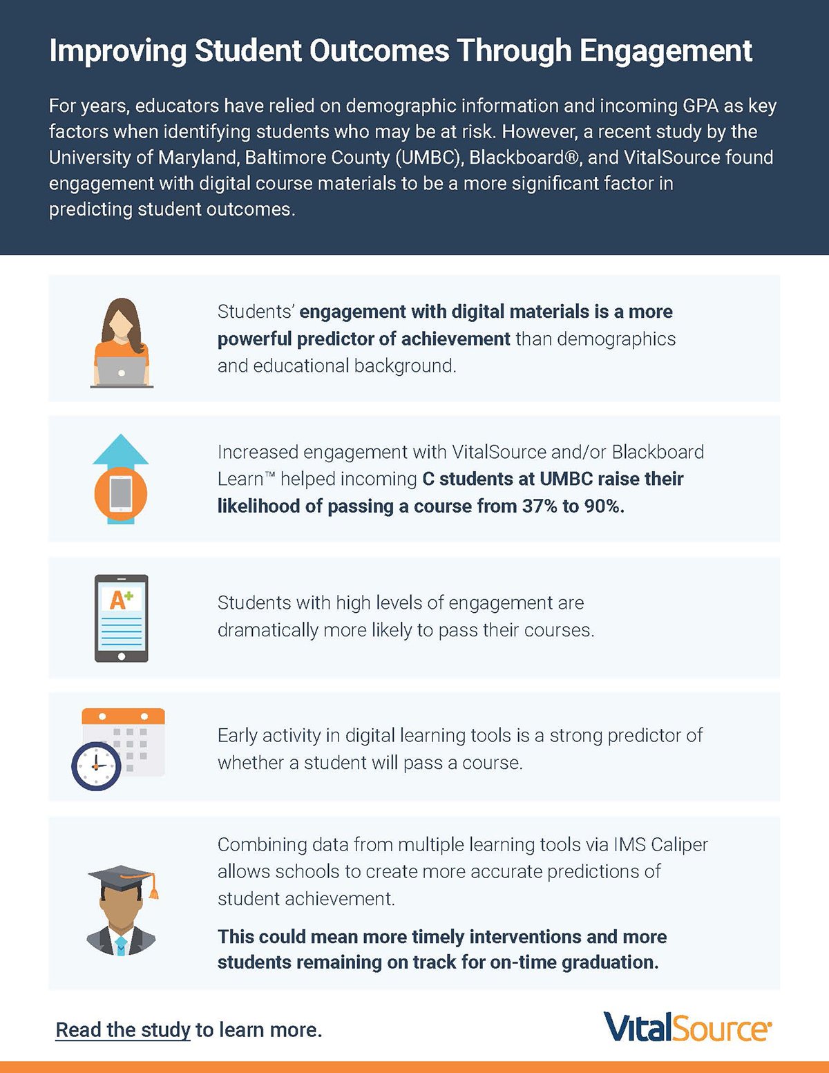
This educational infographic shares some interesting findings from a study conducted by the University of Maryland, Baltimore County (UMBC), Blackboard® and VitalSource.
The research explored how student engagement with digital learning materials influences overall performance and course success.
This infographic design is an excellent example of keeping things simple. It has a modular layout, where each piece of information is in its own section. This layout provides readers with visual breathing room and makes the information easy to scan—a crucial consideration in learning and instructional design.
The navy blue header background grabs attention while the bright colored text creates a visual contrast. Each icon (laptop, calendar or graduation cap) serves as a quick visual cue that helps readers easily associate each insight with a concept.
When you’re putting together your own educational infographics, focus on keeping things organized, easy to read and visually appealing rather than just making it decorative.
Start by using a modular grid to separate ideas and make your content digestible. Limit your color palette to two or three tones that complement each other and align with your subject matter.
For example, cool colors like blues work well for academic or corporate content, while warm tones like orange or gold draw attention to highlights.
Use icons that help explain your ideas and make sure they have a consistent visual style. And don’t forget to give your design room to breathe. Ample white space allows your audience to focus on what truly matters for a better understanding.
AI Prompts
To bring this kind of clean, structured design to life, AI tools can speed up the creative process. Try prompts like:
“Help me turn key research findings on student engagement into a clear, motivating infographic. Suggest a strong headline, three main insights educators should remember, and visual ways to connect cause and effect so the design feels both informative and inspiring.”
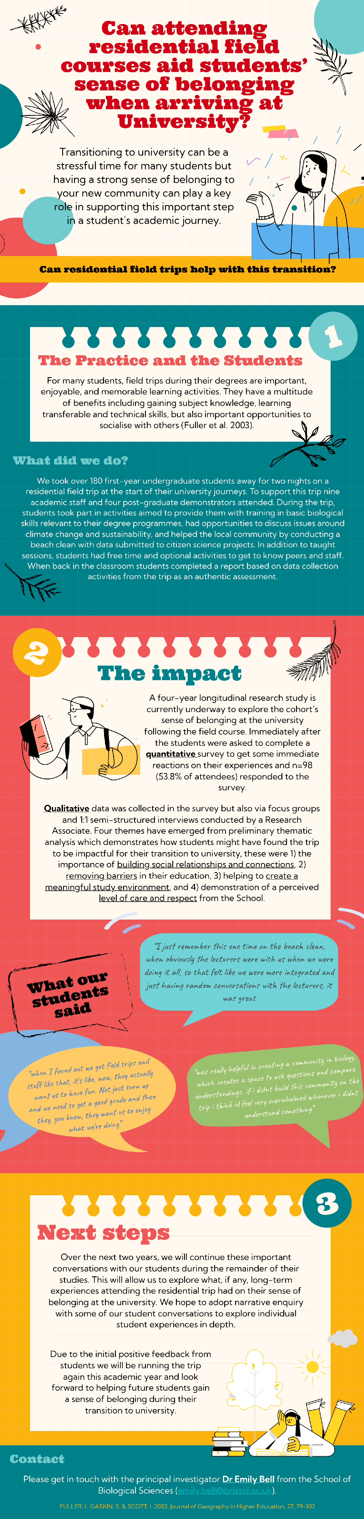
This educational infographic summarizes a case study conducted by the Bristol Institute for Learning and Teaching (BILT) on the long-term impacts of community in an undergraduate cohort following a residential field course.
The study explored how early bonding experiences, such as group fieldwork, shared learning activities and informal discussions, helped students develop a stronger sense of belonging, confidence and collaboration at university.
The design of this infographic reflects a thoughtful blend of storytelling and structure. It uses a vertical, scroll-based layout divided into clearly numbered sections. This flow allows readers to follow the narrative effortlessly from context to outcome.
Unlike our previous example, this design is generous with the use of multiple bright colors. The color palette combines different shades of green, yellows, lemons, red, blue and corals.
What really stands out to me are the hand-drawn illustrations and speech bubbles filled with handwritten-style notes. They add a warm, human touch that makes the data feel personal. I like how these small details turn student feedback into something visual, conversational and relatable, rather than overly formal.
You can have plenty of text in your case study infographic and still maintain visual clarity. It all comes down to your infographic layout, structure and balance.
When creating an educational infographic that tells a story, aim for a sequential, narrative-driven structure. Use numbered sections or visual markers to guide the reader from the introduction to the conclusion.
Choose a warm, inviting color scheme and visual elements that match the emotion or theme of the content. In this case, that's community and belonging.
If you’re presenting qualitative feedback, speech bubbles or quote boxes can make those insights stand out and feel personal. Of course, you need consistent spacing to make your infographic readable.
Finally, strike a balance between visuals and text so that the story flows smoothly without overwhelming your audience.
AI Prompts
“Design a storytelling infographic based on a real classroom success story. Outline a clear three-part narrative (challenge, solution, and outcome) and suggest compelling headlines, short supporting copy, and visuals that emotionally connect with educators while keeping the flow simple and easy to follow.”
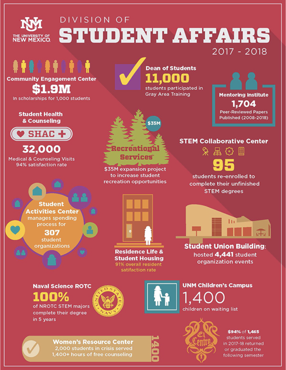
One of the most powerful uses of infographics in education is visualizing data that might otherwise feel abstract or overwhelming for learners. This infographic from the University of New Mexico (UNM) Student Affairs Division does exactly that.
It provides an engaging visual overview of the university’s collective impact across multiple departments, including Student Health and Counseling, Career Services, Student Support Services and more.
Instead of drowning everyone in tables and long reports, this infographic pulls out key stats and turns them into a colorful, easy-to-digest summary that highlights the university’s holistic student engagement efforts.
From a design standpoint, this infographic is a great example of how to manage a lot of data without overwhelming your audience. It uses a two-part layout, with information separated into themed sections across two pages.
The bold color palette of deep reds, yellows and teals reflects the school’s identity and gives each department its unique yet unified feel.
You can’t help but love how the designers use icons and illustrations to replace long text descriptions, making metrics like satisfaction rates, GPA and funding achievements easy to spot.
When designing a data-heavy educational infographic, focus on organization and visual hierarchy.
Begin by grouping related data into clear categories. Then use visual markers such as icons or section headers to distinguish between themes, show metrics and reduce text overload.
If you decide to use a grid layout, keep spacing uniform and ensure proper alignment across sections. Feel free to use typography to build contrast. For example, larger, bolder fonts for major statistics and smaller fonts for supporting information.
Don’t be afraid of using bold colors to segment information or reflect brand identity.
AI Prompts
To recreate a data visualization infographic like this, try prompts such as:
“Take this student services dataset and shape it into a compelling infographic. Focus on the story behind the numbers, identify the top insights, and propose visuals that make the information memorable for educators and decision-makers.”
Andrew’s team also takes the time to create beautifully designed client reports to share their findings and survey results with employers.
New Wave Solutions uses visual content to simplify internal training and thought leadership. They’ve created this piece to compare two ideas that often get mixed up—employee commitment and employee engagement.
What I find impressive about this infographic is how it captures a research-heavy concept and translates it into something visually intuitive.
Instead of long explanations, it uses parallel structure. Each section on the “Commitment” side is mirrored by a matching point on the “Engagement” side, so the comparison is easy to follow.
The split layout with blue and white sections creates strong visual contrast, while subtle background imagery adds depth without distraction. Quotes from credible sources like the Wall Street Journal, Forbes and McKinsey & Company lend authority and balance the visual storytelling.
Overall, this example is a great use of Visme’s infographic maker to make training materials more engaging and easier to absorb.
If you’re designing a comparison-style infographic, pay attention to balance and symmetry. Align sections side by side so readers can scan and compare effortlessly. Use contrasting colors to separate the two sides, but keep the tones complementary.
Keep your text concise—just enough to convey the point and let visuals or icons do the rest. Adding real quotes or stats can make the design feel grounded and authoritative without overwhelming your layout.
AI Prompts
To design a similar side-by-side training infographic, try prompts like:
“Build a side-by-side training infographic that compares two related concepts—Commitment and Engagement. Emphasize how the ideas differ in mindset and behavior and write short descriptive copy for each side. Suggest visuals or icons that make the contrast instantly clear and choose design cues that balance clarity with visual harmony”
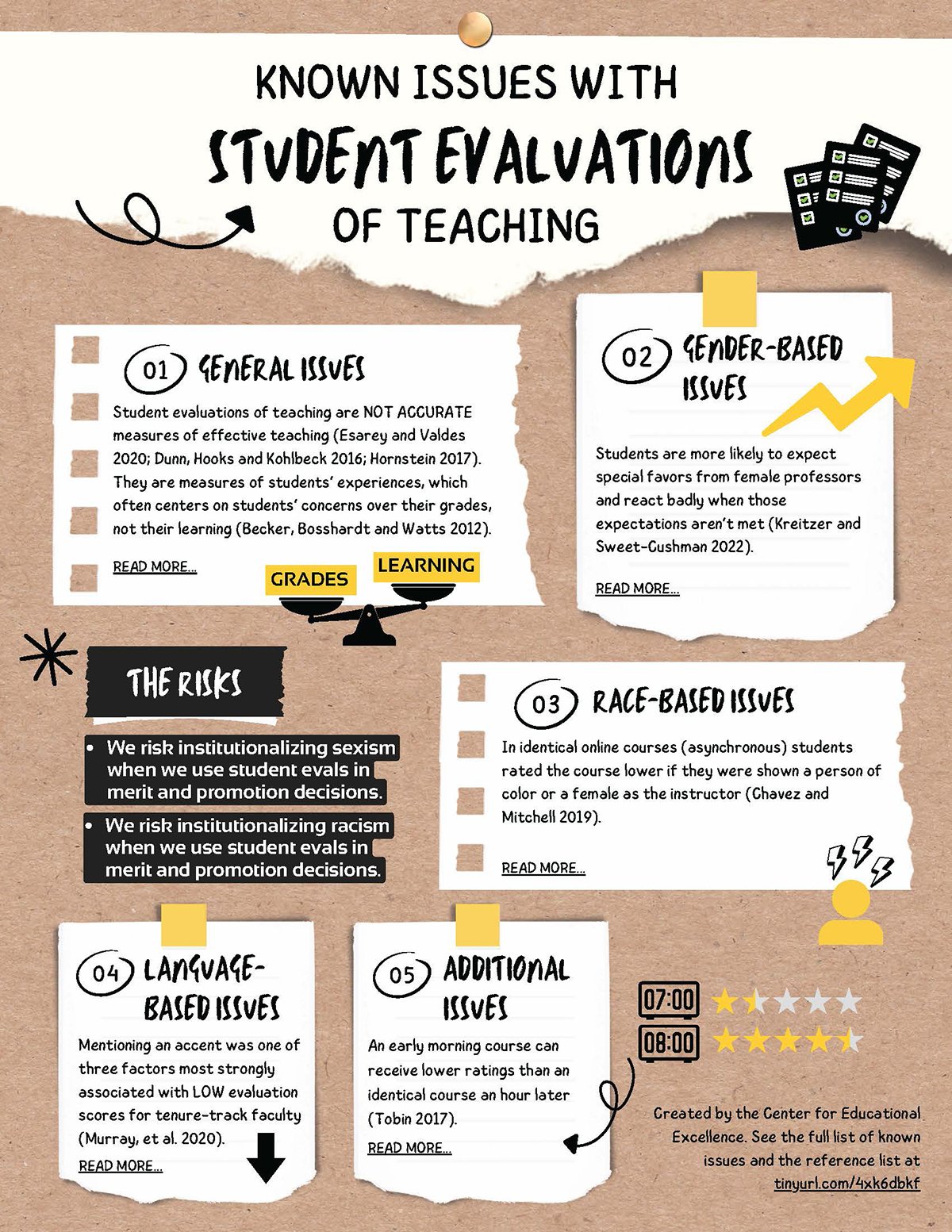
The Center for Educational Excellence (CEE) at the University of San Diego regularly creates infographics to inspire and inform faculty about teaching and learning practices in a visually digestible way.
One of their most insightful pieces, Known Issues with Student Evaluations in Teaching, highlights the biases, limitations and misconceptions often found in traditional course evaluations.
What I find compelling about this infographic is how it condenses academic research into a format that’s easy for educators to read, reflect on and discuss.
The infographic uses a handcrafted visual style, with torn-paper textures, sticky notes and hand-drawn arrows that make it look like something pinned to a faculty notice board. This informal aesthetic contrasts beautifully with the serious nature of the topic.
The layout moves vertically, with five neatly numbered sections, each presenting a different issue supported by citations. The combination of warm tan backgrounds, bold black headers and yellow highlights guides the reader through the content while keeping it visually cohesive. It’s an example of how design can humanize research and make abstract institutional problems more relatable.
I especially appreciate how the “Risks” section uses a dark, high-contrast background to draw attention. It not only separates the information visually but also signals urgency—an effective technique for emphasizing the consequences of systemic bias.
The handwritten typography and paper cut-out elements lend personality without undermining credibility, which is a delicate balance when dealing with data-driven educational themes.
For research-based infographics, approach the design with both intention and empathy. Use textures, colors and layout cues that reflect the topic’s tone. Subtle warmth and informality can help audiences engage with difficult or tricky subjects.
Break long-form research into distinct sections with consistent numbering or icons to make scanning easier. Use visual metaphors like sticky notes or sketch lines to create a sense of reflection and dialogue. Finally, vary the background contrast strategically to emphasize critical points or risks without overwhelming the viewer.
AI Prompts
To recreate this kind of reflective, research-based layout, try prompts such as:
“Create a reflective, research-based infographic that explores the key issues with student evaluations of teaching. Summarize the five most important insights in clear, relatable language, and pair each one with visuals or metaphors that help educators connect with the findings on a deeper level.”
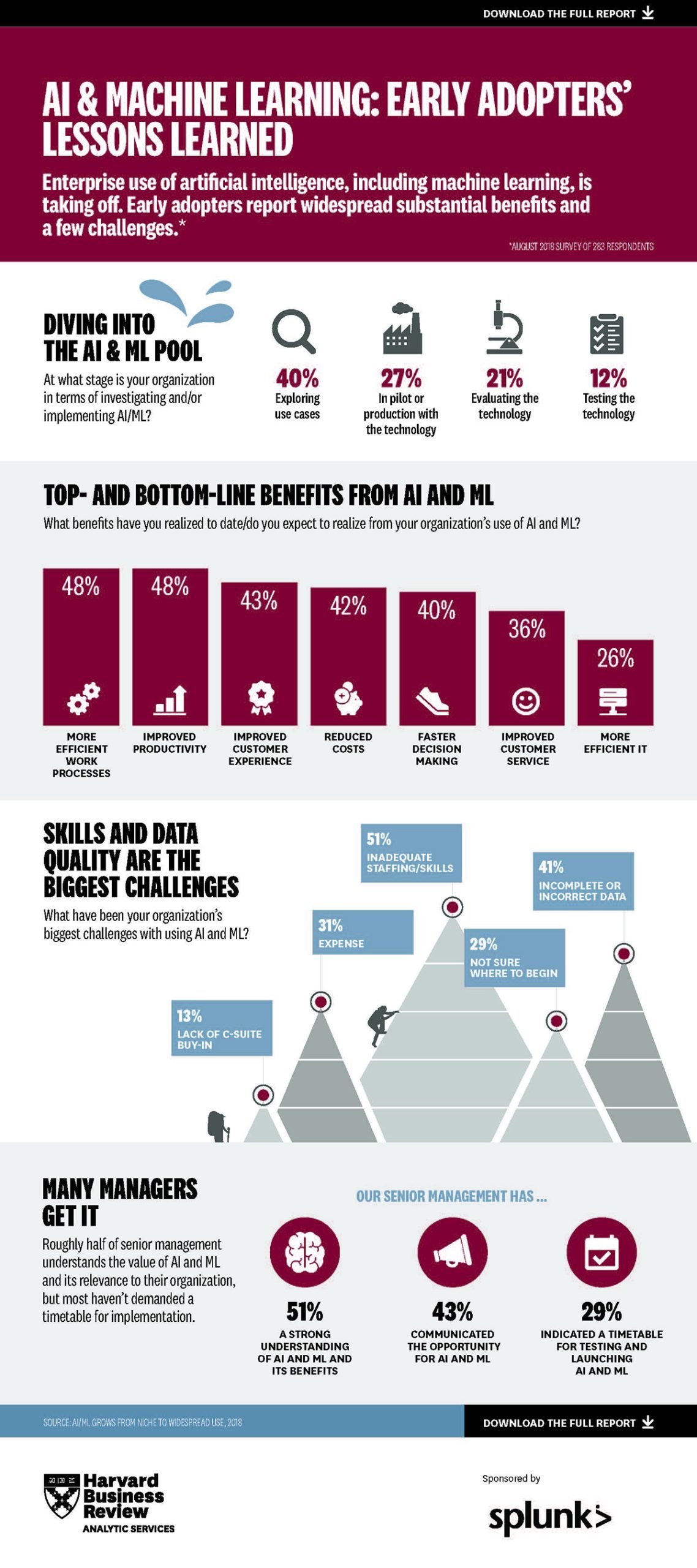
This infographic from the Harvard Business Review (HBR), created in partnership with Splunk, visualizes insights from a survey on how organizations are adopting AI and machine learning. Titled AI & Machine Learning: Early Adopters’ Lessons Learned, it distills key findings from a data-heavy report into a visually engaging summary.
The design highlights where companies stand in their AI journey—whether exploring use cases, piloting technology or scaling production—and breaks down both the benefits and challenges reported by early adopters.
What I love about this infographic is how it turns survey statistics into a clean, story-driven layout. Each section has a clear focus: adoption stages, measurable outcomes and organizational challenges.
The color contrast between deep burgundy and cool gray creates a sharp, professional tone that mirrors HBR’s brand identity. Data points are presented through simple visual devices like bars, icons and pyramid shapes. The layout also uses hierarchy effectively—large numbers pull readers in, while supporting visuals provide context without clutter.
Another subtle but powerful feature is how the infographic gives readers an easy way to dive deeper. At both the top and bottom, a clickable call-to-action invites viewers to “Download the full report.”
If you’re creating your own infographic in Visme, you can replicate this using its interactive features. Add a hyperlink that directs viewers to a webpage, a report or even a slide deck. It’s a smart way to extend your infographic’s value beyond static visuals and drive real audience interaction.
When building a research or data-focused infographic, think like both a designer and a storyteller. Start by identifying the narrative within the data—what journey do you want readers to follow? Then, use visual hierarchy to guide that path.
Larger fonts and bold colors can draw attention to headline metrics, while subtle shades and smaller text can provide supporting context. Use icons or simple visuals to make abstract numbers feel tangible.
AI Prompts
To create a similar data storytelling infographic, try prompts like:
“Turn AI adoption research into a data storytelling infographic that highlights what the numbers actually mean. Focus on the key trends and their implications, craft short, engaging headlines for each finding, and choose visuals that make the story easy to understand and relevant for decision-makers.”
Hopefully, those real-life examples have sparked a few ideas of your own.
So, how do you turn that inspiration into an even better infographic?
Follow these steps to create an educational infographic that transforms boring lessons into impactful visual learning experiences.
The first step in any course design process is to write out the learning objectives or learning outcomes. It describes what you want your learners to achieve after completing your lesson. In this context: your infographic.
Made with Visme Infographic Maker
There are many creative ways you can use infographics in an educational setting:
And the list goes on. Once you start using infographics in your lessons, you’ll find endless opportunities to make training materials more visual and engaging.
Your learning objectives will influence everything else that follows, including the:
We've covered everything you need to learn about setting training goals in this guide.
The next step is the lesson prep, where you gather the information that will be on your infographic. These include facts, visuals and examples that support what you want students to learn.
This part often feels tricky for many educators. Unlike a lesson plan or a textbook, you can’t pack an infographic with everything you know about a topic. The challenge is deciding what stays and what goes.
I asked Inimfon Miraw Antia, a learning experience designer and education researcher, how teachers can figure out what information should take priority.
Here’s what she said:
“When creating an educational infographic, focus on what learners must know, not everything they could know. Start with your core concept, then choose three to five key points that build understanding around it. Anything that doesn’t serve that goal belongs in your next lesson, not on your visual.”
Once you’ve narrowed your focus, organize your ideas in a logical order.
Just like a good lesson plan, your infographic copy needs a flow that takes learners from one idea to the next without confusion. For example, if you’re creating an infographic about the water cycle, you could divide it into four simple stages: evaporation, condensation, precipitation and collection. Each stage becomes its own short, visual section.
When planning your content, ask yourself:
For every paragraph you’d normally write in a handout, aim for one short sentence and pair it with visual assets like images, icons, illustrations or charts.
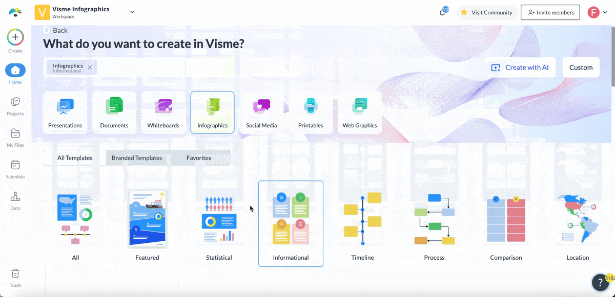
If you’ve ever created an infographic, you’d agree it’s time-consuming. That’s why I recommend using an infographic maker.
These tools come packed with dozens of educational infographic templates, layouts and design elements to jumpstart your creativity. As a non-designer, it makes your design polished from start to finish.
With layout, structure and other design details sorted, you can focus on the content.
Don’t just choose any template for the sake of it.
You want a template that matches the type of infographic you're creating.
Here’s a quick guide to help you choose:
Luckily, Visme has templates across all of these different infographic categories. You’ll also find templates for creating location, hierarchical, how-to, anatomical, resume and even video infographics.
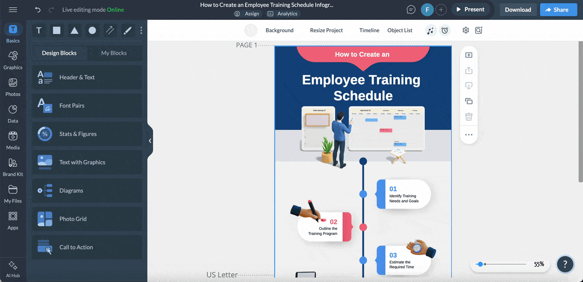
Once you’ve selected your preferred design, Visme’s drag-and-drop editor makes customizing your infographic a breeze.
We’ll discuss how to customize your infographic in the next section.
In Visme, you can easily adjust every part of your infographic to match your lesson, theme or school style.
Start by swapping out the placeholder text with your own lesson content. Do the same for icons, charts and visuals so they reflect what you’re teaching. Adjust the colors and fonts to keep everything consistent with your classroom or school branding.
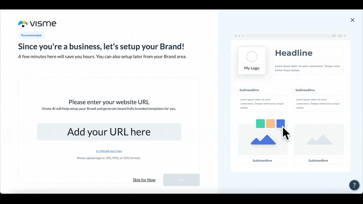
To make this faster, use Visme’s AI-powered Brand Wizard. Just enter your website URL, and the tool will automatically pull in your logo, brand colors and fonts. It then saves them in your brand area so you can use them again later for other projects.
You can also take advantage of Visme’s design collaboration tools to work with your colleagues or students in real time. Invite team members into your workspace and give them permissions to view, edit or leave comments on the project.
Use the workflow management tool to assign tasks, provide guidance and track deadlines towards completion, all within the same workspace.
Next, explore premade design blocks to build your infographic faster. These are ready-made layouts you can drag and drop to add new sections.
You’ll also find millions of free design assets inside Visme, including stock photos, icons, illustrations, graphics, shapes, lines, videos and audio clips. You can even upload your own visuals if you prefer.
Simply drag and drop shapes or icons into your design. Adjust their size, color and position until everything feels balanced and easy to read. Keep things clean and uncluttered so your visuals support learning instead of distracting from it.
Finally, remember that data visualization is the heart of every great infographic. In Visme, you can add graphs, charts, tables, maps, dashboards and data widgets in 2D and 3D formats. These visuals are helpful for visualizing student survey results, population growth or climate data.
When your design is ready, Visme’s analytics dashboard lets you track how it performs once shared. See how many people viewed your infographic, how long they engaged with it and which sections drew the most attention.
Static visuals can only do so much.
To truly grab students’ attention, make your infographic interactive.
Visme includes animation and interactivity tools that help you turn lessons into active, hands-on learning experiences.
Start with animations. A bit of movement helps guide the viewer’s eye and keeps focus on what matters most. You can make icons fade in as you talk about each point or have arrows slide into view to show steps or cause-and-effect.
Hover effects and pop-ups are perfect for lessons that include terms, fun facts or deeper explanations. Imagine a geography infographic where students hover over a continent to see its capital city, population or key landmarks. Pop-ups help you add more detail without crowding your design.
You can also add clickable buttons and links to turn your infographic into a mini learning hub. Link to videos, lesson plans or extra reading materials so students can explore beyond what’s on the screen.
Use dynamic charts and data widgets to make numbers more exciting. Instead of static graphs, add animated bars, lines or pie charts that move as students view them.
If you want to turn your infographic into a classroom presentation, you can also use slide transitions and clickable navigation. Add arrows, buttons or tabs that let students move through each section.
Once your infographic looks just the way you want, it’s time to make it accessible to your audience.
Click Share at the top right corner of your Visme dashboard. Under the Publish for Web tab, add a short description and hit the share button to publish your project online.
If you prefer to control access, open the Share Privately tab. Here, you can choose who gets to see your project—and what they can do with it. Give others permission to view, comment or edit your infographic or send them an invite link straight from Visme.
Want to feature your infographic on a class website or learning platform? Click Embed, and Visme will generate an embed code you can paste into any webpage or LMS (like Google Classroom, Moodle or Canvas). This lets students view your infographic right where they already learn.
You can also download your infographic in several formats, depending on how you plan to use it:
Whether you’re presenting in class, posting online or sending materials home, Visme gives you flexible sharing options that make your infographics accessible anywhere.
Here’s a quick, decision-ready comparison of 8 highly rated infographic tools to design educational content.
| Software | Key Features | Pricing | Best For | Core Uses | G2 Rating |
| Visme | Drag-and-drop editor, AI tools, interactive & animation features, data visualization tools, brand wizard, templates library, embedded media, collaboration & workflow tools, analytics, SCORM & xAPI export. | Free plan; Paid plans from $12.25/mo | Teachers, trainers, business & education teams | Interactive infographics, lessons, reports and presentations | 4.5/5 (450+ reviews) |
| Canva | Drag-and-drop editor, Magic Design (AI), infographic templates, collaboration, charts, brand kit, design assets. | Free plan; Paid plans from ~$15/mo | Teachers, students, schools | Quick classroom visuals, posters, lesson infographics | 4.7/5 (6000+ reviews) |
| Piktochart | Charts & graphs, templates, AI tools, design elements and collaboration tools | Free plan; Paid plans from ~$14/mo (and $39.99/member for students & teachers) | Educators, nonprofits, marketing teams | Data-driven visuals, summaries, classroom reports | 4.4/5 (160+ reviews) |
| Venngage | Infographic templates, drag-and-drop editor, icon & stock photo library, AI text-to-design, real-time collaboration, branding tools | Free plan; Paid plans from ~$10/mo (Education $99/year) | Schools, NGOs, educators | Infographics, comparison charts, visual summaries | 4.7/5 (120+ reviews) |
| Adobe Express | Professionally designed templates, generative AI tools, stock images, icons & design assets, brand kit. | Free plan; Paid plans from $9.99/mo | Teachers, creators, students | Classroom posters, handouts, digital lessons | 4.5/5 (450+ reviews) |
| Genially | Interactive infographic templates, AI features, brand kit, gamification tools, quiz creator, LMS integration | Free plan; Paid plans from ~$10/mo ( ~$7/mo for teachers ) | Educators, trainers, e-learning professionals | Interactive lessons, gamified infographics, quizzes | 4.7/5 (55+ reviews) |
| Infogram | Infographic builder & templates, live charts, dashboards, maps, analytics, brand kit, asset library. | Free plan; Paid plans from ~$19/mo | Teachers, researchers, data-driven educators | Data visualization, research results, reports | 4.7/5 (180+ reviews) |
| Lucidchart | Diagram & flowchart creator, customizable templates, AI-powered diagramming, real-time collaboration & integrations | Free plan; Paid plans from ~$9/mo | Educators, IT trainers, business students | Process infographics, flowcharts, concept mapping | 4.5/5 (6800+ reviews) |
| VistaCreate | Easy-to-use design editor, professional designed templates, animation tools, brand kit, templates, AI design tools, creative stock assets | Free plan; Paid plans from ~$10/mo | Teachers, small teams, content creators | Educational posters, social visuals, infographic layouts | 4.5/5 (170+ reviews) |
Creating an infographic is only half the job.
You also have to figure out how to get the most visibility and value from your educational infographics.
I’ll show you the different ways to distribute and embed your infographic so it supports your learning goals, both online and offline.
Made with Visme Infographic Maker
If you teach online or in a blended classroom, your learning management system is the perfect home for your infographics. You can embed your infographic inside course modules, discussion boards or assessments in LMS-ready formats.
Visme lets you export your training content in HTML, SCORM or xAPI formats, ready for upload to your LMS. This format allows students to interact with your infographic directly in their learning environment as part of their daily study flow.
Infographics make powerful visual anchors in lesson presentations. You can import them into Visme presentations, PowerPoint or Google Slides to create a visual storytelling experience. Use Visme’s presentation mode to turn your infographic into clickable slides or a guided visual tour.
A school website or class blog is an excellent way to showcase infographics as resources or summaries of key projects. You can embed them directly on your website using the embed code from Visme or your hosting platform’s media block.
Email remains one of the simplest ways to reach your audience. You can:
Social media is perfect for sharing educational visuals with a wider audience. Algorithms on platforms like LinkedIn, Pinterest and Facebook favor visual content like infographics.
Printed infographics are still in vogue. You can turn them into posters, bulletin board displays or classroom visuals. Print large-format versions to reinforce key concepts throughout the term, from grammar rules to lab safety procedures.
For example, you can display a “Periodic Table Trends” infographic on the classroom wall to help students visualize relationships between elements.
Turn your infographic into a scannable learning tool. Generate a QR code (Visme can create one automatically) and place it on printed handouts, homework sheets or classroom posters.
Students can scan the code to view the digital version, access embedded videos or explore interactive links.
Infographics also work beautifully in videos. You can:
Insert them into screencasts using tools like Loom, Camtasia or Visme Video Maker.
Use sections of your infographic as slide visuals in Zoom or Microsoft Teams classes.
Turn animated infographics into short explainer videos for YouTube or online lessons.
If you’re a researcher or curriculum designer, infographics make excellent additions to formal documents. Insert them into PDF reports, grant proposals or conference presentations to make your data or key insights more digestible.
Both use visuals and text to share information but are mostly used for different purposes.
Infographics are used to simplify a topic or explain processes and make it easier to understand at a glance. They are usually made for digital sharing, and that makes them ideal for lessons, reports and online learning.
Educational posters, on the other hand, are long-term reference materials. They often include more text and are designed to teach or reinforce key concepts in depth. You’ll typically see them displayed in classrooms, libraries or study areas for ongoing learning.
The key difference is that infographics focus on quick visual storytelling, while educational posters are designed for detailed teaching and long-term reference.
Infographics make learning visual, fun and easy to follow. They help students understand difficult ideas quickly and remember them longer. Research shows that 65% of people learn best through visuals, and they recall visual information much better than text alone. Infographics also support diverse learning styles and help teachers explain big ideas in smaller, clearer parts.
Every infographic has three basic parts:
When these parts work together, your infographic tells a complete story that’s clear and easy to remember.
Infographics have changed the way educators and teachers share knowledge. With the combination of text visuals and data, learning is faster and more engaging for learners at all levels.
But good infographic design doesn’t happen by accident. You’re going to need to clear learning outcomes, a solid structure and the right design tools. Visme’s unified, visual content creation suite ticks all the right boxes.
With Visme’s infographic maker, teachers, educators and trainers can turn lessons, research or data into interactive visuals in minutes, without design experience.
The platform comes loaded with an intuitive drag-and-drop editor, AI-powered writing and design tools, ready-to-use templates and interactive features like clickable elements, animations and pop-ups, designed to keep learners engaged.
You can even export your infographics in formats that work for your classroom or Learning Management System (LMS), including PDF, HTML5, SCORM or xAPI packages.
Ready to simplify a complex lesson or inspire visual learning? Sign up to discover a smarter, faster way to create educational and training content.
Design visual brand experiences for your business whether you are a seasoned designer or a total novice.
Try Visme for free


![How to Make an Interactive Infographic [+Templates]](https://visme.co/blog/wp-content/uploads/2023/11/How-to-Make-an-Interactive-Infographic-Quick-Guide-8-Customizable-Templates-Thumbnail.jpg)


