


14+ Employee Newsletter Examples, Ideas & Templates


AI is taking over graphic design (whether you like it or not).
It’s changing how we create, edit, and even think about design.
With just a few clicks, you can generate logos, marketing materials, social media posts and stunning visuals—all without even touching a blank canvas.
But, unsurprisingly, not all AI design tools are created equal.
Some are actually really good and do what they promise. While others are just...hype.
So, a couple of weeks ago, I took it upon myself to find out which AI graphic design tools are worth investing in. I tested dozens of them—putting their AI capabilities to work, experimenting with their automation features and seeing how well they handled “real-life” design needs.
In this article, I’ll share my list of top AI graphic design tools of 2026, the ones that I think actually save time, boost creativity and make designing easier (without sacrificing quality).
Whether you’re a designer, marketer, business owner, or just someone who wants pro-level visuals without the hassle, you’ll find the right tool here.
If you're short on time, watch this quick recap video. Let’s begin.
*Disclaimer: The comparisons and competitor ratings presented in this article are based on features available as of March 6, 2025. We conduct thorough research and draw on both first-hand experience and reputable sources to provide reliable insights. However, as tools and technologies evolve, we recommend readers verify details and consider additional research to ensure the information meets their specific needs.
AI graphic design tools are platforms that use artificial intelligence to create, enhance and automate visual design.
They analyze your prompts, inputs and preferences to generate logos, social media posts, presentations, marketing materials and more—all in a fraction of the time it would take manually.
What this means is that instead of starting from scratch or spending hours tweaking designs, you can let AI handle the heavy lifting and speed up the entire process.
But AI isn’t just about speed. It’s about making design more accessible.
Here are a few reasons why using AI for graphic design just makes sense:
In other words, some AI tools work like an extra pair of hands, handling repetitive work. Others act as creative assistants, giving you fresh ideas and helping you push boundaries.
Either way, AI isn’t here to replace designers. It’s here to make designing faster, smarter and better.
Before I share my list with you, I want to quickly break down the testing methodology I used to test and review these AI graphic design tools:
That said, here’s my round-up of the best AI graphic design tools of 2026:
| Tool | Best For | Price | Rating |
| Visme | All-in-one design & AI tool for branded content | Free; paid starts at $12.25/mo | 4.5/5 |
| Looka | AI logo design & branding kits | Pay-per-logo (starts at $20) or branding packages from $96/year | 2.8/5 |
| Designs.ai | AI content suite (logos, videos, mockups) | Free trial; paid plans start at $19/mo | 4.3/5 |
| Canva | Quick everyday designs with AI help | Free; paid starts at $55/year | 4.7/5 |
| Adobe Express | Quick, professional-quality designs | Free; paid starts at $9.99/mo | 4.5/5 |
| AutoDraw | AI-assisted sketch-to-icon tool | Free | - |
| Piktochart | AI-generated infographics & data visuals | Free; paid starts at $14/mo | 4.4/5 |
| Kittl | AI typography & illustration | Free; paid starts at $10/mo | 4.7/5 |
| DALL·E | Custom AI-generated images & artwork | Free; paid starts at $20/mo | 3.9/5 |
| Envato | Creative asset marketplace for templates, graphics, stock | Envato Elements starts at $16.50/mo (billed yearly) | 3.7/5 |
| LightX | AI-powered photo & video editor | Free plan; Pro from $5.99/mo | - |
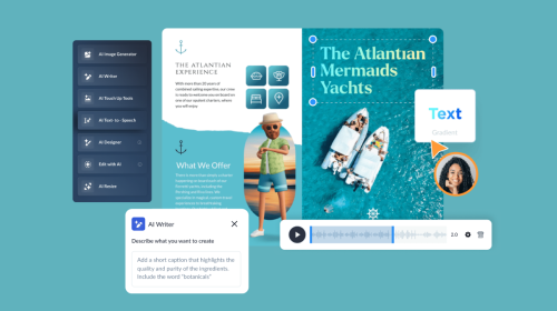
When it comes to AI-powered design, Visme not only does it all but does it extremely well. It's one of the best AI tools for content creation you'd find in the market.
What I particularly love about Visme is that it’s a full-suite visual content platform that helps you create everything from presentations and infographics to social media graphics and marketing materials.
Let’s talk about the Visme AI design generator first. It’s essentially an AI assistant that you can ask to create presentations, ebooks, reports, etc.
I entered this prompt:
“Create a modern presentation for a social media marketing agency called BrightWave. The presentation should include: a title slide, an about us slide, a services slide, a case study slide, and a contact slide. Use a bold, professional design style with clean fonts, plenty of white space, and a color palette of navy blue, sky blue, and white. Incorporate relevant icons, images, and data visualizations where appropriate.”
And the AI design generator came up with this:
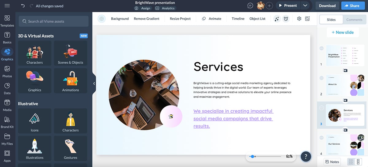
Simply incredible. Especially considering that it took me less than 2 minutes.
But that’s not all. I can then refine this version using an extensive library of shapes and icons, a host of font options and an even larger stock photo and video library.
There are also 40+ charts and graph types that you can add to your projects. Love it.
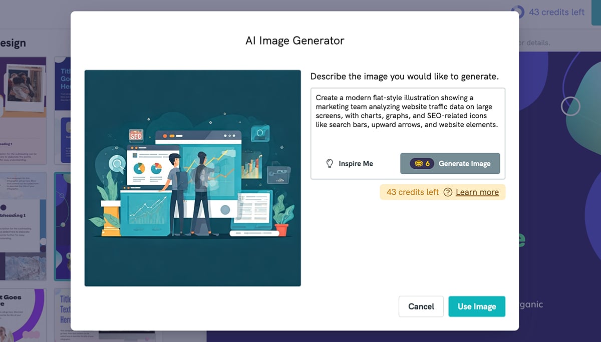
Visme also has a built-in AI image generator that you can use to create unique designs.
Here’s a prompt I entered:
“Generate a high-quality, modern flat-style illustration of a creative team working in a marketing agency office. The scene should show people brainstorming ideas, working on laptops, reviewing social media analytics, and designing graphics. Use a color palette of navy blue, teal, and white, with clean lines and a professional, slightly playful feel.”
And this is what it produced:
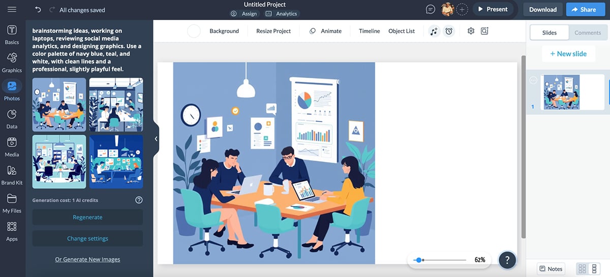
Not only is this exactly what I was looking for, but what’s more special is that I can pretty much use all versions in my project. You can obviously get more intricate with your prompts to get even better results.
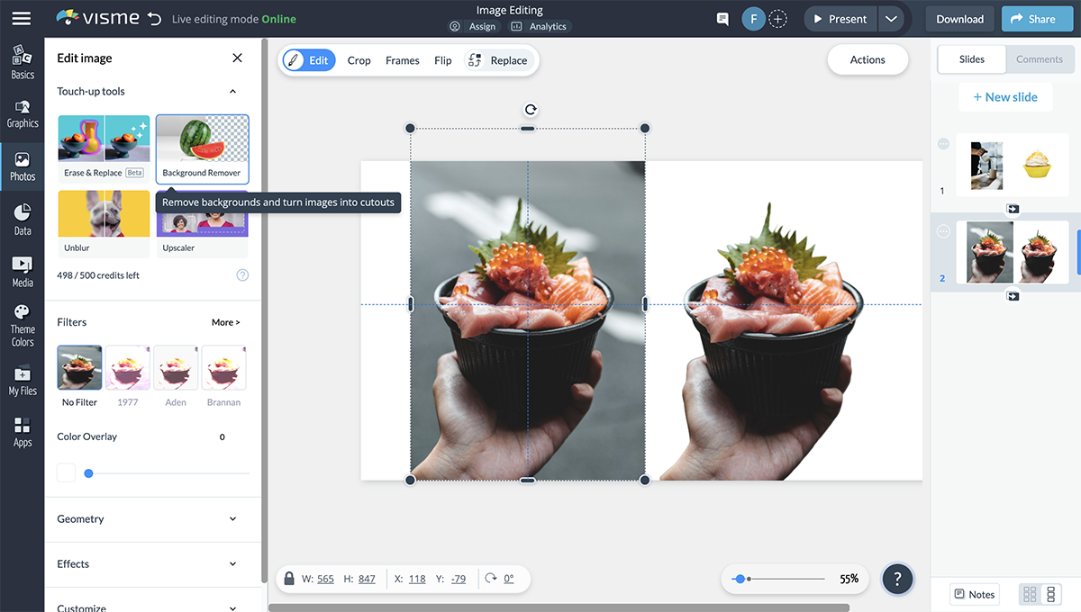
Don’t like what you see or want to spice up your own images? Visme also has an AI image editing tool that takes care of this. You can sharpen images, improve their quality and even resize them automatically to fit different platforms.
You can also remove background distractions from your photos:
Next up is another one of my favorite Visme features—the AI brand wizard.
This lets you skip the tedious work of uploading your branding assets to the platform. All you have to do is enter your web URL and sit back as the AI assistant extracts your colors, logos and fonts.
The assets are tucked away nicely in the “My Brand” tab so you can quickly add them to your projects. This also comes in handy when you’re working for multiple clients. Plus, you can swap complete color palettes using a single click.
Bonus: Once you use the brand wizard tool, the system will also generate a host of unique, branded templates that you can use to create something awesome.
The AI graphic design tool also lets you add 3D character animations and gestures to your projects to bring them to life. And you can even add interactivity, such as hover effects, clickable buttons and animated transitions to help you turn static designs into fully interactive experiences.
Overall, Visme is hands down my favorite AI graphic design tool. I’ve found myself using it the most in the past year or so. The results are brilliant, the ease of use is unmatched and it has replaced so many tools in my tech stack.
If you’ve ever needed a logo fast but didn’t want to settle for something generic, Looka is the AI tool you’ll want to check out.
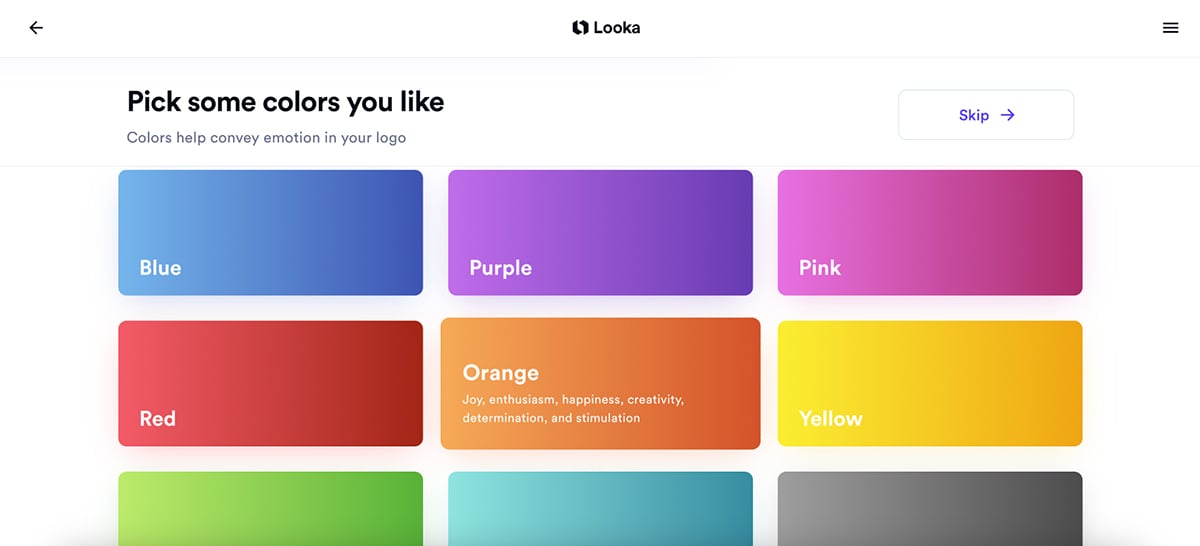
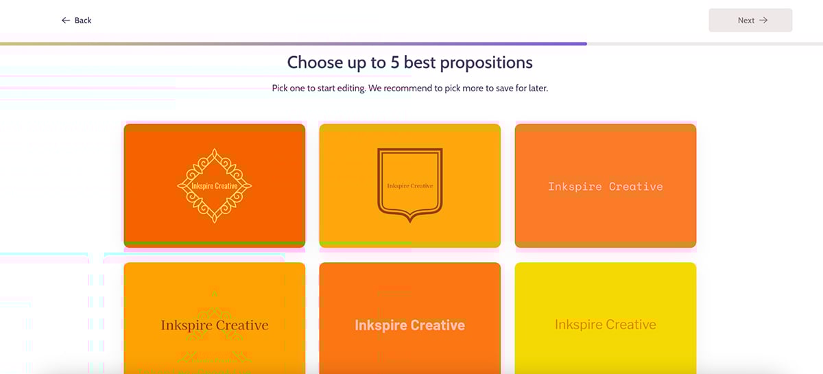
I tested Looka by designing a logo for a fictional writing agency (Inkspire Creative) and the process was surprisingly smooth.
All I had to do was type in the company name, choose my industry and pick a few design styles I liked. There are plenty of logo types to choose from—you’re almost certain to find something you like.
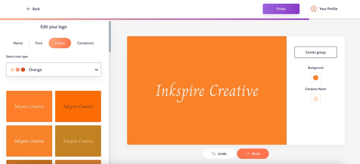
Next, I picked the colors I wanted in my logo. When you hover over the color, you’ll see what each color means. I chose orange, which symbolizes “joy, enthusiasm, happiness, creativity, determination, and stimulation”. You can pick up to three colors here.
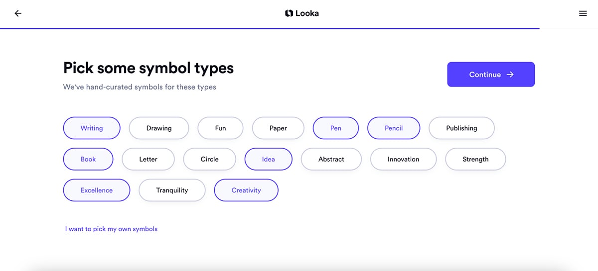
Next, choose your symbol types. I chose several here: writing, book, creativity, excellence, etc.
And, voilà! Looka generated a bunch of logos that can be further customized to match my brand aesthetic.
Sure, you’ll get some generic logo options, but if you look hard enough and customize your designs, you’ll eventually find the right one.
I picked a design, played around with the font and symbol options and this is what I ended up with:
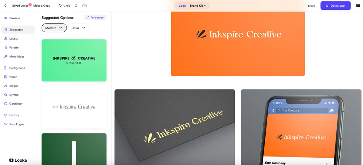
I love this. But that’s not all. Looka also creates a complete brand kit that shows how your new logo will look across different marketing materials.
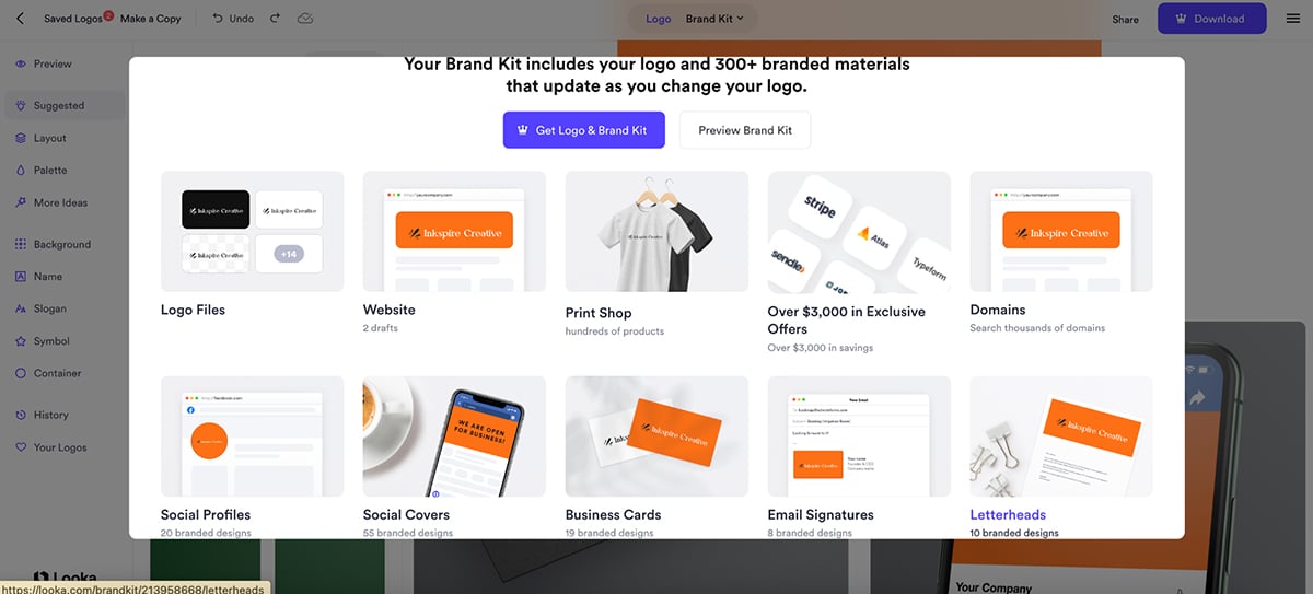
Overall, I find Looka to be super reliable and a great option for logo design.
Option 1: Get A Logo & Brand Kit
Option 2: Get A Logo Only
Next on my list of top AI graphic design tools is Designs.ai—a tool that leans heavily into speed and automation.
It comes with an AI logo maker that helps you design creative logos for your brand. It works in a similar way to Looka. You enter your company name, pick your preferred logo styles and colors and then sit back while the AI does its thing.
This is what Designs.ai came up with:
Not perfect, but this is a good start. And with a bit of tweaking to the fonts and colors, it could easily work. This is what I came up with:
One thing that stood out was Designs.ai’s “Containers” feature. Instead of just pairing your brand name with a standalone icon, Containers wrap your brand name inside a shape—like a badge or emblem. Whether that works for you really depends on your personal style, but personally, I usually prefer having a separate icon next to the name instead of around it. Still, it’s a nice option to have.
But Designs.ai isn’t just about logos.
It also comes with an AI designer that can instantly create branded visuals across multiple formats—including social media posts, flyers, business cards, brochures, and more.
I tested it by giving the AI this prompt:
“Create a set of branded social media graphics and a promotional flyer for a wellness brand called Bloom & Thrive. Use a modern, minimalist design style with soft greens, beige and white as the color palette. The graphics should promote an upcoming 'Self-Care Sunday' event, including the date, time and a simple call-to-action to register.”
Here are the results:
Were they all perfect? Not exactly. Some designs needed manual tweaking to adjust the image placements, fine-tune the text, and swap out a few icons. But the fact that I could get so many branded assets so quickly, with everything already matched to the brand style I’d set up, was genuinely impressive.
If you need a lot of visuals in a short amount of time, especially for social campaigns or product launches, this feature alone makes Designs.ai worth a look.
Next, I tried Designs.ai’s video maker feature.
It’s not a professional video editor by any means, but it’s a good choice for small businesses looking to create quick promo videos, social reels or product highlights. Just type in a script, and the AI pulls together stock footage, adds text overlays and voiceover and turns it all into a short branded video.
Here’s what it produced:
It’s surprisingly useful if you need a quick video and don’t want to start from scratch.
While it’s not the most customizable tool out there, Designs.ai definitely shines when speed matters.
If you’re a small business owner, freelancer, or social media manager who needs branded content fast, from logos and graphics to quick promo videos, Designs.ai delivers a solid mix of automation and creative flexibility.
I couldn’t make a list of top AI graphic design tools without including Canva—and for good reason.
It’s easily one of the most well-known design platforms out there, especially for non-designers who need to create visuals quickly without wrestling with complicated software.
Over the past year, Canva has also rolled out a handful of AI-powered features aimed at making the design process even smoother—and I’ll admit, a few of them have ended up in my regular rotation.
Some are genuinely helpful when you need to get something designed fast, while others feel more like nice-to-have extras rather than must-use tools.
One Canva AI feature that I really like is Magic Design—Canva’s template suggestion tool that offers ready-made layouts based on the content you upload or the type of design you need.
It’s actually somewhat similar to Visme’s AI-powered design suggestions, where you enter your project type and preferences and the tool serves up layouts tailored to your brand.
Both Canva and Visme aim to remove the blank page problem, and while Canva’s version leans heavily on template matching, Visme’s gives you a bit more room to customize right from the start.
To test it out, I gave the Magic Design this prompt:
“Create a promotional Instagram post for a summer sale at a skincare brand called Glow & Co. Use soft pastel colors and a clean, modern design style. Include text that says ‘Summer Glow Sale - Up to 50% Off’ and space for product images.”
Within seconds, Canva generated several templates, each with the text already placed and color schemes that matched the pastel vibe I asked for:
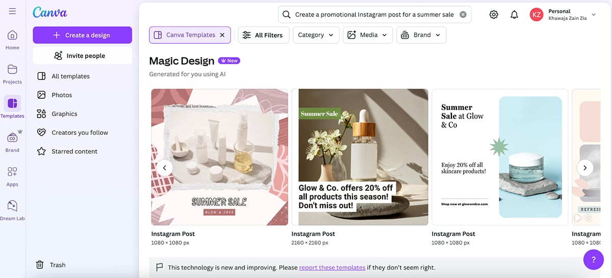
Some designs were on point right away, while others could do with a bit of tweaking to match the modern aesthetic I had in mind. But, overall, great results.
Next, I checked out Canva’s Dream Lab (just a fancy name for their AI image generator).
It works a lot like DALL·E or MidJourney, but the difference is you can generate the images directly inside Canva and drop them straight into your design.
To test it, I gave Dream Lab this prompt:
“Create a flat-lay image of skincare products on a marble countertop, with soft natural lighting and a pastel aesthetic.”
Here are the results:
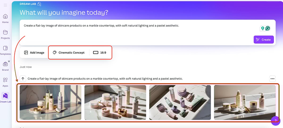
The results are exactly what I had hoped for—great. But what I like even more is that you can select the style and aspect ratio of the images you’re generating in Canva. Subtle but excellent addition.
There’s also a Text to Video and Text to Graphic option you can try. Both worked like a charm for me.
And on top of that, Canva’s got a growing set of AI image editing tools that you can use to edit both your own and AI-generated images. The editing tools include:
Finally, there’s Magic Resize, which instantly reformats your design for different platforms, handy for repurposing content across social channels.
Not every AI tool in Canva hits the mark, but I’d say they’re definitely making design faster, more flexible and easier for anyone.
Envato’s AI tools cover a range of creative tasks, from image generation to video and illustration. Everything is included in the standard Envato subscription, with no extra charge for AI tools.
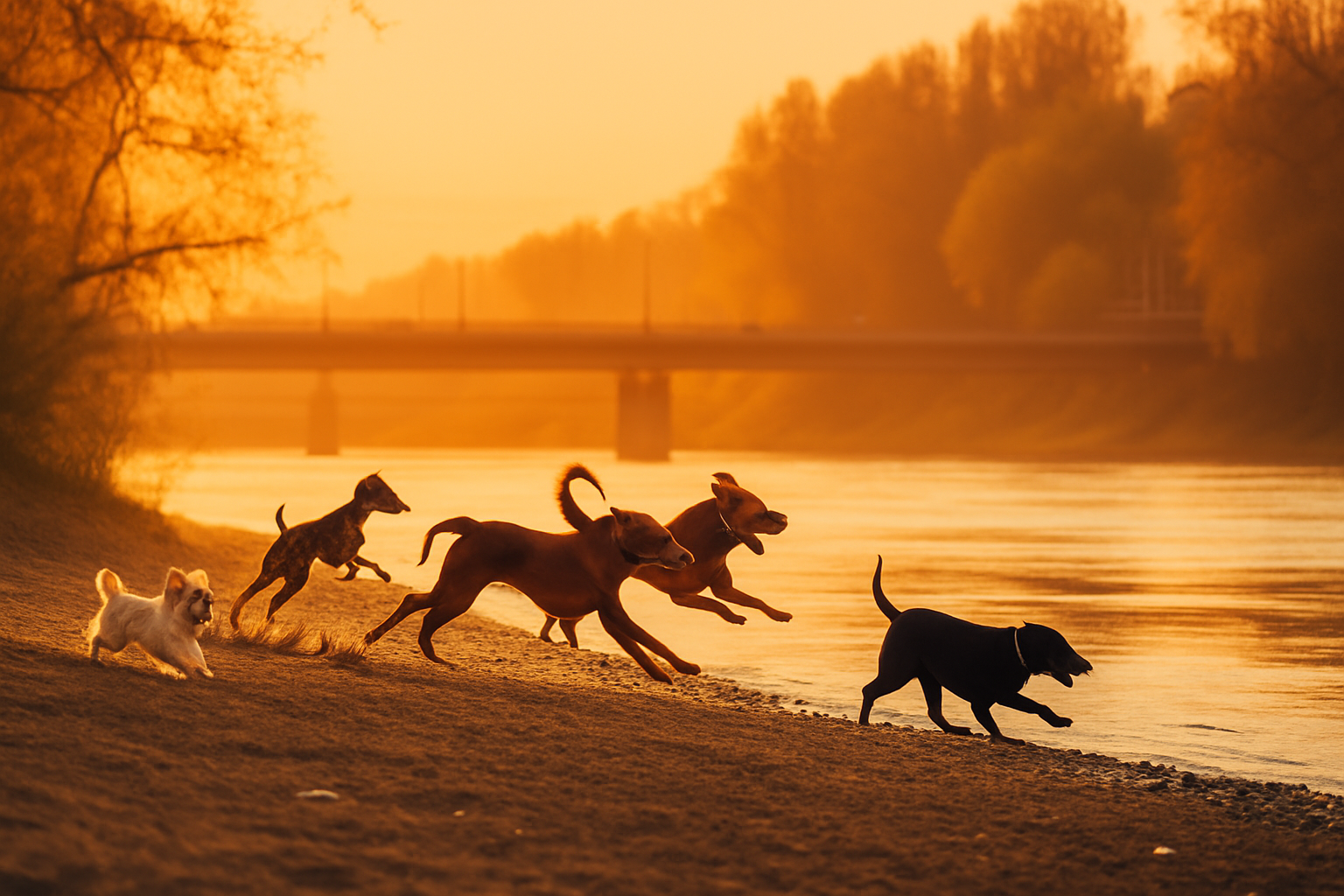
I started with ImageGen, which turns text prompts into personalized visuals. After enhancing my prompt using the built-in tool, I got different image options in a variety of styles. You can use it to create campaign concepts, social media graphics, or moodboards in no time.
My original prompt:
“A nostalgic sunset with several dogs running around in the riverside”
Enhanced prompt:
“Golden hour bathes the riverside, illuminating a vibrant scene of playful dogs. A diverse pack joyfully sprints and leaps, their silhouettes dancing against the warm hues of the setting sun. The atmosphere is filled with carefree energy and a sense of timeless companionship, capturing a perfect moment of canine bliss.”
The result:
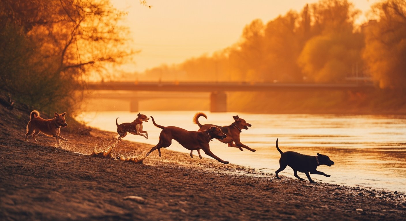
Then, I tried ImageEdit to play with the image I just created. This tool lets you remove backgrounds, erase objects, upscale resolution, crop, or replace parts of an image using generative AI. It works with your own uploaded pictures or with photos from the Envato library.
In this case, I selected the dog on the left of the image and asked ImageEdit to replace it with a smaller dog. Here’s the result:
VideoGen allows you to create short-form videos based on prompts and images. The interface is simple, and the results were usable with just a little tweaking. Paid users can generate up to 30 videos per month.
Envato also offers other AI tools like VoiceGen, MusicGen, GraphicsGen, and InspoGen, covering tasks like voiceovers, AI-generated music, illustrations, and idea sourcing. Overall, it’s a flexible and practical option for creators who want to speed up their workflow in one place.
Unlike hybrid tools that mix templates with AI, LightX is built purely on AI, making it one of the most powerful text-to-design platforms available.
It is all about prompts! Type what you want, get a design, and even edit your generations in real time with prompts.
The tool is capable of generating accurate text within imagery, unlike other AI image generators that often make spelling errors or cannot differentiate between commands and text to be added.
The best part is that for each type of design, they have trained their models separately.
So, a logo generator will create every image in a logo style, and a birthday card generator will turn every prompt into a birthday card (whether or not you specifically ask the AI to create one).
I tried the logo generator with this prompt:
“Generate a logo for a skincare brand called Skin Science.”
Note that at this stage, I didn’t give any design prompts like color, style, or tone.
I generated many variations without changing the prompt, and here are the results
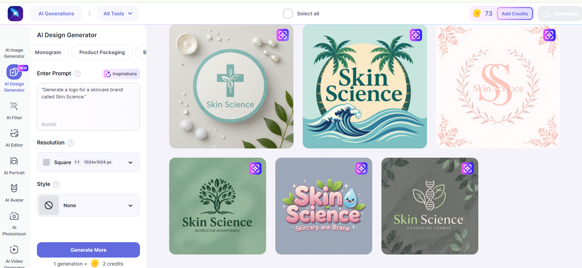
The results were just beautiful as they were generated. I didn't feel the need to edit further in the editor. The output quality was 10/10.
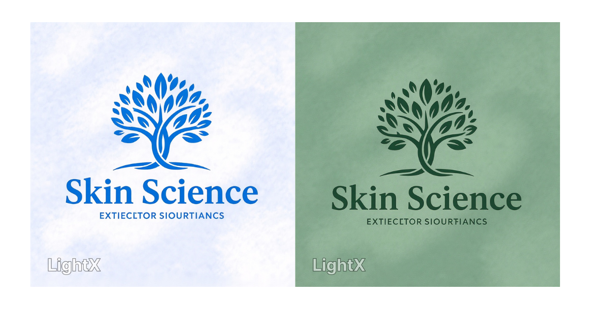
But I wanted to see the level of flexibility in editing, so I gave it a try.
Each generated image had that “Change with AI” button. When you click it, you'll see another prompt box.
The options to remove elements, add elements, replace elements, and change text were pre-set.
I wrote the prompt:
“Change the color theme to white and blue.”
And the results were:
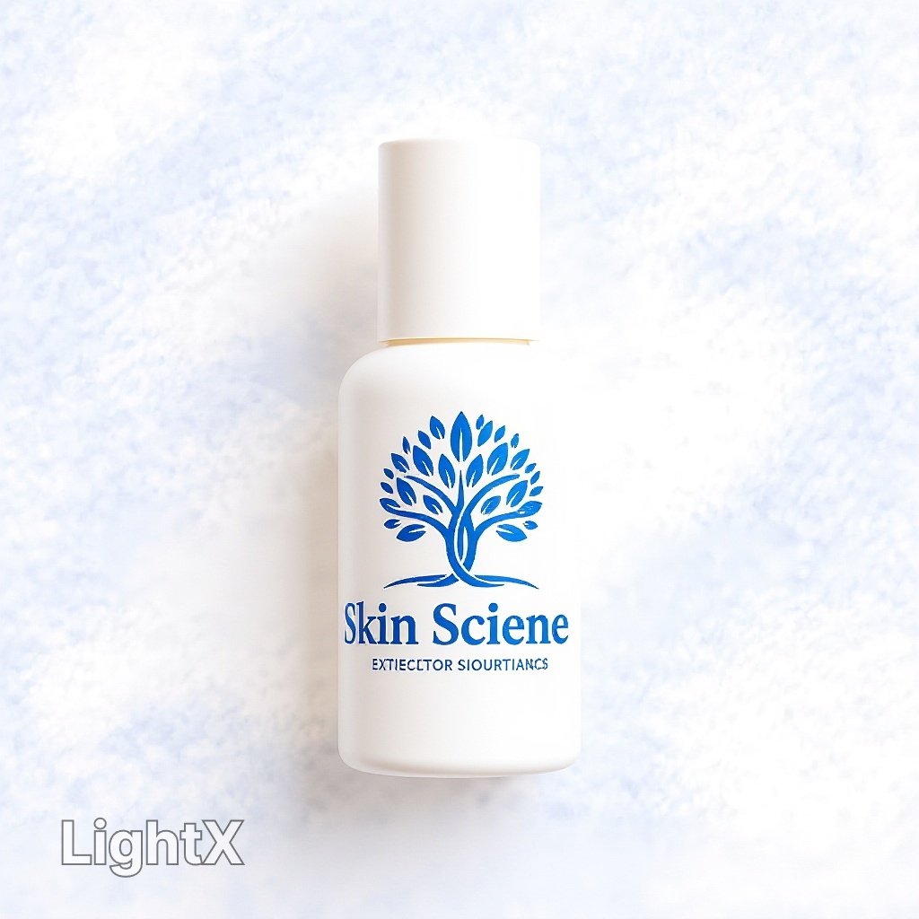
You can also see your generated images on mockups.
The same process needs to be followed.
Click “Change with AI” > Enter prompt “place it on a serum bottle” > Generate
You can use this tool to create:
The tool also has some partial AI features integrated into its AI graphic design tool.
Users can add text manually, remove backgrounds, and add graphic elements like stickers and illustrations from their asset library.
There are also advanced tools like upscaling (for printing designs on small or large-scale canvases), generative fill, AI expand, and more.
It's a credit-based model, you buy credits, and use certain of them for each generation.
Next up is Adobe Express. Adobe’s answer to the growing demand for simple, fast design tools, with a healthy dose of AI built right in.
If you’re used to Photoshop or Illustrator, Adobe Express feels like the lightweight, friendlier cousin built for speed, not complexity. But thanks to some new AI features powered by Adobe Firefly, it’s pretty reliable for everyday design work.
First off, I tested the text-to-image feature. I have to say, the image quality is right up there with most of the free AI image generators I’ve tested.
Prompt:
“Create a flat-lay image of skincare products on a marble countertop, with soft natural lighting and pastel tones.”
The result:
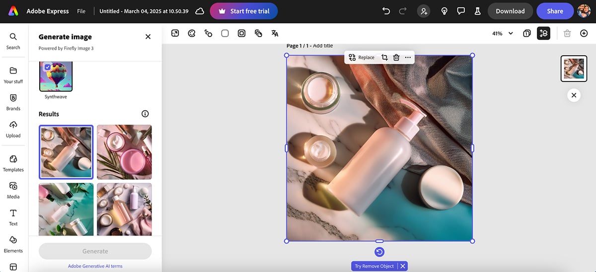
I love how clean, polished and so close to reality this AI-generated image is.
You can also resize images instantly to fit different platforms, which is great when you’re working on social campaigns.
There’s even a Text to Video feature that helps you generate simple, AI-powered video clips. It’s decent for short social content rather than full-fledged promos.
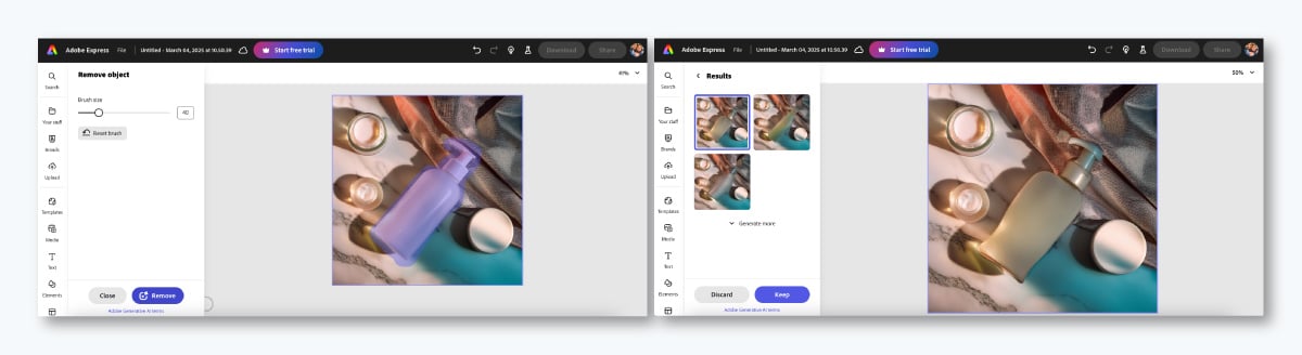
Express also has an AI image-editing feature that lets you add or remove objects from photos. Although, in most cases, it's a hit-and-miss.
The most fun Adobe Express feature, however, is Text Effects. It lets you generate stylized text with textures, patterns or 3D effects using a simple prompt.
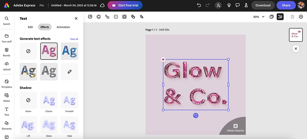
You can even animate the text you generate. And speaking of animations, you also get a character animation tool with Express that lets you turn simple characters into moving animations using AI-generated motion.
It’s not something you’ll use every day, but if you want to add a bit of personality to a social post or presentation, it’s a fun (and easy) way to do it.
All in all, I like the simplicity and straightforward nature of Adobe Express. But a quick heads up: this may be biased as I’ve been using the tool for a very long time. And if you’re new to the tool, it might take you some time to get used to it.
Sometimes, you just need a simple icon or doodle, but drawing isn’t exactly your strong suit (I know mine isn’t).
That’s where AutoDraw comes in. And, honestly, it’s one of the most fun AI design tools I tested.
AutoDraw is a free AI tool from Google Creative Lab that takes your rough, scribbled sketches and instantly matches them to professionally drawn icons.
I tested it by drawing (and I use that word very loosely) a teddy bear, and within seconds, AutoDraw’s AI suggested a list of clean, polished bear icons I could swap in.
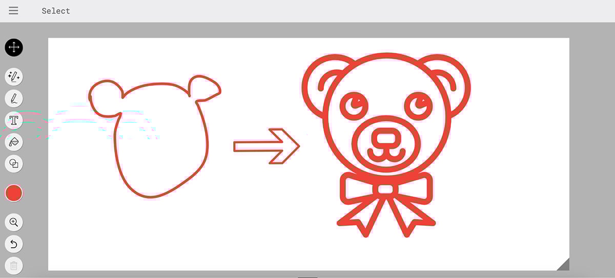
It’s kind of like having an AI-powered art assistant guessing what you’re trying to draw and handing you much better-looking options.
Once done, you can download your icons and paste them wherever you want. Simple and convenient.
Free
If you need to turn ideas or data into professional visuals without spending hours on layout and design, Piktochart is one of the best generative AI graphic design tools for that.
I tested the platform’s AI-powered visual generator.
It starts by asking you to choose your format. The options include:
Next, enter your prompt. I tried this prompt:
“Create an infographic explaining five effective strategies for boosting organic website traffic in 2025.”
The result:
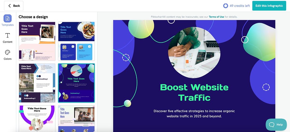
Sure, the copy leaves much to be desired. But the overall quality and variety of infographics it created was pretty good.
You can then go in and swap out images, icons, text and colors to create a design that matches your aesthetic.
This is the image I created using Piktochart’s image generator:
The quality is pretty decent.
So, if you’re building infographics, presentations or reports, Piktochart’s AI gives you a great head start. That said, Visme and Piktochart serve different ambitions. Piktochart excels at getting you started quickly, while Visme gives you more room to grow with advanced interactivity, data visualization and a broader content toolkit.
Next up is Kittl. If you’re someone who loves working with bold typography, detailed illustrations or vintage-style graphics, this tool brings some unique AI magic to the table.
Kittl isn’t a general-purpose design platform like Canva or Visme. Instead, it focuses heavily on typography, logo creation, and artistic layouts. The kind you’d see on t-shirts, posters, packaging and branding projects.
To get started, you first choose your artboard size, and then once you’re inside the editor, click on the canvas and press the button in the top left corner. That’s how you enable Kittl Copilot, Kittl’s built-in AI assistant. Or find the Kittl AI button on the left-hand bar in your editor.
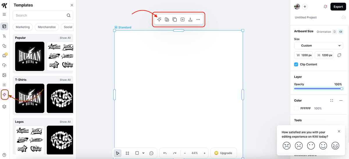
From there, you can create images directly from a simple text prompt without leaving your workspace.
My prompt:
“A retro-style illustration of a man playing tennis, mid-swing, with bold lines and a limited color palette of navy, white, and gold.”
The result:
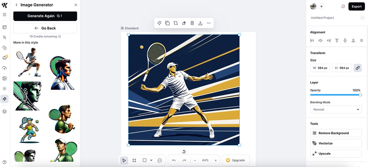
Some of the AI images looked great and gave me a solid starting point—definitely a time-saver if you’re aiming for that vintage or hand-drawn feel.
Kittl also offers AI-powered editing tools, including a background remover, image upscaler and object remover, all designed to help clean up and refine your designs without needing extra software.
Once your design’s ready, you can make the most of Kittl by using it for print-on-demand projects, whether it’s t-shirts, posters, stickers or even custom packaging.
If your style leans toward bold typography, unique layouts and designs with character, Kittl’s AI helps you get there faster without losing that handcrafted touch.
No list of AI graphic design tools would be complete without DALL·E 3—OpenAI’s flagship image generation tool.
Unlike most of the other tools on this list, DALL·E doesn’t come with templates, layouts or pre-made designs. Instead, it’s all about creating completely original images from scratch, just by typing a description.
I tested it with this prompt:
“Create a wide-angle illustration of a prehistoric village set in a lush valley, with primitive huts made of wood and stone, people gathered around a fire, and children playing near a river. The scene should feel peaceful, with soft morning light and detailed natural surroundings.”
The result:
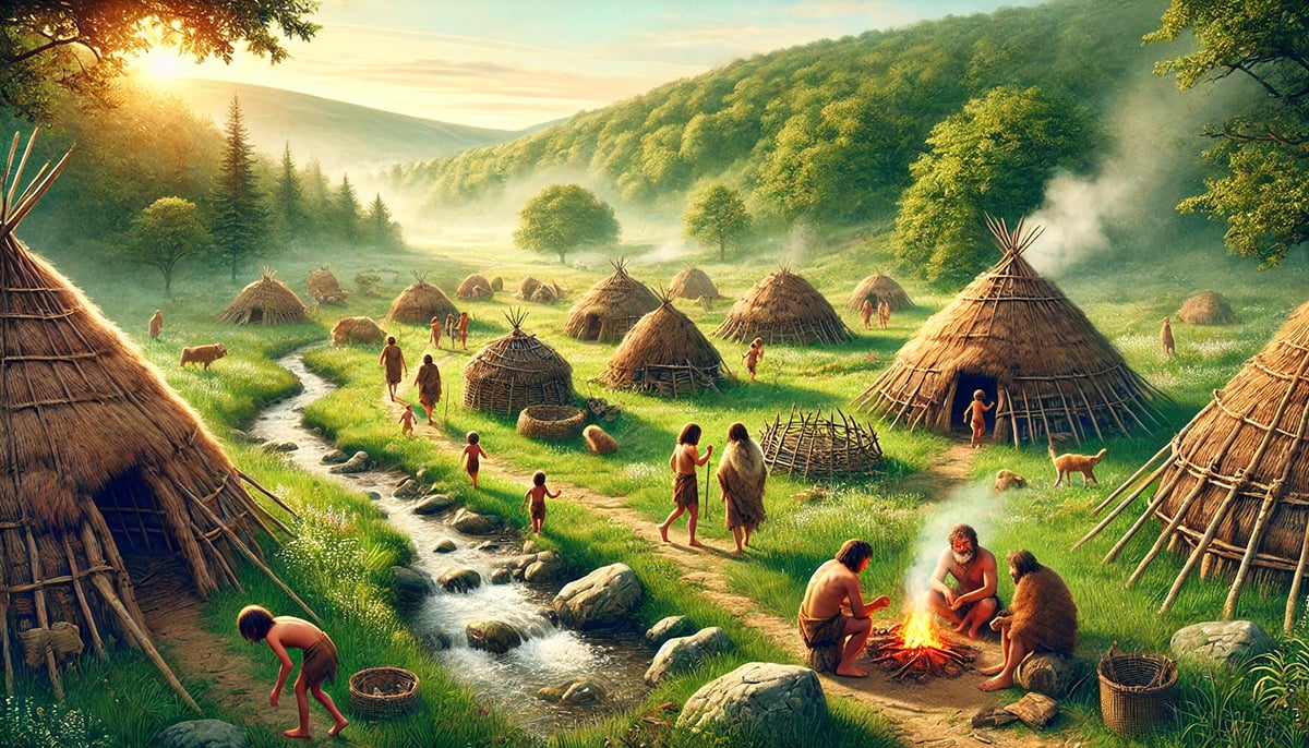
Absolutely stunning. The level of detail, lighting and composition is far beyond what I’ve seen from most built-in AI tools in design platforms.
If you need a custom hero image, background or product visual, DALL·E delivers.
After testing all these AI graphic design tools, one thing became clear. AI can’t replace creativity, but it can definitely speed up the process and make designing a lot more fun.
And if you’re looking for one of the best AI graphic design tools that combines smart automation with a full creative toolkit, Visme AI stands out.
With built-in AI design and AI image generation, you can jumpstart projects in seconds.
But that’s just the beginning.
Visme also comes packed with dynamic fields for auto-updating data, analytics to track content performance and powerful collaboration and sharing and publishing features to work seamlessly with your team.
On top of that, Visme isn’t just for graphics. You can also create forms, videos and presentations, all using Visme’s huge library of premade templates, icons, photos and design assets.
And if you’re curious how AI is changing the marketing industry as a whole, check out this guide to the best AI marketing tools to see how brands are using AI far beyond design.
Design visual brand experiences for your business whether you are a seasoned designer or a total novice.
Try Visme for free


![How to Create a Practical Crisis Management Plan [+ Templates]](https://visme.co/blog/wp-content/uploads/2025/07/How-to-Create-a-Practical-Crisis-Management-Plan-Thumbnail.png)