


Healthcare Data Visualization: How to Turn Data into Impactful Stories

Data visualization can transform your ideas from ordinary to extraordinary.
I know this firsthand. As a PhD student, I relied heavily on data visualization to simplify complex ideas, communicate findings with clarity, and help my audience see patterns and trends that raw numbers alone could never reveal.
Whether it’s for my research or presentations, charts, graphs and other types of data visualizations make the difference between confusion and clarity.
The same applies in business. Companies generate mountains of data every day, and visualization tools help make sense of it. They can build dashboards that track performance, map customer journeys or turn raw analysis into stories that drive smarter decisions.
With the average person creating 1.7 MB of data every second, someone has to put that information into perspective.
With so many data visualization tools available, how do you find the one that's right for you? I’ve put together this list to help you choose the best fit.
Ready? Let's dive in!
Before we get started with our list, let’s find out what a data visualization tool is.
In a few words, it’s software that takes data from a specific source and turns it into visual charts, graphs, tables, dashboards and the likes.
Data visualization tools can create anything from simple pie graphs to complicated interactive choropleth maps The trick is choosing visual tools with all the right features.
Not all data visualization tools are the same. Some tools are more versatile and easy to use, while others have a high learning curve.
But what do the best data visualization tools have in common? They all offer all the standard charts and data visualization types. The most common are pie charts, line and bar graphs, histograms and pyramid charts. For more unique or elaborate data visualizations, you’ll have to shop around to see which tools offer what you need at the best price and ease of use, aligning with the importance of data visualization in your organization.
If you’d love to learn more about data visualization before we get to the tools, this video provides an in-depth explanation of what it really is, along with the different types of charts and graphs to use and how you can make them.
When searching out the best data visualization software, I checked for tools that are versatile and capable of performing a wide range of tasks effectively. Essentially, I was on the lookout for tools that checked these boxes.
Considering this, here’s the testing process I used:
*Disclaimer: The comparisons and competitor ratings presented in this article are based on features available as of August 21, 2025. We conduct thorough research and draw on both first-hand experience and reputable sources to provide reliable insights. However, as tools and technologies evolve, we recommend readers verify details and consider additional research to ensure the information meets their specific needs.
| Software | Key Features | Pricing | Best for | Core Uses | G2 Rating |
| Visme | Customizable charts and infographics, AI tools, animation and interactivity, collaboration, analytics tools, robust template library, millions of design assets, brand kit | Free; Paid plans from $12.25/month | Non-designers, marketers | Presentation-ready charts, maps, infographics, interactive visuals, social media graphics with animations, and marketing materials | 4.5/5 (440+ reviews) |
| Tableau | Advanced and interactive dashboards, real-time data analysis, AI-powered insights, real-time collaboration, geospatial visualization | From $15/user/month | Data analysts, enterprises | Complex data visualization, real-time analytics, storytelling dashboards | 4.4/5 (2800+ reviews) |
| HubSpot | CRM reporting and data visualization, integration with BI tools | From $15/mo/seat | Marketing and sales teams | Visualizing customer trends, marketing funnels, and sales performance | 4.4/5 (12,900+ reviews) |
| Microsoft Power BI | Interactive dashboards, data modeling, AI insights, drill-downs, strong Microsoft integration | Free; Paid plans from $10/user/month | Business analysts, enterprises | Connecting multiple data sources, advanced analytics, real-time dashboards | 4.5/5 (1370+ reviews) |
| RawGraphs | Open-source, unique chart types (alluvial, chord, sunburst), direct data import via CSV/TSV/JSON/API, SVG export | Free | Designers, researchers | Creating highly customized data visualizations for research or design workflows | 4.4/5 (5+ reviews) |
| Flourish | 50+ templates, interactive maps and charts, animations, live data updates, no coding required | Free plan; Paid plans (custom pricing) | Storytellers, marketers, educators | Interactive data stories, dashboards, presentation, and embeddable visuals | 4.8/5 (2+ reviews) |
| Sisense | Embedded interactive visualizations, AI-driven insights, data modeling and connectivity, cloud deployment | Get quote | Enterprises | Creating BI dashboards with advanced drill-down capabilities | 4.2/5 (1000+ reviews) |
| Databox | Centralized metrics and visual dashboards, AI performance summaries, dashboard templates, TV and mobile dashboards, white-labeling | Free; Paid starts at $47/month | SMEs, marketing agencies | Tracking KPIs from multiple data sources in visual dashboards | 4.4/5 (190+ reviews) |
| Datawrapper | Easy-to-use responsive charts, data import and integration, customization options, team collaboration | Free; Paid starts at $599/month | Journalists, researchers | Visualizing survey data, news insights, and academic research | 4.3/5 (10+ reviews) |
| Google Charts | Free and customizable charts, multiple chart types, customization tools, real-time data update, team collaboration | Free | Developers | Creating embeddable charts for websites and applications | 4.2/5 (500+ reviews) |
G2 Rating: 4.5/5 (440+ reviews)
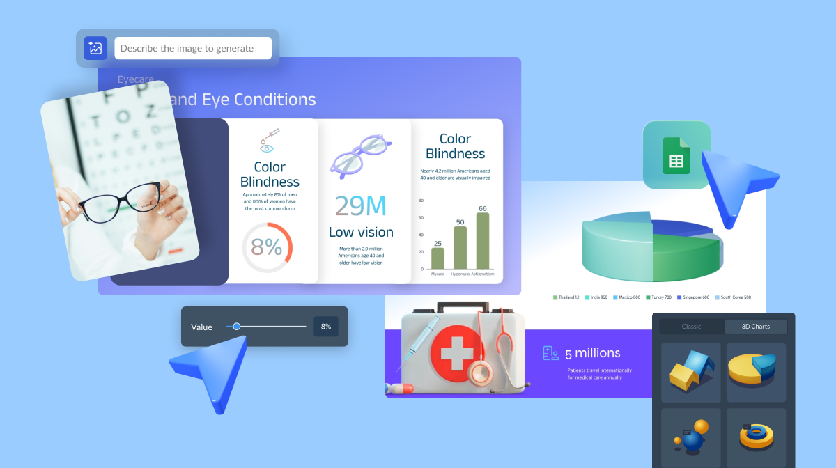
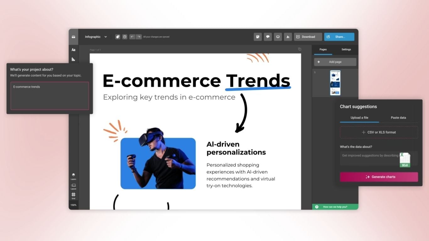
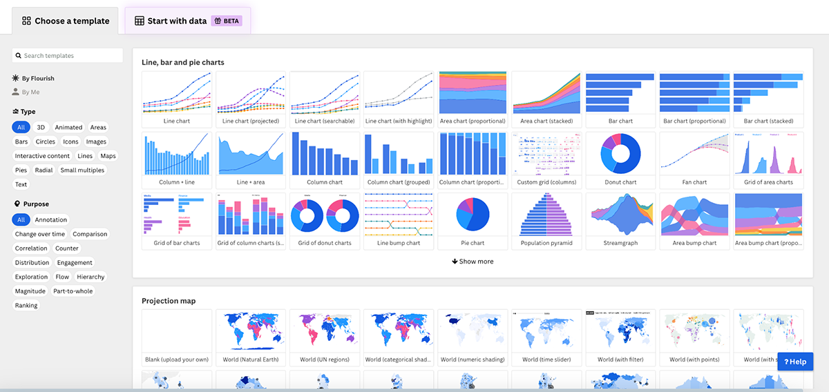
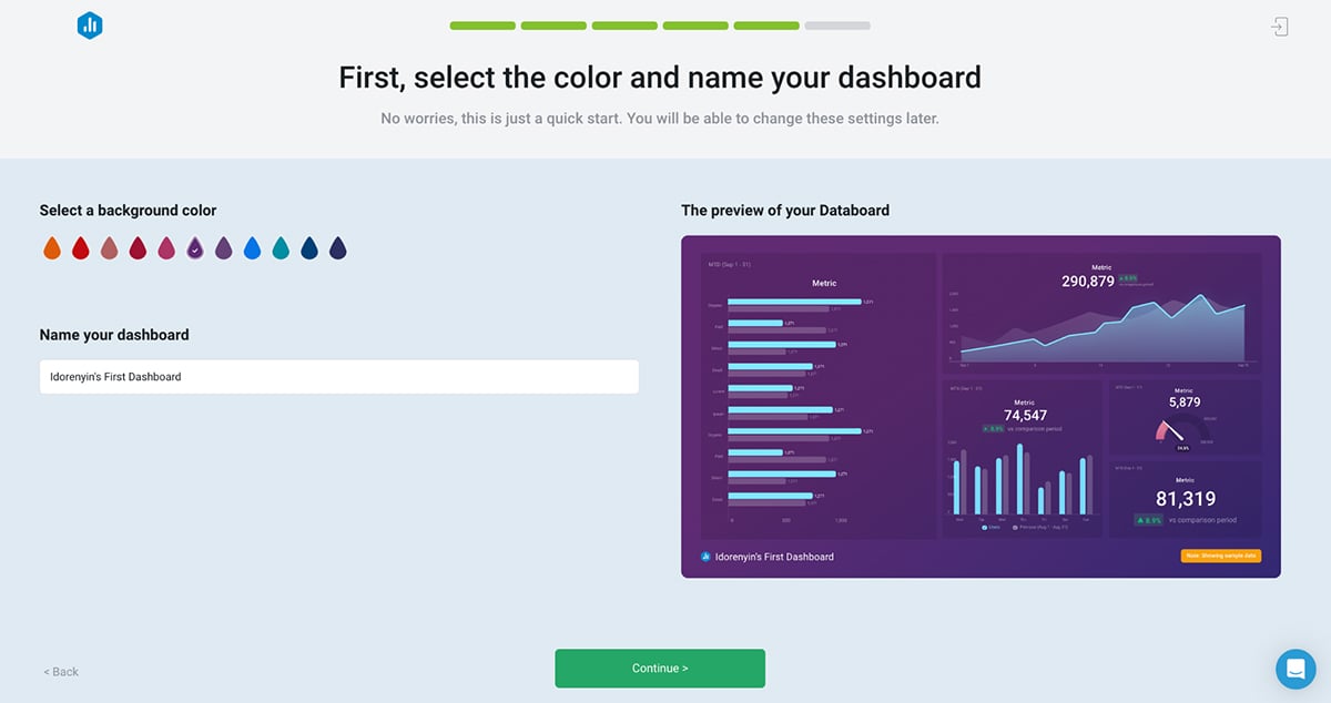
Visme is mostly famous as a visual content creation suite but it also comes with a full suite of data visualization tools that goes above and beyond data.
If you’ve ever stared at rows and rows of data in a spreadsheet and thought, “There has to be a better way to make sense of this,” then Visme has everything you need. It’s one of the most powerful and versatile data visualization tools out there.Using a full set of tools, including a graph maker, chart templates and a data widget library, you can easily create data visualizations of different types.
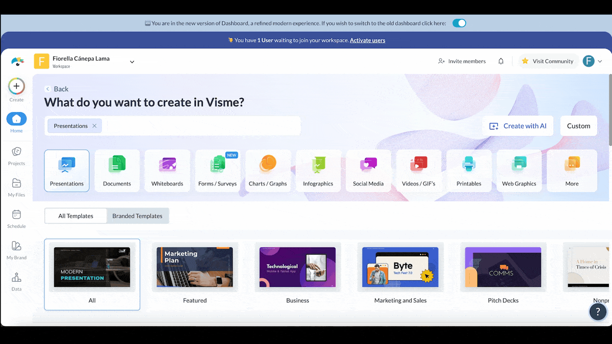
Once you’ve logged in, you’re greeted by a beautiful dashboard that’s easy to navigate. You can start creating these charts from a blank canvas or choose from an overwhelming number of professionally designed templates.
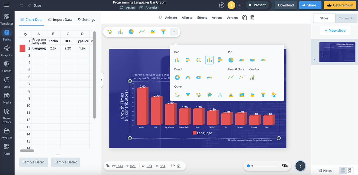
What I love most is how I’m able to switch the chart type with a single click.
The best part is you use these visualizations as a a standalone or add them to any project you’re working on in Visme, such as a proposal, data presentation, board report or any type of infographic.
Visme integrates business intelligence with interactive design to help you create data visualizations that are not only easy to read and understand but also look stunning.
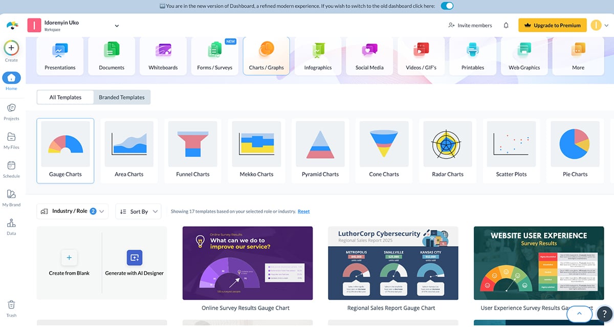
Visme allows you to visualize complex data with 50+ types of charts, graphs, and data widgets. From the dashboard, I found dozens of chart templates across multiple categories, including:
You can manually input your data (Visme provides sample two sets of sample data for you to play around). Or import live data or automatically from Google Sheets, Excel, Google Analytics, SurveyMonkey, and Smartsheet to create custom dashboards to track business insights. Looking to visualize geospatial data?
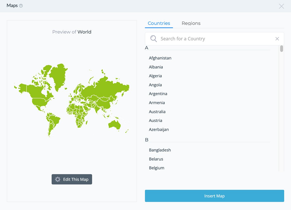
Visme offers map visualization features so you can create interactive maps of specific countries, regions or the world and customize data directly on the map by adding or editing existing data. It lets you adjust colors, captions, and the data legend to make mapsthat show numbers or categories for geospatial insight.
Besides the wide array of chart and map types, Visme also comes packed with different data widget styles for visualizing data, arrays, percentages, gauges and more. But what really caught my attention was the 3D widgets that bring a new dimension to data visualization. And if you’re looking to create flowcharts, diagrams, process flow and decision trees, there are prebuilt shapes and diagrams to make the design process a piece of cake.
Visme also offers dozens of blank table designs along with prefilled tables across different categories like IT & consulting, marketing and media, healthcare, financial services, consumer goods/ services, education, nonprofits and more. I also found options for embedding tables from Google Sheets, Excel and Airtable into my project.
The collaboration features in Visme are top-notch. Regardless of how many you have on your team, they can all tag each other, leave comments, draw annotations and make changes in real-time.
But beyond the basic collaboration tool that lets people in and outside of your team work with you, Visme also has a workflow management feature. This tool lets you assign different sections of your data visualization for team members to work on, set deadlines and track their progress toward completion.
I have to give to Visme—there are a lot of choices when it comes to customizing charts. I found options for customizing the chart heading (title and subtitle), axis, legend and values, along with the overall appearance of your chart.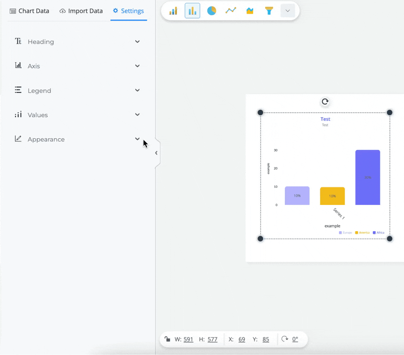
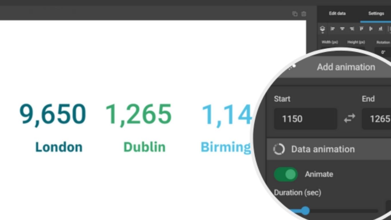
Another reason why Visme is my favorite pick is the ability to create interactive data visualization. Breathe life into static charts with animations and interactive features like hover effects, popups, and internal and external links. Also, you can choose between different styles of animation, such as Linear, Bounce and Elastic, or turn the animation off completely.
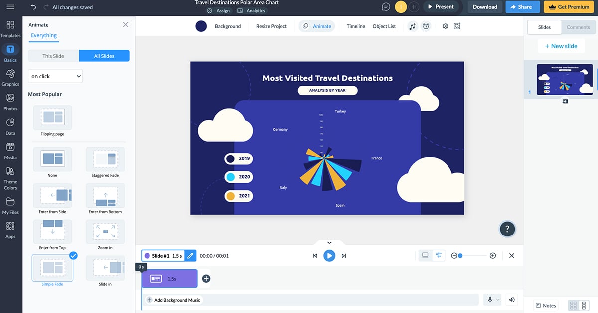
To publish and share your animated chart, just click on the Share button at the top of your screen and then choose from three different options:
If you use any of these options, you can easily track performance or get insights on how your audience is engaging with your chart with Visme’s analytics tool.
Finally, if you want to download your chart as a static image, you can save it as a JPG, PNG or PDF file. You can also download it as an HTML5 file if you want to keep the animation and interactive elements.But don’t just take my word for it.
Here’s a video showing how Visme helps you create data visualizations.
Furthermore, Visme has an AI chart maker that I’m super impressed with. It lets you create first-draft pie charts, Mekko charts, scatter plots, and more by providing text prompts. All I had to do was enter a detailed prompt about my data visualization project and select one of the options recommended by AI. It generated charts I could easily customize according to my needs.
Technically, Visme is for anyone who needs to create data visualizations and visual graphics for a variety of purposes.For example, you can create charts for blogs, reports, proposals, social media, school reports, presentations, print collateral and more. But most of all, Visme is for people who need to create beautiful visuals without learning about design.
Nevertheless, Visme offers lots of resources to improve your designer’s eye and make the most out of the tools provided in the editor. If you need a great-looking data visualization on its own, as part of a dashboard, or inside a report or proposal — Visme is the right data visualization software for you.
Visme offers a free plan with plenty of options to help you get familiar with the platform. You can also upgrade to any of the paid plans:
You may even be eligible for a discount if you're a nonprofit organization or a student.

G2 Rating: 4.4/5(2800+ reviews)
Tableau is one of the most recognized business information data visualization tools. What’s most notable about Tableau is that data visualization techniques are at the core of everything. The data visualization and data analytics tools inside Tableau have revolutionized the way businesses manage their data.
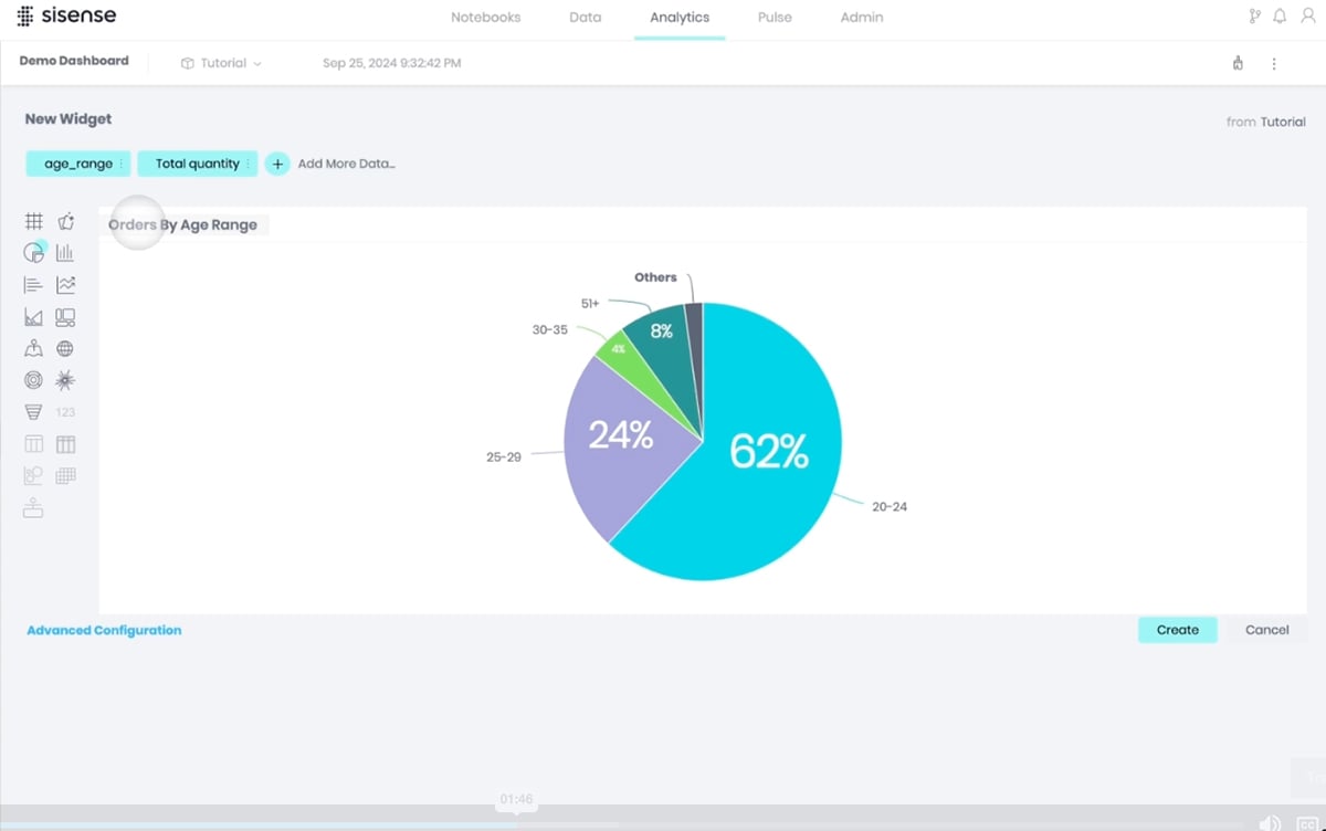
When I first logged into Tableau, it felt like I’d just walked into a graduate-level stats class without the syllabus. There are so many features and options that it can be a bit overwhelming for beginners. Sure, there are plenty of tutorials, but let’s be honest—it takes a while to really feel comfortable.
The interactive product tour became a lifesaver and in a matter of minutes I had set up my first data visualization. Here’s what it looked like:

A great thing about Tableau is that even though they offer private data analytics and visualizations for big data, corporations and businesses, they also have Tableau Public. Tableau Public is a free platform where anyone can create a data visualization. Data can be imported from a spreadsheet or entered manually. The main differences between Tableau Desktop (TD) and Tableau Public (TP) are as follows.
You can get started from a pre-built workbook or connect to a wide range of sources, including Excel, Google Sheets, SQL databases, and even cloud platforms like AWS.
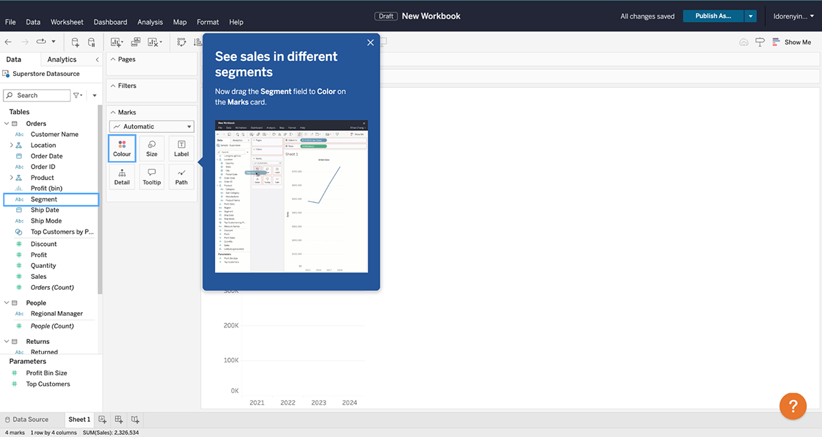
There’s also an option to use sample data to get started.
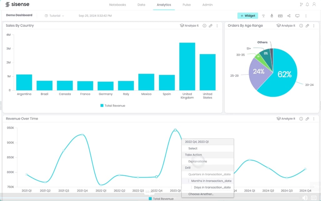
Tableau takes your data, no matter how messy or complex, and transforms it into beautiful, interactive visualizations. This is probably my favorite thing about Tableau. You can create dashboards that combine multiple charts, graphs and maps all in one place.
It’s like a control center for your data, and the possibilities are pretty much endless. You can make them interactive. Filters, tooltips and drill-downs are possible.
The Tableau Story combines visualizations (charts, dashboards, or sheets) into a sequence called story points, which act as slides in a presentation.
Another thing I love about Tableau is that you can embed a visualization created with the tool into your Visme project, proposal or report. That way, you get the best of both worlds (or tools!)
Tableau’s mapping capabilities are next-level. For example, you can use it to map out a project’s impact by location and layer data like population and income levels.
Apart from the steep learning curve, Tableau makes sharing your work a breeze. You can publish dashboards for others to view or interact with, and if you’re on a team, Tableau Server or Tableau Online lets everyone stay on the same page.
Tableau is technically for anyone interested in using data as a driving force in business, community, the environment and the world. For example, Tableau can help with the following:
Tableau
Enterprise Edition
All Tableau plans are billed annually.
Here’s a comparison table between Visme and Tableau:
| Feature | Visme | Tableau |
| Ease of Use | User-friendly interface with drag-and-drop tools suitable for beginners and non-designers. | Steeper learning curve; designed for advanced data analysts |
| Chart Types | Offers a wide range of charts, including line, bar, donut, pie, stacked, and custom infographic-style charts. | Extensive chart types, including complex visualizations like treemaps, heatmaps, and geographical maps. |
| Professionally Designed Templates | Vast library of pre-designed templates tailored for presentations, infographics, and data visualizations. | No template library; users create dashboards and visualizations from scratch based on the dataset. |
| Data Integration | Supports basic data import (Excel, CSV, Google Sheets); ideal for lightweight datasets. | Integrates seamlessly with large datasets from multiple sources (SQL, Salesforce, AWS, etc.). |
| Customization | Highly customizable templates and charts; allow brand-specific design elements. | Advanced customization for visualizations but less focus on branding-specific designs. |
| Animation and Interactivity | Includes animations, popups, hover effects, internal and external links, and hotspots for dynamic storytelling. | Basic interactivity like filters and drill-downs; no animation features. |
| AI Features | Provides basic AI tools for design suggestions and content generation. | Advanced AI-driven insights for predictive analysis and natural language queries (Ask Data). |
| Downloading and Sharing Options | Exports in multiple formats (PDF, PNG, HTML5, MP4); interactive content can be embedded or shared via links. | Exports in PDF, PowerPoint, or image formats; interactive dashboards shared via Tableau Server or Tableau Public. |
| Team Collaboration | Offers version control, workflow management, and robust collaboration features for real-time edits and feedback. | Includes real-time collaboration via Tableau Server and Tableau Online; version control depends on enterprise setup. |
G2 Rating: 4.4/5 (12,900+ reviews)
HubSpot’s Marketing Analytics & Dashboard Software is for those who hate context-switching while working in a set workflow. You don’t have to turn to other analytics tools while you’re working on understanding insights about your customers from CRM.
The dashboard puts everything in one place so you don’t have to hunt for data that matters the most. All your reports can show exactly what you’re looking for.
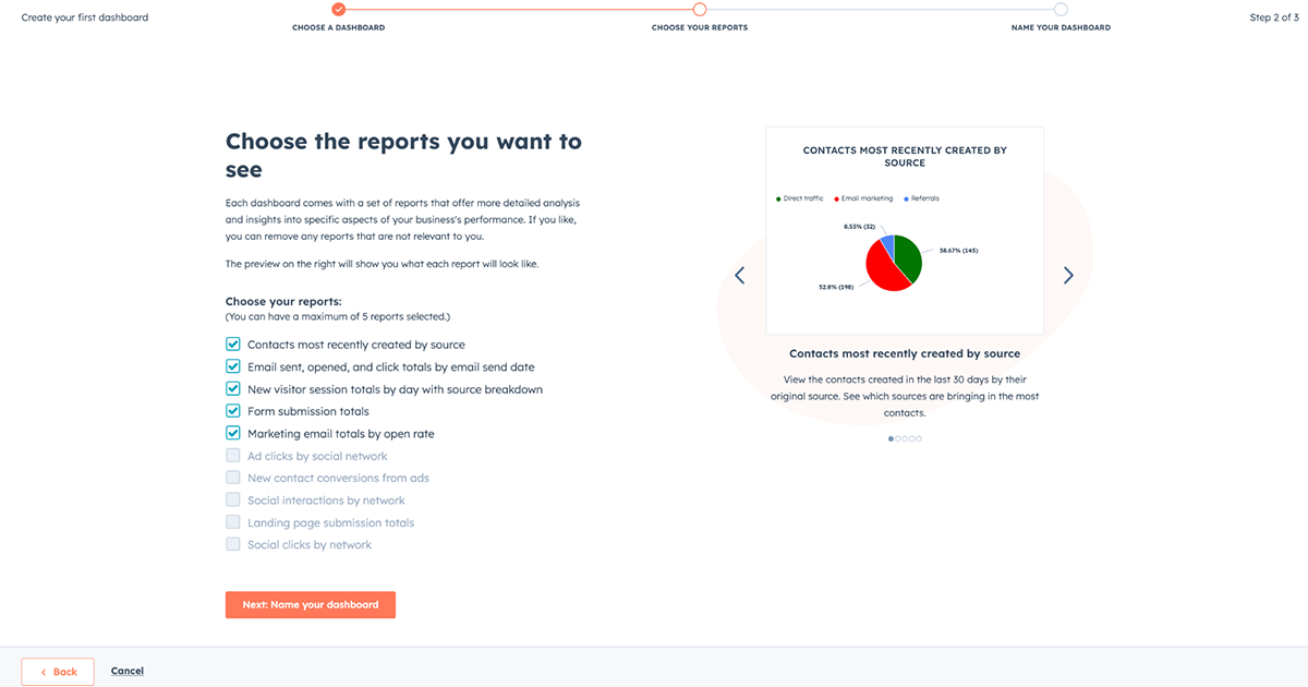
This makes it really easy to digest the data and communicate the insights with your team members. Setting up the dashboard is pretty seamless. You can start from scratch or choose one of the prebuilt templates—whether it’s for sales, marketing channel performance, service overview and more.
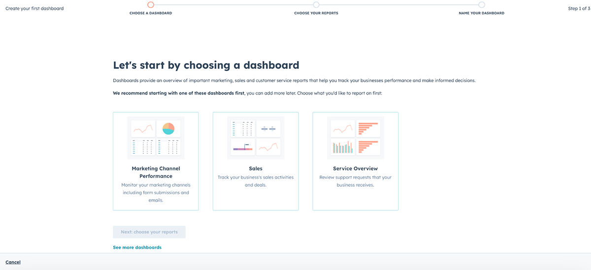
Next, you’ll have to choose reports: each dashboard comes with a set of reports that offer more detailed analysis and insights into specific aspects of your business's performance.
The data is fresh, so you can be assured that the data you’re looking at is the latest and can bet on it. For those who’re always on the run, these dashboards are accessible even on mobile, so it’s like having a whole marketing dashboard in your pocket. If you’re someone who loves tweaking every little detail of a chart, HubSpot might leave you wanting more.
The visualizations are clean and easy to read, but customization options are pretty basic. For example, you can’t always adjust axis labels, data ranges, or chart types to the degree you’d expect in a dedicated data visualization tool like Visme or Tableau.
For those who are control freaks, data is oxygen.
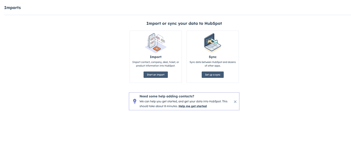
The easy-to-use dashboard is the house of reports related to all your marketing campaigns. You can import or sync data (contact, company, deal, ticket, or product information) into HubSpot or set up a sync between HubSpot and dozens of other apps.
When you create a new record with a company domain or business email, HubSpot auto-fills missing fields. Records can also be enriched manually so your data stays current.
You can add HubSpot’s unique tracking code to follow customer interactions, see why prospects converted (or didn’t), and trigger automations based on behavior. This lets you map the full customer journey back to its source and share insights with your sales team.
The drag-and-drop dashboard makes it simple to organize widgets and surface the data you care about most. You can link CRM data to revenue and pinpoint what triggered a sale—making it easier to repeat successful outcomes.
HubSpot is for anyone who wants to track all their marketing-related data from one place.
Be it a marketing manager of a startup wanting to track multiple campaigns to see the big picture of overall growth to agencies wanting to create client-specific dashboards for quick access to KPIs that matter the most to individual clients.
This dashboard ensures that you find all the data that you need the most in one place. You can create insights using CRM data and map every interaction to revenue. This is to help you understand what triggered a sale, and then it becomes easy to repeat a successful sale.
Using the custom code, you can track the footprints of your potential customers and learn why they didn’t convert or even why they did. The code also helps trigger automations based on customer interactions. You can map the whole customer journey back to the source and have that as an insight for the sales team.
You can track KPIs like:
If SEO is one of your marketing channels, the AI-powered suggestion will help you optimize your pages for amplified reach.
Of course, you can track the SEO growth within the dashboard. Even for CEOs who don’t want to drown in the details of the numbers and want to gain an overview of everything they care about, HubSpot’s Marketing Analytics & Dashboard software is a game changer.
It lets businesses, social media managers, and content creators instantly see what’s working online, from sales triggers to engagement and channel performance.
HubSpot’s Marketing Analytics & Dashboard software is available for free and the free version is more than enough if you’re just getting started. However, for those who don’t settle for less, there are advanced features and premium analytics under various plans. You can upgrade to a paid plan for premium analytics:
Here's a comparison table between Visme and HubSpot:
| Feature | Visme | HubSpot |
| Ease of Use | User-friendly interface with intuitive drag-and-drop tools. | Moderate learning curve, designed for marketing and sales professionals. |
| Chart Types | Wide range of chart types, including line, bar, pie, donut, stacked charts, and maps. | Standard chart types with focus on marketing-related dashboards and reports. |
| Professionally Designed Templates | Large library of customizable, professionally designed templates for various purposes. | Limited templates specifically for marketing and sales analytics dashboards. |
| Data Integration | Supports data import from Excel, Google Sheets, and other tools. | Strong integration with HubSpot CRM and marketing tools, but less diverse import options. |
| Customization | Highly customizable charts, templates, and visualizations to match brand identity. | Customization is limited to HubSpot's preset dashboard elements. |
| Animation and Interactivity | Animations, pop-ups, hover effects, internal/external links, and hotspots. | Basic interactivity limited to embedded reports and charts. |
| AI Features | AI-powered chart creation, image generation, and content design tools. | AI for marketing insights, email optimization, and campaign analytics. |
| Downloading and Sharing Options | Options to download as PNG, PDF, PPTX, or HTML5; easy sharing via links or embedding. | Export options include PDFs and sharing via HubSpot links; less flexibility for formats. |
| Team Collaboration | Robust collaboration with version control, workflow management, and comment tracking. | Collaborative tools integrated with HubSpot workflows but without version control. |
G2 Rating: 4.5/5 (1370+ reviews)
Power BI is Microsoft’s flagship data visualization and business intelligence platform, and it’s one I’ve returned to often when working with larger datasets. Whenever I’m in Power BI, it feels like I’m sitting in a control room—dashboards, charts, and detailed reports are all right there.
What I like most is how it’s built to bring data together. You can connect multiple sources, transform them into a unified model, and then build interactive dashboards that show the story behind the numbers.
Compared to lighter tools, Power BI leans much more into analytics, making it less of a simple chart builder and more of a decision-making hub.
Another standout for me is how seamlessly it integrates with Microsoft’s ecosystem. Since I already work in Excel and Teams, picking up Power BI felt like a natural extension. And because it’s cloud-based, I can publish a dashboard once and share it instantly across devices—with data refreshing in real time.
You can pull data from just about anywhere—Excel spreadsheets, SQL databases, Salesforce, Google Analytics, or even live APIs—and bring it all into a single workspace.
Once inside, it’s easy to clean and transform the data, then start building visuals. Power BI offers a huge library of charts and dashboards, from simple bar graphs to advanced scatter plots and geographic maps.
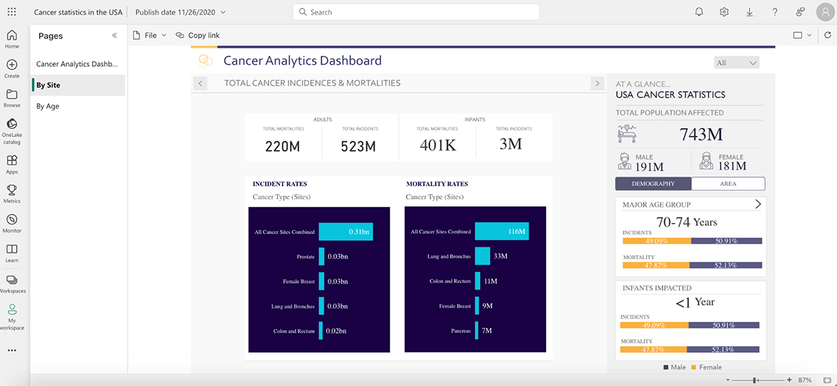
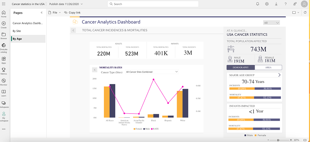
For this test, I explored an existing data story on Cancer Statistics in the USA. Within minutes, I could interact with the dataset by filtering age groups, comparing regions, and drilling down into specific cancer types. It wasn’t just about looking at numbers—it felt like uncovering layers of insight that would have been hard to spot in a static report. The ability to interact with data stories is what makes Power BI so compelling.
And if you’re into predictive insights, the AI features are impressive. The Q&A function lets you type in natural language questions like “What were our top 5 products in Q2?” and instantly see a visualization generated from your data. It feels like having a data analyst built right into the tool.
Power BI is ideal for businesses that need more than just pretty charts. It’s built for teams and organizations that want to connect massive amounts of data, monitor KPIs in real time, and give stakeholders the ability to explore insights on their own. Large enterprises, data analysts, and finance teams will get the most value, but I’ve also seen small businesses use it effectively once they’ve scaled up their data needs.
Power BI pricing plans include:
| Feature | Visme | Power BI |
| Ease of Use | Beginner-friendly with drag-and-drop design tools; no coding required. | Steeper learning curve; designed for analysts and data professionals. |
| Chart Types | Wide variety of charts, infographics, and presentation-style visuals. | Advanced charts, complex dashboards, and analytics-driven reports. |
| Templates | Large library of professionally designed templates for presentations, reports, and infographics. | No built-in templates; dashboards are custom-built based on data. |
| Data Integration | Supports Excel, CSV, Google Sheets, and lightweight datasets. | Connects to hundreds of sources (SQL, Salesforce, Azure, APIs, etc.) for enterprise-level data. |
| Interactivity | Animations, hover effects, pop-ups, and interactive embeds. | Filters, slicers, drill-downs, and AI-driven insights for deep data exploration. |
| AI Features | AI text generation, design suggestions, and automated slide creation. | AI insights, natural language queries (“Ask a question about your data”), predictive analytics. |
| Export & Sharing | Export as PDF, PNG, HTML5, MP4, or share interactive links and embeds. | Share live dashboards via Power BI Service, export to Excel, PowerPoint, or PDF. |
| Collaboration | Built-in version control, commenting, and real-time teamwork. | Team collaboration through Power BI Service and Microsoft Teams integration. |
G2 Rating: 4.7/5 (180+ reviews)
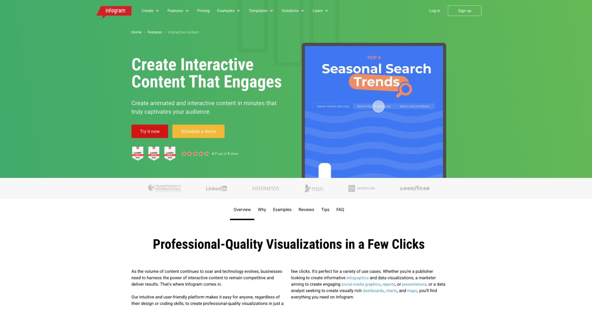
Infogram sits between lightweight design tools and heavier analytics platforms. It’s built for people who want to turn raw data into something interactive and easy to explore, without getting pulled into complex data modeling or code.
The editor is straightforward: drag, drop, and plug in your data. It’s possible to start with a blank canvas or pick from templates for reports, dashboards, social visuals, and infographics. The experience feels closer to building a presentation. To speed up creation, Infogram also includes Create with AI, an AI-powered infographic generator that can generate entire visual projects from a topic, prompt, dataset, or uploaded file.
Where Infogram starts to stand out is in interactivity. Instead of static charts, you can add hover effects, clickable elements, tabs, and filters so viewers can engage with the data on their own terms. This makes it particularly useful for publishing content where exploration matters as much as presentation.
You can upload files, connect live data sources (like Google Sheets), or integrate APIs to keep visuals updated automatically. That makes it viable for dashboards or reports that need to stay current without constant manual edits.
Infogram is designed for communicating data clearly, especially when the audience isn’t technical.
You can build interactive reports, dashboards, infographics, and even simple presentations. The platform supports a wide range of chart types (bar, line, pie, scatter, maps, etc.), along with tools for adding context, such as annotations, images, videos, and text blocks.
Infogram also includes AI Chart Suggestions, which analyzes uploaded or pasted data and recommends chart formats that best match the dataset, helping users move faster from data to visualization.
Collaboration is also part of the workflow. Teams can work on projects together, share links, or embed visuals directly into websites and articles. This makes it easier to move from “analysis” to “published insight” without switching tools.
You can also create:
Infogram is a solid fit for teams that want to present data as much as analyze it.
Think marketers creating campaign reports, media teams publishing data-driven stories, educators building visual materials, or startups needing quick dashboards.
It works well when the goal is clarity and engagement rather than deep analysis, and if you want to turn datasets into something people can actually understand - and interact with - Infogram strikes a solid balance.
Infogram pricing plans include:
Pricing may vary depending on billing cycle and team size.
| Feature | Visme | Yellowfin BI |
| Ease of Use | Drag-and-drop platform for creating presentations, infographics, reports, and branded content. | Drag-and-drop editor focused on charts, dashboards, reports, and infographics. |
| Chart Types | Over 100,000+ Charts, maps, heatmaps, widgets, infographics, flowcharts and interactive visuals. | Offers 35+ interactive chart types, including treemaps, heatmaps, scatter plots, funnels, and maps. |
| Templates | Templates for presentations, reports, proposals, social graphics, and infographics | Templates for infographics, dashboards, reports, presentations, and data storytelling. |
| Data Integration | Supports Excel, CSV, Google Sheets, and manual data entry. | Connects with Google Sheets, Excel, CSV, JSON feeds, and cloud storage. |
| Customization | Advanced branding controls for fonts, colors, layouts, animations, and assets | Customizable charts, themes, labels, legends, typography, and color palettes. |
| Interactivity | Includes animations, hover effects, clickable elements, and interactive presentations. | Supports interactive charts, tooltips, filters, animated visuals, and live dashboards. |
| AI Features | AI tools for content generation, design suggestions, and layout assistance. | AI-powered chart suggestions and infographic generation tools. |
| Collaboration | Shared workspaces, commenting, collaborative editing, and brand management tools. | Team folders, collaborative editing, sharing permissions, and workspace management. |
G2 Rating: 4.3/5(5+ reviews)
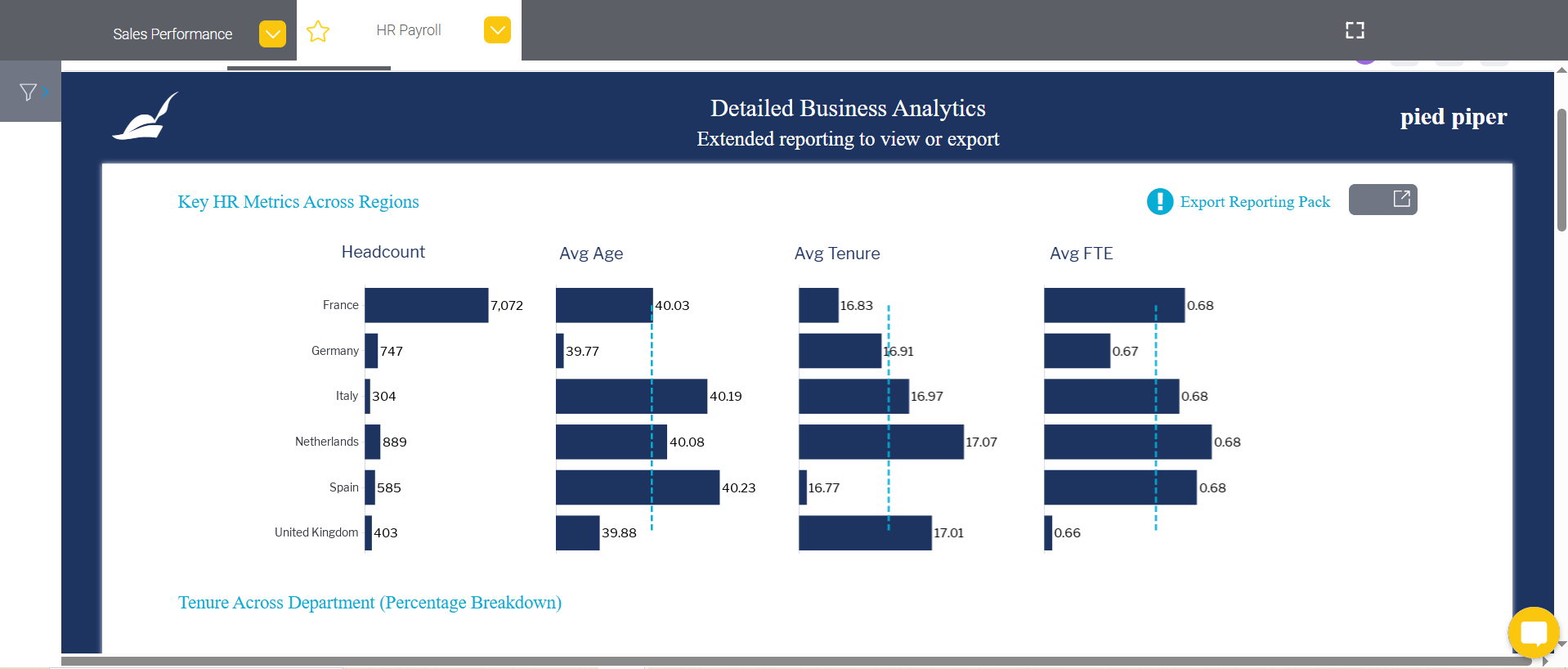
Yellowfin BI is a powerful, enterprise-ready business intelligence (BI) and analytics platform that helps organizations turn data into action.
It’s designed for companies that need rich dashboards, automated insights, and collaboration features in one integrated solution.
When I first tried Yellowfin BI, its intuitive design and storytelling capabilities stood out. You don’t just get static charts, you get a platform that helps explain why things happen through augmented analytics and automated insights. Within minutes, I built interactive dashboards that could be shared across teams with just a few clicks.
Unlike many BI tools, Yellowfin BI blends traditional reporting with advanced features like data storytelling and embedded analytics.
You can connect to almost any data source, from spreadsheets and databases to cloud apps, and transform raw data into dynamic visualizations and narratives that drive decision-making.
The data visualization process in RawGraphs starts with loading your data. Import CSV, TSV, DSV, JSON, or pull directly from a URL, API or even a public Dropbox file.
With Yellowfin, teams can work through the full analytics workflow, from connecting data to sharing insights, inside a single platform. You can:
Yellowfin BI offers flexible pricing based on deployment and scale, available both as SaaS and on-premises. Contact their team for a custom quote.
| Feature | Visme | Yellowfin BI |
| Ease of Use | Very easy for non-technical users | Requires basic BI and data modeling knowledge. |
| Chart Types | Charts, maps, widgets, infographics, progress charts and animated visuals. | Advanced BI visuals including geographic, statistical and relationship charts. |
| Templates | Large library of branded templates. | No design-first templates; focused on dashboard layouts instead. |
| Data Integration | Excel, CSV, Google Sheets, limited live data connections. | Direct databases, cloud systems, APIs and enterprise data pipelines. |
| Customization | Brand-focused styling, layouts, fonts and theme control. | Highly configurable dashboards via SQL and developer controls. |
| Interactivity | Hover effects, animations and clickable navigation. | Interactive drill-downs, filters and dashboard controls. |
| AI Features | AI design generation, AI writing and smart layouts. | Automated insights and pattern detection for analytics only. |
| Collaboration | Real-time comments, editing and team permissions. | Shared dashboards and role-based access. |
G2 Rating: 4.8/5(2+ reviews)
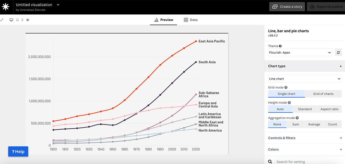
Flourish is a data visualization platform built for telling stories that engage, inspire, and stick with your audience. Compared to other tools I’ve tried, their interface is user-friendly and straightforward.
The learning curve is minimal, which makes it easy to go from raw data to polished visuals without frustration.
Once you’re logged in, you’ll find more than 50 professionally designed templates covering everything from line charts and bar graphs to interactive maps, Sankey diagrams, and survey visualizations.
The workspace itself is well thought out. The toolbar sits neatly alongside the canvas, so you can make adjustments without breaking your flow. I also liked that you can toggle between desktop, tablet, and mobile views to preview how your charts will look across devices.
With Flourish, the workflow is refreshingly simple. Pick a template, upload your data (or start with one of their ready-made examples), and then customize it to match your brand and story.
You can fine-tune every detail (colors, layouts, fonts)so your visualization fits seamlessly into a presentation, report, or campaign. Interactive features like tooltips, popups, filters, and animations make your charts more engaging, turning static visuals into experiences your audience can interact with.
Sharing is just as easy. You can export your work in multiple formats or embed it directly into a website, slide deck, or social media post with a few clicks.
One of Flourish’s best features is live data visualization. Connect a public CSV file and your charts will automatically refresh whenever the data changes—ideal for dashboards, recurring reports, or any project that needs to stay up to date. On top of that, Flourish Stories lets you stitch multiple visuals together into dynamic, animated narratives that are ready to present or embed anywhere.
Flourish works well for individuals, freelancers, and small teams who want to make their data more engaging without needing technical skills. At the same time, larger organizations can use it for dashboards, marketing campaigns, or internal reporting thanks to its collaboration and publishing features.
There’s a free plan that’s more than enough for personal projects, freelancers, or small orgs. For businesses, there are paid Publisher and Enterprise plans. Pricing isn’t listed publicly—you’ll need to contact them for details.
| Feature | Visme | Flourish |
| Ease of Use | Beginner-friendly with drag-and-drop tools for non-designers and professionals alike. | Simple, template-based workflow with an intuitive interface; no design skills needed. |
| Chart Types | Wide range of charts (line, bar, donut, pie, stacked) plus infographic-style visuals, diagrams, and flowcharts. | 50+ professionally designed templates, including line, bar, Sankey, hierarchy graphs, maps, and survey visuals. |
| Professionally Designed Templates | Large library of templates for presentations, infographics, reports, and data visualizations. | Ready-made chart and map templates tailored for interactive data storytelling. |
| Animation and Interactivity | Animations, popups, transitions, hover effects, hotspots, links, and multimedia embedding. | Tooltips, popups, filters, transitions, and animations built into charts and stories. |
| AI Features | AI Writer, AI Design tools, and AI Data Visualization suggestions. | No AI design yet, but interactive storytelling features are core. |
| Downloading and Sharing Options | Export to PDF, PNG, HTML5, MP4, or embed interactive projects. | Embed charts on websites, slide decks, or social platforms; export as images or HTML. |
| Team Collaboration | Real-time collaboration with comments, version control, and workflow tools. | Collaboration via shared projects and embedding |
G2 Rating: 4.2/5 (1000+ reviews)
Sisense is a business intelligence tool built for handling large datasets and turning them into dashboards and visual reports. It connects smoothly with multiple sources (cloud databases, Excel sheets or apps like Salesforce) so you can analyze everything in one place.
Developers can also use the Sisense API to build custom analytics apps. Business owners can also create dashboards tailored to their needs.
That said, it’s not the most beginner-friendly tool out there. If you’re new to data visualization or don’t have a technical background, Sisense can feel a bit overwhelming at first. Setup can be daunting if you’re new to data warehouses or integrations. And while the dashboards are clean, design customization is limited.
With Sisense, you can create interactive dashboards for tracking data across industries like marketing, healthcare, or manufacturing. The data modeling interface makes it easy to connect to sources such as AWS Redshift, then build a semantic layer for dynamic visualizations.
Creating custom columns is straightforward. And once set up, you can use the Designer to drag and drop charts and dashboards onto the canvas.
Sisense offers a wide range of chart options—bar, line, pie, donut, funnel, waterfall. You'll also find advanced visuals like geospatial maps, gauges, and predictive analytics. Dashboards are highly interactive, letting you filter, drill down, and set alerts when key metrics hit thresholds.
Non-technical users can create analytics without code, while advanced users can customize queries and calculations. The tradeoff is limited design flexibility—Sisense focuses more on accurate, actionable data than on polished visuals or storytelling features you’d find in a tool like Visme.
Sisense is great for anyone looking to visualize and analyze large data sets. It's used across a wide range of industries.
Prices are not displayed on the website. You have to request a custom quote.
Here’s a comparison table highlighting the features of Visme and Sisense.
| Feature | Visme | Sisense |
|---|---|---|
| Ease of Use | Intuitive drag-and-drop interface, user-friendly for non-designers and professionals alike. | Advanced interface, geared toward data analysts; steeper learning curve for beginners. |
| Chart Types | Wide variety, including bar, line, donut, stacked, area, scatter, and radar charts. | Supports complex data visualizations like waterfall, Pareto, and Gantt charts for advanced analytics. |
| Professionally Designed Templates | Large library of polished, ready-to-use templates for different use cases. | No pre-designed templates. |
| Data Integration | Imports from files like CSV and Excel; limited direct integrations. | Strong integration with databases and live data sources. |
| Animation and Interactivity | Animations, pop-ups, hover effects, internal/external links, and hotspots for interactive storytelling. | Drill-downs, filters, and alerts for exploring dashboards. |
| AI Features | AI tools for design suggestions and quick template creation. | AI-driven insights and predictive analytics for complex data sets. |
| Downloading and Sharing Options | Download in PDF, PPT, HTML, MP4, or share via links and embeds. | Share dashboards via links, email, or integrations; limited offline export. |
| Team Collaboration | Version control, workflow management, team workspaces, and real-time commenting. | Shared dashboards and commenting feature. |
G2 Rating: 4.4/5 (190+ reviews)
If you’ve ever struggled with piecing together metrics from multiple tools like Google Analytics, HubSpot, or Facebook Ads, Databox neatly packages real-time data visualization, neatly packaged into custom dashboards. The style of DataBox’s dashboards is a bit different from others in the same niche. The colors are richer and deeper, which is perfect for people who like dark mode on their laptops.
What I love most about Databox is its simplicity. You don’t need to be a data expert to use it. The interface is clean, intuitive, and—best of all—it doesn’t feel overwhelming, even when you’re juggling multiple data sources. Setting up integrations is pretty seamless, and you can create dashboards in minutes with their drag-and-drop builder.
But, as much as I appreciate its user-friendliness, there are a few drawbacks. The design options are fairly limited. You can tweak colors and fonts, sure, but the overall aesthetic feels more functional than creative.
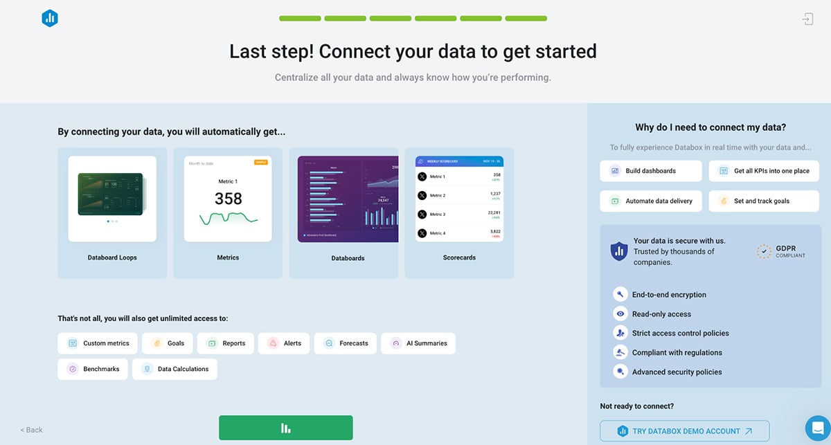
One of its standout capabilities is the ability to connect multiple data sources seamlessly. With integrations for over 70 platforms, including Google Ads, Shopify, Salesforce, and even spreadsheets, Databox allows you to consolidate all your key metrics into one centralized location.
Once you select your metrics, Databox creates a sample dashboard with a visual preview. You can name your dashboard, select a background and then connect your data source. Upon connecting your data source, you automatically get dashboard loops, metrics, data boards and scorecards.
That's not all; you will also get unlimited access to custom metrics, goals, reports, alerts, forecasts, AI summaries, benchmarks and data calculations.
You can build custom dashboards tailored to your specific KPIs (just like this example), whether you’re tracking website traffic, monitoring email campaign performance, or evaluating sales data. And if you’re not sure where to start, Databox has you covered with a library of pre-built templates designed for common use cases.
One feature I especially love is Databox’s Generative AI functionality. This tool gives you complete performance overviews for dashboards, metrics and goals and suggests specific recommendations on how to improve performance.And speaking of performance management, Databox also makes it easy to track progress toward specific goals in real-time. You can set measurable objectives, and the platform provides live updates, acting like a digital accountability partner to keep you on track.
The templates in DataBox seem to be geared mostly toward marketers, such as HubSpot, Google Analytics and email templates. This is a great tool for business data analysts who want to track their team’s efforts.
DataBox offers a robust free plan to get you started. Paid plans include:
Databox also offers dozens of other paid add-ons to upgrade your data visualization experience, such as
Here’s a comparison table between Visme and Databox:
| Feature | Visme | Databox |
| Ease of Use | Intuitive drag-and-drop editor, beginner-friendly interface. | Easy to use but primarily focused on data analytics and dashboards for business metrics. |
| Chart Types | Offers a wide range of chart types including bar, line, pie, donut, scatter, stacked charts, and more. | Supports multiple visualization types focused on business data and performance metrics. |
| Professionally Designed Templates | Extensive library of templates for various use cases, including presentations, infographics, and reports. | Limited to dashboard templates tailored for business KPIs and analytics. |
| Data Integration | Manual data entry, upload CSV files, or integrate with platforms like Google Sheets, Excel, and SurveyMonkey. | Robust integrations with business tools like HubSpot, Google Analytics, and Salesforce. |
| Customization | Highly customizable visuals, including fonts, colors, icons, and backgrounds. | Customization is available but primarily for dashboard widgets and layout designs. |
| Animation and Interactivity | Animations, popups, hover effects, internal/external links, and hotspots for dynamic storytelling. | Focus on static dashboards; no animation but provides interactivity for live data views. |
| AI Features | AI-powered tools for design suggestions, image generation, and text enhancement. | No AI-powered design tools but supports, AI performance overviews, automated KPI calculations and forecasting. |
| Downloading and Sharing Options | Download as PDF, JPG, PNG, PPTX, MP4, and HTML; share online links or embed visuals in websites. | Share dashboards via email, link, or embed; download options vary by subscription plan. |
| Team Collaboration | Version control, workflow management, robust collaboration features like comments and task assignments. | Collaboration through shared dashboards and goal tracking; no advanced workflow features. |
G2 Rating: 4.3/5 (10+ reviews)
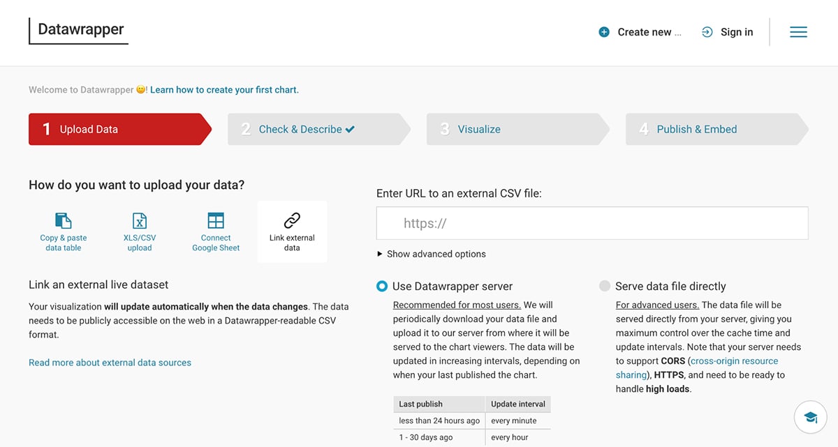
Like other tools we’ve reviewed, you can use Datawrapper to create charts, maps and table. You don’t even need to sign up to get started!
For someone like me, who’s tested a ton of tools that require you to jump through hoops before even accessing the features, this felt good.
It’s straightforward, user-friendly, and perfect for simple data visualizations.
The interface is super clean and intuitive. Whether you’re importing a spreadsheet or manually entering data, the process is smooth, and there’s almost no learning curve.
One of the things I love most is how fast it is—you can upload your data, tweak your chart, and embed or share it in minutes. That said, it’s not the most visually customizable tool out there.
The designs are functional and polished, but if you’re looking to add a lot of flair or branding, you might find it a bit limiting.
Still, for being completely free, it’s hard to complain.All charts created with DataWrapper are mobile responsive. The visualizations adjust to different screen sizes by minimizing lines and shrinking empty spaces.
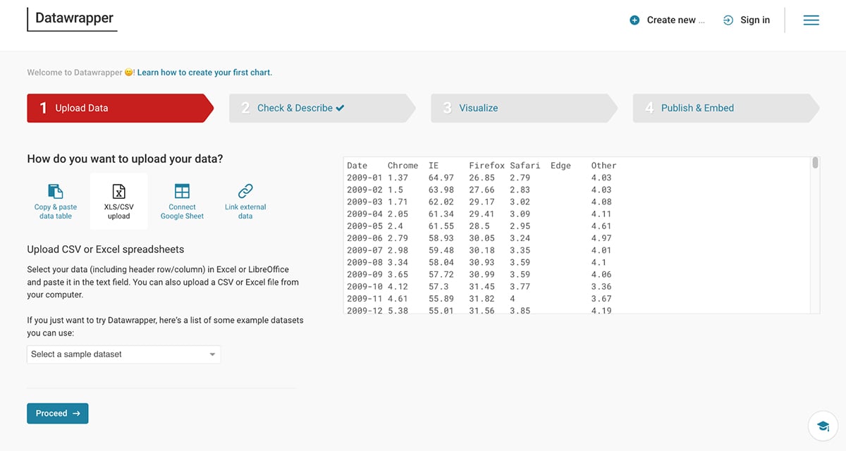
With Datawrapper, you can build charts, maps, and responsive tables in just a few steps. You can upload data by pasting a table, uploading XLS/CSV files, connecting a Google Sheet, or linking external data. If you just want to test the tool, there are sample datasets available.
The platform offers 20+ chart types, and switching between them is seamless. You can customize colors, axes, labels, tooltips, and layouts, as well as toggle between light and dark modes. Annotations, highlights, and branding options (like adding logos) help refine your final chart.
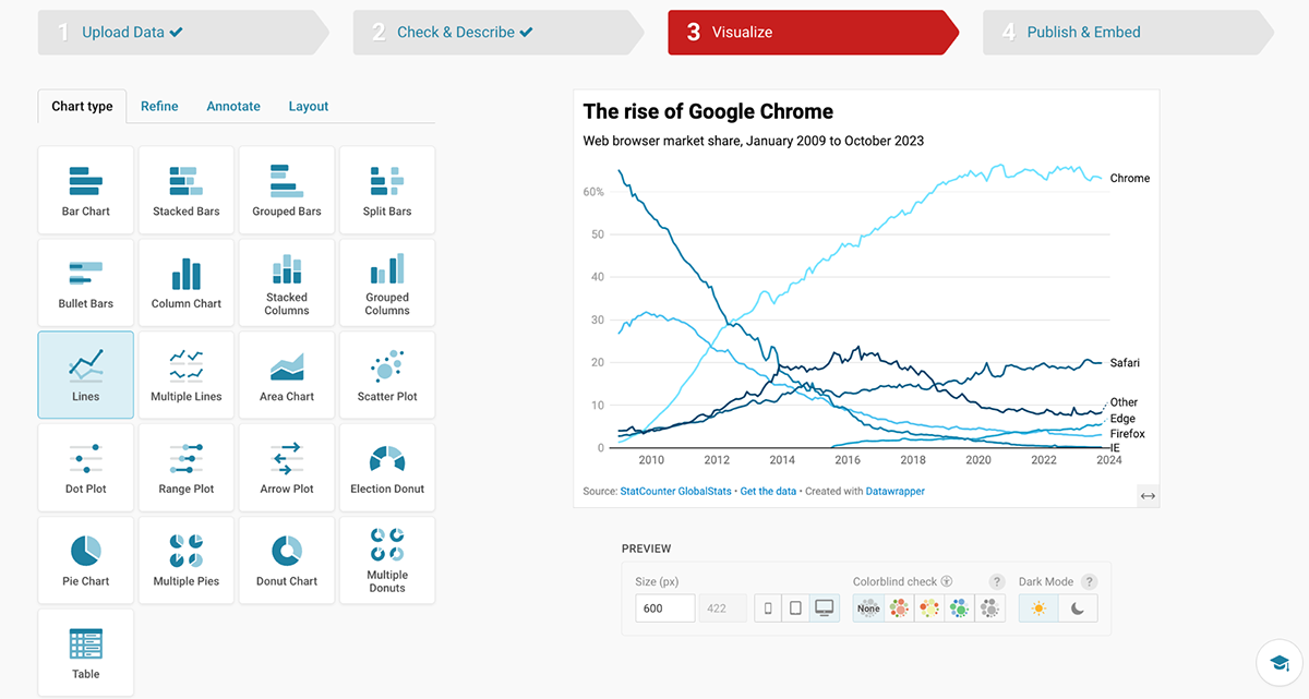
I also liked the responsive preview feature, which let me check how visuals would look on desktop, tablet, and mobile screens. Charts can be exported in PNG, SVG, or PDF, or embedded with responsive code—making them easy to share across websites, reports, or even within Visme projects.
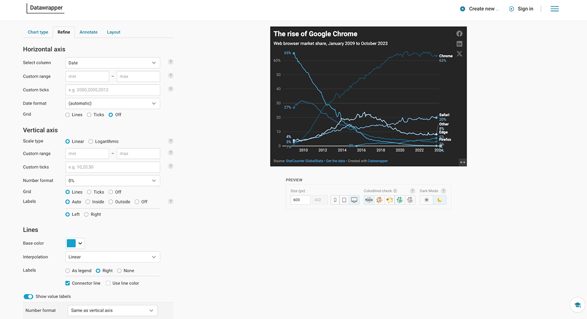
That said, Datawrapper is lighter on interactivity and team collaboration. Aside from hover effects, there aren’t many engagement options. And it lacks the real-time collaboration features you’d find in Visme.

This data visualization tool is for anyone who needs to create a chart, graph, table or map. From students to journalists and marketers in between, there’s really no limit to who can use DataWrapper. The purpose of their tool is to help users make charts and graphs that look great even without coding or any design skills.
DataWrapper has a free plan with many features. For more professional capabilities, there’s a $599/month plan or 5990/per year. Enterprise pricing is upon request.
Here's a comparison table between Visme and Datawrapper.
| Feature | Visme | Datawrapper |
| Ease of Use | User-friendly, drag-and-drop interface suitable for beginners and advanced users | Simple, clean interface, designed to be easy for quick data entry and chart creation |
| Chart Types | Wide range of charts including bar, line, pie, donut, area, scatter, and more | Focused primarily on standard charts like bar, line, and pie, with some advanced charts like choropleths and time series |
| Professionally Designed Templates | Numerous templates, including for presentations, infographics, and data visualizations | Limited templates, focused more on chart creation with customizable styles |
| Data Integration | Supports integration with Excel, Google Sheets, and CSV uploads | Integrates well with Google Sheets, CSV, Excel, and other data sources |
| Customization | Highly customizable with color schemes, fonts, and element sizes, plus a range of design tools for fine-tuning | Offers customization in terms of chart style and colors, but not as in-depth as Visme |
| Animation and Interactivity | Animations, popups, hover effects, internal/external links, hotspots, and interactive data visualizations | Focuses more on static charts, limited interactivity compared to Visme |
| AI Features | Includes AI-driven design tools, layout recommendations, and smart templates to streamline content creation | No notable AI features currently offered |
| Downloading and Sharing Options | Multiple download formats (PNG, JPG, PDF, PPT) and sharing via URL or social media | Downloadable in PNG, SVG, PDF formats, and provides embed options for websites |
| Team Collaboration | Version control, workflow management, robust team collaboration with permissions and comments | Limited team collaboration feature |
G2 Rating: 4.4/5(5+ reviews)
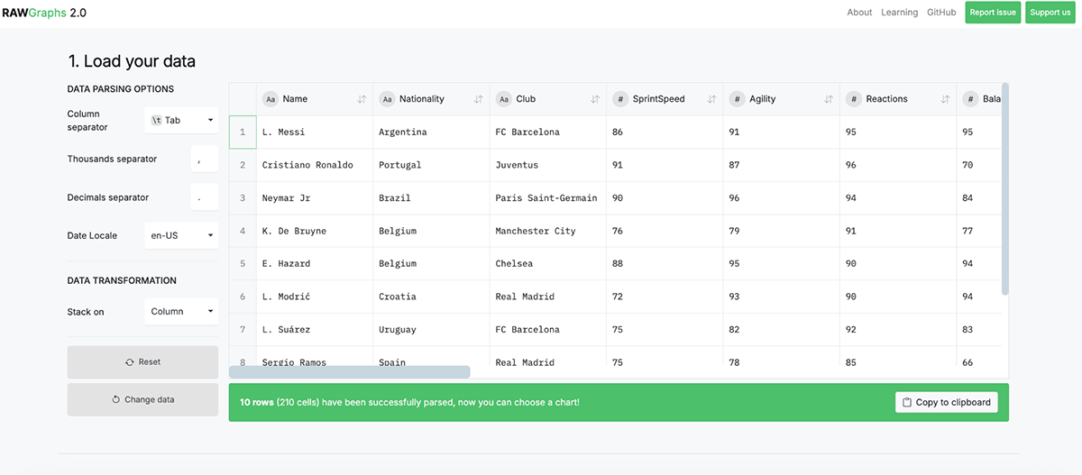
RAWGraphs is a free, open-source data visualization tool built for designers, researchers, and anyone who need editable charts without being tied to pricey platforms.
When I first tried RAWGraphs, its simplicity struck me. You don’t need to register or pay. Just load your data (CSV, TSV, JSON, or even pull directly from a URL or API), pick from a library of charts, map your data dimensions, and export. In minutes, I had a polished visualization ready to use.
Unlike other tools, RAWGraphs doesn’t store your data. It processes everything locally in the browser. That’s a big plus if you’re concerned about privacy. And since outputs are exported as .svg files, you can fine-tune them in any vector editor without being locked into RAWGraphs.
The data visualization process in RawGraphs starts with loading your data. Import CSV, TSV, DSV, JSON, or pull directly from a URL, API or even a public Dropbox file.
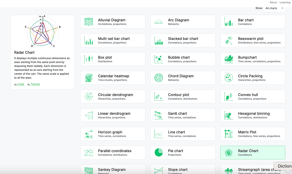
Then choose from dozens of unique visualizations, including chord diagrams, Voronoi plots, sunbursts and alluvial diagrams.
The next step is to assign your data dimensions to visual variables. And then you can customize the chart artboard, sizing, labels colors, series and layouts.
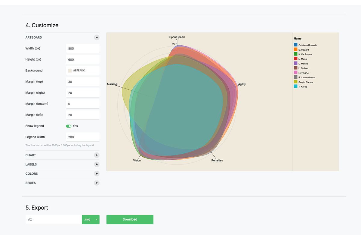
When you’re happy with the result, exporting is clean and straightforward. Download your chart as an SVG or PNG and refine it further in Illustrator, Sketch, or other design tools. Yes, it’s that simple!
Completely free, open source
| Feature | Visme | RAWGraphs |
| Ease of Use | Beginner-friendly drag-and-drop | Simple but requires basic data prep |
| Chart Types | Wide range of charts & infographics | Unique charts (alluvial, dendrograms, Voronoi, etc.) |
| Templates | Large template library | No template, 30+ sample data |
| Data Integration | Excel, CSV, Google Sheets | CSV, TSV, JSON, APIs |
| Customization | Brand-focused design & templates | Editable SVG exports |
| Interactivity | Animations, hover effects, links | Static only |
| AI Features | AI Hub for design & writing | None |
| Collaboration | Real-time edits & feedback | None |
G2 Rating: 4.2/5 (500+ reviews)
The last data visualization tool on our list is Google Charts. First off, one of the biggest perks is that it’s completely free, and available to use for both personal and commercial projects.
You don’t even need to sign up or create an account to start using it, which is such a breath of fresh air in the SaaS environment where everything seems to require a login. You simply head to the site, and you’re ready to roll.
It’s also easy to embed any Google Chart into a website or online platform. The data can be static or dynamic according to the source.
However, there were some downsides. This is the only tool in the list that needs coding knowledge to build data visualizations. If you don’t know how to code, figuring out how to use Google Charts may have a high learning curve.
To add to that, I found the documentation a bit overwhelming. While it’s thorough, the amount of information can be intimidating for new users. It took me a while to sift through examples and figure out the best way to implement my charts.
Also, I noticed that some of the more complex visualizations could get a bit tricky if you’re not familiar with coding, as Google Charts requires JavaScript knowledge
While Google Charts is excellent for functional data visualization, it lacks the design qualities and user-friendliness that tools like Visme offer, particularly for non-developers like me.

You can create a wide variety of visualizations, which is great whether you’re presenting data for business insights, academic purposes, or even just for fun. From the basics like bar, line, and pie charts to more advanced options like geo charts, scatter plots, candlestick charts and timelines, Google Charts covers most of the visualization needs you’ll need.

Whether your data lives in Google Sheets, an SQL database, or a CSV file, Google Charts makes it easy to pull it in and visualize it.
One of my favorite features is the ability to integrate charts into web pages. With a bit of JavaScript, you can generate dynamic charts that update automatically as the data changes. If you’re working on web-based projects, you can also add interactive charts that respond to user input.Another standout feature is the interactivity.
Users can hover over specific data points to get more information, which enhances the audience's engagement. And let’s not forget the responsive design of the charts; they look good on both desktop and mobile, which is essential.Everything in Google Charts is built with code, but once you get the hang of it, it gets easier.
Google Charts is a great tool for visualizing data if you want to have complete control over how it looks. Just keep in mind that you’ll need to know HTML and JavaScript to really take advantage of all the options available.
These charts are perfect for anyone looking to present data in a simple and clear way. Plus, Google offers a data dashboard called Looker Studio for those who want to dig a bit deeper.
Google Charts is completely free.
Here's a comparison table between Visme and Google Charts:
| Feature | Visme | Google Charts |
| Ease of Use | Intuitive drag-and-drop interface, easy to use even for beginners. | Requires some technical know-how (JavaScript). |
| Chart Types | Wide variety of chart types, including pie, bar, line, donut, radar, and more. | Offers many types such as line, bar, pie, and geo charts, but more options than Visme. |
| Professionally Designed Templates | Comprehensive library of pre-designed templates for charts and infographics. | No pre-designed templates; charts need to be customized from scratch. |
| Data Integration | Seamless integration with spreadsheets, Google Sheets, and external sources. | Requires integration with Google Sheets or data input via JavaScript API. |
| Customization | Highly customizable, including colors, fonts, labels, and data presentation. | Customizable through JavaScript, but less user-friendly for beginners. |
| Animation and Interactivity | Animations, popups, hover effects, internal/external links, and hotspots. | Limited animation options; basic interactivity with tooltips and hover effects. |
| AI Features | Includes AI tools like automatic suggestions and template recommendations. | No AI features; relies on manual data setup and chart design. |
| Downloading and Sharing Options | Easy download options (PNG, JPG, PDF, HTML) and sharing to social media or via link. | Embeds charts directly into websites, but no direct download options; must be exported via code. |
| Team Collaboration | Robust collaboration tools with version control, workflow management, and team access to templates. | Limited collaboration features; no built-in version control or team workflow management. |
No, Python itself is not a data visualization tool like Tableau, Power BI, or Visme but it is a programming language that lets you create data visualizations with dedicated libraries like Matplotlib, Seaborn, Plotly, Bokeh, Altair, and Pandas, which are specifically designed for this function. In essence, Python offers the environment to develop visualizations using these dedicated libraries.
Yes, it is. Tableau is a popular, interactive data visualization tool that allows users to capture and analyze data, interact with data through dashboards, maps, and other formats and build almost any chart type, dashboard and visualization.
Absolutely, PowerPoint can be considered a data visualization tool, as it includes features for creating charts, graphs, and other visual representations of data within presentations. That makes it a popular choice for presenting data in a visually appealing way, especially when paired with data from Excel.
Yes, Tableau is generally easy to learn, especially for users who are familiar with working with data or creating visualizations. Its user-friendly, drag-and-drop interface makes it accessible to both beginners and advanced users. There’s also an interactive walkthrough that helps you get up to speed quickly. That said, the learning curve can vary depending on your prior experience, prerequisite skills and the complexity of what you want to achieve.
Choosing the right data visualization software depends on your needs, budget, and level of expertise. Here’s a quick guide to help you decide:
Google Analytics is not primarily a data visualization tool, but it includes data visualization features to help users understand website and app performance. Its main function is as a web analytics platform, designed to track and report website traffic, user behavior, and other key metrics. However, it offers various visualization options, such as charts, graphs, and dashboards, to make the data more digestible.
Yes, Microsoft offers several tools for data visualization, with Microsoft Power BI being the standout with robust capabilities. Power BI is a dedicated business intelligence and data visualization tool designed to help users create interactive reports and dashboards. But there are other Microsoft Tools with data visualization features such as Microsoft Excel, Microsoft Visio and Microsoft PowerPoint.
The visual tools in the list above will work for your data viz needs, but what you really need is an all-in-one content authoring tool like Visme.
Creating your own data visualizations is easy with Visme. There are hundreds of templates to choose from, spanning from charts and graphs on their own to multi-page presentations, reports and proposals.
Plus, you have access to the Visme Brand Wizard, which uses your brand to instantly create hundreds of branded templates, including several data visualizations.
The graph maker lets you create 40+ different types of charts and graphs, all of which can be fully customized and animated according to your needs.
Our data widgets, maps, flowcharts and tables complete the suite of data visualization tools available inside the Visme editor.
All your data visualizations made with Visme can then be added to any project in just a couple of clicks.
Get started with a free Visme account and take it for a test drive.
Design visual brand experiences for your business whether you are a seasoned designer or a total novice.
Try Visme for free