Healthcare Data Visualization: How to Turn Data into Impactful Stories


Data visualization can help you transform raw data into meaningful visual stories. This means you can identify trends faster and communicate complex information effectively.
For most people, Microsoft Excel is the go-to choice for visualizing data. But traditional spreadsheet software isn’t the most intuitive option for creating charts and graphs.
Thankfully, there are easier and better alternatives out there for creating engaging data visualizations—enter Visme.
With Visme, you can create 20+ types of charts and graphs and add them to your projects. You can also use data widgets like radials and progress bars, customize colors and legends, and even make your data visualizations interactive. All it takes is a few clicks!
In this article, we’ll show you how to create data visualizations in both Excel and Visme so you can compare the two and decide which option to use for your business.
Bonus: We’ve also included some ready-made chart, graph and map templates to get you started right away with your data visualization needs.
Excel offers a variety of chart and graph options to help you visualize your data. Here's a step-by-step guide on how to create data visualizations in Excel:
Ensure that your data is properly organized in rows and columns within the Excel sheet. Clearly label each row and column to make it easy to identify the data you want to visualize.
Click and drag your mouse to highlight the data you want to include in your visualization, including the row and column headers.

Click on the "Insert" tab in the Excel ribbon. In the "Charts" section, you'll find various chart options such as Column, Line, Pie, Bar, Area, Scatter and more.

Click on the dropdown arrow below the chart type you want to use, and select a specific chart style from the options that appear.

Excel will automatically create the selected chart type based on your chosen data and insert it into your worksheet. You can click and drag the chart to reposition it or use the sizing handles at the corners to resize it.

To further edit your data visualization, click on the chart to select it. Excel will display the "Chart Tools" with two additional tabs: "Design" and "Format".
Use these tabs to customize the chart's appearance, style and layout. You can adjust the chart title, axis labels, legend, data labels and more.
If you need to make changes to your data after creating the chart, simply edit the data in the worksheet. Excel will automatically update the chart to reflect the changes.
Note: You can experiment with different chart types and styles to find the best visualization option for your specific data set and purpose.

Excel offers a variety of charts and graphs to help represent your data. Here are some common data visualization types available in Excel:
Other data visualization types in Excel include histograms, box and whisker plots, pareto charts, funnel charts, gauge charts, heat maps, combination charts, error bars, Gantt charts, waffle charts, violin plots, control charts and KPI dashboards.
Excel is a powerful tool for data visualization, but it has certain limitations when compared to an innovative platform like Visme.
Visme provides more design flexibility, templates, and sharing and collaboration options. This makes it a far better choice for modern businesses that want to create visually appealing and interactive data visualizations.
Creating data visualizations in Visme is incredibly easy.
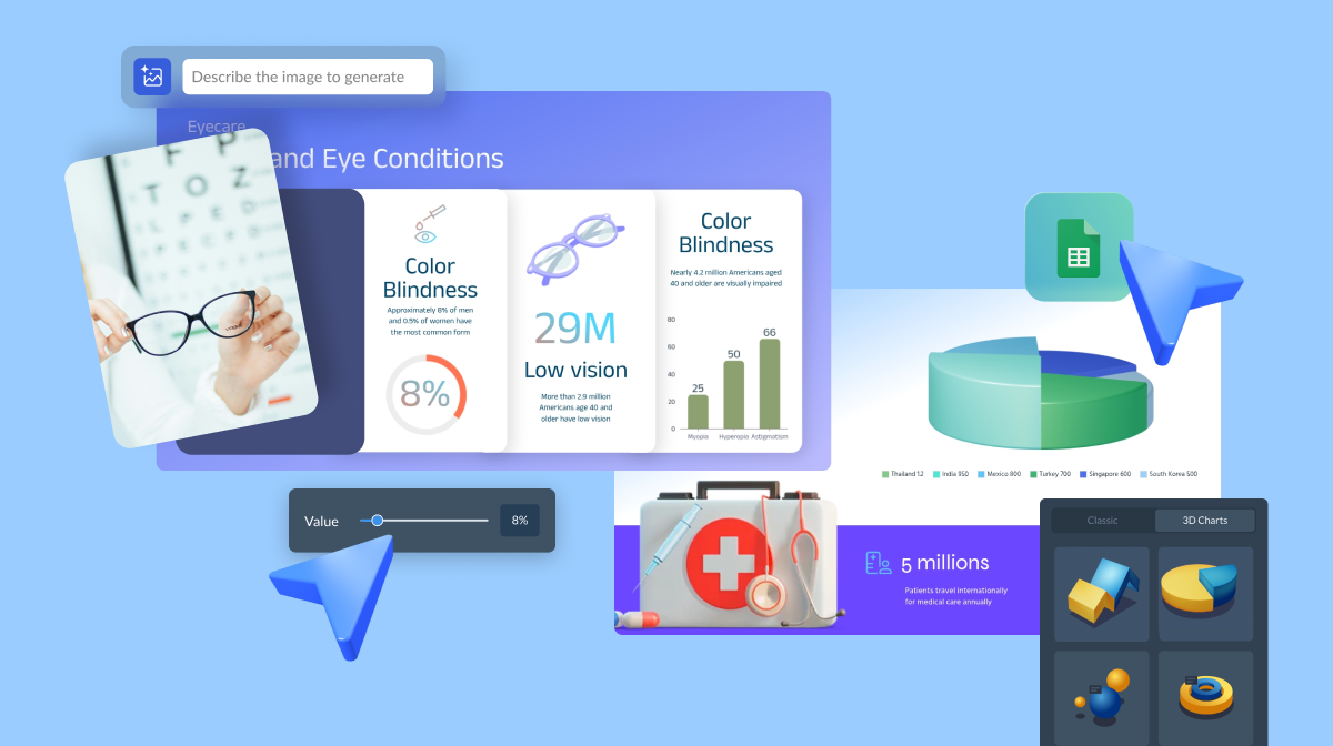
Our platform comes built-in with dozens of charts, graphs, tables, maps and data widgets — all customizable.
You can also add data visualizations directly into other Visme projects like reports, infographics, social media images and more.
Here's a quick step-by-step on how to create data visualizations in Visme:
First, log in to your Visme account. If you don’t already have an account, sign up to create one for free.
Once you sign in, you’ll land on your dashboard. This is where you can manage your projects, files, brand assets, analytics and more.

Click on the Create New button on the left side of the dashboard. Visme will present you with a variety of options, such as presentations, infographics, reports and custom size.
Choose Charts/Graphs or any other relevant category. You’ll see a large collection of professionally designed templates for various purposes and industries. Browse through the options and pick a template you like to kickstart your project.
You can also use the search bar to find a specific type of template, such as a marketing funnel chart, a real estate bar graph or a healthcare area chart.
Want to start from scratch? Select Custom Size to launch a blank canvas with specified dimensions. Don’t worry too much about this part — you can always change the size later.
If you started with a template, you can skip this step.
Once you’re inside the Visme editor, click on the Data tab to access Visme's data visualization tools. You can choose from a bunch of categories:
Browse through the available chart options such as bar, line, pie and more. Click on the one that best suits your data visualization needs. You can also look through the other data visualization categories to find the right type of visual to represent your data.
After inserting the chart into your project, click on it to customize its data and design. You’ll see three tabs pop up on your left side. Use the Chart Data tab to manually add or edit your data.

Looking for a faster way? Head to the Import Data tab. Here, you can:
Connecting your Visme data visualizations to live Google Sheets or Microsoft Excel is much easier. You can select a specific data range instead of an entire sheet and then use that data range to create a chart, graph or table.
Even if you import data from an external source, you can always edit it by going back to the Chart Data tab.
If you started with a template, you can simply click on the existing chart and edit the settings to add and customize your data. You can also replace the chart with another one, keeping the template design consistent.
When you click on your chart, you’ll also see a Settings tab on your left. This is where you can edit the look and feel of your data visualization so it fits your vision, brand style and design.
Here are some settings you can tweak:
You can also make your charts animated and interactive. For example, add captions on hover. Or add motion effects like “Bounce” to your bar graph. This is especially useful if you’re sharing your data visualizations online.
Make sure you’re happy with the size of your chart. Position it within the canvas by dragging and dropping it. Resize it by clicking and dragging the corners or sides of the bounding box.
To truly make your data visualization stand out, Visme provides a wealth of design elements that can elevate the visual appeal and storytelling impact of your project.
Here are some of the built-in assets you can grab from inside the editor:
Happy with your project? It’s time to share it with the world.
Visme lets you download your data visualization in multiple formats:

You can also publish and share your visualization online using a public or private link. This is great for preserving any animation or interactivity. It’s also useful for tracking analytics like views, unique visits and time spent on page.
Finally, you can also embed your data visualization. Simply generate an embed code for your project and add it anywhere on your website.

Creating data visualizations from scratch is tricky, especially if you want a nice design and layout.
But this is exactly why we have templates. Luckily, Visme has hundreds of data visualization templates to get you started on the right foot.
In our template library, you can find data visualizations of all types, purposes and industries. Use the search bar to narrow down your hunt for the perfect template.
Here are some handpicked chart templates to kickstart your data visualization project:
This professional pie chart template can easily be used in sales reports or presentations. Help stakeholders and decision-makers identify areas with potential for growth or ones that require additional attention or resources.
The pie chart template is equipped with customizable elements, such as colors, icons and fonts. Simply input your own data to create a personalized pie chart that accurately reflects your regional sales.
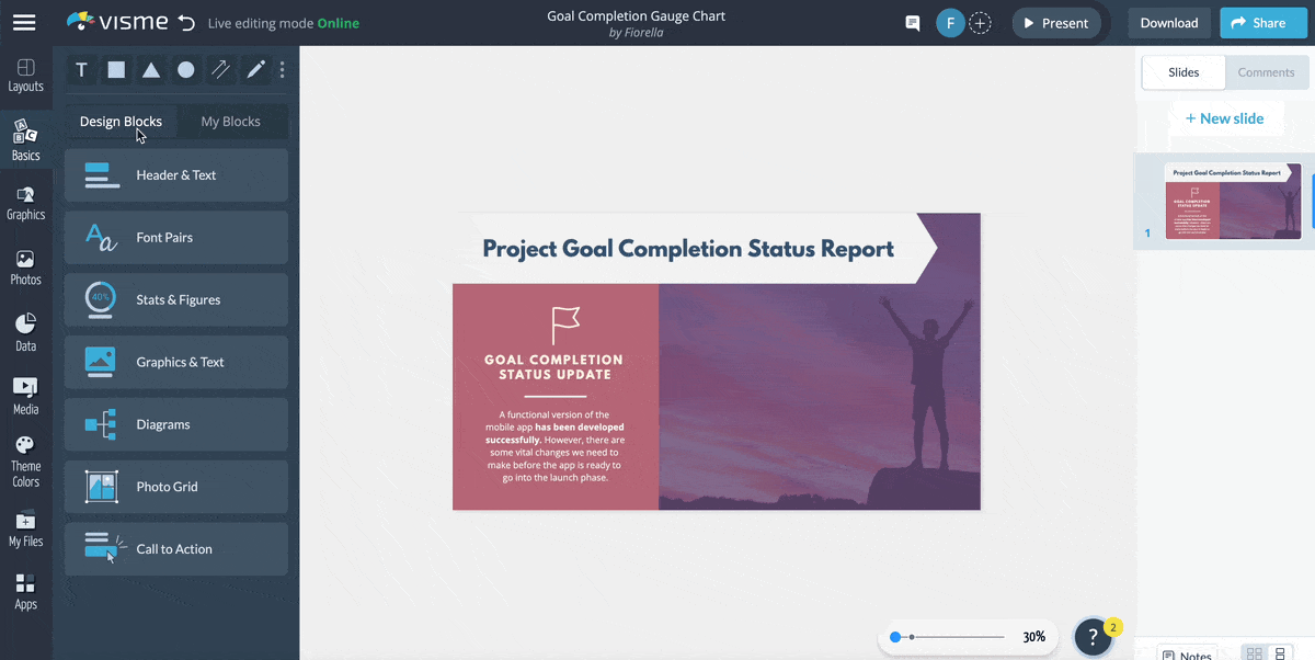
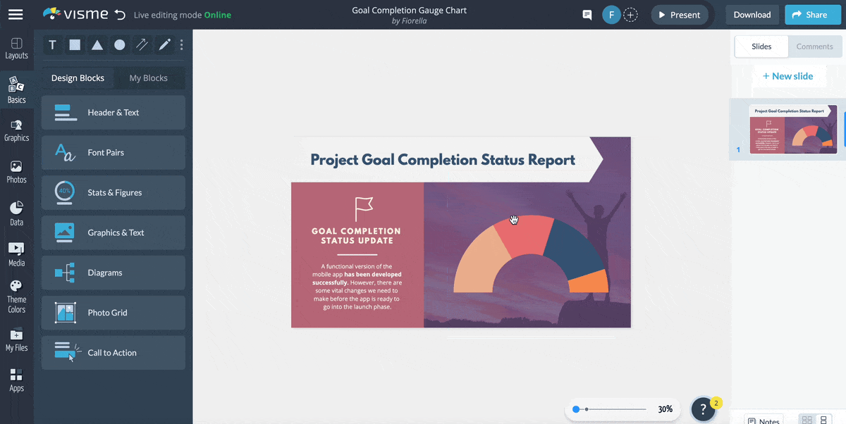
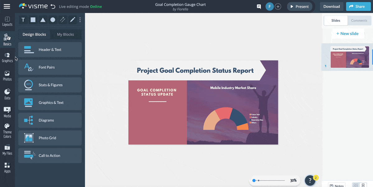
Use this gauge chart template to showcase the progress of your work or highlight the total funds you've collected for a social cause you believe in.
It features eye-catching graphic assets like vector shapes and icons, a background image and carefully chosen fonts and colors to captivate readers.
The template is a great pick for fundraising campaigns, financial reports or visualizing the progress of a crowdfunding project.
Pinpoint where your leads are coming from and where they're falling off with the help of this customizable funnel chart template.
It features a cool design layout with high-quality icons, attractive fonts and a colorful funnel chart to visualize your data.
Add this funnel chart template to your sales and marketing presentations. Or incorporate it into performance reports to help stakeholders make data-driven decisions.
Track which product at your company is performing better by using this creative comparison area chart template.
It features a delightful design layout with elegant fonts, classy colors and a professional area chart to help you visualize your data.
Everything you see in this area chart template is fully editable, so make as many changes as you want until you're happy with the final product.
Showcase the features of Instagram and YouTube with the help of this fully editable Venn diagram template. It’s equipped with social media icons, a high-resolution image from Visme’s photo library and a simple Venn diagram to help you visualize your content.
Venn diagram templates like this are an easy pick for most professional and casual topics—simply upload your branding assets to the template, like data, colors, icons, fonts, logos and images to make this template your own.
Highlight your company's products that are performing well and those that aren’t using this simple polar area chart template. It features a high-resolution image in the background, an attractive legend and an overall colorful design layout.
Take things to the next level by adding interactivity to your text and visual content. You could also add animations, characters and gestures to your template to really drive home the point.
Predict the growth rate projections of two countries, companies, or products using this dual chart template.
This template is a prime pick for anyone looking to draw comparisons between any two items. It features a creative data widget along with a high-res background and vector icons and shapes.
Personalize this dual chart template by uploading your brand assets, like icons, fonts and logo.
Take data visualization to the next level with the help of this creative and colorful histogram template. It comes with a colorful design brought to life by high-quality icons and a modern selection of fonts.
Make the most of this histogram template by adding it to your work or college presentations, reports, eBooks or on website articles and blogs. You can replace the placeholder data manually or by importing Excel workbooks or linking Google Sheets.
Looking for a quick and simple way to present your blog’s engagement metrics to key stakeholders? Use this professional pictograph template.
It features a themed background to add depth to the graphic, high-quality social media icons and a simple table for you to enter your data.
Everything you see in this pictograph template is fully editable. Browse millions of graphic elements in our library and add the ones you love to make this template your own.
If you want to quickly capture the attention of your readers towards your research, then this map template is a great pick for you.
The map visualization will help you display and analyze spatial relationships, patterns and trends and make it easier for your readers to understand your findings.
Use this choropleth map template for topics related to public health, marketing and sales, crime analysis, environmental monitoring, election results and more. And don't forget to upload your branding kit to the template to make it your own.
Bar graphs are an effective way to represent data. And this monthly budget allocation bar graph template serves a similar purpose.
Represent the budget allocated for each activity, like savings, utilities, food, clothing etc. This graph also comes with a background image, a colorful design and high-quality vector icons.
With Visme, you can spice up the design of this data visualization template with a few clicks.
Win over the attention of your readers with the help of this beautiful radar chart template. This data visualization template can be used to represent multivariate data.
Use this radar chart for many topics, including performance evaluation, product comparison, competitor analysis, portfolio analysis and even environmental impact assessment.
To give you a well-rounded solution regarding data visualization in Excel, we’ve answered the most frequently asked questions.
Data visualization in Excel refers to using graphics, charts and other visual elements to represent complex data sets. It makes understanding and interpreting the data more accessible, revealing patterns, trends and insights you may have difficulty finding in raw data.
To create categories in Excel, select the data range you want to categorize and create a table by going to the "Insert" tab and clicking the "Table" button.
Then, right-click on the column header, choose "Format Cells," and select the "Category" you want to create and you are done.
The choice of chart type in Excel depends on the nature of your data and the insights you want to highlight. For comparing values, bar and column charts work best. To show trends over time, use line charts.
For parts of a whole, pie charts are a good choice. However, consider using a data visualization tool like Visme for more complex visualizations.
While Excel is a robust tool for data analysis, it has its limitations when it comes to data visualization. For instance, creating interactive and customizable data visualizations can be challenging in Excel. If you need to create more complex or customizable data visualizations, consider using a dedicated data visualization tool like Visme.
While there's a range of data visualization tools out there, Visme sets itself apart due to its user-friendly interface and powerful features. It allows you to create engaging, interactive data visualizations without a deep understanding of data science.
Plus, Visme provides ample customization options, templates and compatibility with various data sources, making it an excellent choice regardless of your skill level.
Using the right data visualization software can help you present data in its best form and get your message across more effectively.
But traditional tools like Excel are no longer reliable for modern companies looking for faster, more flexible and advanced solutions.
Visme simplifies the process of creating stunning and engaging data visualizations for any purpose. Use hundreds of fully customizable templates, access built-in design tools and make your charts animated and interactive with a few clicks.
Ready to get started? Use our graph maker today to build beautiful data visualizations and tell compelling stories with your data.
Design visual brand experiences for your business whether you are a seasoned designer or a total novice.
Try Visme for free