


Healthcare Data Visualization: How to Turn Data into Impactful Stories


A circle diagram can help you visualize and explain concepts that would be more complicated if organized in a linear fashion. They have been used for many years in scientific, business and other research areas.
Creating a circle diagram can be challenging—especially if you are a non-designer. There are many things to consider, from correctly positioning the elements to choosing legible fonts. But with the right tools and a little practice, you can make an effective circular diagram in no time.
The right tools that we're talking about are Visme's customizable circle diagram templates. And, to help you practice and create your own, we've developed this comprehensive guide.
So, let's see how to do it!
Quick Reads
A circle diagram is a visual tool that displays data or concepts in a circular format, often to show relationships, processes, or cycles. Common types include pie charts and cycle diagrams. Circle diagrams simplify complex information by organizing it into sections or repeating loops.
The diagram consists of a central core and concentric circles representing different information levels—the outermost circle is the highest level and gets progressively smaller as you move inward.
Each circle can have its own color, size and shape. The first circle is usually bigger than the rest, but you don't need to follow this rule; it depends on what makes sense for your data set.
A circle chart is also called a circular diagram or a circle diagram chart. You can also use a circular diagram to represent hierarchies, such as a company's organizational chart or an ecosystem with species on different levels.
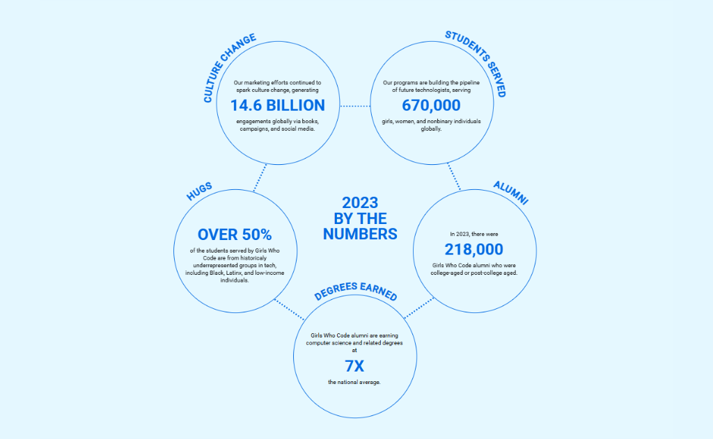
Here's an example from an annual report by Girls Who Code. This circle diagram showcases the main activities, graduates, and achievements of those who completed the program, along with the social impact—all presented in an easy-to-read and digestible visualization. To view the full report, check out how Girls Who Code uses data visualization effectively in their annual summary.
Though a circle diagram is trendy and cutting-edge, there are other ways to present all kinds of data. So, to help you decide whether you need a circle diagram or not, here are some scenarios when they're helpful:
A circle diagram is a perfect tool if you want to present the different steps of a process in an easy-to-understand way. You can show how each step connects to others and what happens when done in a particular order.
Circle diagrams are popular in project management and software development workshops. For example, if your company is creating a new product, you might need to show how it goes from idea to final product just like the template below.
Circle diagrams are also helpful for showing relationships between entities. You can use them to show how one entity relates to another, whether a physical object or a person—for example, a diagram showing the relationship between different departments in your company and how they interact.
Below is an example circle diagram template that explains it. The large circle in the middle is connected to five other secondary circles, each of which has a relationship with more or less three different elements.
You can use a circle diagram to show how two or more sets of data overlap. This means that all sets share some data, but not all of them.
For example, let’s say you want to show how multiple categories of books relate. You can show the overlapping circles using different colors or shades for each circle. You can also create your own custom shapes for the circles by using templates like those available on Visme.
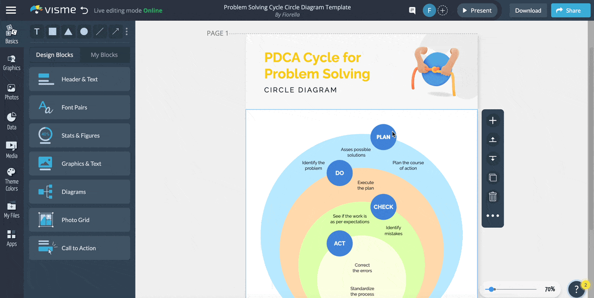
So, in the example below, the outer circle is "Plan," the parent category of all the other circles. The other circles are "Do," "Check," and "Act." These three circles have a relationship with each other and the parent circle, as seen by their overlapping areas in different colors.
This was just the tip of the iceberg; countless other use cases of a circle diagram exist.
Circle diagrams are similar to pie charts in that they show how a whole is divided into parts. However, circle diagrams are different from pie charts in the following ways:
| Chart Type | Purpose | Composition | Sections Supported | Labeling Style | Interactivity | Use Case |
| Circle Diagram | Visually represents concepts, ideas, or relationships | Uses icons, illustrations, and symbolic visuals | Supports many categories or interconnected ideas | Labels placed around the circle’s edge | Highly interactive; supports hover or click features | Ideal for process flows, frameworks, or user journeys |
| Pie Chart | Presents statistical or numerical data in proportions | Uses colored segments and numerical values | Best for limited categories (2 to 7) | Each segment labeled or included in a legend | Typically static with limited interactivity | Ideal for visualizing market share, budget allocation, or survey results |
Despite their differences, circle diagrams and pie charts have similar purposes: to convey information. And the list above doesn't prove one is better than the other. Both can be extremely useful in data visualization for different purposes.
So, here is a visual representation of the differences between a pie chart and a circle diagram.

We have already discussed when you should use a circle diagram. Read this guide on when to use a circle graph to know the use case of a pie chart.
The major drawback of data visualization tools like circle diagrams is that they are challenging to create–especially if you are not a designer. However, with a little effort and the right tools like Visme, you can create your own circle diagram that clearly displays your data.
Now that you know what a circle diagram is and how to use one in your work, we will show you how easy it is to create a circle diagram using Visme's free circle diagram template.
Ready to see the results? Follow the seven steps below to create a circle chart in minutes.
Made with Visme Infographic Maker
The shape, size and overall design of a circle diagram heavily rely on the amount of data you want to include. Therefore, start your design process by gathering all the data you want to visualize.
This can include numbers, statistics and processes to your opinions and feelings. The more information you have about the topic, the clearer and more accurate your circle diagram will be.
For this example, we will explain the process of creating a circle diagram using a circle diagram.
Creating a circle diagram from scratch can be difficult and time-consuming. Using a template is the best way to start. Once you have gathered all of your data, it's time to choose a circle diagram template from Visme's extensive library.
Design Manager
Many templates are available for you to use with various topics and themes. The choice is up to you!
For this example, we will use this Problem-Solving Cycle Circle Diagram Template to help you understand how to customize your template better.
Now that you have chosen your template, it's time to add the text. Make sure that all the circles are positioned where you want them to be on your diagram. Click on each circle to add text inside of them.
You can type your text manually or copy and paste your own text. Additionally, you can add text blocks to add more information to your diagram.
Auther of Death to Pie Charts
To customize your text and create a visual hierarchy, you can change the size, color and type of the fonts you choose. Also, you can try different font combinations already available in Visme.
To make your diagram more precise, you can use colors to differentiate between the data points. The template we are using already has different colors in each circle. This adds more clarity to the design and makes each step stand out.
Graphi Designer
Select the circles you want to change the color of and use Visme's color dropper tool to change them. You can choose from the color presets, your saved palettes, or a custom color using the color wheel or typing a hex code.
Depending on the type of diagram you are creating, you may need to add other elements. For example, if your data represents different types of people or organizations, you can add labels in the circles with their names.
But you also don't want to overwhelm your design with too many colors, text or visuals. In fact, Data Visualization Designer, Leenke De Donder shares this helpful tip:
Data Visualization Designer
Here is a different circle diagram template that includes arrows, lines, icons and other elements.
In addition, you can add additional design elements to make your diagram more visually appealing. For example, you can add icons or images to represent different concepts. With Visme, you get access to thousands of icons, illustrations, 3D graphics, high-quality images and more.
Once you’re done with the design, share the final product with your team. Ask them to provide feedback on what could be improved and what they would like to see in future versions of your diagram. They may come up with new ideas or suggestions to help improve your process.
And don't worry about the collaboration challenges people face while working on a design project. Visme's collaboration features make it super easy to share your design with team members, get feedback and make changes on the go.

Anyone from your team members can get access to your design and pin, circle, point or draw any part of the design and review, respond and resolve comments. The tool also offers live editing features that help them make changes to the design.
Read this article about collaborative design or watch the video below to learn more about it.
Now that you have a stunning circle diagram ready to use, you can download, share or publish it from Visme.
Click on the "Download" button on the top right corner of the Visme editor to download the diagram as a high-quality JPG, PNG or PDF file.
You can also share your design on social media or embed it in an external website using the "Share" button beside the "Download" button. To publish your circle diagram online, click on "Publish" and choose your preferred social media channels to publish it.
Click the “Embed” button on the popup window to generate a code to embed your design anywhere on the web.
So, here is the final result that we get after customizing the template.
You can easily turn your circle diagram into a clickable and interactive one by adding links, videos and other multimedia elements.
Visme allows you to add hover effects, links, pop-ups, buttons and even embedded content to your circle diagram. This is especially useful if you want to share or present the diagram online and add additional information. Viewers can click on the data points to view additional content or visit an external webpage.
Also, you can animate any part of your template for an extra layer of creativity. Select any object in the template and add exit and enter animation effects.
By now, you should've learned to create a circle diagram using Visme's templates and tools.
Below are the ten best circular diagram templates you can choose according to your needs. All the templates are fully customizable and free to download from Visme.
Let's start with this Design Thinking Circle Diagram Template. This type of circle diagram is also called a stacked Venn diagram. The template includes three different categories: understand, explore and materialize.
The template creates an easy way to present your ideas visually and you can use it in meetings and workshops when brainstorming complex issues. It’s great for capturing creative thoughts or organizing them before moving forward with your project.
You can use this or other venn diagram templates for any industry, but it’s especially useful for designers and illustrators.
This diagram is based on a traditional 8-step sales cycle. The template is easy to use and works perfectly for any business owner who wants a better understanding of their sales process. It will help you visualize the whole process from start to finish.
You will be able to identify where in the cycle you have problems and opportunities, so you can take action to improve. It's beneficial if your sales process spans different teams or departments because it can help you pinpoint which areas are performing well—or not—compared to others.
This template is perfect for representing the stages of a process simply and elegantly. It helps visualize the process early on in a project, from start to finish, so everyone can understand what they will do and when they will do it.
The vector icons to represent each step, the use of different colors and the additional 3D icons—everything about this template creates a visual hierarchy.
The template is ideal for project management teams who want to ensure that each step of the process is clearly defined.
This circle diagram template is designed to provide a visual representation of the problem-solving cycle. It offers an accessible and easy way to share critical concepts such as brainstorming, solution development, testing, evaluation and refinement.
The small circles in the template represent the steps in the cycle and the four ellipses show each step's sub-steps. The circles are color-coded to make it easier for the viewer to differentiate between steps, sub-steps and other important elements.
Use this template to brainstorm solutions, develop an action plan and evaluate your progress.
Are you planning to launch a product and need a template to help you organize your thoughts? This product launch circle diagram is a simple way to visualize the different components of your plan.
Use it to outline the key steps in your launch, such as marketing and sales activities. It also makes it easier for others to understand how everything fits together.
This template is ideal for marketing managers and business owners who want to demonstrate how their marketing strategy will increase awareness, interest, excitement and demand for their product launch.
The machine learning circle diagram template helps you plan, document and describe the steps for building a machine learning model. All the steps are clearly defined, from collecting data and creating the model to testing it and predicting its use cases.
The steps are color-coded and organized logically for easy understanding and reference. This template is suitable for data scientists and machine learning experts who want to share their work process with others while they create a model.
Similar to the machine learning template, the marketing campaign circle diagram template helps you visualize and document the steps of your marketing campaign.
The template includes all the necessary information to plan a successful marketing strategy, including the target audience, creating content and analyzing the results.
The template is easy to use and can be customized to suit your needs. It’s also an excellent resource for marketing professionals who want to share their work process with others while creating a marketing campaign.
Do you need a holistic view of what it takes to run a SaaS business? Or, maybe you have a solid SaaS business idea and want your team to understand how it will fit together.
This SaaS circle diagram template is a great way to visualize your business model and gain clarity about what needs to happen next. It includes all the major components of a SaaS business and makes it easy for everyone on your team to understand how each piece fits into the bigger picture.
This circle diagram template clearly defines the five stages of the policy cycle. The policy cycle is one of the key concepts of policy analysis and describes how policies are made and implemented.
The template will help you visualize all the steps in the policy cycle, from problem definition through implementation. It also allows you to identify the stakeholders and their influence in creating a new policy.
The template is a great tool for educating your team on how the policy cycle works and it’s especially helpful if you have a new member who needs to get up to speed quickly.
Have a startup or early-stage business model in mind? So, what's next? How do you get it off the ground? What are some key steps you need to take?
This business incubation circle diagram template will help. It's a great tool for educating your team on how the business incubation cycle works, and you can use it to identify the key steps you need to take to get your new venture off the ground.
From ideation and brainstorming to validating the idea and growing business, this diagram explains everything in a simple and easy-to-understand way. It's a great resource in your arsenal, especially if you're new to business or just starting in the startup world.
Circular diagrams are ideal for visualizing information that follows a loop, cycle, or continuous process.
They are commonly used to represent concepts like life cycles, feedback loops, workflows, and recurring tasks.
These diagrams help audiences understand the relationship between different stages or categories in a system where the end connects back to the beginning.
Circular diagrams should not be used when your data or information follows a strict linear path, requires precise numerical comparisons, or involves complex relationships that can’t be easily segmented into a loop or cycle.
For example, if you’re tracking a sequence of events that occurs only once or showing a timeline, a linear format such as a flowchart or bar graph will be more accurate and understandable.
Circular diagrams can also become confusing when overloaded with too many sections, especially if they vary greatly in size or importance.
Avoid circular diagrams if clarity or specificity is critical—like in financial reporting, technical instructions, or detailed analysis—because they often sacrifice accuracy for aesthetics.
A good circular diagram design is clean, balanced, and visually intuitive. It should clearly communicate the relationship or cycle it represents without overwhelming the viewer.
Use a limited color palette—ideally three to four colors—to create cohesion and avoid visual clutter.
If you need more variation, use lighter or darker shades of your selected colors rather than introducing entirely new ones.
Each segment or part of the circle should be proportionate and labeled clearly so that the viewer can quickly grasp its meaning.
Typography should be legible and consistent, and any arrows or directional indicators must logically show flow or connection.
A good circular diagram also aligns with the brand’s look and feel while maintaining clarity and functionality.
Avoid excessive decoration or design elements that detract from the core message.
The layout should feel intentional, and every part of the circle should serve a purpose—helping the viewer understand the message at a glance.
The four commonly used types of diagrams are circular diagrams, flowcharts, tree diagrams, and Venn diagrams.
Data visualization tools like charts, graphs and diagrams are powerful tools in many fields, including research, business and marketing. But this doesn't necessarily mean that they have to be boring.
You may have found a lot of circle diagrams on the internet that are either too basic or poorly designed or sometimes both. With Visme, you can easily create various data visualization tools that are aesthetically pleasing and functional. As an online tool, it's easy to use without downloading anything or installing it on your computer.
Choose a circle diagram template from Visme's library, customize it using the drag-and-drop editor and download your design. Sign up to create professional diagrams with Visme's online diagram maker.
Design visual brand experiences for your business whether you are a seasoned designer or a total novice.
Try Visme for free