


Typography Infographics: 12 Inspiring Examples & Techniques


Writing a case study is a good way to celebrate your results.
But it’s also a sure-shot way to build your brand’s credibility by showing potential customers exactly what your business can do.
In fact, 73% of B2B buyers use case studies to make purchasing decisions.
Unfortunately, most case studies end up trapped inside static PDFs that few people actually read.
To take things up a notch, try converting your story into a case study infographic—a visual, shareable format that highlights your wins in a way that’s quick to grasp and hard to forget.
In this article, I’ll show you how to do just that.
We’ll cover what a case study infographic is, why it works, five real-life case study examples, expert design tips and infographic best practices and round up seven customizable templates you can use to create your own.
I’ll also walk you through the step-by-step process of creating a case study infographic using Visme’s AI and design tools.
Let’s get started!
A case study infographic is a one-page visual snapshot of your project or client success story. It condenses the traditional case study, complete with background, challenge, solution and results, into a format that’s easy to scan, share and remember.
For example, rather than explaining the entire process behind increasing your lead generation by 45%, you can visualize it with a data widget, chart or animated stat that instantly highlights your win.
Take this SaaS case study infographic template by Visme as an example:
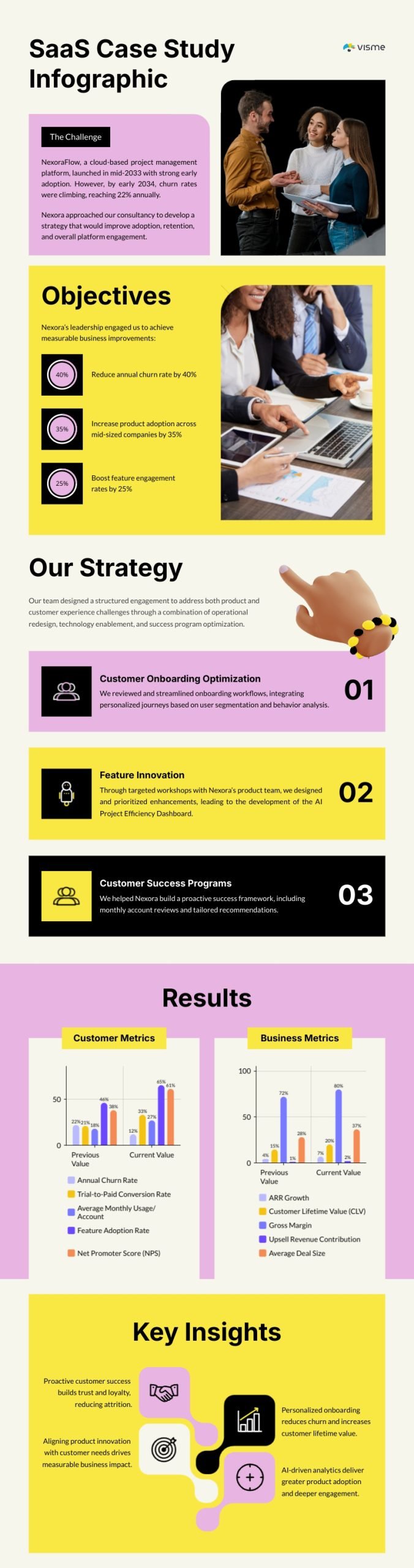
It includes:
And uses charts, icons and concise text blocks to tell the story.
It also replaces long paragraphs with visual cues, so the content is faster to read and easier to remember.
There’s science behind why this works too.
Our brains process visuals 60,000 times faster than text, which means your audience can grasp your impact at a glance, even while scrolling through social media or skimming your website.
They don’t have to sift through pages of dense paragraphs to understand what you achieved.
Studies show:
All these stats point to one thing: case studies work.
But how you present them matters too.
Traditional case studies often:
A pragmatic solution to all these problems is a well-designed case study infographic.
A case study infographic takes all the information you already have about your customer, and turns it into a bite-sized, single-page visual story that’s easy to understand, fun to scroll through and perfect for sharing anywhere.
You can post it on your website, add it to a sales deck, embed it in a newsletter or share it across social media.
And just to be clear, I’m not saying ditch traditional case studies; that would be counterproductive.
But add case study infographics alongside them, and you give your content a much better chance to be seen, remembered and acted on.
Now that we’ve covered the what and why, let’s look at what actually goes into a well-rounded case study infographic:
Made with Visme Infographic Maker
Your infographic is incomplete without a strong headline. It needs to instantly tell readers what the story is about and why they should care. Think results-first.
Keep your headlines short, outcome-driven and visually prominent at the top of your design.
Remember when we talked about shortened attention spans? Yeah, that applies here too.
Give your audience a quick way to understand the story at a glance.
In one short paragraph, summarize:
Think of this like your elevator pitch for the entire infographic, which can have multiple names like The Challenge, The Background, The Situation, The Problem, etc.
Now we’re getting into the good stuff.
Explain, in a few concise lines, what the state of the business was before the transformation. What wasn’t working? What obstacles were they facing?
Keep it simple; this isn’t the place for long paragraphs or heavy data.
You’re setting up the “before” of your story.
Next, explain what they wanted to achieve.
Were they trying to increase engagement? Lower costs? Scale operations? Clarifying the objective sets expectations for what your product or service helped accomplish.
This part connects your client’s goals directly to your offering and shows readers that your solution aligns with real business needs.
This is where you explain how you solved the problem.
List the key actions, tools or processes that led to the result. For example:
“We implemented an automated reporting workflow using X’s data visualization tools that cut manual report prep time from five hours to just 20 minutes.”
Here’s the hero moment, where you show exactly what changed.
Use data to quantify your impact: percentages, growth rates, cost savings, engagement boosts or time saved. Turn those numbers into visual proof using charts, gauges or animations.
Look at the results section of this case study infographic template:
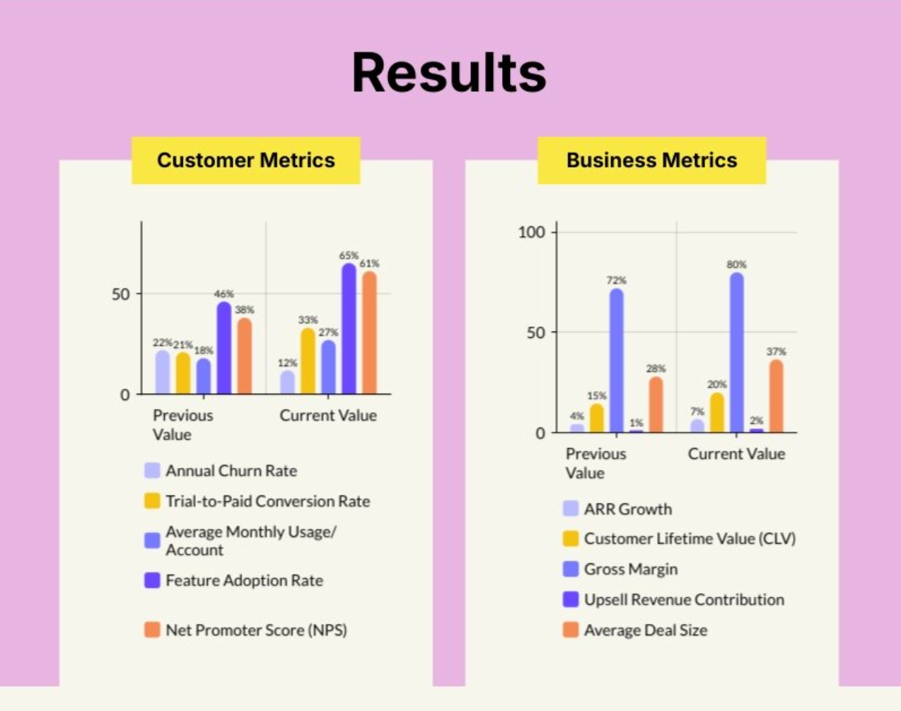
Not only does this look amazing, it’s also interactive. Love it. You can create similar animated charts and comparison widgets to make your before-and-after results instantly stand out.
Finally, close with a clear call-to-action.
Once someone’s seen the results, tell them what to do next, whether that’s booking a demo, contacting your team, exploring your product or reading a blog post. Make sure your CTA is visually distinct, like a button, icon or an interactive link.
This is optional, of course, but why miss an opportunity to turn interest into action?
Once you combine these seven elements, you’ll have a logical, visual narrative that guides readers from the initial challenge to the final outcome.
Now that you know the structure of a case study infographic, let’s see how it all comes together in real life.
Here are five case study infographic examples that nail design and storytelling, and what you can learn from each one.
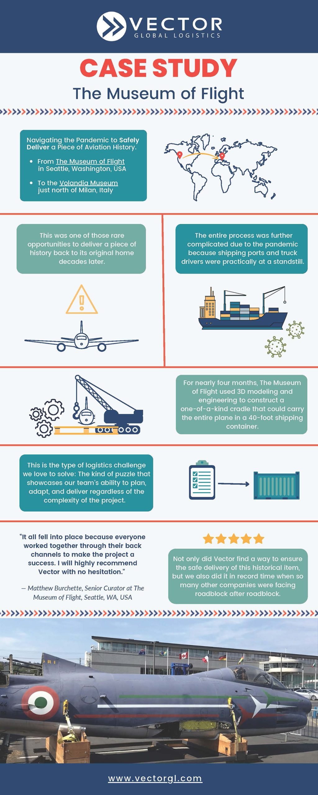
During the height of the pandemic, The Museum of Flight in Seattle needed to transport a historic airplane to the Volandia Museum near Milan, Italy.
This was a massive challenge, as global shipping and trucking were nearly at a standstill. But Vector Global Logistics stepped in to make it happen.
The team designed a one-of-a-kind 3D-modeled cradle that could safely carry the entire aircraft inside a 40-foot container. Through coordination, engineering precision and collaboration across multiple borders, they managed to complete the delivery in record time.
This case study infographic nails emotional storytelling and technical precision. It’s visually structured around the journey, “From Seattle to Milan,” using maps, photos and relevant, high-quality vector icons. The infographic shows not just what was delivered, but how it was achieved through problem-solving and teamwork.
When designing an infographic that specifically involves solving complex logistics, use visuals like route maps, engineering diagrams and timeline infographics to break down each phase. It humanizes the process and makes even technical operations feel like an inspiring journey.
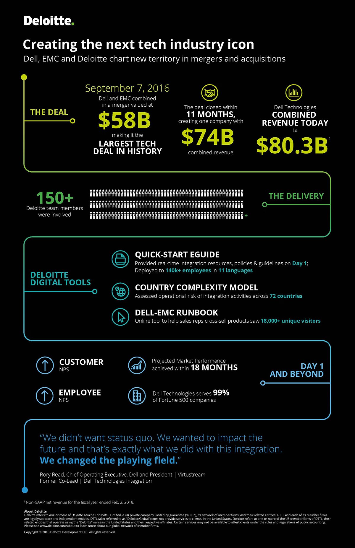
In 2015, Dell and EMC joined forces in what became the largest technology merger in history—a deal valued at roughly $58 billion.
The challenge was enormous: to integrate two massive companies, 140,000+ employees and global operations under one unified brand.
To make the transition seamless, Deloitte formed a Value Creation Integration Office (VCIO), prioritized high-impact initiatives and trained 40,000+ sales professionals to align messaging and execution.
Deloitte’s case study stands out for turning a complex $58B merger into a clear, visual story that’s easy to follow. Their original case study was text-heavy and packed with details, but to make it more digestible, they converted it into an infographic:
It breaks dense details into bold sections like The Deal, The Delivery, and Day 1 and Beyond. Big numbers, clean icons, and smart hierarchy make it easy to scan, while visuals and quotes balance data with story. It’s a strong example of turning long-form content into a visual experience that people actually read.
If your case study is heavy on numbers or long-form content, turn it into an infographic like Deloitte did. Highlight the most impressive stats upfront and group supporting details into clear visual sections. Use color, icons and short labels to guide the reader through the story without overwhelming them.
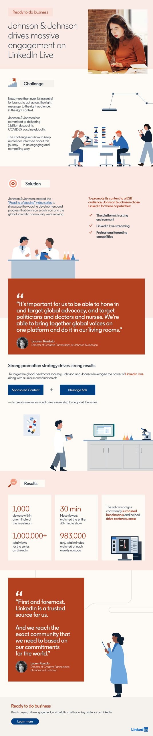
Johnson & Johnson launched a weekly live-video series titled “Road to a Vaccine”, aimed at educating audiences on its COVID-19 vaccine journey.
They used LinkedIn Live to stream interviews with their Chief Scientific Officer and other leading scientists, targeted especially to healthcare professionals and decision-makers globally.
This case study infographic works because it gets straight to the point. The headline immediately communicates what the story is about, so no overview is needed. It jumps right into the challenge, solution and results, keeping the flow crisp and logical. And then there’s the testimonial and final CTA (“Learn more”) to wrap up the case study.
Visually, this infographic is fantastic. It uses flat vector illustrations that add warmth and context without overwhelming the layout. The typography is clean, the metrics stand out in bold and the design uses bullet points, clickable links and well-spaced stats for easy scanning.
If there’s one tweak I’d suggest, it would be to visualize engagement numbers through an interactive bar or line chart to show how viewership grew over time. But overall, this infographic perfectly captures how to present complex data in a credible manner.
When your story already has impressive numbers and a clear outcome, keep the format simple, just like LinkedIn did here. Skip the long intro and go straight into the challenge, solution and results.
This infographic is a reminder that sometimes, clarity and structure do more for storytelling than any amount of extra detail.
Check out this video to learn how to design infographics that actually work:
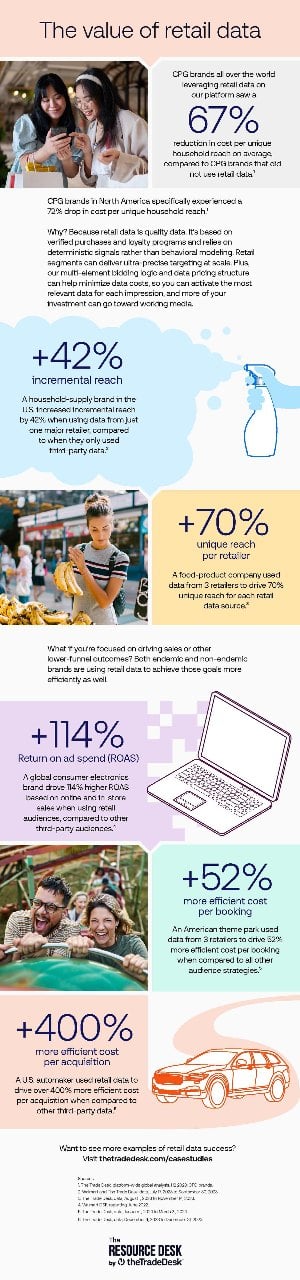
This retail data case study infographic, created by The Trade Desk, illustrates how utilizing retail data in programmatic campaigns yields substantial gains in reach and efficiency.
The infographic explains that marketers across industries are seeing better performance when they layer retailer-derived data onto their media plans, even brands that don’t directly sell through those retailers.
It highlights how campaigns using retail data achieved stronger outcomes in reach, brand lift and conversion metrics.
Right off the bat, I love the color palette here. It feels fresh, modern and consistent with The Trade Desk’s brand. It instantly makes you want to scroll through and read it all the way.
Sure, some sections have longer text blocks, but they’re balanced beautifully with bold numbers, colorful section dividers, icons and clean visuals that keep it engaging from start to finish.
I’m also a fan of how they’ve used different background colors for each section. It helps the reader separate ideas visually and makes the overall design feel structured and easy to follow.
Content-wise, this infographic works because it addresses a real, data-driven marketing challenge (how to use retail data effectively) and explains it in a simple way that even non-technical readers can understand.
Always use relevant visuals to tie your story together (icons and images in this case). They make data feel human and information easier to digest.
A case study like this demonstrates how a brand can effectively transform complex retail data into clear, actionable insights.
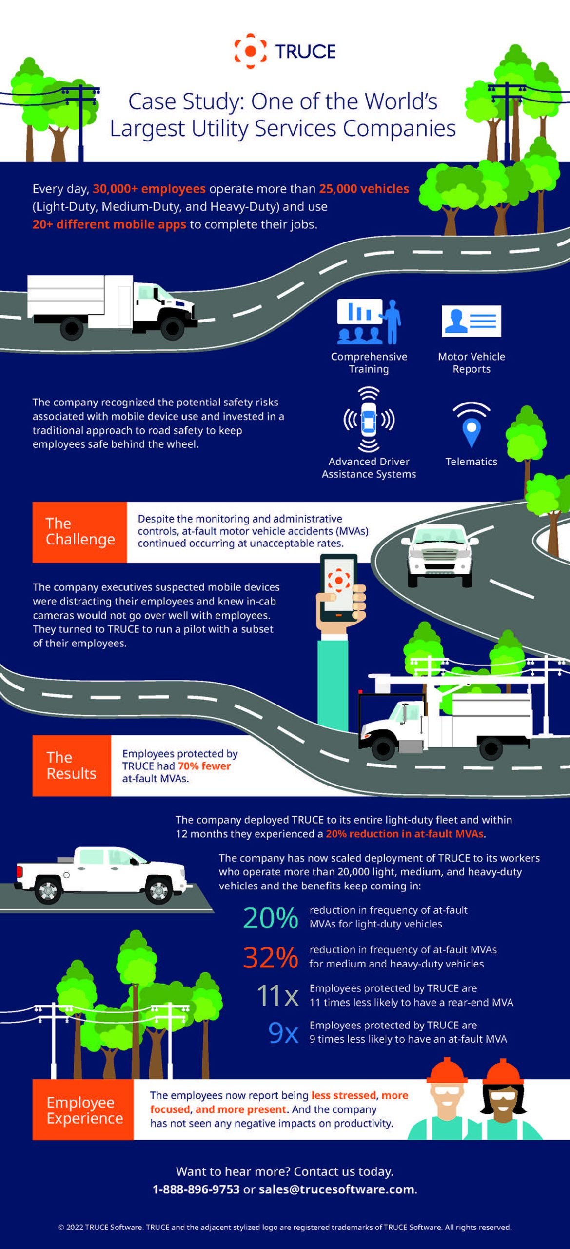
One of the world’s largest utility companies, with over 30,000 employees operating 25,000+ vehicles and using 20+ mobile apps, faced an ongoing challenge: a high rate of at-fault motor vehicle accidents (MVAs).
Traditional safety measures like telematics, driver reports and training programs weren’t enough to reduce distracted driving incidents.
To address this, the company partnered with TRUCE Software to implement mobile device management technology that minimizes distractions while keeping employees connected safely.
After deploying TRUCE across its light-duty fleet, the company saw a 20% reduction in at-fault MVAs within 12 months, and employees protected by TRUCE were 70% less likely to cause accidents overall.
This case study nails the balance between storytelling, proof and visual clarity.
In short, this case study infographic is persuasive and scannable.
If your case study involves measurable operational improvements, lead with data and visuals that make the impact undeniable. Use icons and themed graphics to connect your story visually to your industry. And, whenever possible, always close with a strong CTA, so readers know exactly where to go next once they’re convinced by your results.
Pro Tip: Add videos, reviews and testimonials wherever possible in your case study infographics. These elements instantly build trust, break up text-heavy sections and add a human touch that makes your story feel more authentic and relatable.
If you’ve read the article till here, it would be a shame if I didn’t tell you how to actually create a case study infographic—so, let’s fix that.
There are plenty of tools you could use to create infographics, but Visme is one of the best infographic tools for a reason. It’s not just a design app; it’s an all-in-one visual storytelling platform that lets you write, design and visualize data effortlessly.
It also comes with an AI-powered case study generator that helps you automatically generate complete case studies based on a simple text prompt.
Here’s a step-by-step guide you can follow to create an engaging case study infographic using Visme:
Before you can even think about creating an infographic, you need data.
And not just any data. You need a real customer who’s used your product or service and seen an actual improvement in their workflow, sales or results.
Then comes the crucial part: getting them to share their story with you. That means the details: their goals, challenges, the implementation process, the results and even the alternatives they considered before choosing you. This context adds authenticity. Anonymous or vague case studies may be accurate, but they often feel inauthentic, which can damage credibility.
This step can take time, sometimes a day, sometimes weeks, depending on your product, the implementation process and how long it takes for measurable results to appear.
Once you’ve gathered everything, organize it neatly in one place: customer background, problem, solution and results. That way, when you start designing your infographic, you’ll know exactly what to focus on and which parts deserve visual attention.
Now that you’ve gathered your story and data, let’s turn it into a visual narrative your audience will connect with.
There are several ways to get started inside Visme, depending on how hands-on (or hands-free) you want to be.
Once you’re inside your dashboard, click “Create from Blank.”
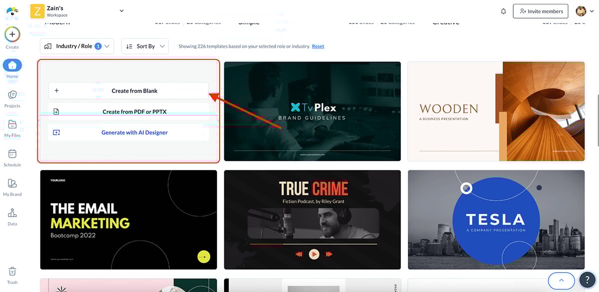
This opens an empty canvas where you can design your case study infographic from scratch. You can add shapes, charts, icons, photos and colors to match your brand identity—perfect if you already have a specific design direction in mind.
Unless you know exactly what you want your design to look like, this is the best place to start.
Visme offers over 1,500 infographic templates and more than 200 case study-specific designs, all ready to edit in minutes.
Just browse, pick a layout that fits your business type or story and replace the placeholders with your own data.
Each template already includes dedicated sections for your challenge, solution, results, metrics and testimonials, so it’s more of a plug-and-play experience than a start-from-zero project.
If you want to speed things up, try Visme’s AI design generator.
Inside your dashboard, hit “Create with AI.” This opens a Visme chat box where you can enter your prompt.
Let’s put it to the test:
Prompt: “Create a modern B2B case study for a marketing agency that helped a SaaS client increase sign-ups by 60% using SEO and paid ads.”
Here’s what it generated:
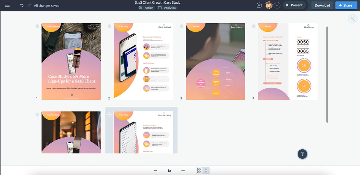
In less than a minute, Visme generated a beautiful layout with organized sections, bold visuals and a clear hierarchy. Love it.
As a first draft, it’s genuinely impressive. And the more specific and detailed your prompts are, the better the AI’s output becomes over time.
Note: You’ll notice that this version is generated as a multi-page case study layout, not an infographic. Visme’s current AI case study generator is focused on creating long-form, presentation-style case studies, not single-page infographics (yet).
That said, Visme more than makes up for it with hundreds of handcrafted infographic templates, designed and curated by its in-house design team. These templates are fresh, modern and trend-driven, giving you a professional head start every single time.
Now that you’ve chosen your template (or generated one with AI), it’s time to make it look like you.
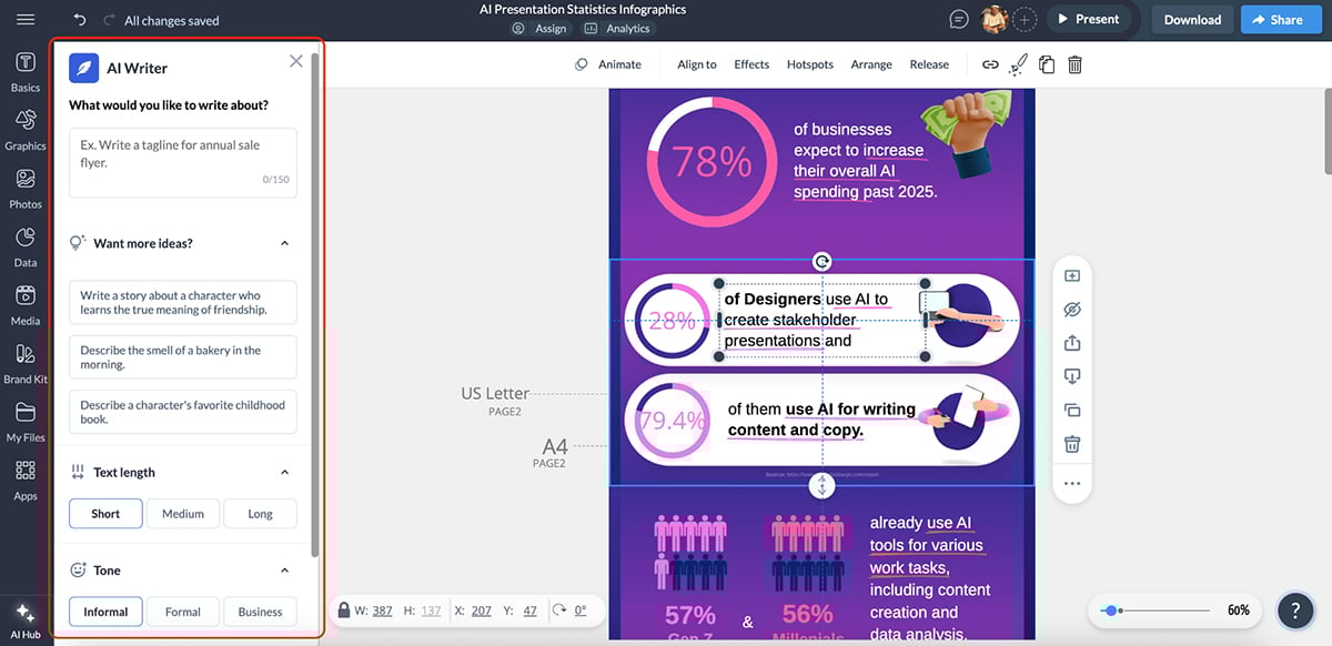
Start by adding your text and brand voice to the infographic. You can do this manually, but there’s a better way: Visme’s AI writer. Just tell AI what you want written, how long and in what style, AI will do the heavy lifting for you.
Next, focus on the infographic’s branding. Incorporate your brand colors, fonts logo so your case study infographic feels consistent with the rest of your marketing materials.
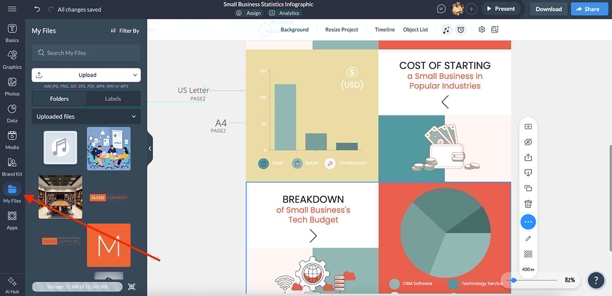
Sure, you can manually upload your logo, fonts and color palette, but if you want to work smarter, Visme gives you a few shortcuts to make this process faster and more organized.
Inside Visme, your Brand Kit is where you store and manage all your brand assets, from logos, fonts and colors to templates and design elements. It keeps everything organized and instantly accessible across projects, so you never have to upload the same assets twice.
If you’re working with a team, you can share your Brand Kit with teammates to ensure every design stays on-brand and consistent.
If you’re designing in a team setting, you’ll love this. Visme’s advanced collaboration and workflow features let you:
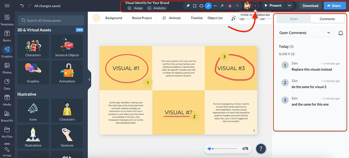
No need for endless email chains, Slack messages or scattered feedback. Just everything you need, built inside the tool.
Visme also comes with an AI-powered Brand Wizard that does the heavy lifting automatically.
All you need to do is enter your website URL, and Visme instantly pulls your logo, fonts and color combination directly from your site and saves them to your Brand Kit for future use.
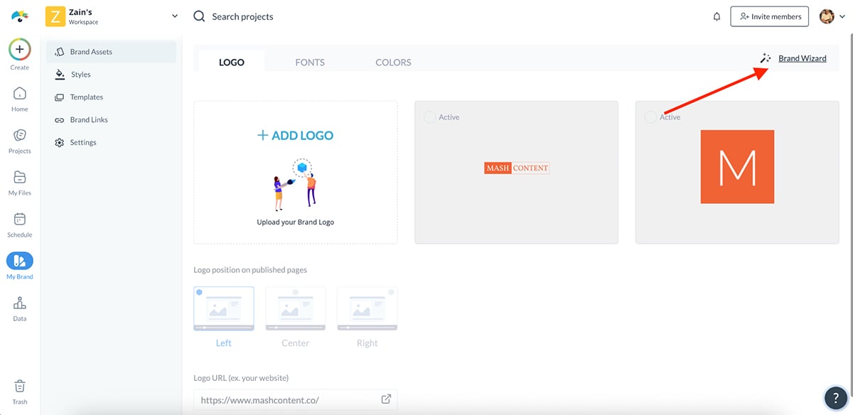
You can always tweak or expand your kit later, but this shortcut saves hours of setup and ensures every project starts fully on-brand.
If you’re just starting out and don’t have a branding kit, Visme has you covered.
You’ll find a huge collection of pre-designed color palettes, font pairings and design themes that you can apply to your project in one click.
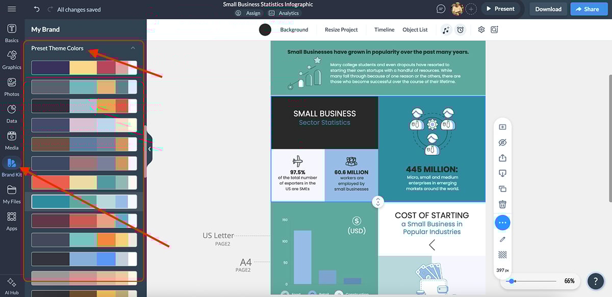
Once you find one that fits your personality or client aesthetic, add it to your Brand Kit for future use.
There’s literally something for everyone:
Your brand is your story’s visual signature, and with Visme, keeping it consistent across every case study infographic is hassle-free.
Now it’s time to turn your customer story into a scroll-stopping visual experience that makes readers actually pause and take it all in.
Visme comes with a massive built-in icon and visual library that includes everything you could possibly need: animated icons, 3D graphics, characters, shapes, gestures, wireframes, illustrations and avatars.
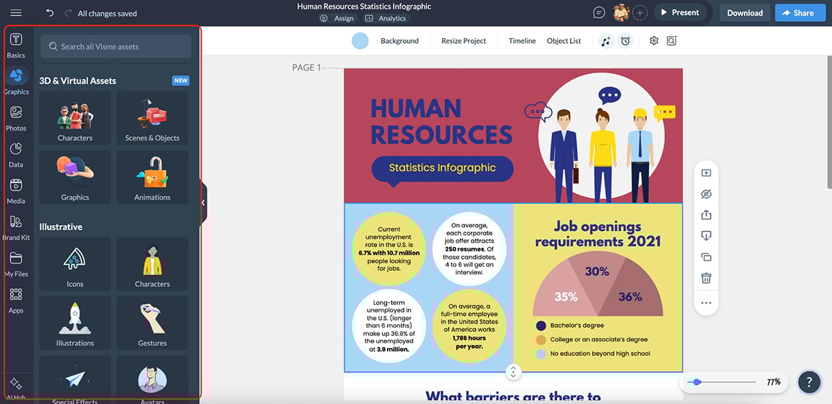
You can use these elements to complement your text or headings, or even replace them entirely to make your infographic more visual, scannable and engaging.
Visme also includes a dedicated stock photo and video library with over a million high-quality assets you can use to strengthen your story.
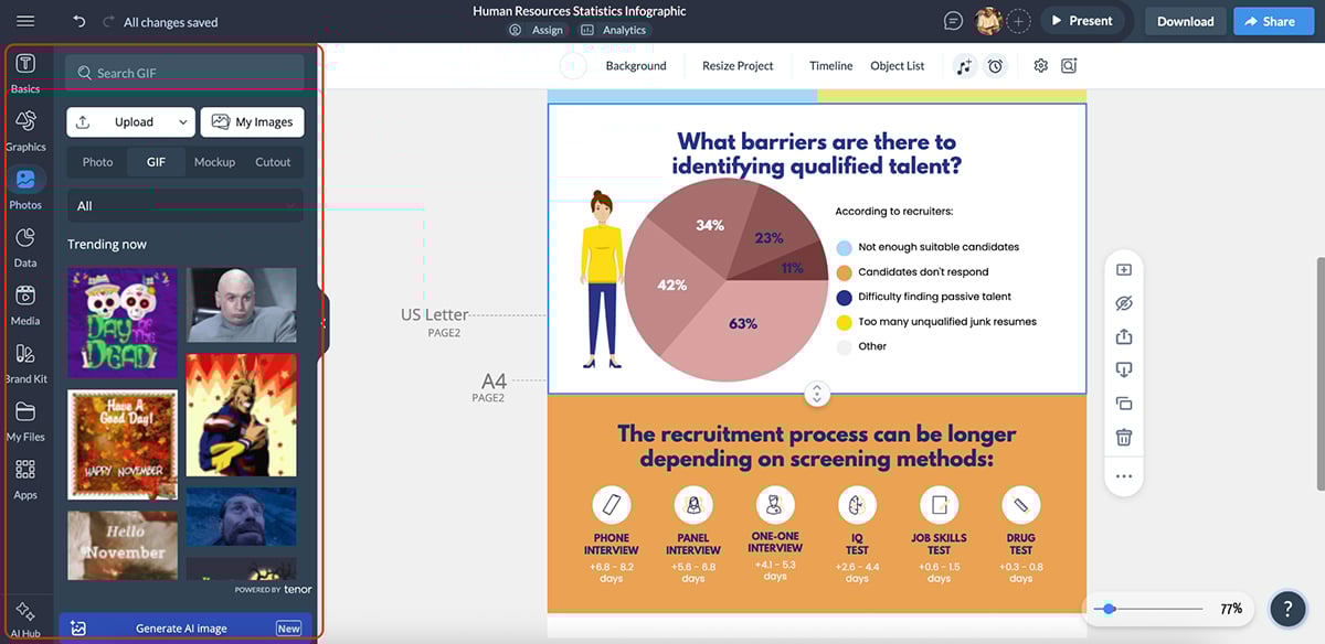
Whether it’s a GIF, mockup, cutout, background image, product shot or a contextual visual, these assets help you make every section feel polished and purposeful.
And on the off chance that you’re unable to find exactly what you’re looking for, you can use Visme’s AI image generator to create a unique image based on your prompt.
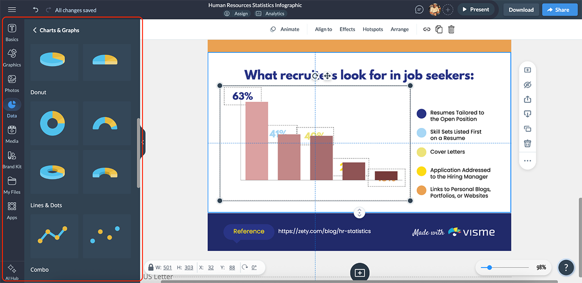
And of course, your case study infographic will almost always include data. To make those numbers shine, use Visme’s data visualization tools.
You can choose from 40+ chart and graph types, from simple bar charts and line graphs to heatmaps, progress rings and timelines.
You can even go a step further with 3D charts, perfect for showcasing results like growth rates, conversion boosts or performance comparisons in a visually striking way.
But that’s not all. You can make your content come alive with animation and interactivity. Add hover effects, clickable buttons and pop-up tooltips to guide readers through the story.
You can even animate charts, icons or text blocks to create a natural visual flow that leads the reader’s eye from challenge → solution → results.
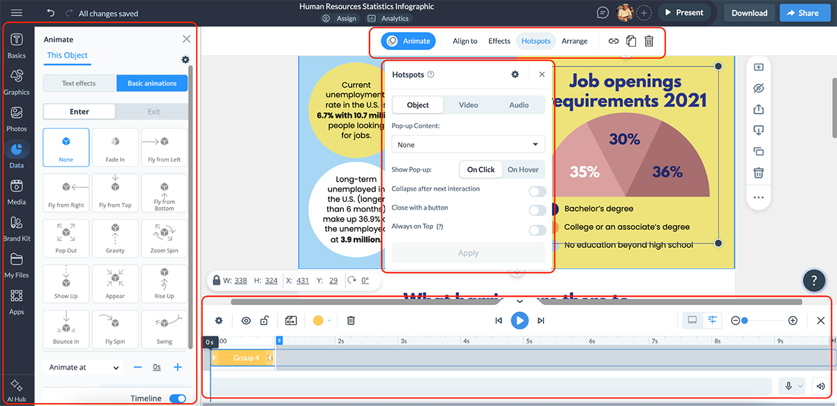
If done right, this is the step where you can turn your case study infographic into a living, visual story that keeps readers engaged till the very end.
Congratulations—your case study infographic is ready to go!
Now it’s time to put it out into the world and let people see the results of your hard work.
Visme offers tons of sharing and publishing options, so you’re sure to find one that fits your use case perfectly.
You can:
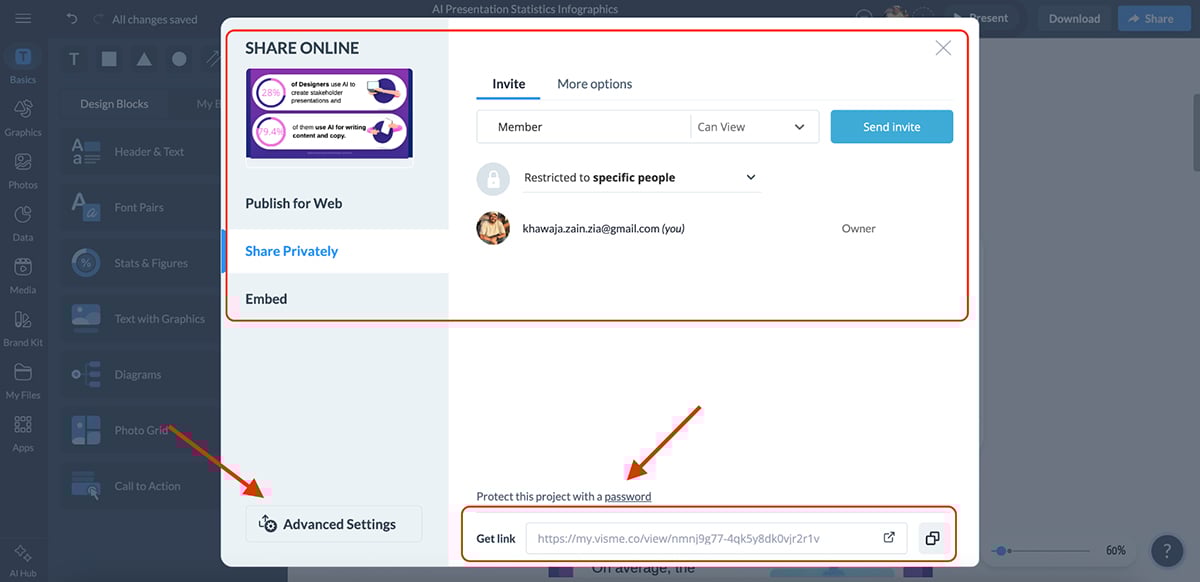
You can even configure advanced sharing settings, such as:
When you share your case study infographic via a direct Visme link, you can also track detailed analytics—see how many people viewed it, how long they spent on it and where they clicked. It’s a great way to measure what parts of your design resonate most with your audience.

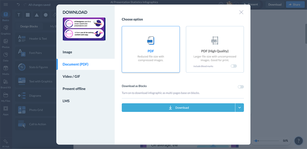
And if you prefer to use your infographic offline or upload it somewhere else, you can download it in multiple formats, including:
All in all, Visme gives you full control over how, where and when your case study infographic is shared.
Once you follow this playbook, you’ll have a fully branded, data-rich and visually engaging case study infographic that’s ready to share across your website, sales decks and social channels.
At Visme, we’ve created seven professionally designed case study infographic templates for anyone who wants to turn results into shareable, visual stories.
Here they are:
'
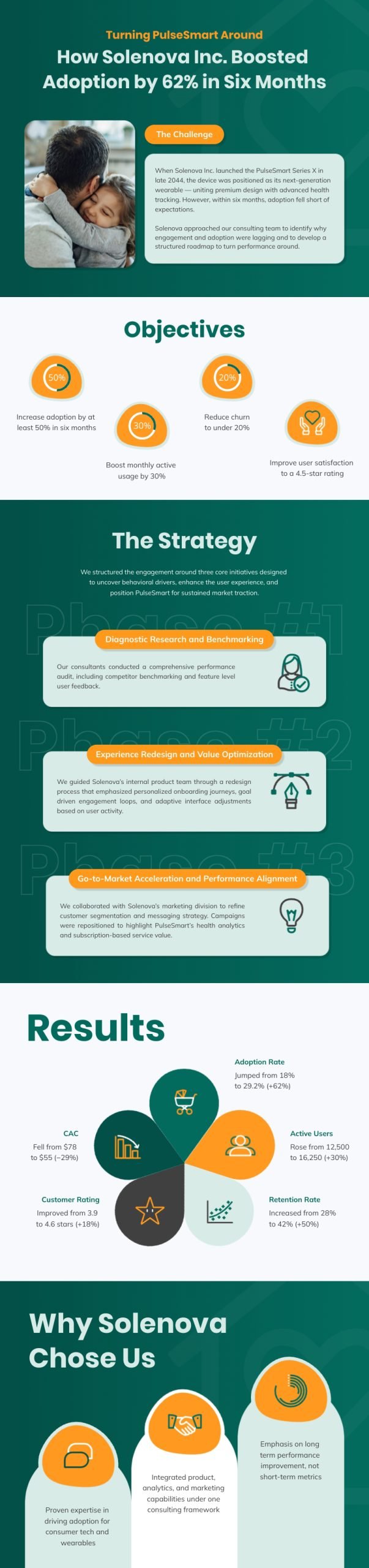
This product case study infographic nails the balance between structure and storytelling. It uses clear sections (challenge, objectives, strategy, results), separated by bold headers, icons and color blocks that naturally guide the reader’s eye down the page.
The green, white and orange color scheme looks brilliant, while the minimalist icons for each section tie everything together neatly. Plus, if you scroll through the template, you’ll also notice subtle but impactful animations that add life without distraction.
Sure, you can easily use this template as is and it’ll look great, but if you want to make it “come alive”, try using Visme’s animation and interactivity features.
For instance, you can add hover effects to data points, clickable links for in-depth results or even embed third-party content like videos or testimonials to make your case study more engaging and immersive.
Clean, vibrant and full of energy. This SaaS case study infographic is perfect for anyone going for that modern, upbeat vibe. The muted pink, yellow, and black color combination is a treat for the eyes, and the generous white space gives everything room to breathe. Plus, the modular layout makes each section instantly scannable.
My favorite part is the use of graphs and data widgets. Not only do they look fantastic, but they’re interactive too. You can click on legends to isolate metrics and focus on what matters most.
Visme offers advanced data visualization tools, including bars, lines, pies, gauges, maps and funnels that are ideal for data-heavy case studies that you want to make more dynamic.
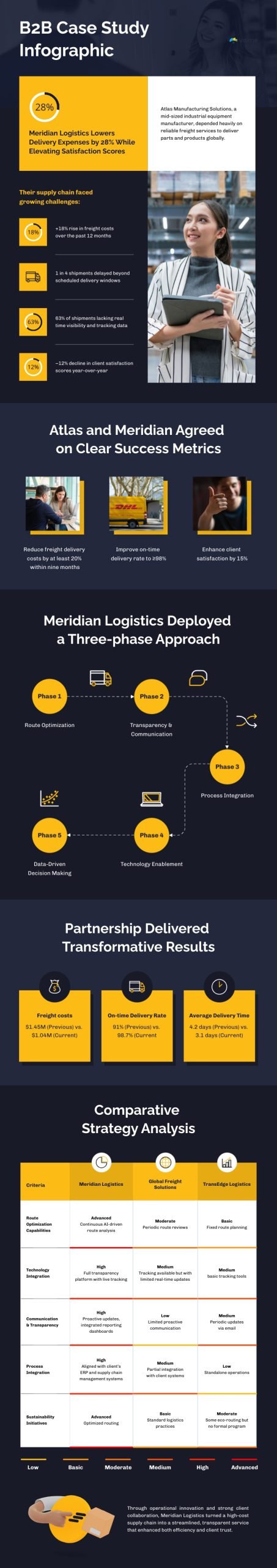
This B2B case study infographic looks sharp, data-driven and corporate—exactly what you’d expect from a logistics or manufacturing story. The dark navy background paired with golden yellow accents gives it authority and sophistication, while the clean, structured flow keeps everything easy to follow.
What stands out most is the comparative analysis table near the end. Sure, it’s detailed, but that’s exactly what makes it ideal for B2B readers evaluating multiple vendors or approaches. The workflow diagram and supporting images also add great visual context.
If you have your own photos, you can upload and replace them directly. Or use Visme’s built-in stock photo and video library, and for something more custom, create visuals using Visme’s AI image generator.
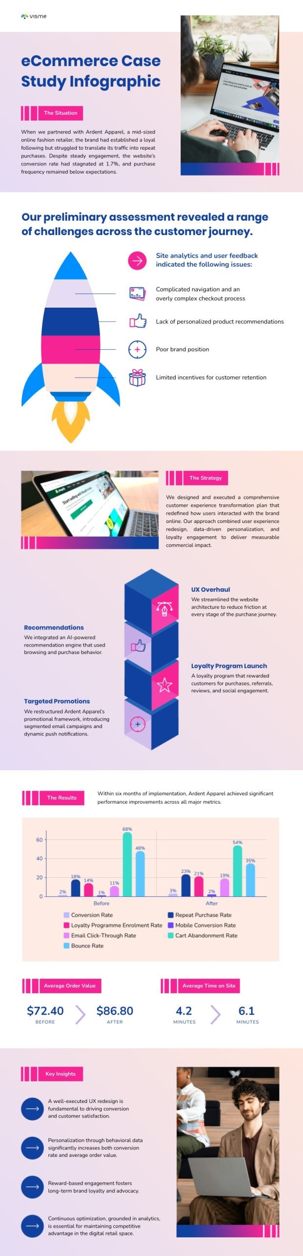
This eCommerce case study infographic is colorful, dynamic and perfectly suited for retail or DTC brands. The pink, purple and blue gradient palette gives it a modern, upbeat tone, while smart visuals like the rocket graphic and 3D cubes add movement and storytelling flair.
I love the use of icons from Visme’s icon library, the data widgets and the dedicated space to upload your brand logo. The strategy section, in particular, stands out. It uses building blocks to represent each phase of the plan—clever and visually satisfying.
Let’s say you want to share this case study on social media. Visme lets you do that with a single click. You can even plan ahead by scheduling your post directly using Visme’s built-in social media scheduler, so all your design and promotion workflow in one place.
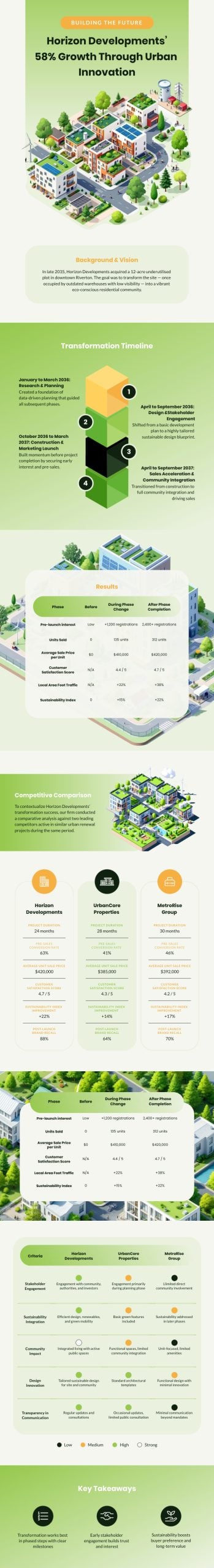
This timeline-style case study infographic is clean, structured and perfect for storytelling around multi-phase projects in industries like real estate, architecture, energy or urban development.
I love how the 3D stacked timeline guides you through each phase, from research and planning to execution and community impact, while keeping the viewer engaged. And the data tables and comparison charts add depth and credibility without clutter.
If you’re ever stuck while customizing any Visme template, Visme’s AI suite can help you out. Whether you need to rewrite section copy (AI writer), generate visuals (AI image generator) or edit images (AI touchup tools), you can do it all right inside Visme, without switching tools or losing your creative flow.
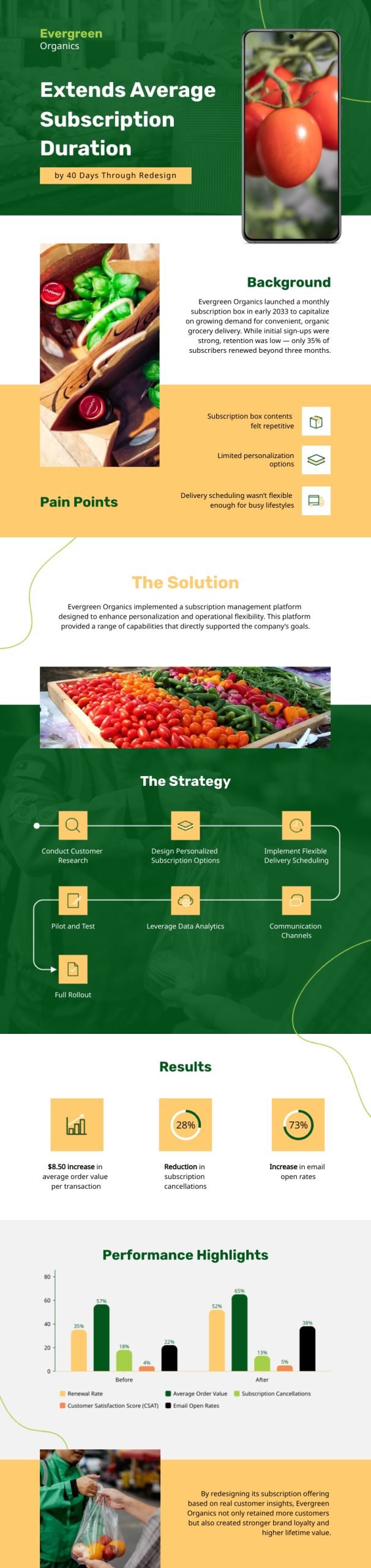
This business case study infographic is perfect for consumer-focused brands like subscription boxes, wellness products or retail startups. The green and mustard palette gives it an organic, down-to-earth feel, while the clean layout keeps visuals and text in perfect harmony.
I love how the flowchart-style strategy section guides readers through each step clearly, while the performance charts and percentage widgets add a data-driven touch without losing the friendly tone. The animated icons tie it all together, adding motion and warmth that make the story feel more human and relatable.
A few ways you can enhance this template are by adding mockups to showcase your products in realistic settings, like packaging on shelves, lifestyle shots or mobile app previews, using Visme’s mockup generator. You can also incorporate maps through the Visme map generator to visualize customer locations, delivery coverage or regional sales performance.
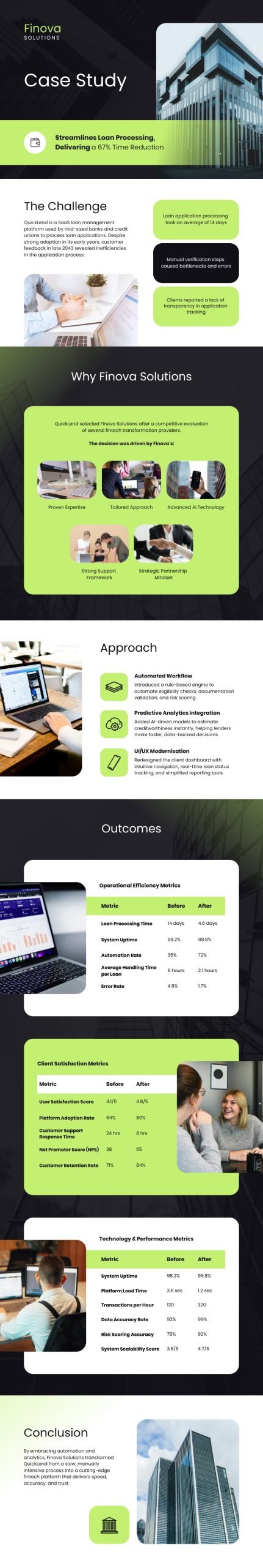
This case study infographic is purpose-built for SaaS and tech companies that want to highlight product-driven results. The black, white and lime green palette gives it a professional yet energetic look, perfect for fintech, automation or analytics brands.
What stands out most about this case study design is how the content flows like a real customer journey, just like all Visme case study infographic templates. The data tables clearly break down metrics across operations, satisfaction and technology, while the images complement each section’s theme beautifully.
If you want to make your version stand out, try using Visme’s 3D character creator to add animated figures and gestures. They’ll help break monotony, add motion and make your SaaS case study feel more interactive and human.
Below are expert insights from professionals who live and breathe design, data, and content:
The headline is the hook of your case study infographic. And the stronger your hook, the better your chances of getting readers to stick around. Use numbers or data points right in your headline to make your story feel instantly credible and results-driven. Even if someone reads only the title, they should already understand what success looks like.
Here’s what Victoria Taylor, Head of Content at Visme, says about this:
“Before people even dive into your case study, they're going to use the headlines to decide if it's worth their time. You don't have a second to lose (literally). By using data or statistics, you're not only grabbing their attention but also letting them visualize the potential wins they can achieve if they work with you.”
Visuals beat paragraphs. Case study infographics work best when data is presented visually. Use icons, graphs and data widgets instead of lengthy explanations. Make sure your audience understands your results at a glance.
Look what Jessica Wells Russell, Director of Production Operations at Brafton Inc. has to say:
“When it comes time to incorporate your stats into the actual copy, remember: Show, don’t tell. If you feel the need to include big, wordy sections to support your stats and facts, something’s wrong.”
A well-crafted infographic can outperform multiple written case studies. It reinforces the power of visual storytelling: it’s faster to digest, easier to share and far more persuasive. If your goal is visibility or lead generation, a visual case study is the smarter, higher-ROI play.
Here’s what Hanna Parkhots, Data Collection Project Manager at Unidata, says about the importance of visuals in infographics:
“At Unidata, I use infographics to market our data collection capabilities to potential clients. One infographic showcasing our crowdsourcing efficiency complete with turnaround times, accuracy rates, and cost comparisons generated 23 qualified leads in two months. That single visual asset outperformed three written case studies combined.”
Not everyone processes information the same way. Some people read, others watch. Embedding short videos or motion snippets in your case study infographic helps you capture both kinds of learners while keeping your design dynamic.
Victoria Taylor, Head of Content at Visme, puts it perfectly:
“Adding video content to your case studies helps to elevate the reader's experience. Rather than solely relying on the copy to tell the reader about the solution, videos help show the reader how it was done, whether it's a product demo, use cases, or even just a case study summary. Plus, when you add videos to case studies, you can cater to different types of content consumers and learners, so you're keeping everyone along the way.”
Interactivity should guide, not distract. Clickable graphs, hover-to-reveal results or tappable CTAs are great examples of interactive storytelling done right. They make your infographic feel alive and purposeful.
Alejandra Mariscalez, Design Manager at Visme has this to say about the importance of interactivity in infographics:
“One of the most important things to clarify with interactive infographics and anything related to interactivity is that it has to be engaging. Some people confuse interactivity with simple animations or special effects and forget about the most important part which is having the user interact with elements within the design in order to convey/uncover a special message.”
Each of these tips shares one core message: your case study infographic should do more than show results; it should feel like the story of your success.
There are several ways to illustrate a case study. You can turn key information, like the challenge, solution and results into visuals such as charts, icons, images and data widgets. Transform customer quotes into testimonial blocks, show comparisons using tables and map out stages with flowcharts or process diagrams. You can do all of this and more with design tools like Visme.
The four main parts of a case study are:
These sections give readers context, insight and measurable proof of success.
A case study infographic should include your client’s problem, steps taken to solve it, quantifiable results and visual elements like graphs, icons and branded colors. Adding testimonials or quotes can also boost credibility.
A case study can be as long as it needs to be, what matters is clarity and flow. A case study infographic, however, should be bite-sized and skimmable, focusing only on key sections like the challenge, solution, results and takeaway.
Keep it concise, visually engaging and easy to digest so readers can grasp the story in under a minute or two.
Yes. Case study infographics help sales teams show proof of results quickly, making them powerful tools for pitches, landing pages and client presentations. Visuals make data and customer success stories easier to understand and remember.
Case studies are the proof of your business’s success, but if you’re not turning them into bite-sized, shareable visuals, you’re leaving a huge opportunity on the table.
Case study infographics are the obvious next step. With clear sections, engaging visuals, interactivity, animation and data visualizations, you can turn any customer story into an attention-grabbing narrative that builds trust and drives action.
Visme is built to help you do exactly that. It comes with AI-powered tools, customizable templates, branding features and analytics that make every project easier to create and scale.
Whether you’re part of a marketing team, sales department or creative agency, explore Visme for Teams to collaborate, share feedback and scale your visual storytelling efficiently.
Design visual brand experiences for your business whether you are a seasoned designer or a total novice.
Try Visme for free


![How to Make an Interactive Infographic [+Templates]](https://visme.co/blog/wp-content/uploads/2023/11/How-to-Make-an-Interactive-Infographic-Quick-Guide-8-Customizable-Templates-Thumbnail.jpg)


