


Typography Infographics: 12 Inspiring Examples & Techniques

Some of the best infographic tools and infographic maker software are Visme, Venngage, Canva, Piktochart, Snappa and Infogram.
In this comparison guide for 2025, we compare these and many more infographic tools to help you choose the best infographic maker for your business.
If you're ready to create one quickly, choose from hundreds of professionally designed infographic templates for business, education, or personal use.
Let’s get into it.
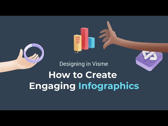
Before we start, here is a video on how to create infographics for marketing
Disclaimer: The comparisons and competitor ratings presented in this article are based on features available as of January 22, 2026. We conduct thorough research and draw on both first-hand experience and reputable sources to provide reliable insights. However, as tools and technologies evolve, we recommend readers verify details and consider additional research to ensure the information meets their specific needs.
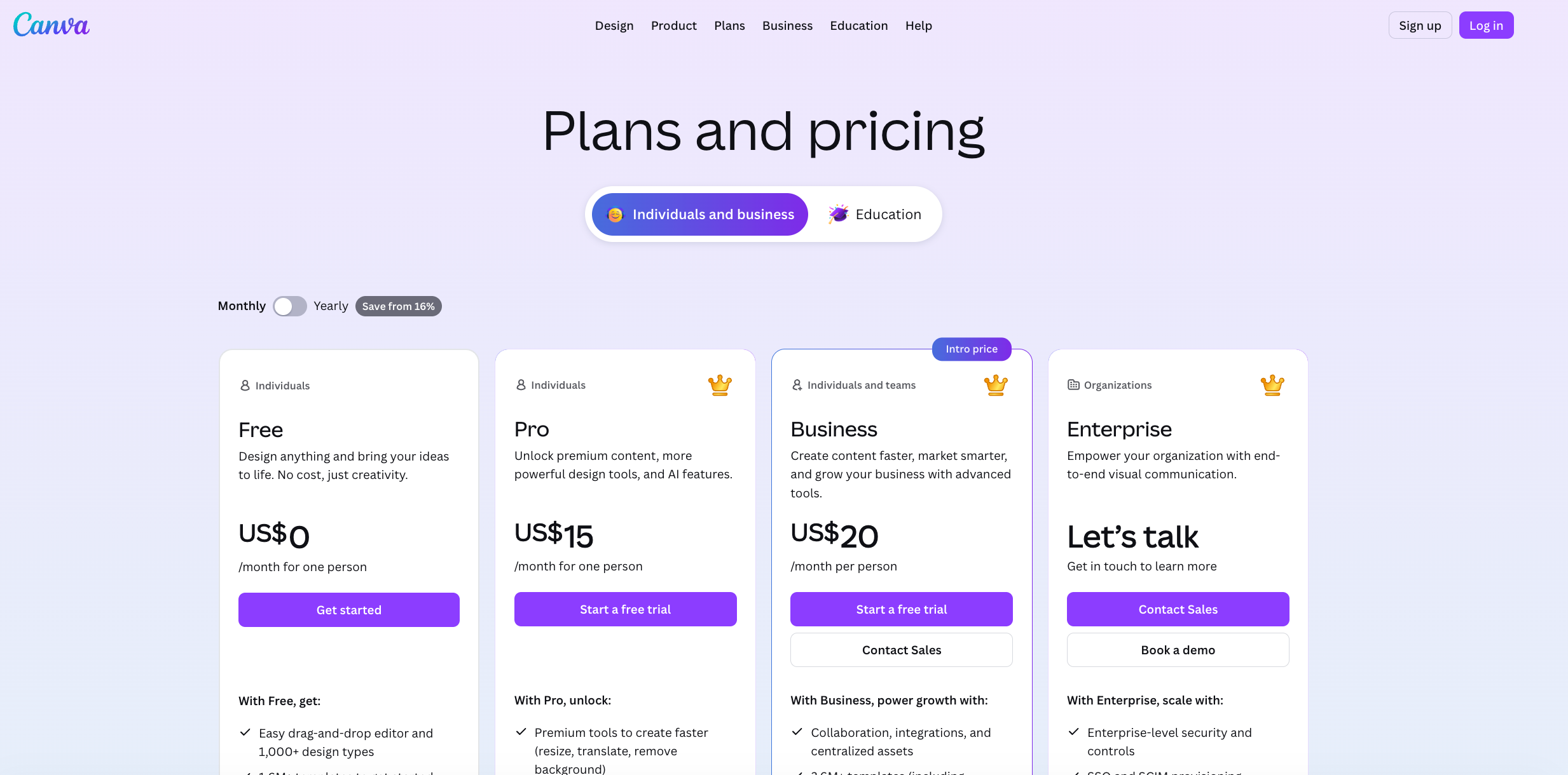
| Software | Features | Pricing | Best For | G2 Rating |
|---|---|---|---|---|
| Visme | Customizable infographic templates, AI generator, interactivity, animations, data widgets, live data, branding, collaboration, analytics, AI writing & image tools | Free; Paid from $12.25/mo | Marketers, educators, non-profits, corporate teams | 4.5/5 (460+) |
| Venngage | AI infographic maker, templates, charts, animations, brand kit, collaboration | Free; Paid from $10/mo | Bloggers, marketers, students | 4.7/5 (120+) |
| Canva | Infographic templates, Magic Studio, visuals, data charts, collaboration | Free; Pro from $15/mo | Creators, bloggers, small businesses | 4.7/5 (6,600+) |
| PicMonkey | Templates, brand kits, animations, photo editing, cloud storage | Free trial; from $7.99/mo | Social media users, bloggers | 4.4/5 (410+) |
| Piktochart | AI infographic generator, charts, collaboration, brand kit | Free; from $14/mo | Marketers, content creators | 4.4/5 (160+) |
| VistaCreate | Animations, brand kit, AI image tools, collaboration | Free; from $10/mo | Marketing teams, educators | 4.5/5 (170+) |
| Snappa | Stock assets, resizing, background removal, charts | Free; from $10/mo | Content creators, educators | 4.6/5 (30+) |
| DesignCap | Smart layouts, icons, data visuals | Free; from $4.99/mo | Beginner marketers, bloggers | 4.4/5 (20+) |
| Easel.ly | Templates, visuals, collaboration | From $4/mo | Students, educators | 4.7/5 (150+) |
| Infogram | AI infographic maker, interactivity, data visuals | Free; from $19/mo | Marketers, entrepreneurs | 4.7/5 (180+) |
| Animaker | AI infographic videos, animations, characters | Free; from $15/mo | Educators, creators | 4.7/5 (1,000+) |
| Genially | Gamification, interactivity, animations | Free; from $10/mo | Educators, designers | 4.6/5 (60+) |
G2 Rating: 4.5/5 (460+ reviews)

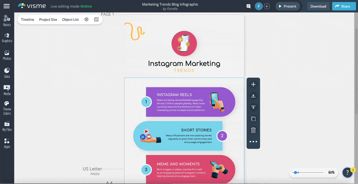
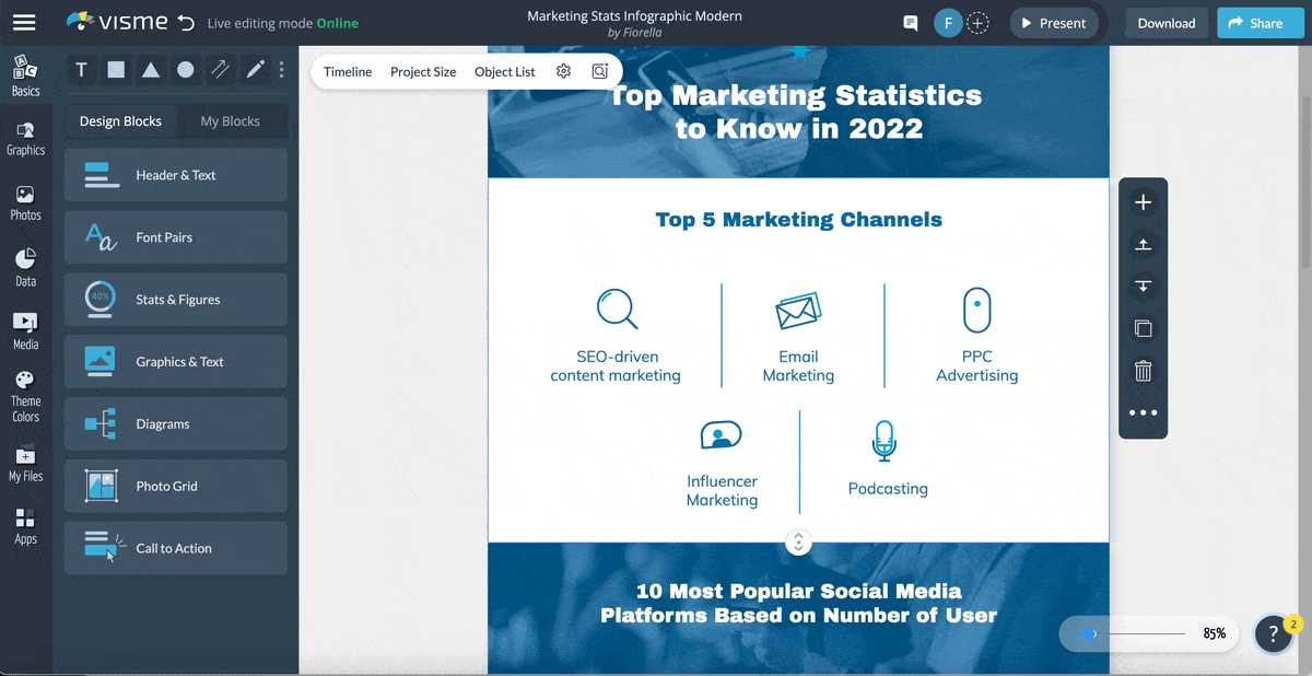
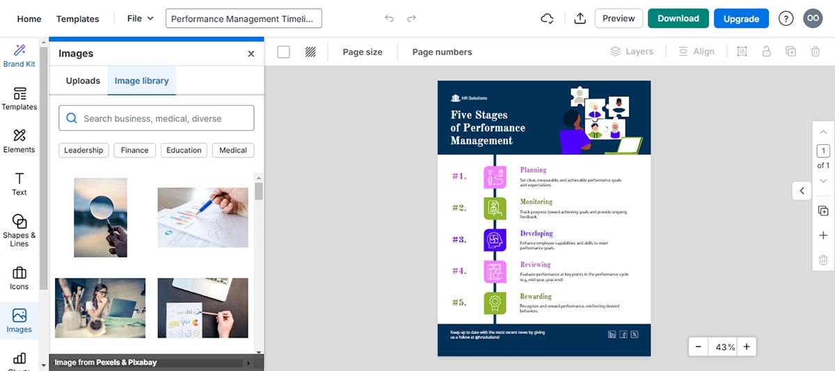
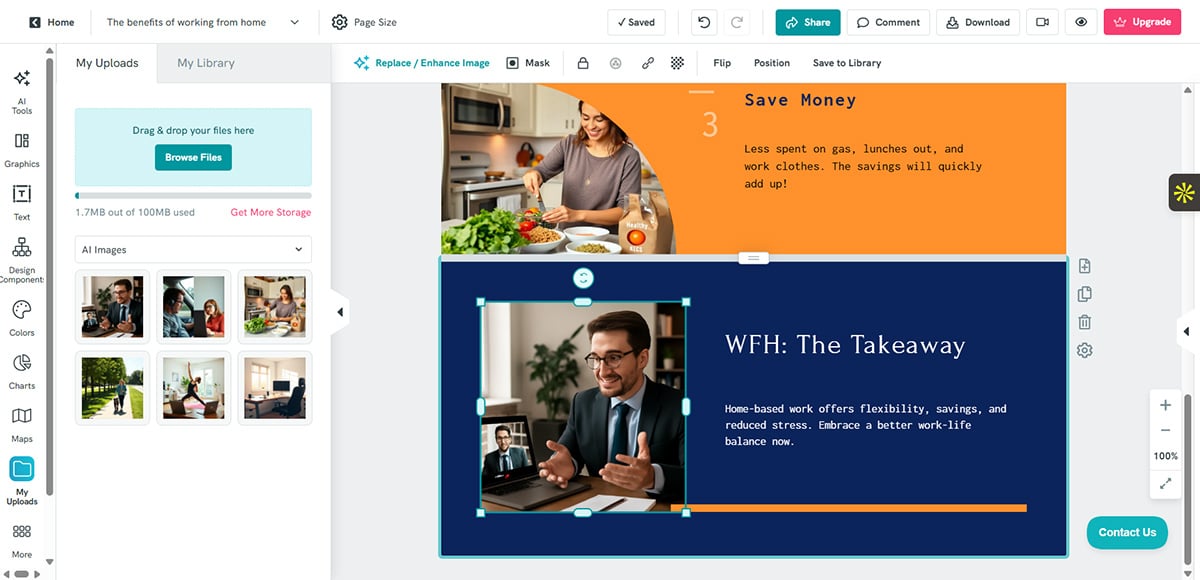
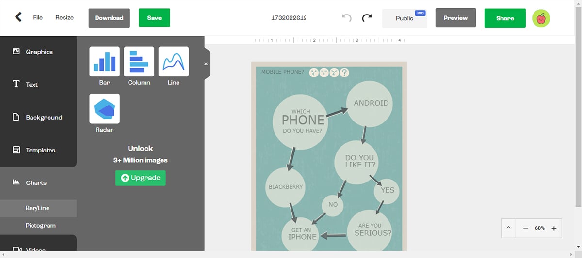
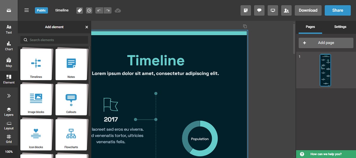
When I started using Visme to create infographics, the biggest thing that stood out for me was how surprisingly simple it was.
The drag-and-drop interface was very intuitive. It only took me about 10 minutes to customize a template once I found the one I liked. Here’s an example of a template I customized.
Not bad for a non-designer, right?
Once you’ve let Visme know what you want to do, you can start on a blank canvas or use a template to jumpstart your infographic.
The infographic templates that are available are plentiful and can be easily searched by categories that include informational, geographic, comparison, list and many others.
From there, you can customize every aspect of your design to your heart's content.
I know the pain of having to move everything over in a design when all I needed was half an inch below an icon. In Visme, customizable content blocks make it easy to edit an infographic section by section without adjusting the entirety of the content. That was a breath of fresh air.
When it comes to interactivity, Visme goes beyond most tools I tested on this list. You can animate text or illustrations, add hover effects, clickable buttons, hotspots, pop-ups and links to make your infographic more engaging. You can even add animated characters from the library to your infographic or create yours from the ground up.
Of the best tools to create infographics on this list, Visme sits at the top because it is a well-rounded visual content creation tool for not just infographics but also presentations templates, reports, white papers, ebooks, videos and more.
Visual assets are Visme's bread and butter. Its drag-and-drop editor has all the visual assets you could ever need to create a memorable infographic. You can find it in the Graphics tab in the left sidebar of the editor.
Choose from millions of free stock photos, videos, shapes, icons, illustrations and animated characters. You can also embed third-party content like YouTube videos or JotForms. All visual assets are customizable to fit your brand colors or theme.
If you’re like me and you love fully animated designs, you’ll find Visme’s animation options golden.
The animated characters have a selection of poses and settings, as well as clothing and skin color options.
Furthermore, Visme goes beyond conventional visual assets with its innovative AI Image Generator. Powered by cutting-edge technology, this feature enables you to generate high-quality visual aids instantly, saving time and effort in your infographic creation process.
With the AI Image Generator, you can transform simple text into stunning visuals, making your information more engaging and visually appealing. Simply input your text, choose from various output styles, and let Visme's AI do the rest.
Whether you need eye-catching backgrounds, attention-grabbing icons, unique illustrations and anything you can imagine, the AI Image Generator will generate it for you, elevating the overall impact of your infographics.
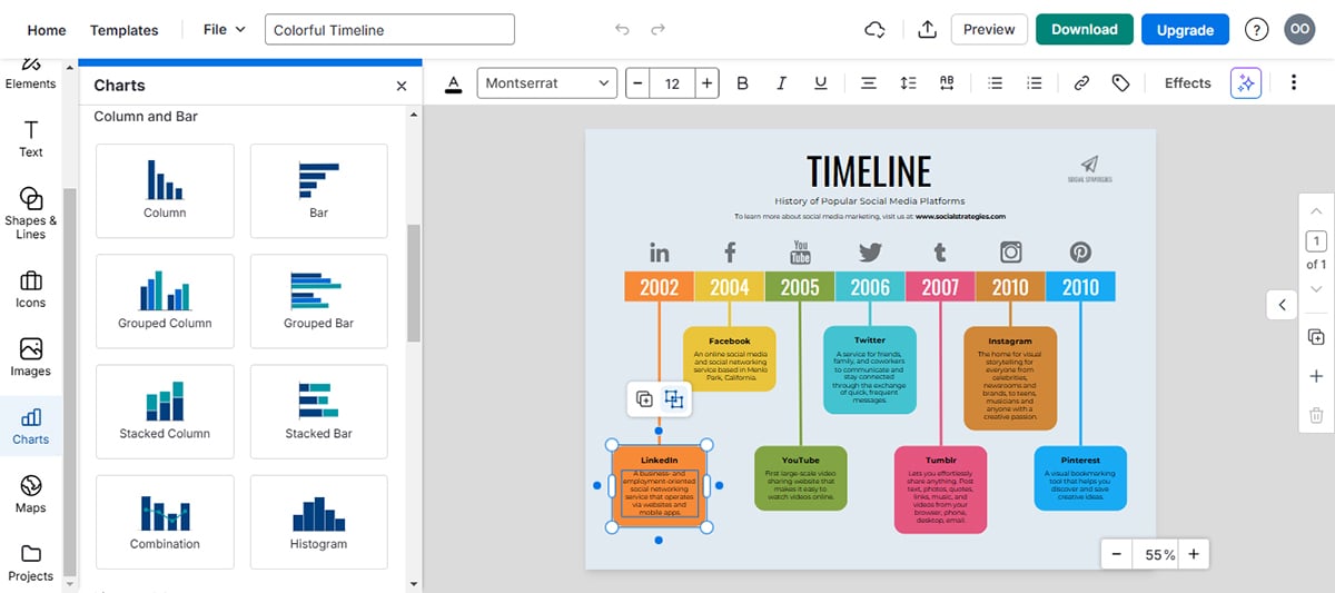
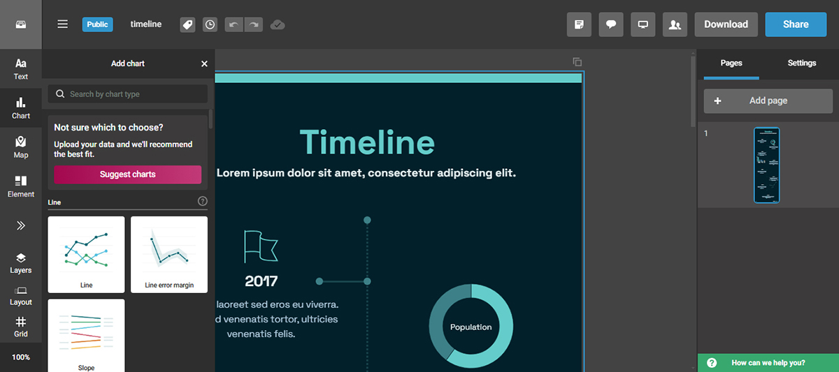
Visme offers a vast selection of data visualization tools for your infographics.
I found Visme’s data visualization tools to be the most robust out of all the tools that I tested.
To make your charts and graphs stand out, Visme offers automatic animation. In the Graph Engine's configuration, you have the option to select one of four animation types and modify it according to your needs.
To make the widgets more dynamic, you can add hover effects that bring up additional information when the visitor clicks on them.
Also, it's very cool that the embedded infographics update to reflect the new figures as you modify the numbers in the data widgets.
Here are some highlights of what you’ll find in the data visualization tool:

Visme offers a robust brand kit feature that lets you store your brand elements for use across all your project, including design infographics.

You can store your color palette, typography, logo and branded templates, and share it with your team so they can create on-brand infographics every single time.
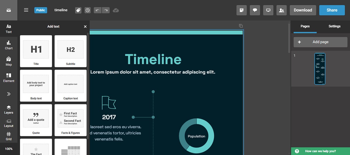
Add text to customize as you wish or start with pre-designed text blocks. Use your fonts by uploading them to a Brand Kit.
Even if you’re facing writer's block, Visme AI Text Writer is right there to help you. With a text prompt, you can generate content ideas for your infographics and create outlines, headlines and draft copy. It can also assist in proofreading and editing your text for grammar, clarity, and conciseness.
Feeling stuck with your writing? Meet our new smart text generator: the Visme AI Text Writer! Simply give it a prompt and watch the magic happen. It helps you brainstorm content ideas for your infographics, craft catchy headlines, and fine-tune your writing for grammar and clarity
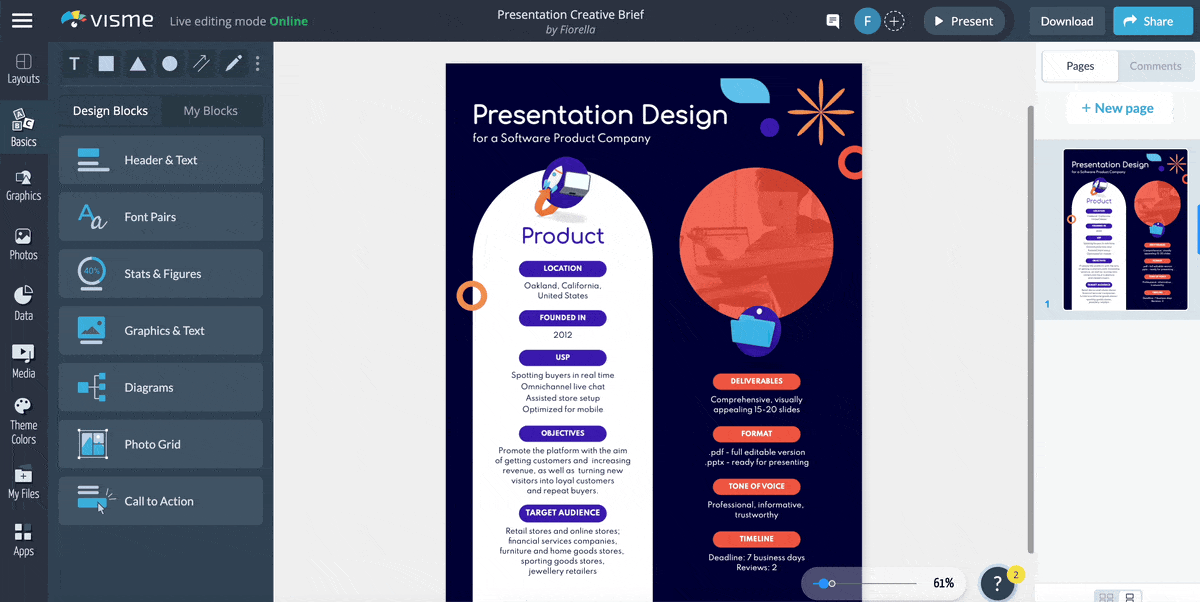
With the content block library, putting content together fast is as easy as cutting and pasting. There are hundreds of blocks to choose from in different styles and for various purposes.
Each infographic content block has a drag bar, as well as a main bar for the entire infographic. These size-adjusting bars help you create infographics as tall or as short as you like, while giving you the ability to manipulate every block in the same way.
When you drag the first block’s length, all the blocks below it move as well, dissolving the need to adjust every element’s position to fit again.
Visme offers a shortcut feature that provides a more convenient way to add elements to your infographics quickly. This feature eliminates the need to navigate through the left sidebar, allowing for a more efficient design experience.
Just type the forward-slash ("/") on your keyboard, and a convenient pop-up menu will appear with everything Visme offers. You will find everything in one place, from icons, illustrations and other graphics to data visualizations, animations and help sections.
Visme offers advanced collaboration features like commenting and annotation tools so you can create infographics and other designs with your team.
Team members can edit designs in real-time and asynchronously, tag each other, leave feedback, resolve comments and much more.
The free accounts on Visme have everything you need to get started with any type of visual content, not just infographics.
The Visme template library offers hundreds of infographic templates, making it one of the best tools for infographics.
You’ve got options for every type of content. From survey results to timelines and everything in between. You can search through them easily using the category list.
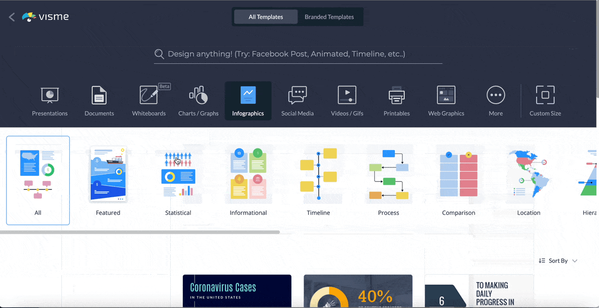
This makes it easier to create DIY infographics that look like they've been created by a professional designer. Plus, it takes minutes, not hours, to customize an infographic template.
The range of templates in our library is always growing, and our graphic designers are constantly creating new ones for you.
Visme is the best tool for infographics for pretty much everyone, from content marketing specialists to history teachers.
With Visme, you can create all types of visual designs; that’s why it’s perfect for small, medium and large businesses, nonprofits, classrooms, and even freelance graphic designers.

G2 Rating: 4.7/5 (120+ reviews)

Infographics are the main affair at Venngage. That’s how they got started and it’s still their most
notorious offer.
While Venngage’s onboarding process looks quite long, I appreciate the fact that they used the information to curate personalized templates for me.
Although, I didn't find exactly what I needed from the templates curated. Once I used the search functionality, I could filter the templates library and I found a template that suited me.
That said, the sidebar and top toolbar aren’t very intuitive and it took a lot of digging around to find some features like interactivity tools.
Venngage’s Accessibility tool stood out to me though. The tool provided impressive real-time feedback on color contrast, font size, alt text, headings and more. It ensures that your designs are accessible to everyone, including those with visual impairments.
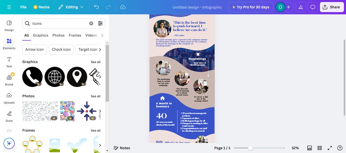
As one of the best software for infographics, Venngage has a large selection of icons and illustrators organized in searchable categories.
I spotted some fun flat, outline, and colorful icons in every category!
Unfortunately, the colors of the illustrations can’t be changed and must be used as-is. The icons do have customization.
There’s also a small selection of background gradients and patterns to apply to an infographic’s main background area.
I noticed that the colors of the illustrations and multicolor icons can’t be changed and must be used as-is. That's quite restrictive in my opinion. Other options like Visme allow you to customize most multicolor icons and illustrations to suit your needs.
There is an additional sidebar where you can search for stock images. You’ll find photos from Pixabay and Pexels in this library.
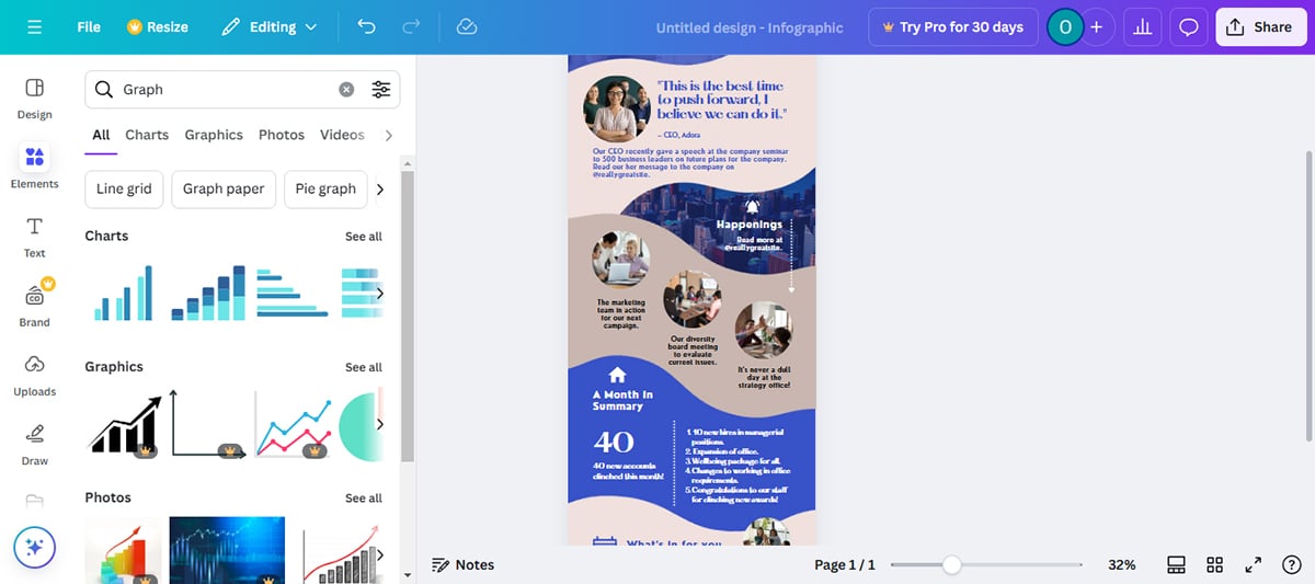
Venngage has 35 different types of data widgets, from line graphs to pie charts, bar graphs to radials and more. This is quite small compared to Visme that has over 60 different charts, graphs and data widgets.
Venngage allows you to import data from spreadsheets and other sources to your charts and graphs.
If you’re subscribed to Venngage Business, you can apply brand colors and logo automatically to any template by setting up your brand kit.
It's quite simple to set this up, I simply inputed my website’s URL and it fetched my brand assets.
The AI-Infographic generator allows users to auto-create their desired infographics with prompts. I couldn’t use this tool during my test. It was clunky and kept redirecting me to sign up or log in again every time I tried.
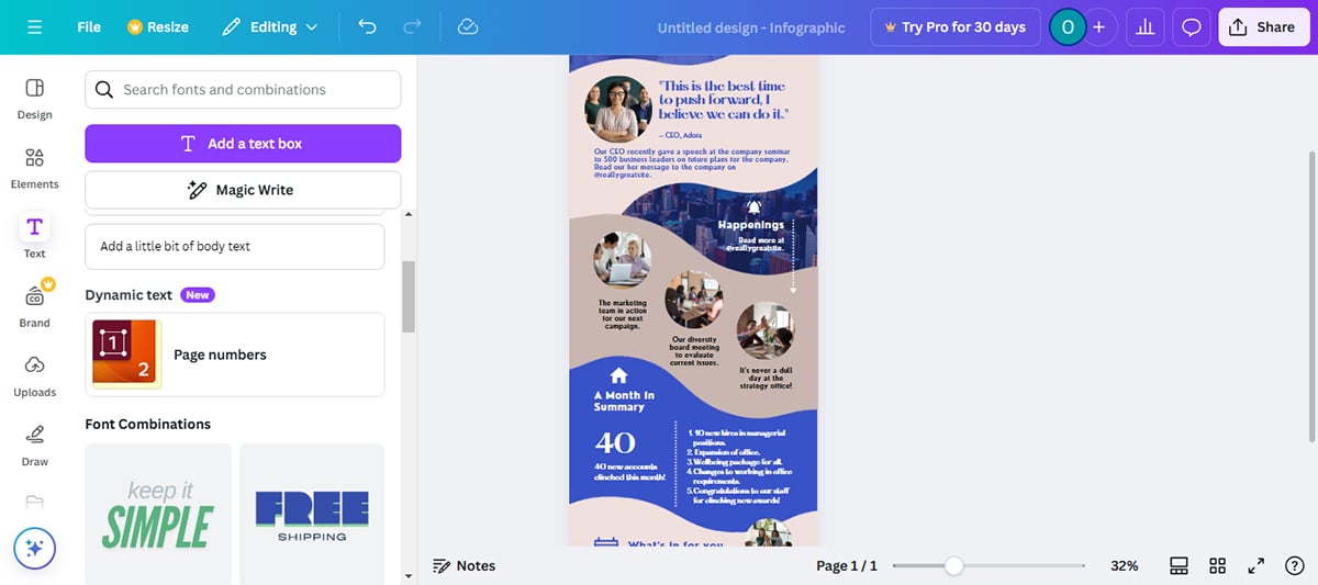
Apart from the usual text options, Venngage offers pre-designed text blocks in different styles. These blocks are designed to help you quickly add stylized text without needing to create custom designs.
However, Visme offers a broader range of pre-designed text blocks, including animated text options.
With a business subscription, you can work on projects as a team. Users can share designs, collaborate on designs in real time, give or receive feedback and manage user access to shared designs.
Venngage's team collaboration tool doesn't include a feature for managing team workflows like you would find in Visme. So, if you would like to assign tasks to different team members and track progress toward completion, Visme might be a better option.
Venngage does not provide this option. You can opt for Visme if you want to measure views, visits and time spent on your designs.
Venngage offers various infographic options such as PNGs, PDFs and interactive PDFs (with clickable hyperlinks). However, if you intend to upload your infographic to your learning management system, you won’t find suitable options like SCORM and XAPI on Venngage. You’ll find those options on Visme, though.
This is one of Venngage’s stand-out features and I find it particularly interesting. You can use the color-blind simulator to ensure that your designs are accessible to color-blind users.
The tool offers filters for several types of color blindness, including Protanopia (difficulty seeing reds), Deuteranopia (difficulty seeing greens), Tritanopia (difficulty seeing blues and yellows), Achromatopsia (complete color blindness), Cataracts (cloudy vision) or Low vision.
By viewing your design through these filters, you can identify areas that might be problematic for color-blind users and make necessary adjustments to improve accessibility.

Venngage has a free plan with limited resources so anyone can try out the tool, see how they like it, and discover all the possibilities of a Premium or Business plan.
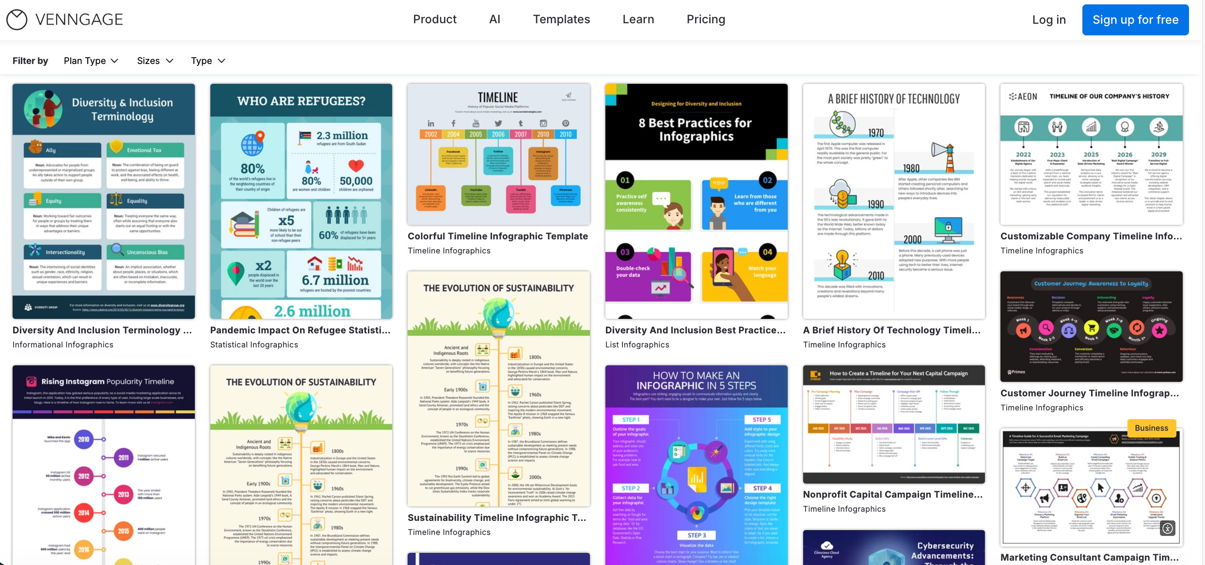
Venngage has lots of template varieties and new ones are introduced all the time. Not all templates are vertical and there are also horizontal designs. You can use the category menu to find a template in one of many categories.
Although I would love to see a wider variety of customization options in the templates, the ones available are solid foundations to build upon. They can really spark your creativity and inspire you to create something unique!
Venngage is one of the best infographic software for anyone needing an infographic template to customize without much need to customize illustrations or the size of the design’s content.
Infographics in the Venngage library are good for marketers, bloggers, students, small business owners and entrepreneurs.
| Aspect | Venngage | Visme |
| Ease of Use | Drag-and-drop, intuitive interface | Drag-and-drop editor, intuitive interface, AI-powered tools |
| Analytics | No-built in analytics | Built-in analytics |
| Collaboration | Real-time collaboration with no workflow feature | Real-time collaboration with workflow feature |
| Export options | PDF, PNG and JPG | PNG, JPG, PDF, SCORM and xAPI |
| Best for | Bloggers, Marketers, Students and Entrepreneurs | Marketers, entrepreneurs, educators, corporate teams and individuals in general. |
G2 Rating: 4.7/5 (6,600+ reviews)

Canva is an all-in-one content creation tool, considered by many to be one of the best tools to make infographics available out there.
What immediately caught my attention about Cava is its accessibility. There’s no need to sign up until you’ve created your first design and you’re ready to download it. You can dive right in and start creating your infographics.
There were so many infographic templates to choose from, each tailored for different purposes such as education, marketing and more. Canva’s free templates actually fall short in quality for me. So if you want to find great templates, you’ll need to subscribe to a premium plan.
That said, I love how the drag-and-drop interface made it incredibly easy to add, adjust and resize elements.
Canva has a wide variety of visual assets, from simple icons to colorful illustrations and animated stickers—so many that it can be overwhelming to some people.
Some icons are illustrations that have editable color palettes, while others are not customizable. It took a while for me to dig through for the right customizable icons that suited me.
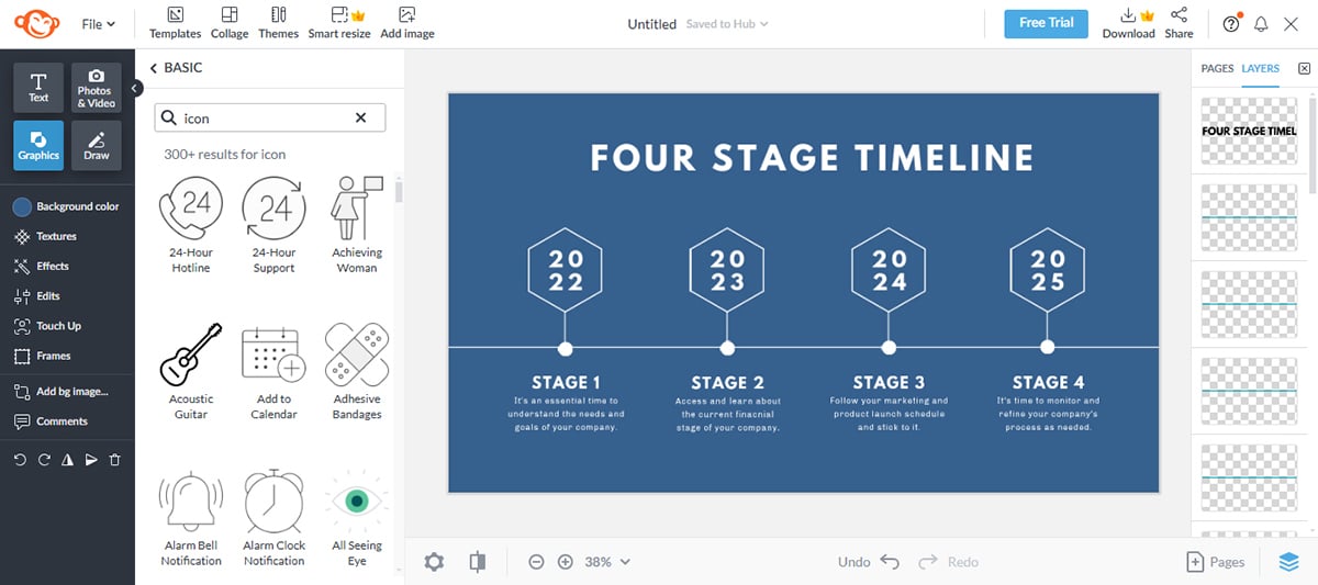
Under the “Elements” tab, you can find about 20 different types of data visualization tools ranging from bar charts, line graphs and pie charts to pictograms. However, I found them relatively limited in comparison to Venngage and Visme.
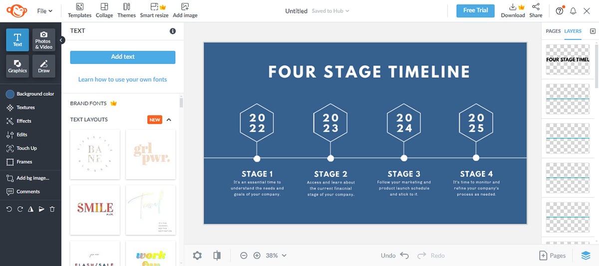
The text features in Canva have both the standard editing choices plus plenty of pre-designed text compositions. These are easy to edit and customize.
A stand-out feature in Canva is their new real-time collaboration tool. Team members can work on a project together and see what the other person is doing as they do it.
When you choose to view a template, be it an infographic or anything else, there’s a set of design details. These include the colors and fonts used for that template.
I wasn't able to try out this tool because it requires a Pro version but I read about it on their site and found it quite interesting. It lets you resize your infographic into a perfect fit for social media sites like Instagram, Facebook, X (Twitter) and more.
Additionally, it lets you transform your design into a variety of document formats, including summaries, emails, poetry and blog posts.
Canva’s branding tool helps you to maintain consistency across all your infographics. The tool stores your brand’s fonts, colors and logos and automatically applies it on your designs.
You can download your infographic in various formats, such as PNG, JPG, and PDF, or share it directly on social media or via a link. However, Canva doesn’t offer rich media (HTML5) export options, which is one of the options you’ll find on Visme.
Canva has the reputation of being the best free graphic design platform. You can indeed get a lot done on the free plan, but there are some limitations.
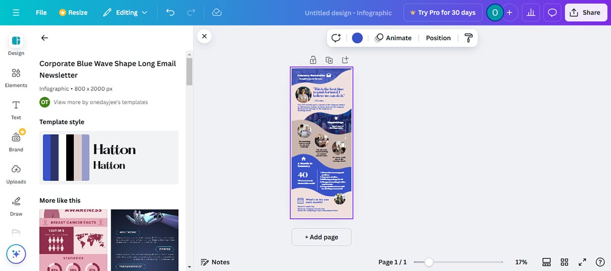
The infographic templates are available in a standard size of 800 x 2000 pixels. You can click on the resize option and adjust as you like to change the design’s size. You can also use Visme's AI Resize tool to do it for you!
The majority of templates are perfect for blogs in informational-style designs like lists and timelines. There are a few data visualization templates but not too many.
Canva is one of the best free tools to create infographics, ideal for individual users such as content creators, bloggers, small business owners, virtual assistants and social media managers.
Likewise, it’s also a good tool for small business teams and companies that create a lot of visual content for digital marketing.
| Aspect | Canva | Visme |
| Ease of Use | Drag-and-drop, intuitive interface, Magic Design tool | Drag-and-drop, intuitive interface, AI Designer tool |
| Collaboration | Real-time collaboration | Real-time collaboration |
| Analytics | Built-in analytics | Built in analytics |
| Data Visualization | Limited data visualizations | Advanced charts, graphs and data imports |
| Export Options | PDF, JPG, SVG, PPTX, DOCX, PDF Standard and Print. Lacks HTML5 export option. | PDF, JPG, SVG, PPTX, DOCX, PDF Standard, PDF Print and HTML5 |
G2 Rating: 4.4/5 (410+ reviews)

PicMonkey is an accessible design tool with features that streamline the process of creating captivating infographics. Popular for its simplicity, it's one of the best software for infographics for beginners jumping into infographic design.
However, where it really shines is in its photo editing features. You can add a personal touch to your photos with its many drawing tools, filters, effects and erasers. If you need to edit or add effects to the visuals in your infographics, it’s a great option.
It's also intriguing that I could view the color hex on any element simply by hovering over it. As far as element color blending goes, it's a neat function.
That said, I got stuck so many times because it was quite hard to find my way around the editor.
PicMonkey offers a rich selection of high-quality vector graphics, images, icons and backgrounds. Additionally, you can personalize elements by altering their color and size. However, it's important to filter carefully to ensure elements align with your brand.
Visme has an advantage over PicMonkey when it comes to the variety of visual assets and customization options. You’ll find a broader selection of icons, illustrations and graphics, all of which can be easily customized to suit your needs.
PicMonkey offers basic charting and graph capabilities to handle simple data visualization. However, Visme and many other tools might provide more versatility when it comes to in-depth data representation.

Text editing in PicMonkey is straightforward yet deeply customizable. You can select from various fonts or upload your own, adjusting the text size, color, spacing and overlaying text on images.
Even more impressive is its ability to have a picture appear through the letters of your text.
PicMonkey also offers pre-designed text boxes, known as text layouts. However, unlike Visme, PicMonkey does not provide animated pre-designed text blocks.
PicMonkey stands out with its robust photo-editing features. Often considered an affordable alternative to Photoshop, you can refine your images with effects, touch-ups and creative filters.
PicMonkey also offers cloud storage, ensuring your creations are safe. This feature lets you easily retrieve and edit your infographics at any time, a feature particularly useful for iterative design processes.
Besides just saving your logo, fonts and color palette, PicMonkey allows you to add branded templates and graphics to your kit. I couldn't test this feature out though, because it’s only available to Pro and business subscribers.
With PicMonkey's Shared Spaces, you and your team can engage in real-time collaboration. Everyone can view, comment or edit the same image at the same time and your changes are instantly saved.
However, it doesn't include a workflow feature like you see in alternatives like Visme.
PicMonkey offers three tiers of pricing:
PicMonkey offers an impressive range of infographic templates designed to be highly customizable and versatile. The templates in PicMonkey often feature a clean, chic aesthetic and promote simple yet effective layouts. However, they have only one separate infographic category: Timeline infographic.
Visme, on the other hand, offers well over 500 different infographic templates in the following categories: Anatomical, Art, Bar Graphs, Business, Comparison, Concept Maps, Education, Flowcharts, Science, Sport, Timelines, Venn Diagrams and more.
PicMonkey is ideal for social media enthusiasts, bloggers and small business owners looking to create appealing visuals for marketing or instructional purposes.
| Aspects | PicMonkey | Visme |
| Ease of Use | Simple, modern interface | Drag-and-drop intuitive interface |
| Collaboration | Real-time collaboration | Real-time collaboration |
| Analytics | No built in analytics | Built-in analytics |
| Data Visualization | Limited data visualization tools | Advanced and wide range of data visualization tools |
| Best for | Social media enthusiasts, bloggers and small-business owners | Marketers, small and enterprise businesses, educators, non-profits and individuals |
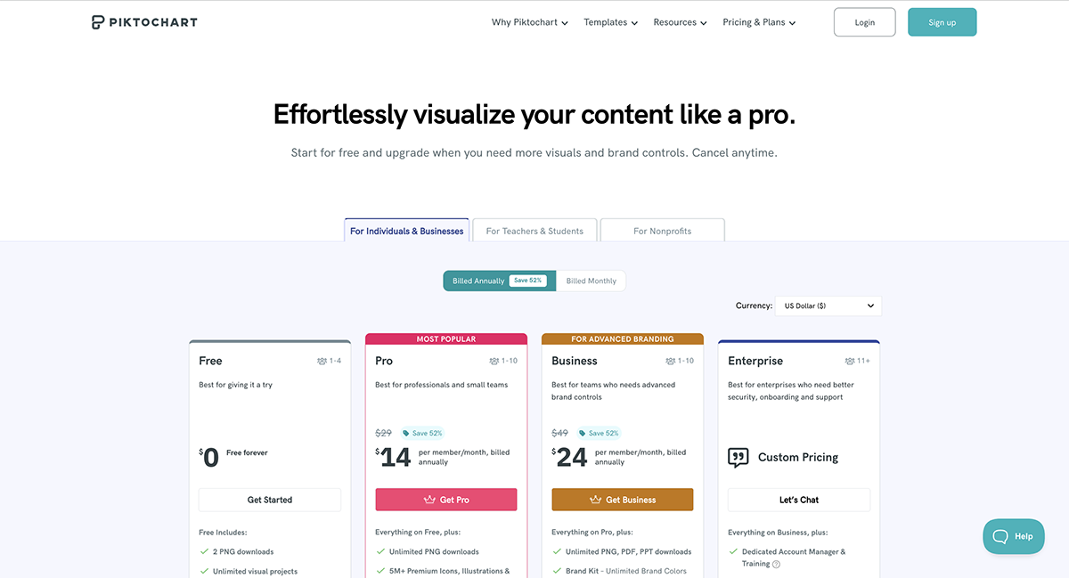
G2 Rating: 4.4/5 (160+ reviews)

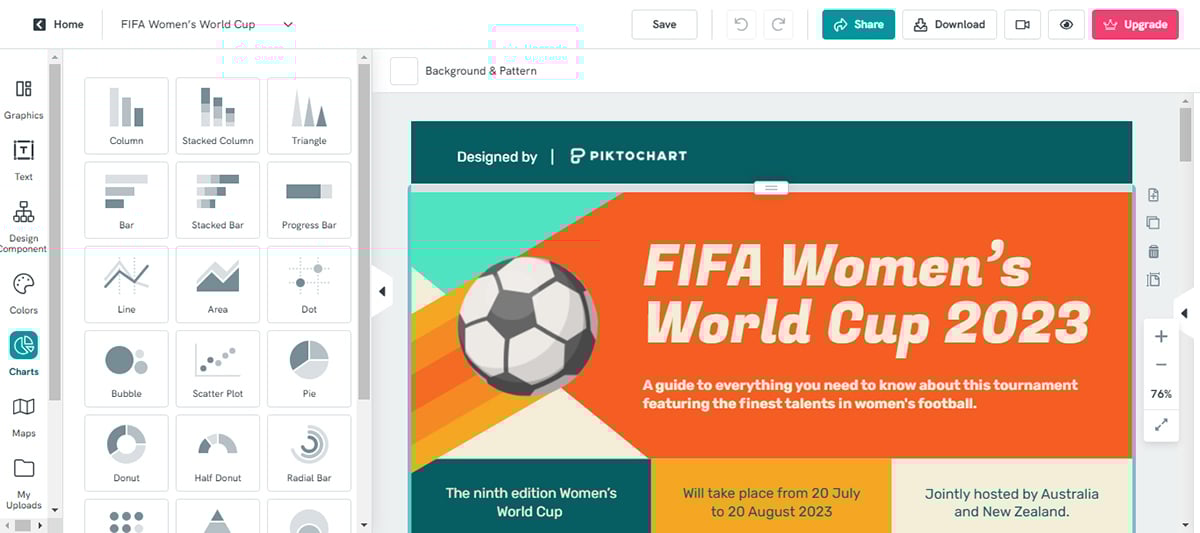
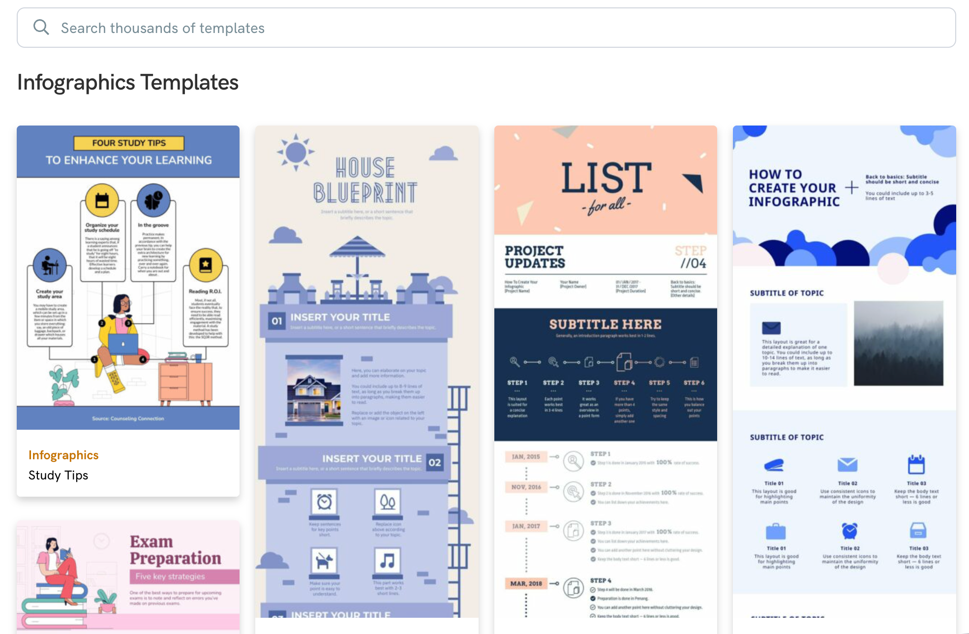
Piktochart is another software to make infographics, geared mostly towards infographic creation and design.
Unlike most other infographic tools on this list, Piktochart is more similar to Visme in that it offers solutions for businesses instead of just bloggers and content creators.
I love how I could use features like grid lines and smart alignments to make layouts professionally-looking. But what really caught my eye is the “Download as blocks” feature. You can use it to break down massive infographics into more manageable micro-graphics that are perfect for sharing on social media or tweeting.
The biggest drawback I discovered about Piktochart was that it lacked a dedicated desktop and mobile app. If you’re like me and you love working on the go, you’ll find it restrictive.
This infographic tool has a considerable selection of icons and illustrations to choose from.
There is a large collection of free graphics available for you to use in your projects. It is easy to add graphics, logos and other pictures. Using the toolbox, you can quickly add, move and remove blocks.
However, I discovered that some of the graphics are color customizable while some aren’t. So you’ll need to take your time to find the right graphic if customization is a big deal to you. Visme has an upper hand here because its wide range of visual assets are easily customizable.
Piktochart has around 15 charts to choose from plus maps. The functionality is similar to Visme in that you can either add data manually or import from a CSV or Google Sheet.
Most charts in Piktochart are standard, but there are some nice radial charts and hierarchy charts available in different shape styles.
Much like the other tools on this list, text is available in simple form and in the form of pre-designed text blocks in many different styles. Most of these text blocks are customizable although you won’t be able to animate them like you would in Visme.
Piktochart also has customizable content blocks. When you’re adjusting elements in one content block, a mini menu helps you personalize the design’s background, size and position.
When it comes to Visme vs. Piktochart, this app also offers a library of design components for lists, timelines and comparisons.
Piktochart offers multiple export options, including PNG and PDF. However, you won’t find options for HTML5, SCORM or xAPI which are particularly useful when storing your infographics in a learning management system. Visme, on the other hand, includes these options.
Like Visme, Piktochart also provides an AI-powered infographic generator. To use it, simply click Pikto AI on the homepage, which takes you to the AI visual creation tool. Next, select the infographic icon from the top panel. Enter your topic and provide details about the context, tone, and content. After that, choose a template, and the AI will generate your infographic.
I tested the tool using a prompt, and the results were impressive. The AI produced a well-structured infographic with solid copy and polished visuals.
You can quickly create custom images for your infographics when stock visuals don’t fit. Just type in a prompt, and the AI will generate an image for you. I tested this feature with a prompt, but while the results looked good, they felt a bit too generic.
Pikto AI tools also comes with AI image enhancer with tools such as background removal, upscaling, restoring and text removal.
The free plan in Piktochart is perfect for trying out the tool and seeing if it’s the right one for you.
 The most noticeable feature in Piktochart is that their infographics have a lot more space than others. They almost look like websites. The template design is balanced and easy to edit.
To search for an infographic, you have to click on the search bar, and then a drop-down menu appears. There’s a long list of topics and styles to choose from.
This infographic tool is great for marketers, entrepreneurs, team leaders and other content creators who aren’t necessarily bloggers.
There are also many infographic templates with data visualization features in various styles. You’ll see Piktochart more inside websites than on Pinterest boards.
| Aspects | PiktoChart | Visme |
| Ease of Use | Simple and intuitive interface | Drag-and-drop intuitive interface, AI designer |
| Export Options | PNG, JPG and PDF | PNG, JPG, PDF, HTML5, SCORM and xAPI |
| Collaboration | Real-time collaboration with no workflow feature | Real-time collaboration with workflow feature |
| Analytics | Lacks built-in analytics | Built-in analytics |
| Focus | Infographics with data visualization features | Infographics with a wide range of business use case |
G2 Rating: 4.5/5 (170+ reviews)

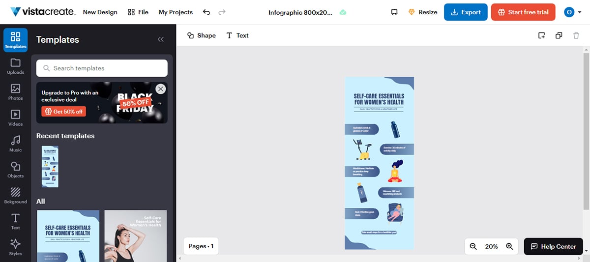
VistaCreate is an intuitive, user-friendly design platform for anyone looking to create professional-grade infographics with little effort.
The first thing I loved about VistaCreate was its clean and simple UI, which made it easy to find what I needed. It has a sidebar where you can select specific design elements like icons, illustrations, animations, visuals and more. You’ll also find the top menu where you can customize design elements.
That said, VistaCreate’s selection of infographic templates are vibrant and beginner-friendly, but it lacks the depth for complex infographic designs. For instance, if you need to add interactive charts where viewers can hover, click or engage with data, VistaCreate doesn’t offer that option.
With a rich library of icons, illustrations, images and other graphic assets, VistaCreate ensures you'll find the correct elements to match any design preference or aesthetic you have in mind. Vector-based icons can be resized, recolored and adjusted without losing quality. But there are a lot of animated stickers that can't be customized.
VistaCreate provides a variety of charts and graphs, empowering users to effectively present their data in infographics. However, data visualization isn’t VistaCreate’s strong suit. It offers limited options in terms of quantity and interactivity compared to tools like Visme.
VistaCreate offers 13,000+ animated design objects to enhance your visuals. You can add animated effects to text blocks or images in your infographics.
You can also tweak pre-animated elements by resizing or changing their position, but the animations themselves are usually fixed in style and motion.
This is a bit restrictive when compared to Visme which allows you to customize the style, motion and every other element of your animations.
VistaCreate’s brand kit allows you to upload your brand’s logos, fonts and color palettes. This ensures that all your designs are aligned with your brand identity. The brand kit is quite easy to set up. Simply input your website’s URL and you're good to go.
You can work simultaneously with team members on your infographics with the pro version. You can invite up to 10 team members at once to collaborate on projects.
However, the collaboration feature is basic compared to Visme where teams can access workflow tools to assign tasks, track deadlines and approve designs.
The resize tool allows you to adjust your image size or even the whole infographic. It’s a great way to tailor your images to Facebook and other social media platforms. You can also select from preset formats or enter custom dimensions in pixels, inches, or centimeters.
While VistaCreate does not offer an AI infographic generator, it has an AI feature for creating images. So you can easily create visuals from text prompts, which you can then incorporate into your infographic designs.
I wasn’t able to test this feature because, unlike other tools on this list that offer free trials without requiring payment details, VistaCreate’s free trial is locked behind a credit card requirement.
Here’s how the interface looked like and from the tutorials, it was simple to use like any other AI-image generator.
VistaCreate's free plan lets you use thousands of templates and design objects with access to basic photo editing tools.
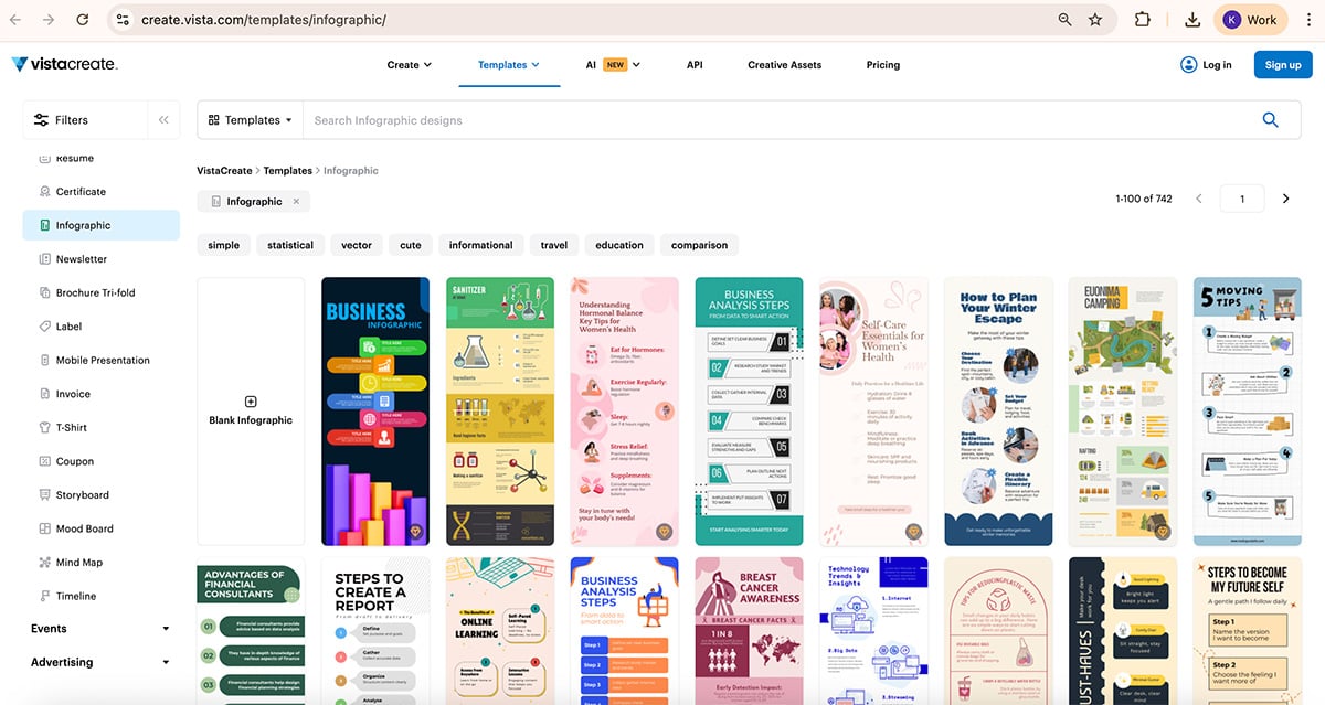
VistaCreate's template library is diverse and all-encompassing. They provide templates ideal for multiple applications ranging from marketing to education and beyond. These templates are beautifully designed and intuitively built with placeholders for text, images and data elements.
VistaCreate serves a wide range of users, such as marketing teams, small businesses, freelance designers and educators.
| Aspects | VistaCreate | Visme |
| Ease of Use | User-friendly interface | Intuitive, drag-and-drop interface, AI designer |
| Data Visualization | Wide range of charts and graphs. Does not support data imports | Extensive range charts and graphs. Supports data imports. |
| Customization of Animations | Limited animations customization options | Extensive animations customization options |
| Collaboration | Real-time team collaboration | Real-time team collaboration |
| Analytics | Lacks Analytic feature | Built-in analytics feature |

G2 Rating: 4.6/6 (30+ reviews)
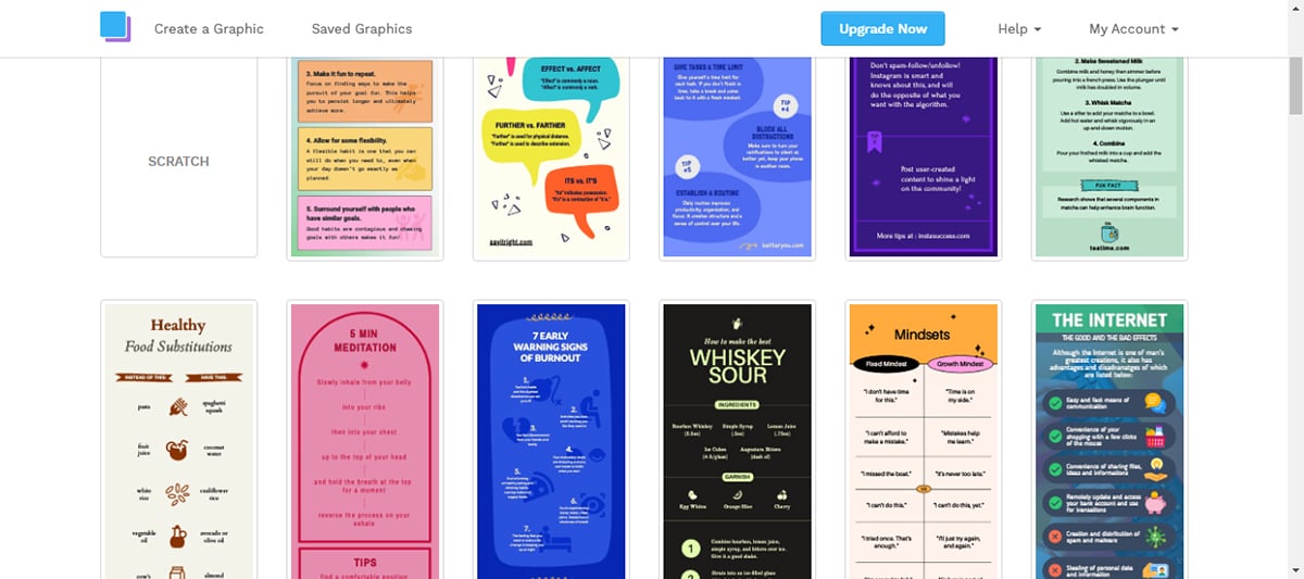
Snappa has a more fun and colorful approach to their designs.
They’re also mostly a social media graphics tool but they do have some infographics available. Their infographics are generally simple, more often in an informational or list style.
This interface is extremely light; it doesn't have a ton of gradients or make you feel overwhelmed. Furthermore, the layout of the templates and elements is clean and uncluttered, allowing you to swiftly select whatever catches your eye.
One notable downside of Snappa is the absence of a dedicated desktop or mobile app. This means that users are limited to accessing the design tool solely through the website, which can feel a bit inconvenient.
I also find Snappa quite limited compared to many alternatives on this list. For instance, it doesn’t have data visualization tools nor support interactivity. The text options are also very limited.
Snappa wouldn’t be the best fit if you're someone who is really big on customizing your infographics to your heart's content.
Along with the regular shapes and some simple icons, Snappa also offers vector elements.
These design elements can be resized to any dimension for creating atmosphere and composition in an infographic. The shapes range from blobs to sketch lines. The graphics library is stellar but still doesn't match the depth of platforms like Visme and Canva.
There aren’t any tools for creating charts, graphs or other forms of data visualization tools in Snappa. This is a major downside especially if you’re looking to create data-rich infographics.
Text options are limited. There are no pre-designed text blocks like you would find in Visme or Canva.
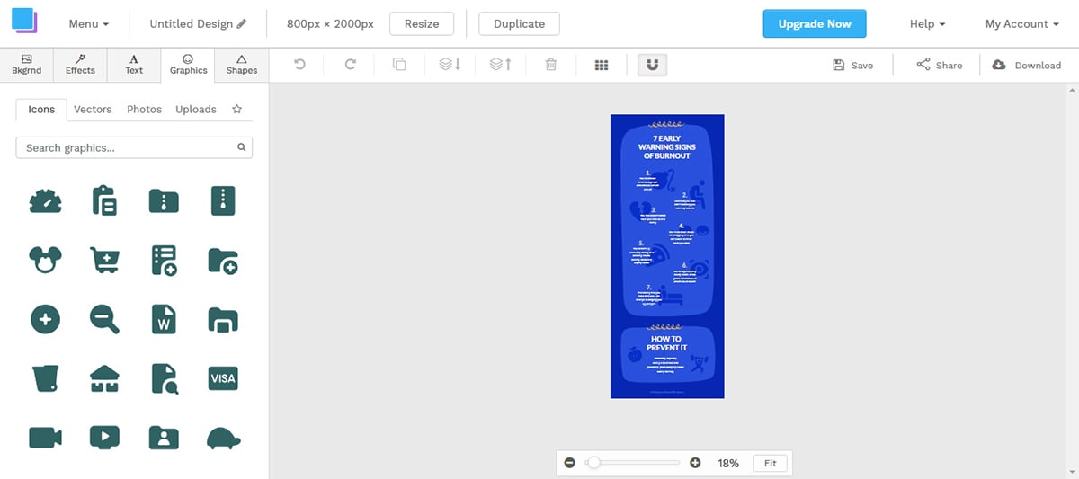
Snappa has a background remover if you need to add cutout images to your infographics.
When it comes to resizing visuals or infographics, Snappa does a great job. After selecting Instagram or Pinterest from the drop-down menu, the Resize button will resize and reposition the elements neatly, minimizing the need for manual editing.
The export options are limited to standard image formats such as web-optimized JPG, high-res PNG, or retina PNG. It doesn't support export in PDF, SCORM or xAPI as you would find in Visme.
To easily share infographics on social media, Snappa offers an integration with Buffer, making it easier to share infographics directly to Pinterest.
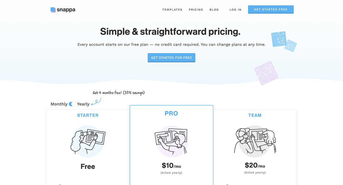
The free version of Snappa gives you access to all the templates and design elements. But then you have a limit on how many designs you can download per month.
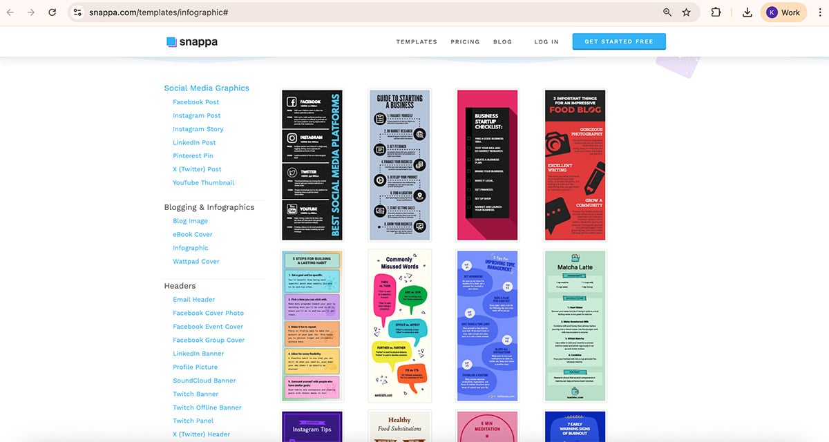
The infographic templates in Snappa are very colorful. Many of the templates are lists and the color schemes are cheerful and attractive for a younger audience.
A huge plus is that all of their assets and templates are accessible regardless of your plan. However, it lacks advanced templates for professional and more detailed infographic designs.
Snappa is perfect for bloggers and educators. This infographic tool is also useful for social media managers and content creators.
| Aspects | Snappa | Visme |
| Ease of Use | Simple, easy-to-use interface | Intuitive drag-and-drop interface |
| Visual assets | Rich library of visual assets | Extensive library of visual assets |
| Collaboration | Does not support team collaboration | Supports real-time team collaboration |
| Data Visualization | Lacks data visualization tools | Wide range of data visualization tools |
| Export Options | PNG, high-res PNG, retina PNG | JPG, PNG, HTML5, SCORM, xAPI |

G2 Rating: 4.4/5 (20+ reviews)
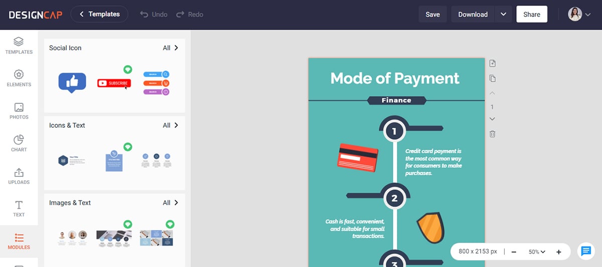
DesignCap is an easy-to-use tool that empowers users to create captivating infographics and other visual assets without design expertise. The tool's simplicity, paired with its extensive range of customizable elements, makes for a smooth design experience.
One feature that truly fascinated me is the Modules! This function allows you to create your own template if you're not satisfied with the ones that are provided.
You can choose from distinct pre-arranged groups of design elements, such as image+text, icons+text, timelines, options, steps, shapes, and statistics, then personalize them as you like.
A major drawback of DesignCap is that it’s entirely web-based and lacks a mobile app for on-the-go designs. In addition, it doesn’t support interactivity or animations, so if you’re looking to create dynamic infographics, it might not be the best fit.
DesignCap offers a comprehensive library of images, icons, and other graphical elements, making it easy to find the perfect assets for your design needs. Customize these elements by adjusting color and size to achieve the desired look. However, the visual assets in DesignCap can't compare to the larger libraries in tools like Visme or Canva.
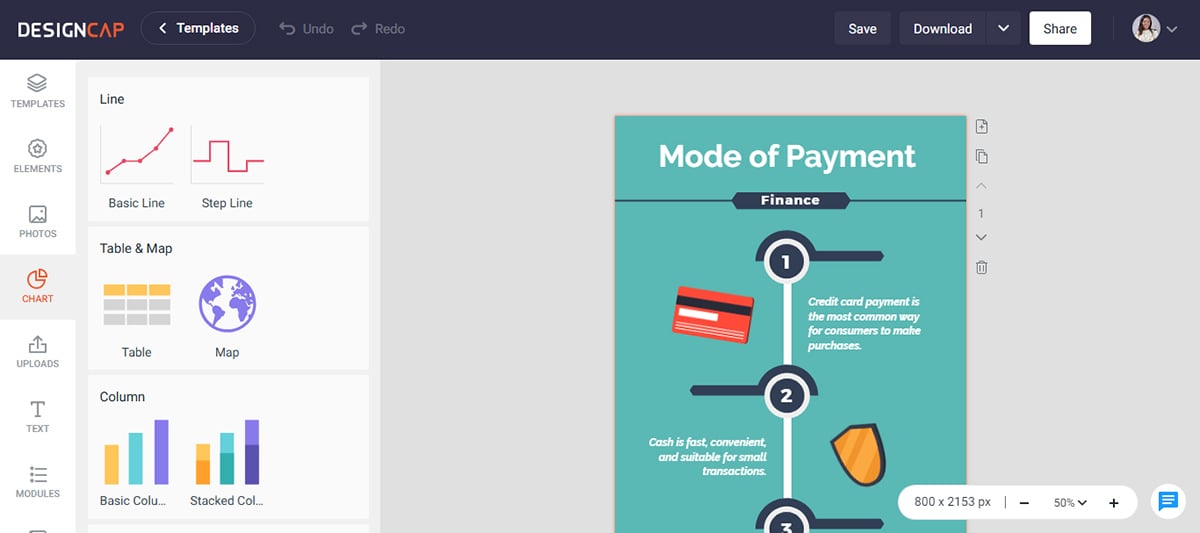
With DesignCap's chart and graph functionality, you can create simple data visualizations for your infographics. However, you may want to consider other specialized tools like Visme for more advanced data representation. For instance, DesignCap does not support interactive charts and you can't import data directly from Excel or CSV files to your charts.
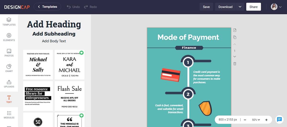
DesignCap's text editor enables users to format and customize text easily. Select from various font types, sizes and colors to create informative yet visually appealing infographics. It also offers pre-designed text blocks for creating attractive, well-aligned text elements in your designs.
DesignCap is designed for users without prior design expertise and features a shallow learning curve, making it accessible for beginners.
All outputs from DesignCap are static. You cannot add animations, clickable elements or media to your infographic. This limits its versatility compared to options like Visme.
The export options are limited to JPG and PNG. It doesn't support advanced file types like interactive PDFs, SCORM or xAPI which are available in Visme.
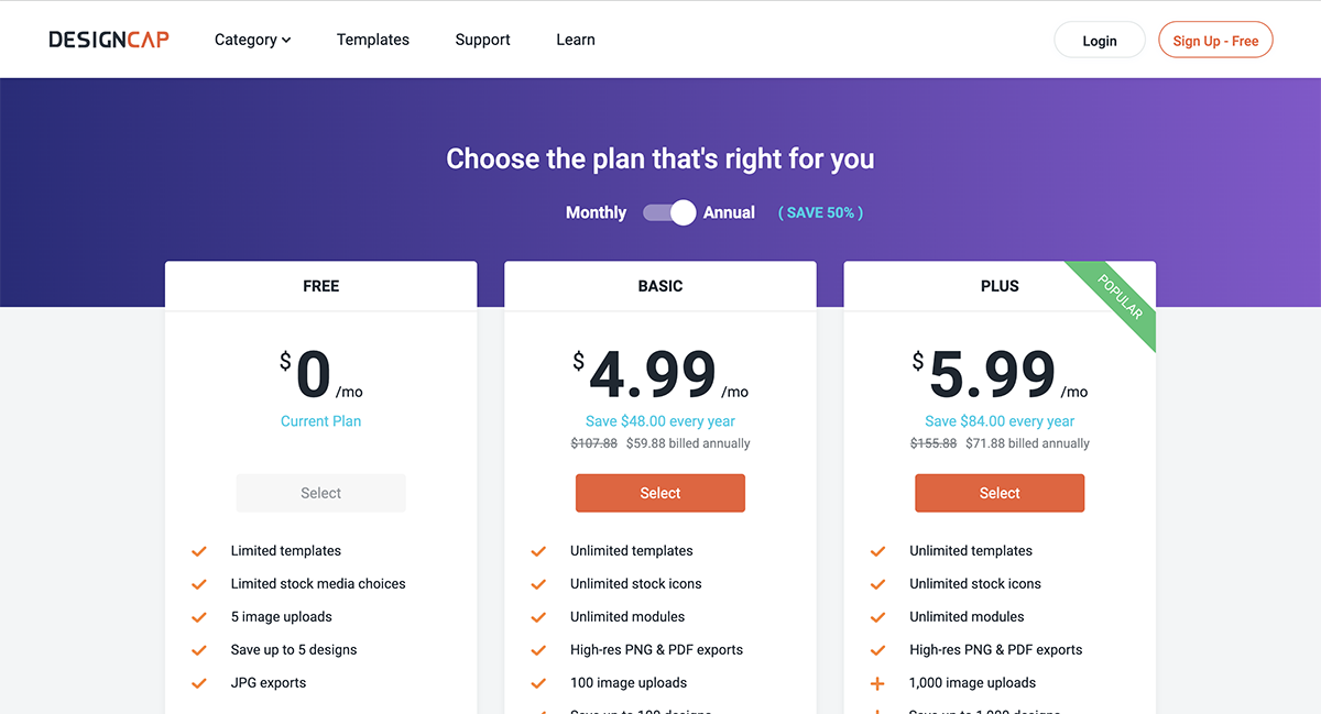
The free plan gives you access to limited templates and stock media choices, and you can save up to 5 designs.
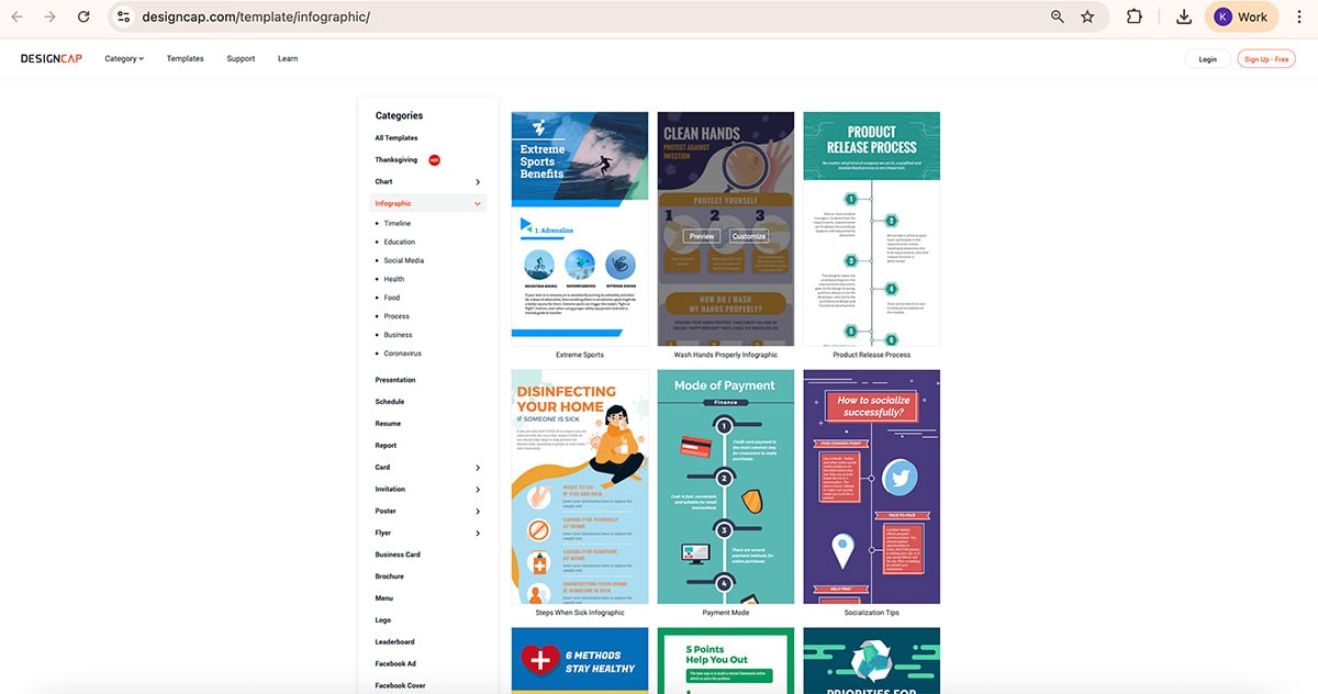
DesignCap offers an extensive library of infographic templates, which are often eye-catching and designed for easy customization. The templates cover a broad spectrum, from business and social media to education and healthcare.
This tool is well-suited for beginner marketers, educators and bloggers who must quickly create visually striking infographics.
| Aspects | DesignCap | Visme |
| Ease of Use | User-friendly interface | Intuitive interface, AI designer tool |
| Customization and Interactivity | Limited customization and interactivity options. | Extensive customization and interactivity options |
| Collaboration | Lacks collaboration feature | Supports real-time collaboration |
| Analytics | Lacks built-in analytics | Built-in analytics |
| Data Visualization | Basic charts and graphs. Does not support data imports | Advanced range of charts and graphs. Supports data imports. |

G2 Rating: 4.7/5 (180+ reviews)
Easel.ly is the only infographic tool on this list that exclusively offers infographic design, and there are no other types of templates available in this tool.
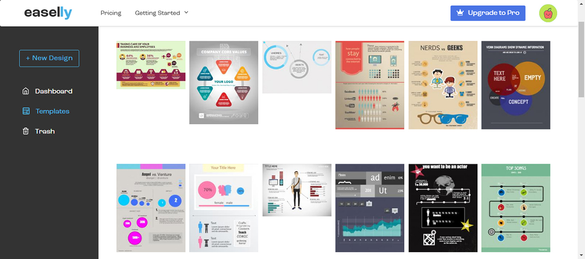
Getting started with the tool was easy for me but I was disappointed by the very small library of templates.
The templates also have a simple, casual design style which might not suit your needs if you’re looking for professional and data-driven infographic templates. However, if you just need a casual design, these templates will give you a solid start.
Overall, Easel.ly is quite limited in terms of customizability and design features when compared to alternatives.
The visual assets in Easel.ly include icons, illustrations, photos, shapes and lines. There is also a collection of simple animations. The library is very small compared to options like Visme and can be limiting.
There is a selection of charts available to add into infographics easily. However, it’s limited to static charts and does not offer data import options like those available on Visme.
Text options are limited. There are no pre-designed text blocks, but there are options for bullet lists.
Easel.ly doesn't support real-time collaboration, making it less suitable for teams working on shared design projects. It's best for individual use.
It offers export options such as PNG, JPG and PDF. However, it does not support exports in SCORM, xAPI or HTML5 like is available on Visme.

Easel.ly is the most affordable infographic tool on the list. There isn’t exactly a free plan but you are allowed to see how the tool works.
The infographic templates in Easel.ly are varied but mostly have intense contrasting colors. The topics chosen for the templates are primarily educational and informative.
Easel.ly is mostly geared towards students and educators. The Pro account offers 30 free student accounts but only the business accounts permit the commercial use of finished graphics.
| Aspects | Easel.ly | Visme |
| Ease of Use | Simple, intuitive interface | Intuitive drag-and-drop editor |
| Visual Assets | Limited range of visual assets | Extensive range of visual assets |
| Templates | Limited number of templates | Wide range of templates |
| Collaboration | Lacks real-time collaboration feature | Real-time team collaboration |
| Best for | Students and Educators | Marketers, small and enterprise businesses, no-profits, educators and individuals |

G2 Rating: 4.7/5 (180+ reviews)
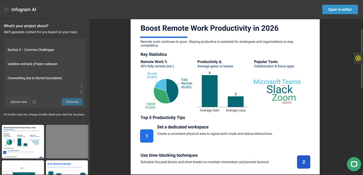
Infogram is mostly about data visualization.
Their primary offer is all about charts and elements to visualize any kind of content. Apart from vertical infographics, they also offer infographics in social media sizes.
I was able to quickly get started with the tool thanks to its simple drag-and-drop features. It has a clear navigation menu and all its visual assets are easily accessible on the editor.
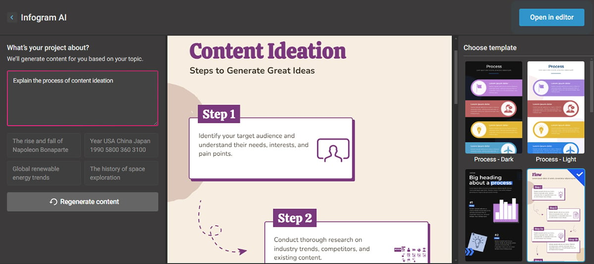
One unique feature that caught my attention is its AI-driven infographic generator, which automatically creates visuals based on user input or data. I simply chose a template and inputted my prompt and it generated this infographic below.
Infogram offers icons from The Noun Project, GIFs and stickers from GIPHY and a selection of shapes. There are no available illustrations or animations.

As expected, Infogram has a large selection of charts. A few are different from the other infographic tools, particularly tree charts and word clouds.
Data can be added manually or imported from SQL databases and CSV files.
3. Text
Text options include heading levels, tables and regular text as well.
This infographic tool offers “Callouts.” These are interactivity functions to create links between slides and hyperlinks to external sites.
It excels in creating animated charts and graphs, but it doesn't offer the flexibility to animate text or visuals.
The Infogram editor also offers content block style elements in different styles. The two most popular ones in their collection are flowcharts, timelines and diagrams.
You can export your infographics in high-quality PNG, PDF, or GIF formats. Additionally, Infogram supports interactive HTML embeds.
Infogram allows team members to collaborate on projects in real-time, share folders and edit together. However, it’s less robust compared to Visme, which offers a more extensive team workflow feature.
Infogram has also recently added the AI infographic generator to their toolkit. When you enter a topic or short description, the AI populates a selected template with relevant content, visuals, and layout suggestions.
The infographic generated was quite decent, but you may need to edit the generated copy and visuals to suit your needs.
The free plan has access to all the interactive charts and other elements in the editor. It’s enough for someone to try out the tool and see if it’s the right fit for them.
Most of Infogram's infographic templates have charts in them. Not all of the templates are vertical; there are also plenty of other sizes that can be used on blogs and social media.
Infogram is the ideal infographic tool for anyone looking to create infographics from data sets.
These users are most likely marketers, business owners, entrepreneurs, data analyst professionals, and the like. Infogram is also a good choice for students in higher-level education.
| Aspects | Infogram | Visme |
| Ease of Use | Simple and modern interface | Intuitive drag-and-drop interface |
| Collaboration | Real-time collaboration tool with no workflow feature | Real-time collaboration tool with workflow feature |
| Export Options | PNG, JPG, Interactive HTML and GIF formats | PNG, JPG, PDF, HTML5, SCORM and xAPI |
| Illustrations | Does not feature illustrations in its visual library | Wide range of illustrations in its library |
| Focus | Creating Infographics from data sets | Interactive, branded and data-driven infographics |

G2 Rating: 4.7/5 (1000+ reviews)
Animaker is a versatile design tool that shines when creating animated infographics and videos. The user-friendly interface and a wide range of features make it a popular choice for those seeking to add movement to their designs.
What immediately caught my attention is the playful and engaging look of the interface. I also like the fact that you can create an explainer infographic video with its built-in audio and video tools.
However, I noticed that Animaker has a limited number of templates, pre-built characters and audio library, so your choices are restricted if you really want to stand out.
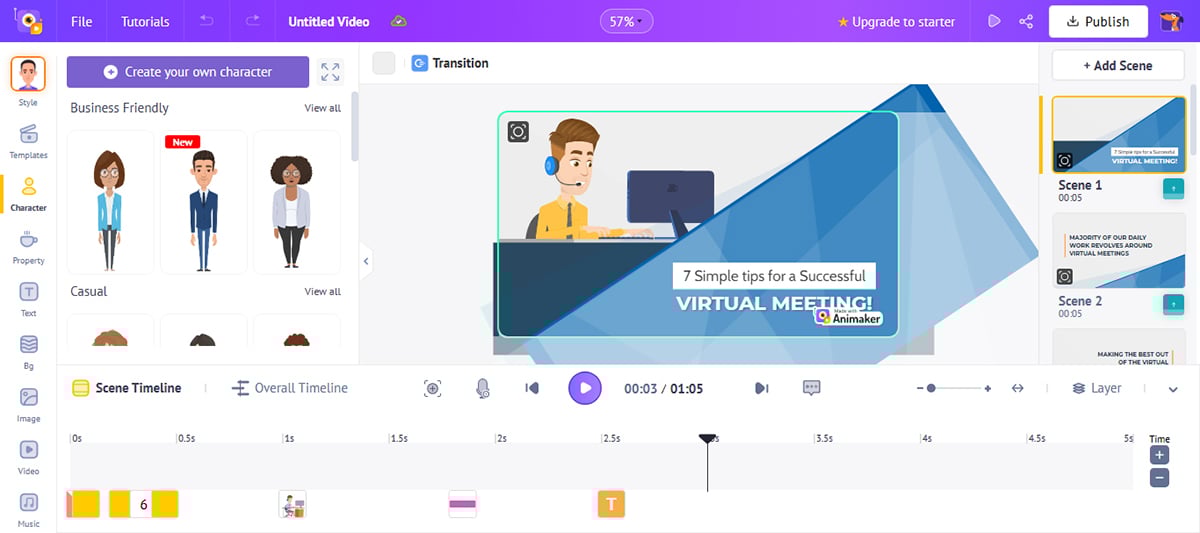
Animaker offers various pre-designed characters and other visual assets to create engaging and unique animated infographics. You can easily customize their appearance to match your brand or message.
Although primarily an animation tool, Animaker provides basic charts and graphs capabilities for simple data visualization within your animated infographics. For complex data representation, other specialized tools may be more suitable. You can animate charts, graphs and diagrams to change over time or to highlight key data points when users hover around them.
However, for complex data representation that require data imports, other specialized tools like Visme may be more suitable.
The text functionality in Animaker allows you to customize fonts, sizes, colors and styles, ensuring your animated infographics accurately convey the needed information with the desired visual impact. The tool also includes prebuilt text animation options which can enhance the visual appeal of your infographics.
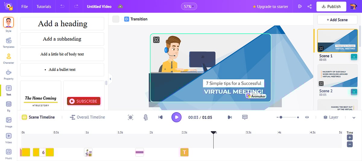
Animaker sets itself apart with its built-in voiceover and audio tools. You can quickly record voiceovers and add background music or sound effects to your animated infographics, enhancing their overall appeal.
To facilitate your design process, Animaker offers a selection of videographics templates. These templates assist beginners in generating professionally designed animated infographics quickly and efficiently.
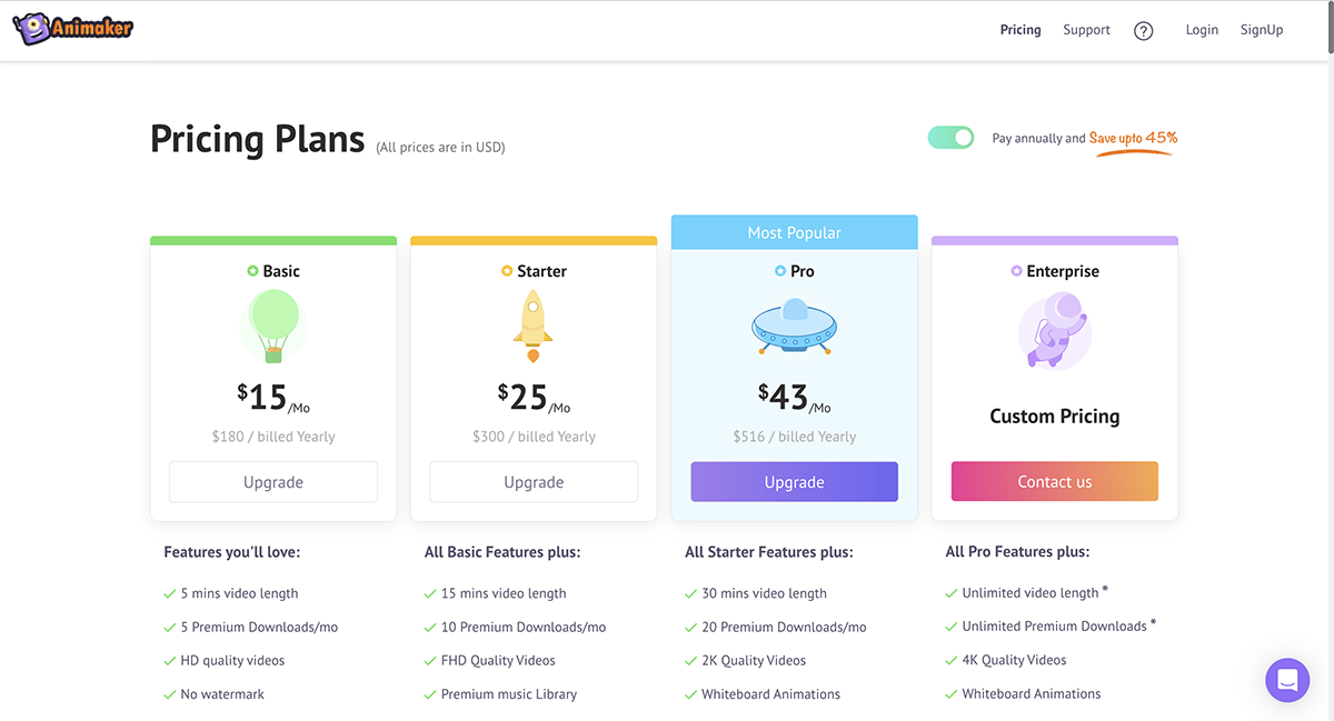
They have a free plan that lets you create standard-definition videos with access to limited features and assets.
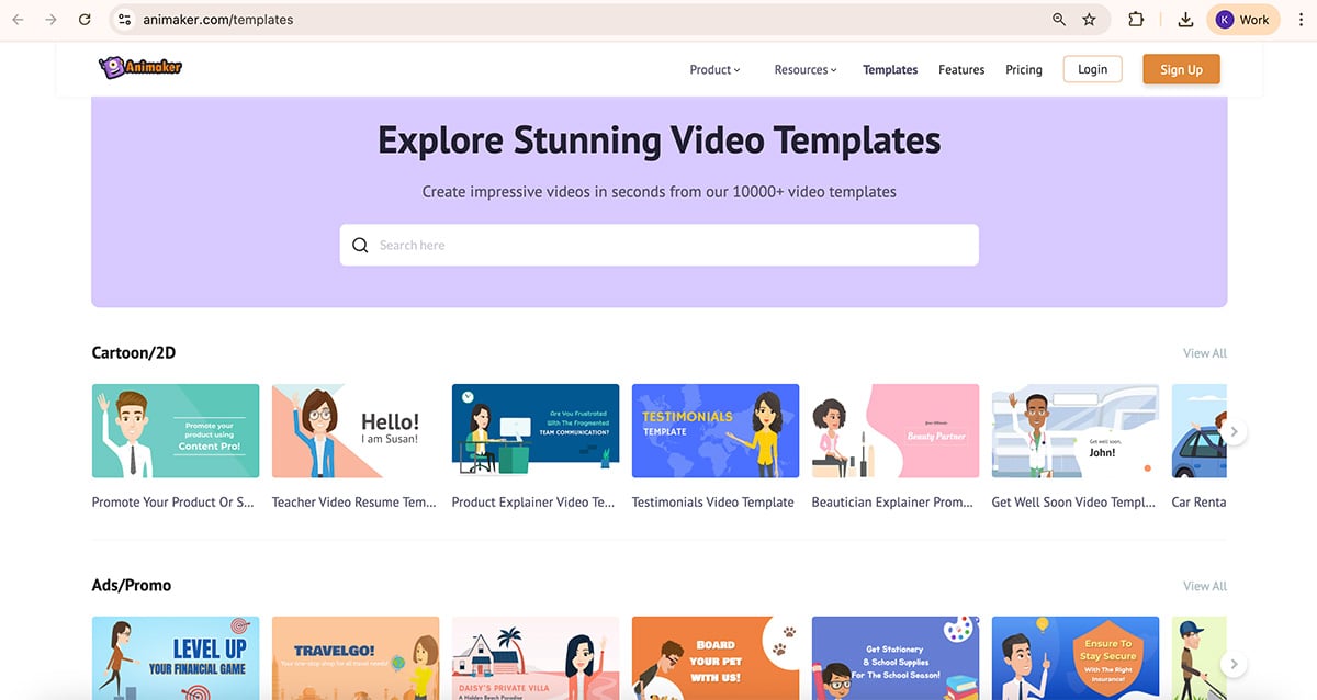
Animaker shines out in its unique offering of animated infographic templates. Their templates are designed to be dynamic and interactive, ensuring your data is informative and engaging.
Animaker is perfect for individuals or businesses looking to leverage the engaging power of animation in their infographics. Suitable for educators, content creators, or teams aiming to make complex data more digestible and entertaining.
| Aspects | Animaker | Visme |
| Ease of Use | Simple, clean interface | Intuitive, drag-and-drop interface |
| Visual assets | Wide range of images, animations, illustrations and more | Extensive library of images, illustrations, animations and more |
| Templates | Limited number of templates | Wide range of templates |
| Export options | PNG, JPG, PPT, SVG, GIF, MP4, PDF | PNG, JPG, PDF, SVG, MP3, MP4, PPT, SCORM and xAPI |
| Collaboration | Real-time collaboration with no workflow feature | Real-time collaboration with workflow feature |

G2 Rating: 4.6/5 (60+ reviews)
Genially is an infographic tool mostly for creating interactive content, not just infographics but also plenty of others. Their design style is quite varied and unique, even a bit artistic.
Where Genially really stands out is that its free plan includes many interactive features, making it accessible to users without a budget.
The interactive features in Genially are also very interesting. For instance, you can trigger a sound when a user clicks on something on your infographic. You could also add a tooltip that shows up when someone hovers around a text, image or icon. Infact, you could embed a YouTube or Vimeo video into your infographic.
One major limitation about Genially is that it lacks desktop or mobile apps, it runs entirely from the web browser. This limits the tool’s accessibility.
In Genially, visual assets are called resources. These include icons, shapes, illustrations, scenes and silhouettes. Icons are customizable, but the illustrations are not.
The tools for data visualization are inside the Resources tab. There are 15+ charts and maps with simple customization options. It's quite limited compared to Visme which offers 60+ charts and maps.
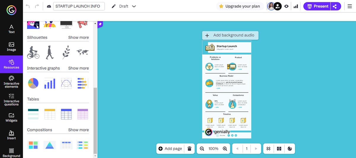
Along with regular text options, Genially offers pre-designed blocks called Smartblocks. It comes with different combinations of content types and helps create infographics quickly. The tool offers animated pre-designed blocks as well.
The biggest attraction in Genial.ly is the interactive features available for any project, including infographics.
Interactive infographics with tooltips, pop-up windows and links to other sites should be downloaded as an HTML file or shared as a link.
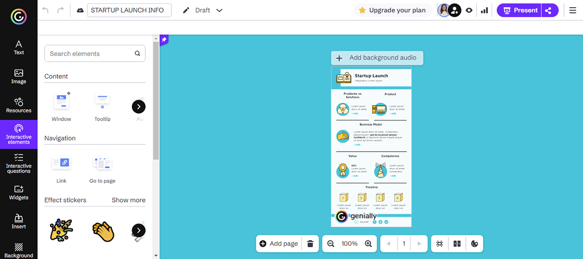
Genially supports animation for elements like text, icons and charts. You can apply motion effects like fades, zooms, slides and other transitions to make your infographic come alive.
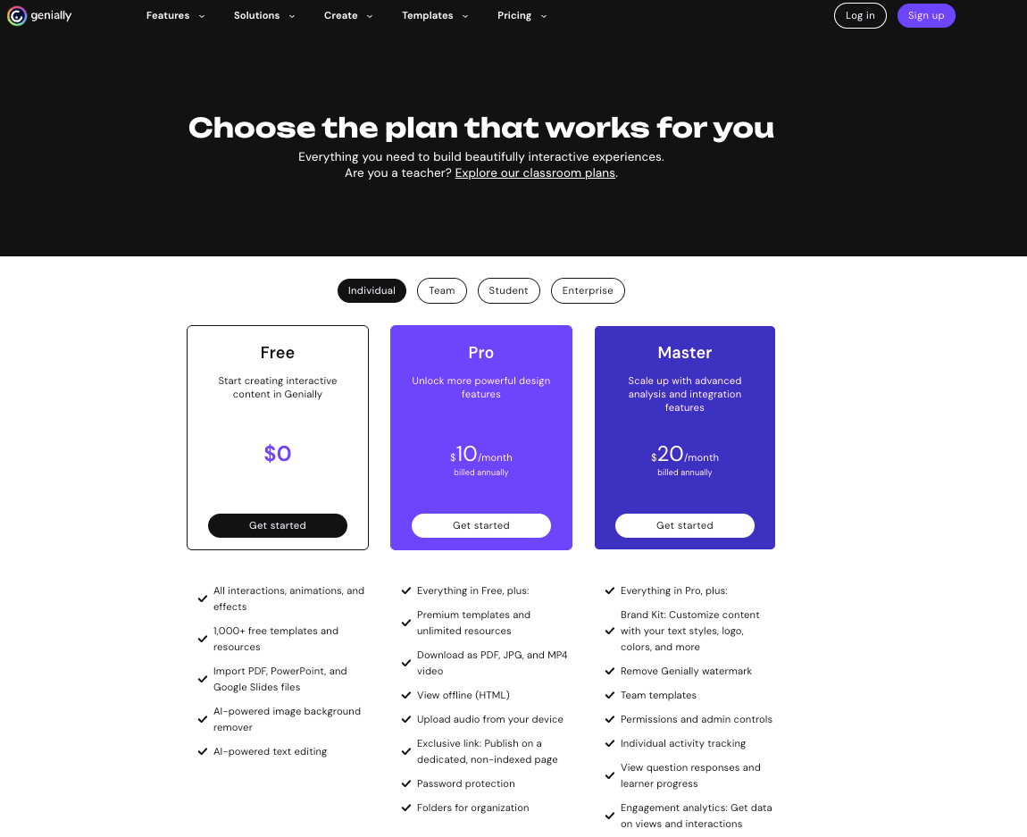
Prices for Genial.ly have two angles: education and professional. The free version offers all the tools to create an infographic, but you won’t be able to download it; you can only share it as a public link.
Here's a summary of the Professional pricing:
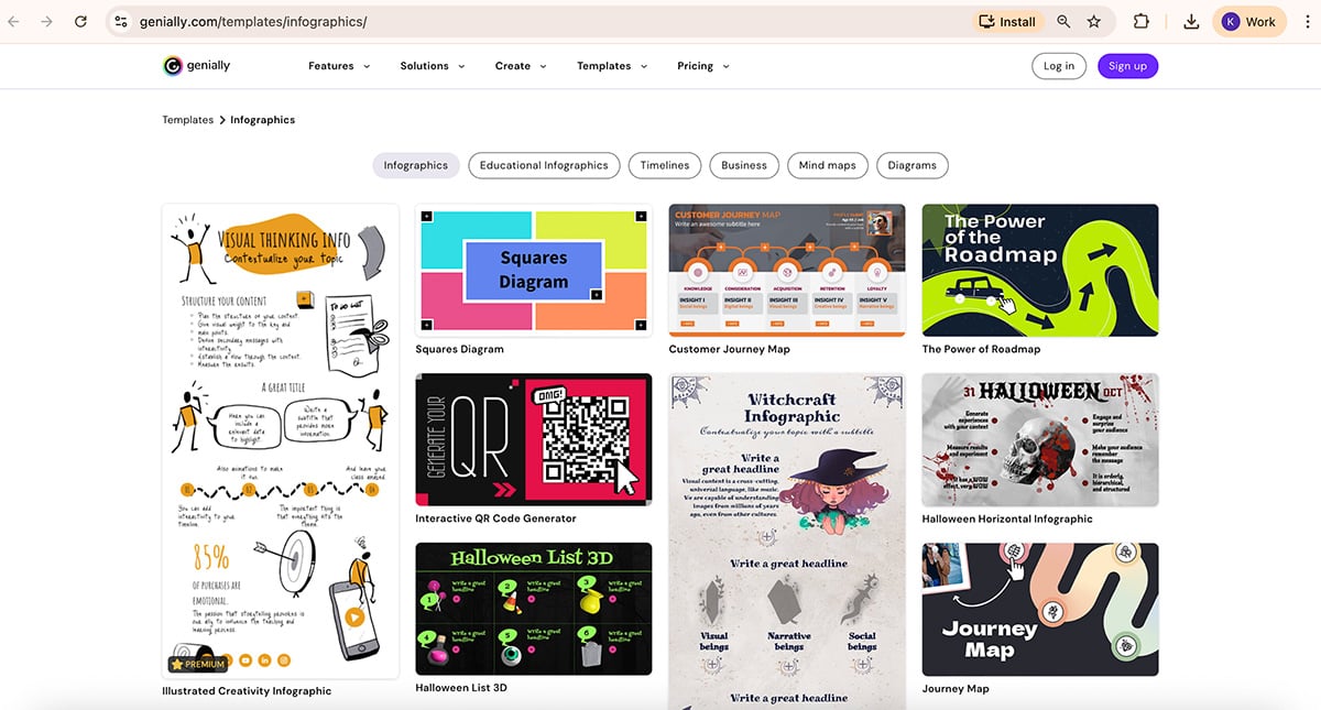
Of all the infographic tools in this list, Genial.ly is the only one that offers infographics in vertical and horizontal layouts as separate categories in their template library.
Genial.ly is mostly for corporations, the media, educators, and designers. Not so much for individuals or bloggers.
| Aspects | Genially | Visme |
| Ease of Use | User-friendly and simple interface | Intuitive drag-and-drop editor, AI designer |
| Customization | Limited customization option | Extensive customization options |
| Data Visualization | Rich library of charts, widgets and graphs. Supports data upload | Extensive range of charts, graphs and data widgets. Supports data upload |
| Collaboration | Lacks collaboration features | Real-time collaboration |
| Analytics | Lacks an analytic feature | Built-in analytic feature |
Here we’ve compiled a list of infographic tool FAQs for you to clear all your confusion and help you pick the right tool for your needs.
Here is the process of creating an infographic:
Watch this video below to learn more about creating an infographic in Visme.


Read this article to discover how to produce infographics in 5 simple steps.
We have already compiled a list of the 17 best tools to make infographics in this article. You can check them out to find the one that suits your needs.
If you’re looking for how to make infographics for different purposes, Visme stands out as the best infographic software due to its exceptional features and capabilities.
Though there is no definitive answer to this question, here are the 13 most common types of infographics:
1. Statistical Infographics
2. Informational/Listical Infographics
3. Timeline Infographics
4. How-To Infographics
5. Process Infographics
6. Comparison Infographics
7. Location Infographics
8. Flowcharts
9. Hierarchical Infographics
10. Single Chart
11. Visualized Numbers
12. Anatomical Infographics
13. Visual Resume
Read this article about the 13 types of infographics to learn more about them.
Yes, you can create a basic infographic in Google Docs by utilizing its drawing tools and shapes. However, it’s important to note that Google Docs is primarily a word processing and collaboration tool, so its infographic capabilities are limited compared to specialized infographic tools like Visme.
Visme, on the other hand, is a comprehensive infographic tool specifically designed to create visually stunning and professional infographics. With Visme, you can access various customizable templates, graphics, icons and interactive elements. Its user-friendly interface and drag-and-drop functionality make designing and customizing infographics to suit your needs easy.
Additionally, Visme offers advanced features such as data visualization, interactivity and animation, allowing you to create dynamic and engaging infographics.
The best Adobe tool for creating infographics is Adobe Illustrator. However, it’s important to note that Illustrator can have a steep learning curve and may not be the most user-friendly option. Alternatively you can use Adobe Express but if you’re not a fan of the adobe eco-systems this is where Visme comes in.
Visme is a user-friendly platform that balances ease of use and design flexibility. While Adobe Illustrator is a powerful tool, Visme stands out as one of the best tools for making infographics.
Yes, you can create infographics in PowerPoint, but it may not be the most efficient or practical option. PowerPoint is primarily a presentation tool, and while it does offer some design features, it may not have the same level of customization or flexibility as a dedicated infographic tool like Visme.
With an extensive library of templates, a user-friendly interface, AI-powered tools, and advanced features, Visme surpasses PowerPoint in every aspect. While PowerPoint can help you create basic infographics, Visme is the ultimate solution for creating engaging and visually stunning ones.
Yes, there are dozens of AI-powered tools for creating infographics, including Visme’s free AI Design Generator, Piktochart, Pixazo and Venngage. The beauty of using Visme is that you have access to a wide array of tools to customize your infographic, including 2D and 3D graphics, icons, illustrations and charts, animation and interactive elements, and other AI tools.
Yes! Google Docs and Google Slides come with a wide variety of charts, graphs, graphics and other design elements for creating stunning infographics.
No, they are not the same. Visme and Canva are both visual design tools for creating beautiful infographics, presentations, social media graphics and other types of visual content. However, there are a few things that set both tools apart.
Visme offers a beautiful collection of 2D and 3D design assets, graphics, charts, characters and more to bring your content to life. It also offers advanced visualization tools, animation and interactivity, a full suite of generative AI tools and an animated, interactive form builder that triples your conversions.
PowerPoint is a presentation software used to create slideshows with text, images, and multimedia elements. On the other hand, an infographic is a visual representation of information that uses design elements to communicate complex data or concepts in a clear and concise way.
That said, Microsoft offers dozens of infographic templates you can customize for your presentations, whether in business or academic settings.
In this list, you’ve seen a selection of the 12 best infographic makers for 2025. All of them have their positive aspects, from design assets to available templates.
But you know what I think? And I’m gonna be a little cheeky here...
Why try them all if you can just use Visme!
Let me list a few reasons why:
I could keep going, but you get the idea.
Wow, what a ride! We just reviewed 12 of the best infographic makers available in 2025. You can now make an informed decision to use the one that works best for you.
But if you ask me, you better just go with Visme. It's the most versatile and complete of all the infographic tools on this list.
Sign up for a free account today and take it for a test drive!
Design visual brand experiences for your business whether you are a seasoned designer or a total novice.
Try Visme for free


![How to Make an Interactive Infographic [+Templates]](https://visme.co/blog/wp-content/uploads/2023/11/How-to-Make-an-Interactive-Infographic-Quick-Guide-8-Customizable-Templates-Thumbnail.jpg)


