


The Best Beautiful.ai Alternatives to Create AI-Powered Presentations

It’s a human right to access information easily and without obstacles.
So what happens when someone can't read the text in our webpages, documents and graphics? What if your font choices make information inaccessible to 1.1 billion people worldwide?
These questions led me on a journey to understand the critical importance of font accessibility in design.
To get answers to these queries, I had insightful conversations with several designers about their experience with font accessibility:
Together, they helped me understand not just the technical requirements of accessible fonts but also the positive impact of choosing typography with humans in mind.
Because ultimately, this is about making sure everyone can access information, regardless of visual or cognitive differences.
In this article, I share everything you need to know about choosing and using accessible fonts to create inclusive designs for your business.
Let's get to it!
A font is considered accessible when it’s legible and readable by a diverse audience, including people with visual and cognitive impairments like low vision, dyslexia, aphasia, ADHD, etc. To achieve this, accessible fonts share these key characteristics:
In some cases, a font is made accessible specifically for the target audience. Such is the case when designing for children and people in the later stages of life. Popular examples of accessible fonts that embody these characteristics include:
Here’s an example of a design with accessible typography within an overall accessible design.
Regardless of the instance where text is used, be it the header, subtitles or data visualizations, the text is legible and readable.
The color contrast also complies with good standards.
Font accessibility is important because the last thing you want to do with your content is isolate or alienate your readers. You want your text to be understood by everyone who comes across it, especially your target audience.
According to Vision Atlas, there are 1.1 billion people worldwide with visual impairments, ranging from minimal impairment to full blindness.
In 2020, it was calculated that 510 million people have near vision problems, 258 million have mild visual impairment, 295 million have moderate to severe impairment and 43 million are fully blind. In total, that’s 13.7% of people who can benefit from accessible typography and inclusive content .
Made with Visme Infographic Maker
But aside from using accessible typography for better understanding, there are also laws that dictate the use of accessibility in different content types.
More specifically, you must ensure that your design complies with the WCAG (Web Content Accessibility Guidelines), which follows legal design standards from the ADA (Americans with Disabilities Act) and the EAA (European Accessibility Act).
Businesses and organizations failing to meet ADA and EN 301 549 requirements can face several setbacks. In a legal sense, you can be fined for not being compliant. But more than that, your business can lose reputation and credibility.
Regarding typography and these laws, you’re expected to be compliant everywhere that you use text. This includes your website, signage in public spaces and any printed material.
When choosing a font for your project, you’ll want to make sure it’s accessible. To achieve that, you must consider several things. The two most important aspects are legibility and readability. Sometimes these terms are used interchangeably, but they’re not the same.
Plamen defines them like this:
Discussing this topic with Plamen, he also brought up the likeability factor. The idea is that, if a font is technically legible, but people hate reading it and that’s a problem too. He shared a very insightful video with me from Pimp my Type.
In this PMT episode, Eleni Beveratou, type designer and creative director of Dalton Maag, talks about font likability for accessibility with Oliver Schöndorfer.
She explains likability by referencing a quote from type designer Zuzana Licko, “We read best what we read most.”
The idea is that people will better understand a font if they’ve already seen it many times before, and might even choose it over a more accessible font, simply because they’re used to it. So, when choosing the best accessible font for your designs, take this into consideration. For example, use a classic font that checks off all accessibility parameters instead of using a very different option.
In conclusion, for your font to comply with accessibility, it must be legible, readable and hopefully likeable.
Here’s the full video from Pimp my Type, you’ll get lots more great insight from Eleni and Oliver:
But what about beyond the web and accessible fonts for print?
Most of the content you find online regarding accessible typography refers to the web. In my discussion with Plamen, we also talked about font accessibility for print materials.
Plamen shared that, “In long-form printed content like books or magazines, serif typefaces have traditionally been the go-to for readability. Those little serifs actually guide the eye along lines of text and create distinctive word shapes, which is super helpful when reading paragraphs for a long time. In print, you typically have high resolution (1200+ DPI in good printing), so fine details like serifs and subtle stroke contrast are preserved. However, you also have to choose an adequate font size because readers can't zoom a piece of paper!”
I asked how that applies to accessibility. Plamen answered:
“Many printed materials for visually impaired readers use larger font sizes and sometimes sans-serif fonts for clarity. Large-print books or signs often opt for sans-serif because they might be viewed from a distance or by readers with very low vision – the simplicity helps in those cases. For print, it's crucial to use a highly legible type at a comfortable size (often 12- 14pt or above for body text in accessible formats) and to avoid ultra-thin or condensed styles that might disappear on paper.”
To know if your chosen font is both legible and readable, it must check off some key principles, both in terms of the font’s anatomy and how it works harmoniously within your design.
For likability, you’ll have to analyze your target audience and consider the fonts that they might be used to seeing.
Plamen and I came to the conclusion that it’s a good idea to have these principles as a checklist you can refer to when starting a design you want to make accessible.
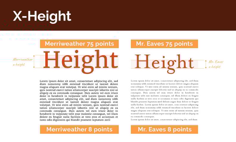
X-height refers to the height of lowercase letters in a typeface, specifically the height of the letter 'x'. For better accessibility, select fonts with taller lowercase letters (higher x-height). A greater x-height improves legibility because it creates more distinct letter shapes and increases the size of the counters (the enclosed spaces within letters), especially at smaller sizes.
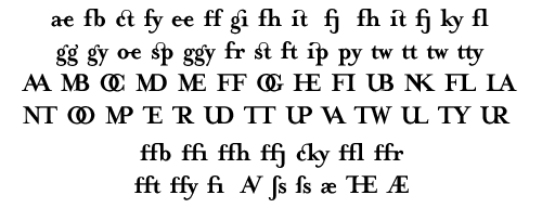
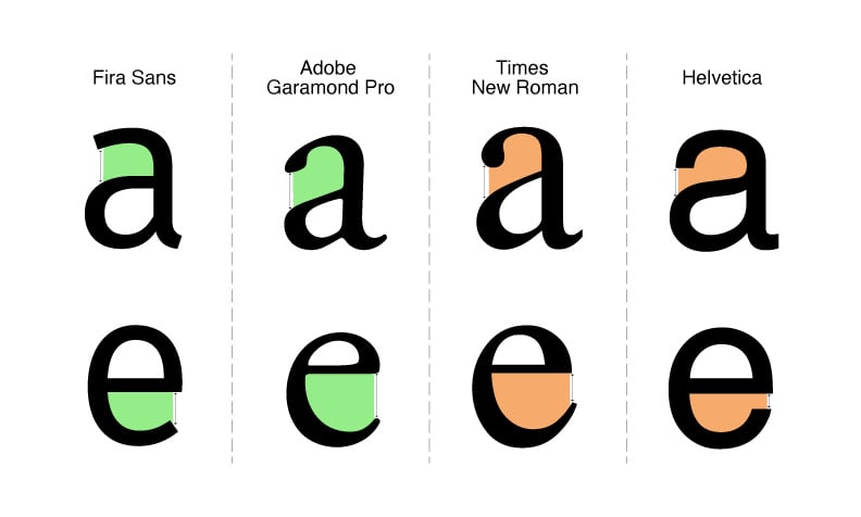
Letterforms are the shapes that make up each character in a typeface. Counters are the spaces inside letters like 'o', 'e', and 'a.' There are both open and closed counters, so opt for fonts with more counters that are clear and won’t crowd or collapse in small sizes.
Ligatures are two or more characters joined together, like "fi" and "fl" combinations. Even though these are visually appealing in calligraphic styles, they’re not accessible. Therefore, avoid these, as they can be difficult for many readers to decipher. In fact, it’s best to avoid script fonts altogether because those connect every letter to the other.
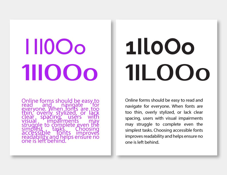
Character distinguishability refers to letters and numbers that are clearly different from one another. Pick fonts with easily distinguishable characters to prevent confusion.
A good accessible font clearly differentiates between characters like capital "I", lowercase "l", and number "1". The same applies to mirrored letterforms like p and q or d and b.
Made with Visme Infographic Maker
The contrast ratio measures the difference in brightness between your text and its background, which is expressed as a ratio. For both digital and print content, you must ensure sufficient contrast between your text and background colors.
According to WCAG standards, aim for a minimum 4.5:1 ratio for normal text and 3:1 for large text. Black text on white background achieves about a 21:1 contrast ratio, making it highly readable for almost everyone.
You must also check your contrast ratio in dark mode, as more people are using that function on their devices.
Made with Visme Infographic Maker
Font weight refers to the thickness of the strokes that make up each character in a typeface, ranging from ultra-light to extra-bold or black. Choose medium-weight fonts that aren't too light or too heavy for optimal legibility and accessibility.
Extremely thin fonts can be difficult to see and may disappear on bright backgrounds, while overly bold fonts can cause characters to blur together as the inner spaces (counters) become too small.

Text in images refers to words or characters that are embedded within picture files rather than existing as actual text on a page. This applies to digital content like websites and digital documents.
Use actual text rather than text embedded in images to ensure screen readers can access the content and users can adjust the size as needed.
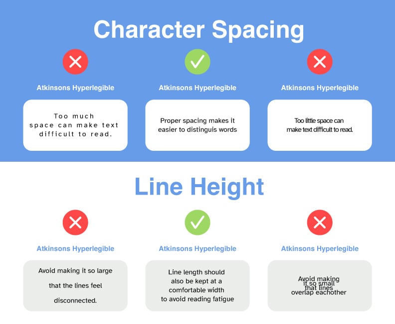
Letter spacing (kerning) is the adjustment of space between pairs of letters, while line spacing is the vertical distance between lines of text. Pay attention to proper letter spacing and maintain adequate line height.
Follow WCAG 2 guidelines for web and set line height to at least 1.5 times the font size, paragraph spacing to at least 2 times the font size, letter spacing (tracking) to at least 0.12 times the font size, and word spacing to at least 0.16 times the font size.
All caps refers to text written entirely in capital letters. Avoid using text in all capital letters as it removes the distinctive shapes of words, making them harder to recognize, especially for people with dyslexia and cognitive disabilities. Your best bet is to use title case or sentence case rather than all caps.
Accessible fonts range from those that meet all the accessibility parameters to others that were created specifically for that purpose. Most of these fonts are available for download and use in both personal and commercial projects. And they’re also available in Visme, where you can create a landing page to promote your business or collect leads.
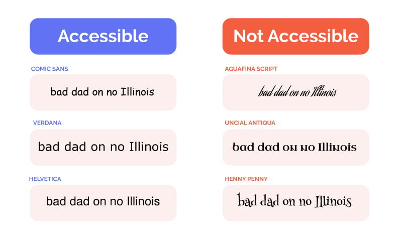
First, let’s take a look at some of the ADA accessible fonts in serif and sans-serif options. Most of the examples in this accessible fonts list are available in Visme; the ones that aren’t can be easily uploaded into your workspace.
Aside from the tried and true fonts listed above, there are other fonts that are also quite accessible, just not as known.
This report document template, for example, uses Inter. It’s a sans-serif font with a tall x-height and distinguishable letters. It’s a good option when you want your font to look at little different but still be legible and readable. Not to mention, comply with key characteristics for accessibility.
If you're also designing presentations and want to combine accessibility with visual polish, check out our curated list of the best fonts for presentations. You'll find several modern typefaces that are not only stylish and professional but also perfect for inclusive slide designs.
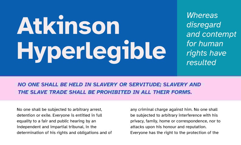
During my conversation with Shoji, an artist and product designer, we talked a lot about Atkinson Hyperlegible. He told me how he’s incorporating the font into a project because of its accessible qualities.
This is what he shared with me:
“Anthrocon, the convention I volunteer for, is very much about inclusivity and diversity—a lot of people find their way into our community because they often might feel marginalized about their identities, and that often includes people with low vision.
So I was thinking about how to meet that need. There are a lot of existing typefaces that are meant for low vision, but I think what makes Atkinson Hyperlegible unique is that it was designed very intentionally to balance visual harmony and legibility, principles which can be directly opposed to one another. Atkinson is a very professional in appearance, while at the same time being very readable for various types of low vision.
It was developed by the Braille Institute when they wanted to do a 100-year anniversary rebrand but encountered many of those same problems—I think the closest thing that met their legibility needs was Comic Sans 😆 so they just went ahead and made their own typeface.”
You can download and use Atkinson Hyperlegible from The Braille Institute and use it royalty-free for both personal and commercial use.
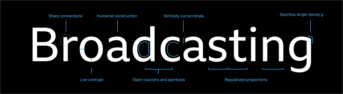
BBC Reith is a type family and system that Plamen told me about when we met. It was designed specifically by Dalton Maag for the BBC. What Plamen appreciates the most about BBC Reith is that it includes versions that are ideal for content directed at people of all ages.
Look at the image below, which highlights all the valuable qualities that make BBC Reith accessible to all audiences across digital platforms, print materials and physical signage.
Watch this video to understand the details behind the design of BBC Reith and the considerations taken into account when creating it.
Head typeface designer, Bruno Maag shares some insight at the 3:12 timestamp:
"The challenge was to be able to maintain the history and tradition that the BBC has but then also how do you combine that aesthetic quality with the very pragmatic needs of accessibility you know, we're an 80 year old has to be able to read that phone as well as an eight-year-old. On one hand it has to be aesthetically profound on the other hand it has to be utterly utilitarian utterly usable the core theme of BBC reads is accessibility.”
You can download BBC Reith from the BBC website for personal projects.
According to the NHS, One out of ten people in the world have Dyslexia, a cognitive impairment that affects how you read and write. With dyslexia, letters tend to get turned around and words are difficult to understand.
Fonts like Dyslexie and Open Dyslexic were designed with good intentions—to support readers with dyslexia. In fact, Dyslexie was created by a designer who is dyslexic himself. These fonts use heavy baselines, exaggerated letterforms and distinct shapes to help differentiate commonly confused letters.
However, research has shown that these specialized fonts may not significantly improve reading speed or accuracy. A study by Springer Nature found no measurable improvement in reading performance among dyslexic children using Dyslexie compared to common fonts like Arial.
What this means is that while Dyslexie and Open Dyslexic might be helpful for some individuals, they’re not a one-size-fits-all solution, and they may not be suitable for professional or design-forward settings due to their unconventional appearance. As always, prioritize clarity, spacing, and testing your type choices with your audience. Also, in my opinion, they look a bit childish and unprofessional.
A good way to know if the fonts and their usage in your web or app design are accessible is to use an accessibility analysis tool.
Thankfully, there are many resources available online.
Here’s a list of tools you can try straight away.
What about checking accessibility for infographics, documents and presentations?
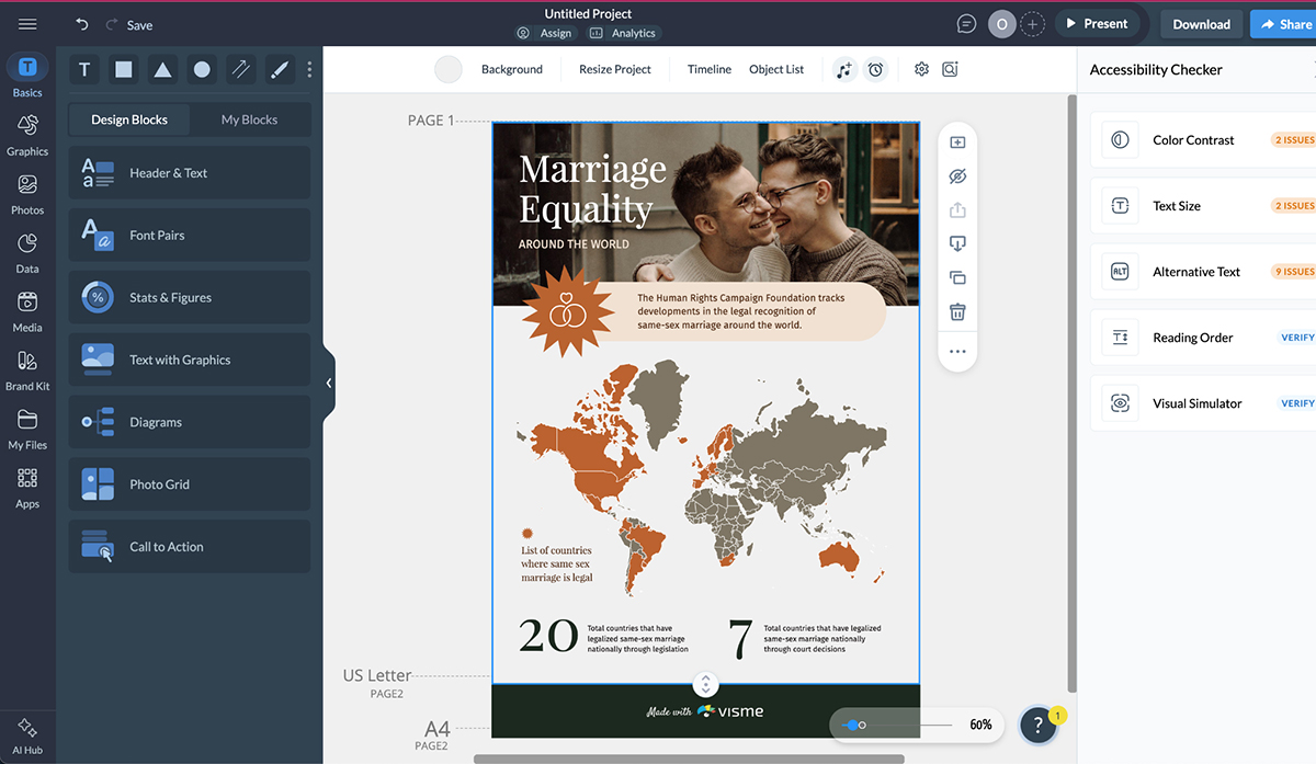
If you’re working on this type of content, Visme can be a good resource. Not only can you check for accessibility inside the editor, you can also create accessible presentations, digital documents, graphics and marketing materials like printable flyers, brochures and posters.
Use one of the pre-designed templates or Visme AI’s generative designer to start working on a visual project. Then, before publishing or sharing, open the accessibility tools to check for contrast issues, alt text and object reading order.
Here’s how the Accessibility Checker works in your Visme editor. To open it, click on the hamburger menu at the top left. You’ll see the option in the drop-down.
Firstly, what is a design system?
This is how Chad Bergman Designer Advocate at Figma defines it:
“At its core, a design system is a set of building blocks and standards that help keep the look and feel of products and experiences consistent. Think of it as a blueprint, offering a unified language and structured framework that guides teams through the complex process of creating digital products. A design system can assist in reducing the amount of time spent recreating elements and patterns while designing and building products and interfaces at scale.”
Many elements in a design system feature typography. They all need to be designed with user accessibility in mind. For example:
Before turning an element into a design system function, first run it through your accessibility checklist and online tools.
Furthermore, the font in your accessible design system must be accessible itself. It’ll be used both in elements and as stand-alone text in headings, subheadings and body text.
The design system must include instructions on usage and implementation for all these instances, showing do’s and don’ts for easier comprehension.
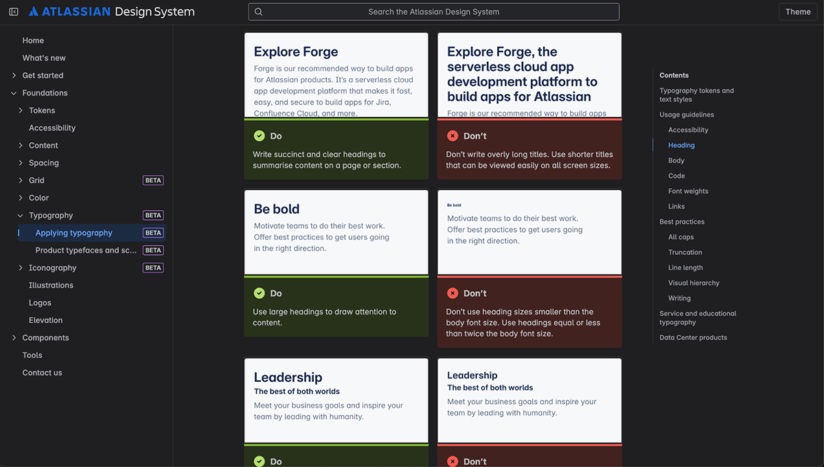
The Atlassian Design System, for example, uses custom fonts Atlassian Sans and Mono as the main typeface for all elements and text. This is actually a new implementation in the Atlassian design system; they changed to the new fonts to improve accessibility.
In their online guidelines, Atlassian explains how to use the typeface, including common mistakes to avoid.
When it comes to accessibility in design, typography is only part of it. There are many other aspects you need to check and analyze.
Here’s a list for you to check through:
If you still have pressing questions about accessible fonts, these FAQs will help.
For digital content, sans serif fonts are better because their clean, unadorned characters render clearly on screens.
However, printed books are more accessible with known fonts like Georgia, because they make reading easier in the long run due to the serifs that help readers keep track of what line they’re on.
All these fonts are ADA compliant. Also, all are free to download and can be used for personal and commercial projects.
Yes, Canva Sans is considered an accessible font because it differentiates letterforms so it’s legible and readable for all audiences.
These are the best fonts for dyslexic readers:
Dyslexie and Open Dyslexic were designed for dyslexic readers, but through testing have been deemed harder to read than other accessible fonts.
Font accessibility impacts SEO in several ways:
To check if your font meets WCAG guidelines, you can use accessibility checkers like Visme Accessibility Checker or Level Access. But before you use an analysis tool, make sure your font checks off all these characteristics:
Color and contrast impact font accessibility in these ways:
Typography is more than just aesthetics; it's a fundamental aspect of human communication. When we choose accessible fonts and implement them thoughtfully, we're not just following guidelines or avoiding legal issues. We're affirming that everyone deserves equal access to information.
As I’ve shown you throughout this article, font accessibility isn't particularly complicated, but it does require intentionality. The difference between an accessible font and an inaccessible one often comes down to seemingly small details: the openness of counters, the height of lowercase letters and the spacing between lines.
Yet, these small details make an enormous difference for the 1.1 billion people worldwide with visual impairments. They're the difference between frustration and understanding.
So the next time you're selecting a typeface for your project, remember that your choice impacts real people's ability to engage with your content. Consider legibility, readability, and yes, even likeability. Test your typography with diverse users when possible. And remember that inclusive design isn't just good ethics, it's good business.
Want to create accessible content that looks great too? Try Visme's suite of design tools, built with accessibility in mind from the ground up.
Design visual brand experiences for your business whether you are a seasoned designer or a total novice.
Try Visme for free