


14+ Employee Newsletter Examples, Ideas & Templates

An executive summary is the most crucial part of any business document.
It’s the first–and sometimes the only—thing decision-makers look at before making a big call.
What makes this tricky is that most executives are either pressed for time or drowned in information.
A Harvard Business Review survey shows that 40% of leaders and 30% of managers feel overwhelmed by the amount of information they have to process every day.
That means if your executive summary doesn’t grab attention right off the bat, it’s game over. The rest of your document might as well not exist.
I’ve reviewed hundreds of documents, and trust me, most executive summaries miss the mark. They’re either way too long, sound robotic or never get to the point. And when that happens, readers tune out.
Writing an excellent executive summary isn’t rocket science. You just need to know what works and what doesn’t.
In this guide, I’ll walk you through 10 real-world executive summary examples that stand out. You’ll see how top companies and organizations use this one section to hook readers, showcase value and drive action.
I’ll also break down, step by step, how to write an executive summary that gets read.
An executive summary is a concise overview of a larger document, such as a business plan, proposal or report. It highlights the main purpose, key findings and recommendations so readers can quickly understand the most important points without going through the full document.
It should be clear, concise and written after the main work is complete. The ideal length and depth will depend on what it’s summarizing. For instance, a one-page summary might work for a proposal, while a complex research report may need a few pages.
You’ll often find executive summaries in:
An executive summary can be included within the main document, usually after the table of contents or as a standalone piece.
The standalone version is especially useful when the full report is lengthy or when investors, partners or decision-makers need a quick snapshot before making a decision.
Unlike an abstract, which provides only a brief academic summary, an executive summary offers a complete, self-contained picture of the entire report.
In a nutshell, an executive summary helps readers grasp the purpose and main insights of your report. Think of it this way: if a stakeholder were to read only your executive briefing, would they have the information they need to make a decision? If the answer is yes, then your summary has done its job.
There’s a reason why every solid report, proposal or business plan includes an executive summary.
It’s what determines whether a document you’ve spent hours writing gets read, understood or tossed in the trash.
Here are four key reasons why you should take it seriously:
A strong executive summary doesn’t follow a rigid formula. There’s no one-size-fits-all approach.
The length, tone and level of detail can vary depending on several factors, such as your audience, the type of document, its purpose and how complex the subject matter is.
For example, a one-page business proposal summary will look very different from a 20-page summary of a government or technical report.
But no matter the context, a well-written executive summary always has one goal: to guide readers smoothly through the key points of your document.
After reviewing several real-world examples, here are the core elements that show up again and again in the best ones:
Now, let’s get into the meaty part — what executive summaries actually look like in real life.
You know what makes a strong executive summary and why it’s crucial.
But nothing beats looking at real examples.
I’ve put together 10 real-life executive summaries from different types of business documents. Each one takes a slightly different approach based on what it’s for, who it’s aimed at and what it wants to achieve.
I’ve also shared a professionally designed executive summary templates to help you replicate or create a better version.
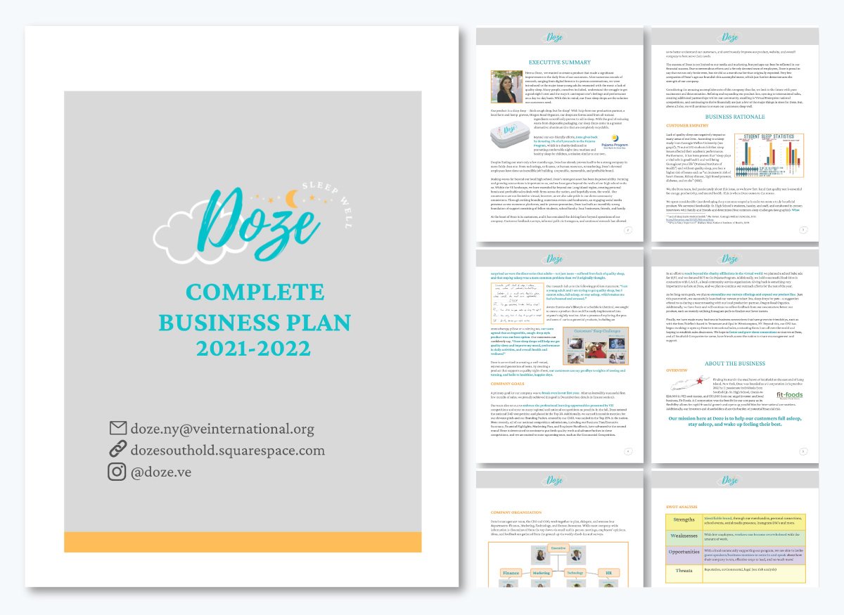
What I love about Doze’s executive summary is how laid back it feels.
The flow doesn’t read like your typical corporate pitch. It kicks off with a simple, human problem everyone can relate to: not getting enough good sleep.
Then it explains the product in the simplest, smartest way possible—“think cough drop, but for sleep.” That’s clever and memorable. That one line instantly explains what they do.
I also like that they mention using eco-friendly packaging and giving a small percentage of profits to the Pajama Program. It shows they care about more than just making money.
Mentioning that they broke even earlier than planned adds credibility without sounding boastful. And the summary ends on a confident note, outlining their plans for growth while staying focused on the mission to help people sleep better. It’s short, sincere and persuasive: everything an executive summary should be.
That said, it does miss a few things you’d expect in an investor-ready executive summary. There’s no snapshot of the financials, market size or growth projections—details that show real business potential.
The target audience is also too broad, and there’s little about how Doze stands out from other sleep aids. A line or two about the team’s background, the business model or competitive advantage would have made it more complete. Still, it nails what many summaries miss: clarity, warmth and a clear sense of purpose.
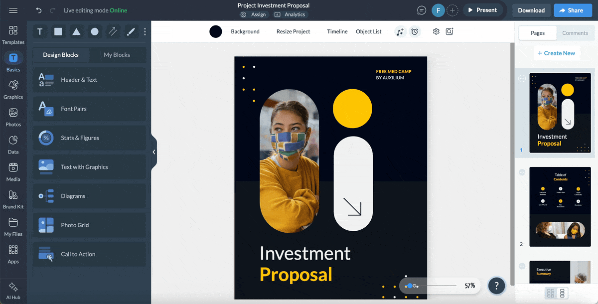
If you're looking to create an executive summary that’s just as good, check out this executive summary template.
You can easily tweak this business plan template from Visme for your industry or idea. Or personalize it to fit your brand with Visme’s AI-powered Brand Design tool.
Want to take it up a notch? Visme’s design asset library has tons of icons, illustrations, characters, stock photos and videos you can use to make your document look incredible, too.
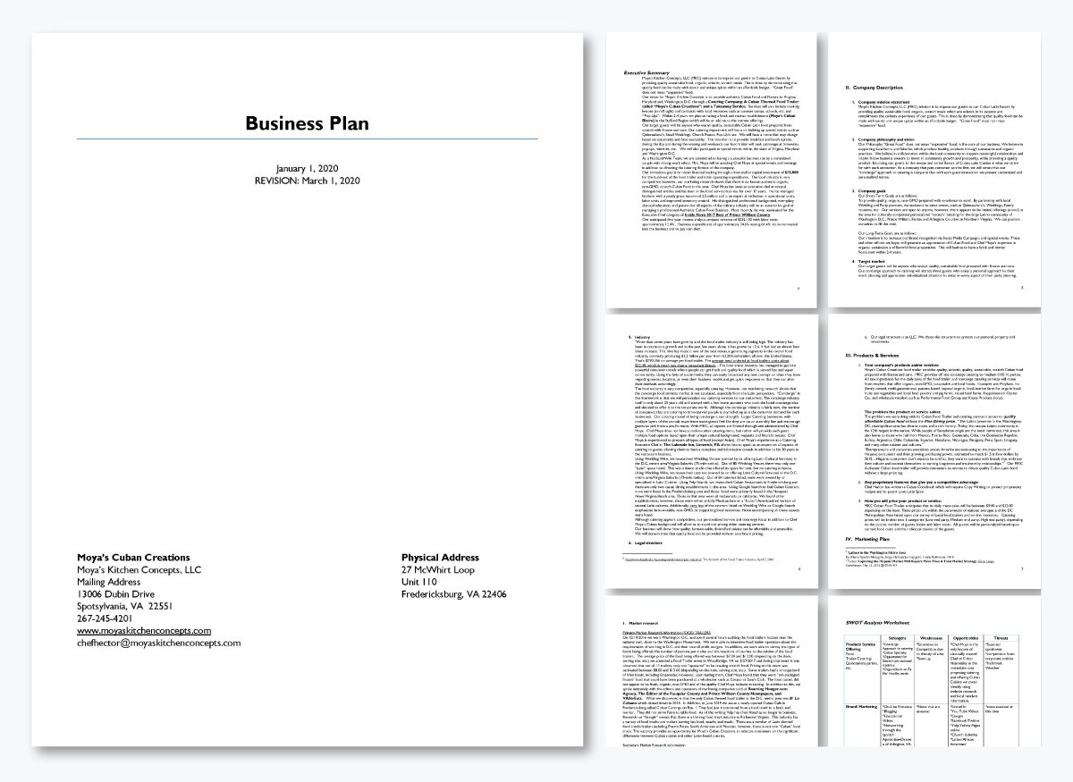
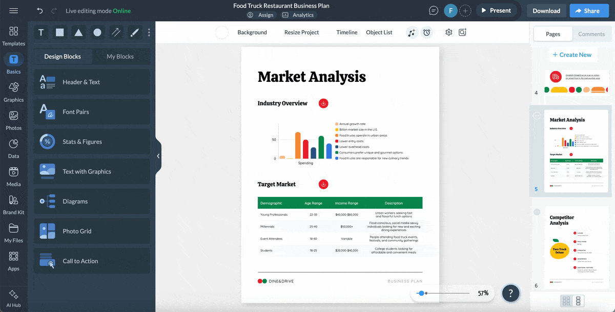
Moya’s Kitchen Concepts takes a more traditional route compared to Doze’s executive summary.
But it still does a solid job of spelling out what the business is all about.
From the very first line, it’s clear they are focused on authentic Cuban-Latin food made with sustainable, organic ingredients—and how they plan to actualize that vision. I like that they get specific right away, outlining their catering company, food trailer and future plans for a brick-and-mortar bistro. It comes across as concrete and goal-oriented, not just aspirational.
Unlike Doze, which leans more on storytelling and emotion, Moya’s executive summary is more structured and detailed. They even mention the exact amount of funding they need ($15,000), which gives investors confidence that they’ve done their homework.
What really makes this summary shine is how it spotlights the chef’s experience and credibility.
Chef Moya’s 30 years in the food industry and his nomination for Inside Nova’s 2017 Best of Prince William County add serious weight to the plan. You can tell this isn’t just some new idea or experiment; it’s the next chapter in a well-established career.
I also appreciate that they included financial projections, including expected revenue, labor costs and reinvestment percentages. That’s something the Doze summary didn’t fully cover, and it makes this one investor-ready.
If I had to tweak anything in this restaurant business plan summary, I’d say it could use a bit more warmth and flow.
It’s packed with useful details but feels a little dense in places. A few shorter paragraphs or a bit more personality could make it easier to read without losing its professional tone.
Still, it’s a strong, well-thought-out executive summary that clearly shows vision, planning and experience.
If you’d like to create something better, check out this executive summary template below.
It’s the perfect starting point for creating a data-backed summary like Moya’s. And with Visme, you have the added benefit of animation and interactive features to elevate your presentation.
To give your readers an immersive interactive experience, you can:
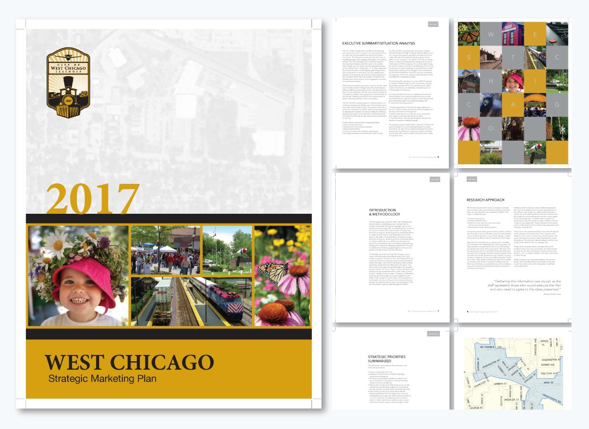
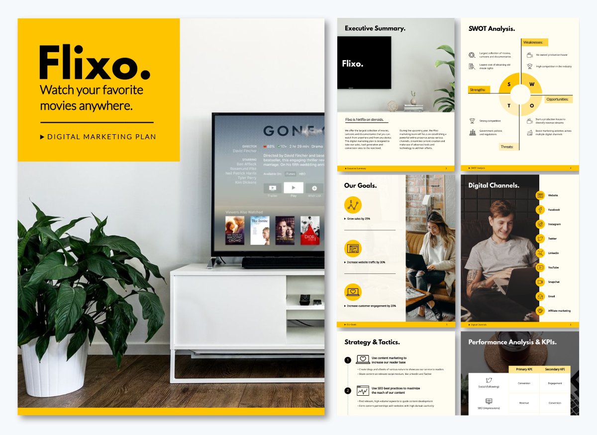
Our next example is an executive summary for a marketing plan.
And right away, you can see how it plays a different role from that of a business plan.
A business plan aims to sell an idea or attract funding, while a marketing plan focuses on positioning, perception and communication.
It’s less about convincing investors and more about setting a clear direction for how an organization connects with its audience.
What I like about this one is how it starts by acknowledging the problem honestly.
West Chicago’s image issue is described as something that’s been around for decades, but the tone stays positive. It quickly shifts toward opportunity, showing that the city has a strong community and real potential to rebrand itself.
I also appreciate how specific it gets about what the plan will cover — public relations, events, media outreach, website updates and even attracting new residents and businesses. It’s organized and practical, with no fluff.
The section that breaks the plan into three guiding questions around segmentation, awareness and partnerships is also a smart move. It makes the whole thing easier to follow and gives readers a sense of direction. If I were to change anything, I’d say it could use a little more storytelling to help people visualize the new image the city wants to create.
You can use this digital marketing plan template as a starting point for your executive summary.
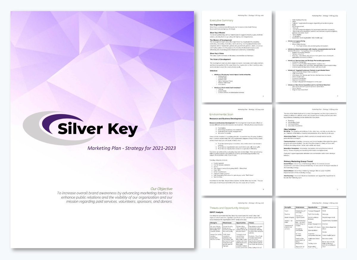
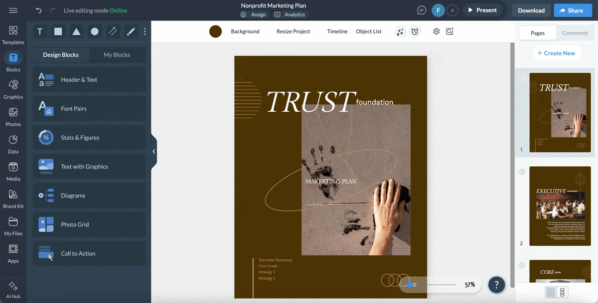
This next example of an executive summary takes a much broader, more detailed approach than the previous marketing plan we looked at.
While the West Chicago plan focused on solving a reputation problem through strategy and messaging, Silver Key’s summary feels more like a complete roadmap for both marketing and development.
What stands out is how intentionally everything is laid out. The summary starts by defining the organization and its purpose, then connects that purpose to specific marketing and development goals. It gives readers a full picture of who Silver Key is, what they do and why their work matters.
It’s also refreshing to see how it ties marketing directly to service. Every initiative — from social impact programs to digital outreach and donor engagement — feels like a natural extension of their mission to support seniors.
The tone is professional but still warm, and including their guiding values at the end adds a nice touch that many plans overlook. You can tell this team isn’t just chasing metrics; they're genuinely trying to make a difference.
The section on initiatives is impressive and covers a lot of ground. IIt outlines seven detailed focus areas, from donor engagement and sponsorships to digital outreach and community storytelling. It’s the kind of executive summary that gives a team clarity on what to prioritize and how to measure success.
If I had to point out one thing, it’s that this summary reads more like a strategy document than a high-level overview. For an executive audience, it could probably be condensed without losing impact.
If you’re looking to create a similar nonprofit marketing plan, you can start with this Visme nonprofit marketing plan template. It’s built to help you organize campaigns, highlight goals and communicate results effectively — all in one collaborative workspace.
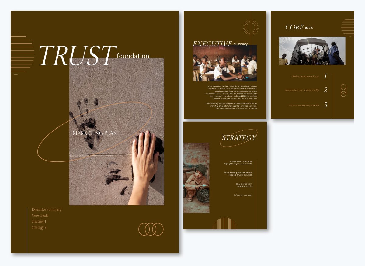
Visme’s collaboration tools make it easy to work as a team. You can share permissions with colleagues or board members to let them view, edit or comment directly on your document.
Whether you’re collecting feedback on your messaging, refining visuals or finalizing the layout, everyone stays in the loop in real time.
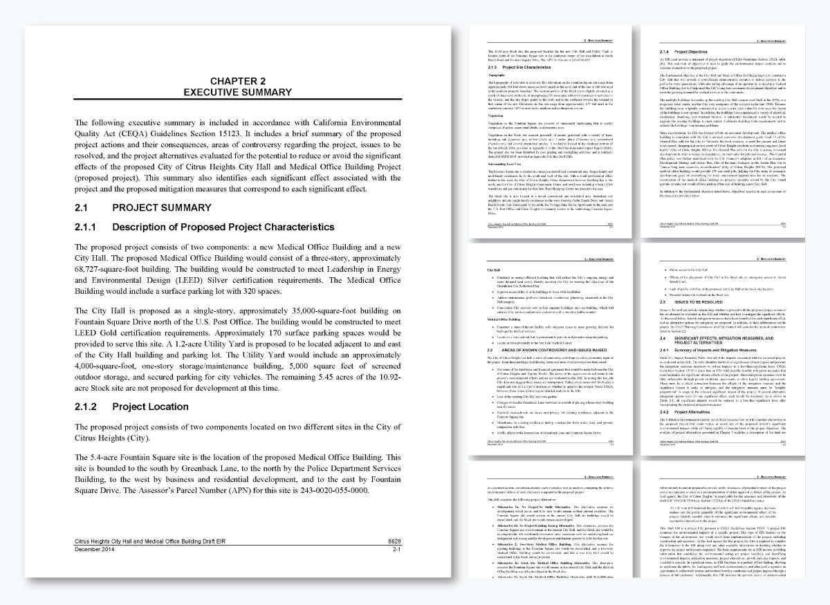
This example of an executive summary takes a very different form from the ones we’ve seen so far. The earlier executive summaries focused on marketing or business goals.
But this one is a project proposal and more like a technical summary and that changes everything.
Because it’s part of an environmental impact review, the tone, structure and intent are all shaped by compliance requirements rather than persuasion or storytelling.
What immediately stands out is how structured and regulatory this summary is.
It’s built to meet the California Environmental Quality Act (CEQA) guidelines, meaning every section must align with specific legal standards.
Instead of weaving a narrative, it methodically breaks down the project — from its description and location to areas of potential controversy, issues to be resolved and proposed mitigation measures.
I find it interesting how comprehensive this executive summary is. The document condenses an entire environmental report into one accessible document. It identifies significant project effects, such as environmental or community impacts, and then pairs each with a mitigation strategy.
The summary also goes a step further by outlining alternative project options, explaining how each would reduce or avoid potential harm. This kind of precision and transparency builds accountability — something that’s crucial in public-sector projects.
Unlike other summaries that lean on tone or emotional resonance, this one is all about clarity and compliance.
It’s written for decision-makers, stakeholders and the public who need to understand the project’s implications before approval. And even though it spans several pages, its structure makes it easy to navigate. Each section answers a specific question about the project’s what, where, why and how.
If you’re looking to create something similar, try this project proposal template from Visme. It’s perfect for outlining large-scale initiatives with multiple moving parts.

And if you’re working on it as a team, Visme’s workflow feature makes collaboration seamless. You can assign specific sections of the report to different team members, add instructions or notes on what needs to be done and set deadlines to keep everyone on track.
Once tasks are complete, teammates can upload updates or tag others for review — all within the same workspace.
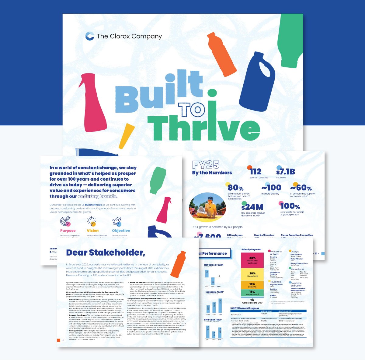
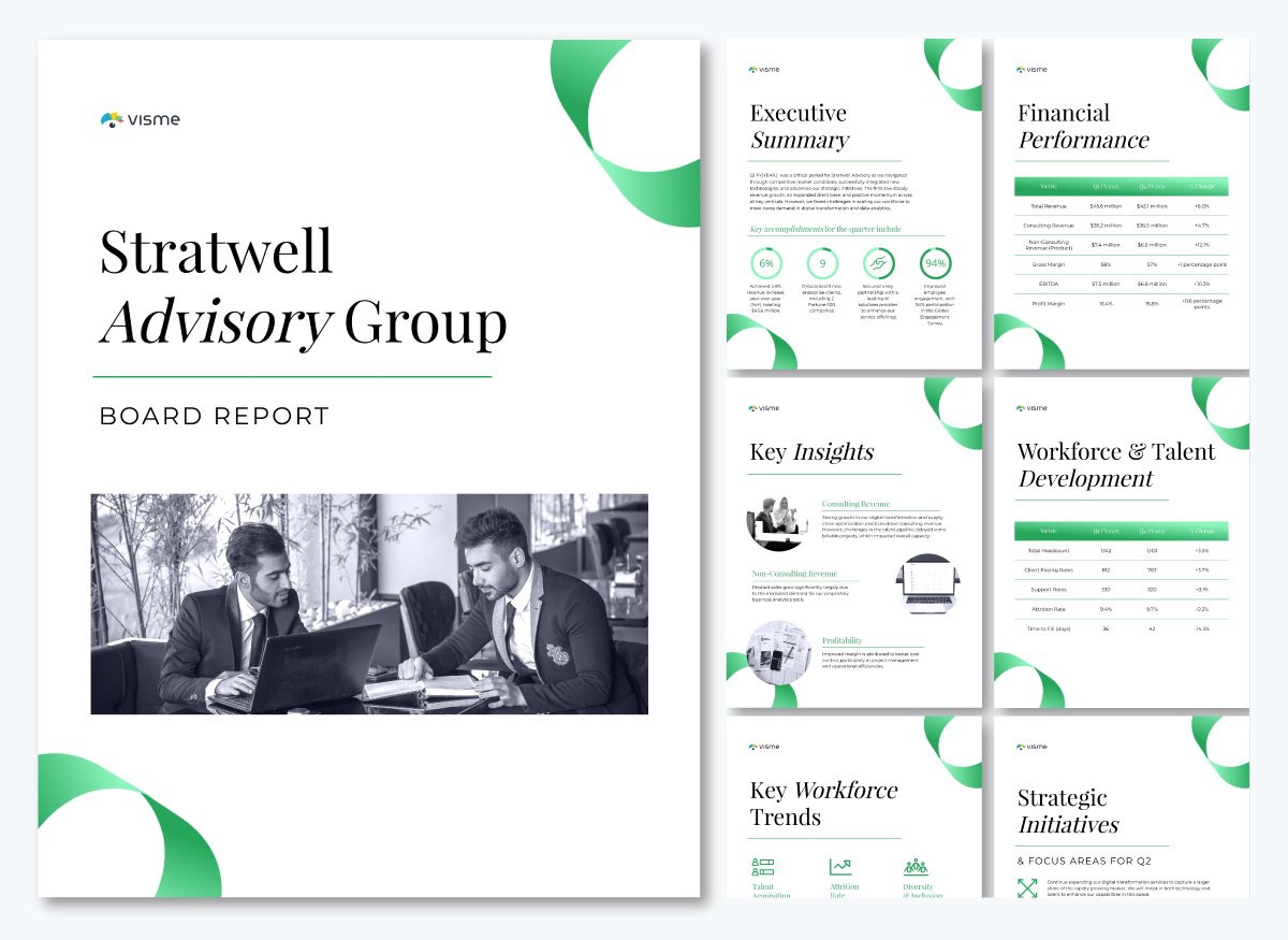
The executive summary of The Clorox Company’s 2025 Annual Report is an excellent example of how large corporations use this section to give readers the full picture without overwhelming them. For most big companies, the annual report itself can be hundreds of pages long, filled with financial data, ESG disclosures and strategy updates.
To make that information easier to digest, Clorox created a separate 28-page executive summary that highlights only the most important insights, achievements and priorities.
The colorful design, clean layout and smart use of visuals make it look like a brand magazine rather than a financial report — and that’s exactly what makes it an absolute beauty.
Another thing that strikes me is how they’ve achieved a good balance. It captures both the financial and human sides of the business, showing progress, challenges and future goals in equal measure.
This example is a good reminder that an executive summary doesn’t have to be one or two pages long. When done well, it can serve as a complete narrative for stakeholders who want to understand where a company is heading without getting lost in the details of the full report.

If you want to create an annual report or executive summary that looks just as polished, start with this template. Or browse our extensive library for other annual report templates for more ideas.
Once your document is ready, Visme gives you flexible share and publish options. You can:
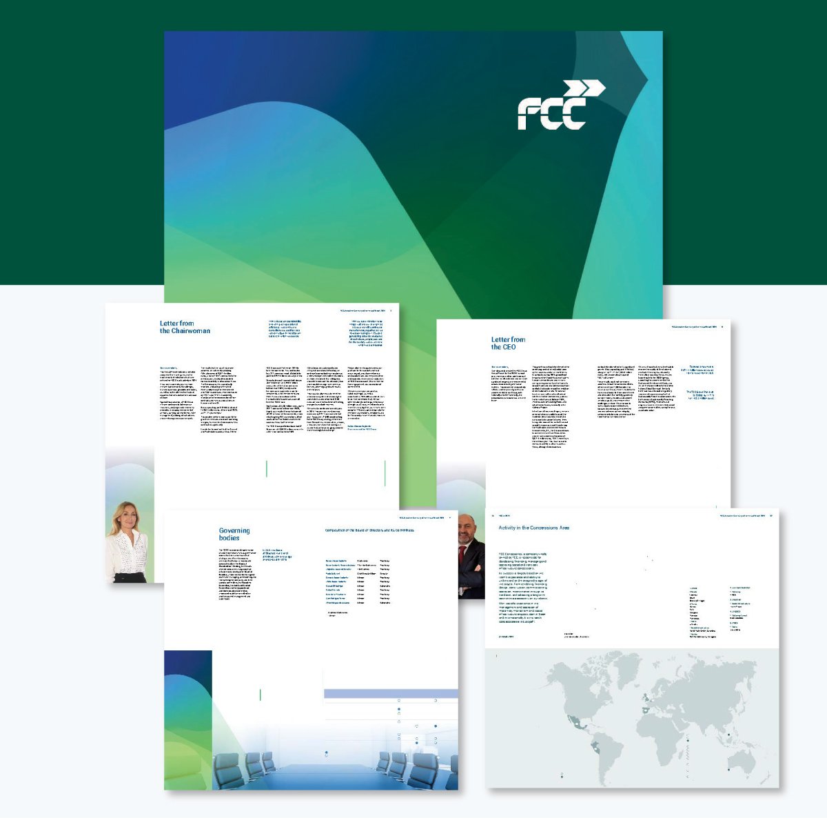
Just like the Clorox example, the FCC’s executive summary is presented as a standalone digital document — and it’s stunning. It opens like an interactive book, drawing you in with a smooth, engaging reading experience. The layout feels more like you’re flipping through a high-end magazine than reviewing a corporate report.
At 47 pages, it manages to be thorough yet super engaging, proving that an executive summary can have lots of details without being a bore. There’s also a link for you to dive into the full 825-page report.
You can’t help but admire how well it captures the essence of the organization.
The document includes letters from the Chairwoman and CEO, a breakdown of FCC’s corporate governance structure and a clear overview of how the company creates value.
There’s also a snapshot of its 2024 financial performance, complete with charts and visuals that make the data easy to understand at a glance. Add to that sections on stock market performance, geographic coverage maps and a forward-looking view of sustainability, and you have a complete executive summary.
It’s not just informative — it’s beautifully designed. The combination of icons, images and clean layouts turns what could have been a dry report into something visually inviting. Every element feels intentional, helping tell FCC’s story of transparency, growth and purpose in a modern, engaging way.
You can create a similar report using this template:

Share it with your team and see how people interact with your report using Visme analytics. It lets you know who checked it out, how long they spent on each page and which sections grabbed their attention most.
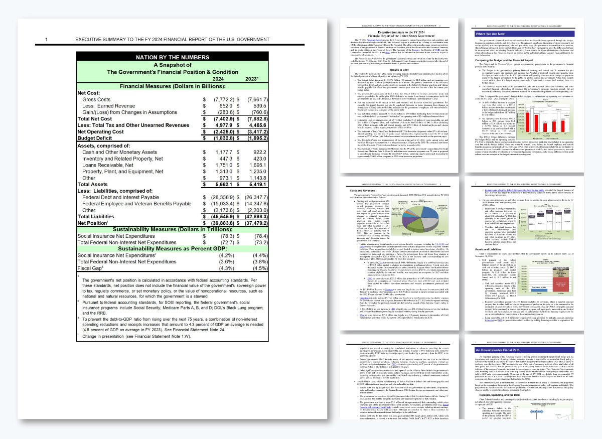
Our next executive summary report example is from the United States Government Financial Report, and it’s very different from the corporate ones we’ve seen so far.
Unlike Clorox or FCC’s visually polished reports, this one is straightforward. It’s only 10 pages long, but it gives a complete snapshot of the federal government’s financial position and performance for FY 2024 without any fluff.
It starts with a simple table that lays out the government’s financial condition — assets, liabilities, revenues and expenses all in one view. The next section, “Results in Brief,” does a nice job of breaking down the key metrics into short bullet points, so you get the main takeaways right away. There’s no storytelling or fancy layout here, just straight facts.
From there, the summary walks readers through major highlights like Comparing the Budget and the Financial Report, Costs and Revenues, Assets and Liabilities and Key Economic Trends.Each section includes shortened versions of tables and charts to make the numbers easier to follow.
What I really like about this summary is how accessible it is. Not flashy; it just makes sense.
Policymakers, analysts and the public get a quick and honest peek at the country’s financial status and the challenges ahead. The summary is simple and to the point and does exactly what an executive summary should: make complicated information easy to understand.
You can create a similar report using this template:
One of the best parts about using Visme is its powerful data visualization tools. You can choose from a wide range of charts, graphs, maps and tables — available in both 2D and 3D formats — to share beautiful visual insights.
Whether you’re showcasing national financial trends, departmental budgets or year-over-year comparisons, these tools make it easy to turn raw numbers into visuals that tell a clear story.
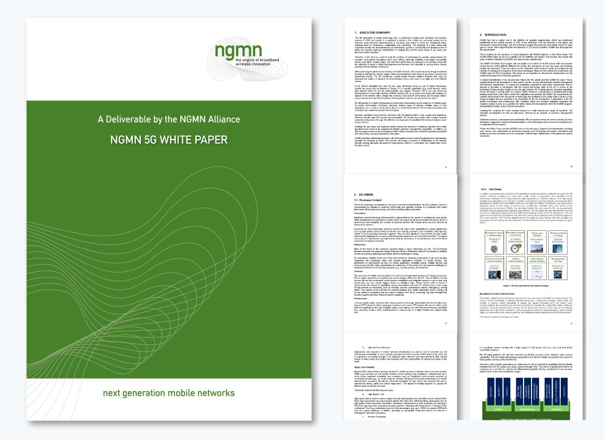
This next example comes from a white paper — the NGMN 5G Initiative — and it shows how an executive summary can look very different depending on the type of document. Unlike financial or corporate summaries we’ve covered so far, this one is technical and forward-looking. It sits right after the table of contents and lays the groundwork for what 5G means, how it works and why it matters.
What stands out to me is how it mixes technical vision with real-world relevance. It touches on the expected performance improvements — faster speeds, lower latency and better energy efficiency. It also ties those capabilities to broader goals like sustainability, productivity, socio-economic transformation and digital inclusion.
The tone is formal but optimistic. It outlines the technical challenges, such as spectrum management and modular network architecture, while highlighting the collaboration needed among global partners to make 5G possible. It’s not a summary of results; it’s a roadmap for what’s to come.
That said, the summary could benefit from a few improvements. The opening paragraph feels dense and overly technical, using phrases like “multi-layer densification” and “business contexts of 2020 and beyond” that might lose non-technical readers.
Create your own whitepaper executive with the help of Visme’s template below. Or browse our extensive library of whitepaper templates to find a design that suits your needs.

Our final example is an executive summary from a legal due diligence report for the Tibar Bay Port Project. And it’s quite different from the other examples we’ve looked at.
The entire second chapter is dedicated to the executive summary, which gives a full overview of the legal framework behind the project and highlights the main risks and issues that could affect how the public-private partnership (PPP) is structured.
This executive summary sample starts by outlining the scope of work. The legal team met with key stakeholders, reviewed relevant laws and noted any missing or unavailable documents.
I like that it’s very transparent about what information was and wasn’t provided. It clearly states that while some requested documents were not received, their absence shouldn’t affect the choice of PPP structure. That level of honesty gives the summary credibility and helps readers trust the findings.
From there, it walks through 11 key areas that shape the project’s legal foundation, including procurement rules, public financing, ports legal framework, land regime, environment, foreign investment protection, taxation, corporate matters, finance and securities, labor and governing law and arbitration.
Each section gives a short but focused look at the current regulations, identifies any potential risks and offers insights on what needs further clarification before the project moves forward.
What makes this summary stand out is how organized and straightforward it is. It reads like a practical guide rather than a pitch.
It’s simply there to help decision-makers, investors and legal teams understand the legal landscape they’re working with.
In a project of this scale, that kind of clarity is exactly what you want from an executive summary.
Create your own due diligence report using this customizable template below.

Writing an executive summary doesn’t have to feel overwhelming.
With the proper structure and guide, you can create one that’s clear, persuasive and easy to read.
Here’s a simple step-by-step process to help you get started. And if you’d like a deeper dive, check out our detailed guide on how to write an executive summary.
And if you ever get stuck, try using Visme’s AI Text Generator.
It can help you generate fresh ideas, refine your tone or even rewrite entire sections to make your summary flow naturally and sound professional — all while staying true to your brand voice.
Before you write a single line of your executive summary, review your entire document to pull out the pieces that actually matter.
Start by going through the report section by section and flag anything that stands out.
Look for the parts that carry real weight: the objectives, the strongest findings, any numbers that prove impact and the recommendations that move the project forward.
Jot down these points in your draft or keep a separate list. This way, you’ll be able to see the document from a decision-maker’s perspective.
This approach makes sure your executive summary captures the most crucial parts of your report rather than being just a shot in the dark.
Before you start drafting, take a moment to think about who will actually read your summary. The tone, level of detail and structure should match their priorities, not yours.
Consider asking questions like:
For example, an investor-focused summary will highlight ROI, market potential and financial projections. An internal update, on the other hand, might focus more on progress, challenges and next steps.
When you shape your summary around the needs of your readers, it becomes more relevant, more persuasive and far easier for them to act on.
And here’s the part most people overlook: your conclusion has to be brutally concise. No rambling. No backstory. No explaining how hard you worked.
Before you move on to writing the actual content, there’s one mindset shift worth adopting. Your summary has to be brutally concise. No rambling. No backstory. No explaining how hard you worked.
A Reddit user in r/consulting captured it perfectly:
“You have to be VERY SUCCINCT. Can't stress this enough. And get to the point ASAP. Nobody cares about how hard you worked or your process or your interim results or your assumptions (not yet, anyway). Get to what matters to them and why they should do what you recommended. They may not, but you’ll have their attention.” — Daxim74
This is exactly the kind of clarity and economy of words that every strong executive summary depends on.
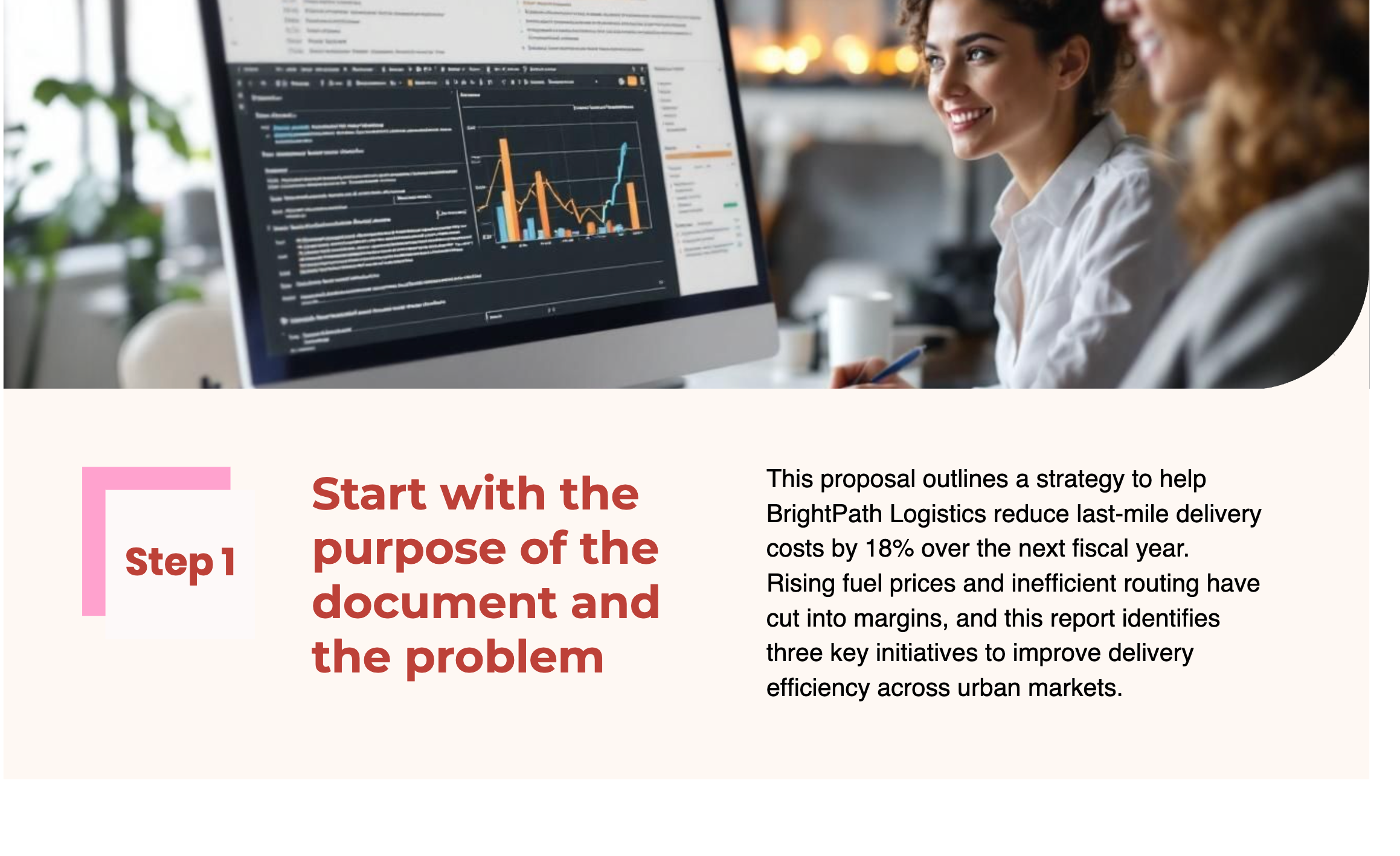
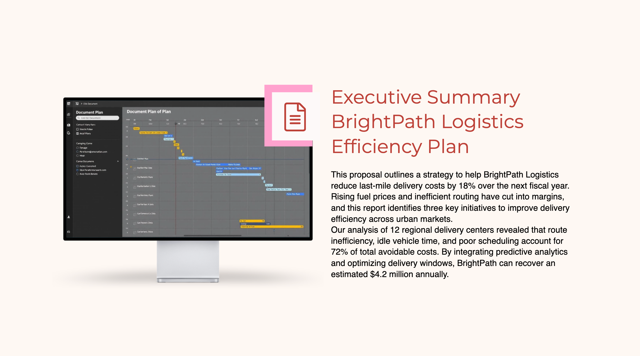
Open by clearly explaining what your document is about and why it exists. Define the problem you’re solving or the opportunity you’re addressing.
This section should establish context and relevance by answering three core questions:
Example:
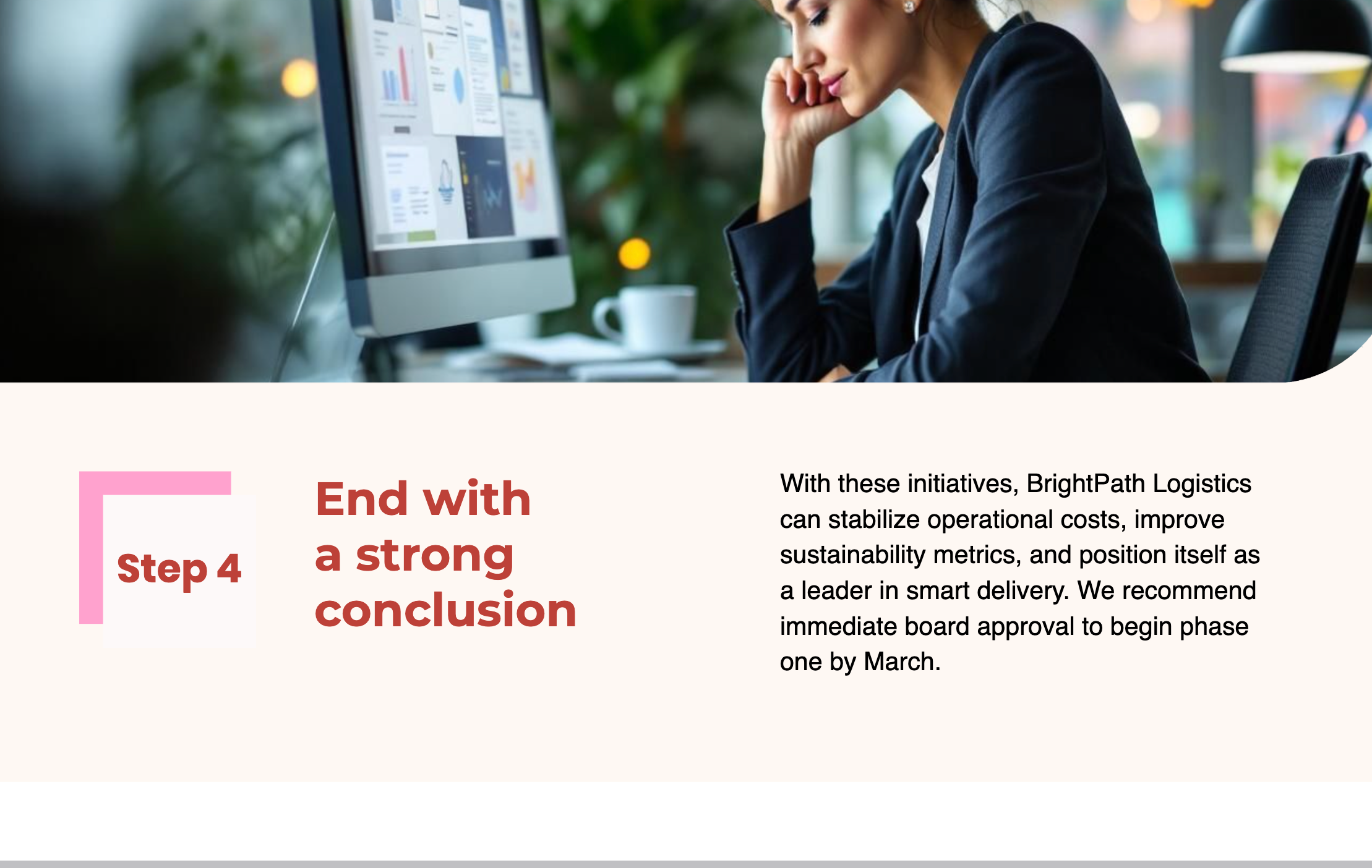
Let’s say you’re creating an efficiency plan for a logistics company. Here’s what this section would look like:
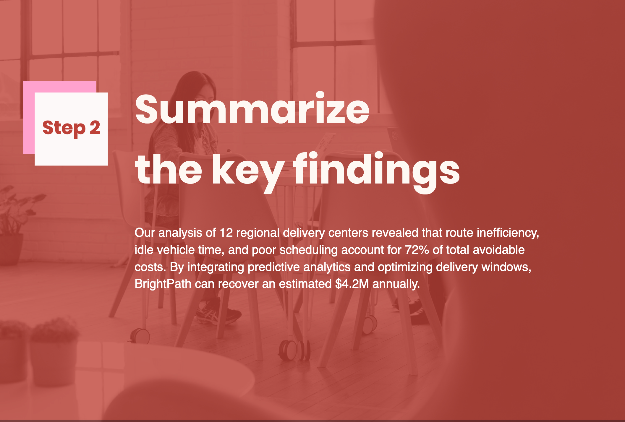
Once readers understand the “why,” it’s time to show them the “what.” Present your main insights at a high level. Focus on clarity and outcomes rather than technical details.
This section should address three critical questions:
By weaving key findings into your executive summary, you make it clear that your recommendations are based on solid evidence, which increases your report’s credibility.- Benjamin Ball from Benjamin Ball Associates
Example:
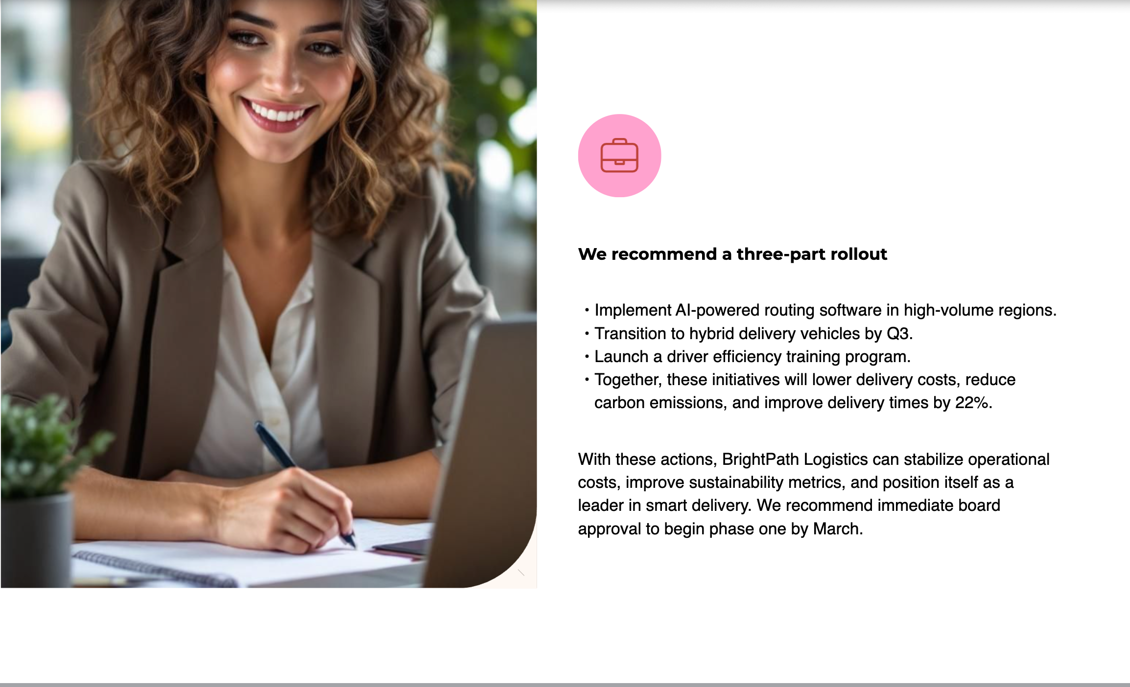
Since you’ve shared the data, it’s time to suggest what they should do next. Link each recommendation to your findings and make sure the next steps are easy to understand.
By the end of this section, your reader should walk away knowing:
Example:

To wrap up your executive summary, tie everything back to the bigger picture. Highlight the value of your suggestions and outline the next steps. This last part should make your reader feel confident about where to go from here.
By the end of this section, your reader should understand:
Example:
Writing a good executive summary isn’t complicated. But there are a few traps that even experienced professionals fall into.
Too often, professionals either over-explain, under-deliver or miss what decision-makers really need.
Below are the most common pitfalls and how to avoid them.

Striking the right balance between brevity and depth is one of the hardest parts. You need to include enough to communicate your key points and recommendations without turning it into another full report.
Too short, and it feels incomplete; too long, and readers lose interest before reaching the conclusion.
I reached out to our content editor, Unenabasi Ekeruke, who’s experienced at writing different business and executive-level documents. Here’s what he recommends:
“Executives are always racing against the clock. So before you write, ask yourself: If I had just 60 seconds of their attention, what’s the one message I’d want them to walk away with? That’s exactly what belongs in your executive summary.”
Another guideline I find helpful is to keep it to 2% or less of your entire document or about one page for every 10 pages of content.
Of course, this varies depending on context — a one-page startup proposal won’t follow the same rules as a detailed government policy report.
I also love how Erin Lebacqz from High-Value Writing explains it. She calls it a balance every writer has to navigate:
"It's a balancing act in writing; we're trying to be brief and yet comprehensive. So it's up to you to decide when something is important enough to be included. I typically decide that based on whether the reader needs that information to be able to make a decision."
Starting with the executive summary might seem efficient, but it almost always leads to revisions or inaccuracies. If you don’t reference the full report, you risk missing key insights or misrepresenting your conclusions.
The most effective approach is to write the executive summary after you’ve completed your main document. By then, you’ll know exactly which findings, data points and recommendations are most relevant to highlight.
I’ve seen this mistake more times than I can count. People tuck their main point somewhere in the middle of the document, hoping readers will find it. The problem is, most executives won’t.
They scan for insights, not paragraphs. If your key takeaway isn’t front and center, there’s a good chance it’ll be overlooked. That’s a missed opportunity, especially when your summary is supposed to drive action.
Start on a strong note. Lead with the main message: the problem, opportunity or finding that matters most. Once you’ve captured attention, use the following paragraphs to provide context, data and evidence to back it up.
Your opening lines should make readers want to keep going, not search for the point you buried halfway through.
A common mistake is writing an executive summary that feels too generic. When it comes off that way, it quickly loses credibility. People, especially executives and investors, can spot when something isn’t tailored for them. I’ve found that the best executive summaries connect directly with what the audience cares about.
You can’t just use the same version for a board meeting, an investor pitch and an internal report.
Each group has different priorities. Executives want to know the outcomes and what’s next, investors are looking for ROI, and internal teams are focused on how the plan affects their daily work.
Tailor your executive summary to your audience. Use the company or project name, include real data and highlight what matters to the readers. When your summary feels like it’s made just for them, it grabs their attention and builds trust right off the bat.
Even the best ideas can fall flat if they’re buried in jargon or dense language. A summary full of technical terms, filler phrases or long sentences will lose readers fast.
Use plain language and short paragraphs. Aim for a grade 6–8 reading level so your message comes through clearly, even with busy readers just skimming between meetings.
A summary that cuts off or doesn’t give clear next steps can leave readers feeling a bit lost. An executive summary should be more than just a recap of your work; it should guide your reader toward making a decision.
You want to clearly outline what you need from them—whether that’s giving the thumbs-up to a proposal, allocating some budget for your project, kicking off the implementation phase or scheduling a follow-up meeting to discuss further details.
A good template starts with a short introduction that explains the purpose of the document, followed by background or context, key findings, recommendations or next steps and a brief conclusion. Think of it as a concise version of your full report that’s easy to skim.
The general rule of thumb is to focus on the essentials. Explain the main purpose of the report, summarize the key findings and end with the most important recommendations or takeaways. Don’t get lost in the details; just provide a quick overview of the “what,” “why,” and “so what” in a page or two.
Here’s a standard format you can follow:
Start by setting the stage. Explain what the document is about, why it was created and the challenge, issue or opportunity your document tackles. For example: “This report outlines our findings on market trends in 2025 and recommends strategies for growth in emerging sectors.
The three main elements are:
Most executive summaries are between one and three pages, depending on how detailed and complex the main document is. The key is to keep it concise enough for a quick read but informative enough to be understood on its own.
That said, there are exceptions. Some organizations create separate executive summary documents that go beyond this range, especially for large corporate, government or technical reports.
No, executive summaries and abstracts both capture the essence of a project in a concise form, but they serve different purposes and include different levels of detail.
An abstract is mostly used in academic writing. It provides a brief, highly condensed overview of the research, usually limited to a single paragraph or a few hundred words.
An executive summary, on the other hand, is a standalone section or document used in business, government or professional reports. It’s longer than an abstract, often running two to five pages. It summarizes the entire report and includes key insights, conclusions and recommendations.
Absolutely. Many professionals present executive summaries as slides for meetings or board presentations. The same rules apply: keep it clear, focused and visually engaging with only the most crucial information.
Just keep it simple and to the point. Use visuals like charts, graphs and bullet points to highlight key insights. Avoid long paragraphs, focus on what matters most and make the main takeaway easy to spot. Senior executives should be able to grasp the message in just a few minutes.
Busy executives hardly have time to dig through the pages of business documents. Executive summaries are one of the easiest ways to bring everyone up to speed. They distill long reports, proposals and business plans into something people can read, understand and act on in minutes.
If you want to create polished, professional executive summaries, Visme makes the process a breeze. You’ll find dozens of templates for creating reports, business plans, case studies, white papers, project plans and other types of business documents. Each of these templates comes with professionally written executive summary examples to guide you.
With Visme, you can easily collaborate with your team and customize every part of your document. Add icons, stock photos and videos to make your content visually engaging. Use data visualization tools to turn complex numbers into easy-to-read charts. And bring everything to life with animations, interactivity and AI-powered tools that streamline your workflow.
And if you’re starting from scratch and need design inspiration, let Visme’s AI Document Generator do the heavy lifting. Just describe what your executive summary is about and the AI will create a well-structured draft in minutes, ready for you to refine and design.
Sign up to create beautiful, professional documents and winning reports that get noticed and leave a lasting impression.
Design visual brand experiences for your business whether you are a seasoned designer or a total novice.
Try Visme for free


![How to Create a Practical Crisis Management Plan [+ Templates]](https://visme.co/blog/wp-content/uploads/2025/07/How-to-Create-a-Practical-Crisis-Management-Plan-Thumbnail.png)