


Lean Canvas Business Model: What It Is + How to Create One

Sharing information about typography is best done visually.
Typography infographics are an outstanding option for achieving that.
Typography infographics educate, promote and drive traffic. They can also position you as an authority on the subject and build lots of backlinks for your site.
You probably know how to assemble fonts on a canvas. But for typography infographics, every font choice, layout decision and visual cue has to be intentional.
In this guide, I'll walk you through everything you need to know about typography infographics. I’ll share the most popular styles, real-world examples and a step-by-step process for creating them with Visme.
This article is for font designers showcasing a new typeface, design educators explaining the fundamentals of typography and content marketers looking to build backlinks through shareable visuals.
A typography infographic is a visual representation of information about typography, fonts, and typeface design, including what they are and how to use them.
But why create them? There are three main purposes:
Here’s an example of a typography infographic our designers created for an article I wrote about the anatomy of typography. It showcases all the details about a font's parts and their names.
Since we published that article, the infographic has been shared hundreds of times on Pinterest and in other articles, helping us grow our domain authority through infographic backlinks.

Typography infographics come in several styles. s. Here’s a brief introduction to typography infographic design styles you’ll encounter most often.
These infographics dissect individual letterforms to explain technical terms like stem, bowl, aperture and terminal. They’re educational resources that fit perfectly into blog posts and typography basics design courses.
The example infographic above falls into this category, as does the one below.
This one is a smaller version that visualizes only the anatomy of the letters themselves, while the one above shows additional details like x-height and baseline.
Another difference is that the one above uses bodies and objects as examples for the letters’ parts.
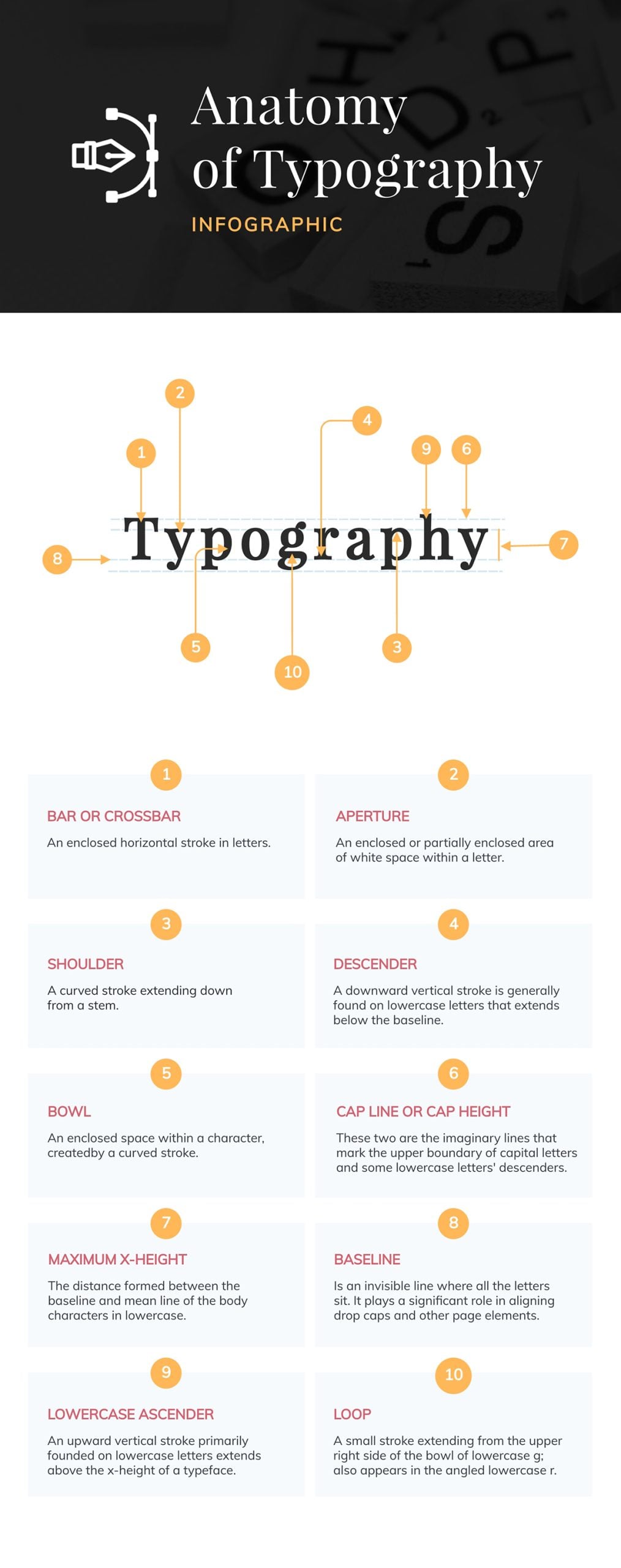
As you can see, there are many ways of creating a font anatomy infographic. It all depends on your objective and the visual style you want to use.
For instance, for my article on accessible fonts, our designers created several small infographics visualizing the anatomy of accessible fonts.
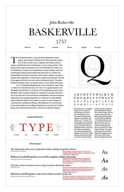
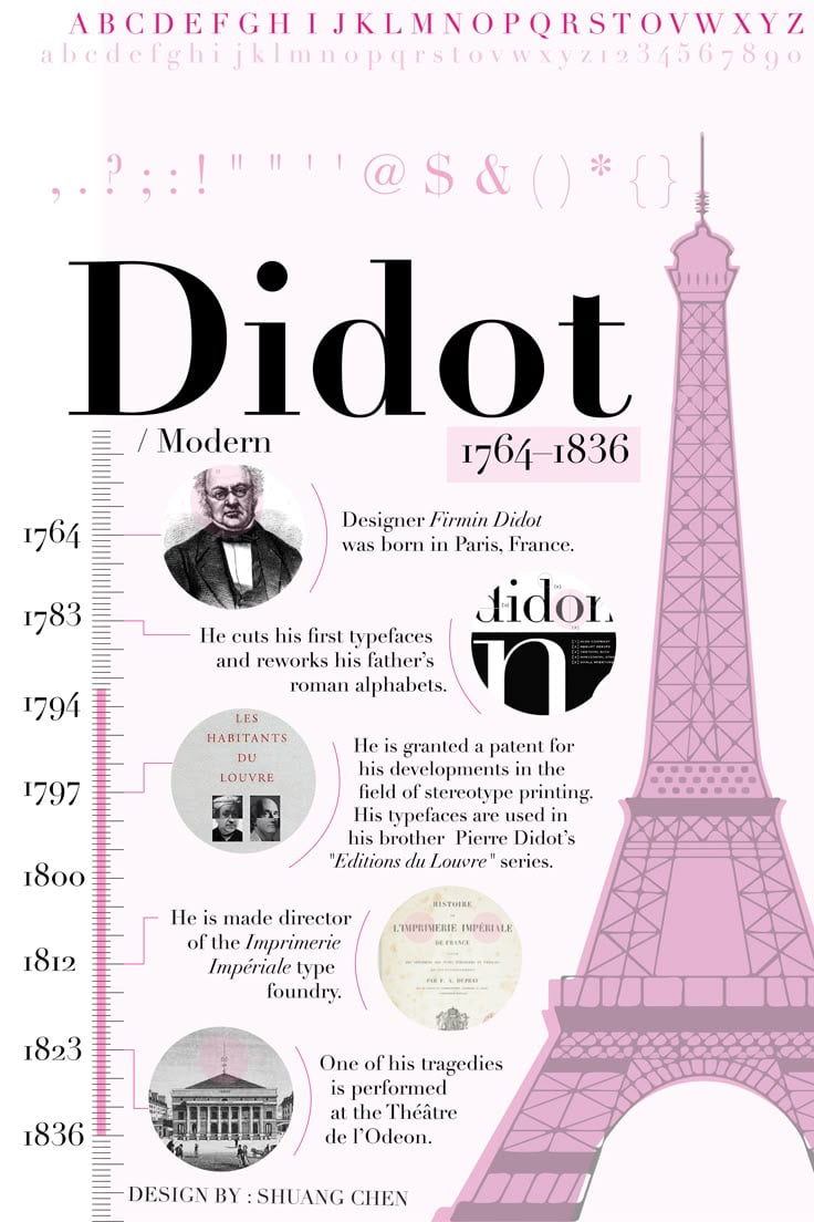
The next infographic style for typography showcases the distinctive features of a specific font family, like, for example, available weights, character sets, alternate glyphs and suggested use cases. Font designers use them to promote new releases and help buyers understand what they’re getting.
They’re perfect for font launches, portfolio pieces and design system documentation.
As Charles Nix, senior director of Monotype, says, “It’s always important to ensure consistency and easy access to fonts, guidelines, and templates.” This type of typographic infographic is perfect for achieving that goal.
You’ll see lots of these typography infographics on Pinterest. That’s because Pinterest loves the vertical format and can link back directly to font download pages.
The designer will need to design an infographic describing the qualities of a typeface or font. Here are some inspiration links:
Comparison infographics are super versatile and also work well for typography. They can help people understand the differences between similar-looking fonts or typeface categories.
The layouts can answer questions like “When do I use Helvetica vs. Arial?” or “What makes a transitional serif different from a modern serif?”

These styles are predominantly used as decision-making guides and as educational content for both students and designers.
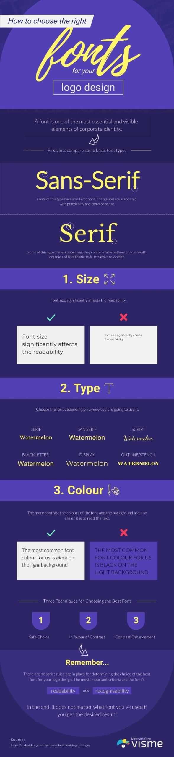
Here’s a typography infographic template from our gallery, created as a resource for choosing the best font for a logo design.
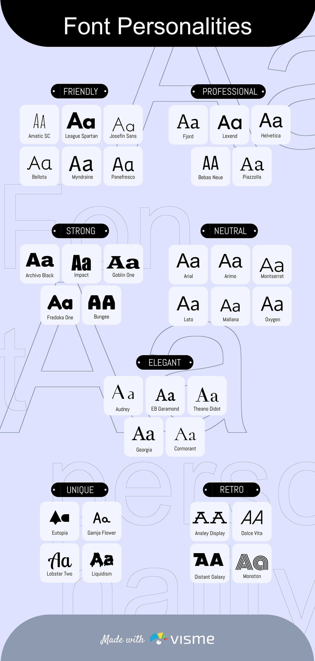
A font classification infographic organizes typefaces into categories.
These can be physical categories like serif, sans serif, script, display, etc.
Or, they can be psychological, like friendly, elegant or serious.
In some cases, a font classification typography will display both physical and psychological characteristics of fonts.
You can even create a simple infographic that visualizes this quote from Lisa Cain, professional packaging designer:
“We read fonts instinctively. A soft script feels approachable, while a geometric sans gives direction. One invites you in, the other gets things done. One suggests weekend wine, the other screams deadline.”
The best ways to use this type of infographic is in blog posts, design courses, tutorials and as reference guides. The template below is an idea resource for this style of infographic content.
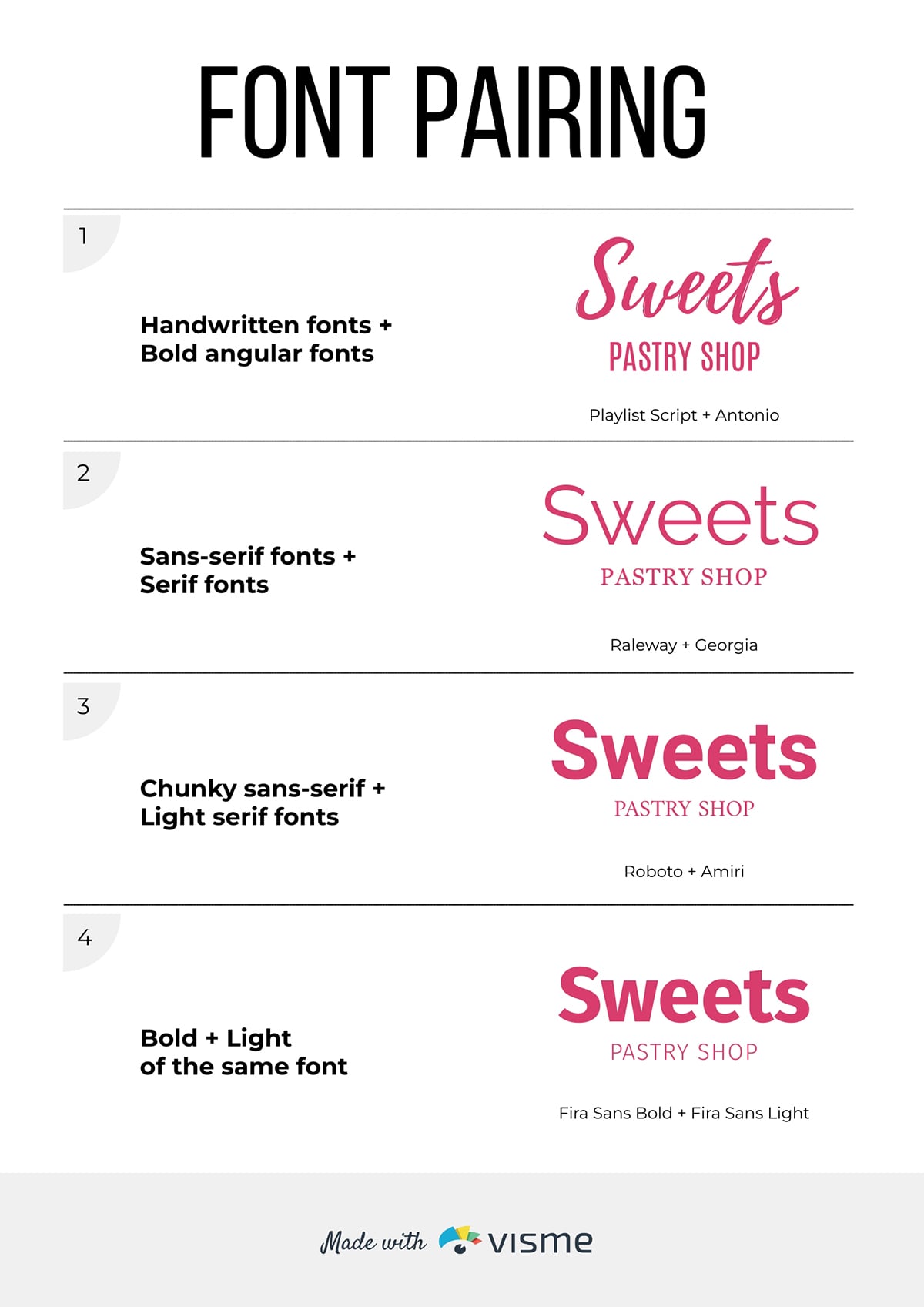
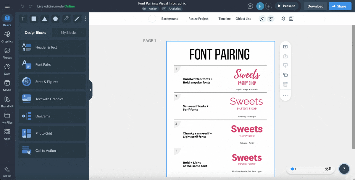
With a font pairing infographic, you can demonstrate which typefaces work well together and why.
Show headline and body text combinations with explanations about contrast, mood and hierarchy.
These infographics are immediately actionable, as readers can use the information for their ongoing projects. These infographic styles are great for social media content, design tips and brand guidelines templates.
Use the template below to create your own favorite pairings or to promote your foundry’s typefaces as bundles.
Now, let’s look at some of the best typography infographics created by designers and typography professionals.
There’s a lot out there, so I picked a varied selection to show you different types and styles.
I also share what makes them effective, plus an actionable takeaway you can apply to your own projects.
This infographic from Iconic Fox breaks down the three most important typographic styles: serif, sans-serif and script, and shows how they’re used in branding logos.
Every section describes how the styles of typography have evolved, and what this evolution means for how we perceive things, particularly brands.
Breaking an infographic into sections like this makes the final design more versatile, since you can pull it apart and use the sections as separate visuals in a blog post.
When you create an infographic with Visme using the section editor, you can download it as a long vertical graphic or as separate images, section by section.
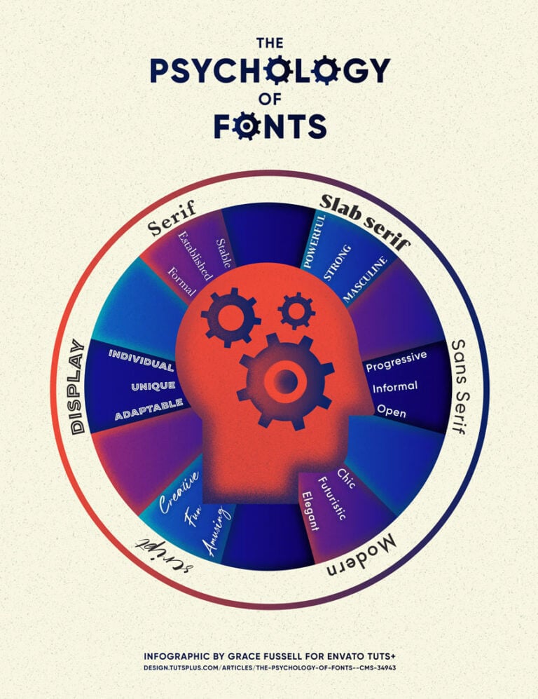
Fonts aren’t just building blocks for text. They also carry meaning.
Font psychology is a large part of how designers and marketers use typography to connect with the customer, the reader and the audience in general.
Take a look at this typography infographic poster published by Envato Tuts+. It categorizes fonts by visual type and also shows which psychological characteristics apply to each type. The head in the center instantly conveys that the infographic's content relates to perception and psychology.
Actionable takeaway: Typography infographics don’t need to be overly detailed, long or complex. They can also be simple and distinct. So simple that it can be used as a poster for quick, easy reference.
Visme has hundreds of poster templates you can use to create your own typography-inspired design.
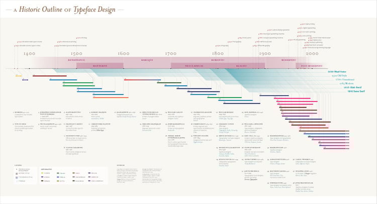
Infographics, even typography infographics, don’t need to be vertical to be effective.
Here’s an example. It’s a horizontal, highly detailed timeline about the history of typeface design.
This printed infographic is shared in Z’s data design portfolio.
In Z’s own words, it’s “An infographic illustrating the history of typography and typeface design outlined by the development of printing in East Asia and Europe, and on towards the rapid and expansive advancements in the 19th and 20th centuries.
This history is considered within the contexts of artistic movement, typographic styles and technological developments.”
Actionable takeaway: Don't be afraid to break traditional infographic formats. If your content naturally flows horizontally (like a timeline), design it that way.
Visme's canvas is flexible enough to accommodate horizontal layouts, and you can always adjust the dimensions and design elements to fit your content's natural structure.
Consider how your audience will consume the infographic; horizontal formats work well for presentations and desktop viewing, while vertical formats excel on Pinterest and mobile devices.
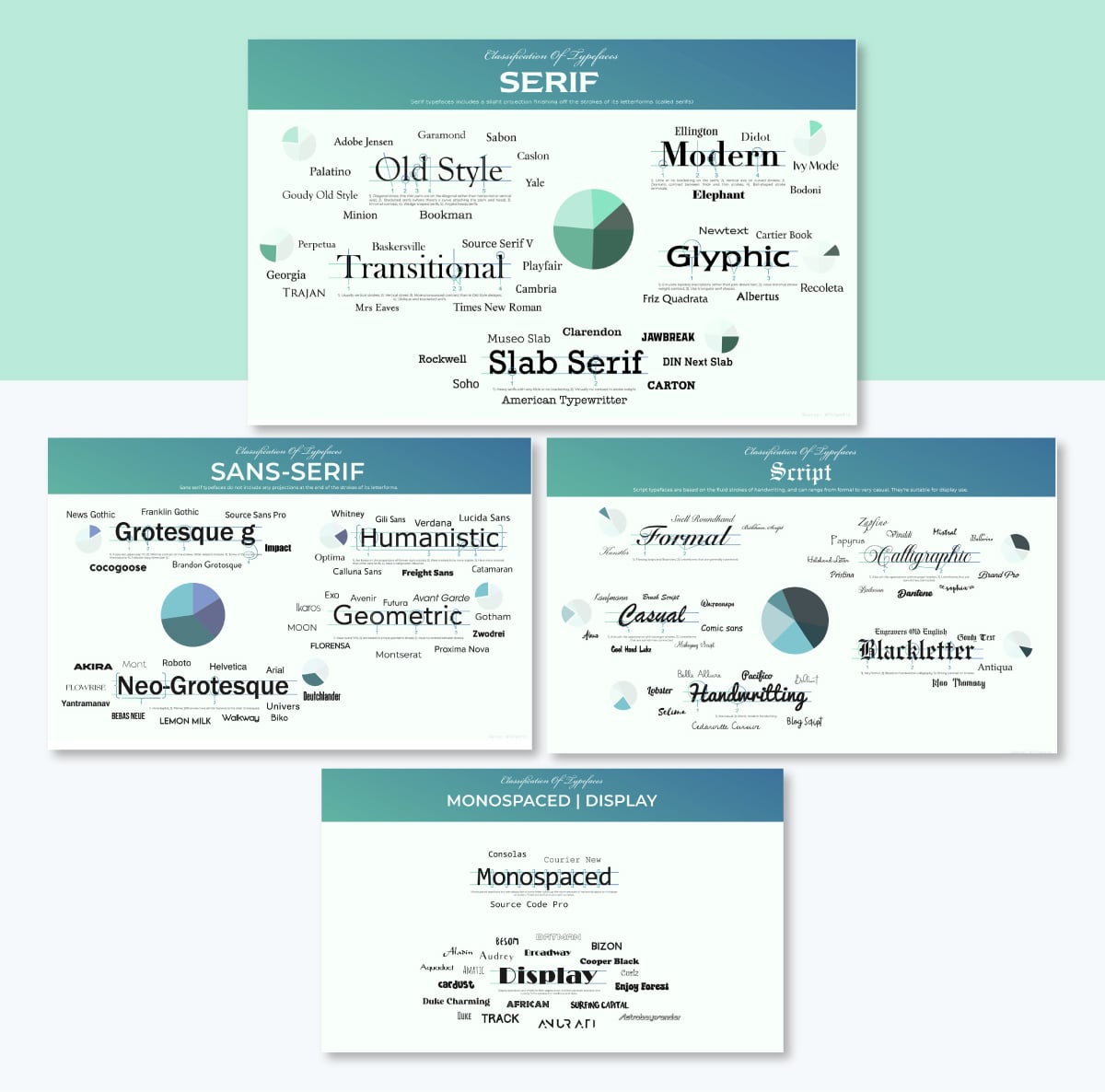
This four-part infographic breaks down typeface classifications with detailed visuals.
Each section focuses on one font category: serif, sans serif, script and display fonts.
Within each category, the graphic design showcases popular subcategories and explains the distinguishing characteristics that define each classification.
What makes this series particularly effective is its consistency. All four infographics follow the same visual structure, making them easy to follow and perfect for educational purposes.
The layout uses actual brand fonts as examples, letting viewers see the characteristics being described rather than just reading about them.
Actionable takeaway: If you're creating an infographic with multiple categories, consider designing a series rather than cramming everything into a single, overcrowded visual. This approach lets you dive deeper into each topic while maintaining visual clarity. Plus, a series gives you more content to share across social media and blog posts over time.
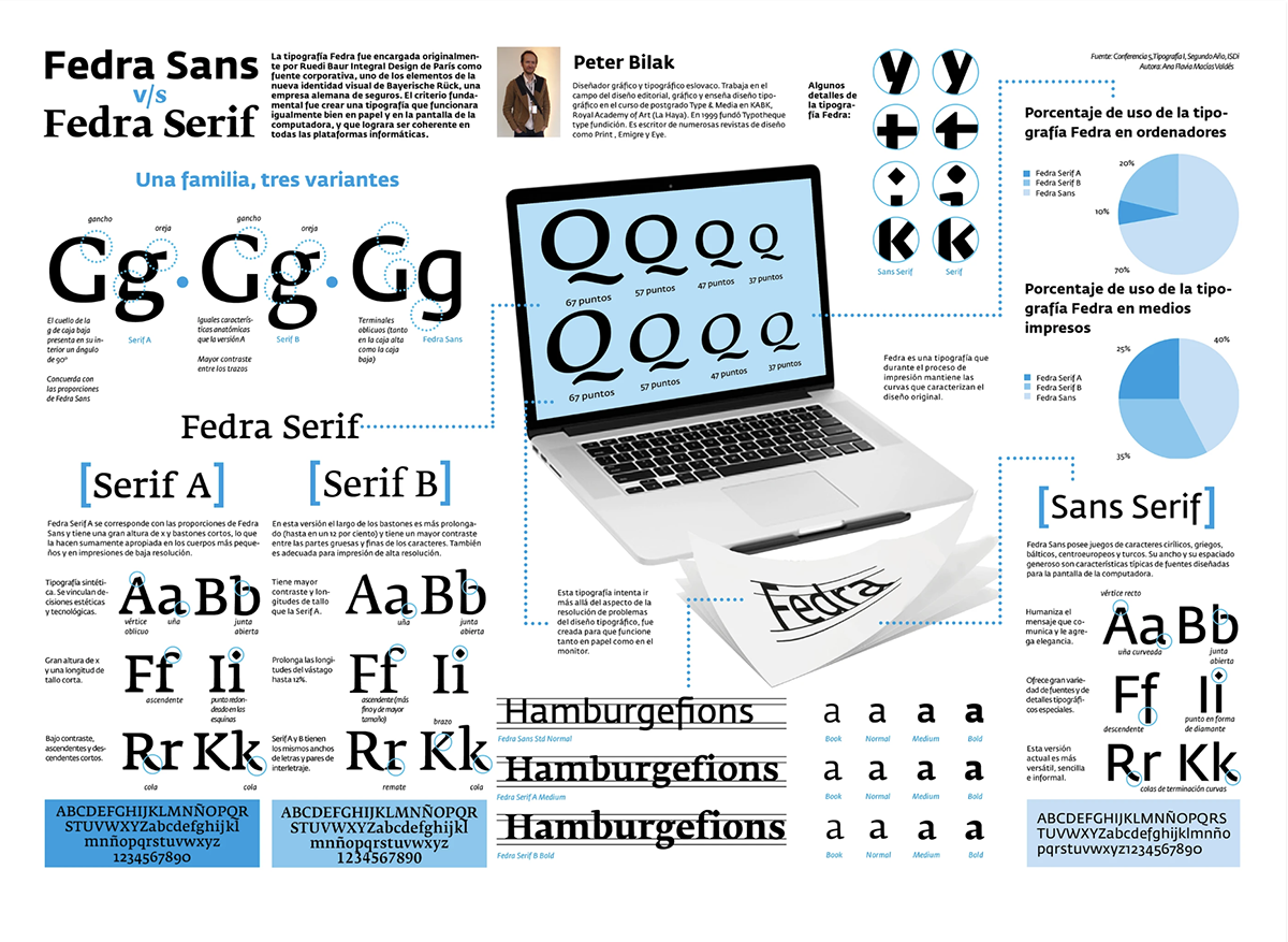
This comparison infographic shows the visual differences between two versions of the same typeface: serif vs sans-serif. The eye-catching design includes sample text for both fonts, making it easy to spot the subtle distinctions in letterforms, spacing, and overall personality.
The layout is clean and straightforward, with each font occupying half the space in each section. No font is given more importance than the other.
The design also includes technical specifications and suggested use cases for each typeface. This information helps designers make informed decisions about which font better suits their project needs.
Actionable takeaway: When creating comparison infographics, use a layout that showcases both options equally. This lets viewers focus on the actual differences rather than being influenced by the design.
Include practical decision-making criteria (such as suggested use cases), so your infographic doesn't just inform but also helps people take action.
Our designers created an infographic on typography principles as a narrated video. This example from our YouTube channel explains fundamental typography concepts like hierarchy, spacing, and font selection using animated examples.
The video format works particularly well for typography because it demonstrates how good (and bad) typography affects readability in real time.
Viewers can see how principles are applied across different sections of text, making abstract concepts easier to understand.
Actionable takeaway: Consider turning your static infographic into a video for social media distribution. Visme's animation features let you add transitions, motion effects and timed reveals that make typography concepts more engaging.
Aside from YouTube, videos also perform exceptionally well on LinkedIn and Instagram, where they're more likely to stop the scroll than static images.
Creating a typography infographic doesn't require advanced design skills, but it does need a strategic approach. Follow these five steps to develop an infographic that educates, engages, and drives results.
The first step of the process is to clarify your infographic's purpose and the intended audience.
Ask yourself:
The answers to these questions are what will help you build a design strategy. They will guide you on how to put together the information so it’s relevant for your audience.
Also, knowing what problem you’re solving will support the way you write the content and the visuals you choose.
So now, using the answers, outline your infographic's structure. List the main sections, the key points you want to cover, and any data or examples you'll need.
If you're working with a team, use Visme's whiteboard and collaboration features to share your initial concept and gather feedback before diving into design. Getting alignment early saves time later.
For infographics that could involve user engagement, plan interactive features such as clickable sections or expandable details. Annotate these from the start rather than adding them after the design is finished. This will save a lot of time in the long run.
Creating a wireframe before designing is like making a blueprint for your infographic. It shows where content blocks, headlines, and visual elements will be laid out before adding any of the details.
You can sketch this on paper, use a digital tool or work directly in Visme. The fastest method? Start in the Visme whiteboard tool to create a quick wireframe using shapes and text boxes.
Don't skip this step. A solid wireframe will prevent you from redesigning halfway through because the layout doesn't work.
Your wireframe should answer:
Now it's time to gather all the content your infographic needs. Keep any uploads organized with Visme's folder system so you can access them quickly as you build.
These are the things you’ll need:

Here's a quick guide on creating and managing folders to keep your workspace tidy.
This is where your planning pays off. Open Visme and find a template that loosely fits your wireframe, or a blank canvas if you're feeling ambitious, and begin translating your wireframe into a polished design.
Here are some design fundamentals to keep in mind:
Here's a tutorial on creating infographics in Visme that walks through the design process.
There are several AI features inside Visme to help you speed up the process and enhance your design. These two are the most relevant in this case:
Watch this tutorial to see the AI Writer in action.
A typographic infographic or flowchart isn't finished until it's in front of your audience. Visme gives you multiple ways to distribute your work:
For immediate sharing:
For strategic distribution:
Track performance:
Check out this complete guide to sharing and publishing in Visme for all your distribution options.
Don’t forget to optimize your infographic for SEO! Here’s a quick rundown of things to take care of. You can read our full guide on infographic SEO for more information.
Web-based AI tools and Visme’s built-in AI features help you jumpstart and streamline your infographic creation process. Below is a categorized list of simple prompts to help you along.
Don’t forget that the key to using AI in design is to let it do the heavy lifting, like research, structure, and initial drafts. You must then provide the editorial judgment, visual taste that makes the final infographic actually useful.
When chosen and arranged properly, good infographic typography achieves the following things:
The core typography principles for infographics include:
To choose the color for a typography infographic, consider the following aspects:
The ideal layout for a typography infographic is the one that best showcases your information. Vertical infographics are the most common, but that doesn’t mean your infographic can’t be horizontal or square.
Technically, there are more than 5 types of typography, but these are the main ones:
The five essential elements of an infographic are:
The 3-font rule suggests using no more than three different typefaces in a single design to maintain visual cohesion. Typically, you’d use one font for headlines, another for body text and a third for accents or callouts. Many designers simplify this further by using just two fonts or different weights of the same font family.
The seven most common types of infographics are:
Great infographic fonts prioritize legibility at various sizes. Sans-serif fonts like Montserrat, Open Sans, and Roboto work well for body text and data labels. For headlines, you can use bolder sans serifs or clean serif fonts like Merriweather. Avoid overly decorative fonts for core content, but they can work for emphasis when used sparingly.
Typography infographics combine education with visual appeal, making font and typeface concepts accessible to anyone. Regardless of whether you're explaining font anatomy to beginners, promoting a new typeface or creating a reference guide for designers, the key is matching your content strategy to your audience's needs.
Start with a clear purpose, sketch your structure, gather your content and let your design bring the information to life. With Visme's templates, AI features, and drag-and-drop editor, you can create professional typography infographics even without any design experience.
Ready to turn your typography knowledge into shareable visuals? Start creating your infographic with Visme today.
Design visual brand experiences for your business whether you are a seasoned designer or a total novice.
Try Visme for free


![How to Make an Interactive Infographic [+Templates]](https://visme.co/blog/wp-content/uploads/2023/11/How-to-Make-an-Interactive-Infographic-Quick-Guide-8-Customizable-Templates-Thumbnail.jpg)


