Typography Infographics: 12 Inspiring Examples & Techniques

When creating infographics, it's important to have a good balance between your information and the visuals that represent it. And one great way to do that is through infographic icons.
Infographic icons catch the eye faster than text and, more importantly, communicate meaning at a glance while supporting your message.
That said, icons shouldn’t just stand in for images or visuals in your infographic. They need to feel intentional and work in sync with every other design element in your infographic.
To help you get this right, we’ve created an infographic icon design tutorial. You’ll find practical examples and use cases, a step-by-step guide, ready-to-use templates and expert tips to help you design polished, professional infographic icons.
Let’s get to it.
Icons are a simple way to represent text visually in your infographic. They’re minimal but add balance and support your content.
Below are a few more perks of using infographic icons in your infographic:
One of the great things about icons is that they often convey the same meaning across different cultures and contexts.
For example, in this infographic about environmental factors that affect plant growth, icons like water/rain, sunlight and soil are already clear. They don’t need text to explain what they represent.

A few other universal examples:
Icons naturally draw attention and when used thoughtfully in an infographic, they guide the reader’s eye.
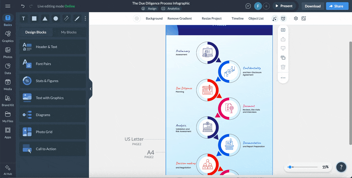
In a detailed infographic, you can use icons to break up sections, emphasize anchor header text, highlight key points or show the flow of a process.
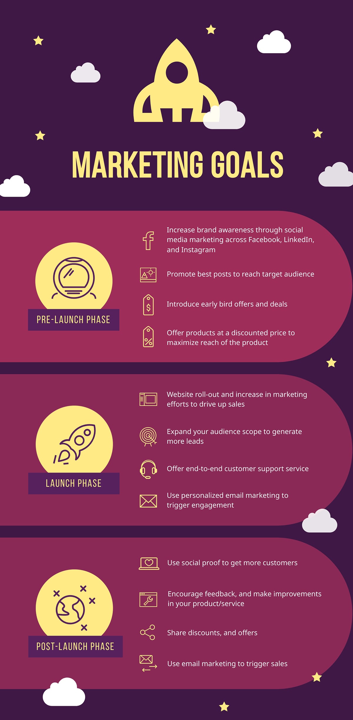
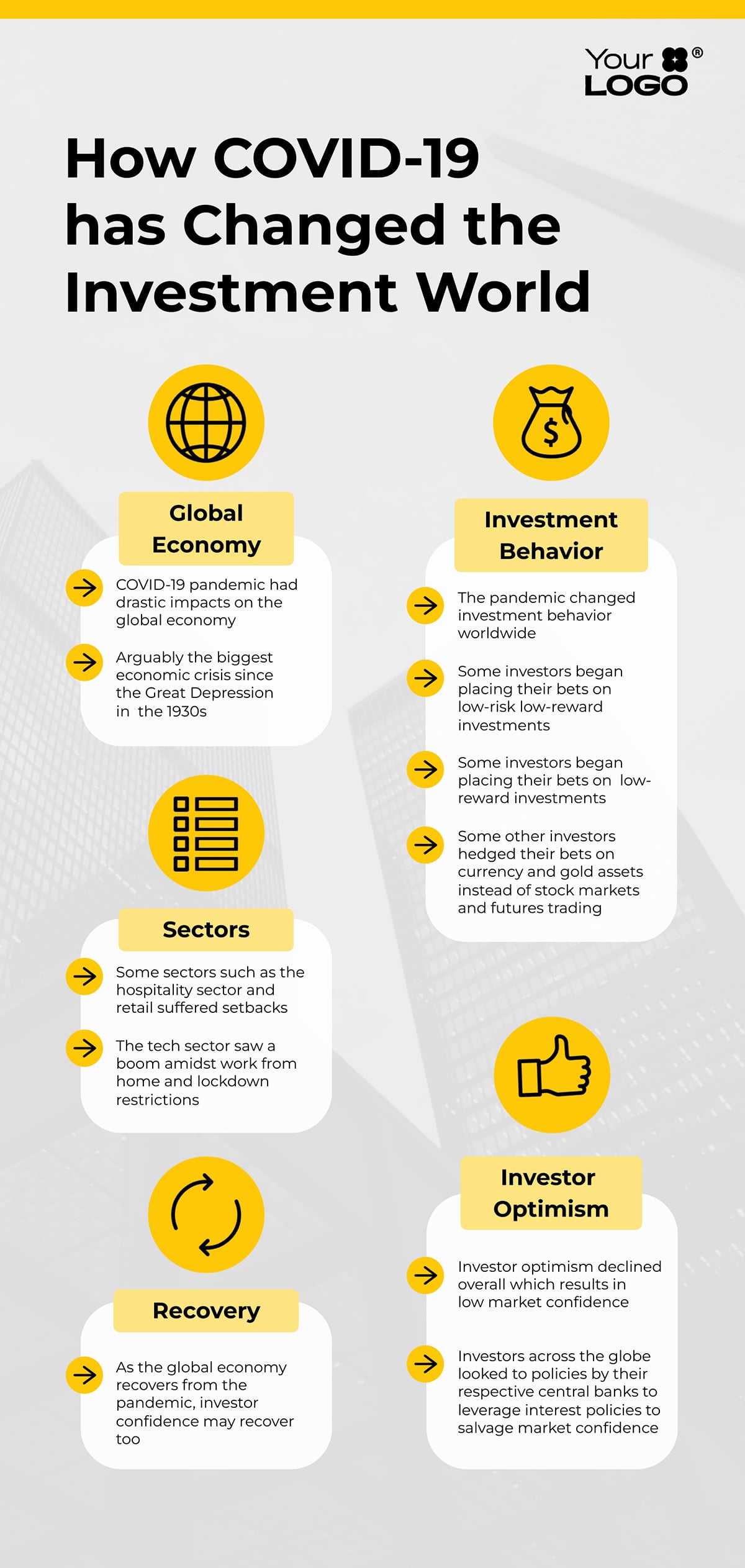
For example, look at this marketing goals infographic. Icons are used to emphasize the main header in each section and highlight the key points.
Icons are great for illustrating concepts or presenting data without resorting to lengthy sentences. This is especially great for topics that are hard to explain with text alone.
For example, if you are using several sentences to explain a concept such as cloud storage or customer satisfaction, an icon paired with a short label can convey the idea quickly.
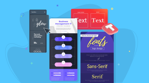
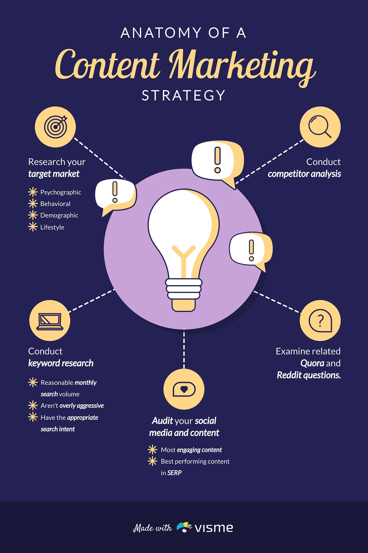
Check out how icons were used to explain content marketing here:
To design a professional infographic, your icons should meet the following criteria:
Some icons are used frequently in infographics because people recognize them right away. This makes it easier for everyone to grasp information quickly.
Here are common icon categories and tips on how to use them in different types of infographics:
Business topics can sometimes feel complex but icons can be a great way to simplify them.
Icons such as charts, graphs, briefcases, lightbulbs, targets, handshakes and presentation boards are staples of business communication.
Check out the over 190 business infographic icons in Visme.
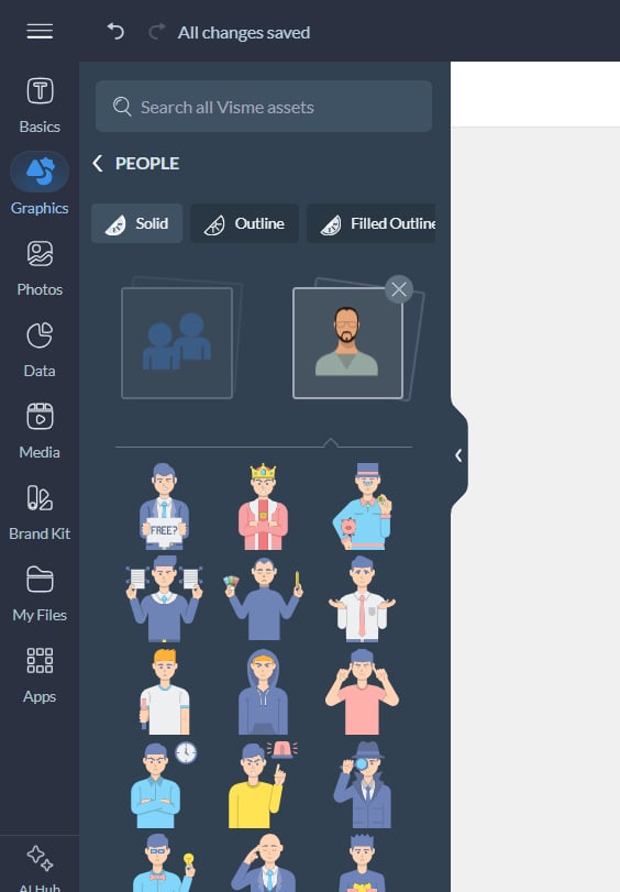
Use these icons when your message is about human interaction or connection. Common examples include speech bubbles, megaphones, email envelopes, phones, video cameras and messaging symbols.
Find more of these free infographic icons in Visme:
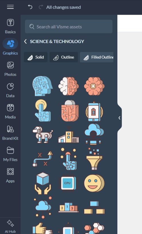
Technology and science icons add clarity and credibility to technical content. Think microscopes, test tubes, DNA helices, atoms, computers, smartphones, cloud symbols, Wi-Fi signals, gears, locks, circuits and rockets.
Check out some royalty-free science and technology icons in Visme
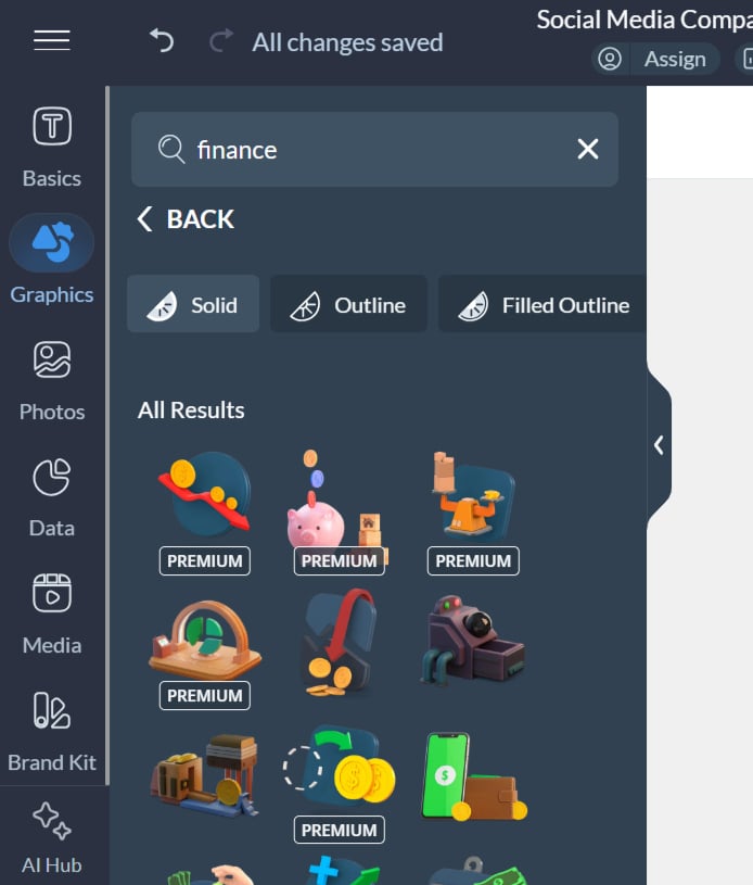
Numbers are not everyone’s strong suit. Finance icons help make abstract figures feel more tangible and easier to understand.
Common examples include currency symbols, coins, piggy banks, wallets, credit cards, calculators, banks and growth charts.
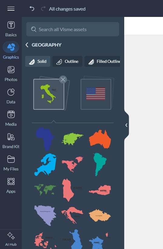
Location icons help people instantly grasp where something is happening. They are useful when talking about geography, movement or reach. These include map pins, globes, compasses, buildings, houses, airplanes, cars and road signs.
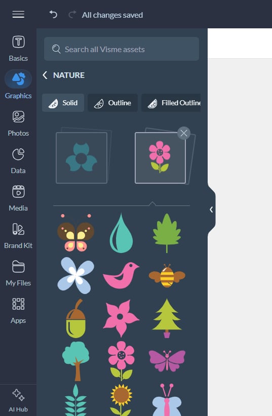
Nature icons are commonly used in sustainability, climate and weather infographics, but their usefulness goes beyond literal topics.
Because nature is a universal experience, these icons also serve as effective metaphors. Sunshine can suggest clarity or optimism, storms can represent challenges and growing plants can show progress.
Practical examples:
Here’s how to use icons effectively in an infographic and a few infographic best practices that you should note:
Viewers usually scan infographics before committing to a full read. Header and section titles are entry points that either invite viewers in or send them scrolling past.
Adding icons in these prominent positions grabs attention and makes it easy to know the direction of the infographics.
Here’s an example of how to pair section headers with relevant icons:
With this visual distinction, viewers can quickly find the information they care about most.
Pro Tip: Make sure to scale icons appropriately. Title icons should be larger than icons in the body content to establish a great visual hierarchy.A good rule of thumb: make header icons at least 1.5 times as large as body content icons. Within each section, you can further maintain hierarchy by giving primary concepts larger, more prominent icons and using smaller or no icons for secondary details.
Here’s another creative example of using icons as headers.
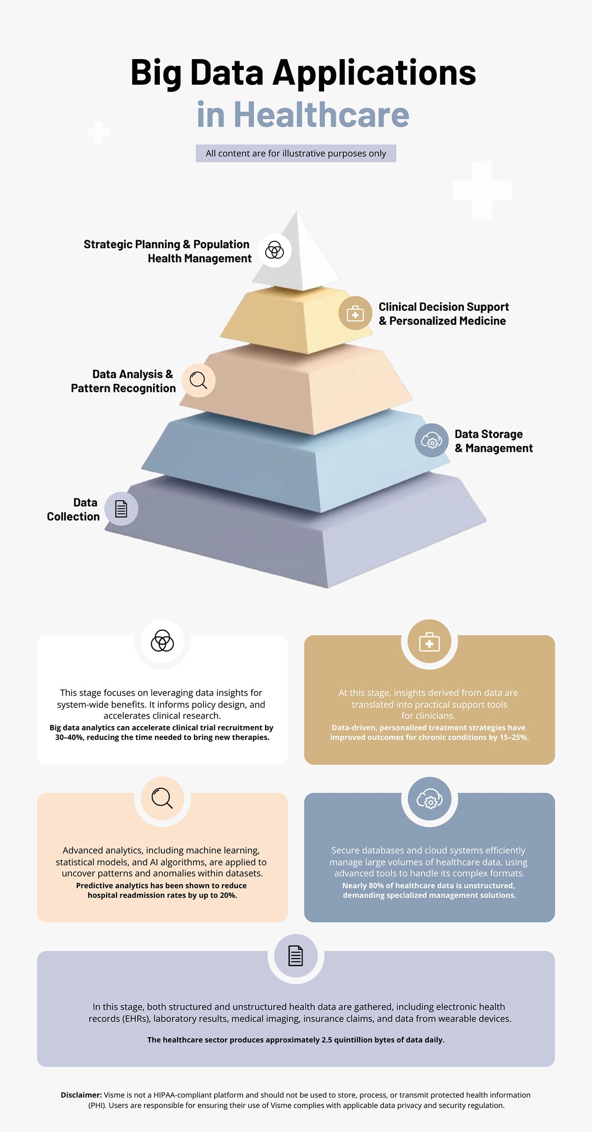
Each step in the 3D triangle has a matching icon. Below the triangle, the same icons are reused as section headers instead of repeating long text.
The infographic is not only more engaging, but it also helps people understand the content faster.
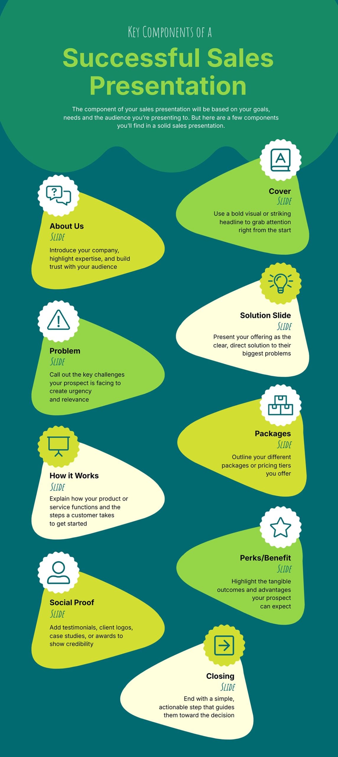
You can use icons to illustrate each step of a lengthy process. This works well only because it not only adds visual interest, but it also prevents the design from becoming text-heavy.
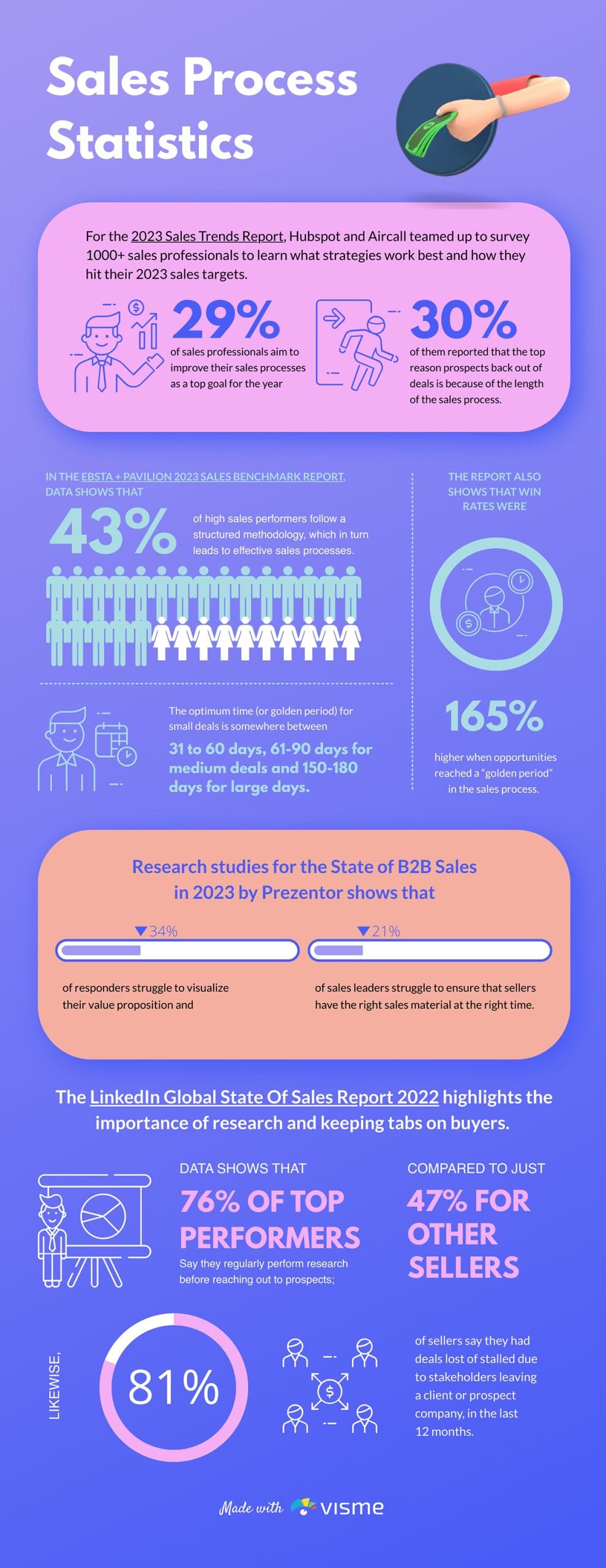
See how the infographic below breaks down the components of a successful sales presentation using illustrated icons:
In addition to using icons on their own, you can also combine icons to create your own custom illustrations when explaining a process.
For example, look at how icons were combined in this infographic. The icons jump off the infographic and grab your attention before anything else:
You might also want to show a general overview of a process or one that doesn’t follow a set order. In these cases, icons can help readers see the different steps or options available to them.
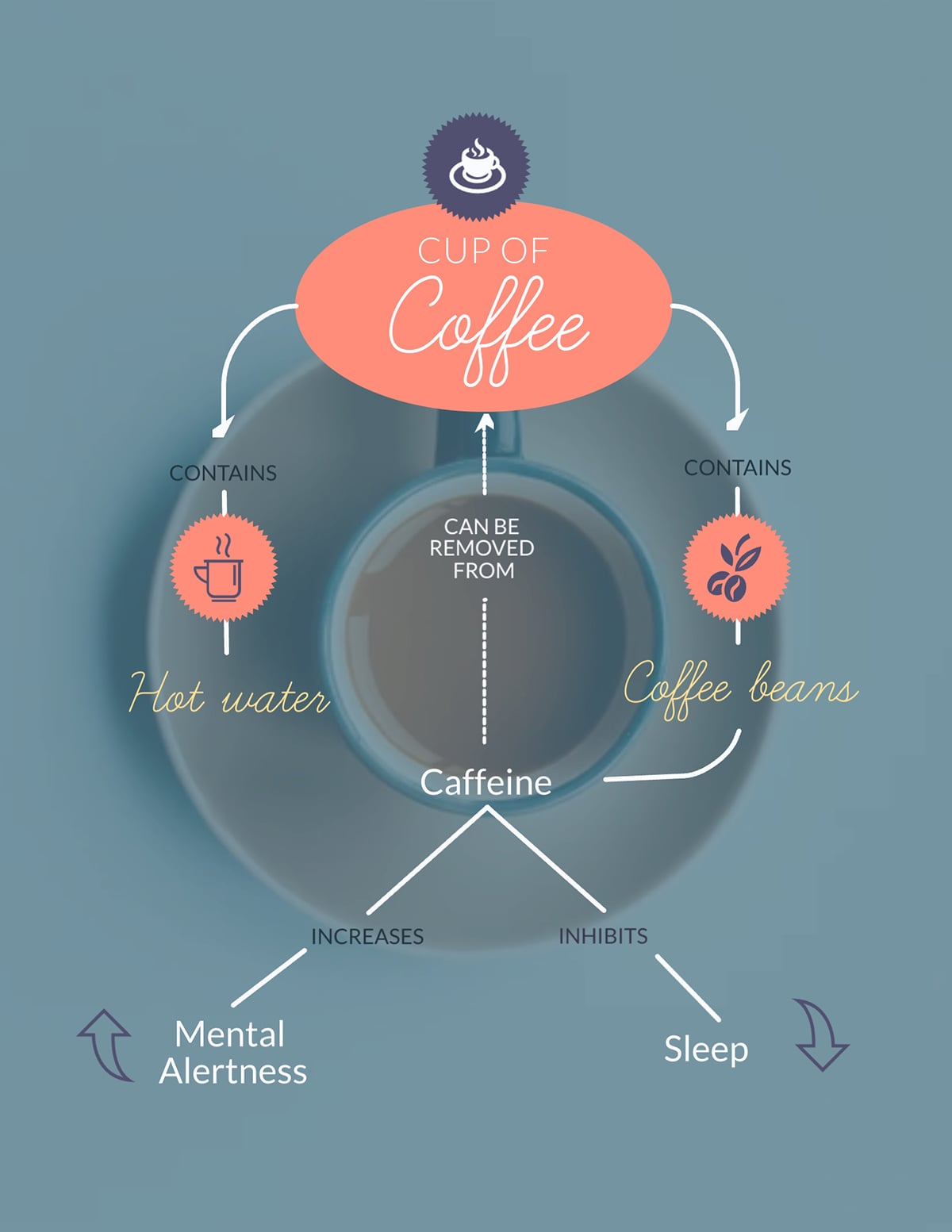
For example, this infographic uses icons to explain two processes at the same time: the components of a cup of coffee and how each one affects the body.
Visme also makes it easy to create concept maps and mind maps without breaking a sweat.
In some cases, icons work well on their own when viewers can understand them at a glance. This is especially true for icons with literal meanings, for instance, a building icon, a heart icon, a water icon and more.
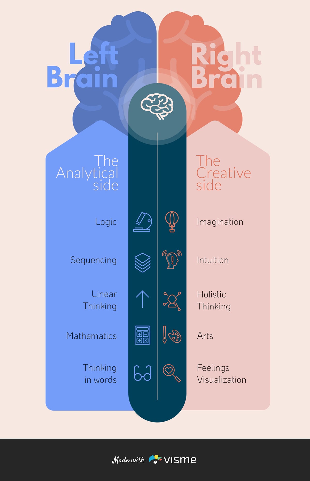
But, when an icon represents an abstract idea, such as a lightbulb for “innovation” or a shield for “security,” the meaning isn’t very obvious, so it shouldn’t be used alone.
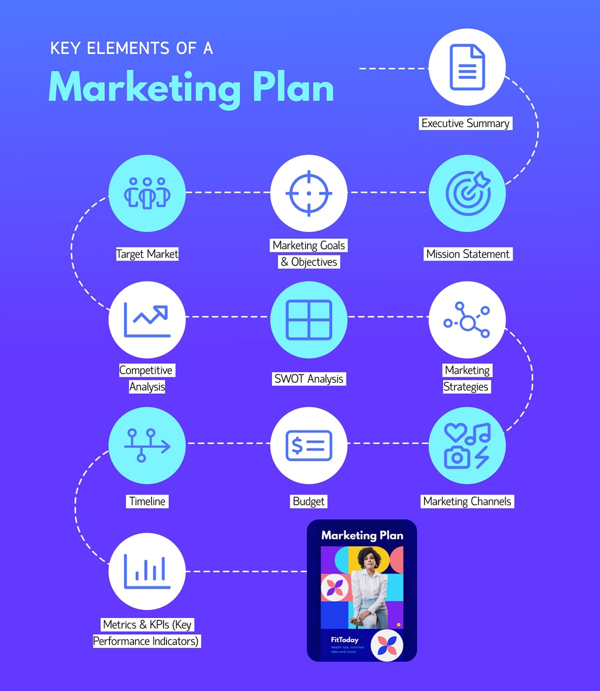
For example, in this infographic highlighting the key elements of a marketing plan, icons on their own wouldn’t have been enough. But pairing them with text made the message clear.
Lists are great for organizing info, but they can get boring fast. Use icons to turn plain bullet points into something people actually want to read.
You can use them in two ways:
1. Icons as visual bullets: Use icons to separate list items while reinforcing each point’s meaning. For example, a list of project management benefits becomes way more engaging when each has an icon like a clock for time savings, a dollar sign for cost reduction or a group of people for better collaboration.
2. Numbered lists with icon enhancements: You can pair numbered lists with icons for step-by-step processes or ranked information. Numbers show the order, while the icons make it visual.
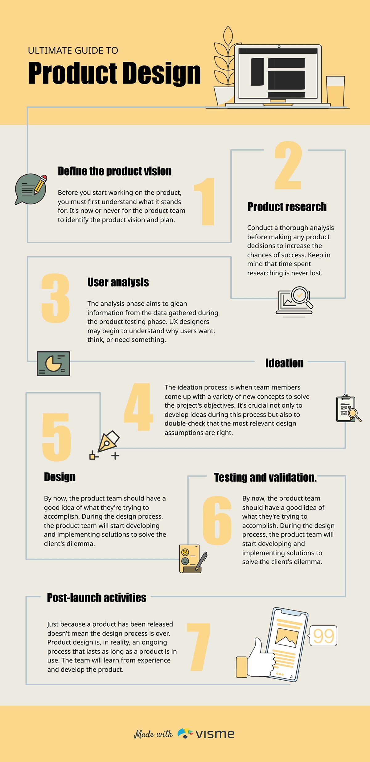
Case in point: this product design guide infographic below shows the step numbers with relevant icons. This helps both visual learners and text readers follow along easily.
Instead of always using plain charts and graphs, you can add visual interest to your data with chart icons.
This type of visualization uses repeated icons to represent data. In an icon chart, icons are stacked horizontally, vertically or both to represent numbers or proportions.
You can easily create high-quality icon charts in Visme. Just choose the symbol you want from the icon categories or search for a specific keyword, then add the number of icons needed to represent your data in the infographic.
Here’s an example of how that will look.
Custom icons give your infographic a distinct visual identity and ensure every symbol matches your message. Here’s a step-by-step guide to creating your own professionally designed infographic icons.
Not every element in an infographic needs an icon. Overusing them creates visual clutter and works against your goal of clarity.
Before adding icons, decide where they will genuinely help viewers understand, scan or remember information. Common places include:
Avoid placing icons next to every block of text or alongside descriptive content that already explains itself. These icons add little value and may distract rather than help.
When your icon style matches your overall design, brand and content tone, everything feels more cohesive.
To make the right choice, it’s important to know the main icon style categories. Let’s take a quick look:
The good thing is, you can access all these icon styles in Visme:

Next, ensure your stickers or icon style aligns with the tone of your content and the audience you’re addressing. Ask yourself: who is this for and how should it feel?
For example, a financial infographic for corporate executives might use line icons or subtle isometric designs that make it feel professional.
On the other hand, an educational infographic for children should come alive with colorful, playful illustrated icons that grab attention and feel fun.
Pro Tip: Always test your chosen style at the smallest size you’ll use. If the details start to blur or lose clarity, that’s a sign it may be time to rethink your choice.Designing a great-looking infographic—or even just the right set of icons—can feel overwhelming, especially if you don’t have a design background. Visme makes it easy.
You don’t need to be a designer or wrestle with complicated tools like Photoshop.
Visme gives you everything you need to create professional visuals quickly, which is exactly why both beginners and experienced designers love it.
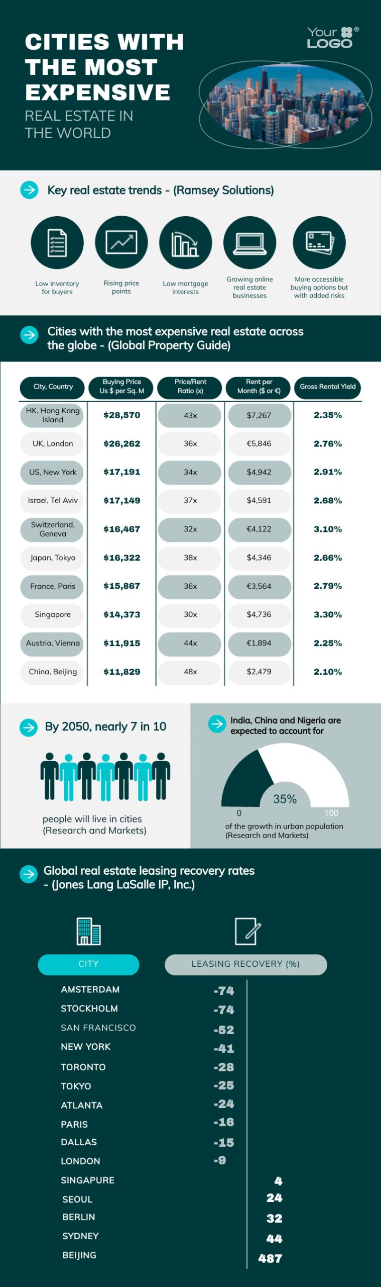
To get started, sign up or log in to your Visme account and open your project in the Visme editor. If you haven’t created your infographic yet, choose from the wide range of infographic templates available for different use cases.
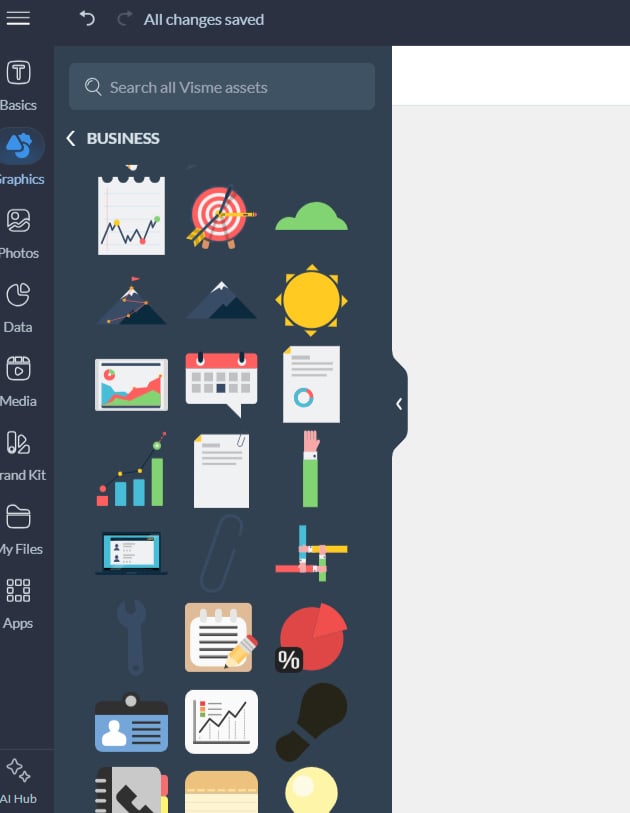
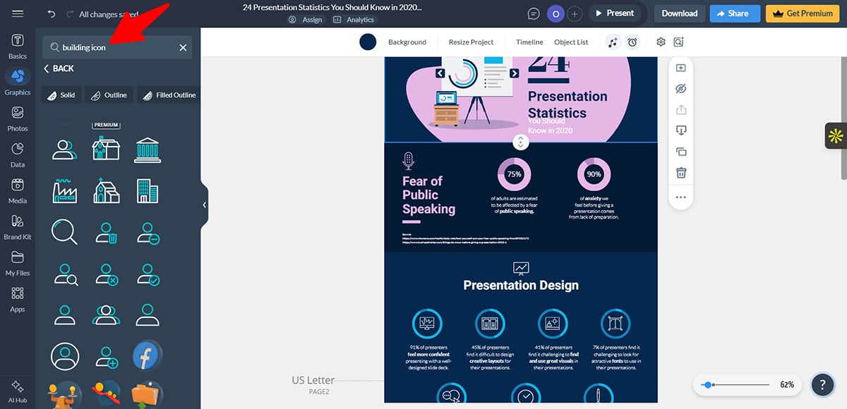
Next, click the Graphics tab in the left toolbar.
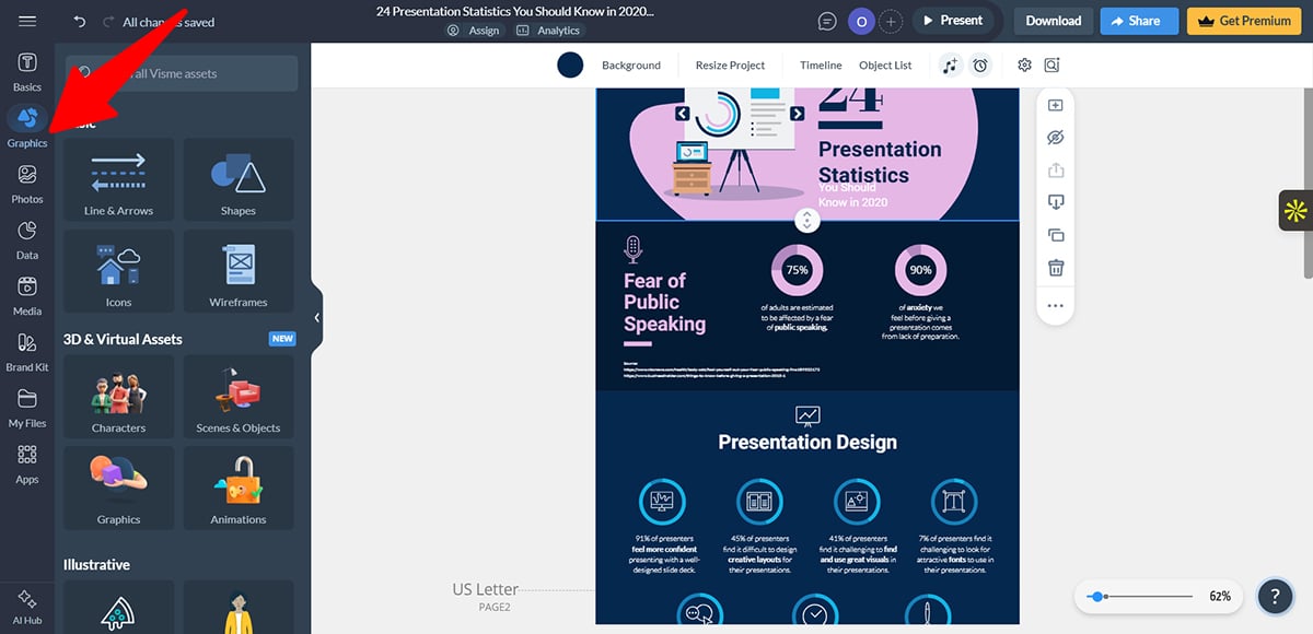
Under Basics, select Icons to browse a wide variety of icon options.
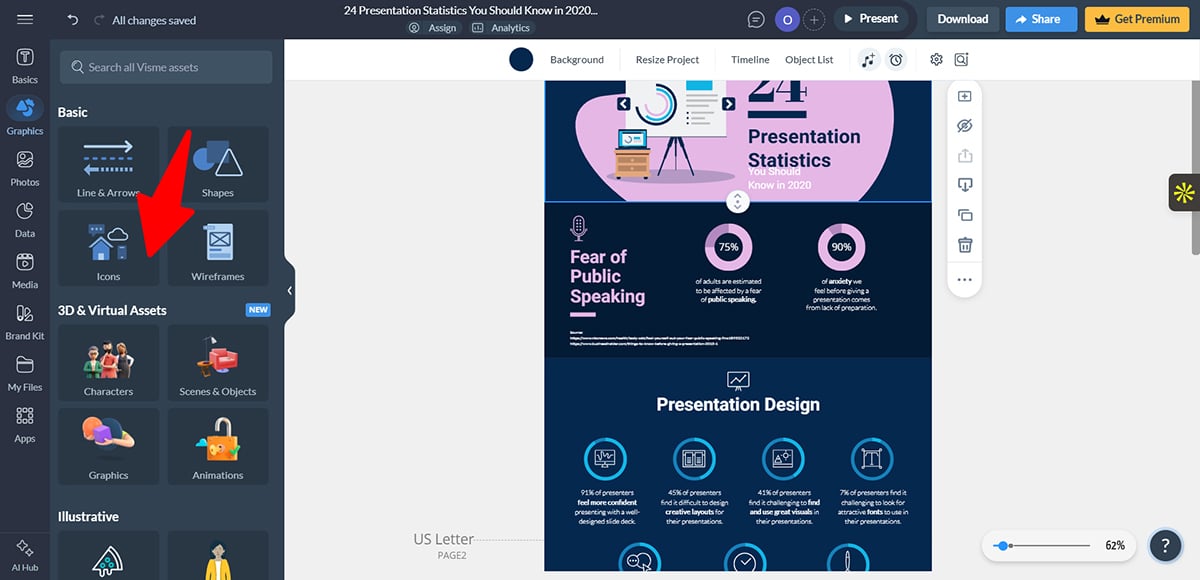
At the top, use the style filters such as solid, outline, filled outline, isometric and hand-drawn to narrow your selection.
To save time, use the search bar to find icons by function or concept instead of scrolling through categories.
When you find an icon you like, click it to add it directly to your canvas.
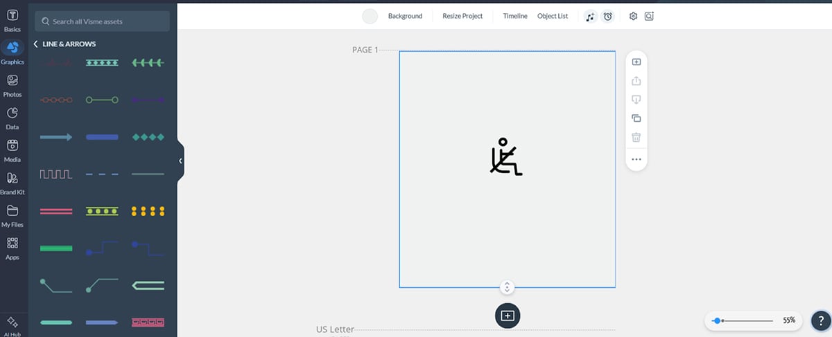
If you can’t find exactly what you need, you can create a custom icon by combining shapes, lines, arrows or multiple icons.
Select all the elements and click Group to move and resize them as a single unit. For example, I created this seatbelt icon by combining a sitting figure with a simple line.
For an even faster option, use the AI image generator. Enter a short prompt describing the icon you need and Visme will generate multiple options for you to choose from.
You can also use the AI touch-up tools to remove unwanted elements, replace specific areas or remove backgrounds.
Once your icon is on the canvas, customize its appearance to align with the rest of your infographic. Here are key areas to focus on:
Start by changing the icon's color to a shade that fits your design. Visme lets you easily customize the color, size, positioning and orientation of the icon.
And to make things easier, you can use Visme’s Brand Wizard. Simply enter your website URL and the tool will automatically extract your brand colors, fonts and logo, making it easy to apply them across the entire infographic.
Next, apply effects to enhance the visual appearance. Add shadows or reflections to create depth or use blur effects to keep an icon in the background.
You can also place icons on background shapes such as circles, squares or triangles to improve contrast and make them stand out. Remember to group infographic elements to make them easier to move.
To make the infographics more engaging, you can animate your icons to guide attention.
Visme offers options like entrance animations, exit animations and subtle emphasis effects such as pulses to highlight important points.
Remember, don’t overuse them; animation works best when used sparingly.
After customizing your icon, adjust its size by dragging the corner handles until it fits your design. Once you’re satisfied with its appearance, click and drag the icon to place it in the desired position within your infographic.
If you're using multiple icons (like in a list) and need them perfectly aligned, use Visme's align feature. This ensures all your icons line up cleanly to the left, center, right or are distributed evenly across a section.
After investing time creating the perfect infographic with carefully crafted icons, you need to get it in front of your audience.
Visme offers multiple download and sharing options, so you can choose the format that best fits where your infographic will live.
To download your infographic, click the Download button in the top-right corner of the editor.
You can also share your infographic directly from Visme without downloading it. Click the Share button to generate a link you can send via email, post on social media or include on a website. You can enable password protection to share it privately.
For websites and blogs, Visme provides an embed code that lets you place your infographic directly on a page. One significant advantage of embedding is that it stays up to date; any edits you make in Visme automatically reflect in the embedded version.
Even small mistakes can hurt your icon design and weaken the integrity of your infographic. Here’s what to watch for:
You should avoid sprinkling icons everywhere in your infographic. This would only make your infographic look unprofessional.
For example, if your subheaders already have icons, adding more icons to the text below won’t help; it just makes things look cluttered.
Matthew Tran, engineer and founder of Birchbury, echoes this:
“One mistake I usually see is using too many icons or adding details to the point that it becomes confusing and they lose meaning. This causes scanning fatigue, which may reduce readers' comprehension and interest. Icons should point readers to the important stuff, not distract from the actual message.”
Use icons only where they really help readers understand or navigate your content. If the text is clear on its own, don’t add extra visuals. Each icon should serve a purpose, such as replacing text, indicating structure or guiding the reader.
Mixing icon styles is one of the most common mistakes teams make when designing infographics.
This problem usually shows up in two ways.
Pavlo Tkhir, CTO at Euristiq, also highlighted this issue:
“The most common mistake I see teams make is using icons that are too diverse in style. When some elements are flat, some are three-dimensional and some are pseudo-realistic, attention is distracted from the content.
We once encountered this on a client project: the infographic looked like a collection of random images, even though the solution architecture itself was clear. After unifying the style and simplifying the icons, the material became much easier to digest.”
The best way to approach this is to choose one icon style and stick with it for the whole infographic. This keeps your design clean and easy to read.
Colors can be tricky in icons, so it’s easy to make mistakes if you’re not a designer. Don’t pick colors just because they “look nice.”
Every color should have a purpose: showing hierarchy, organizing information or staying on brand.
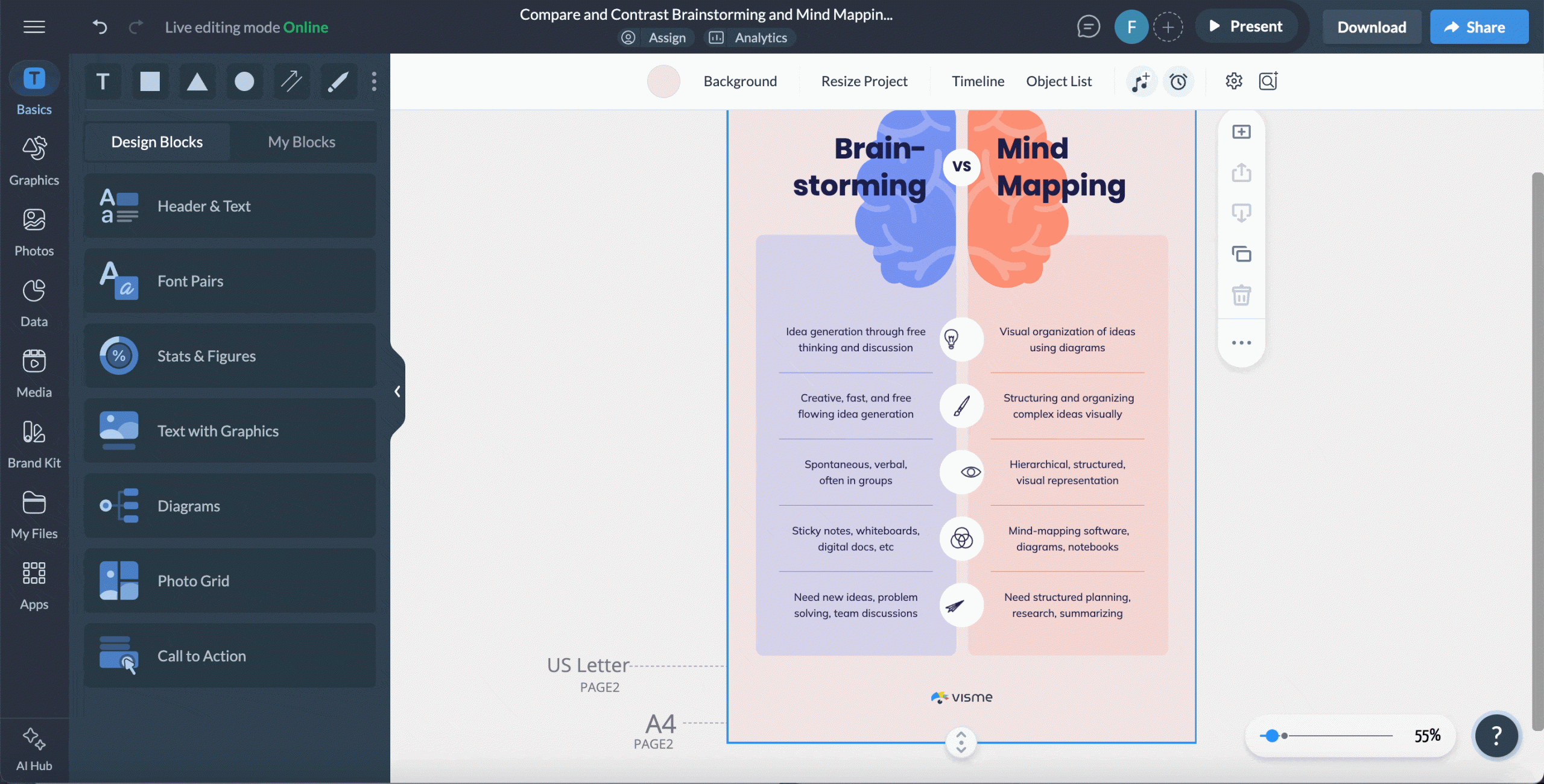
For example, in this infographic comparing walking and biking, each column uses different icon colors. This instantly shows which activity each icon represents.
Another way to use color is with shades of the same color to indicate hierarchy. Make your most important icons bold and saturated and use lighter shades for secondary icons.
If you use multiple colors, think about their meanings. Red often signals danger, green suggests success or the environment and blue conveys trust. This helps your message feel intentional.
When you don’t need multiple colors, stick to one or two that match your design. This keeps your infographic clean.
Infographics are visually appealing tools that combine visuals, icons, charts, graphs and other design elements to break down detailed information.
Icons in an infographic should be big enough to be visible and understood, but not so large as to dominate the rest of the text or other visuals.
Here are a few reasons why you should consider adding an infographic as part of your marketing assets:
An icon is a small visual symbol that represents a single idea, object or action. It supports content, but doesn’t explain full stories on its own.
On the other hand, an infographic is a complete visual communication tool that tells a story or explains information.
Icons work best in these key areas of an infographic:
Yes, you can use free icon libraries for common infographics, as long as you use them correctly and know their limitations.
There’s no fixed number, but in infographics, too many icons are when they stop helping and start distracting.
To create a strong and effective infographic, your design should be built around these five principles:
Now that we’ve walked through the process step by step, you should feel confident selecting and using icons that clearly support your message. You can get started right away by exploring Visme’s extensive library of professionally designed icons.
With Visme, you don’t just design icons; you can create awesome infographics to share your ideas from start to finish, thanks to features like AI-powered design tools, customizable templates, data visualization widgets and built-in collaboration and workflow features.
Ready to see what Visme can do for you? Sign up and try Visme’s infographic maker for free today.
Design visual brand experiences for your business whether you are a seasoned designer or a total novice.
Try Visme for free


![How to Make an Interactive Infographic [+Templates]](https://visme.co/blog/wp-content/uploads/2023/11/How-to-Make-an-Interactive-Infographic-Quick-Guide-8-Customizable-Templates-Thumbnail.jpg)