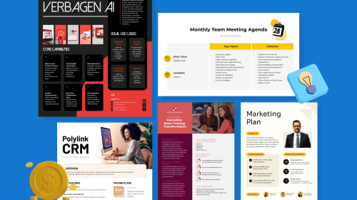
Proven Product Specification Examples That Give You Clear Decisions

Excel might not be the most intuitive tool for creating Gantt charts, but it remains a go-to option for many professionals— not because it’s the easiest or most visually appealing option but because it gets the job done.
The problem is, creating a Gantt in Excel is time-consuming and requires a lot of manual formatting. And the output isn’t exactly eye-catching.
In this guide, I’ll walk you through the process of making a Gantt chart in Excel. Plus, I’ve tested nine of the best Gantt chart makers to help you find the right tool for your project planning needs.
If you’re looking for a better, faster and more visually appealing alternative, I’ll show you how to create a Gantt chart in Visme and provide five professionally designed templates you can customize in seconds.
Let’s dive in!
A Gantt chart is a project management tool that displays tasks, timelines and dependencies over time using a visual bar chart.
On the left side of the Gantt chart is a list of activities, while the top features a suitable time scale. Each activity or task progress is represented by a horizontal bar; the position of the bar indicates the start date and its length reflects the duration and end date of the activity.
This visual representation makes it easy for project managers to see the overall project schedule, the timeline for each task and how they overlap or align with one another.
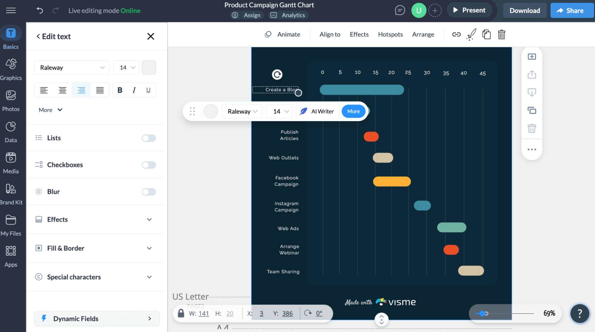
Here’s an example of a Gantt chart created for a product campaign
The Gantt chart’s origins go back further than Henry Gantt himself. In the late 19th century, Polish engineer and economist Karol Adamiecki developed a similar project visualization tool called the harmonogram. He introduced it around 1896 to help manage production processes more efficiently.
However, because Adamiecki published his work in Polish and Russian, it didn’t gain widespread recognition outside Eastern Europe due to language differences and the slower spread of information in the 19th and 20th centuries.
A few years later, in the early 1900s, American mechanical engineer and management consultant Henry Gantt created his own version of the chart—what we now call the Gantt chart. He created it to effectively measure employee productivity levels and determine which employees were underperforming or overperforming.
His system gained traction, particularly in large-scale projects like the Hoover Dam. During World War I and II, this tool helped teams manage resources and coordinate tasks and deadlines more effectively.
From “The Gantt Chart, A Working Tool of Management” by Wallace Clark (1922)| Source
While Adamiecki was the first to develop this concept, Gantt’s work popularized the method in the Western world.
Before computers, Gantt charts had to be drawn by hand, which meant every little project change required a complete redraw. Considering that most projects are always evolving, this made them impractical.
Thanks to computers and project management software, updating a Gantt chart is now as easy as a few clicks. You can tweak timelines, shift tasks and print polished charts in no time.
Despite its century-old roots, the Gantt chart remains one of the most essential charts in project management.
Over the years, it has also evolved to cater to the needs of various industries and project management practices.
Here are some key benefits of using Gantt charts:

Although Excel doesn’t have a built-in Gantt chart, you can create one by customizing a stacked bar chart to visualize task status and track progress, timelines and dependencies.
To create your Gantt chart in Excel, follow this step-by-step guide:
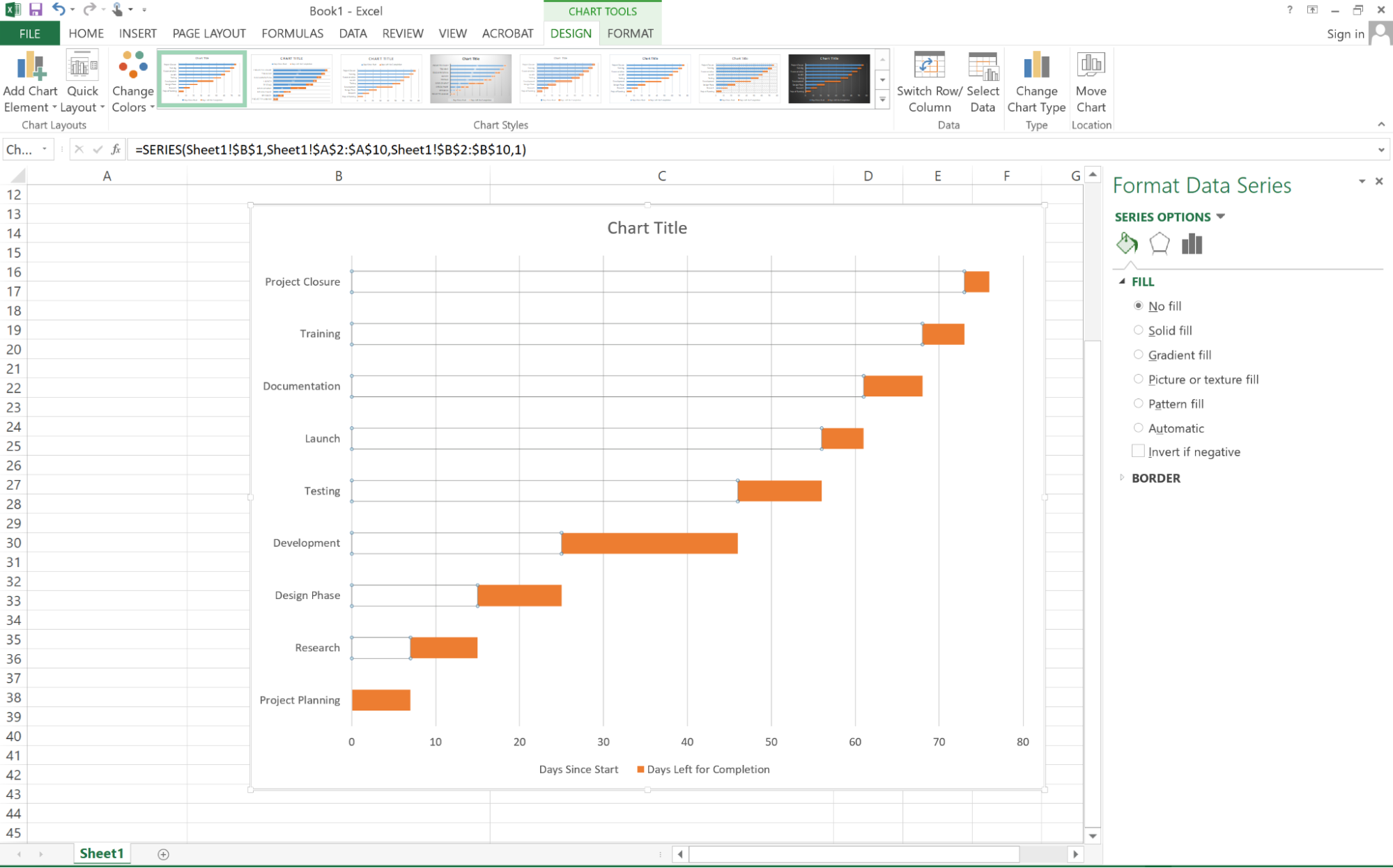
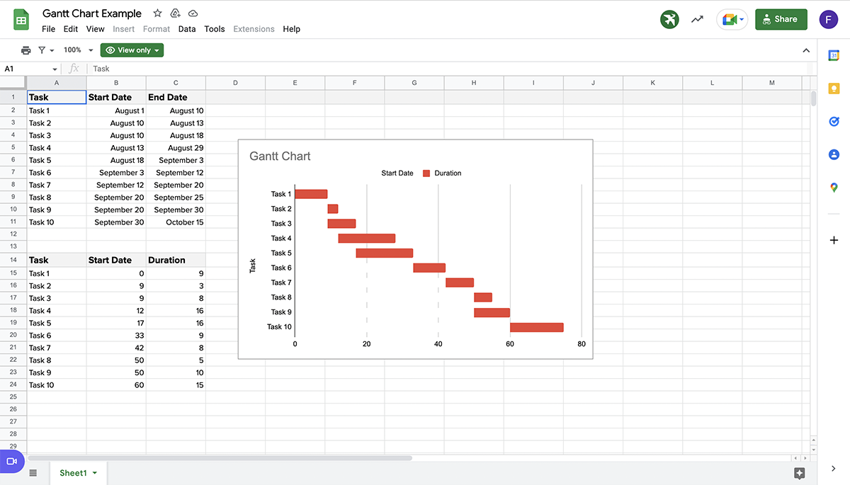
1. Prepare your data by creating a data range that lists all your project tasks along with their start date and days left for completion. See our example data below:
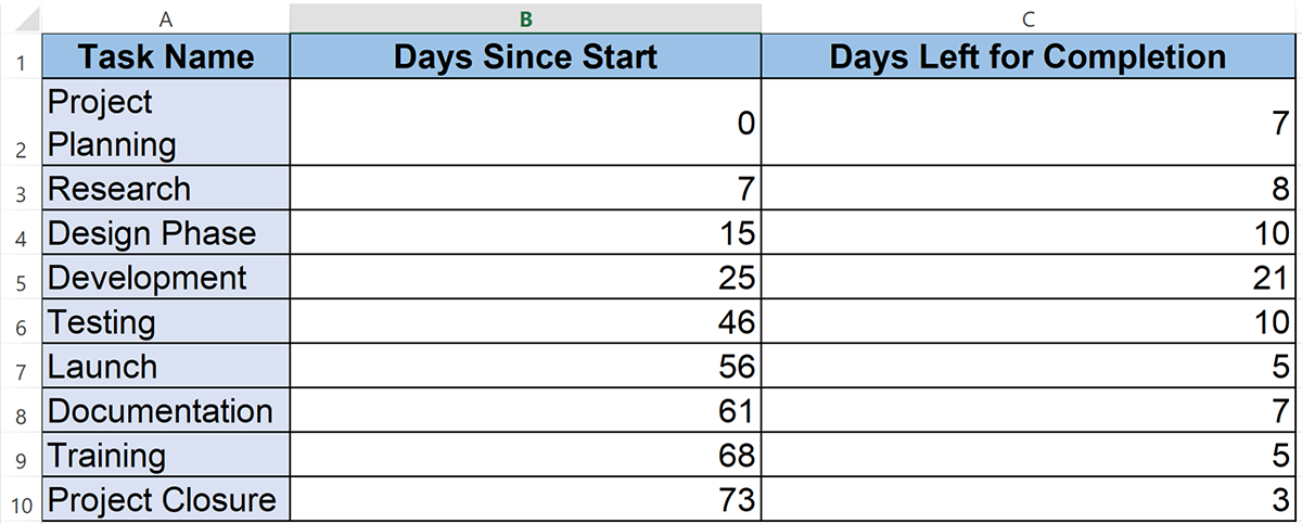
2. Select the data you want to use to create a Gantt chart. In our example, that’s A1:C10.
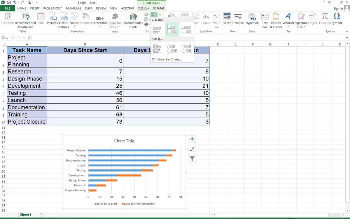
3. On the top navigation bar, go to the insert tab.
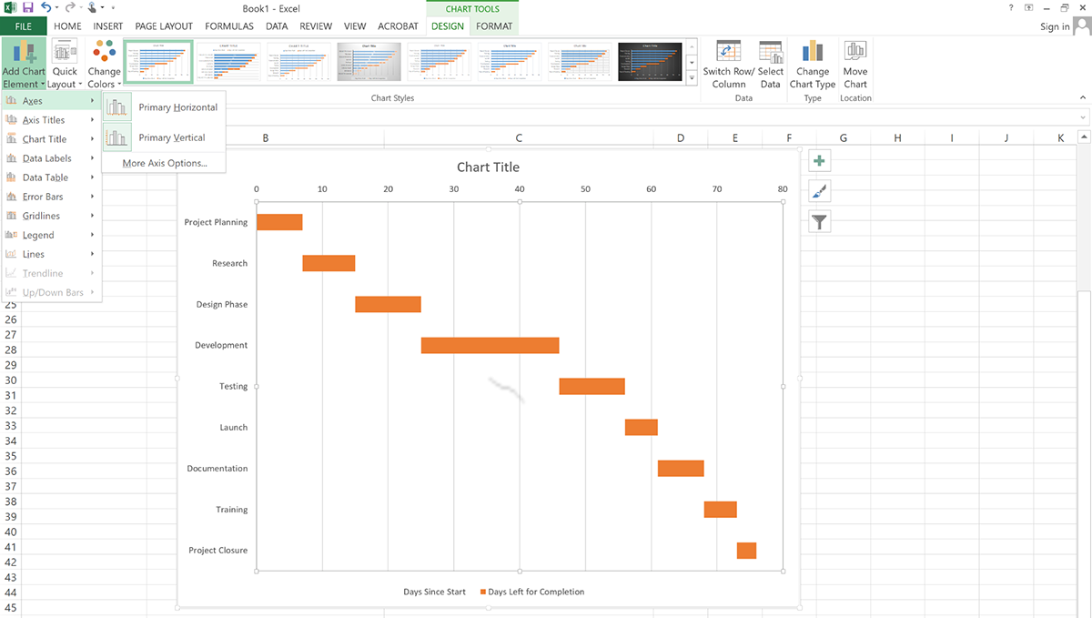
4. In the Chart group, click on Bar Chart > Select the 2-D Bar group and click on Stacked Bar Chart. Here’s what your chart will look like:
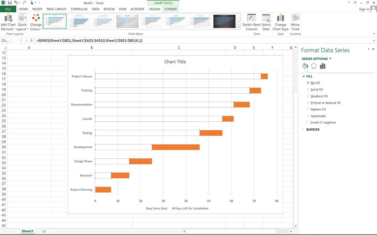
5. The next step is to format the chart to look like a Gantt chart. Click on the blue bars (representing start dates). Then right-click >select Format Data Series > set fill to No Fill.
6. Reverse the task order so that it starts with the number one task. Click on the task names (vertical axis). Right-click > choose Format Axis > under Axis position, check Categories in Reverse Order.
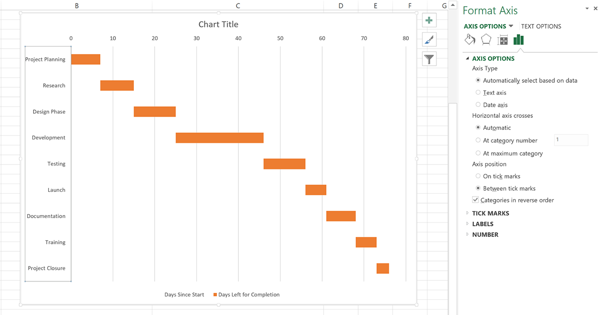
7. Double-click the text box at the top to add a chart title. You can also format the axis title by double-clicking on either axis. A popup box will appear on the right with options for customizing the legend and text options.
8. You can further customize your Gantt chart by adding labels, gridlines, labels, changing the bar color, size and more.
To add elements to the chart, click the chart area and on the Chart Design tab, choose Add Chart Element. You’ll find options like Axes, Axis Titles, Chart Title, Data Labels, Data Table, Error Bars, Gridlines, Legend and Lines.
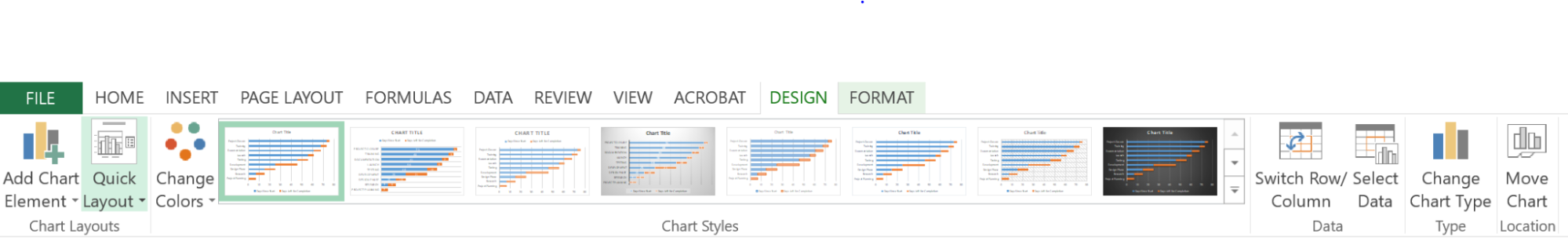
To change a layout, select Quick Layout. And if you want to tweak the design, scroll through the design options and select one. To change the chart color, select Change Colors.
If you plan to reuse your Gantt chart, save it as a template. To do this, right-click in the chart, and select Save as Template, input your template name and Save.
Sure, you could build your Gantt chart in Excel, but why churn out dull charts that fail to capture attention and look as dated as earlier 2000s?
With Visme, you can design dynamic, interactive Gantt charts that are not only functional but visually compelling.
The drag-and-drop editor is not only intuitive but foolproof. You don’t need design experience to get the hang of it. Plus, Visme comes packed with dozens of ready-to-use templates, advanced features, data visualization tools, assets and integrations to help streamline your project management workflow.
Let’s walk through the process.
Log in to your Visme account or create one if you haven’t already done so.
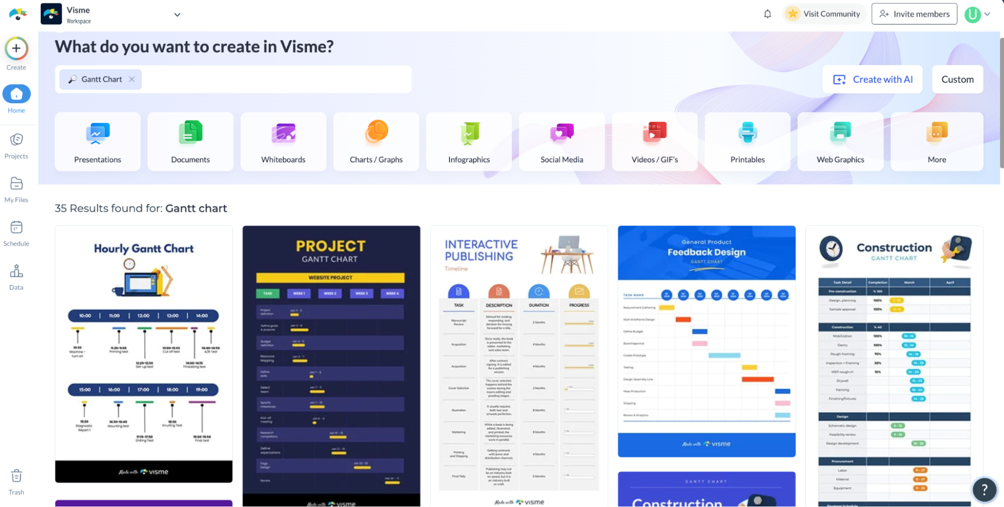
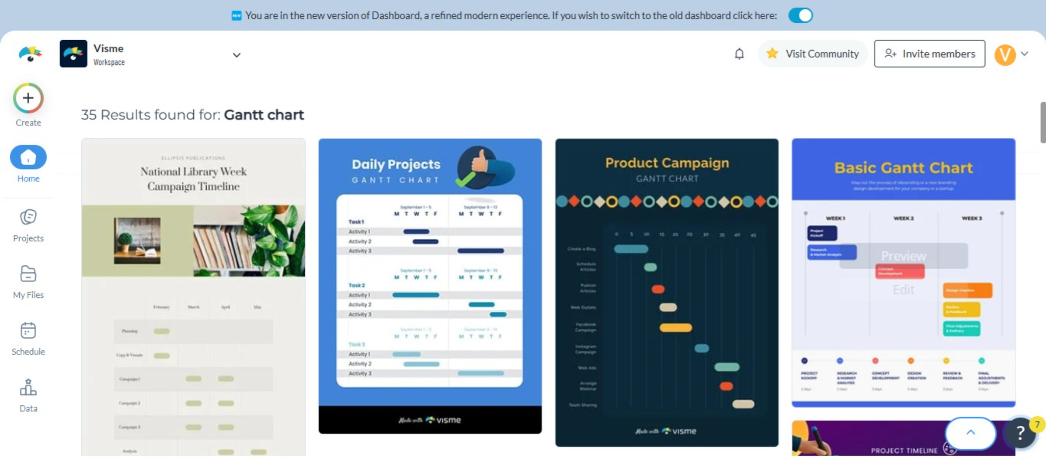
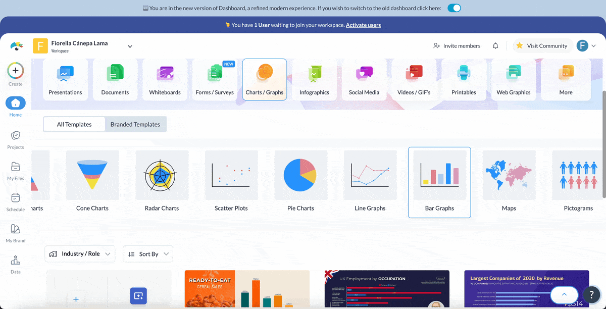
Click on Create New Project and choose Infographics or Charts & Graphs from the available categories.
In the search bar, type Gantt Chart to browse through ready-made templates.
Click on a template that fits your needs (or just looks good); after all, you can customize everything. Then, hit Edit to open it in the Visme editor.
Before you dive in, round up all the key details you’ll need:
These details will help you set up a Gantt chart that actually works for your team rather than just looking pretty.
If you’re working on this chart with your team, invite them into your workspace for smoother collaboration. Team members will have the ability to leave comments, edit the chart, draw annotations and resolve comments in real-time or asynchronously.
With it’s workflow management tool, you can even assign different parts of the charts to team members to work on, set deadlines and leave instructions, and track progress toward task completion.
Locate the task list on the left side of the template.
Click on any existing task name to edit it or double-click to add a new task. List your project’s key tasks in the correct order, starting from the top.
At the top of the chart, update the dates to match your project’s timeframe.
Then, adjust the bars for each task by clicking to select them. Drag the left or right edge to extend or shorten the duration of each task.
Some tasks may overlap, while others will need to wait for previous tasks to be completed.
If a task depends on another, draw a visual connection by adding lines or arrows. Click on the date labels at the top of the chart and modify them to match your project’s timeframe. Double-check that all start and end dates align correctly.
Color coding makes your Gantt chart clearer and easier to read. You can organize your tasks by:
Click on any taskbar to open the color picker. Assign different colors based on task owners, project phases or deadlines. This visual organization helps your team quickly spot key information at a glance.
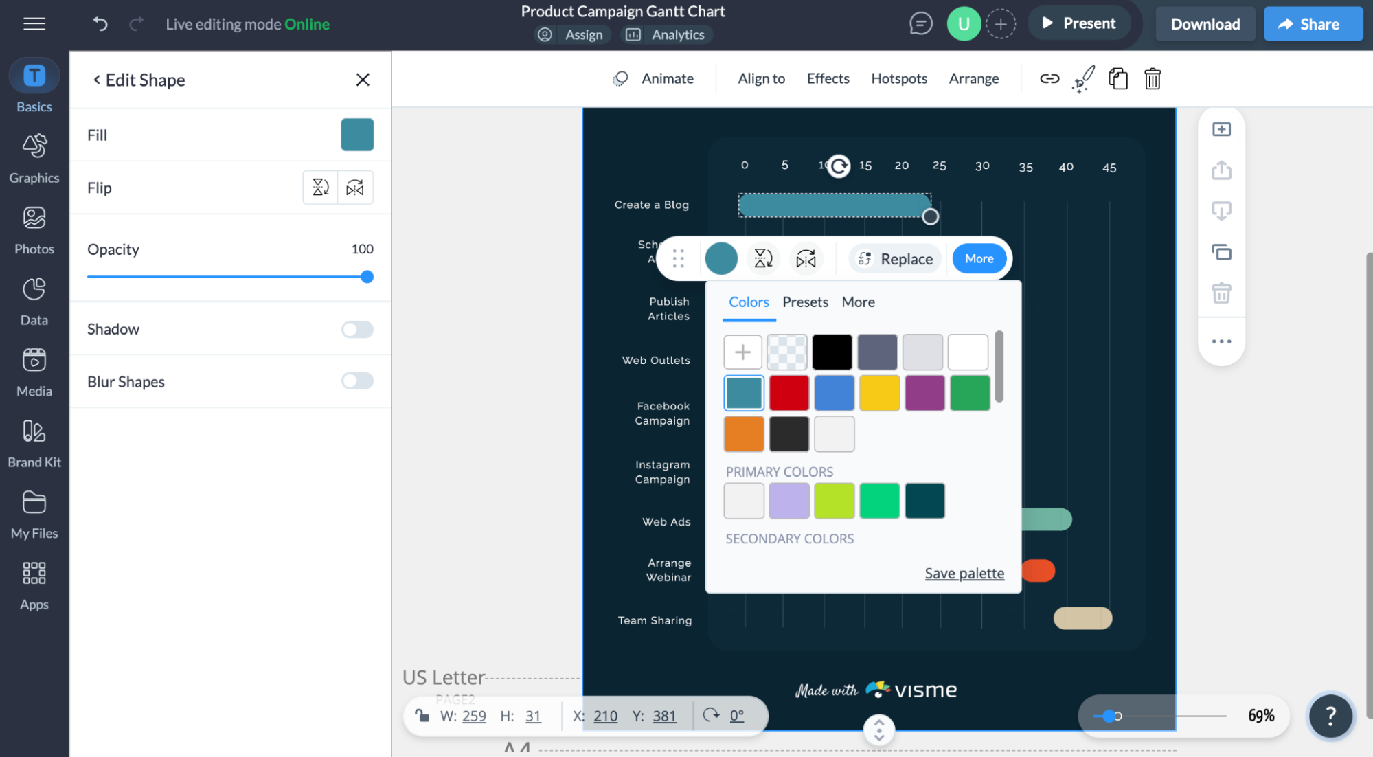
Click on the title at the top of your template and rename it to match your project. Adjust the layout by dragging or resizing elements as needed.
Keep your chart on brand with the Brand Wizard. Input your URL and the tool will pull in your assets (logo, fonts, color) and save them in your brand area. Once your assets are saved, you can automatically apply them to your charts and future projects.
Tell better visual stories and enhance visuals with millions of designs assets with our extensive library of design assets, including icons, shapes, lines, effects, widgets, 3D characters, stock photos and videos.
Transform static data into engaging narratives with animation and interactive elements, including links, popups and hover effects.
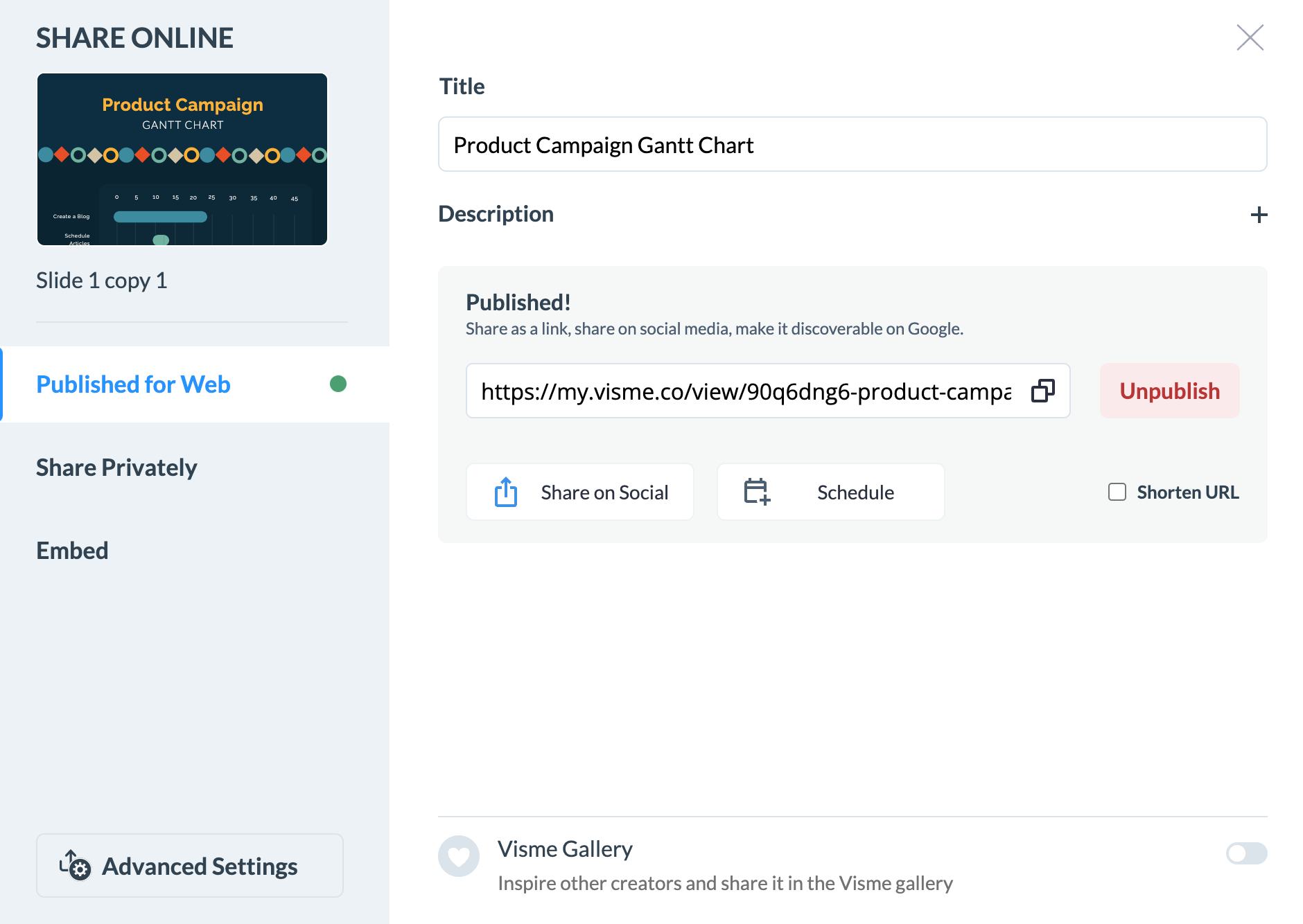
Once your Gantt chart is ready, it’s time to get it in front of the right people. Click Share to access these options:
Click Publish for Web and generate a live link to share with your team or externally
Share privately and give permission for the recipient to view, comment or edit the project.
Generate an embed code to place your chart on a website or landing page.
There’s also an option to Download your chart in these formats:

Already using tools like Slack and monday.com for project management? No need to switch between multiple platforms. Just connect your account and embed your Visme projects directly into your monday.com boards and documents.
And that’s it! With these simple steps, you can build a professional, easy-to-follow Gantt chart in Visme that keeps your project running smoothly.
Besides Visme and Excel, there are many different software applications that can be used to make Gantt charts. I reviewed nine of these tools to help you make an informed decision.
Here’s a quick breakdown of my review process:
Before I dive in, here’s a comparison table for these tools:
| Name | Best For | Best Features | Pricing | G2 Ratings |
| Excel | Data analysis and calculations | Customizable templates, conditional formatting, formulas for automation, charting tools, pivot tables, integration with Office apps, VBA scripting | Subscription-based; part of Microsoft 365 | 4.7/5 (2850 reviews) |
| Visme | Visual content creation, interactive content, data visualization | Drag-and-drop interface, AI chart maker, extensive library of template, animations and interactive elements, millions of design assets, collaboration and workflow management tools, version control, multiple export options | Free plan; premium plans start at $12.25/mo | 4.5/5 (443 reviews) |
| Google Sheets | Collaboration and cloud-based | Cloud-based, real-time collaboration, built-in templates, formula-based automation, script editor for customization, add-ons & third-party integrations, version history | Free; G Suite pricing for additional features | 4.6/5 (42,782 reviews) |
| PowerPoint | Presentations | Fully customizable timeline visuals, animations & transitions, SmartArt & design suggestions, integration with Excel for data syncing, export to various formats (PDF, video, images) | Subscription-based; part of Microsoft 365 | 4.6/5 (4235 reviews) |
| ClickUp | Project management | Task dependencies & automation, drag-and-drop Gantt chart, real-time collaboration, workload management, time tracking, integrations with over 1,000 apps, goal tracking | Free basic plan; Paid plans start at $7/user/mo | 4.7/5 (10,046 reviews) |
| GanttProject | Project scheduling | Free & lightweight, simple UI, task dependencies & baselines, no internet required, customizable task hierarchy | Free and open-source | 4.3/5 (62 reviews) |
| ProjectManager | Project planning | Advanced scheduling, real-time dashboards, resource & workload management, time tracking, portfolio management, integration with MS Project & Jira, risk management tools | Free trial; paid plans start at $13/user/mo | 4.4/5 (94 reviews) |
| Toggl Plan | Team planning and scheduling | Drag-and-drop task planning, intuitive Gantt charts, color-coded timelines, team workload management, integrations with Asana, Slack & Trello, mobile-friendly UI | Free basic plan; paid plans start at $9/user/mo | 4.3/5 (41 reviews) |
| Smartsheet | Project management and automation | Spreadsheet-like interface, Gantt charts, AI-powered automation, Gantt & grid views, resource allocation, critical path analysis, integration with Microsoft & Google apps, real-time reporting, conditional formatting, mobile accessibility | Paid plans start at $9/user/mo | 4.4/5 (18,915 reviews) |
*Disclaimer: The comparisons and competitor ratings presented in this article are based on features available as of February 28, 2025. We conduct thorough research and draw on both first-hand experience and reputable sources to provide reliable insights. However, as tools and technologies evolve, we recommend readers verify details and consider additional research to ensure the information meets their specific needs.
As someone who's already familiar with its layout and functions, creating a Gantt chart in Excel isn’t the most pleasant experience. It's a tedious, manual process that feels more like a workaround than a real solution.
Since Excel doesn’t have a built-in Gantt chart option, I had to follow a series of steps to convert a stacked bar chart into a Gantt chart. From there, I need to tweak the formatting, remove unnecessary elements, adjust the start dates, and carefully align everything so it actually looks like a Gantt chart.
Every little change, whether it’s shifting a deadline or adding a new task, means going back in and manually reformatting things. It’s frustrating, especially when I just want a simple visual timeline that updates automatically.
But that's not the only downside. Excel’s chart designs are plain and boring. If I need to share my Gantt chart with a team or stakeholders, I have to put in even more effort just to make it look decent.
In short, Excel is solid for those who like working with spreadsheets but don’t want to invest in another tool. But if you want efficiency, ease of use, visual appeal and interactivity, you’ll want to use an alternative.
Visme caught my attention for its ability to produce highly polished and visually appealing Gantt charts without the headaches that come with building one from scratch. Right off the bat, what got me invested was the variety of Gantt chart templates.
If you're new to Gantt charts or just need a quick, professional-looking timeline, these templates make it incredibly easy. You don’t have to wrestle with formatting or structuring your data—it’s all laid out for you, ready to customize.
But templates aren’t the only way to create a Gantt chart in Visme. One feature that really stands out is its AI Chart Maker. Instead of manually adjusting bars and entering data line by line, just input an accurate prompt and the tool does the heavy lifting. It’s a game-changer if you want a quick, clean visualization without spending hours tweaking details.
And if you already have your data stored elsewhere, you don’t have to enter it manually. Visme lets you import data directly from Excel, Google Sheets, Google Analytics and others—saving you a ton of time and effort.
Another big plus is Visme’s collaboration capabilities. I can easily share my Gantt charts with my team, gather real-time feedback, and keep everything updated seamlessly.
But it takes it a step further with its built-in workflow management tool. You can assign tasks to team members, track progress, and ensure that everyone stays on the same page.
The wide range of animations and interactive elements makes it a solid choice for collaborative projects where visual storytelling is just as important as functionality.
While Visme isn’t a full-fledged project management tool, it integrates with hundreds of third-party apps like Slack, Zapier, monday.com and more. This makes it a powerful complement to your existing workflow.
Google Sheets is another tool you can turn to for basic Gantt charts, primarily for its accessibility and collaborative features.
Being part of the Google Workspace suite means I can easily work on projects alongside my team in real-time, making it ideal for remote collaborations. The ability to share files quickly and work simultaneously adds a layer of convenience that I value.
That said, creating Gantt charts in Google Sheets involves a bit of manual setup similar to Excel which I find can be tedious.
If you’re already comfortable with Google Sheets and need a free, shareable way to manage timelines, it can get the job done. But if you want a tool that’s designed specifically for Gantt charts—with built-in features that make your life easier—there are much better alternatives out there.
PowerPoint isn’t the first tool that comes to mind for Gantt charts, but it does have its place—especially if you need a simple, static timeline for a presentation.
If your goal is to visually showcase your project schedule rather than actively manage tasks and dependencies, PowerPoint can be a useful option.
The downside, of course, is that it’s not dynamic. Unlike other PowerPoint alternatives, where you can easily update tasks and dependencies, a Gantt chart in PowerPoint is just an image. If something changes, you’ll have to go in and manually edit each element. That’s fine for one-off presentations, but it’s not ideal for real-time project tracking.
PowerPoint works best when you need to present a polished, high-level view of your project without the need for constant updates. But if you’re managing a long-term project with evolving timelines, you’ll quickly find its limitations frustrating.
ClickUp’s Gantt chart feature is solid, but getting it set up takes some effort. Unlike Excel, where you have to manually tweak a stacked bar chart into a Gantt chart, ClickUp actually offers it as a dedicated view.
You can easily switch between different timeframes—day, week, month, quarter or year—so you’re not stuck with a rigid timeline. Plus, exporting your chart as a PDF is a handy option when you need to share your project progress.
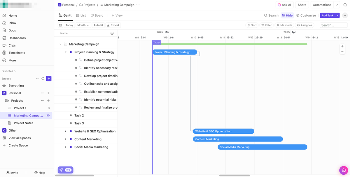
That said, be prepared for some upfront work. Before I could even generate a Gantt chart, I had to manually list out all my tasks, add details for each one and define dependencies.
If you're thinking you can just plug in a few dates and get a clean timeline, think again. This tool demands a more structured approach, which can be great for complex projects but a hassle if you just want a quick visual.
Another thing to keep in mind: ClickUp is feature-packed—almost to a fault. If you love having a ton of customization options, you’ll appreciate the flexibility. But if you’re new to Gantt charts or just need something simple, the sheer number of features can feel overwhelming. I found myself clicking through multiple settings to get the Gantt chart view I needed.
If you need a powerful tool for in-depth project management, ClickUp is worth considering. But if you’re after something quick and intuitive, it might feel like overkill.
GanttProject is a straightforward, open-source tool that I’ve found quite appealing for its simplicity. If you just need to build a Gantt chart without dealing with an overwhelming number of features, this tool gets the job done. It’s designed specifically for Gantt charts and that focus makes project planning refreshingly easy.
Once you input your project details—like task names, start and end dates, duration and priority levels—the Gantt chart updates almost instantly.
There’s no steep learning curve and because it’s free to download, it’s a great option for individuals or small teams who need a simple yet effective way to visualize their project timelines.
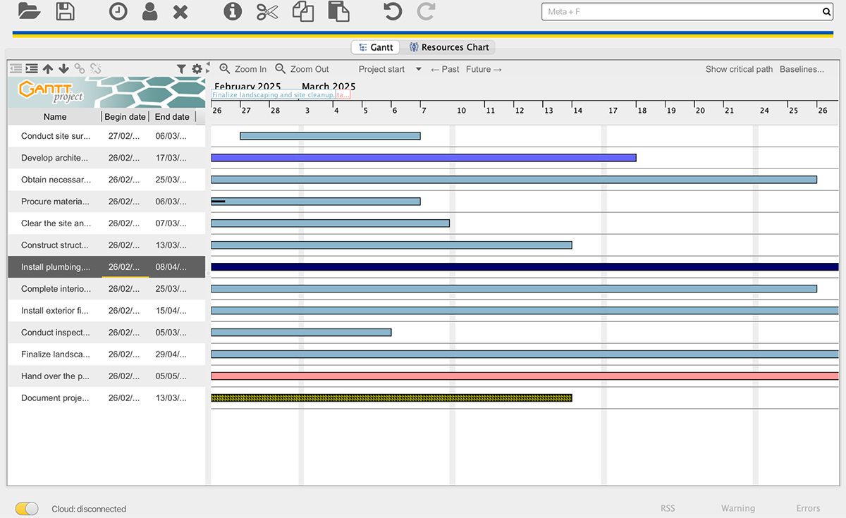
That said, GanttProject has its limitations. It doesn’t integrate with other tools so if you rely on software like Google Drive, Slack or even Excel for project updates, you’re out of luck. The interface also feels a bit old-school and lacks the polished, collaborative features found in modern project management software.
That said, GanttProjct is great for solo planning, but if your team needs real-time updates and seamless communication, you might find it a little restrictive.
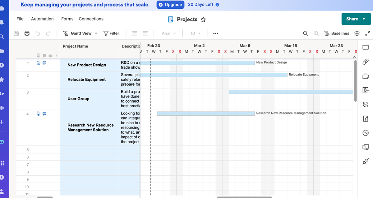
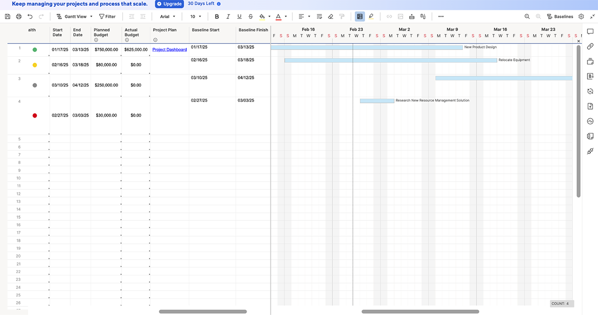
ProjectManager does a great job of balancing traditional project management with a user-friendly experience. I liked the variety of templates available across different industries—construction, manufacturing, IT, software, marketing, professional services and general project management. Instead of building everything from the ground up, I went with a template to save time.
The best part? The data was already populated from the template, so all I had to do was switch to the Gantt view and my chart was ready in seconds.
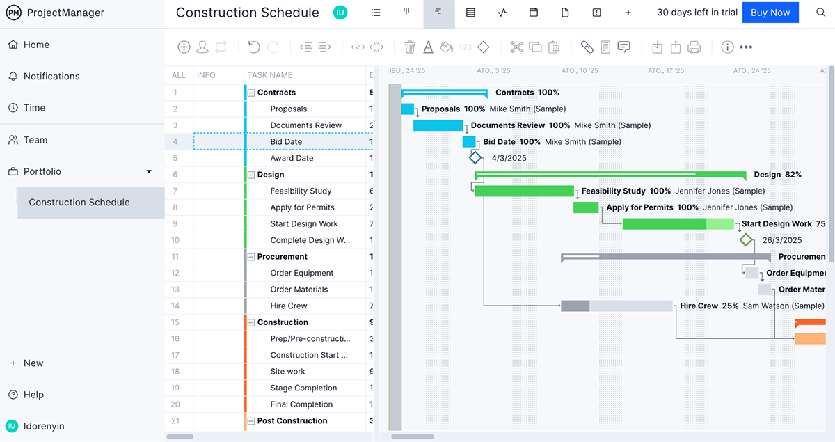
The interface is straightforward and easy to navigate, which makes setting up and managing tasks pretty smooth.
If you already have project data stored in another tool, you can import it directly from Microsoft Project, Excel or even a CSV file—no tedious data entry required. Once your Gantt chart is up, making changes is a breeze. You can just drag the bars to adjust task durations, so tweaking deadlines doesn’t feel like a chore.
I also liked that ProjectManager gives you the option to start from scratch if you want full control. But honestly, the pre-built templates made things so much faster for me. If you need a tool that gives you structure while still letting you customize as needed, this one is worth checking out.
Toggl Plan’s Gantt chart maker makes scheduling feel effortless. With just a few clicks, you’re able to add tasks, assign them to team members and update progress—all without a steep learning curve.
For my test, I imported data from an Excel sheet, switched to timeline mode and my Gantt chart was ready to go almost instantly.
Adjusting task timelines is as simple as expanding or contracting task durations. The color-coded milestones are a nice touch, too, especially since you can make them visible across multiple projects to keep everything on track.
Collaboration is another area where Toggl Plan shines. You can assign tasks to one or more team members. And if you’re working with clients or stakeholders who need updates but don’t want to be bogged down in the nitty-gritty, there’s a handy read-only view.
That said, Toggl Plan isn’t perfect. The biggest drawback is that you can’t create task dependencies. This can be frustrating if you need to track how tasks flow into one another, making it less ideal for complex project management.
While it’s great for simple scheduling and team coordination, if dependencies are a dealbreaker for you, you might need to look elsewhere.
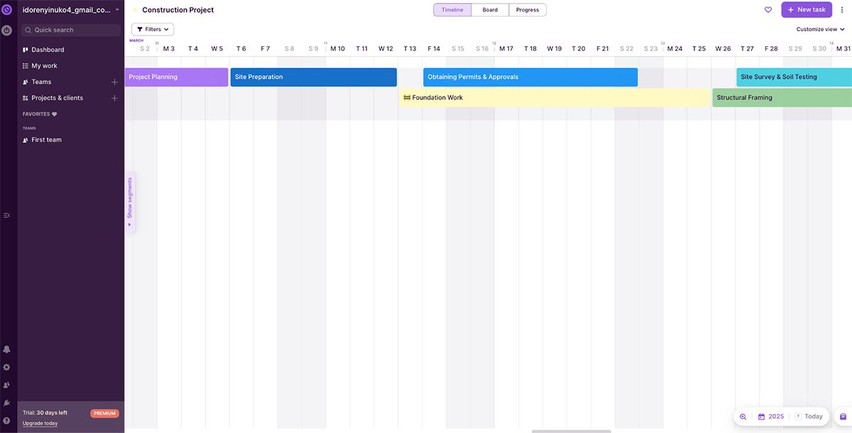
Smartsheet blends the familiarity of spreadsheets with the power of project management, making it one of the most versatile Gantt chart tools available.
This tool makes creating Gantt charts incredibly easy, thanks to its massive library of templates. You can easily build Gantt charts by defining tasks, setting dependencies and assigning timelines.
While previewing these Gantt chart examples, I liked that I could toggle between different views—Grid, Gantt, Calendar and Card—before making a selection. To save time, I went with a pre-built template and since the data was already filled in, all I had to do was switch to Gantt view and my chart was ready in seconds.
One thing I appreciated was how Smartsheet organizes project data. The split-screen layout lets you see task details alongside your Gantt chart, which keeps everything in context.
However, this setup has a drawback—if you’re working with a longer timeline, you’ll need to scroll horizontally to view the full chart or zoom out, which isn’t the most seamless experience.
Another limitation is that Smartsheet doesn’t allow you to drag the bars on your Gantt chart to adjust task durations like you can in a Toggl Plan.
Instead, you have to manually change the dates in the table, which can feel a bit tedious if you’re making frequent updates. While it’s a solid tool for structured project management, this small inconvenience could slow down users who prefer a more interactive approach.
Visme offers an extensive library of templates that fits your project’s needs—whether you’re managing a product launch, planning a marketing campaign or tracking multiple client deliverables.
To give you a sense of just how expansive our Gantt chart templates are, check out this GIF showcasing the variety of styles available.
From sleek corporate timelines to bold, color-coded task planners, there’s something for every industry and workflow.
Here are five impressive and professional Gantt chart templates you can customize to fit your needs:
Planning an app development project? This Gantt chart template keeps everything organized, laying out tasks and sub-tasks in a clear, structured way with bars stretching from start to finish so you can track progress at a glance.
What I love about this template is how easy it is to make it your own. You can tweak the bars to match different phases, priorities or teams and customize fonts and design elements to fit your style.
This template is ideal for mapping out every stage of app development, from wireframing and coding sprints to testing and deployment. Whether you’re a solo developer, part of a startup or managing a big team, it can help you stay on top of timelines and keep everyone in sync.
Managing agile sprints requires flexibility, clear task assignments and real-time tracking—this template delivers on all fronts. It’s designed for teams working in short, iterative cycles and features two separate Gantt charts: one for marketing and another for development. This dual-view approach helps align cross-functional teams while keeping their workflows distinct yet interconnected.
Each task is color-coded based on the assigned team member, making it easy to see who’s responsible for what at a glance. The bars visually track progress from sprint planning to execution and review to ensure nothing falls through the cracks. Plus, you can effortlessly adjust timelines, shift priorities and update dependencies as your project evolves.
Building a website requires careful planning. This project management template helps you stay on top of every stage—from wireframing to launch. It features a visually engaging blue-purple background with bright-colored text overlays, bars and other visual elements that make your project timeline stand out.
You can fully customize the template to fit your project. Change the time frame to days, weeks or months. Add your own tasks, adjust the timeline and update progress with ease. The color-coded bars show who is responsible for what, keeping your team on the same page.
Use this template to keep things organized, whether you’re working alone or with a team. Share it as a live link with your team members and provide edit or comment access. That way, they’re able to provide updates in real-time and keep things moving in the right direction.
Managing a restaurant project—whether it's launching a new location, revamping the menu or organizing an event—requires a well-structured plan.
This Gantt chart example helps you keep track of every moving part. One standout feature is the ability to add headshots for task owners, so it’s clear who’s responsible for what.
Each task is broken down into smaller steps with two bars—one showing the timeline and the other tracking progress. To make things even clearer, the start and end dates, along with the percentage completed, appear right above the bars.
This template is fully customizable. Adjust timelines, update task progress and change colors to fit your project’s needs.
Planning a successful event marketing campaign requires precise scheduling and this Gantt chart template makes it easy. Instead of dragging bars to adjust task durations, you’ll simply recolor table cells to reflect the timeline—giving you a structured, spreadsheet-like approach to visualizing your schedule.
With just a few text edits, you can map out when and where to post announcements, stories and reels across different social media platforms. This makes it perfect for coordinating promotional efforts and ensuring every marketing milestone is met on time.
Whether you're launching a product, hosting a conference or managing a brand activation, this Gantt chart keeps everything streamlined. Assign tasks, update progress and share it with your team to keep everyone aligned from start to finish.
Gantt Chart is pronounced as “Gant” (rhyming with “ant”) and “Chart” (like the word “chart”). So, it sounds like “Gant Chart” with emphasis on the first word.
Color-coding Gantt charts help differentiate tasks, priorities and team responsibilities. Here’s how to do it right:
Update colors as needed: As priorities shift, adjust color coding to reflect the changes.
The best software for creating a Gantt chart depends on your workflow, collaboration needs and budget.
Visme stands out for its visually stunning Gantt charts, offering an extensive library of templates, animation and interactivity and other AI-powered design tools.
Smartsheet is a top choice for enterprises, providing robust project management capabilities, automation and integrations with major tools. If you need a highly intuitive platform, ClickUp offers a flexible Gantt view alongside task management features.
For a free and straightforward solution, Google Sheets allows you to build simple Gantt chart schedules using stacked bar charts. Lastly, Toggl Plan is great for teams that need a lightweight, user-friendly tool for collaborative project tracking.
A Gantt chart is a visual project management tool that displays tasks, timelines and dependencies. It helps teams track progress, manage deadlines and allocate resources effectively.
Each task appears as a bar across a timeline, making it easy to see start and end dates, overlapping tasks and milestones.
Whether you're juggling multiple moving parts in a product launch, mapping out a marketing campaign or managing client deliverables, a well-structured Gantt chart keeps everything (and everyone) in sync.
Now, while Excel and other traditional tools can technically get the job done, they often feel clunky, time-consuming and visually uninspiring. That’s where our data analytics tool shines.
With its AI-powered Gantt chart creator, you can create stunning, interactive Gantt charts in minutes—without the frustration of a steep learning curve. It offers intuitive data visualization tools, a massive library of templates and design assets and robust AI tools.
Plus, its built-in workflow management tools let you assign tasks, track progress and collaborate effortlessly with your team.
Ready to ditch the frustration and create functional and beautiful Gantt charts? Sign up to start exploring Visme's Gantt chart maker today.
Design visual brand experiences for your business whether you are a seasoned designer or a total novice.
Try Visme for free