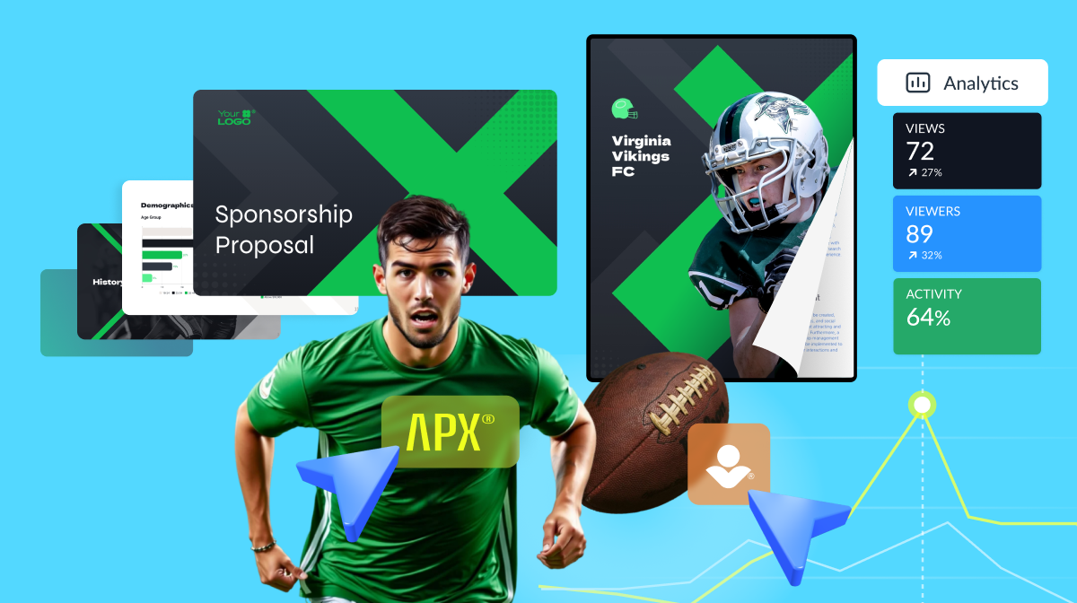


Sports Sponsorship Explained: How Top Teams Build Lasting Partnerships


Keeping track of your company's financial health is crucial for strategic decision-making. It empowers you to identify growth opportunities, monitor performance and drive long-term financial stability.
However, visualizing sales data, KPIs and other financial metrics can be overwhelming. That's where a financial dashboard comes in! They provide crystal-clear, real-time insights into your financial data in a centralized place.
But the problem with creating a financial dashboard is that it requires you to learn complex software with a hefty price tag.
So, in this article, we'll provide you with the seven best financial dashboards to track your company's sales, KPIs and metrics.
Let's get to it!
A financial dashboard is a visual tool you can use to monitor and analyze key financial metrics and performance indicators in your business. It uses charts, graphs, tables and other data visualizations to consolidate critical financial data and present it in an easy-to-understand format.
The tool empowers you to quickly gain insights, identify trends and make informed decisions to improve your company's financial health. With a comprehensive overview of your company's financial situation, the financial dashboard saves you time and resources, driving your business toward growth and success.
Now, let’s take a look at the financial dashboard templates from Visme’s library that you can easily customize to make your own. All of these templates are fully customizable, so you can select any of them regardless of the industry, business type and size.
Track your company's financial performance in a visually concise and highly informative way using the financial performance dashboard template.
The template is guided by a pleasing blue color scheme and uses bar graphs to manifest important data such as revenue, net profit and cash flow within a specific timeframe. An added feature is its comparative dimension, which presents differences in results for the current month, the previous month and the month-over-month change rate.
Creating a financial dashboard is a collaborative effort, especially in a business or organizational setting. From data gathering and analysis to the dashboard design, team members play different roles.
Keeping this in mind, Visme comes with some advanced collaboration features like live editing, commenting, annotating, version control and more.
Additionally, with Visme's workflow management feature, you can assign specific sections to different team members and manage roles, tasks, progress, deadlines and corrections—all in one place.
Watch the video below to discover how you can collaborate in Visme.
Immersed in a succinct blue theme, this template is a concise yet detailed visualization tool for your company's financial KPI dashboard. The template includes a chart showing monthly revenue using a bar graph and a line graph. This helps you see where money is coming from and how much.
There's also a separate line graph that shows the cash flow each month. Moreover, the dashboard has two pie charts that give a quick summary of critical financial figures like total profit, cash flow, ROI and net flow.
The nonprofit financial dashboard template is specially tailored for organizations in the nonprofit sector that require a simplified yet comprehensive approach to financial analysis. It features bar graphs to display essential metrics such as collections and endowment growth rate and a line graph to visualize donor retention rate easily.
This financial dashboard template goes beyond just presenting visual trends by providing valuable insights like cost to raise a dollar, fundraising efficiency ratio, ROI and average donation size.
Enhance your financial dashboard with Visme's 30+ data widgets and 20+ types of charts and graphs. Easily visualize data, from simple stats to complex figures, all customizable to fit your needs.
Watch the video below to learn more about creating charts and graphs in Visme.
Breaking even is the difference between success and financial failure. When you overlook it with assumptions or fail to track cost fluctuations, it can compromise real-life results that you’ll need to learn from and adjust.
This monthly break-even analysis dashboard comes with two pages, one dedicated to your break-even point (BEP) and the other to revenue and cost breakdowns. Each has top highlights and supporting charts or graphs to track progress and the data contributing to these highlights, allowing you to practice effective decision-making.
The financial statement dashboard template from Visme is a striking design featuring black, yellow and green color combinations. This financial reporting dashboard template employs vertical bar graphs to illustrate various critical financial factors such as cash flow, operating expenses, EBITDA, gross profit and net profit.
Its bold and distinct color scheme enhances readability and draws attention to crucial data points. The vibrantly colored template is perfect if you want a bold, visually dynamic representation of your financial condition.
Customize the financial dashboard template to tweak the color settings, adjust graph parameters and modify the labels to align with your brand and specific financial metrics. This dashboard would also be a great addition to your financial presentations.
Furthermore, Visme's analytics feature allows you to track your dashboard's performance over time. These analytics features give you insights into views, unique visits, visitor IP, visitor location and much more.
You can use these insights to better understand viewer engagement patterns, optimize content and ensure your financial dashboard effectively communicates the intended message.
Whether you're a CFO or someone who reports directly to one, this is one of the best financial dashboard templates to help you quickly assess and analyze the company's financial performance, identify trends, and make informed decisions to optimize profitability.
Its clean yet colorful design allows you to identify high and low points of sales and net profits, COGS breakdowns and ROI at first glance. You can change or add alternative graphs. Also, you can use Visme’s Workflows to assign different tasks to key members of your team, set deadlines, leave comments to review and edit data, keeping this dashboard up to date regularly.
With its fresh green color scheme and color-coded elements, this cash management dashboard template allows for an easy understanding of various data points.
Two color-separated bar graphs are used to monitor cash balance and accounts payable. They give a clear view of these critical financial areas. A line chart neatly depicts expenses, providing insight into outgoing funds.
Additionally, it uses a donut chart with different colors to display the income of different months, making it simple to compare and analyze financial growth over time. Overall, this dashboard offers a quick and straightforward way to manage and understand cash flow, making it a great choice for an executive financial dashboard.
Visme simplifies creating engaging dashboards by allowing you to embed tables easily and import data from external sources.
You can pull data from platforms like Google Sheets, Microsoft Excel, Survey Monkey and Google Analytics straight into your dashboard. This will help you to keep your data fresh and up-to-date, as any changes you make in these sources will automatically reflect in your dashboard.
The best part is that Visme lets you select and import specific data ranges from Google Sheets and Microsoft Excel instead of importing the entire table.
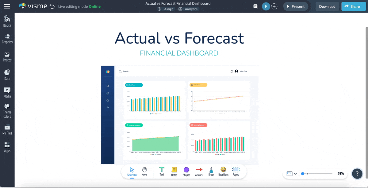
This dashboard template presents a comprehensive look at your financial health using various color contrasts for clear interpretation. It uses two intuitive bar graphs to illustrate cash flow and operating expenses over time, providing an immediate visual understanding of incoming and outgoing assets.
Additionally, this dashboard for financial reporting includes two line graphs to seamlessly convey your company's profit margin and return on investment trends. Overall, it's an excellent tool for companies keen on juxtaposing projected finances with actual figures for a better financial strategy.
Costs for projects, operations and services can add up fairly quickly—a dollar here and there—and soon you’re left with a large lump sum to pay on a monthly basis. To avoid this and get better financial transparency for your company or department, use this monthly operating expenses dashboard.
This template is designed with two accent colors against a white and light gray background. It has allocated sections for each possible monthly expense. Of course, you can customize it to your specific expenses. This template can be made into a presentation that can be shared and used internally or turned into a whiteboard with a never-ending canvas, expanding as your expenses grow. The choice is yours.
The finance service dashboard template provided by Visme is a unique tool for making financial concepts and data easy to understand. Its intuitive layout and captivating icons make it a great choice for personal financial dashboards or business planning tools.
You can personalize colors, fonts, charts and even add animations with robust customization options. This versatile, accessible template is perfect for anyone eager to distill complex financial data into a simplified visual narrative.
Make your financial metrics dashboards aesthetically pleasing by adding additional design elements from Visme's library. With Visme, you can add vector icons, 3D animated illustrations, shapes, lines and more. This will give your dashboard a fresh and professional look.
Get a clear visualization of your profit and loss with this financial dashboard template. Access clear and intuitive charts and graphs for a comprehensive view of your financial performance. It features a sleek layout with four panels dedicated to tracking total revenue, total expenses, gross profit margin, and operating profit margins.
You can also add hotspots or link slides, URLs, or reports to sections of your dashboard with Visme’s interactive feature. Easily incorporate hover effects or clickable pop-ups, allowing readers to access additional information on the items your financial dashboard reports.
The best part? No coding is required. Visme enables you to add interactive content with just a few clicks.
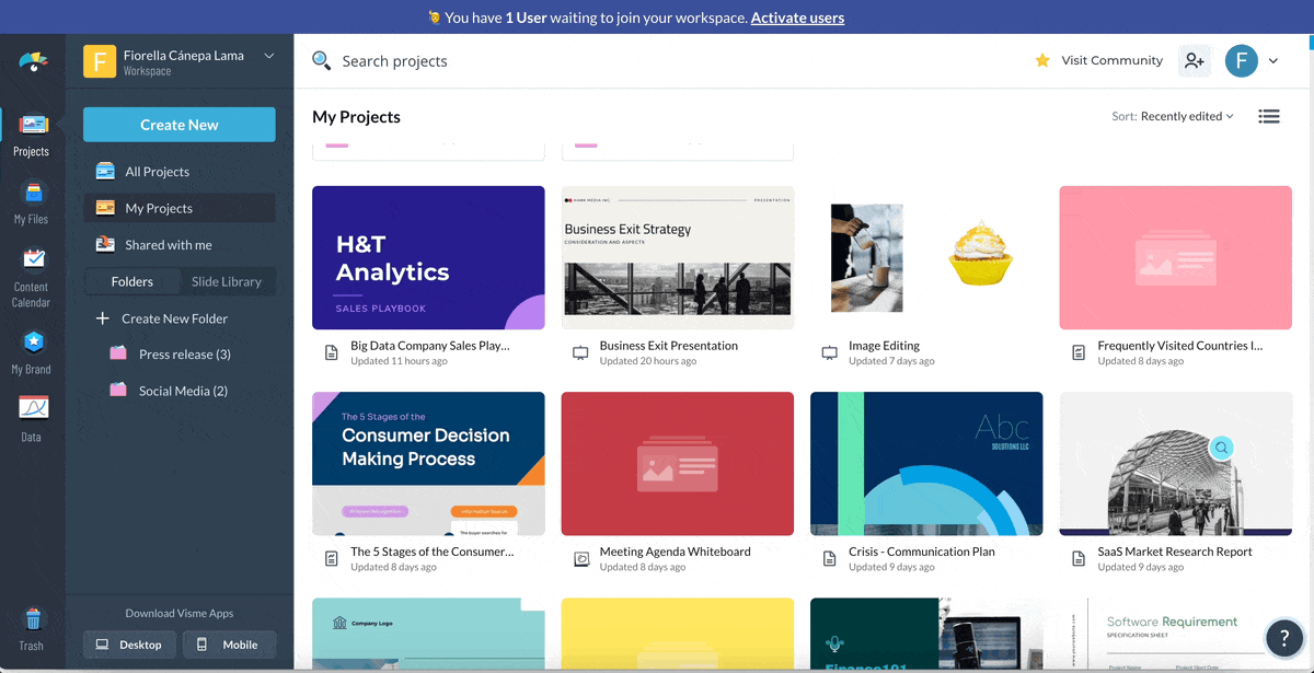
Visme provides a painless experience to create a financial dashboard without any design experience. All you have to do is create an account, choose a template and customize it.
Visme’s fully customizable, aesthetically pleasing templates empowers many individuals and businesses across the globe. Don’t just take our word for it. Here’s what one of our satisfied customers has to say about Visme.
“Creating and sharing visually appealing content is quick and easy with Visme. I often find myself jumping into Visme during a meeting and finding an infographic or two to share stats and data. The response I receive about the data and presentation stylings are always positive and people want to learn more about Visme - which I'm glad to do.”
Paul | Sustainable Travel Services Coordinator
Now, follow these simple steps to create your own financial dashboard in Visme.
Getting started with Visme is simple and free. You can create an account using your email address or easily link it with your Gmail or Facebook account.

Log in if you already have an account. That's the first step towards building your finance dashboard with Visme.
After logging in, head over to Visme's template library. To find the perfect template for your financial dashboard, simply type 'financial dashboard' in the search bar and browse through the available options. Pick the one that best suits your needs and prepare to customize it.
The next step is to connect your live data source to the dashboard.
Visme lets you pull data from various platforms, including Google Analytics, Survey Monkey, Google Sheets and Microsoft Excel.
This feature ensures your dashboard stays updated with real-time information from your chosen sources.
Visme also seamlessly integrates with popular apps like HubSpot, Salesforce, Jotform and Mailchimp. Transferring data directly from your favorite apps becomes incredibly straightforward with this feature. Your financial dashboard will be populated with accurate and up-to-date information, making data analysis easier than ever.
Now here's the fun part—customizing your data visualization. It's essential to ensure all data widgets, charts and graphs look cohesive and are laid out in a balanced manner. Cohesion and balance are basic design principles that can make your financial dashboard design visually appealing and easy to understand.
A well-designed financial dashboard should convey the most complex data in the simplest form possible.
Here are some tips on customizing data visualizations in Visme:
Incorporate your company's branding elements—logos, colors and fonts—into your financial dashboard. This consistent branding fosters company culture and promotes visual cohesiveness in your internal business communications.
Furthermore, it makes the data presented in the dashboard easily identifiable as part of your organization.
Visme's brand design tool enables you to apply branding elements like brand colors, brand fonts and company logo with just one click.

Simply paste your company URL and the tool will automatically extract and save your brand assets. This efficient process streamlines your design workflow, conserving time and effort while reinforcing brand consistency across all your visual content.
Visme's built-in collaboration tools make it easy for teams to collaborate on your financial dashboard. Invite team members to view, comment or edit the dashboard, engage in real-time discussions and ensure everyone is aligned.
Watch this video to see how the collaboration tool works.
Once finalized, you can share the dashboard with your team or the whole organization, either by inviting them directly on Visme, sharing a link, or embedding it on a secure intranet site.
Not only does this foster transparency and communication, but it also allows informed decision-making backed by up-to-date financial data.
Excel offers various chart types and data visualization capabilities, making it an accessible choice for a financial dashboard.
Let's walk you through the step-by-step process to build an effective and user-friendly financial dashboard in Excel.
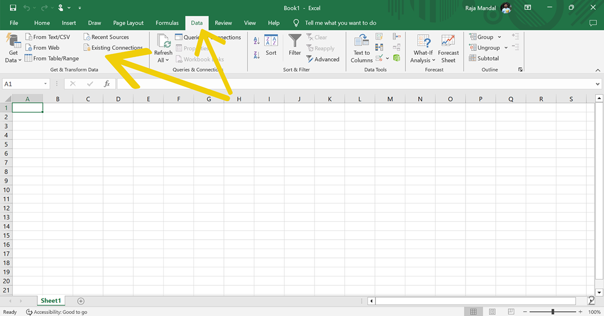
To begin, import the necessary financial data files into Excel. Data can come from various sources, such as CSV files, text files, or even databases. To import a file, click on the "Data" tab and then select "From Text/CSV" or "From Other Sources" as needed.
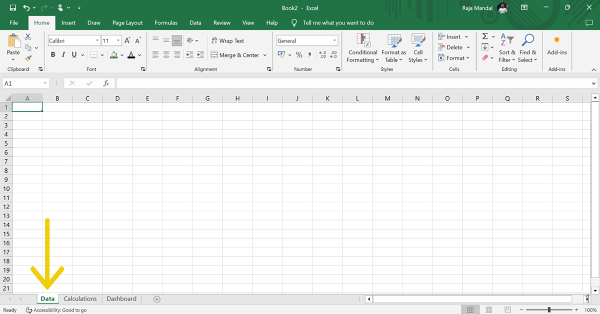
Create a structured layout for your dashboard by organizing different worksheets for your raw data, calculations and visualizations. Name each sheet according to its purpose to make navigation simple.
Place your raw data into an Excel table to have better control over formatting and to utilize advanced features like filtering and sorting. Begin by selecting a cell within your data range, then click on the "Insert" tab and select "Table."
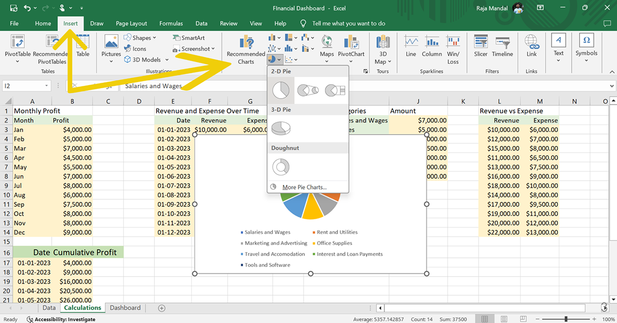
Decide on the most appropriate data visualization methods for your key performance indicators (KPIs) and financial metrics. Consider bar charts, line charts, pie charts or gauges, depending on the relationships and trends you want to highlight.
Now, select the data range you want to visualize and click the “Insert” tab and choose the appropriate charts and graphs you see fit.
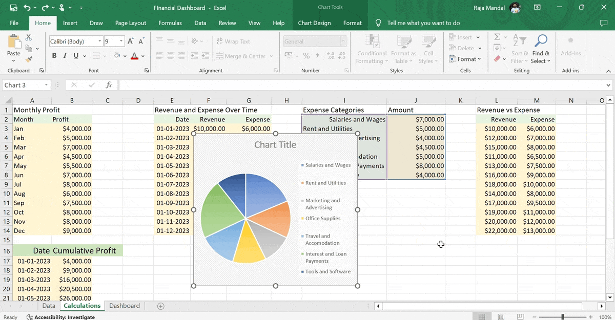
Begin by designing a layout within the Dashboard sheet in your workbook. Add labels for each metric you will visualize. Use Excel's text and cell formatting tools to enhance clarity and user experience. Be sure to leave enough space for each of the data visualizations.

Arrange your visualizations according to the layout you designed in step 5. Remember to keep your data visualizations simple and relevant to avoid confusion and enhance readability.
If you need more detailed information regarding creating your Excel dashboard, read our Excel dashboard examples article. It includes a step-by-step tutorial and a better alternative to Excel for creating dashboards.
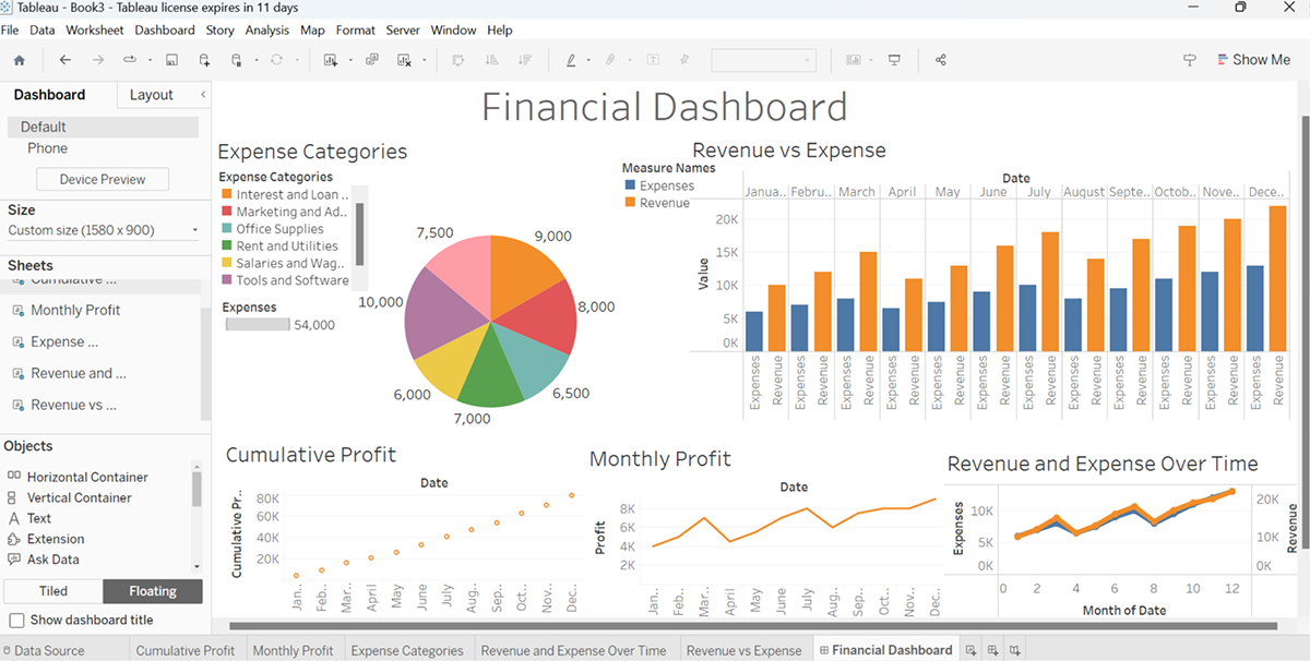
Creating a financial dashboard in Tableau typically demands a significant level of proficiency with the tool. Understanding the nuances of Tableau is pivotal because each layer of information and every visual component in a financial dashboard serves a unique purpose, contributing to a clear, cohesive financial narrative.
Any misstep or misunderstanding in using Tableau can lead to inaccurate data representation or analysis.
We'll now show you an example of creating a financial dashboard in Tableau using a straightforward data set and simple steps.
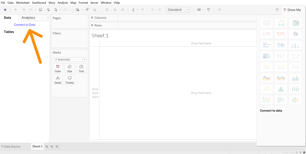
First things first, launch the Tableau application on your computer. You'll find an option called 'Connect to Data' at the top left corner of your application. Click on that.
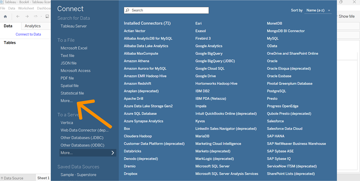
This leads you to a range of data types, for example, PDF, CSV and MS Excel, to name a few, available for you to select. You can either choose from the given choices or if you need to upload the file from your device, hit on 'More.'
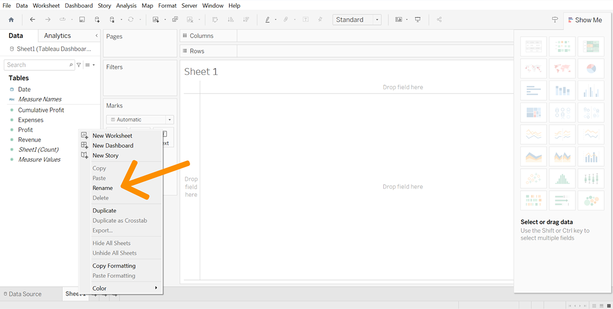
Next, move to the 'Sheet 1' option and name it accordingly. For example, if you wish to create a chart demonstrating cumulative profit, name the Sheet as 'Cumulative Profit.'
Repeat similar actions for every outcome you aim to present visually-Monthly Profit, Cumulative Profit, Revenue versus Expense, Expense Categories and Revenue versus Expense Over Time, among others.
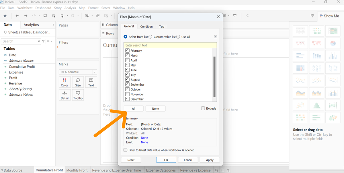
Proceed to the specific Sheet for creating your visual. You might need to filter your date if it is not already done. All you have to do is drag the date field to the 'Filters' section.
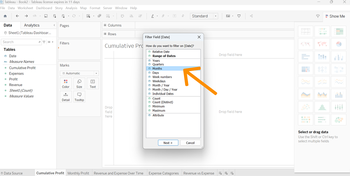
Customize the filtration as per your preference. For instance, if you want to filter it by months, opt for 'Month'; after that, select the boxes of the months you wish to showcase.
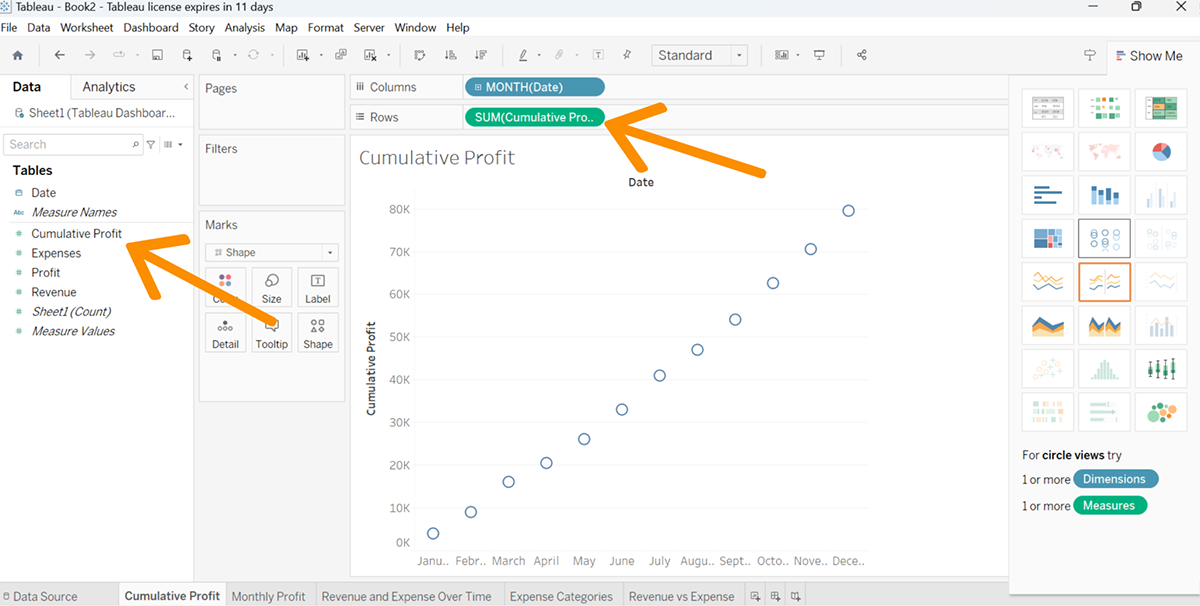
Drag your 'Month(Date)' element to the Columns field and the 'Cumulative Profit' to the Rows field. Now, pick your chart style from the options on the right side.
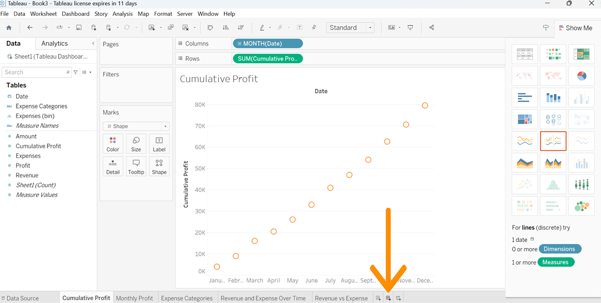
Keep repeating this procedure for each sheet to produce your visualizations.
Once you've created your charts and diagrams in separate sheets, it's time to assemble them into a dashboard.
To set up the dashboard, click on the 'New Dashboard' icon, which is located on the bar at the bottom.
Pick your preferred dashboard size and decide upon a container type – 'Horizontal' or 'Vertical.' Subsequently, one by one, drag and drop all the charts and diagrams you wish to include in the dashboard.
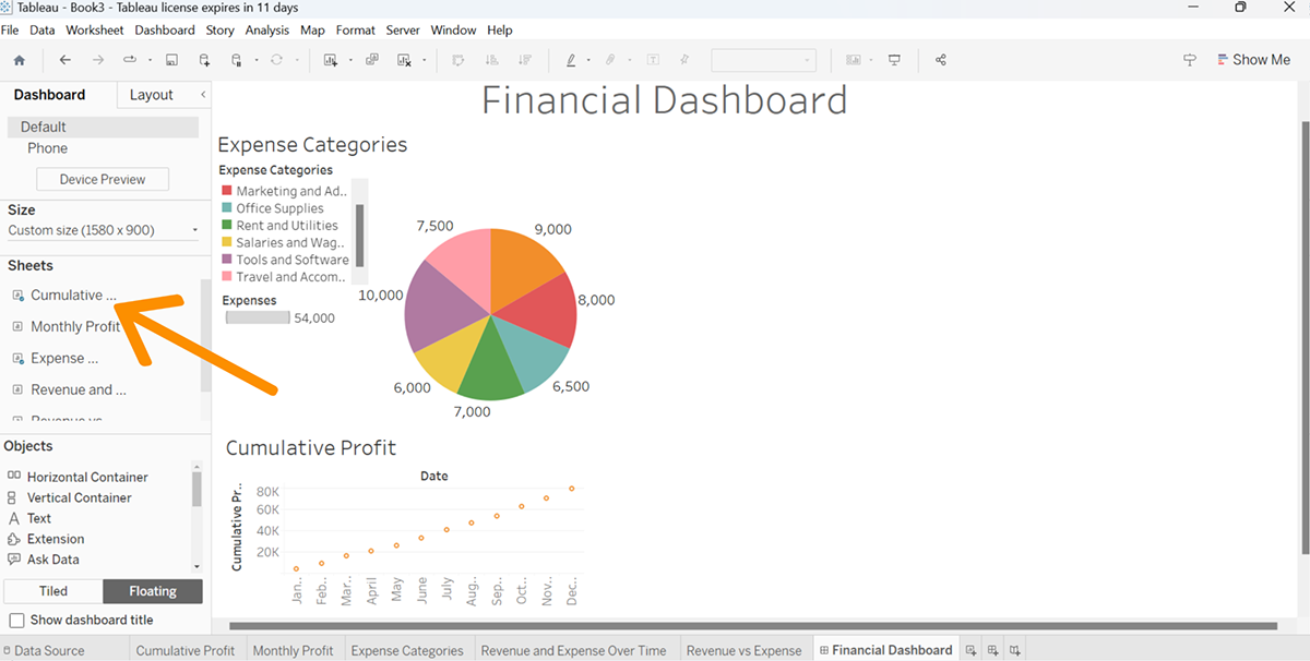
For a neat layout, be mindful to adjust the dimensions and shape of every chart and graph. Ensure these elements complement each other well within the dashboard composition.
Creating a financial dashboard is a complex and time-consuming process. It requires a lot of planning and consideration to create an accurate, valuable and attractive dashboard for your company.
However, with these seven financial dashboard templates, you can create a powerful financial dashboard in no time.
You can use any other tool like Excel, Tableau, Power BI or anything else. However, they require an advanced level of skills and experience to turn your data into beautiful visuals.
With Visme, you can create a financial dashboard in minutes by simply dragging and dropping your data into the tool’s intuitive interface. You can also add charts, graphs and maps to display your data in a way that makes sense for your audience.
Create a free account in Visme to start building intuitive financial dashboards.
Design visual brand experiences for your business whether you are a seasoned designer or a total novice.
Try Visme for free