


14+ Employee Newsletter Examples, Ideas & Templates

Having a bird’s eye view over a business is a power that executive dashboards can grant to anyone, even if they don’t have omnipresent superpowers.
Everyone on the organizational chart benefits from the knowledge an executive dashboard brings. But not everyone knows how to make a data dashboard that impacts business decisions positively while also nurturing company culture and highlighting brand values.
Think of that cliche that says humans are visual creatures, and we remember information better when it’s visual. Well, executive dashboards are real proof of that saying. A visual executive dashboard presented in a meeting instead of a pile of spreadsheets incites interest and an easy grasp of the information.
If you’re looking to create executive dashboards that aid better decision-making, you’re in the right place.
In this guide, we share 11 editable executive dashboard templates. Edit them with Visme’s infinite whiteboard and collaborate with your team to collate the data and set it up according to your brand.
An executive dashboard is a collection of data visualization types organized on a layout that tells a business story. Data dashboards can tell broad stories about a business or detailed analytic stories of specific processes.
In the catalog of business intelligence tools, the executive dashboard is high on the list. In business communications, the majority of shared information consists of data. Most of the time, the data exists in several different platforms and software.
Executives and managers like yourself regularly have to collate that data and present it to the team or higher management. Executive dashboards are the ideal solution for this type of communication.
Dashboards help monitor performance across business operations at the highest level. On an executive dashboard, your audience can see top-level KPIs and visualizations of revenue-driven data.
As an executive, internal communications with higher management, stakeholders and C-suite are unavoidable. Executive dashboards make communicating at every level of the organizational chart easier.
Dashboards are categorized into operational, strategic, tactical and analytical. Each has its own value and you’ll likely need to create all of them at different points in time. This flowchart will help you figure it out.
Made with Visme Infographic Maker
The operational dashboard is the most common of the four dashboard types. An operational dashboard collects data about short-term deadlines and processes. A dashboard for operational tracking and overview is perfect for project and marketing managers to share progress with higher-level management and the team on the ground.
Live data and regular updates are critical for operational dashboards. Transactions, operations and processes are tracked with performance metrics for real-time data analysis. Use operational dashboards every time you embark on a project that needs tracking and analysis. Create the operational dashboard your boss wants to see periodically as the project progresses.
The strategic dashboard is the most suited for keeping the CEO and senior management up to date on the business. A strategic dashboard is an overview of the big picture. The data includes high-level KPIs that share the most critical points about every aspect of the business. The data in a strategic dashboard is revenue based and highlights strengths and shortcomings to be addressed.
There’s no urgent need to add live data to a strategic dashboard because they are periodical. Don’t forget to include the date the data was pulled on and include it as a footnote or caption on the dashboard. Also, mention the periodicity of the dashboard; monthly, quarterly, or annually.
Use a strategic dashboard in your team to align departmental performance tracking with the overall corporate strategy and the process for achieving big goals.
In a tactical dashboard, data is interactive and filterable for in-depth analysis. Sitting between strategic and operational dashboards, tactical dashboards are a detailed overview of a particular business area. Detailed data shares insight about a specific goal and how everyone is performing on the way to reaching that goal.
A tactical dashboard helps with performance management and tracking. The filters help see the data from different angles to make better decisions about every aspect of a business.
Use the Hubspot integration to track how many clients are using Visme resources. Connect to Salesforce and include all Visme projects in their client profiles. Track Hubspot and Salesforce connections with the Visme workspace in relation to productivity and revenue.
Similar to tactical dashboards, analytical dashboards are filterable and interactive. The difference is that an analytical dashboard covers many business areas, unlike a tactical dashboard. Analytical dashboards are not the type of dashboard the general business public needs. These dashboards are for data analysts of different industries and fields.
Analytical dashboards zoom in on trends by visualizing data across long periods or about a large group of people. These dashboards are ideal for data comparison between topics or business efforts. Add plenty of filtering options for the analyst to navigate the data deeply in many directions.

Visme whiteboard dashboard templates are the ideal collaborative business intelligence tool for tracking and analyzing processes, campaigns and more. All eleven dashboard templates in the list below are editable using Visme’s intuitive whiteboard editor.
Your team can collaborate in real-time to create a functional dashboard to make better business decisions.
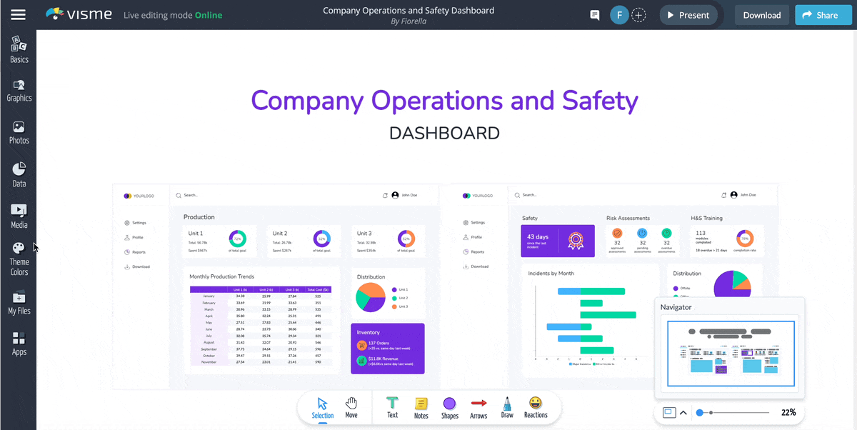
This strategic executive dashboard uses color to bring attention to the two most important metrics of this business; revenue and safety. Secondly, you’ll find three performance trackers on the dashboard template, one for each unit or team. Strategic dashboards show the bigger picture with data widgets and charts pulling data from a spreadsheet.
Collate all SEO data in one tactical dashboard using this template. Organize data visualization views by SEO topics like top posts, links and leads.
Connect your Visme workspace with Google Analytics and show only the needed data. Then create individual charts and graphs for specific details and data filters.
Use a contrasting color scheme or your strategic dashboard. Pull attention to critical metrics with a bright color and strategic positioning. Create metric filtering by building different views for the dashboard. In each view, connect your live data to populate your charts in real-time. This board is very helpful when you're panning to share a presentation to board of directors.
Take a minimal approach to an overview dashboard design with this PPC dashboard template. Pull Google Analytics data from your website’s account and visualize it in bar charts and line graphs. Combine different data visualization types in the dashboard views for easier reviewing by your team.
Collaborate with your marketing team to create a social media dashboard everyone can benefit from. Create views per channel and social. Import live data from Google Analytics to show how social media is bringing traffic to the site and what the demographics are.
Put together an HR dashboard to see the company's employees' bigger picture. Track diversity rates, hiring progress and recruitment costs. Create views according to the topic you need to track and pull data from various sources. Pull data from your Survey Monkey polls to showcase employee satisfaction and engagement.
Track and view sales and revenue for your eCommerce business with this tactical analytic dashboard. In the collaborative whiteboard, create separate views for different points of interest. Then you can transfer the content to an infographic or presentation format and use interactive buttons to help the viewer navigate the filtered views.
Create a dashboard to track and analyze crime and corruption in a specified area or locale. This dashboard can help a county, a city, or a community understand the bigger picture visually. Share access to the overview dashboard with everyone interested and help spread an objective view of a problem. This knowledge can help inform decisions as a group.
Strategic financial dashboards offer a broad view of business activities. This is a revenue-based dashboard where you can show overall cash flow per month. A yearly dashboard like this one is perfect for including in an annual report or end-of-the-year review with stakeholders and C-Suite.
Collaborate with your team on the Visme Whiteboard to create a strategic digital marketing dashboard. Lay out all the important revenue-based metrics to share the progress and performance of all digital marketing efforts.
Use large numbers and spacious data visualizations for easy viewing by anyone that needs a bird’s eye view. This dashboard can also be easily embded or added to your executive presentation for ease of sharing updates.
Put together a simple strategic dashboard to overview the successes and weaknesses of the marketing team. Track how much paid ads are costing per period and channel. Your managers can easily analyze the cost per conversion and make better decisions for future campaigns.
Now that you know the importance of having a functional executive dashboard as part of your business communication stack, it’s time to create one. The Visme infinite whiteboard is a great starting point for your executive dashboard. Here is a step-by-step tutorial for creating an executive dashboard with Visme.
Before embarking on all the fun of creating and organizing data visualizations on a dashboard, you’ll need to answer some strategy-related questions. Otherwise, you won’t know what dashboard you need or what metrics to include.
Use the decision-making flowchart above to help you decide what type of dashboard you need. Another thing you need to know about the dashboard’s purpose is the intended audience. Is it your direct team, higher management, C-Suite or another group entirely? Design the functionality of the dashboard specifically for that audience.
To select the data for your executive dashboard, follow a pyramid technique. Choose a key metric for the dashboard, the number one data point that relates to the dashboard’s purpose. In a high-level strategic dashboard, the key metric could be overall revenue for a specific time.
Once you have the key metric, select underlying metrics that are directly related to the key metric. Then for each underlying metric, check if you need an additional metric to support the data.
Do this for all metrics until you have the right combination for the dashboard. If you doubt a metric, just ask if it affects the key metric. If it does, find out if it’s related to the overall goal.
Choosing the perfect dashboard template isn’t difficult when you have a vast library of ready-to-use templates. Browse the Visme templates to find the perfect executive dashboard for your team. Dashboard templates are editable in the collaborative infinite whiteboard and can be shared in a number of ways.
Don’t limit your team’s data analysis to boring spreadsheets. Create functional dashboards to help you make better decisions as a team. All available templates are professionally designed and ready for editing with your data and brand guidelines.
Whiteboard dashboard templates gallery CTA
Collating data in one place needs integrations and data imports with other business communication tools in your company’s digital stack. For example, Google Analytics, Salesforce, and Survey Monkey can be connected to the dashboard for pulling data. To connect a live or static data source to your dashboard’s charts and graphics, follow the steps in this guide. Follow this guide to learn how to add live data to tables in Visme.
Connect a Salesforce or Hubspot account to your Visme workspace and start a powerful integration to share data, embed content, and track how your visual content is managed and created.
All data visualizations in the dashboard must look cohesive and visually balanced. Widgets, charts and graphs must have the same color palette throughout. Use rectangular shapes and a grid to help you align and size the data points. Place data widgets and charts over the rectangles to help keep a balanced layout.
Build a visual flow with spacing, sizing and color to help you tell the dashboard’s data story. Doublecheck all captions, legends and grids in the charts.
Do you need to have all lines and legends visible? Keep only the indispensable and remove the rest. Keep all data visualizations in the same style, ensuring none of these customizations change how the data is analyzed.
Don’t forget to brand your dashboard with the right colors and fonts according to the company’s brand guidelines. Internal business communication that’s properly branded supports company culture and visual cohesiveness with the brand’s client-facing visual identity. It unites both worlds and makes employees feel like they belong to something worthwhile.
Save time and use the Visme Brand Wizard to create branded templates for dashboards and other practical business communication. In Visme, your brand assets are always easy to access. Applying your brand to any template is easy and intuitive. You’ll have a branded dashboard in no time.
The Visme infinite whiteboard is the best platform to create and manage business intelligence with your team collaboratively. Pick everyone’s brain in the teaam to cover all the bases and ask each other questions until the dashboard is just how you need it. Use a variety of dashboard views to collate data from different teams or teams within teams.
When the dashboard is ready to use regularly, share it with other teams or higher management. For long-term data dashboards without live data, you can share them as a PDF or live link hosted online on Visme servers.
Share the whiteboard with an invitation or collaboration link and give view, edit, comment access to get feedback or comments about the data.
Comprehensive executive dashboards for CEOs can be shared alongside an executive summary that introduces the data and the analysis. Track dashboard views and other performance metrics with the integrated analytics feature in your Visme account.
Watch this video below to see our collaborative online whiteboard software in action.
Give your teams the superpower to create visual collateral for internal communications. Empower them to create collaborative executive dashboards using Visme’s online whiteboard.
With a Visme enterprise account, you can have multiple Visme workspaces for different parts of your business processes. Keep all visual content creation organized and fluid by creating teams inside Visme workspaces. Collaboratively create executive dashboards to make better data-backed decisions.
Design visual brand experiences for your business whether you are a seasoned designer or a total novice.
Try Visme for free


![How to Create a Practical Crisis Management Plan [+ Templates]](https://visme.co/blog/wp-content/uploads/2025/07/How-to-Create-a-Practical-Crisis-Management-Plan-Thumbnail.png)