


Healthcare Data Visualization: How to Turn Data into Impactful Stories

Data is a powerful tool for businesses of all sizes. However, what makes data beautiful, insightful and impactful are the stories behind it. In a recent survey, 93% of business leaders and data experts agree that decisions made from data storytelling can increase revenue.
Rather than overload your audience with dry numbers and statistics, Data storytelling can provide more valuable and actionable insights. It weaves compelling narratives around your data that drive engagement, inspire action and improves decision-making.
Ready to unlock the full potential of your data? This post discusses everything you need to know about data storytelling and why you should implement its best practices in your presentations with examples. You’ll also learn how to create an effective data storytelling strategy using Visme to wow people and convince them to say yes to anything.
Data Storytelling Techniques & Best Practices
How to Create the Right Data Storytelling Strategy
6 Data Storytelling Templates to Use
Data storytelling is a way of communicating to your audience using data visualizations. The goal is to present complex ideas from data in an easy-to-understand format for your audience to understand.
The key to data storytelling is choosing a narrative based on the gathered data, which serves as a hook to draw people into your research. From here, you use visuals to communicate your findings in a compelling way to keep your audience hooked until the very end.
Of course, you can't proceed with data storytelling without knowing the best practices that prominent brands use. Following the tips and examples below should help you break down your findings into digestible information that even your novice audience would pick up quickly.
Knowledge gaps refer to the difference between the information you know and your audience or organization needs to know.
So, when presenting information to them, close the gap by finding the information they want to know and sharing it with them.
This is important because the most common mistake when presenting data is talking about what something is rather than why.
For instance, it's one thing to inform executives about the decrease in website traffic. It's another to discuss why traffic decreased and its probable causes, which is the information they're more interested in.
Another problem is not knowing the correct data and metrics for your presentation. As valuable as traffic is, it doesn't necessarily tie into a business's sales and revenue. In this case, you should also connect website traffic with sales data.
The examples above show the vast divide in the knowledge gap, which can make your audience lose interest in your presentation.
Here’s how to close the knowledge gap. You can inform stakeholders if the decrease in site traffic had something to do with the fewer sales over time. You must also present them with suggestions you must take based on your hypothesis to improve the results.
The BetterUp Insights Fall 2021 Report is an excellent example of data visualization backed by exceptional data storytelling.
The page lets you download the full report regarding how your organization transforms inclusive leaders. But it showcased part of the data that shed light on lingering issues even before the pandemic occurred.
More importantly, it presented information on how organizations can take action against these issues by promoting inclusivity.
When presenting your data, ensure they are in the proper structure and format. Use a recognizable pattern that provides a complete view of the situation.
If your gathered data presents numbers and figures, you must contextualize them based on their previous results.
Did the numbers increase or decrease? And, going back to the previous point, what caused the trend and how can you as an organization sustain its performance or improve it over time?
Oxfam International's Year in Review is an example of data storytelling that provides its audience with the lowdown on everything. It highlighted statistics regarding how the organization positively impacted job opportunities for women and significantly decreased violence against them.
The data narrated the story that Oxfam International was instrumental in the progress made in these countries. It further contextualized them by sharing the goals of their initiatives.
Cognitive load refers to how much information we process at any one time. The human brain has a limited capacity for processing information, so when we try to learn something new, our brains tend to focus on only a small amount of information at once.
This creates a “cognitive bottleneck” where we struggle to understand concepts that require us to think about multiple things simultaneously.
To avoid cognitive bottlenecks, your data visualizations must guide the user's eyes accordingly. Use white space by eliminating elements that don't add value to the story. Conversely, visual cues direct your audience to where the story is.
Also, there is no need to use graphs if the dataset is small. Don't show bars and graphs if the data isn't enough to warrant them. Sometimes, just making the numbers and figures bigger in your presentation is good enough to communicate the data to your audience.
The Fry Universe is a perfect example of reduced cognitive load in data storytelling. It focuses on tackling a specific niche topic (about the different types of potato fries) and the science behind them.
However, instead of digging deep into the details, it presents the data in a fun and entertaining way, so its audience isn't forced to think or overanalyze it.
Watch this video to learn more about using data visualization in business intelligence.


To help you put the best practices of data storytelling into action, you must develop a strategy that allows you to execute each one successfully. Below is a step-by-step process that enables you to do so:
Segmentation involves grouping your audience into their common characteristics.
If you're selling a product, you want to know where your audience is in your sales funnel, whether on the top (ToFu), middle of the funnel (MoFU) or bottom of the funnel (BoFu).
On the other hand, you must know whether or not decision-makers will be in the room with you when pitching an idea or submitting a proposal.
The segment of your audience you're addressing with your presentation determines what story you plan to tell using data and visuals.
This also means you may have to create multiple stories about the same topic to appease these segments of your audience.
For ToFu, you must present a story that enables them to connect with your product on a more fundamental level first, i.e., its benefits. You want to hold off selling them the product through case studies, something you can do for your BoFu audiences.
A draft plotline is a story outline that aims to help you develop ideas about how you want to tell your stories.
Since you already have an audience segment in mind, it's much easier to develop a goal for your narrative to anchor your story.
The plotline usually starts with identifying the segment's pain point in the introduction. It then compares your product or service with competitors for your story's body and closes by discussing why they must choose your product as the conclusion.
All the parts of your plotline should stick with your goal to help make a focused and cohesive story that will resonate with your user segment.
Your plot outline paves the way for you to tell a compelling story using data.
Paint a picture of a world without your product or service in the market. Using the introduction, body, and conclusion as your story's pillars, you want to embellish it with tension and struggle. You want your audience to feel the main character's hardship caused by the pain point that your business addresses.
The idea here is to make them empathize with the main character and feel what it’s like to be in their shoes. From here, they'll likely immerse themselves in the story more than ever before.
One of the biggest mistakes people make with presenting data is twisting it to push their agenda. For instance, some brands cherry-pick and highlight information in their presentations to paint them in a positive light. However, the other datasets speak negatively about them.
You're not being honest with your audience by allowing your bias to override your storytelling. So, instead of leveraging data to your benefit, you are creating a false narrative about your brand, which won't bode well for you once your audience finds out.
Therefore, your data must narrate a story about your topic using numbers and figures alone. In other words, it lets your audience view a topic in the most objective way possible.
Use the most appropriate visuals that provide the most value for your audience to help flesh out your data.
The best way to present data stories is using infographics. Infographics are visual representations of information that help users understand complex concepts. They are also effective at conveying large amounts of data quickly.
From an infographic, you can include various charts (bar, line, pie) to help you make sense of the gathered data. The chart type you must consider using in your visual depends on your data and how you want to present them. For example:
Other forms of visuals to help you convey data are tables (arrange data in rows and columns) and heat maps (colors of varying temperatures represent data).
Need help determining which data visualizations to use? Please read our complete guide to learn more about the different types of data visualizations.
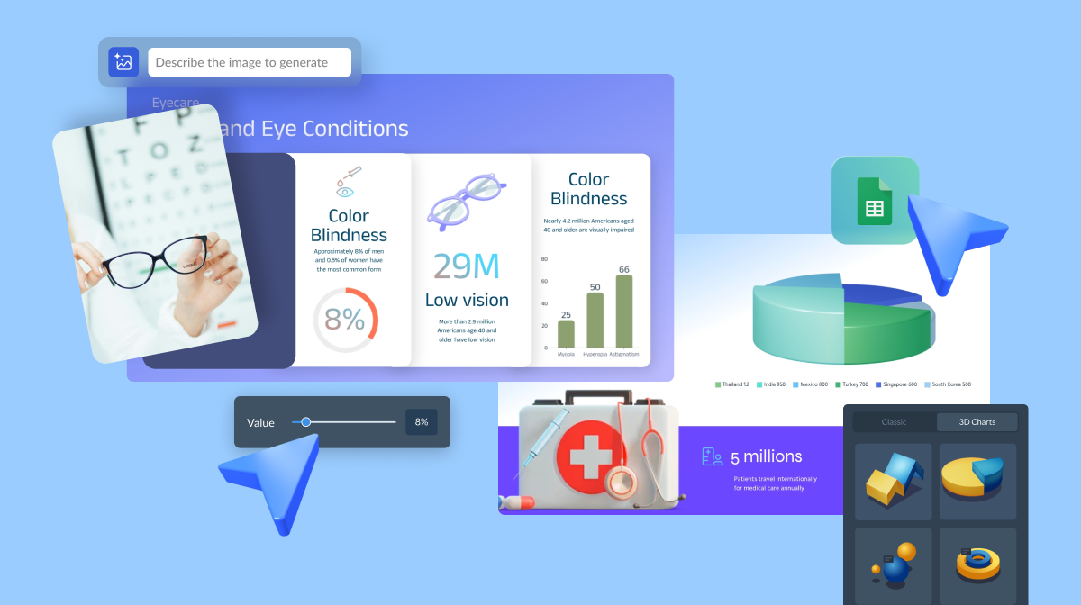
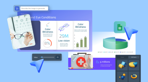
You can use many tools to help you create captivating stories with data using visuals. But we at Visme strongly believe that our platform can help you articulate your stories and add color to them with our features.
Our data visualization tools allow you to turn data into easy-to-understand visuals like charts, graphs, bars, and the like. Just input the data into these elements and customize their appearance to fit your infographic.

You can also make your presentations interactive with Visme. The tool lets you create clickable menus and tables of contents, as well as interactive pop-ups, to encourage engagement from your audience.

There's also an option to embed quizzes, polls, and other third-party apps to help make people a greater part of your presentation.
You want to see how people received your presentation over time. When publishing it on Visme, you can track the number of people who viewed your presentation and how much time they spent on it.
More importantly, you can monitor the goal completion percentage of each presentation or proposal.
Suppose either has a call to action, i.e., click on a button or submit a filled-out form. In that case, this metric helps you better understand how successfully your visual narrative turned prospects into your leads or customers.
Using this data, you can generate insights on how to improve your storytelling using data and visuals.
Coming up with ideas for a narrative for your data is no easy task. But to help jumpstart your data storytelling efforts, below are templates you can use as inspiration
This infographic provides tips on telling your story in general and not just using data. It uses short lines of text and lots of white space to give way for the visuals to do the talking. In particular, the pie chart allows you to present statistics in a more engaging way.
This presentation template sets the stage for visual data storytelling to take place. It prompts users to follow the process of telling a story using data correctly, as indicated by the three steps on the slide.
Feel free to customize it with your colors, logo, and other brand assets before adding more slides.
A mind map is another great way to showcase data in stunning visuals as seen in this infographic. It lets you present data or information procedurally with visual cues like arrows guiding you in the right direction. This enables your audience to know which following steps to take.
The infographic helps you get started with your data storytelling. It has the pieces in place, such as using short sentences and phrases in small text to emphasize the large icons. You can add your data as visuals to help your audience understand the information better.
Here’s a slideshow template about storytelling you can also use to present your data visually to your audience. The structure is already there: minimalist slides with large images and short sentences, generous white space and limited use of color. You can edit the slide to add your bars and graphs, and you're all set!
Among the templates listed here, this infographic leverages interactive content like no other. The moving visuals and the slide-up text animation are just the tip of the iceberg concerning how you can visualize your data and content using Visme.
You can also use square and wide versions of this infographic template.
Developing a cohesive story that compels your audience to perform your desired action is impossible without the right visuals. Choosing the right elements to highlight your data, among the other tips mentioned above, helps convey your message to your audience more effectively.
Visme has everything you need to visualize your data and tell compelling stories. Thanks to our suite of data visualization tools and easy-to-edit templates, you can turn data into visuals, make it digestible and make important business decisions. Sign up for an account today and get started!
Design visual brand experiences for your business whether you are a seasoned designer or a total novice.
Try Visme for free