


Proven Product Specification Examples That Give You Clear Decisions


One-pagers are supposed to make your message easy to understand.
But that only works when the layout is done right: something designers often overlook.
A strong layout guides the reader’s eyes, highlights the right details and helps them grasp your value in seconds.
A weak one does the opposite. It buries important information, creates friction and makes your one-pager feel cluttered.
Here’s what most people don’t realize. There isn’t a single layout that works for every one-pager. A sales sheet, a product overview and an investor summary all need different page structures.
Each use case needs a layout that supports its specific goal, whether that is to educate, persuade or help someone make a decision.
In this article, we’ll explore inspiring one-page layout ideas for different use cases, along with real-life examples.
You’ll also get a step-by-step guide, expert insights and ready-to-use one-pager templates to help you build your one-pager.
Quick Reads
A one-pager is a concise document that captures and presents essential information about a project, idea or company, all on a single page.
One-pagers can be used for internal or external purposes, such as:
Because one-pagers serve so many different purposes, the structure of the page should support the kind of information you’re sharing.
For example, you can use a single-column layout when you want readers to follow a simple, linear flow.
A two-column layout works well when you need to balance text with visuals or compare information side by side. A modular block layout helps you break your content into distinct sections for faster scanning.
And a visual-first layout lets images, charts or illustrations carry the message before the text comes in.
Each layout style sets a different rhythm for the page and influences how your message comes across.
What makes a layout great is the sense of order it creates.
There’s a smooth flow that ensures your reader sees the most important information first and knows exactly what to do next.
To create that kind of flow, your layout needs a few key elements that help it stand out:
Let’s look at one-pager examples along with layout ideas you can draw inspiration from.
I've also included ready-to-use Visme templates to help you easily recreate any of the layouts.
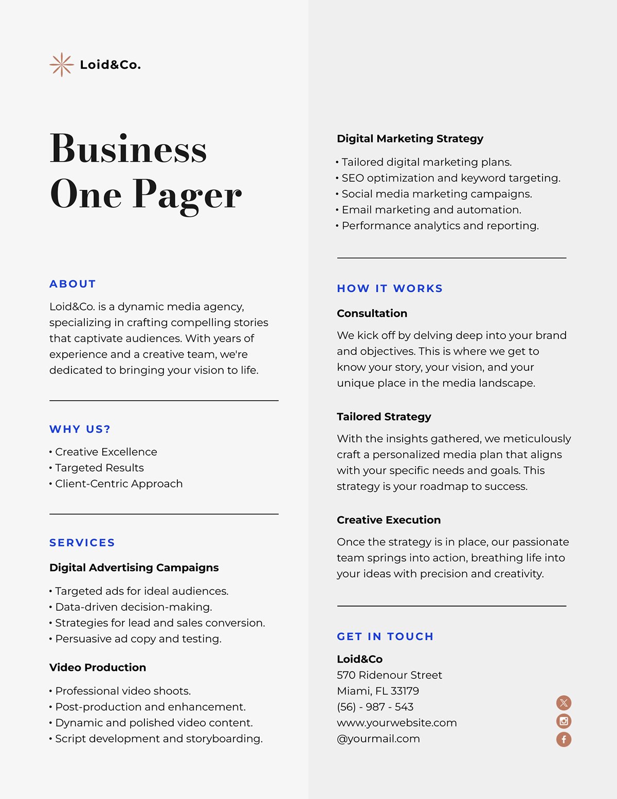
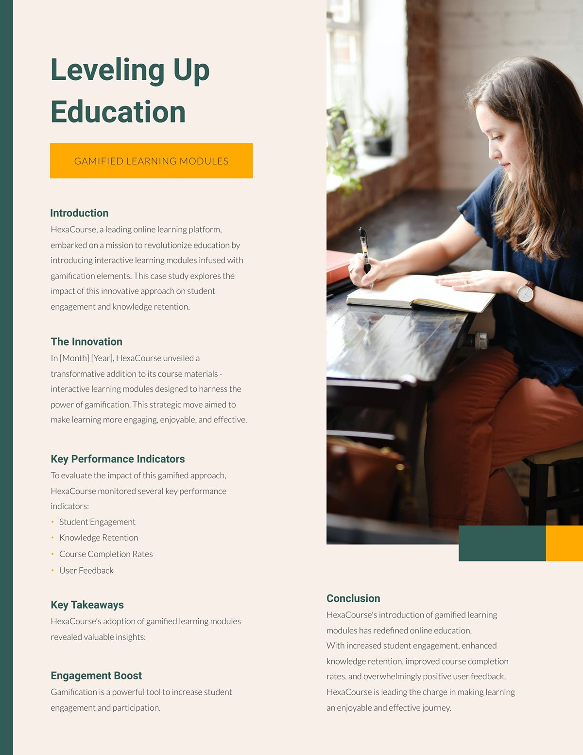
A business or company one-pager is a concise document that presents your company’s most important information in a digestible way. It’s often used to pitch investors, engage potential customers or share updates with internal and external stakeholders.
For instance, a one-pager business plan will come handy if you need to pitch to busy investors and show them, at a glance, why your business is worth their attention.
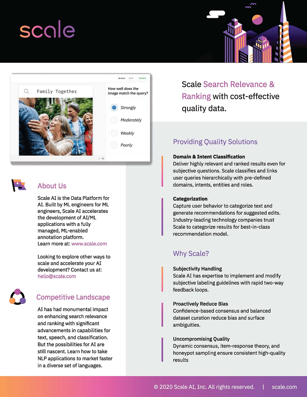
This Scale AI business one-pager proves that a minimalistic layout can also be very engaging.
The design uses a two-column layout with visual boundaries to separate each section for easy reading.
The left column features the foundational context, which is the “About Us” and “Competitive Landscape,” while the right column highlights the solution and value propositions. This creates a natural balance between background information and the big message you want readers to walk away with.
Each content block is vertically aligned with variations in typography and spacing that guide the eye naturally through the content.
You won’t find heavy graphics or colors in this example. However, the top banner and mobile interface image add a splash of color that draws attention.
Here are some business one-pager ideas that you can use to recreate yours.
Use this two-column format to organize your one-pager around what matters most to decision-makers.
It uses simple visual hierarchy, including bold headers, uppercase subheads and smaller body text, to guide the reader smoothly from one section to the next. Simple dividing lines keep each section neat and structured, giving the design a polished look that’s easy to follow.
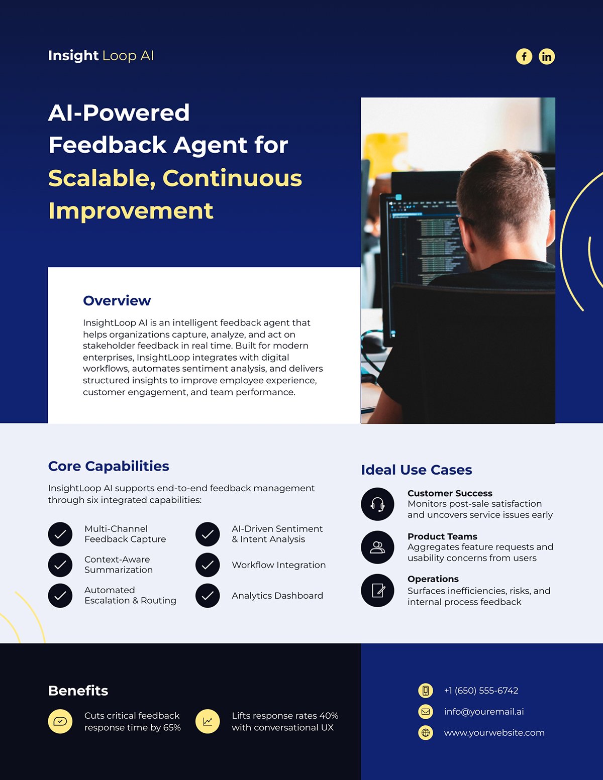
This one-pager design follows a split layout structure—perfect for a pitch deck slide or a leave-behind document. The left side presents the core message with text, while the right side uses visuals to instantly capture interest.
Notice how this company one pager layout uses color blocking. The deep blue background anchors the main message, while the bright green accents highlight key details like headings and contact information. It not only breaks visual monotony but also directs the reader’s attention to what is most important.
Make any of these designs interactive with Visme’s interactivity feature. You can add hyperlinks to your contact info, add your social media links or even include clickable buttons for next steps. You can even add hotspots that reveal extra information about a section when hovered over.
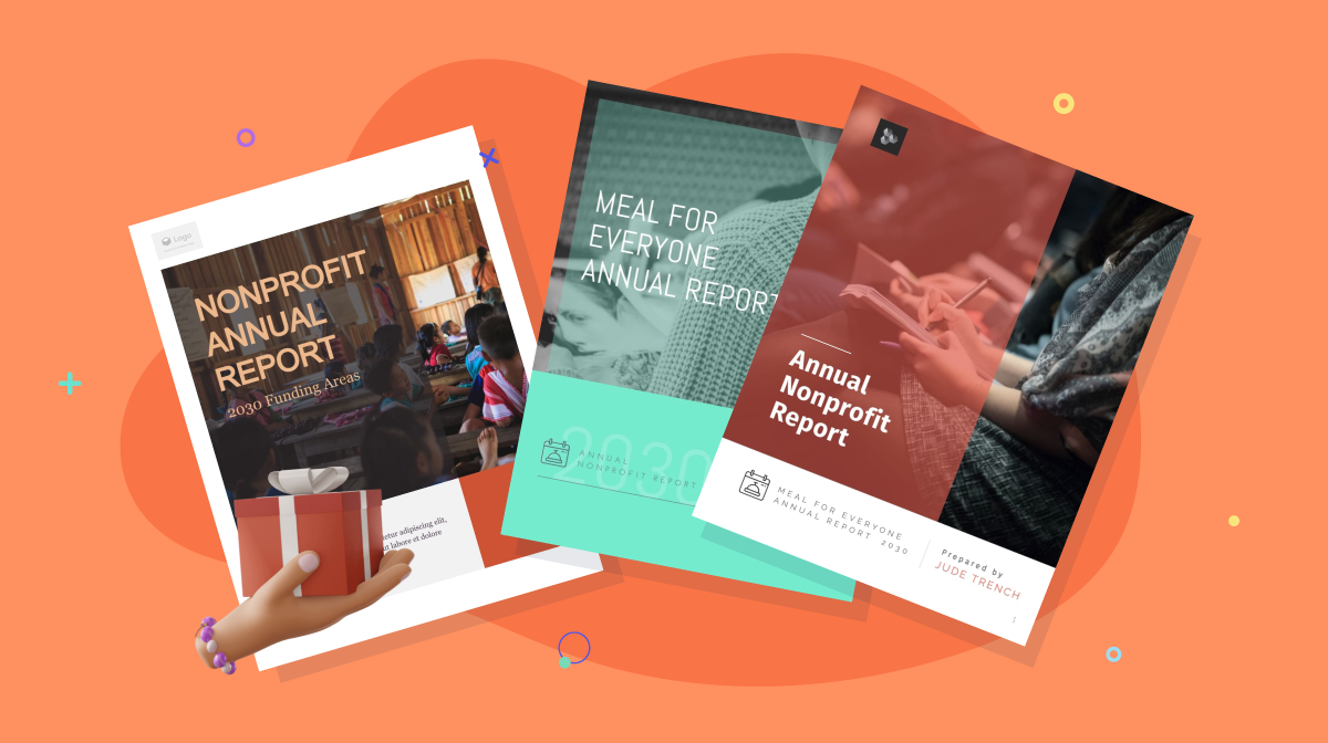
Your non-profit one-pager is a solid tool to showcase your organization’s mission, impact and encourage donations or partnerships. It can also be useful for recruiting new volunteers for a non-profit’s program or campaigns.
Here are a few layout ideas that you can easily customize:
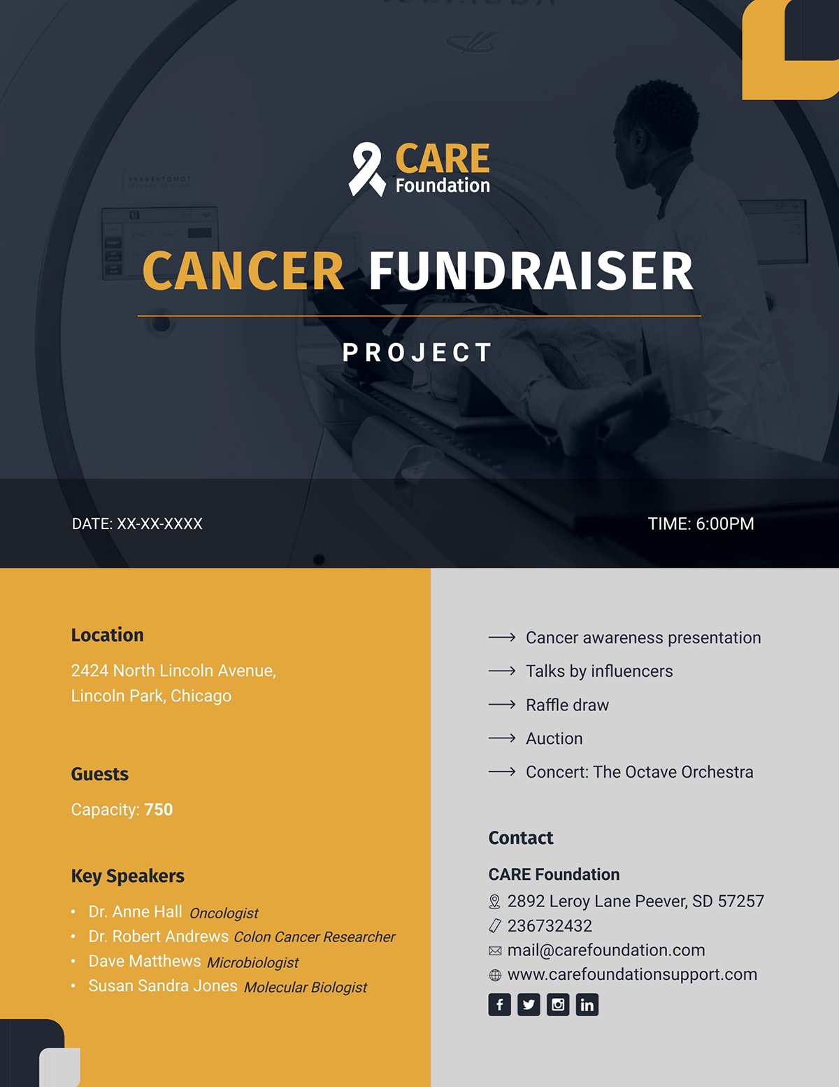
With this template, you get a clean structure that makes your next fundraiser proposal easy to grasp at a glance.
The slide uses a table-like layout with generous spacing and logical grouping so each section stands out without overwhelming the viewer. It organizes the key event details such as location, guest capacity and speaker lineup into simple blocks that are quick to scan.
The bold headings and contrasting colors also create visual anchors that guide the reader’s attention.
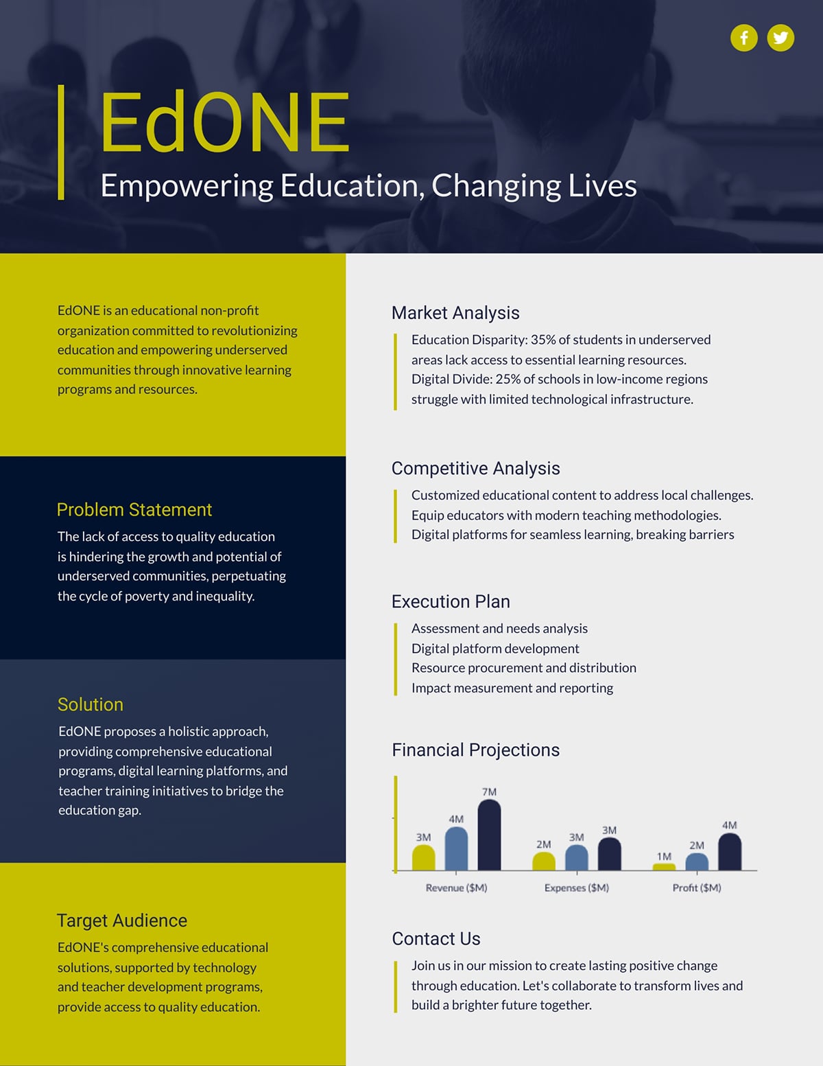
If you’re pitching to donors or partners, this nonprofit proposal template is a great starting point.
It uses a modular layout with horizontal breaks to separate each section. Each content block of the one-page proposal, from problem statements to financial projections, is placed vertically with consistent spacing.
Even with a ready-made template, you may still need to work quickly. If you’re short on time, Visme’s AI document generator can build your one-pager for you. Simply describe the tone, look and content you want and it will produce a draft in seconds.
A marketing one-pager summarizes a company’s product, service or campaign to capture interest and drive action quickly. It’s often used in sales presentations, investor pitches, product launches and promotional campaigns.
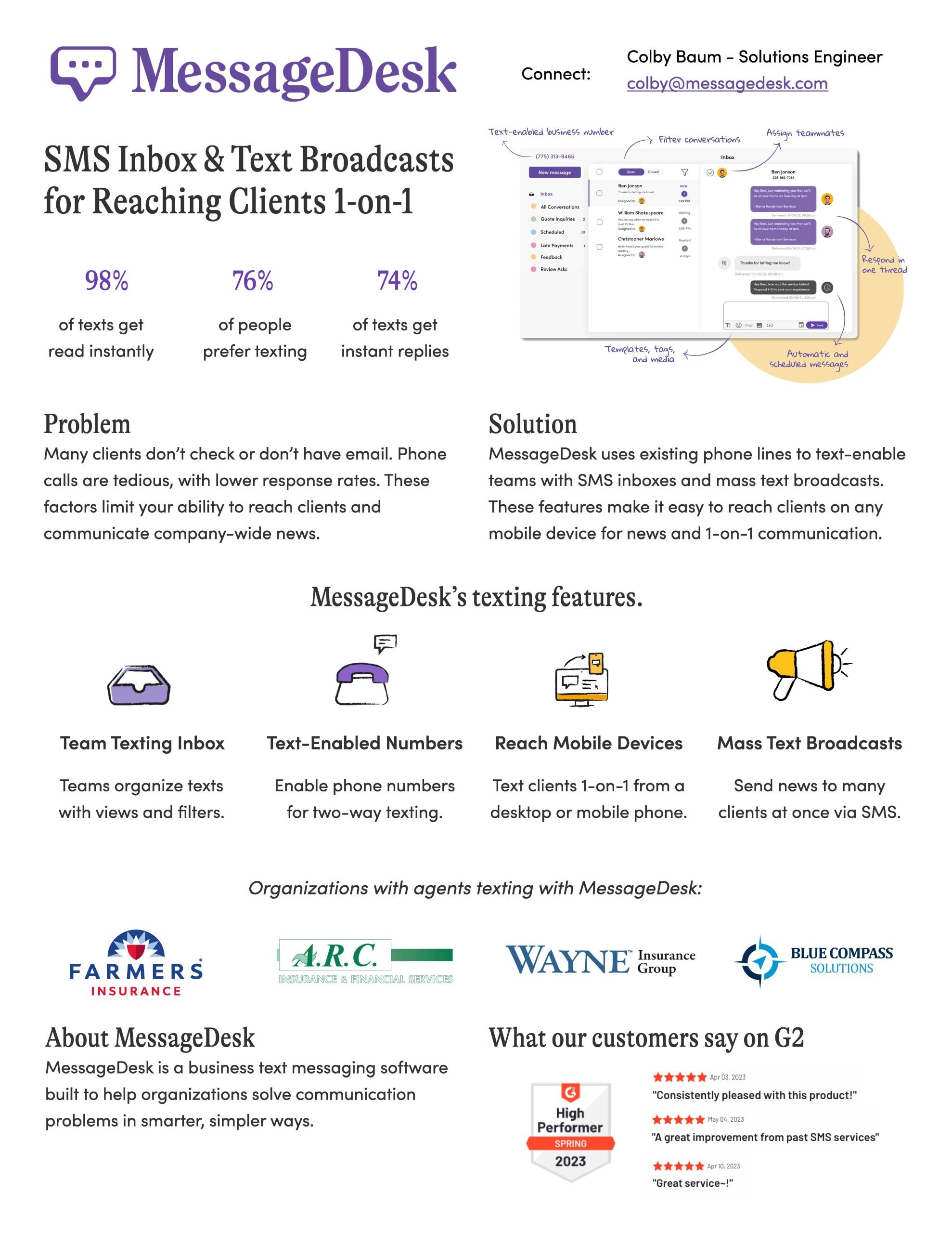
This crisp marketing one-pager by MessageDesk stands out for its level of detail and structure. It blends two layout styles: the top section uses a two-column format, while the bottom expands into four evenly spaced columns.
The layout flows naturally from identifying the communication problem to presenting MessageDesk’s solution. It then introduces specific features with their corresponding descriptions, followed by names of organizations already using MessageDesk.
Strategic formatting choices such as bold headings, icons and boxed sections make the one-pager easy to scan and digest, even for a busy reader.
Here are a few sales one-pager layout ideas to inspire your own design.
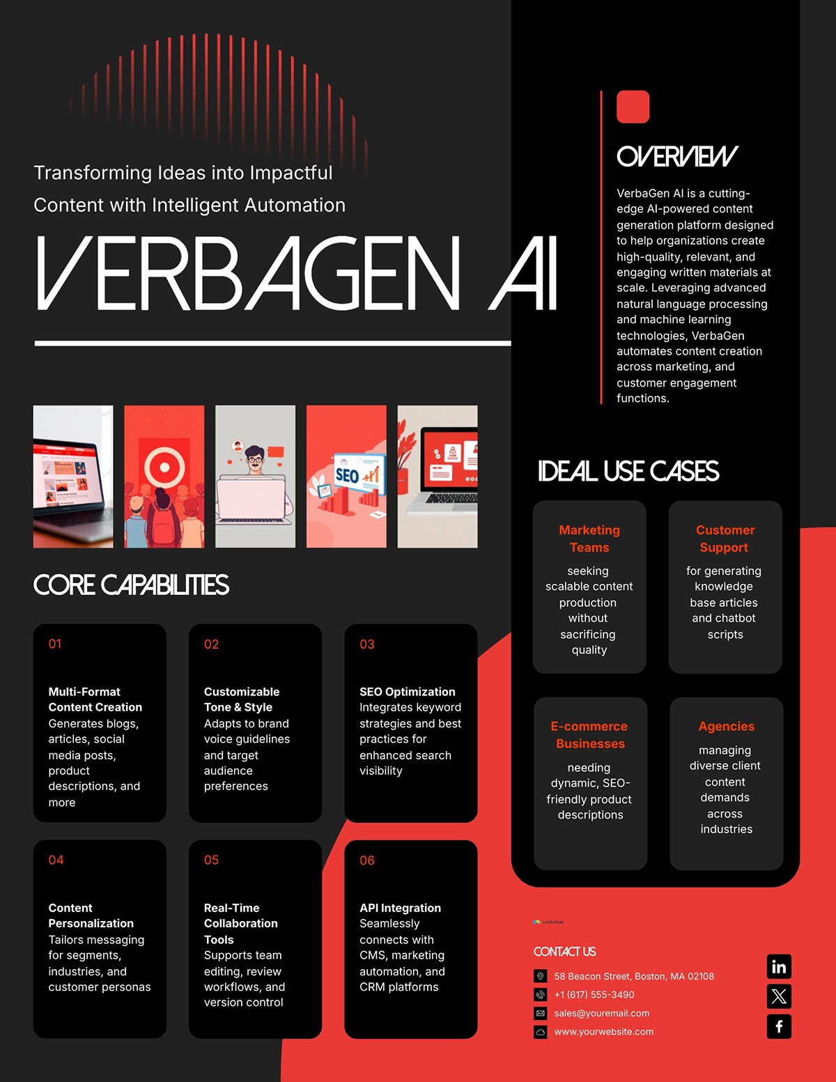
Creating marketing collaterals for your existing or new products is easy when you’re working with this kind of one-pager marketing plan template.
This product one-pager comes with a vertical block layout, section dividers and bold headings to separate each content area. Each segment, from overview to use cases, follows an easy-to-skim hierarchy.
To drive better marketing results, it’s important to start with a well-thought-out strategy and that’s where a template like this shines.
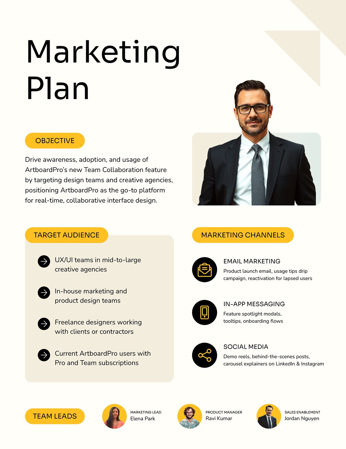
This marketing plan one-pager presents all the key elements in a two-column, easy-to-navigate format. Bold headings provide visual anchors, while the supporting content is thoughtfully structured to lead the reader through each section.
Plus, the team photos and a striking professional image also complement the design without distracting from the message.
If you need to edit or summarize the content of your marketing customer persona, Visme’s AI Writer can help. Enter a simple prompt and watch the AI create its magic.
With a sales one-pager, you can easily showcase the key benefits of your product or solution in a scannable format. It’s usually used by sales teams and reps when closing deals.
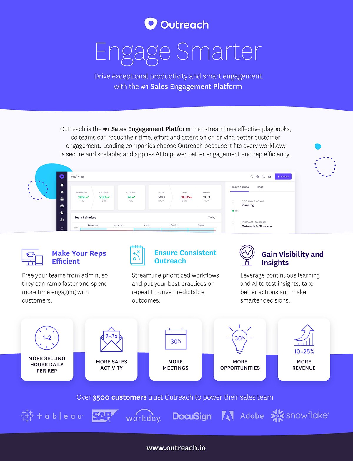
Outreach’s Engage Smarter one-pager effectively uses a three-column horizontal grid layout to separate content sections. This layout ensures each section stands out clearly and promotes balance across the page.
Each block has a concise heading followed by short descriptive text that explains the platform's benefit or feature. The varying font sizes and weights are used to establish hierarchy.
The layout also comes with generous white space. With this, each block is distinct while still being visually connected to the rest of the document.
Below are some sales one-pager layout ideas to help you create yours.
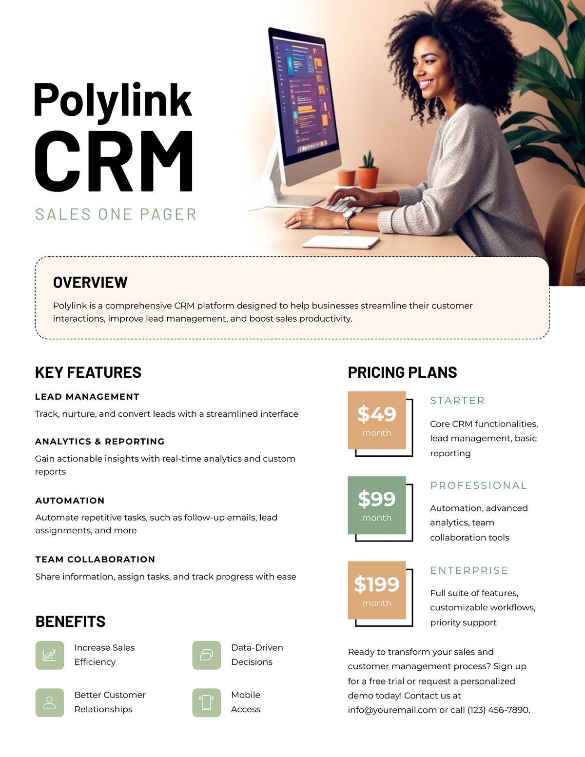
This design comes in a structured, multi-section layout that guides the reader's eyes from the headline down to the details.
Headings are bold and uppercase, while the body text uses a lighter font for supporting details.
The pricing tiers in the right column are differentiated with subtle color blocks. This way, key information stands out without overwhelming the page. To the bottom left, the key benefits are accompanied by icons that provide helpful visual cues.

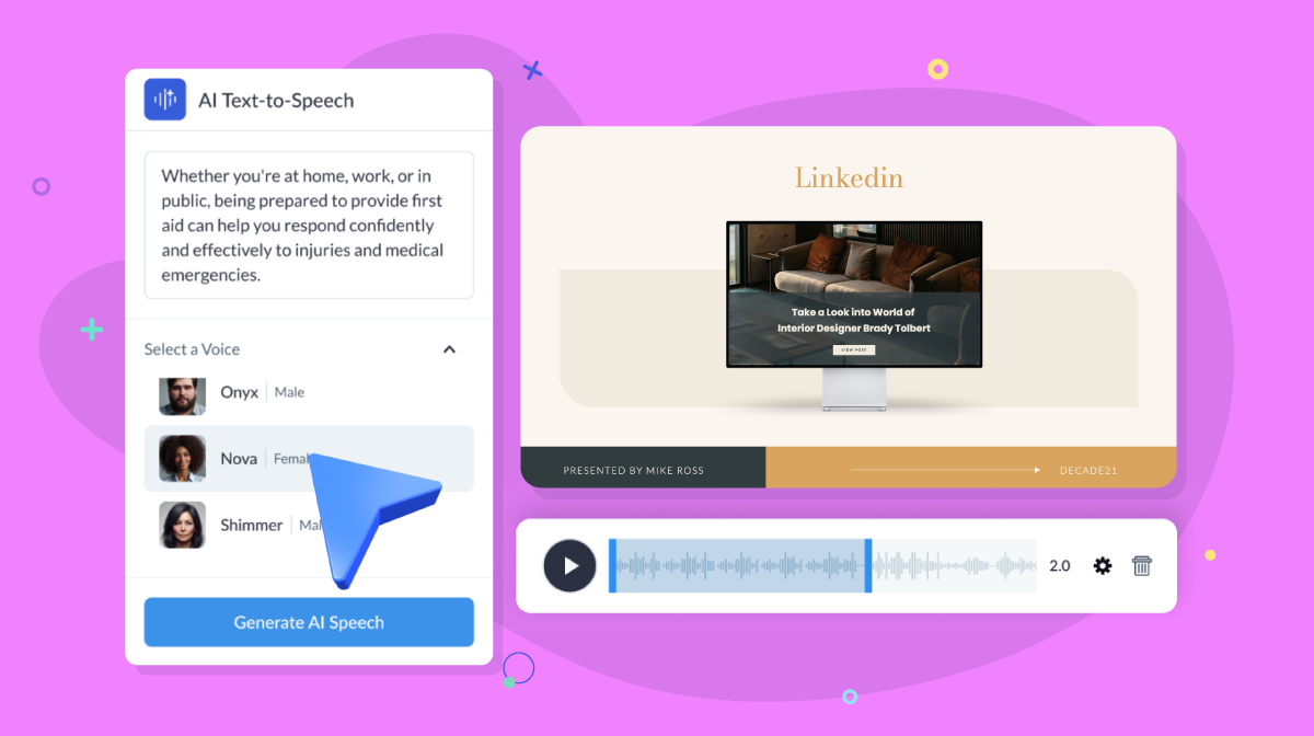
This sales one-pager opens with a striking header image overlaid with bold text, instantly drawing the reader’s eye to the core message.
Below, the layout transitions into well-defined content blocks that highlight the company’s services and areas of expertise.
A subtle contrast between the left and right columns, achieved through a darker background on the left, adds visual structure that guides the reader’s attention.
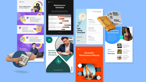
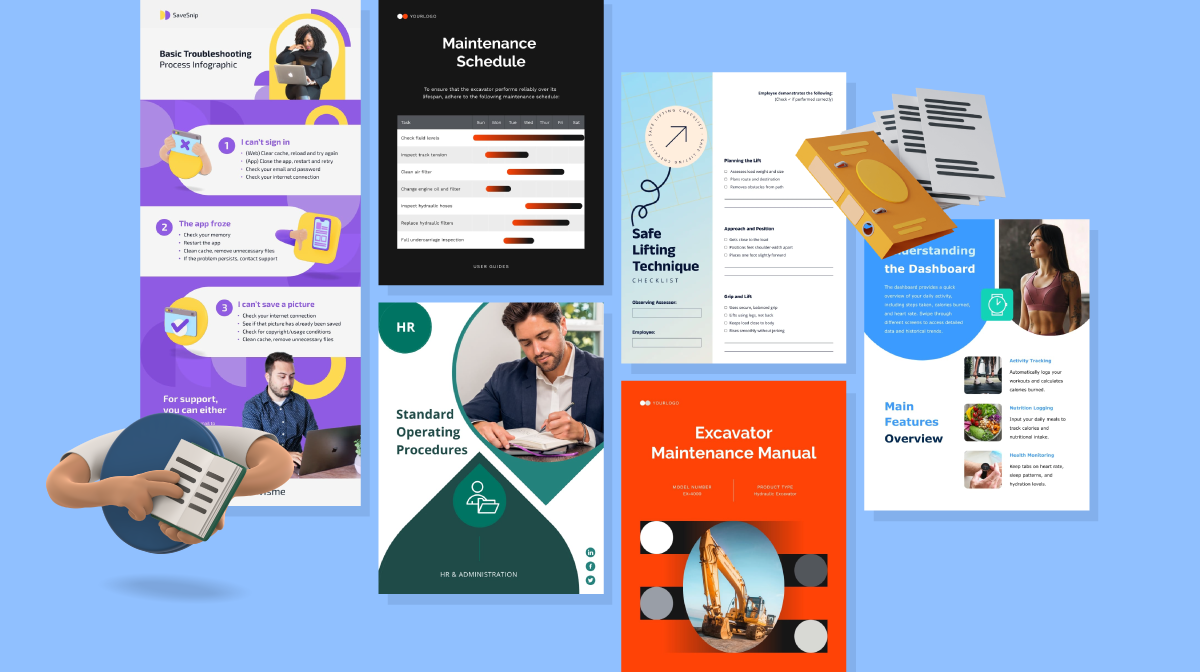
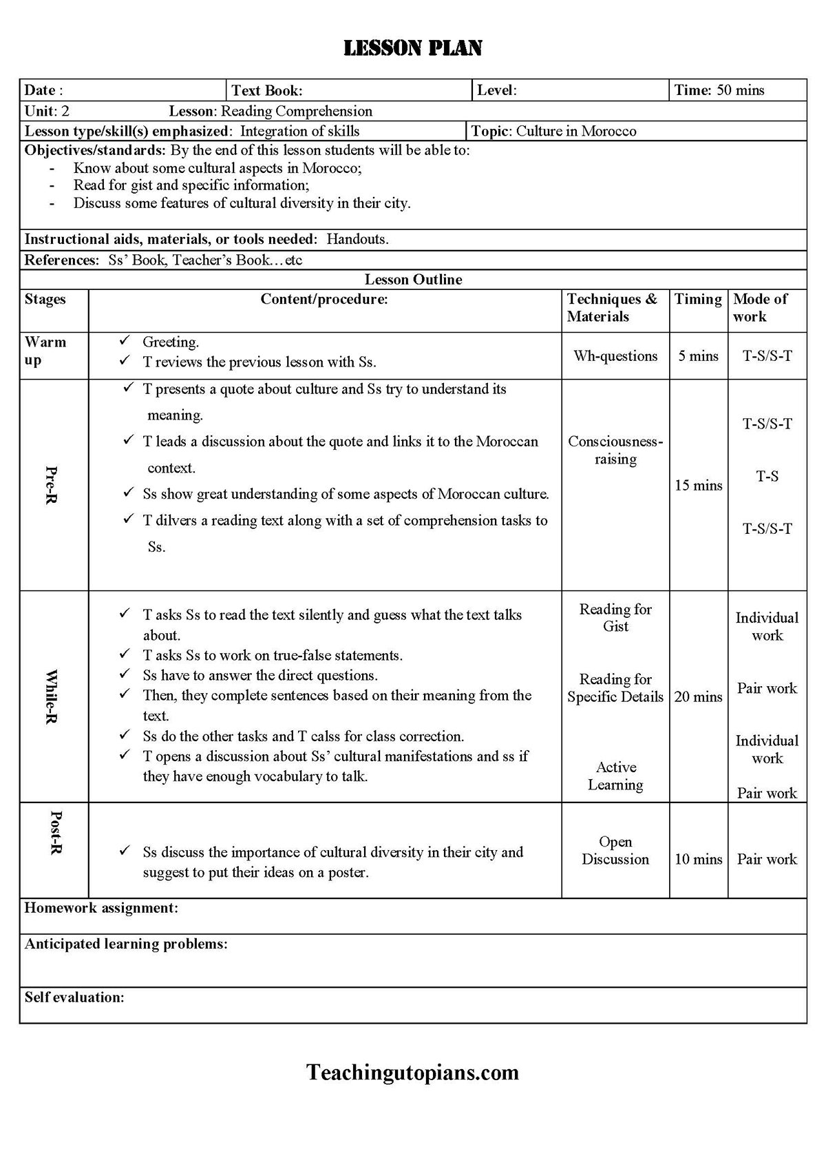
An educational one-pager provides a summary of a lesson or unit, outlining key elements such as learning objectives, activities, materials and more. Teachers use it as a quick reference to understand the key components of the lesson.
This lesson plan snapshot from Scribd is organized into distinct blocks, with bold section headers that ensure an easy flow of information. Every section is separated logically for efficient scanning and reference to help the teacher understand it at a glance.
The layout comes with table rows and columns that break down the lesson into distinct stages. Block dividers help prevent visual clutter, while bullet points make the content quick to digest, even if the teacher is working under time pressure.
Here are some educational one-pager layout examples to help you create your own.
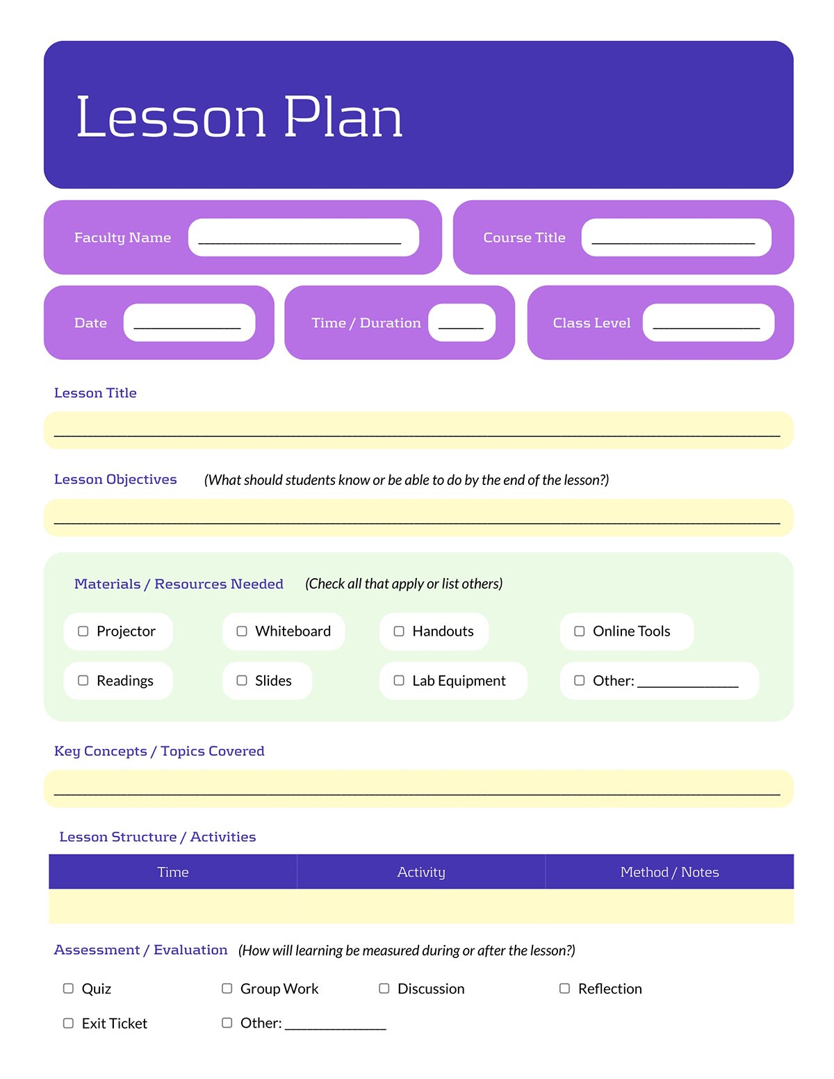
This one-pager lesson plan template comes with a clean, modular layout that captures all essential information at a glance.
The sections are vertically aligned to emphasize a specific element of the plan, keeping the design organized and easy to follow. It also features checkboxes and tables, making it flexible for presenting a wide range of details. This is especially useful if your lesson plan is bulky and you need to make it concise and scannable.
With a split layout with text on the left and a high-quality visual on the right, this design creates a strong visual balance.
The content blocks are left-aligned with consistent margins. This creates a clean and structured design. The natural beige background also provides contrast that lets the headings, body text and accents stand out clearly.
Personalize your one-pager for different sessions or facilitators with Visme’s dynamic field feature. This way, you can update and reuse the template for multiple classes by simply updating the dynamic fields rather than redesigning the entire document each time.
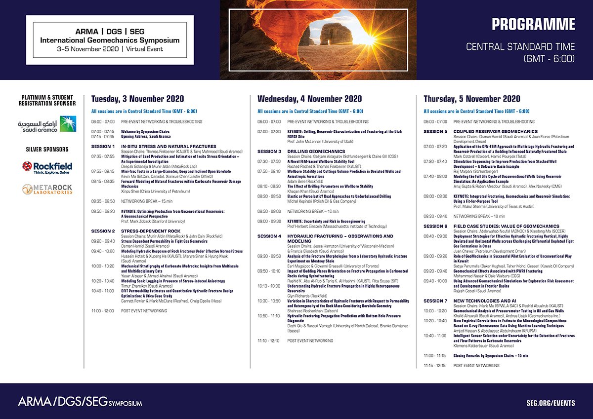
Event one-pagers are typically designed to provide insight into the schedule of an upcoming event. It can serve as both a promotional tool and a practical reference guide for conference, summit or symposium attendees.
This KSA SAGM Symposium Programme is a solid example of an event agenda one-pager. It is designed with a highly organized grid to manage a high volume of information across a three-day virtual event.
The document’s key details are spread across four columns divided by distinct vertical lines. On the left, sponsor logos are neatly grouped by category, clearly separating them from the main event details. The rest of the vertical grid is dedicated to showcasing the itinerary for each day of the event.
Easily recreate this layout with the event one-pager templates below.

If you want to provide your audience with a detailed overview of your event schedule while keeping it visually engaging, this layout is an excellent choice.
It features a modular structure with defined blocks that separate each section. Content areas, including title, description, themes, highlights and attendee information, are arranged vertically with generous spacing, creating a natural flow.
Bold visuals and high-contrast colors also make the design eye-catching and ensure the text stands out for easy readability.
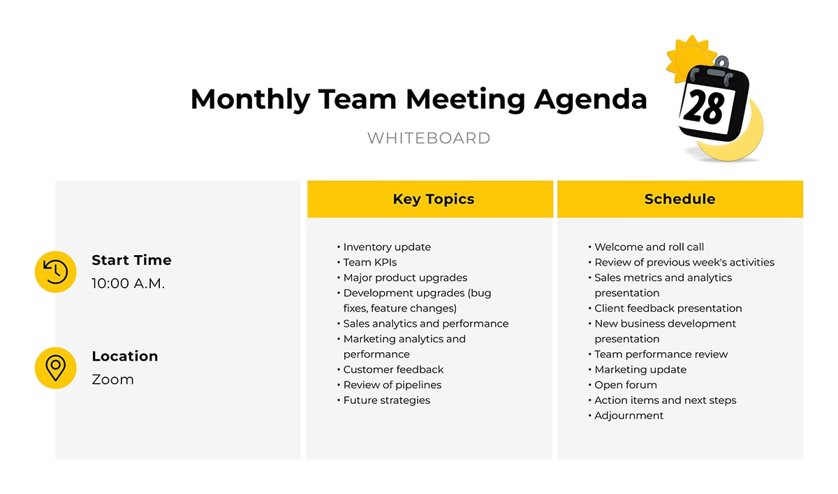
Use this team meeting one-pager to provide participants with an organized agenda for your upcoming meeting.
The layout arranges information in a clean four-column grid, covering segment, topic, team member and start time, where each row represents a distinct agenda item. This multi-column, tabular structure makes it easy for attendees to grasp the meeting flow at a glance.
Notice that this layout maintains consistent alignment and spacing throughout the table, ensuring that the content remains the focal point of the one-pager.
Once your layout is set, you can give it a on-brand look in seconds.
Use our brand wizard to instantly apply your brand colors, logos and fonts across your one-pagers and projects. Enter your website URL and the tool will automatically save them and apply the assets to any project.
Now that we’ve explored practical examples, let’s focus on how you can create an effective one-pager layout.
Follow the step-by-step process below to create the perfect one-pager layout.
Before you design or structure your one-pager, start by clarifying what you want it to achieve and who you’re creating it for.
As Michael Pedrotti, the co-founder of Ghostcap, puts it:
“A one-pager will work well if it has one function or else it will slow down and the user will get frustrated. Before we start designing, we have to identify the single purpose of the one-pager. That single purpose will dictate how we lay out everything else.
When you attempt to make it a lead-gen machine and a profound brand clarifier, the entire affair simply stalls and the user becomes irritated. You have to outline that one purpose even before you get to the layout. This is the final decision that determines all the other decisions that you make since you are creating a tool that you want to use in performing a given task and not a brochure of your whole company.”
To put this into practice, ask yourself these questions:
Then choose the layout that best communicates that message. For example:
Gather all the necessary information about your product, service or business. Decide on what information will go on your one-pager and how you will organize it.
This step ensures you don’t forget or leave out any important details.
Depending on your one-pager’s purpose and audience, you’ll need:
To make this process effective, collect data from credible sources such as internal reports, analytics, customer feedback or customer success stories.
Once you have all the information you need, it is time to actually structure it on the page. Here, you will need to choose the proper hierarchy and flow of information.
Not all information on your one-pager has equal importance. The most important information should be what your readers see when they look at your one-pager.
Here’s how Michael approaches this:
“Once I determine what the single function of the one-pager is, then I can determine the information hierarchy. The information hierarchy is how important each piece of content is relative to the others. When we set up our one-pager to display this information, we want the most important pieces of content, the headline and call-to-action to be displayed first and with the least amount of lag possible. The less important pieces of content like feature lists or testimonials, should be displayed after and may take longer to load.”
You can split the information you have into three tiers:
This step will introduce proper hierarchy and force you to choose what the most important information is and what supports it.
The standard page format for one-pagers is 8.5 x 11 inches (letter size) or A4. This format is great for easy distribution of information across the page.
Once you have the format, choose a grid system. A grid is a framework of rows and columns that keeps your content aligned and proportional.
There are various kinds of grids used for one-pagers, but the most common are: 12-Column Grid, 3-Column Grid and a Modular Grid. Choose the grid that best matches the type and amount of content you’re working with.
For example, use a 12-column grid for flexible, complex layouts, a 3-column grid for simple, structured designs and a modular grid when you need neatly organized, repeatable sections.
Design elements like fonts and colors have a huge role to play in your one-pager layout.
For easy readability, it is best to keep your font type simple. Limit your font type to one or two across your one-pager. You can have one font type for headers and the other for the body text.
With your color scheme, limit it to two or three colors. Ensure the colors align with your brand colors for brand recognition and look out for contrasts so that your text stands out.
Notice how the fonts create strong visual emphasis in the layout below and how the color choices complement the message while keeping everything easy to read.

The right visuals support and reinforce your core message. It also drives a better understanding for your readers.
When incorporating visuals into your one-pager, choose high-quality photos, icons, charts or graphs that directly support your content. It shouldn’t be random or act as a filler.
Interactivity can also be a great way to level up engagement and add more value to the design.
In the words of Alex, Visme’s Design Manager:
“The “actions' menu in Visme’s editor has a lot of great options to choose from. My favorite is the simplest: attaching external links to your document. You have to make sure you don’t saturate your one-pager with information and it can sometimes be hard to decide what you want to keep visible on your design. Having your website linked to your design can take your readers to your landing page in case they want more information. This will keep your design clean and to the point without saturating the design.”
Here are some more ideas on how to add interactivity to your one-pagers in Visme.
The footer of your one-pager is just as important as other sections. It typically contains your call to action and contact information, providing direction and next steps for your reader.
Some examples of a great call-to-action include:
It is best to have just one CTA in your one-pager. This ensures your readers know what to do after reading.
For your contact information, keep it simple but relevant by including:
Your footer section should be visually distinct but consistent with your brand’s colors and fonts. Try to keep the design clean and simple. Also, ensure you have enough white space.
Pro Tip: With Visme’s design collaboration tool, you can invite teammates to your document, allowing them to provide insights, suggest edits and comment in real time. This keeps feedback organized and helps everyone stay aligned. Our workflow management tool further streamlines the process by letting you assign specific tasks or sections of the one-pager to different team members and track their progress.
Now you’re done! Your one-pager is ready to go out.
With Visme, you can download and share your document in various formats. This includes PDF, JPG, PNG or HTML5.
You can share your one-pager online directly by generating a public or private URL. You can also send it via email or other platforms.
Lastly, you can embed your one-pager on your website, email or more very quickly and seamlessly.
The ideal layout for a one-pager usually has a header section that has your company name, logo and key value proposition. A main body section that includes your key content. And a footer section with your CTA and contact details. This layout prioritizes visual hierarchy, scannability and a call-to-action to drive a specific decision or next step.
One-pagers typically follow the three-part structure with a header, body and call to action. Depending on the purpose of your one-pager, you will need to tailor it to your audience and content. You can typically structure your one-pager with:
A one-pager is a concise but visually appealing document that presents key information to stakeholders in a scannable and digestible manner. It offers your reader the essential information they need about a product, service, project or concept.
With the right prompts, ChatGPT can assist you in brainstorming, writing and structuring your one-pager. While it can generate a visual one-pager document, it can’t create a professionally designed one-pager.
An effective one-pager is concise and able to guide readers to make a quick decision.
To make yours truly effective:
Use Visme to create a high-impact, professional one-pager. Visme is a powerful all-in-one visual editing tool that offers hundreds of pre-built templates and a wide range of features to help you create a professionally designed one-pager.
A one-pager usually contains about 3 to 5 paragraphs. This range allows for a clear introduction, a few body paragraphs covering key points or supporting arguments and a concise conclusion or call to action.
To make your one-pager stand out:
To create a one-pager in Word,
In this article, we have explored the key layout structures to take note of when creating your one-pager.
We also explored real-life one-pager examples to inspire you to make your own.
Now it's your turn. With Visme, you can experiment with the right type of layout for your one-pager without starting from scratch.
Choose from an extensive library of one-pager templates and customize them with millions of design assets, powerful features and AI-powered tools.
And Visme is not just for creating one-pagers. You can also create presentations, manuals, videos, ebooks, handbooks and a whole range of branded business content.
Ready to start creating impressive one-pagers and business content? Sign up with Visme.
Design visual brand experiences for your business whether you are a seasoned designer or a total novice.
Try Visme for free