


A Quick Guide on Sponsorship Marketing: Best Framework, Examples & Tools


In the last few decades, marketing has largely shifted towards digital formats.
But the good ol’ brochure isn’t going anywhere.
If anything, this classic marketing tool just got better with a wider variety of formats and styles.
Yet, when it’s time to design a brochure, many of us automatically default to the Letter Fold (Tri-Fold) as if it were the only option on the menu.
There’s a whole lineup of creative folds and formats that may be better suited for specific purposes and audiences.
But if you’re not sure which one to choose, don’t worry. This guide will walk you through the different brochure types, explaining when and why to use them so you can make the right choice for your needs.
We’ve also handpicked some professionally designed templates that you can easily customize to create any of these types of brochures.
A brochure is a versatile, printed or digital marketing tool you can use to inform customers about your products, services, organization, event or cause. It’s typically designed to be compact, visually appealing and easy to distribute.
You’ll find brochures in folded multi-panel formats or as multi-page booklets.
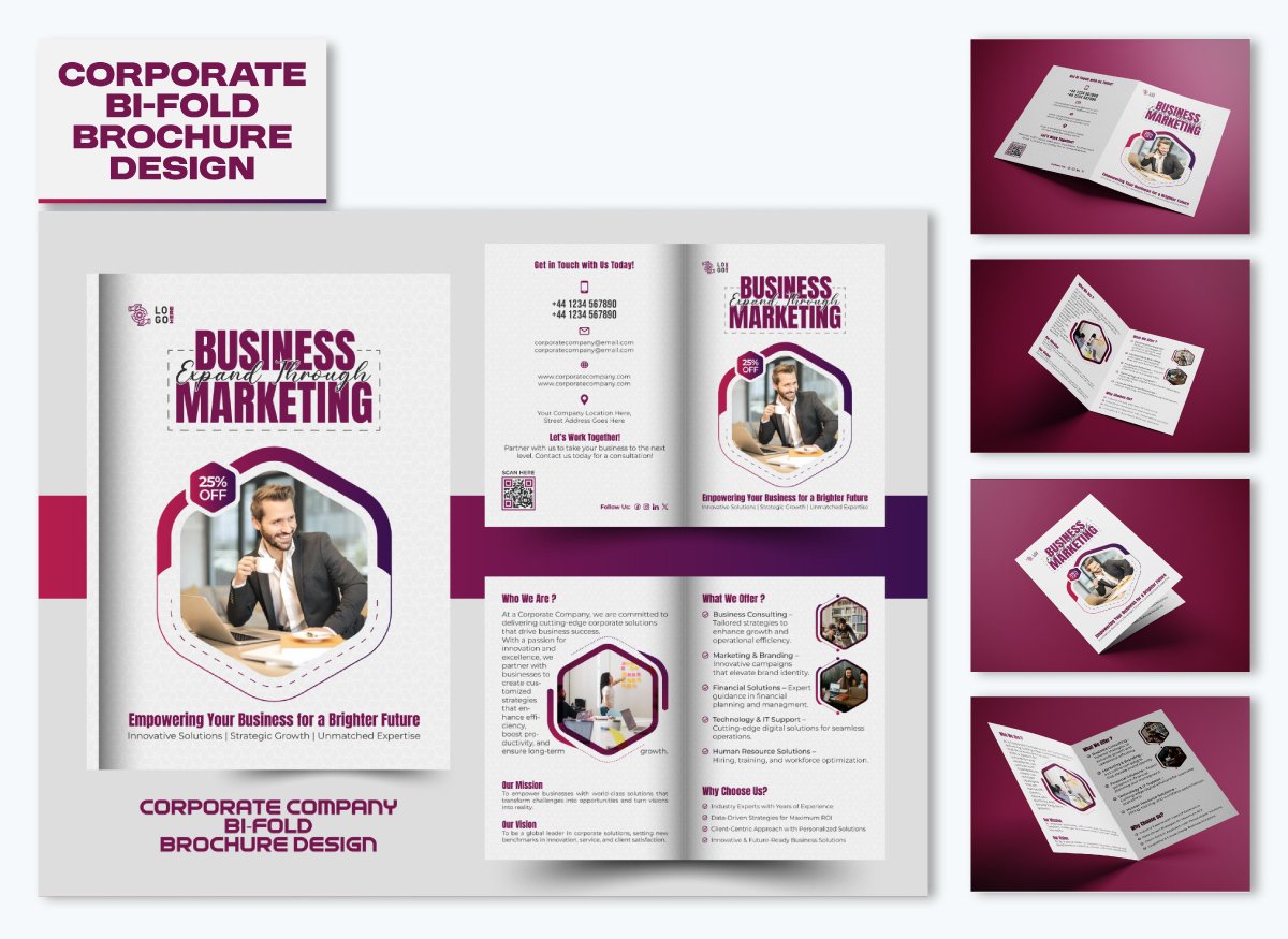
Below is a great example of a bi-fold brochure.


Looking for inspiration for your next design project? In this article, we've compiled 20 stunning brochure examples & templates to spark your creativity.
| Brochure Types | Fold Details | Best Used For |
| BI-fold | Single fold down the middle, creating four panels | Simple brochures with minimal content or promotional material |
| Tri-fold | Two parallel folds, creating six panels | Informative brochures for product details, event flyers, or business info |
| Z-fold | Two folds in a zigzag pattern creating six panels | Step-by-step guides, product showcases, or maps that unfold sequentially |
| Double Parallel | Folded twice in the same direction, creating eight panels | Detailed brochures for complex products or services |
| Accordion fold | Folded in a series of parallel folds, creating multiple panels | Brochures with extensive content, schedules, or detailed product lists |
| Gate fold | Two end sides fold inward to meet in the center | High-end product showcases, event promotions, or luxury services |
| Closed gate fold | Similar to a gate fold but with an additional fold to seal the brochure completely | Teasing offers or secretive content, then revealing a detailed message |
| Roll fold Brochure | Multiple parallel folds that roll into each other | Sequential content, such as event programs, step-by-step guides, or timelines |
| French fold | Paper is folded in half both horizontally and vertically, creating eight panels | Elegant brochures for premium services or products, often for invitations |
| Diecut brochure fold | Custom shapes created by cutting the paper in unique forms | Creative marketing materials or brochures for artistic promotions |
A bifold, also called a half-fold brochure, is a classic and widely used type of brochure. It’s simple, versatile and effective for conveying information in a clean and organized way.
A bifold brochure is created by folding a single sheet of paper in half, resulting in four panels (two on the front and two on the back).
Unlike most brochure examples that divide content into multiple narrow sections, a bi-fold brochure has larger panels, which allows more space for bold visuals. It resembles a small booklet or pamphlet, making it great for corporate presentations, product catalogs and professional services.
8.5” x 11” or 8.27” x 11.69”
Chris Calo, a Design & Creative Executive at Vulcan agency shared the following insights about creating a Bi-fold brochure.
“For a bi-fold brochure, which is essentially a booklet-style fold, I recommend always using very high-quality photography and a really neat layout. Of all the four panels, the main thing to work with when using a bi-fold is the placement of content. I like to keep one side a bit more visual-heavy, while the other focuses on informing text. The cleanest and simplest works best here, so it doesn't come off as cluttered.”
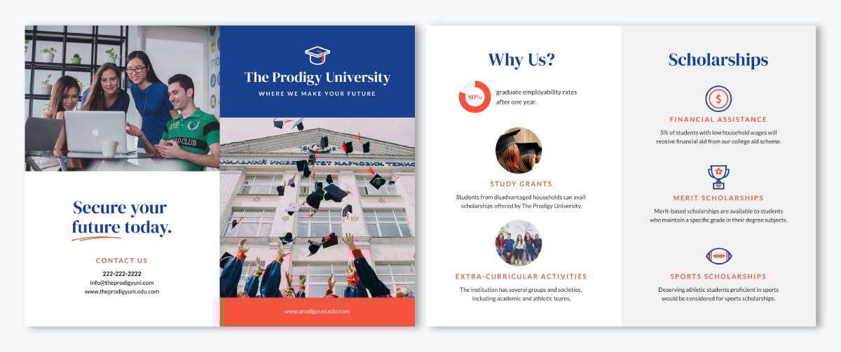
This bi-fold brochure is a great example of clean, stylish and effective design. Its front cover catches the eye with a bold layout and an enticing discount offer that makes you want to flip inside. Although the inner panels are text-heavy, they’re very easy to read, thanks to bold headers and bullet points. Outside, there are clear headers that highlight the contact details so readers know exactly where to go next.


Customize this educational bi-fold brochure template to match your brand by tweaking the colors, fonts, logos and text. With Visme’s Brand Wizard tool, it’s super easy. Enter your website URL and the wizard will pull in your brand assets and add them to your brand kit for a seamless, professional look.
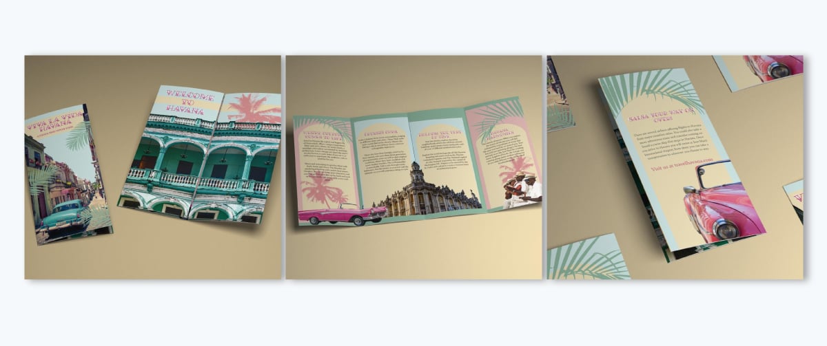
A trifold brochure is one of the most widely used marketing tools and for good reason. It follows the classic letter fold style (or C-fold); the right and left panels fold inward, overlapping in the middle. It’s compact, easy to carry and fits neatly into display racks, making it a go-to choice for businesses, restaurants, travel guides and event promotions.
The elegance of a trifold lies in its layered reveal. The cover draws people in, the inside panels tell the story and the final section delivers the key takeaway or call to action.
Here’s what Chris has to say regarding designing Trifolds:
“A tri-fold brochure is really one of the most common formats, and yet careful planning is required. The greatest mistake I see is not making sure the folds are serious when a designer makes perforations-hurt most on text getting lost in the creases. I like to use the first panel hook, fill the middle sections with key details, and close it off with a strong call to action on the last panel. A mix of bold headlines, bullet points, along with images ensures that the message could be skimmed through and still receive.”
8.5” x 11”, 8.5” x 14” and 11” x 17”
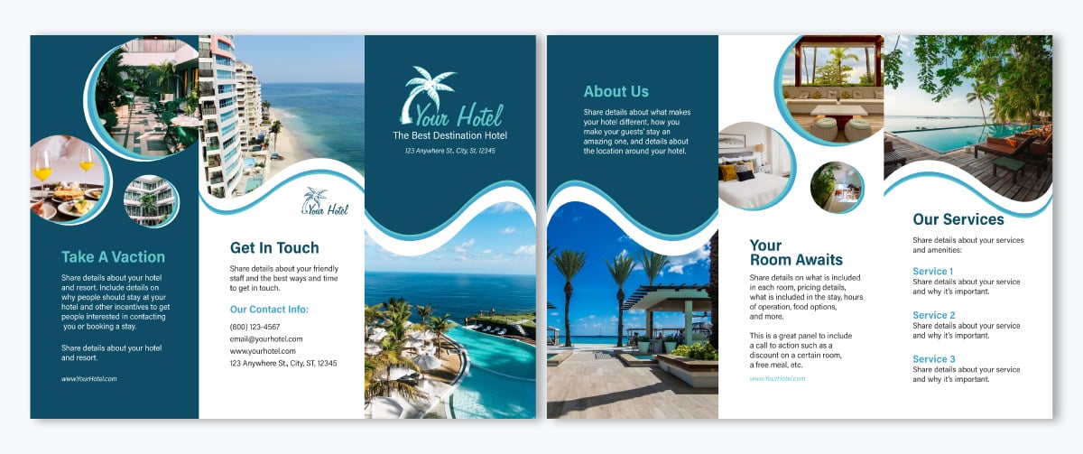
This vacation trifold brochure takes you on a smooth journey from panel to panel. The beach-themed images paired with wave-like dividers create a captivating visual experience. I love the luxurious feel of the front cover, with an attention-grabbing text. Inside, there are clear details about the service and the company without feeling cramped.


This Visme template makes creating a trifold brochure simple. Any of the outside side panels can form the front cover, while the middle panel becomes the back page.
Feel free to unleash your creativity in the inside panels that hold your main content. For instance, you can add your own images, 3D animations, illustrations or pick from Visme’s library of thousands of stock photos to make it unique.
A Z-fold brochure opens literally like the letter "Z." You create it by folding a single sheet of paper into three equal sections that zigzag back and forth, creating a continuous flow from front to back.
Unlike a trifold, where panels tuck into each other, a Z-fold opens out in one smooth motion. What makes this brochure format special is that the reader gets a full view of the content without having to flip or fold back.
Since all panels are equal in size and open flat, Z-fold brochures are ideal for designs that need to stretch across the entire brochure without interruption, like maps, event programs, or product showcases.
8.5" x 11, 11" x 17" and 8.5" x 14"
Kevin Liu, VP of Products at Octoparse shared the following insights about creating Z-folds:
“One of my biggest tips when creating Z-folds is to think of each panel as a progression, each fold should build on the previous one, leading the reader through a journey. At Octoparse, we’ve used this format to explain how our web scraping tool works, dedicating one panel to each stage (setup, automation, and data export). High-quality visuals and icons can make a big difference here. Since the reader unfolds the brochure in a continuous motion, the design should feel seamless and connected.”
What immediately caught my eye in this Z fold brochure is the royal blue monochrome background—talk of class and elegance. The first panel inside serves as the front cover, while the last page on the outside is the back cover, creating a nice Z-overlap effect.
As a jewelry eCommerce platform, the flow chart showing how to shop from the website is a smart and unique way to show, not just tell.
A double parallel fold brochure is a multi-panel format where you fold a sheet of paper in half, then fold again in the same direction, creating four panels on each side. The key feature of this fold is that both folds run parallel, giving it the name "double parallel."
How does a double parallel fold stand out? It offers more space than common folds like bi-folds or tri-folds yet remains compact and easy to handle. This unfolding process naturally lends itself to progressive storytelling, such as step-by-step instructions or product comparisons.
8.5" x 14"
Here’s what Kevin shared regarding creating Double Parallel folds.
“From my experience, the key is hierarchy and clarity; each fold should introduce a new idea without overwhelming the reader. Since this format has four panels per side, I recommend using the first panel for a compelling hook and then dedicating each subsequent panel to different aspects of your message. Also, avoid placing important text at the folds, if the content is misaligned or cut off, it can make the design look unprofessional.”
The simple design and calm colors of this double parallel fold brochure create a soothing, clean look. It ensures the two end panels form the front and back pages, making it easy to fold into the intended shape. The way the packaging box images cross from front to back cover makes for a perfect visual counterpart.
An accordion fold brochure is similar to a Z-fold in that both unfold in a zigzag pattern. However, the accordion fold typically creates more panels, allowing for a more expansive layout that mimics the pleats of an accordion.
When folded, it’s compact, but once fully opened, it reveals a much larger brochure, making room for flowing content without interruption.
8.5” x 14”, 11” x 17” and 11” x 26”
Chris Calo shared the following has to say about designing Accordion:
“For an accordion fold brochure, I like to embrace a very strong, sequential design. This format is really designed for very step-by-step instructional events or even infographics. I tie each panel school together with a visual connection of colors and other design elements, so that a reader can intuitively go through it with minimal stress of feeling overwhelmed.”
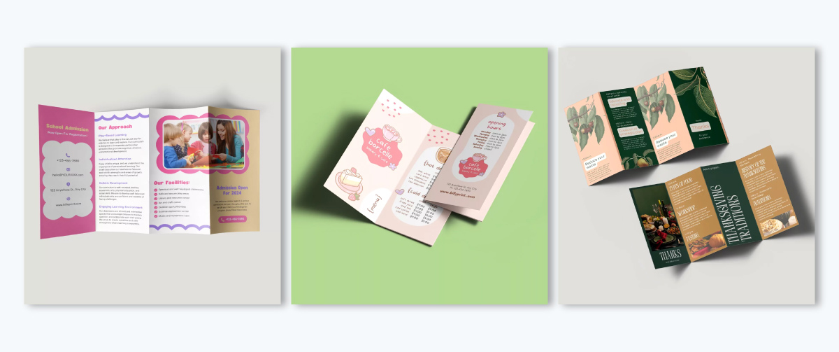
This brochure design is colorful and well-suited for a primary education admission brochure. Since it needs to provide enough information to help parents decide, the fold choice is perfect. The first panel already holds a lot of content, with plenty of space inside for more details.
One thing I would change is the placement of the contact information. The back cover's last panel is the best spot for it; people will find it easier.
A gate fold brochure is a visually striking format where two side panels fold inward to meet in the center, like opening a gate. The act of opening the "gates" creates a sense of anticipation and excitement, making it perfect for showcasing high-value products, launching new services, or presenting premium content.
A common design strategy is to use the front "gates" to tease the reader with an intriguing message, logo, or image. The inside panel then delivers the main message or product showcase in a bold, eye-catching way.
8.5" x 11" and 11" x 17"
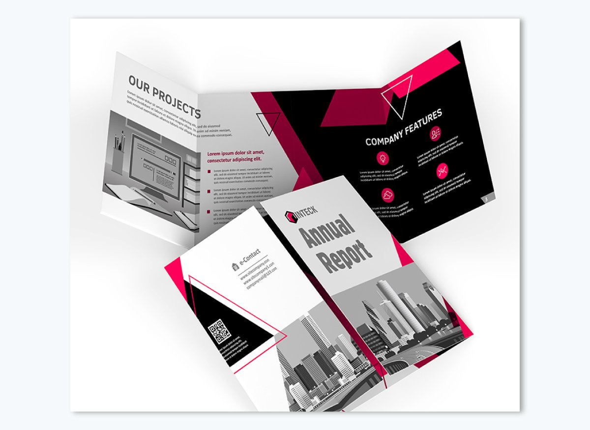
This is one annual report that won’t go unread. From the bold color contrast to the striking title and the image that spans both sides of the gate, it grabs attention right away. I like that the contact details are placed on one of the gates instead of the back.
To better align the design with the content, I’d suggest centering the main details in the middle panel and placing supporting information on the sides.
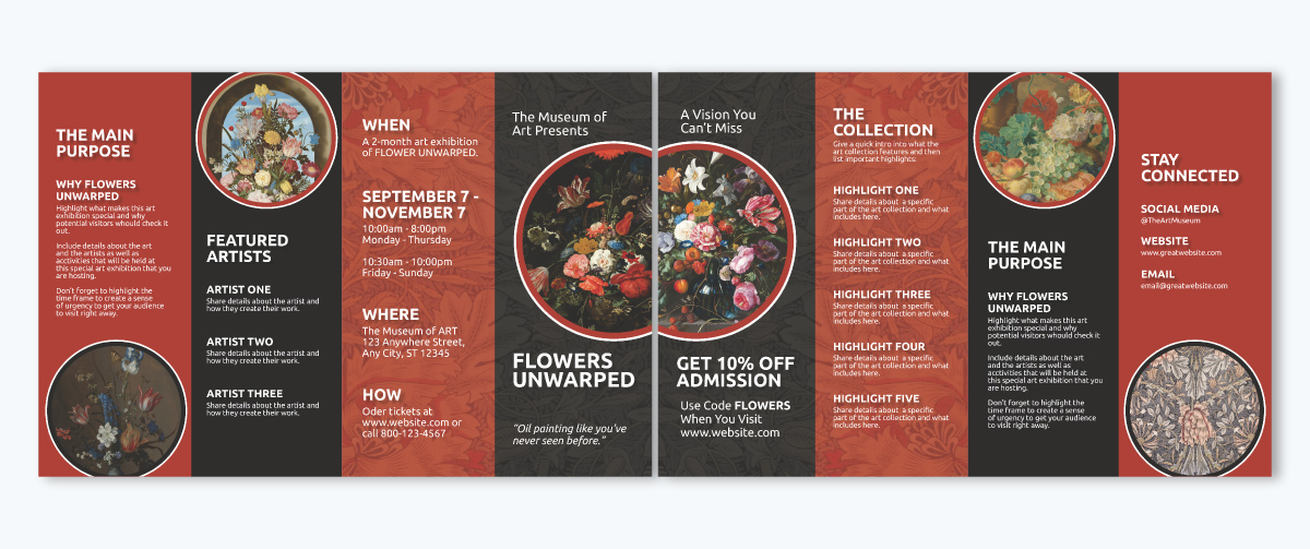
A closed gate fold brochure is a variation of the standard gate fold. Unlike the traditional gate fold, where two side panels fold inward and meet in the center, this version includes an extra fold down the middle. This additional fold fully encloses the brochure, eliminating visible edges or flaps and making it even more compact.
To open it, you first unfold the sealed section, which reveals the gate fold panels leading to the central panel. This extra step creates a sense of anticipation and exclusivity, making it an excellent choice for high-end marketing materials, VIP invitations and product unveilings.
8.5” x 14” and 11” x 17”
This brochure is the perfect example of how design should align with the fold. I love how the images spread seamlessly across the entire outside panel works beautifully. The simple, uncluttered text adds to the appeal, while the destination images introduce an extra layer of sophistication to the design.
A roll fold brochure is a beautifully layered and sequentially unfolding brochure, where each panel folds in on itself, much like rolling up a scroll. Think of it as opening a letter one section at a time, with each new panel revealing a fresh piece of information.
Typically, a roll fold has at least four panels, but you’ll often see five, six, or even more, depending on how much content you need to include. As the panels "roll" inward, each one must be slightly narrower than the outermost one to ensure everything folds neatly without bulging. The design is more complex but allows you to pack a lot of information without overwhelming the reader.
8.5" x 11" and 8.5" x 14" or 11" x 17"
A museum tour promotion brochure has never looked more bold and beautiful. Bursting with vibrant, attention-grabbing images, this piece keeps your interest alive at every turn. The dynamic color contrasts from panel to panel harmonize beautifully with the roll fold format, allowing each section to shine with its unique message. I especially love how the bold all-caps headings stand out, pairing perfectly with the gentle elegance of the lowercase text below.
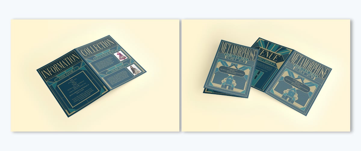
A French fold brochure, also known as a cross fold brochure, is an elegant format that folds a single sheet of paper twice, once horizontally and once vertically, creating four equal panels when folded.
Unlike other brochures that use parallel folds (like tri-folds or Z-folds), the French fold creates a square or rectangular piece that opens up in two motions, almost like unwrapping a gift. When fully opened, you get a large, uninterrupted canvas, perfect for bold visuals, big text messaging, or full infographics.
8.5” x 11” or 8.27 x 14” folding down to approximately 3.67” x 8.5” or 3.76” x 8.27” respectively
This A3 French fold brochure grabs your attention both inside and outside. What stood out to me immediately was the striking Art Deco-inspired design on the front and back cover. I also love how the attention-grabbing text and the geometric patterns elevate the design appeal.
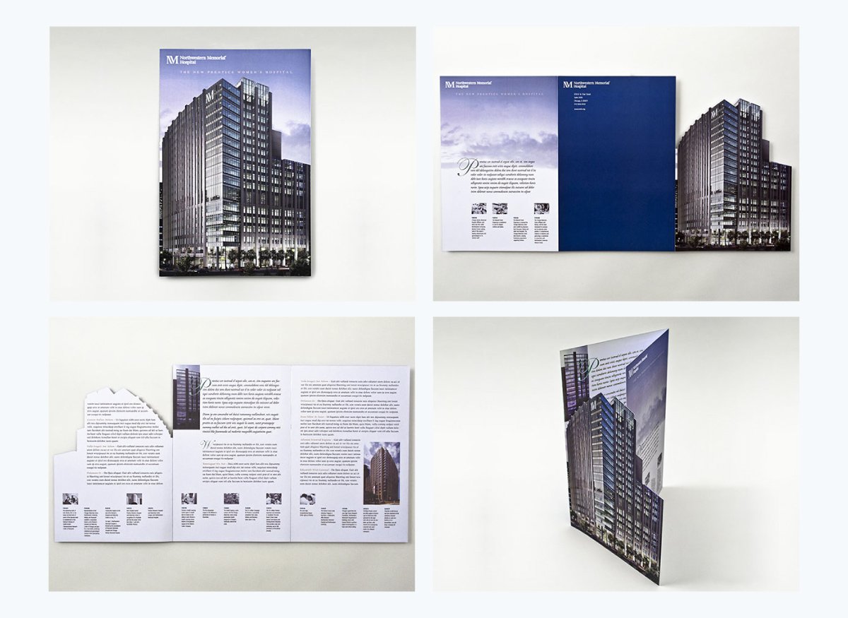
A die-cut brochure uses a specialized tool to cut paper or other materials into custom shapes. Unlike traditional brochures that are rectangular or square, a die-cut brochure can take on any shape you can imagine, whether it's curves, waves, windows, or even silhouettes like a bottle, car, or logo. This format immediately grabs attention by breaking away from the typical, straight-edged designs.
Die-cut brochures don’t follow fixed dimensions.
Bully Max’s CMO, Maris Laatre shared the following insights.
“A die-cut brochure is all about standing out, but it’s easy to overdo it. The trick is to make the die-cut shape work with your branding and messaging. At Bully Max, we once created a die-cut brochure shaped like a dog bone, instantly recognizable and fun for our audience. When designing one, think about how the cutout enhances the content. It should add to the experience, not make it harder to read. Also, test your folds and cuts, sometimes what looks great on screen doesn’t fold or stack properly in real life. And always use high-quality, sturdy paper so the unique shape holds up well.”
Imagine a brochure that captures the essence of creativity and thoughtfulness in every detail – that’s what you get with this stunning hospital opening die-cut brochure design.
The page-sized trifold features a striking high-rise hospital silhouette on the front cover. Though it’s text-heavy, the unique design and sophistication make you want to open it and read through every word.
After learning about each of these, you might already have a brochure idea that suits your needs.
To validate your choice, here are the key factors to consider:
8.5” x 11” (letter size), 8.5” x 14” (legal size) and A4 (8.27” x 11.69”)
The three types of brochures are Bi-fold, tri-fold and Z-fold
4-fold brochures are called double parallel fold
Examples of brochures are travel brochures, real estate brochures and product catalogs.
The most popular type of brochures are trifold brochures.
The differences between brochures and flyers are:
Oh, absolutely! Brochures are still very much a thing—and they’re not just surviving, they’re thriving. Sure, digital marketing is everywhere, but nothing beats the impact of a well-designed, tangible brochure. It’s something people can hold, flip through, and revisit—way more memorable than another ad they scroll past.
And the best part? Modern brochures are anything but boring. From sleek designs to interactive elements, they’ve evolved into powerful marketing assets.
Brochure design options are vast, from simple bi-folds to intricate die-cuts, each makes a unique impact. To choose the right one, consider your audience, message and practical factors like technical specs such as paper types and dimensions. With these in mind, you’ll confidently select a format that delivers results.
With Visme, creating your professionally designed brochures is a walk in the park. You can access a wide range of templates and intuitive features such as interactivity, branding, data visualizations, collaboration tools, analytics and more. What’s more, you can easily resize your canvas to fit different types of brochure formats.
Apart from creating brochures, Visme offers an extensive template library and design tools for creating business assets such as flyers, infographics, reports, social media graphics, training guides, proposals, presentations and more.
Sign up now to start creating impactful brochures.
Design visual brand experiences for your business whether you are a seasoned designer or a total novice.
Try Visme for free