


Healthcare Data Visualization: How to Turn Data into Impactful Stories


Project management is an integral part of any business process. Project managers are often facing high stakes, and they need to ensure there are no make-or-break moments in any process. This is where project management charts come in.
According to a recent PMI study, nearly half (48%) of all projects are not completed on time, leading to major financial losses for companies across the board.
However, creating a solid project management plan and using the right project management charts can help ensure that everyone stays on deadline every step of the way.
Read on to learn more about the top 14 project management charts you should be including in your next project plan.
Here’s a short selection of 8 easy-to-edit project management templates you can edit, share and download with Visme. View more templates below:


Let’s take a quick look at all the project management chart types, their use cases and what kind of projects they’re good for.
| Chart Type | Use Cases | Project Types |
| Project Timeline | Milestone tracking, phase visualization, timeline communication | Event planning, product launches, multi-phase projects |
| Gantt Chart | Task scheduling, dependency mapping, resource allocation, progress tracking | Construction, product development, event planning |
| SWOT Analysis | Strategic planning, risk assessment, opportunity identification | Business strategy, market entry, organizational change |
| PERT Chart | Complex project planning, critical path analysis, probability assessment | Research & development, large-scale engineering |
| Flowchart | Process documentation, workflow optimization, standard operating procedures | Business process improvement, software development |
| Pareto Chart | Problem identification, prioritization of issues, quality control | Manufacturing, service improvement, defect analysis |
| Cause-Effect Chart / Fishbone Diagram | Root cause analysis, problem-solving, quality improvement | Quality management, process improvement, troubleshooting |
| Bar Chart | Comparative analysis, performance tracking, budget reporting | Financial projects, sales analysis, resource utilization |
| Pie Chart | Budget allocation, resource distribution, market share analysis | Financial planning, portfolio management |
| Line Chart | Trend analysis, performance tracking over time, forecasting | Performance monitoring, market analysis, risk tracking |
| Work Breakdown Structure | Project scope definition, task decomposition, deliverable organization | Complex projects, software development, construction |
| Activity Diagram | Process flow, system behavior, user interactions | Software development, business process modeling |
| Stakeholder Analysis Matrix | Stakeholder mapping, communication planning, influence assessment | All project types requiring stakeholder management |
| Control Chart | Quality control, process stability monitoring, variance tracking | Manufacturing, service delivery, quality management |
Project management charts are visual tools that support the four phases of project management: initiation, planning, execution and closure. There are several charts that project managers use to help them take care of projects effectively with their teams. Each chart has a specific purpose, and they’re combined to create the perfect system.
A project timeline is a graphical representation of a project's deliverables laid out in chronological order.
When you create and share a project timeline for your project, key stakeholders and other team members can get a quick overview of the project using this chart.
Project timelines are important during a project’s planning stage because, as Dr. Pramod Kumar says in his article about the importance of a project’s timeline, “A schedule is more than just dates — it’s the backbone of project success.
As a project manager, you already know that a project timeline is your best friend when launching a new project. It helps keep a clear organization and gives you better visibility into the project management life cycle.
Furthermore, project charts and layouts also allow you to bulk schedule tasks and provide an in-depth overview of the project from start to finish.
These are the beneficial things you can do with a project timeline. For example, you can:
Cons of a Project Timeline Chart
While project timelines are valuable tools, they have some drawbacks such as they:
Here's a project management timeline template from Visme to get you started.

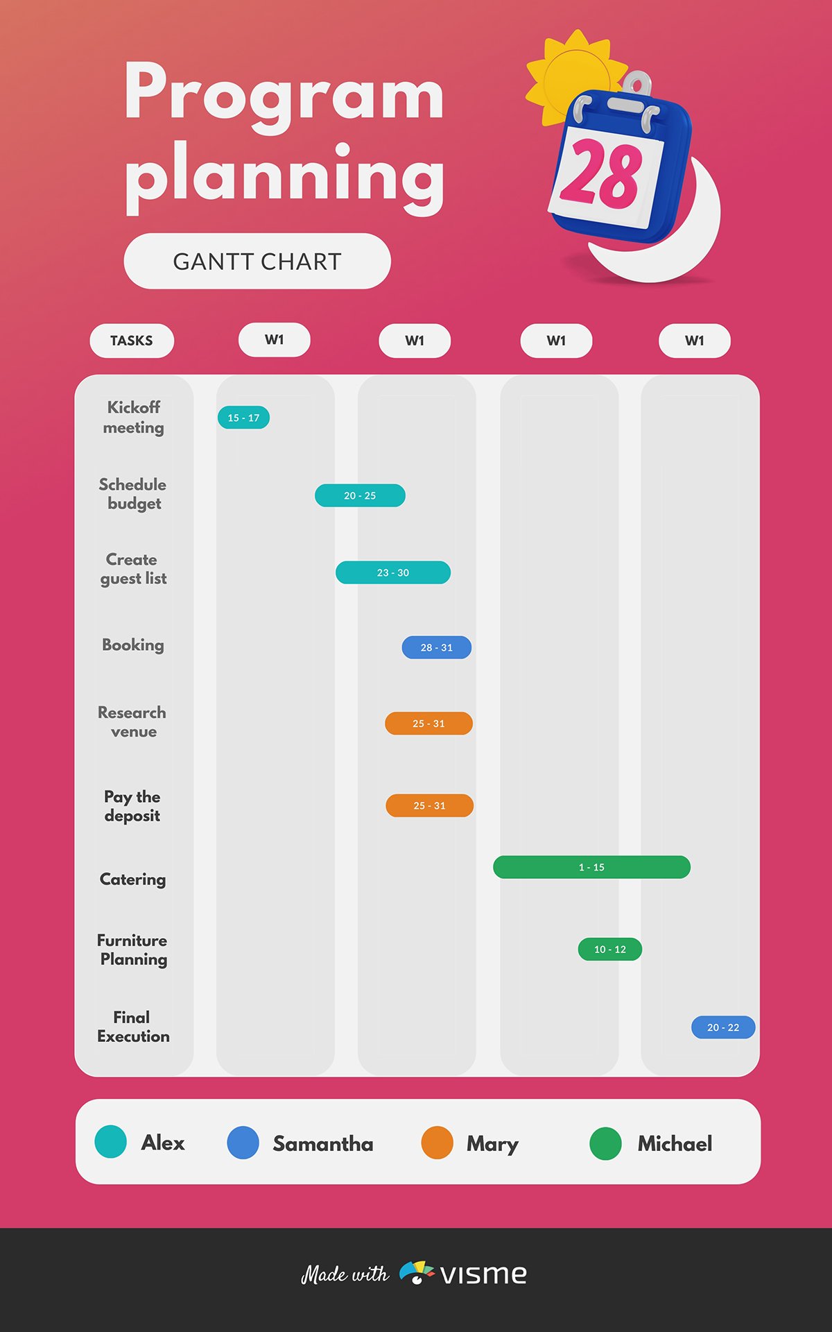
The Gantt chart is one of the most popular and effective project management charts managers use to illustrate a project plan. It's a type of project timeline that uses different-sized bars to display the start, duration, and end of a project.
As the project progresses, you adjust the Gantt chart simultaneously to display an up-to-date schedule and inform everyone of the progress. Hence, Gantt charts are one of the best tools for visual task management.
Due to the sheer simplicity and ease of access to real-time information, these charts are an ideal choice for teams to organize their time and schedule effectively. This chart is widely used by marketing, product launch, engineering, and manufacturing teams in various industries. Visme's Gantt Chart Maker makes project tracking a breeze and provides a clear visual representation of every phase of your project.
Keeping things up to date is key, as project manager Amber Caro, CM-Lean, pointed out on LinkedIn about Gantt Charts “On complex projects, publishing and reviewing the sequence bi-weekly or weekly is top priority. This ensures that the clients needs are communicated to the team and that the stakeholders have an opportunity to help plan for the upcoming changes.”
Here are some of the benefits of using Gantt charts for your project management progress:
While Gantt charts are powerful project management tools, they have notable limitations. For example, they:
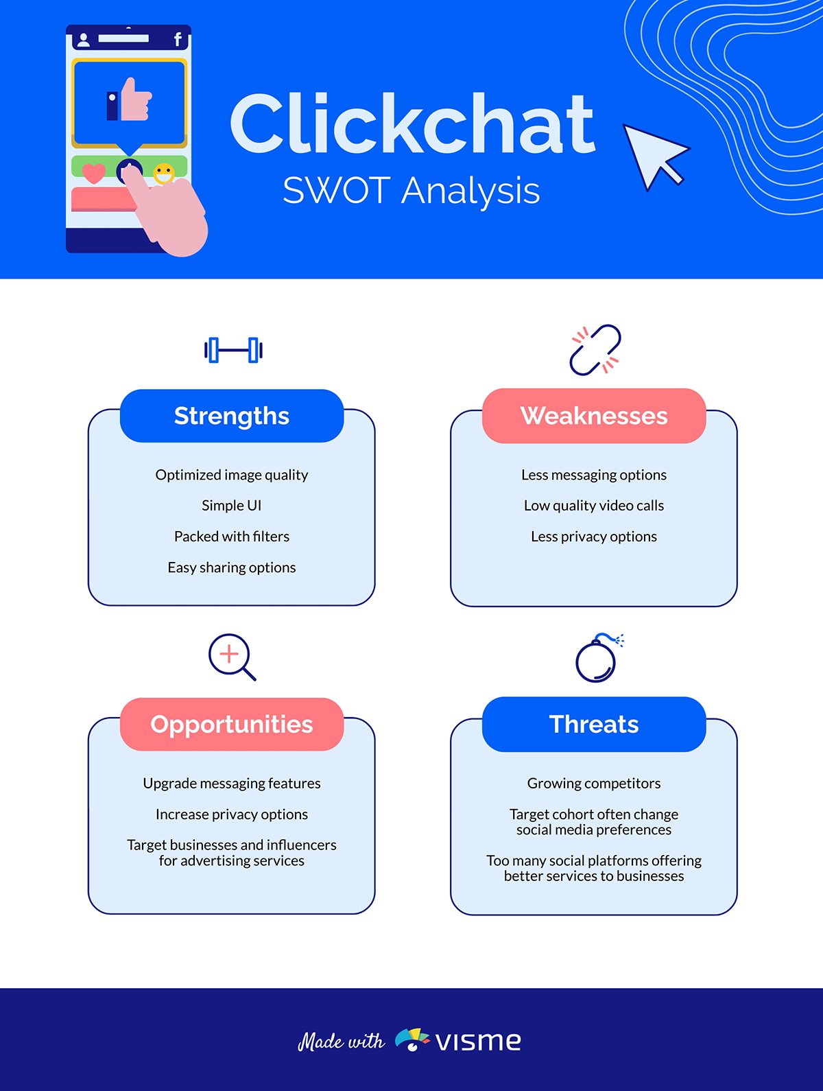
SWOT stands for Strengths, Weaknesses, Opportunities and Threats. A SWOT analysis gives the project managers and key stakeholders an insight into all the potential risks and opportunities for a project, along with reasons why it's worth it.
SWOT analyses are ideal for strategic planning and decision-making at crucial project stages. They provide a structured framework for evaluating internal and external factors that could impact your project’s success. This analytical tool helps teams identify competitive advantages and potential roadblocks before they become issues.
It’s a good idea to implement a SWOT analysis in project management because they:
While SWOT analyses are valuable project analytical tools, they do have some setbacks. For example, they:
According to Dr. Gleb Tsipursky, the biggest con of using SWOT analysis in project management is cognitive bias, “Relying on SWOT to inform your strategic plans without accounting for cognitive biases results in appalling oversights that ruin profitable businesses and bring down high-flying careers.”
Look at the SWOT analysis worksheet below. It's a square segmented into four quadrants, each dedicated to an element of SWOT. It will provide a quick overview of a company's position.
Here are the benefits of using a SWOT analysis in your business:
Though you'll need a more advanced solution for complex issues, a SWOT analysis is still a great project management chart to use.

PERT is the acronym for Program Evaluation and Review Technique, and is another famous project management chart that represents the activities and milestones
This chart includes circles and arrows and shows the result in the form of a network diagram. The circles represent the project activities and the arrows depict the progress.
A PERT chart can help you identify both the critical and non-critical activities of your project.
Furthermore, the PERT chart can display information about the tasks you should take care of simultaneously to speed up the project.
PERT charts are best suited before a project starts, unlike a Gantt chart, which works better during the duration of a project.
There are several key advantages of using PERT charts in project management. Like, for example, they:
Regarding the good and bad aspects of the PERT chart, it’s a good idea to consider Senior Airport Infrastructure Engineer, Pablo Roux’s thoughts in a collaborative LinkedIn article and asses if you’re choosing the right chart for your needs.
“The PERT chart, with its ability to visually represent project dependencies, identify critical paths, and calculate slack, is a valuable tool in project management. While it offers several advantages, such as improved communication and risk management, it also has limitations, such as complexity and subjectivity in estimating activity durations.”
So, despite their usefulness in project planning, there are definitely some challenges you might face while using them. For instance, they:
PERT chart templates in Visme's graph maker are easily editable and customizable. Here is a PERT chart template that you can use.
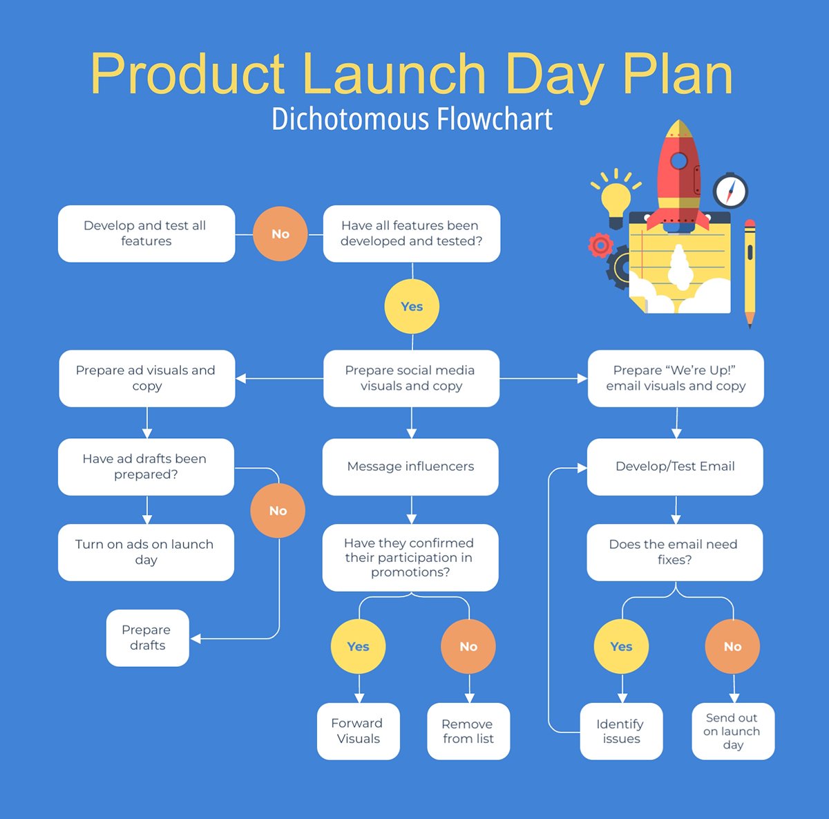
If you're a project manager striving to improve project efficiency, you should give a flowchart a try. It can help you get a clear picture of the processes and work to improve efficiency.
Not convinced? Take Jason Sayen’s word for it, “Flowcharts aren’t the tools you use to run your business—they’re the strategy to optimize it. By identifying knowledge gaps, alignment issues, and software inefficiencies, flowcharts reveal the full picture of your processes. Once you see the process clearly, you can’t unsee it.”
Here are the must-know elements of a flowchart to help you get started with effective design:

Successful project planning and monitoring rely heavily on effective communication. One of the flowchart's primary benefits is that it strengthens team communication by providing a clear visual framework of a complete project or one of its parts.
There are different types of flowcharts and they are best used to represent a step-by-step process involved in completing a project. They are also essential helpers for determining the right direction to go when something happens during the project’s progression.
Here are the key benefits of using flowcharts in project management:
Like any project management tool, flowcharts come with their share of drawbacks. They:
Look at the flowchart template below. The arrows indicate the flow and help determine what comes next depending on an outcome. This example visualizes a product launch process.
A Pareto chart is a graphical representation of all the defects in a product or the project development process and the frequency of defects.
For project managers, a Pareto chart can be an excellent tool for finding flaws and prioritizing them for improvement.
By combining a bar graph with a line graph, Pareto charts display individual problem frequencies and cumulative percentages simultaneously. Though the chart is handy for Six Sigma analysis, it can fit well into any project management process.
The Pareto chart was inspired by the Pareto Principle, which says that 80% of the results are determined by 20% of the causes. By identifying and addressing 20% of defects in your project, you can effectively resolve 80% of your project's problems.
Joe S. business support manager at Key Bank, describes the principle perfectly in one of his helpful LinkedIn posts, “Pareto’s Law reminds us why focus matters. The principle that 80% of results come from 20% of actions is a powerful guide for how we design, prioritize, and execute.”
Pareto charts increase communication and collaboration between team members by providing a clear visual representation of the most significant issues. They are particularly effective for prioritizing problems or defects in manufacturing processes by showing which issues occur most frequently.
In project management they can help by analyzing customer complaints or feedback to identify the most common concerns or demonstrating the relative importance of problems to stakeholders.
A Pareto chart offers several key advantages, as follows. They:
Despite their usefulness, Pareto charts have some limitations you should be aware of. For example, they:
Here is a Pareto chart template to get you started. The visualization represents a bug frequency analysis for a piece of software, showing how the most frequent bugs represent 80% of the problems. With this information, the team knows what 20% of the bugs to work on first.
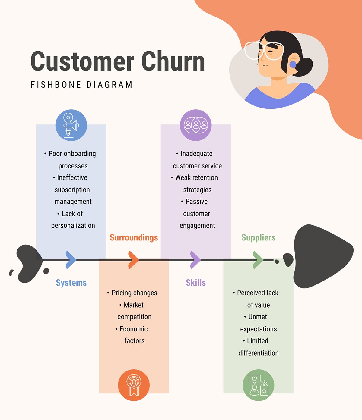
Also known as cause-effect charts, fishbone diagrams are a visualization tool to logically visualize possible causes of a specific problem in your project. Identifying the potential causes makes it easier to determine the root cause.
Just do what Kaoru Ishikawa, the creator of the fishbone diagram suggests, “Think of at least four factors which influence your problem. See if a shift in one of these causes can give you a different effect to explore.”
You can use this chart in the early stages of your project to minimize the issues in a lesser amount of time, uplifting your project's success rate. The most important reason for which you should use this chart is its ease of use.
Additionally, this chart helps you conduct brainstorming sessions that can yield innovative ideas and solutions. However, you need to include all the potential issues in the chart. Otherwise, you might make it challenging to find and resolve a problem during the process.
When considering the implementation of fishbone diagrams, several advantages make them particularly valuable for problem-solving. Like how they:
While fishbone diagrams do help with project management, they come with certain limitations you should consider. For example, they:
Here’s a fishbone diagram for you to use for your own analysis. This example visualizes the root causes of customer churn, helping a team start to make adjustments and improvements in their processes.
Due to their versatility and simplicity, bar graphs are one of the most popular visualizations in project management. Bar graphs are used for visualizing a wide variety of data in the most straightforward way possible.
As a project manager, you might need a bar graph to visualize critical information such as your team's performance, efficiency, and quality of work. They are particularly effective at portraying data trends over time, such as resource utilization, task completion rates, or budget allocation across different project phases.
Bar graphs also also practical for showing relative numbers of various categories, helping project managers quickly assess and compare different aspects of their projects, such as team performance, milestone achievements, or departmental contributions.
Using bar graphs in project management has several benefits because they:
Don’t shy away from bar graphs; they are helpful information-sharing tools. As Cole Nussbaumer Knaflic says in his book Storytelling with Data: A Data Visualization Guide for Business Professionals, “Sometimes bar charts are avoided because they are common. This is a mistake. Rather, bar charts should be leveraged because they are common, as this means less of a learning curve for your audience.”
Bar graphs don’t have much going against them, but there are some things. For example, they:
Here’s an example bar graph in a template you can use immediately for your own work like a project’s status report or results of a campaign.
As the name suggests, a pie chart is a graphical representation of data in a pie shape. This is also one of the simplest and most popular charts used by project managers. Like bar charts, they can represent different types of data.
Due to their circular shape, pie charts are an ideal tool for data segmentation. The primary objective of using a pie chart is to illustrate the different parts that form a collective whole. For example, pie charts can display market share distribution, budget allocations, or demographic breakdowns.
There are numerous advantages of using pie charts, such as that they:
Even though pie charts are easy to use and interpret, they do have some setbacks. For example, Pie charts:
Here’s a pie chart template you can use for research analysis during your project management processes. This one visualizes time spent on mobile phones according to the activity.
A line chart is a type of chart that displays the change of data over a specified time. This is one of the most basic types of charts used in finance. Visually, this chart features a continuous line formed over a series of data points.
You can use line charts in many ways, such as displaying day-to-day changes in performance. Since tracking progress is essential to assess whether a project will be completed on time, this chart is great for project managers.
Other uses for line charts in project management include monitoring budget spend versus time to identify spending patterns and forecast overruns and track key performance indicators (KPIs) over the project lifecycle to spot trends early.
Line charts are super practical in project management and have many beneficial qualities. Like for example, they are:
Even though line charts are practical for project management, they do have some disadvantages such as that,
Here's an example of a line chart that would be perfect for your project management.
A work breakdown structure chart in project management is a deliverable-oriented breakdown of a project into smaller manageable sections. It's actually a more summarized version of a business case. Breaking tasks into smaller units is a common productivity technique and a WBS structure is the tool to achieve it.
Though you will not be able to display any stats or figures using this structure, it can help you simplify complex projects. You can formulate a better project plan, schedule and assign tasks, and track their progress to make your project successful.
The visual hierarchy in a WBS provides stakeholders with a clear understanding of project scope and deliverables. It is a common reference point for discussions about project progress, changes, and dependencies. It's a great addition to any stakeholder engagement plan as well.
Made with Visme Presentation Maker
There are several advantages of using work breakdown structures in project management. WBSs can:
No project management charts are without disadvantages, and work breakdown structures are no different. For example,
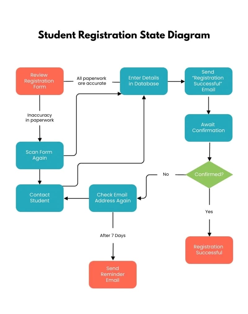
When you have complex projects with lots of tasks and subtasks, activity diagrams can help represent the process. Like the work breakdown structure, an activity diagram allows you to divide the tasks into flows.
With an activity diagram, you can identify the critical path of a project, making it easier to allocate resources. This, in turn, helps significantly reduce your teams' slack time.
Activity diagrams show dependencies for a smoother tracking process. They capture a system's behavior by depicting the events' sequencing through a workflow. The activity diagram is particularly helpful for product development projects.
Activity diagrams have several benefits for project management, some of which include:
There aren’t too many setbacks to activity diagrams. These are the few that are worth mentioning:
Here’s an activity diagram template you can use immediately for your project management processes. This one visualizes the state of a student registration process.
By the way, creating activity diagrams collaboratively with Visme is easy. Take it from Vanessa Ware from Vorys, “The nice thing about Visme is that it gives us the ability to all go in, make comments on it, see it, touch it, and go through and see exactly what it's going to look like before it's published."
A stakeholder analysis matrix is a project management tool that identifies key stakeholders and visualizes their engagement for the project's duration.
Your project’s stakeholders are the ones who can support or block your project and become the break-or-make factor. You need to identify the key stakeholders and know where they stand regarding communication and need-to-know status.
If you’re unsure as to how the stakeholder analysis matrix will help you in project management, just read what project manager Thor Dandanell Moensted has to say, “A comprehensive stakeholder analysis is not just a checkbox in the project management process. It is a dynamic, ongoing process that supports decision-making, project direction and ensures that the project aligns with the needs/expectations. Understanding the stakeholder landscape is also a source for potential unclear agendas and underlying cultural challenges.”
A stakeholder analysis matrix can help you identify, analyze and prioritize your stakeholders. You can use this chart to define:
The stakeholder analysis matrix as a project management chart is very specific for its purpose. So, the benefits are quite detailed. For example, stakeholder analysis matrices:
The stakeholder analysis matrix isn’t perfect; it does have some complications. Like, for example:

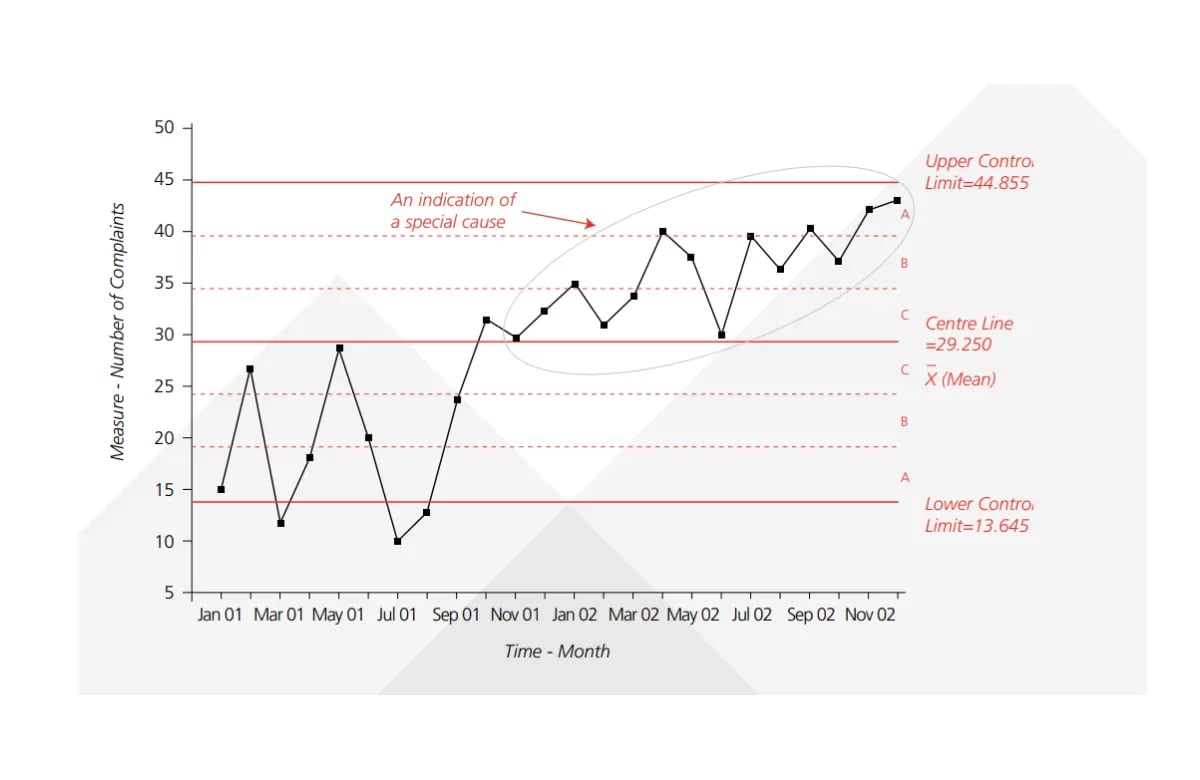
A statistical process control chart can be helpful in project management, as it can accurately represent the changes made in a project.
The control chart is a graph with an upper and lower control limit and an average or centerline for process output. As long as the graph line is between the upper and lower control limits, progress is considered fine. When the graph line touches the lower limit or crosses the upper limit, it indicates that the project behavior is undesirable.
Mariusz Dworniczak, PMP explains them clearly in his article about statistical process control charts, “SPC helps to determine if a process is "in control", meaning it is consistent and predictable, or if it is "out of control", indicating that there are issues requiring attention. By using SPC, project managers can prevent problems before they occur by identifying early signs of trouble.”
This type of chart is best for monitoring your project’s progress. By implementing it, you can identify errors during the early stages. Also, with the help of this chart, stakeholders can quickly develop reliable strategies to improve the project's success rate. With the help of this chart, stakeholders quickly develop reliable strategies to improve the project's success rate.
In project management, statistical process control charts have several benefits for your quality analysis strategies. For instance, they:
Statistical process control charts are considerably more difficult to use and interpret than other charts on this list, especially for people who don’t have a statistical background. Therefore, this chart has some setbacks. Like, for example, they:
Here’s an example of a statistical process control chart.
The best chart for project management depends on the specific needs of your project. But the most common and widely used chart in project management is the Gantt chart.
In project management, the four most commonly used charts are:
Yes, project managers use Gantt charts to visualize project timelines, dependencies, and resource allocation. Gantt charts help keep track of a project’s progress and can be adjusted according to the changes along the way.
The only thing better than a Gantt chart is a combination of project management charts working together in unison to initiate, plan, execute and close a project effectively.
To visualize a project plan, you need some sort of chart on which you can lay out your project’s phases. Some options include a Gantt chart, a flowchart or a project timeline. Likewise, you can also use a comprehensive document that combines different charts along with textual explanations like the project goals and objectives.
A milestone chart is a type of timeline chart that visualizes a project’s milestones. The objective is to visualize a project’s stages according to the milestones that are achieved at the end of each stage. Once one milestone is completed, the project continues on to the next stage.
The chart that shows a project’s stakeholders and their involvement is the stakeholder analysis matrix. This chart is a visual representation of which stakeholders are the most involved in the project’s progress and which aren’t. Knowing this information helps with stakeholder communication.
As a manager, you must be familiar with all the helpful project management charts to utilize them for the projects they are best suited to. You can see that all the project management charts mentioned above are tested and proven ones that will help you visualize the project and make correct decisions.
However, you might find it extremely difficult to create these charts, even though you are familiar with them.
So, once you have decided on the type of chart that best fits your project, start creating them using Visme's graph maker. It features hundreds of chart templates to start with across all of the project management charts mentioned above.
Design visual brand experiences for your business whether you are a seasoned designer or a total novice.
Try Visme for free