How to Speed Up Sales Content Production: Insights From 164 B2B Revenue Teams

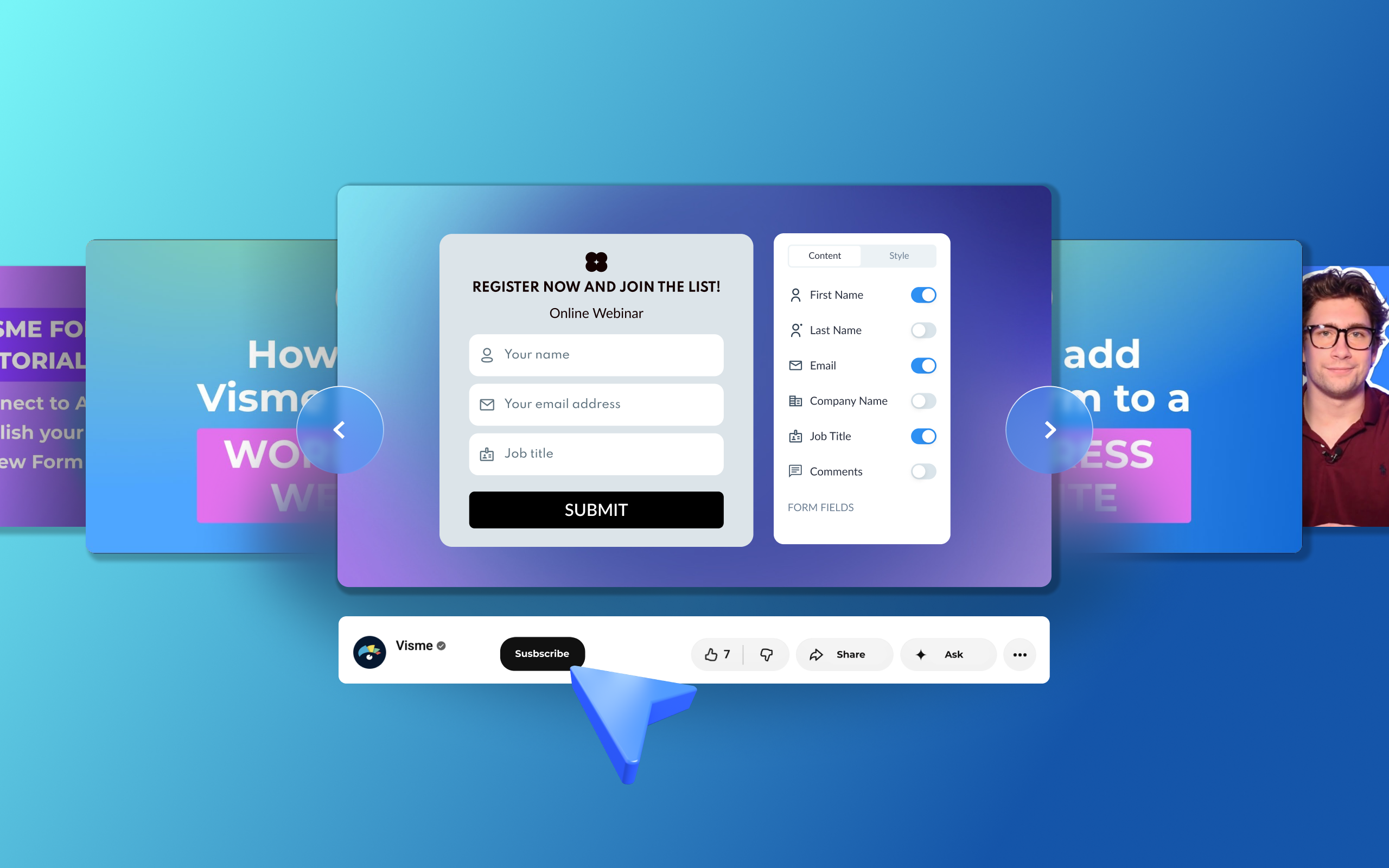
A while back, we started grouping videos from our YouTube channel into sets, beginning with 11 content creation tricks you might have missed inside the Visme editor.
This roundup covers Visme Forms end-to-end. Building the form, branching it based on answers, connecting it to your CRM, getting it onto your site and reading what the data tells you afterward.
It’s a collection of seven videos, totaling roughly half an hour. Most run under three minutes.
Start wherever you are in your Visme Forms journey. If your form is already live and underperforming, skip to the last video.
You need a registration form ready by tomorrow. Open the builder and make the first real decision right away: how many questions go on each step.
One question per step feels slow to fill in. Everything on a single step feels like a tax return.
Visme forms run either way or a mix of both. While building, you can rearrange fields and steps by dragging them where you’d like. Click Add Field to choose a type and drop it into the slide.
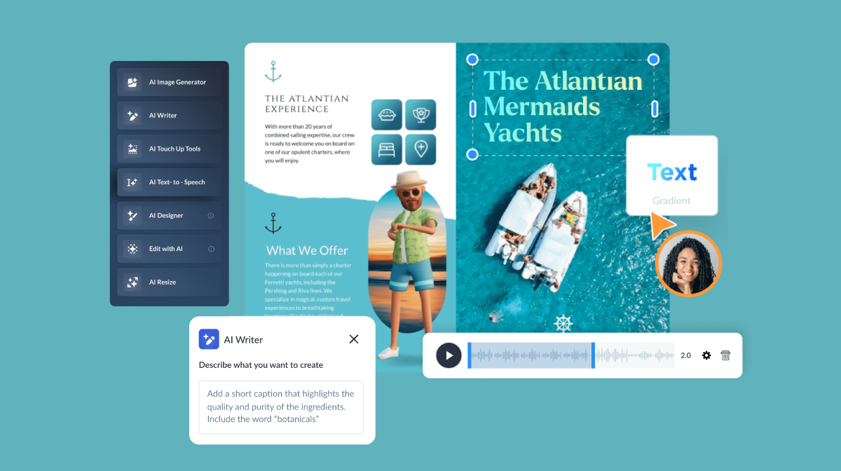
The video below tours the full build, including the 3D characters whose facial features, clothing, poses and hand gestures you can adjust. You can easily switch the character off entirely for a plainer look. The clip also shows where the auto-responder and email delivery settings are located, which is a step you won’t want to skip.
Worth knowing before you switch the RD character off: when we split-tested animated forms against static ones across 400K organic visitors, the animated versions brought in 29% more leads on average.
Recommended for you: How To Create A Multi-Step Form with Visme
You send out a post-event survey. Someone selects "very satisfied," then gets asked three follow-up questions about what could have gone better.
That misalignment leads to form abandonment. Avoid it by using conditional logic.
Conditional logic routes every answer to its own next step. Click Logic in the lower right of the editor and your form appears as a visual map, with each question as a step and lines you drag between them. Answers without a route simply continue to the next step.
This video shows how to build and edit those routes. It also covers a rule that catches people out after the form is built: if a step contains more than one question, only one can control the branching. So, give each question its own step and you’ll avoid rebuilding later.
Routing is only one option. The same rules can hide steps, show a custom message or disqualify a response outright, which is useful when you are screening leads rather than surveying them.
Recommended for you: Applying Conditional Logic to Visme Forms
Your webinar sign-up form is live, and registrations are coming in. But the data is sitting in Visme while the campaign is being managed and built in the email software.
Exporting a CSV every morning works, but that’s finicky and unreliable. Connect the form to your email provider and stop stressing over it.
The Connect tab syncs your form to Mailchimp, ActiveCampaign, ConvertKit, GetResponse, HubSpot or a Google Sheet. Anything not on the list can route through Zapier.
Watch the field mapping part of this video closely. Every field on your form needs a matching field at the other end, and you pair them one at a time from a dropdown. Mismatched fields will send submissions to the wrong column.
Recommended for you: How to Collect and Sync Data Across Applications
Your sign-up form sits at the foot of a blog post. Readers who don’t scroll that far will never see it.
A pop-up solves the visibility problem, but it does need you to set up and optimize the display trigger and frequency. A pop-up that fires the second someone lands on a page won't yield the results you seek. Across 1.24 billion pop-up displays analyzed by Omnisend, immediate pop-ups converted at 1.9%, while a six- to ten-second delay reached 2.4%.
Visme gives you four triggers: on page load, after a set number of seconds, once a reader passes a scroll percentage, or when they move to leave the page. You can also choose between a popup, an embed within content and a sidebar placement.
The frequency settings control whether a returning visitor sees the form again and whether it stops appearing once someone has already submitted. Watch the video below to see how all this works inside the form editor.
Recommended for you: Embed your Visme Form on a Website
Your lead magnet form is ready, and now you want to add it to your WordPress site. With an embed code, you can place it in a blog post or a landing page.
Add a Custom HTML block where you want the form, paste the code from Visme and preview the live site to see how it looks.
The pop-up version is a bit different. The code belongs in your theme's footer rather than on a single page, which is what makes it fire across the whole site.
This video walks you through both options. If your site is on WordPress.com rather than self-hosted, it also covers the plan requirements for getting custom code permissions.
Recommended for you: Embedding a Visme Form on WordPress
Someone browses three of your product pages on Shopify, adds nothing to the cart and moves to close the tab. That visit is over and you have no way to reach them again.
An exit-intent popup is your last chance to trade a discount code or a newsletter signup for an email address, and it fires at the one moment you have nothing left to lose by interrupting.
Shopify needs no plugin for this. The code goes straight into your theme, which is what makes the popup work across every product page in the store.
This video shows exactly where it belongs in the theme file and sets up the exit-intent trigger on the Visme side first.
Recommended for you: How to Embed Visme Forms on Shopify
Your Visme form has been live for a month. Plenty of views, far fewer submissions, and nothing obvious explaining the gap.
Use the Results tab to track views, starts, submissions, completion rate and average time to complete, split by desktop and mobile.
A low completion rate alongside a long average completion time usually means the form is asking for more than people are willing to give, and the best fix might be cutting fields rather than redoing the whole thing again.
This video walks through the Results tab and shows how to compare metrics to find where people drop off. It also covers how to make sure you’re not tracking your own views and how to export the data.
Recommended for you: Converting More Leads from Existing Traffic with Visme's Interactive Form Builder
Each one is already in the forms editor, waiting for the day you need it.
Pick the one that solves the problem in front of you, watch the video and try it on your next form.
And if something in here changes your numbers, tell us in the comments on the YouTube video. You can also let us know which Visme feature you would like us to cover next.
Don't forget to subscribe to the Visme YouTube channel

Design visual brand experiences for your business whether you are a seasoned designer or a total novice.
Try Visme for free