


Typography Infographics: 12 Inspiring Examples & Techniques

![13 Types of Infographics You Should Be Creating [Plus Templates]](https://visme.co/blog/wp-content/uploads/2015/11/Header-58.jpg)
Still using the same type of infographic for every piece of content? If so, you're missing a huge opportunity to tell more impactful stories.
Most people don't realize there are several types of infographics, each designed to visualize different kinds of information.
Whether you're building awareness, educating your audience, or driving decisions, your infographic style should match the message, audience and goal.
In this guide, I’ll walk you through the top 13 types of infographics to add to your content strategy. You'll see real-world examples that work, get tips on when to use each one and walk away with professionally designed infographic templates to get your creative juices flowing.
If you’re more of a visual learner, this video summarizes the 13 types of infographics and when to use them:
Better yet, you can jump right into creating the perfect infographic with Visme's range of professionally designed infographic templates.
Here’s a short selection of 8 easy-to-edit infographic templates you can edit, share and download with Visme. View more templates below:


Infographics are visual tools that break down or summarize information so you can spot the main idea at a glance. It typically combines text, icons, charts and images to make content clearer, more engaging and easier to remember.
Dr. John Medina, author of Brain Rules, says that “people remember only 10% of information after three days. But if you add a relevant image, that number jumps to 65%.”
What does that tell you? If you want your message or your brand to stick, infographics can get the job done. And not just any kind, you need the right type of infographics for the job.
Most marketers assume that any infographic is better than none.
But using the wrong type of infographic can confuse your audience or dilute your core message, especially when complex data is involved.
If you use the wrong format (like a stacked list to guide decision making), you risk confusing your audience or burying the main point.
But when you match the content to a format that fits (like using a flowchart infographic for decision making), the story becomes clearer, more intuitive and easier to follow.
Mohbeen Qureshi, VP of Growth at Oppizi, points out how often teams prioritize design over clarity and how that choice can derail your message.
"Most people overthink infographics. Or worse, they pick the wrong type just because it looks good. I’ve worked with design and data teams across SaaS, FMCG, proptech, all sorts of places. The mistake is usually the same: they dump info into a pretty format without checking if it actually makes the point clearer.
We once had a stakeholder trying to explain how their product evolved over a few years. They slapped everything into a stacked list. It looked fine until you tried to follow the sequence. We switched it to a horizontal timeline and suddenly the story made sense. Same content, different layout, completely different reaction.
If the goal is to explain how a process works or what steps a customer takes, how-to infographics or flow diagrams help. How-to infographics should feel like IKEA instructions. Short, direct, almost impossible to mess up."
| Infographic Type | Best Use Case | Ease of Creation |
| Interactive Infographics | Driving engagement through clickable links, pop-ups, video embeds or animations | Advanced |
| Statistical Infographic | Presenting data, percentages, trends or survey results | Moderate |
| Informational Infographic | Summarizing dense or text-heavy content like reports or blog posts | Easy |
| Timeline Infographic | Showing chronological events or progressions | Moderate |
| How-to Infographic | Explaining a process or step-by-step guide | Moderate |
| Process Infographic | Illustrating sequential stages or workflows | Moderate |
| Comparison Infographic | Contrasting products, features or ideas side-by-side | Easy |
| List Infographic | Presenting grouped items, tips or facts in an organized layout | Easy |
| Location Infographic | Highlighting data tied to specific places like cities or venues | Moderate |
| Flowchart Infographic | Guiding decision-making through branching paths or logic trees | Advanced |
| Hierarchical Infographic | Ranking elements or showing organizational structures | Moderate |
| Anatomical Infographic | Breaking down parts of a subject (e.g., body, tool, system) visually | Moderate |
| Geographical Infographic | Displaying region-specific trends like demographics, climate or economic data | Advanced |
Best for: Engaging your audience, presenting complex information in layers and encouraging interaction or action.
Interactive infographics transform static visuals by adding dynamic elements like quizzes, hotspots, polls, videos, audio and animation. These features improve engagement and let you present more content without cluttering the canvas.
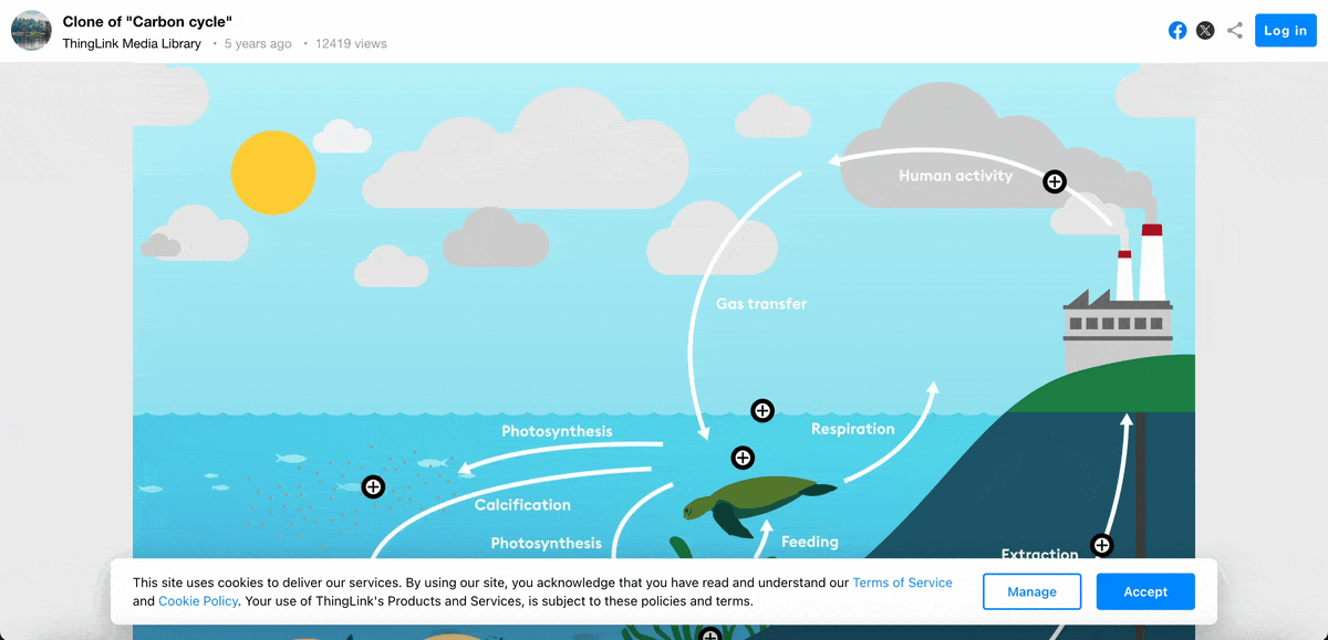
This infographic example uses pop-up elements to embed extra content such as text, videos and images. The content appears when you hover or click on the plus button.
What makes it particularly effective is its dual interaction design. The hover effect offers a brief teaser that sparks interest, while clicking opens up a more detailed explanation with accompanying visuals.
This design avoids information overload while delivering detailed content, making it a smart way to balance depth and simplicity.
You can create similar pop-up interactive infographics using Visme. But Visme offers even more:
Visme’s drag-and-drop editor makes it simple to go from static to interactive without a single line of code.
Many confuse animation with interactivity, but there’s a big difference. Alejandra Mariscalez, Design Manager at Visme, sets the record straight on what true interactivity really means and why it matters.
“I think one of the most important things to clarify with interactive infographics and anything related to interactivity is that it has to be engaging. Some people confuse interactivity with simple animations or special effects and forget about the most important part which is having the user interact with elements within the design in order to convey/uncover a special message or audio/video etc. The magic is all about keeping users interested and fully involved with the content in order for users to really learn and comprehend the information they are taking in, in a more visual and fun manner.”
Best for: Presenting research findings and data analysis
Raw numbers can be overwhelming, but statistical infographics help you translate complex data into visuals that are much easier to understand. These kinds of infographics quickly reveal patterns, trends and insights like spikes, dips or correlations that might be missed in plain text.
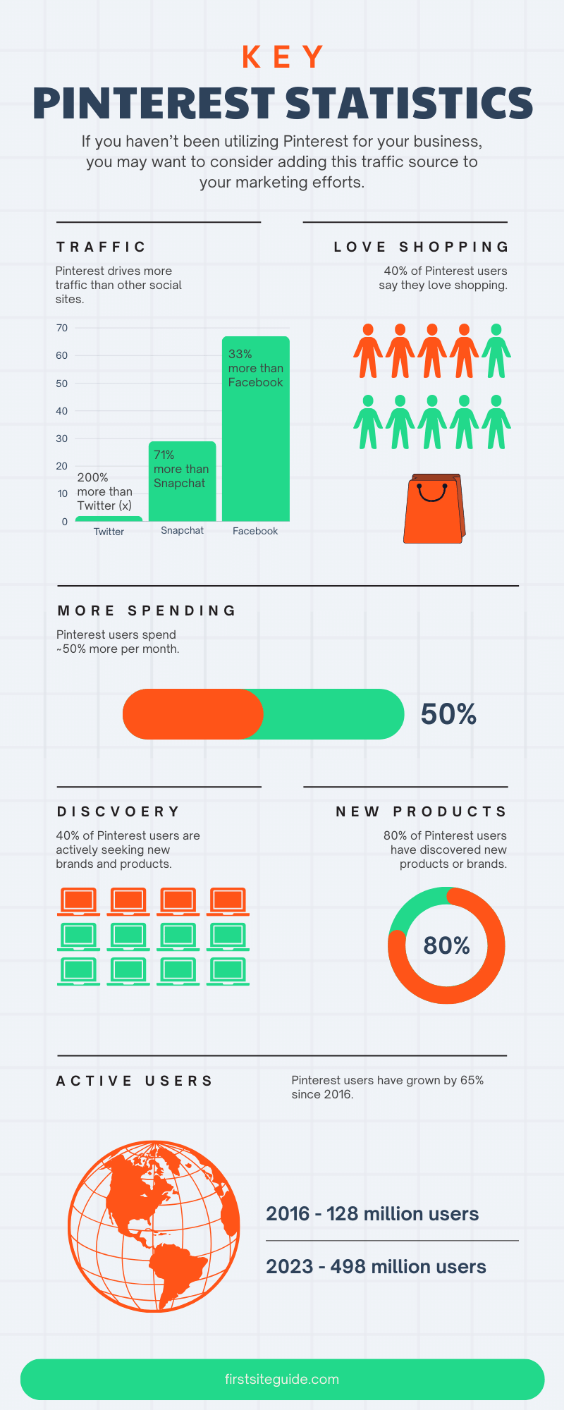
Created by First Site Guide, this infographic is a great example of clean, functional design. Its grid-based layout leads viewers through key Pinterest statistics in a way that feels intuitive and easy to follow.
Each data point is broken up with bright, consistent color blocks and minimal text, making the content easy to scan. Plus, bold visuals like people icons and stacked bar charts add instant visual impact and help bring the data to life.
Create yours using this template or choose from hundreds of statistical infographics templates available in our library.
You can change the format into any of the other Visme’s over 30 chart and graph types based on what you want to highlight, whether it is comparisons, proportions or trends.
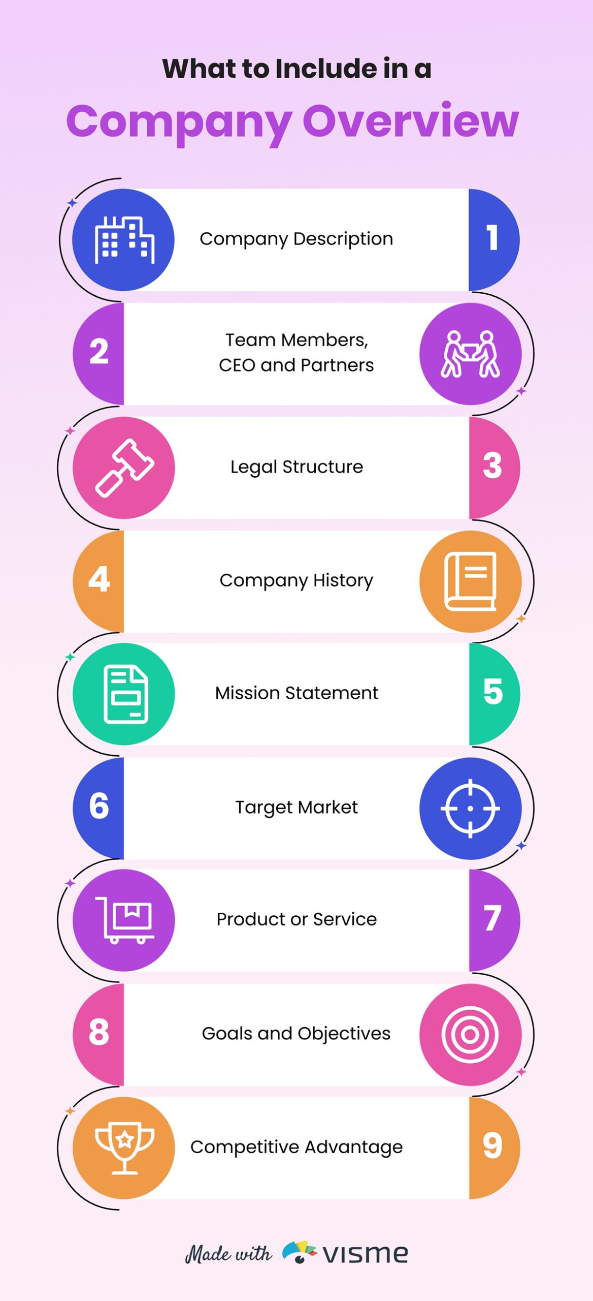
Best for: Summarizing word-heavy guides, reports, blog posts, ebooks, case studies and white papers.
Informational infographics are great for summarizing key points from long-form content. They use a text-focused layout to highlight essential takeaways, making them perfect for topics where clarity is more important than visuals.
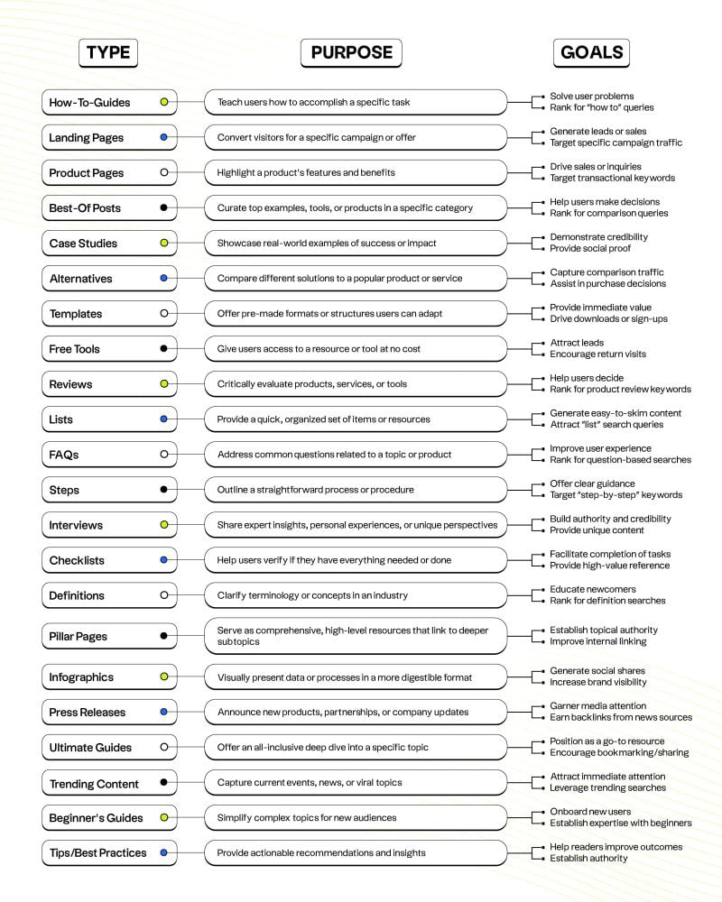
This infographic by Jake Ward neatly categorizes 23 content formats into a simple, clean visual. While it leans heavily on text, the structured layout makes it easy to scan and digest.
Each format is organized into a three-column table—Type, Purpose and Goal, which makes it easy to compare and understand how each one supports different stages of the marketing funnel. The smart use of icons also adds a layer of visual appeal to the design.
To save time, use this ready-made Visme template to create yours or find more informational infographic template options in the library.
 Pro Tip: Keep your infographic scannable with short sentences, whitespaces, bullet points and bold highlights. Use icons to break up the monotony of text. The more text you include, the fewer colors you should use to avoid visual overload.
Best for: Showcasing events over time, trend shifts, historical progression, growth phases, evolution or roadmaps.
When time is the key factor in your message, timeline infographics are your go-to. They're perfect for showing how long a process takes, when events occur or how something evolves over a specific period.
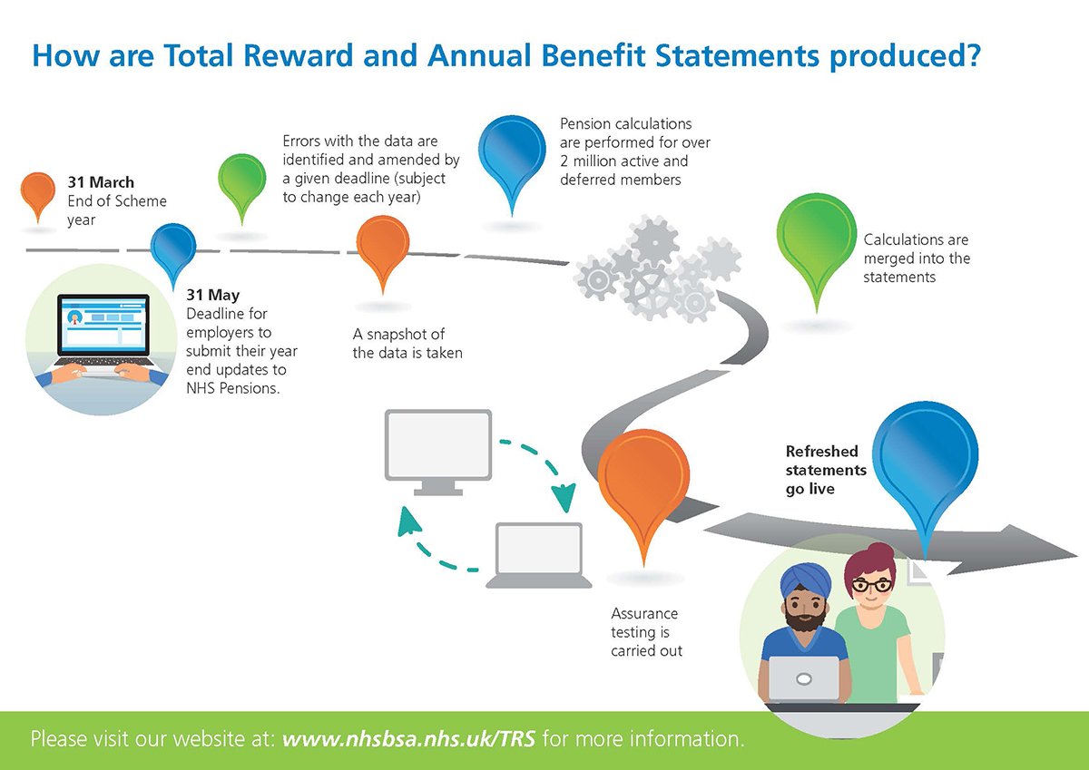
This infographic by NHS Pensions explains how Total Reward and Annual Benefit Statements are produced. It’s simple but effective.
Each stage of the process is marked with a distinct colored pin and icon, clearly showing the sequence from the end of the scheme year on 31 March to the final release of refreshed statements. Instead of a traditional timeline, a winding path guides the viewer through the process, illustrating the non-linear yet forward-moving nature of the workflow.
The template below is a good starting point to create your own timeline infographic. You can easily customize any part of the design to match your topic or style.
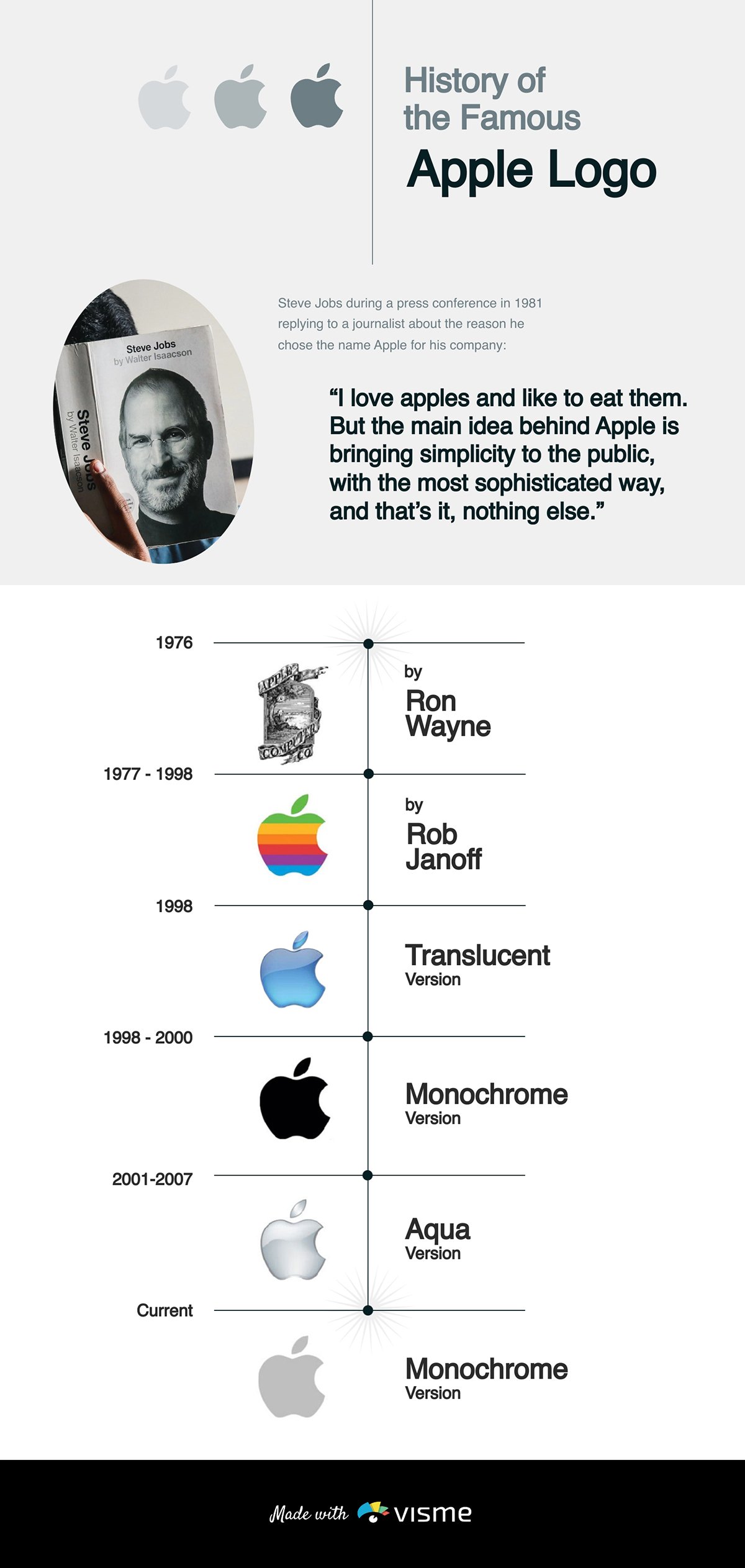
Visme offers a variety of timeline elements like date markers, zigzag or spiral paths, color-coded segments and animated sequences to help you build a timeline that fits your story.
Pro Tip: Use visuals to anchor key moments, icons for clarity and images for depth. And always guide the eye with a clear flow, like a single-direction arrow, to make the timeline easy to follow.
Best for: Simplifying instructional content like teaching a process or explaining a solution
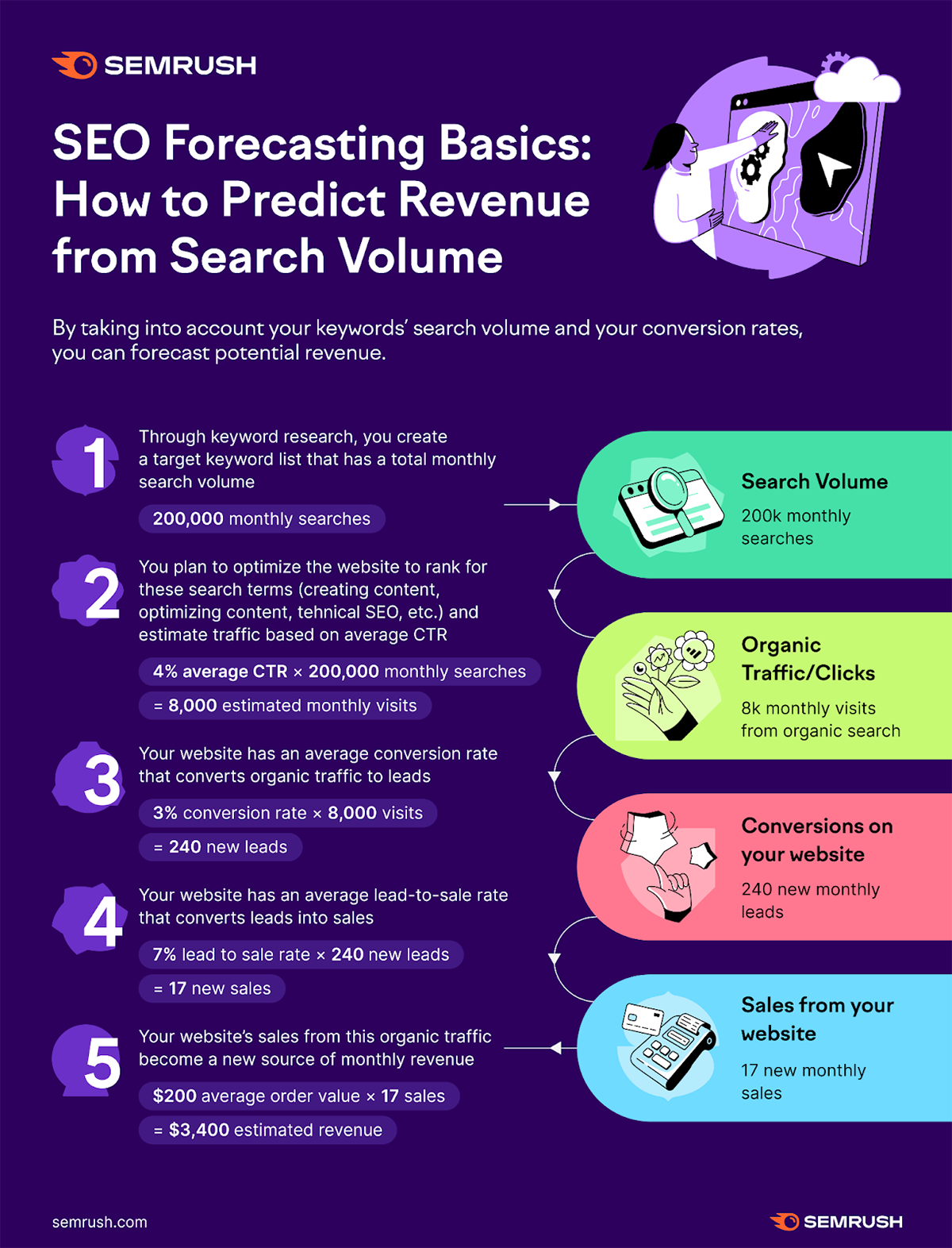
A how-to infographic is ideal for teaching a process, explaining a solution or making instructions memorable. Research shows that people are 323% more likely to follow instructions correctly when presented visually, as these infographics break down complex procedures into clear, actionable steps.
In this Semrush article, rather than explaining revenue forecasting in a lengthy paragraph, they use a step-by-step infographic to simplify the concept. It guides users through the process with clear steps, colorful icons, and highlighted text. While it leans on the text-heavy side, the use of bold fonts, well-placed colors, and a clean layout keeps it visually appealing and easy to navigate.
The Visme template below is a great starting point for replicating this kind of infographic. You can customize it for any topic, from tutorials to workflows or find more how-to infographics in the library.
 Pro Tip: Stick to 3–7 steps to keep things manageable. For longer guides, categorize steps into broader stages. Use active voice with direct commands: say “Add two scoops of coffee,” not “Two scoops of coffee are required.”
Best for: Instructional manuals, standard operating procedures (SOPs), training materials, customer journeys and workflows.
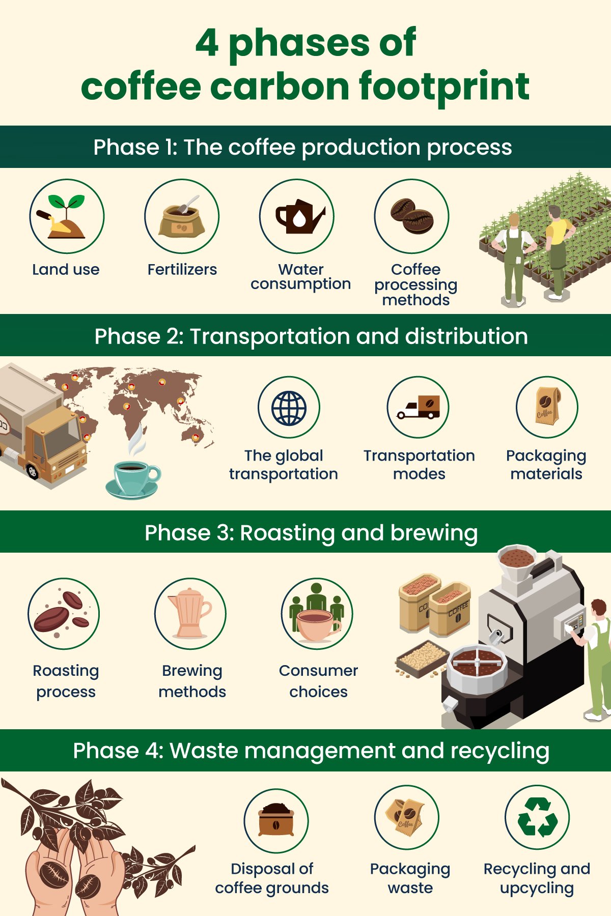
Process infographics are similar to how-to infographics, but with a stronger focus on the stages, tasks or system flows. They typically follow a linear (start-to-finish) or cyclical (repeating pattern) path with numbered steps, clear headings and brief descriptions.
This infographic by Regenx breaks down the carbon footprint of coffee production into a clear visual sequence. Instead of using text-heavy explanations, it uses images to show where carbon is released at each stage of the supply chain.
There’s room for the content to breathe. And the concept is easier to understand because each step is paired with a visual reference.
Customize the template below to recreate this kind of process infographic for your training material or operational guide. You can also find more process infographic templates in the library.
 Pro Tip: Use numbered steps to help readers follow the flow. If your process is linear or cyclical, choose a layout that reflects that structure.
Best for: Comparing products, Before vs. After, Countries or Regions, Trends over time or Pros and Cons.
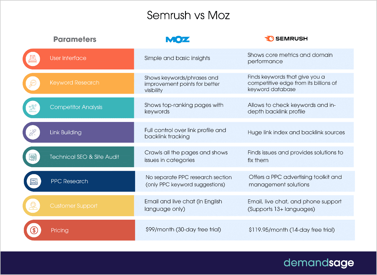
Comparison infographics are ideal for putting two or more things side by side like products, services or ideas. They make differences easier to spot, help audiences digest information faster and support better decision-making.
This example summarizes the difference between Moz and Semrush SEO tools. Rather than just stating the differences, the visual shows how they stack up against each other based on different parameters. The variety of colors and icons used to highlight different parameters for comparison makes this infographic design stand out. Plus, the concise copy complemented with legible fonts pairs well with the overall design.
Use this eye-catching Visme template to get started or find more comparison infographic options in the library.
Pro Tip: If you want one option to seem more desirable, highlight it with a bolder color. Use color to group or differentiate items, e.g, Green for “dos,” red for “don’ts”.
Best for: Sharing tips, hacks and ideas; listing tools, stats, benefits or features.
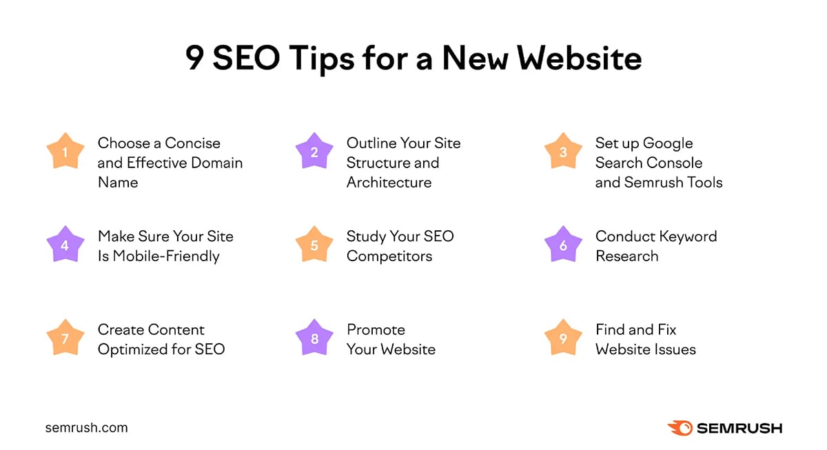
This type of infographic layout uses a grid or vertical layout. It’s ideal for presenting information in numbered lists, bullet points or checklists. List infographics are far more engaging than plain text lists. You can improve them by swapping bullet points for icons and adding simple illustrations to represent each item.
Instead of just listing SEO tips in plain text, this Semrush blog included a list infographic that readers can save, reference later or share easily without needing to revisit the article.
This infographic is laid out in a grid format, which helps keep it concise and clean. The star icons add visual interest, while the generous white space makes it easy to scan and digest quickly.
Here’s a list infographic you can customize immediately.
 Pro Tip: Keep each point to 1–2 lines and use bold and consistent numbering or bullets.
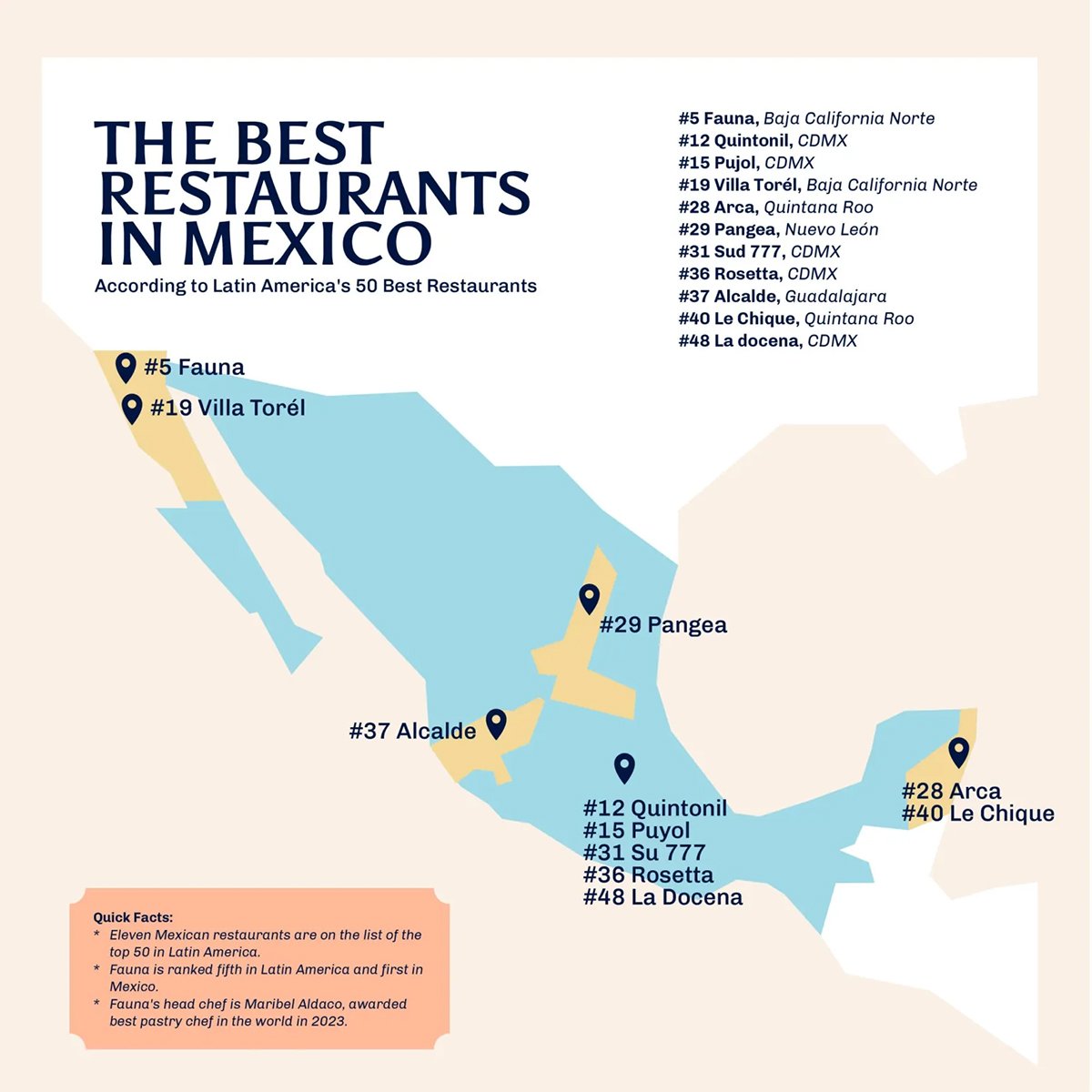
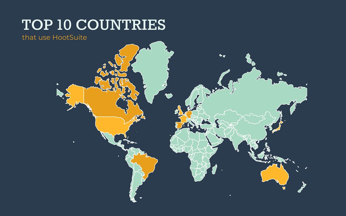
Best for: Highlight data related to that specific area, such as sales data for a store, foot traffic at a particular location or demographics of a neighborhood.
Location infographics present information connected to specific cities, landmarks or buildings. They often incorporate maps, pins, icons, color codes and symbols to visualize data within a spatial context.
This infographic highlights 11 restaurants in Mexico that were featured in Latin America’s 50 Best Restaurants. Each restaurant is plotted on a map of Mexico, with location markers showing where they are across the country. Quick facts offer context at a glance, and a legend helps viewers interpret the geographic layout.
You can use this Visme template as a base and customize it to match your topic or find other location infographic options in the library.
If you're publishing your location infographic online, consider making it interactive, like adding pop-ups that display more information when someone clicks on a location. This keeps the design clean while still offering detailed insights.
Pro Tip: Use colors intentionally to differentiate regions, categories or data points. For example, use distinct colors to separate urban vs rural or apply gradients to show levels like population density or market reach.
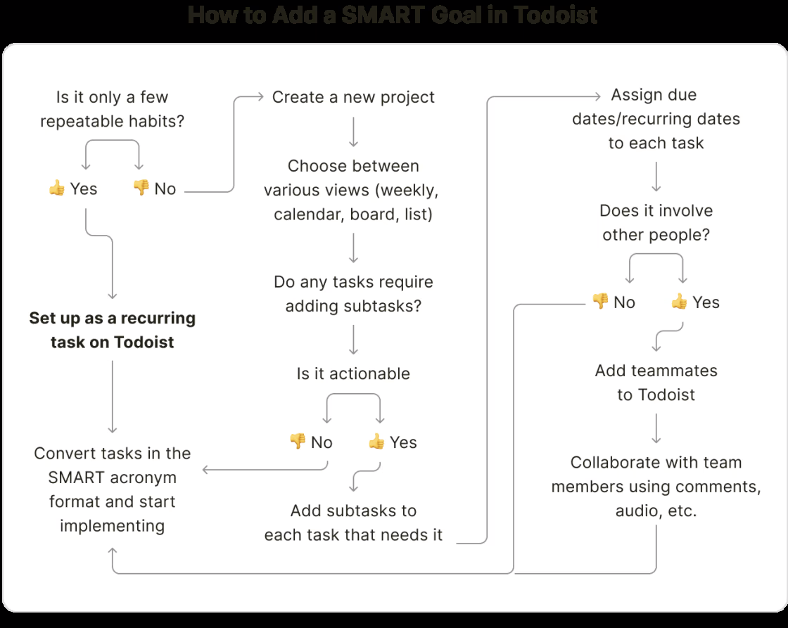
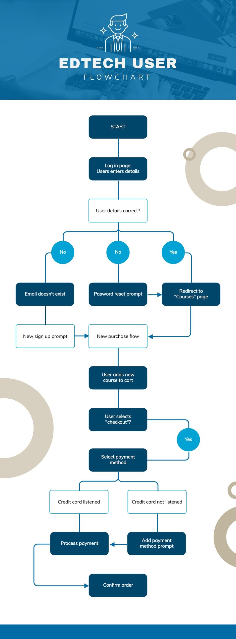
Best for: Ideal for visualizing processes like step-by-step instructions, decision trees, workflows and onboarding journeys.
When a process isn’t linear or just too messy to explain in a simple paragraph, a flowchart infographic breaks it down visually. This type of infographic usually:
This video shows how to create flowcharts in Visme.
This flowchart by Todoist walks users through the SMART goals process. Using yes/no paths, it provides a step-by-step guide on how users can refine their goal.
This may not be the most visually elaborate design. But the clean layout makes the content digestible. Plus, the use of thumbs-up and thumbs-down emojis adds a friendly touch that keeps it engaging.
Think of any process in your organization or business that could be better understood with a flowchart infographic and try it out using this simple Visme template.
 Pro Tip: Avoid overly complicated branches that might confuse your audience. Always test readability by asking the question: “Can someone unfamiliar with the process follow it from start to finish without asking questions?”
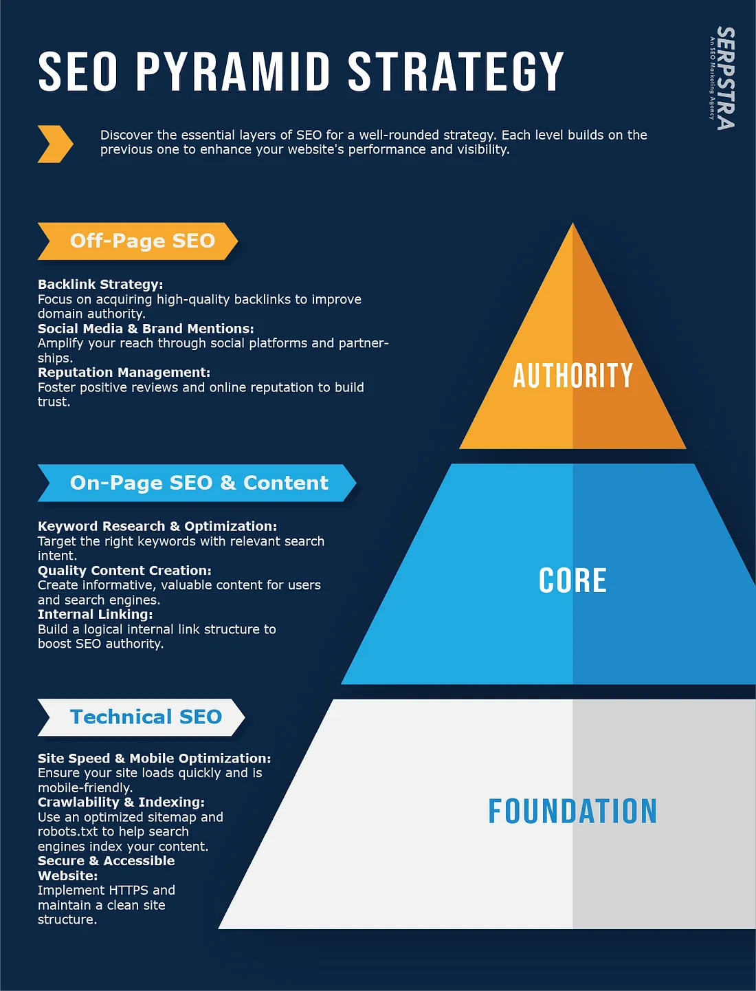
Best for: Showing organizational structures, classifications or anything based on rank or priority.
A hierarchical infographic shows information ranked by importance or level, like a pyramid org chart or layered blocks. It helps people quickly see what comes first, who reports to whom or what matters most.
This SEO pyramid breaks down the different types of SEO based on priority. While each level is important, the structure clearly shows which areas to focus on first.
I like how the creator used different colors to distinguish the categories. Since there are only a few layers, there's enough space to briefly explain each type, making the design clean and easy to follow.
You can recreate your version of a hierarchy with Visme or find other hierarchical infographic templates in the library.
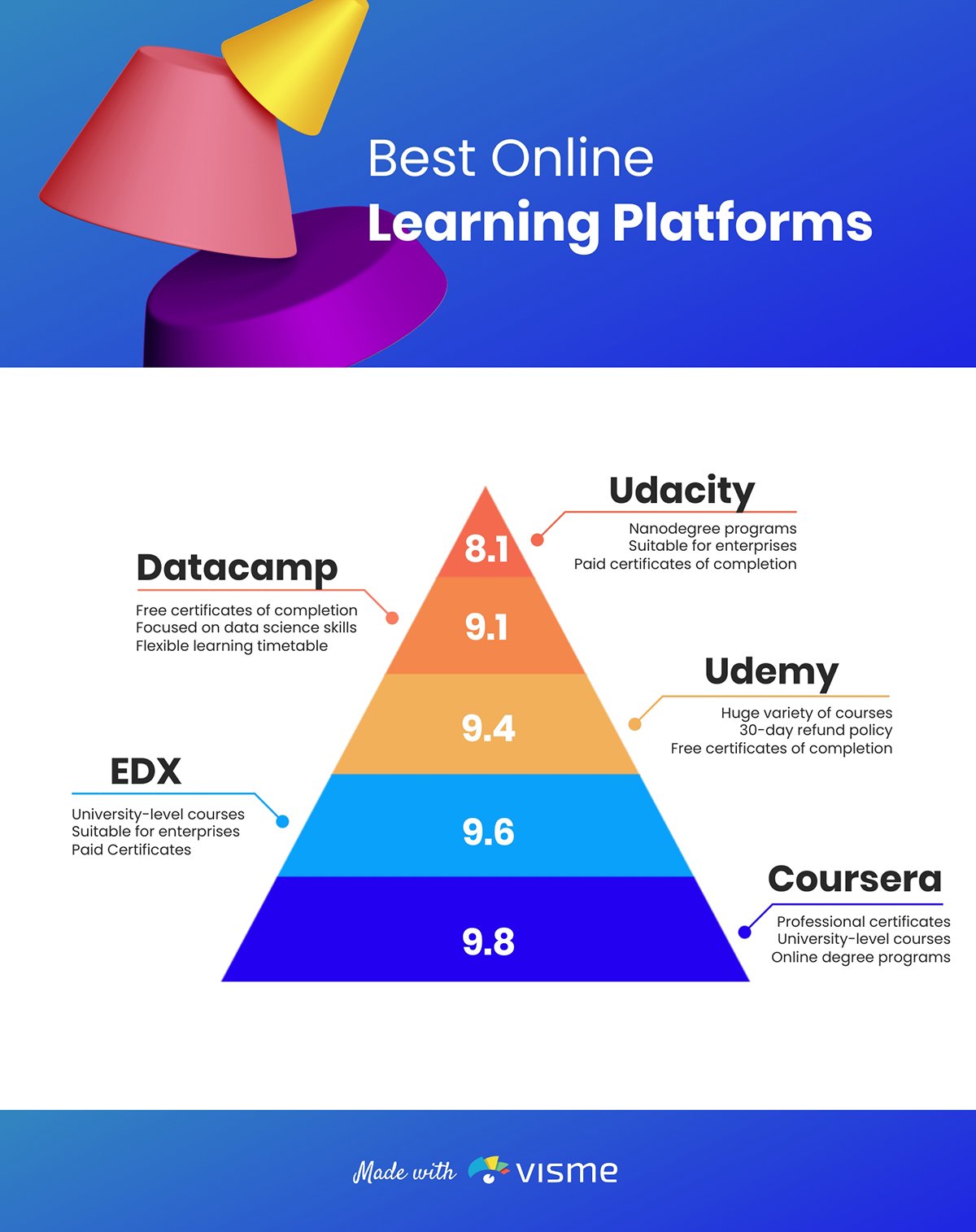
You can also check out other designs like classic pyramids, trees and funnels.
Pro Tip: Leave enough room between levels to avoid visual clutter. Use subtle color shifts or gradients to show progression without overwhelming your viewer.
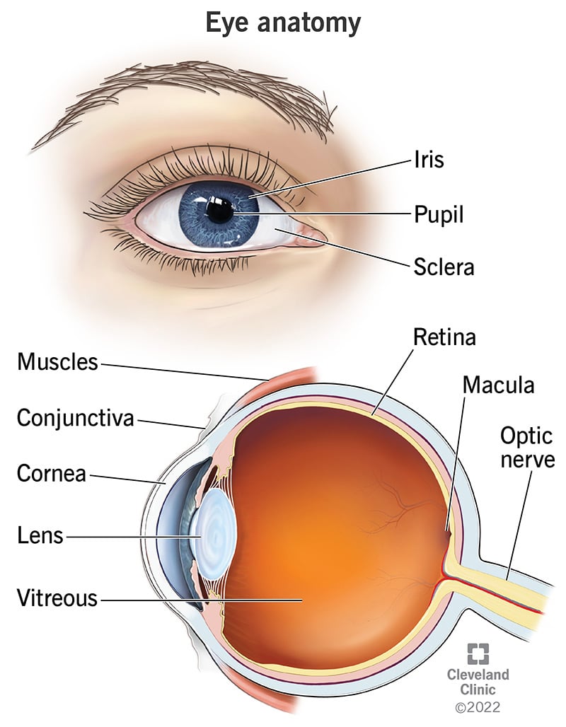
Best for: Breaking down a product, tool or machine into its parts and educating on human or animal anatomy.
An anatomical infographic visually dissects and labels the internal components of something. While it's rooted in biology, like human organs, designers now use this style to explain the "anatomy" of almost anything: a camera, a website, a shoe or even a creative process.
This infographic by Cleveland Clinic breaks down the human eye using both surface and cross-sectional visuals. The top half shows outer parts like the iris, pupil and sclera, while the bottom half uses a cutaway illustration to reveal internal structures.
Clear lines and simple labels make it easy to follow without overwhelming text. Combining the two perspectives gives a complete view of how the eye works, which would have been hard to achieve with just text.
Use this template to create yours or find other anatomical infographic templates in the library.
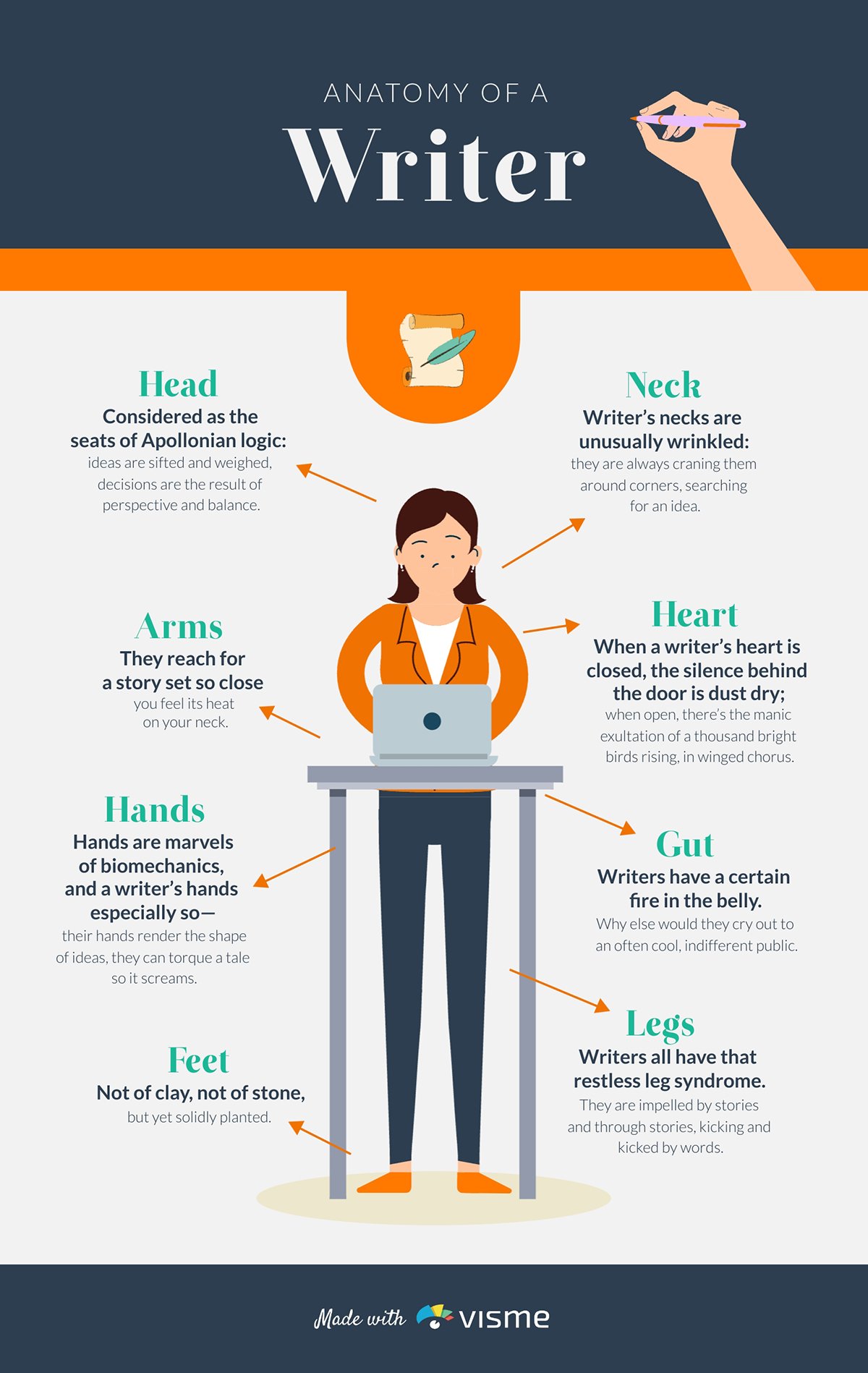 Pro Tip: Keep text minimal and precise. Let the visuals do most of the talking.
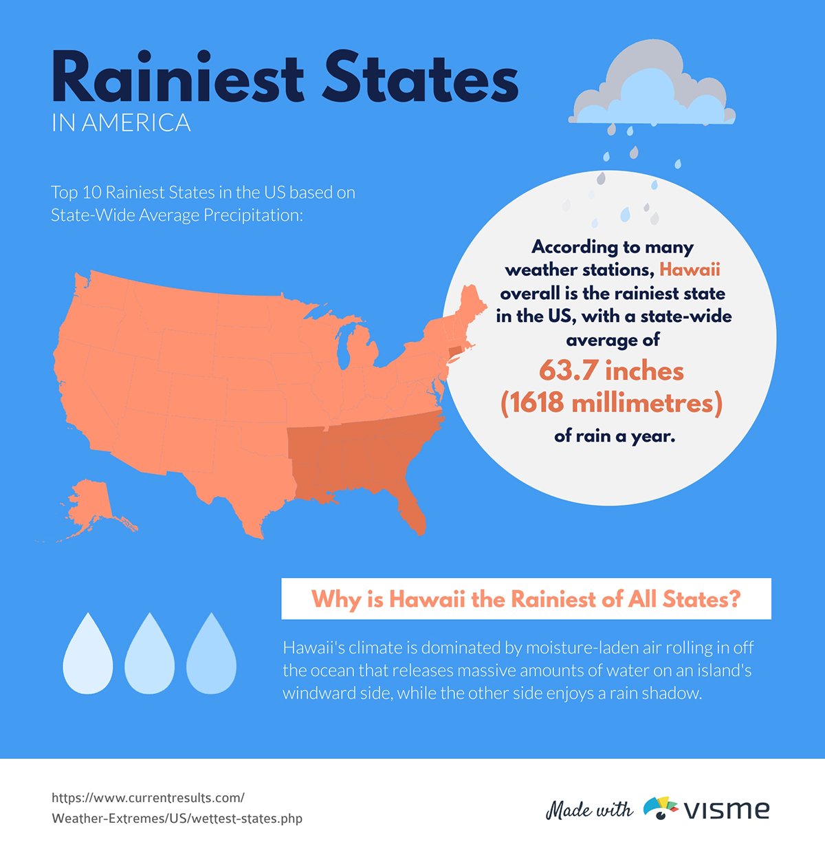
Best for: Showcasing population growth, economic factors or climate patterns
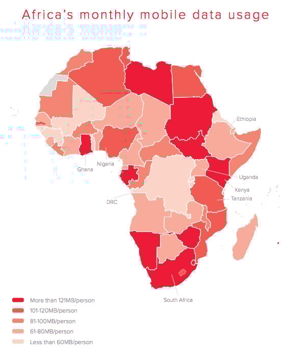
While geographic infographics may seem similar to location-based ones, there's a distinction. Geographic infographics represent larger areas: countries, regions or even continents.
This infographic uses a map of Africa to display monthly mobile data usage across the continent. A key explains the data for each country through a single color gradient, showing the differences in usage levels. I particularly like how the map uses a single color gradient, which is effective for illustrating the varying intensity of data usage from country to country.
Have a global dataset to represent? Use this global geographic infographic template.
 Pro Tip: Use labels, headlines and keys to guide your viewers. This ensures that the infographic communicates clearly, even when it’s not embedded within a larger piece of content.
Choosing the right infographic starts with asking the right questions.
These answers will help you gain clarity on your content, audience and overall goal:
Let’s dive in:
Start by defining the goal. Are you trying to explain a complex idea, persuade someone to take action, or just make dry data more engaging?
Your goal should guide your format. A timeline infographic is perfect for showing historical or step-by-step information. A comparison infographic helps highlight differences between two products or ideas. Want more interaction and engagement? An interactive infographic might be your best bet.
A solid understanding of your audience’s needs and preferences is also crucial. A technical group may prefer detailed charts and industry-specific terms, while a general audience will connect more with simple wording and straightforward visuals.
Design style matters, too. Younger viewers often favor bold colors and energetic layouts, whereas professionals may lean toward clean, minimal designs. If your data is complex but your audience isn’t data-savvy, focus on simplifying the visuals to keep the message clear.
Finally, think about where your infographic will be shared. The format you choose should be tailored to serve users at specific touchpoints in their journey.
Valentin Radu, founder of Omniconvert breaks down how format and placement should go hand in hand.
“The best infographics are built around how users use them, not just how they see them. One thing that doesn’t get talked about enough is where the infographic will live. On a landing page, for example, comparison or list infographics can drive conversions because they help users make decisions quickly. But if it’s embedded in a long-form article or used in onboarding, something like a how-to or process format works better—it gives structure without overwhelming.”
Now that you know how to choose the right type of infographic, let’s walk you through how to create one that looks professional, even if you’re not a designer.
Follow the steps below:
Let’s dive in.
Start by visualizing the structure of your infographic. For instance, if you’re turning a blog post into an infographic, begin by identifying the key takeaways. These will become your main sections or steps of your infographic.
Next, outline the content. Keep it simple:
Then look for parts that can be visualized: icons for key actions, simple charts for stats or images to add clarity. This early planning makes the design process smoother and helps your message land better.
You’ve got your message and structure. Now think about how to present it visually.
This is where choosing the right infographic type comes in. You already saw the main types above, now ask yourself which one fits your content best.
If you're outlining steps, a process infographic might be the most natural fit. Trying to highlight key stats? A data-driven layout makes more sense. And if you’re comparing options or summarizing tools, a list or comparison format could work better.
The point is: pick a type that supports your message.
Now that you’ve mapped out your content and picked the right infographic type. While you can always start from a blank canvas, using a professionally designed template can fast-track your design process and help you visualize the end result more effectively.
Visme offers a wide variety of infographic templates tailored for different topics, industries and goals. To get started, sign up or log in to your Visme account and create a new project. Head to the infographic section, browse the available templates and choose one that fits your message and audience.
To find the right fit, ask yourself:
Once you’ve picked your template, open it in the Visme editor. From there, you can customize every element—adjust the layout, change colors and fonts, swap out images and add or remove pages as needed. Then, simply replace the placeholder text with your own content.
This is where content meets design.
Start by laying out your elements in a way that flows. Use shapes to separate sections, guide the reader’s eyes or highlight key messages. A clean, intentional layout makes your infographic content easier to skim and more likely to land.
Keep in mind that a clear color palette with enough contrast will keep things readable. One primary color with a few accent shades is often all you need to create a cohesive look.
For fonts, less is more. Stick to one or two clean, legible typefaces and apply them consistently. Your text should support the design, not compete with it.
If you want to keep your infographics on brand, use the Visme brand kit. Just enter your website URL and Visme will automatically pull in your logo, brand fonts and colors.
To improve visual appeal and engagement, choose from thousands of stock images, icons, illustrations and 3D graphics in Visme’s library. You can also upload yours to make it more personal and edit it with the AI image editor or create new images that fit your needs using the AI image generator.
If you're creating a digital infographic and want to add motion or interactive elements, you'll find variety of pop-ups, buttons, transitions and animated characters.
Need to visualize data? Visme offers over 20 types of charts, graphs and maps plus more than 30 widgets, tables and data visualizations.
It's time to get some fresh eyes on your infographics. Share it with team members and ask for feedback on visual appeal, clarity of message and resonance.
Visme’s collaboration features make this easy. Your team can share feedback in real time, edit, comment and suggest changes. Our workflow tools help keep things on track, allowing you to assign tasks, set deadlines and request approvals. This makes the review process smooth and efficient, ensuring your infographic is polished and ready for final use.
Once you’re happy with your infographic, share it with the world. Using the download or share button in Visme, you’ll find many ways to export your design, including :
If you’d like to track your infographic’s performance, Visme also offers built-in analytics to monitor engagement. Whether you’re sharing it on social media, embedding it on your site or using it in a presentation, you can gather insights and improve future designs based on real data.
A good infographic should feature the following
There’s no single “best” type of infographic. It depends entirely on your goal. Each infographic type exists to solve a specific communication challenge.
Use a rough sketch or wireframe to break your infographic into clear sections, then organize it with consistent spacing, alignment and flow.
A bad infographic overwhelms or confuses viewers with too much information without structure, distracting design elements or a lack of visual clarity through poor contrast and inconsistent fonts.
There’s no one-size-fits-all when it comes to infographics. Each type serves a unique purpose, whether you're simplifying complex steps, drawing comparisons or visualizing regional trends.
The good news? You don’t need to be a designer to whip up a beautiful infographic.
With Visme’s infographic maker, you can experiment with the right type for your content without starting from scratch. Choose from thousands of templates and customize them with millions of design assets and AI-powered tools, while managing the creation process with built-in workflow and collaboration features.
And Visme is not just an infographic tool. You can also create presentations, manuals, videos, ebooks, handbooks and a whole range of branded business content.
Ready to create stunning infographics and more? Sign up with Visme.
Design visual brand experiences for your business whether you are a seasoned designer or a total novice.
Try Visme for free


![How to Make an Interactive Infographic [+Templates]](https://visme.co/blog/wp-content/uploads/2023/11/How-to-Make-an-Interactive-Infographic-Quick-Guide-8-Customizable-Templates-Thumbnail.jpg)


