9 Proven Roadmap Presentation & Slide Examples For High Level Projects

Bad communication costs money—a lot of it.
Companies that don’t prioritize power skills like communication and strategic thinking lose almost 9% of their investment when projects fail. Compare that to just 4.8% for companies that do. That’s nearly double the loss, all because people weren’t aligned.
Your roadmap presentation is where that alignment either happens (or doesn’t). And your deck isn’t supposed to be just a decorative visual with dates and milestones.
When your roadmap deck is effective, it makes your vision crystal clear, keeps priorities front and center, and shows ownership at a glance. Plus, it keeps scope creep in check and helps stakeholders focus on decisions that move the project forward.
In this guide, I’ll walk you through a few roadmap slide examples plus templates you can use today. I’ll also show you how to build and present roadmaps that actually drive decisions.
Table of Contents
- Key Elements of a Roadmap Presentation
- 9 Roadmap Slide Examples + Templates for Products & Projects
- How to Create a Roadmap Presentation in 5 Steps
- How to Present a Roadmap Presentation
- Roadmap Presentation FAQs
Quick Reads
- A roadmap presentation communicates the strategy, timing and ownership behind a product or project.
- It helps stakeholders involved in the execution and product development process understand what’s coming next, when key milestones will happen, and who is responsible for delivering them.
- We'll share roadmap slide examples with completed themes, markers, key milestones, dependencies, status/confidence and schedule next reviews properly to keep expectations checked.
- The nine PPT formats (quarterly, portfolio, sprint, release, phase, launch, IT, client and dev timeline) map to specific decisions, so you choose by outcome.
- To create a roadmap presentation, define the scope and audience, collect a few decision-changing milestones, place them on a timeline with lanes and time windows and add only essential context. Tailor it to executives and the audience.
- To present a roadmap, lead with the request on a one-slide executive view, make uncertainty explicit with confidence levels, tell an outcome-driven story and visualize trade-offs to speed alignment.
- Visme helps you move fast with ready-made roadmap templates. Use Brand Wizard for consistency, have real-time collaboration and analytics while working on your presentations.
Key Elements of a Roadmap Presentation
A roadmap presentation should make strategy, timing, and ownership obvious at a glance.
Keep labels concise, group work by theme, and indicate what’s committed versus tentative to establish expectations.
After reviewing dozens of project presentations, I’ve pulled together the key elements you need to make your roadmap and milestones easy to follow.
Made with Visme Infographic Maker
- Objective and scope: State the purpose of the roadmap and the time horizon in one line. For example, “12-month product roadmap”.
- Themes to objectives: Group items under 2–5 strategic themes tied to OKRs or business goals.
- Time buckets + Today marker: Use time frames and include a “Today” line to clarify status and sequencing.
- Milestones: Highlight the 3 to 7 moments that influence decisions (release, launch, phase gate).
- Swimlanes by owner/workstream: Separate tracks by owner, team or workstream (Product, Engineering, GTM) to show accountability.
- Dependencies and constraints: Use visual connectors or icons to show cross-team or vendor dependencies.
- Status and certainty labels: Tag items as Committed / Planned / Proposed or similar to prevent over-promising. Keep labels with 5 words or fewer.
- Risks and assumptions: Include a legend or notes section to call out known risks or underlying assumptions.
- Metrics and success criteria: Tie initiatives to 1 to 2 KPIs (adoption, NPS, cycle time) to keep the focus on measurable results.
- Stakeholder specific-views: Provide an executive summary view along with filtered delivery views tailored to each audience.
- Notes and decisions log: Reserve space to capture alignment decisions, changes, or open questions during reviews.
- Next review checkpoint: Add a review date to the slide (like “Quarterly review: Oct 15”) so stakeholders know when to revisit and adjust the plan.
9 Roadmap Slide Examples + Templates for Products & Projects
Every roadmap tells a story.
The real question is: does yours make strategy easy to follow? Or does it leave stakeholders confused about priorities?
Robert S. Kaplan, author of the book The Strategy-Focused Organization, found that only 5% of employees understand their company’s strategy. This gap makes successful execution nearly impossible.”
A well-built roadmap presentation bridges that gap. It turns strategy into something people can see, understand, and rally around.
In this section, we’ll break down nine proven roadmap formats and match them to real B2B scenarios like quarterly reviews, multi-product portfolios, and client rollouts so you can choose the one that fits your goals.
We have researched and selected real-life examples and Visme templates to help you create compelling stakeholder presentations.
1. Quarterly Product Roadmap
A quarterly roadmap breaks the year into four decision windows (Q1, Q2, Q3 and Q4). This bird’s eye view allows leaders to quickly see outcomes, milestone gates and ownership within a specific project.
This format is useful for strategic planning, board reporting or client reviews where you don’t need to dive into the details of every task.
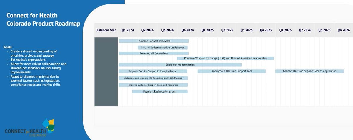
Connect for Health Colorado’s Product Roadmap is a good real-life example of a quarterly roadmap. On the left side of their deck, they’ve listed the goals of the roadmap. To the right, a Gantt chart lays out initiatives, such as Eligibility Modernization and an Anonymous Decision Support Tool, plotted across Q1 2024 to Q4 2026.
This gives stakeholders an immediate sense of task sequence, overlap, dependencies and certainty. It’s simple, time-boxed and audience-aware, exactly what a quarterly view should be.
Visme Alternative: Product Roadmap Presentation
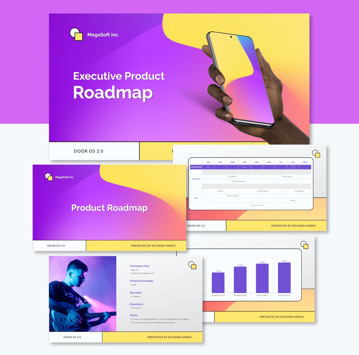
You could create one using product roadmap examples like the one above. It contains an entire presentation that frames lanes and milestones in months. It also includes outcomes and release windows.
This deck is a complete roadmap presentation that opens with a branded cover and then frames the main topic with a strong message “Door OS 2.0 aims to.” It includes a SWOT analysis, so stakeholders can see the context before the timeline. It also consists of a goals-to-success-metrics matrix and a dedicated Product Launch Date slide.
The core roadmap is a monthly grid with a Milestones row and swimlanes for Product and Dev. It’s great for showing ownership, dependencies and phase gates.
You can edit this deck entirely according to your branding guidelines, using our Brand Wizard and export to PPT for handouts.
2. Portfolio Swimlane Roadmap
A portfolio swimlane roadmap organizes multiple products or programs on a single timeline, grouped by lanes such as “Product A/B/C” or “Web/Mobile/API.” This format allows leaders to view capacity, sequencing and cross-team dependencies.
This view is handy when executives need to compare investment, priorities and funding across a whole product line, not just a single roadmap.
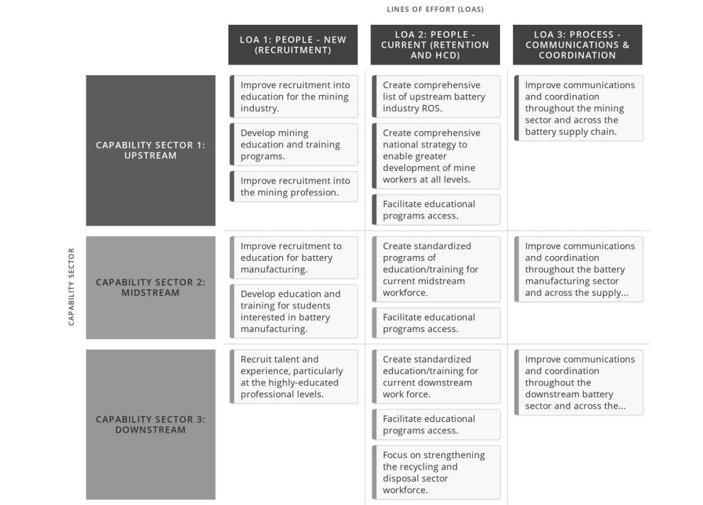
The BWD Capability Sector Strategic Roadmap - Swimlane View roadmap slide example lays out U.S. battery/minerals initiatives across three capability sectors (upstream, midstream, downstream). This project roadmap organizes work by lines of effort such as recruitment, retention/HCD, process and coordination.
Each card is an initiative. Lanes show accountability and the grid reveals interdependencies across academia, industry and government.
The result is a clean, presentation-ready swimlane roadmap that aligns many owners around one portfolio plan.
Visme Alternative: Multiple Product Roadmap Whiteboard
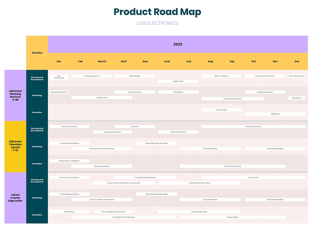
Among the free roadmap presentation templates available, this one is a solid choice for structuring a portfolio view. Each product gets its own lane along with a visual timeline for different stages of the product development process: planning and development, marketing and evaluation.
It’s an excellent fit for MVP launches and multiple schedules. The template includes visuals and custom graphics that keep stakeholders engaged and make the roadmap easy to understand.
3. Agile Sprint Roadmap
An Agile Sprint Roadmap maps upcoming sprints over weeks or months, showing planned features, user stories, and priorities in each cycle. Instead of long-term detail, it focuses on the near-term view: what the team is working on now and what’s next.
This format helps product owners, developers, and stakeholders align around sprint goals, track progress, and quickly adjust plans when priorities shift. It’s especially useful for agile teams that need flexibility while still keeping a structured, visual plan.
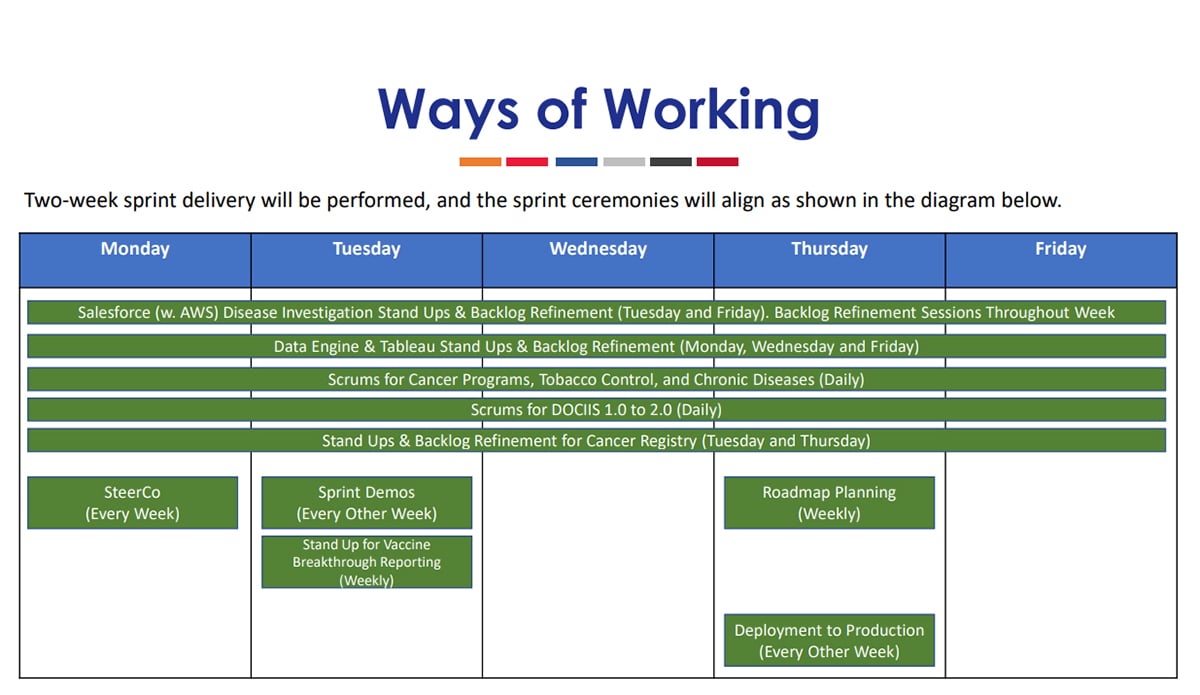
A great example is the DC Office of the CTO. They shared a planning deck that maps a two-week sprint delivery with ceremonies on a fixed cadence with sprint demos and production deployments happening in turns along with regular team-specific stand-ups/backlog refinement. It’s a practical pattern to anchor your roadmap rhythm on one slide.
Visme Alternative: Agile Project Sprint Gantt Chart
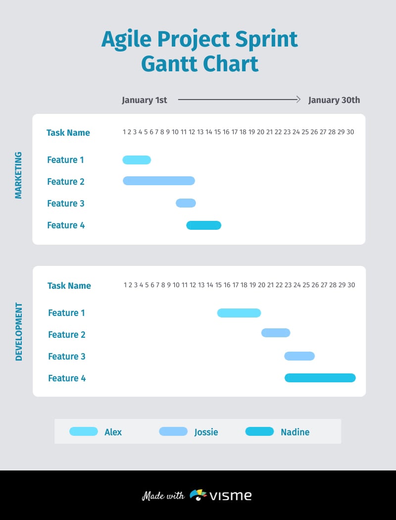
Instead of building one from scratch, use this agile project sprint template to streamline your workflow. The timeline already aligns tasks by timeframe and owners, making release cadence and handoffs clear from the start.
Follow the main guideline from Eddie Meardon, Senior Content Designer at Atlassian, when creating a Gantt chart.
“When you’re creating a Gantt chart, determine how long each task will take to complete. Be realistic, and consider any potential delays. Include buffer time in your schedule to accommodate unexpected delays and ensure the project remains on track.”
This template follows that principle with lanes for different departments and a legend showing who’s responsible for each task. Keep stakeholders in the loop with a view-only link, then export to PPT for the final handout after sign-off.
4. Release Plan Roadmap
A release plan roadmap allows project managers (PMs) to map when major versions or epics will drop, tying them to key delivery gates and business outcomes.
It’s ideal when stakeholders need to understand high-level execution, with clear milestones and without revealing every technical detail.
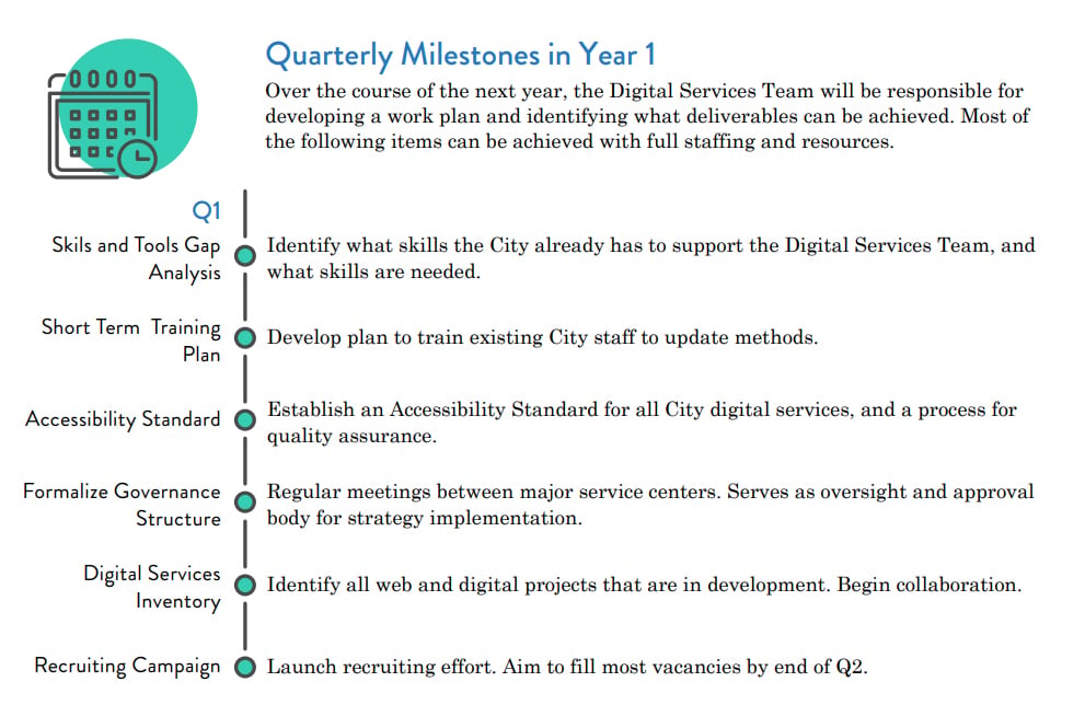
San Francisco’s government has a City Digital Services timeline that outlines quarterly milestones, including "Accessibility Standard" in Q1, “Build Service Directory” in Q3, “Business Process Mapping” in Q4, and “Ongoing Standards Development,” all with concise labels and a vertical time axis. It's a realistic roadmap slide example that you can easily replicate for your own release plan.
The chart ensures reviewers immediately understand what happens when and how work progresses throughout the year.
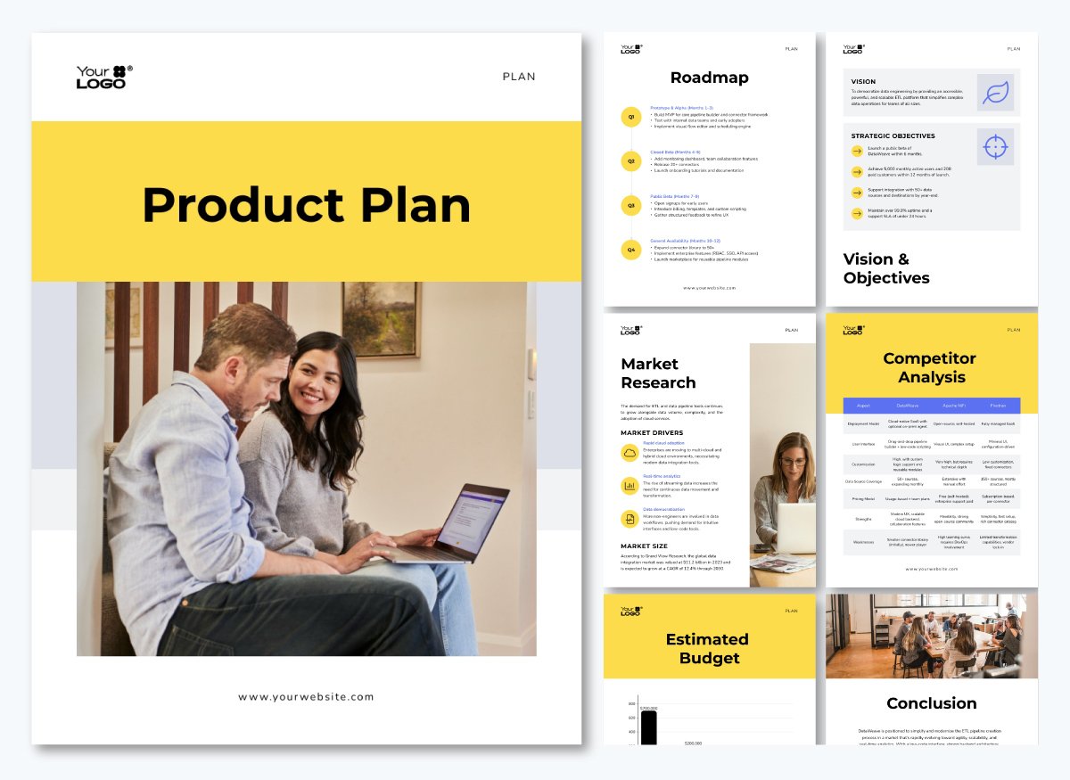
Visme Alternative: Product Plan Roadmap
This strategic product plan communicates the product development and release roadmap in a similar format. The roadmap is structured as a vertical list, with each quarter labeled at the top and the key tasks shown as bullet points beneath. This makes it easy to scan, compare quarters, and understand the sequence of activities at a glance.
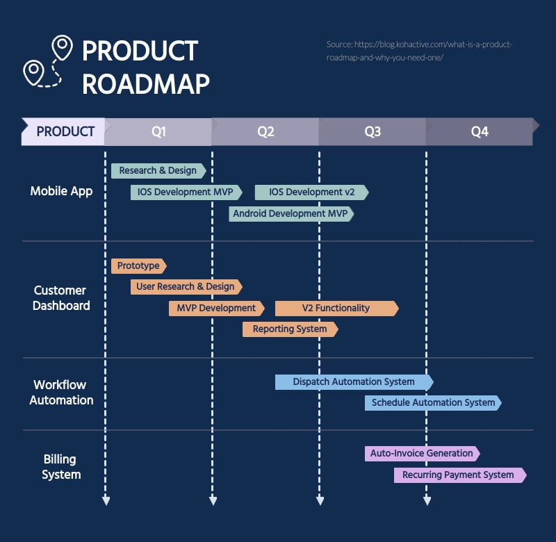
Prefer a more visually engaging format? This Product Roadmap Gantt Chart Infographic template maps epics or versions as horizontal bars with milestone flags, similar to the timeline view in the City example.
Lay out the version spans, label milestones (Beta, GA) and add a KPI legend for stakeholders.
5. Project Phase Roadmap
A phase-based roadmap is the easiest way to align sponsors on how work moves from discovery to delivery without drowning them in details.
Instead of features, you sequence decisions and outcomes across phases to visualize the multiple stages of product development.
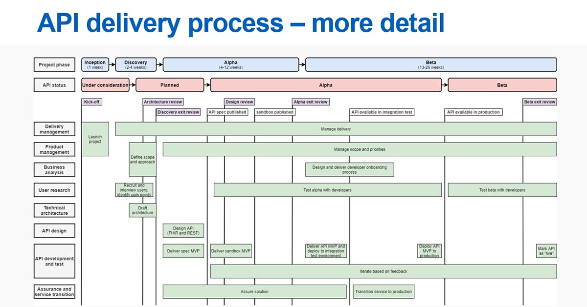
The NHS England API delivery process is a strong real-world model to take for reference. Their roadmap visualizes milestones such as Discovery, Alpha, Beta and Live with stage gates such as spec and sandbox publication, integration testing and production availability.
It also includes parallel swimlanes to show the ownership throughout the roadmap execution process.
The result is a narrative of outcomes and decision points, not a backlog, which is exactly what stakeholders, executives and PMs need in presentations.
Visme Alternative: Project Roadmap Template
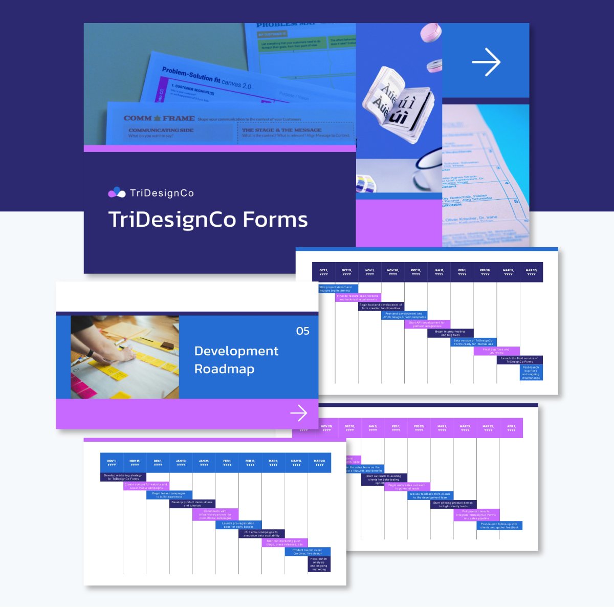
It’s possible to recreate the above presentation using this strategy roadmap template deck.
This deck mirrors the phased flow to label entry/exit criteria per phase and keep evidence (designs, tests, onboarding) in captions. It also provides complementary presentation slides with project objectives and multiple roadmaps at a time to prepare a full product review with stakeholders.
6. Marketing Launch Roadmap
A launch roadmap aligns marketing, product and enablement across pre-launch, launch and post-launch so dates, deliverables and ownership are unambiguous.
It sequences channel work like content, paid, PR and sales enablement against the product’s release window and stabilization period.
Choose a launch roadmap when you must coordinate multi-channel execution around a fixed date, make go/no-go decisions visible, and keep handoffs clear between teams.
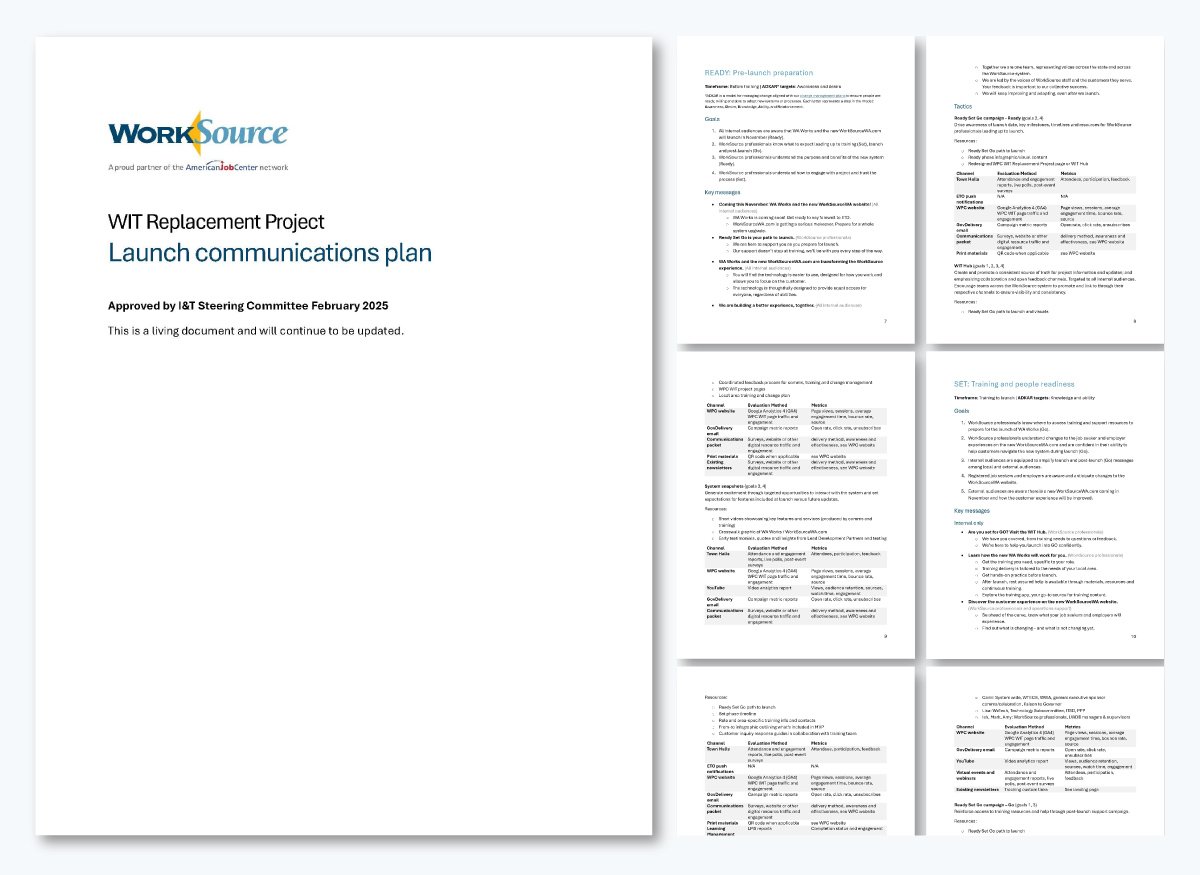
A strong example is Washington State’s WIT Replacement Launch Communications Plan, the roadmap explicitly prepares a “pre-launch through stabilization” (Feb 2025 to Feb 2026) and structures work as READY (pre-launch), SET (training/people readiness), GO (launch & stabilization) with clear goals, messages and metrics.
The plan details what happens at launch, including tasks like official announcement, feedback channels, toolkits and how post-launch reinforcement is measured, making expectations transparent for every audience.
This is the kind of phased narrative executives expect when they ask what’s coming, what’s live and what’s improving next.
Visme Alternative: Promotional Campaign Gantt Chart Infographic Template
Washington State’s plan is a text-based presentation and we have templates that follow similar formats like this one below.
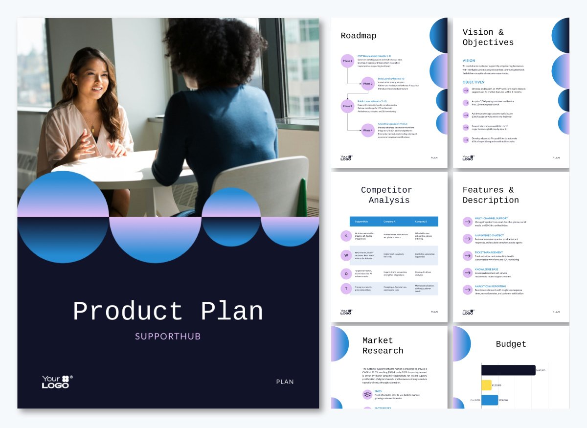
If you prefer a more visual approach, that’s where our templates really shine. You’ll get clear, engaging designs such as this Promotional Campaign Gantt Chart Infographic.
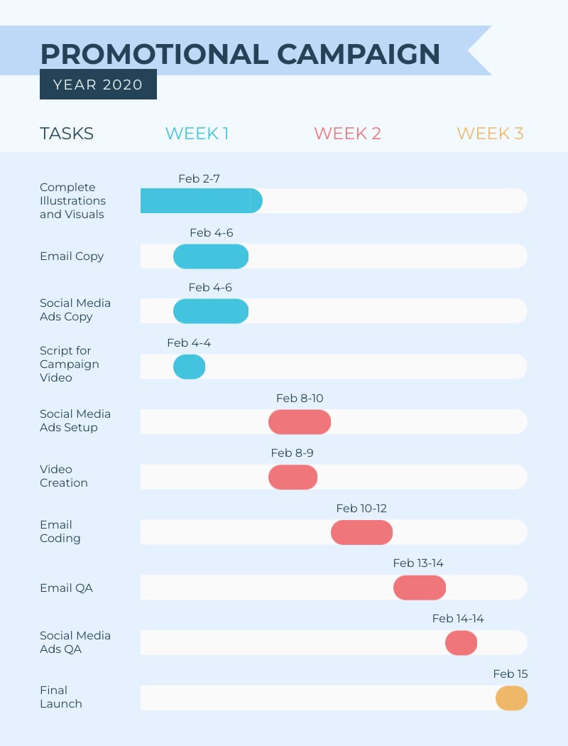
The canvas is built for three bands: Pre-Launch, Launch and Post-Launch, with milestone flags and channel lanes.
You can sequence content drops, press moments, paid bursts and enablement without clutter.
Owners, dates and dependencies are visible at a glance, which mirrors how leadership reviews launch readiness.
7. Technology / IT Modernization Roadmap
The modernization roadmap is useful when the Chief Information Officer (CIO) needs one timeline that sequences modernization across infrastructure, apps, data and security over quarters or years.
The goal isn’t creating a feature backlog. Instead, it’s a clear path to retire legacy systems, migrate to cloud/hybrid platforms, strengthen security and fund the new wave of capabilities.
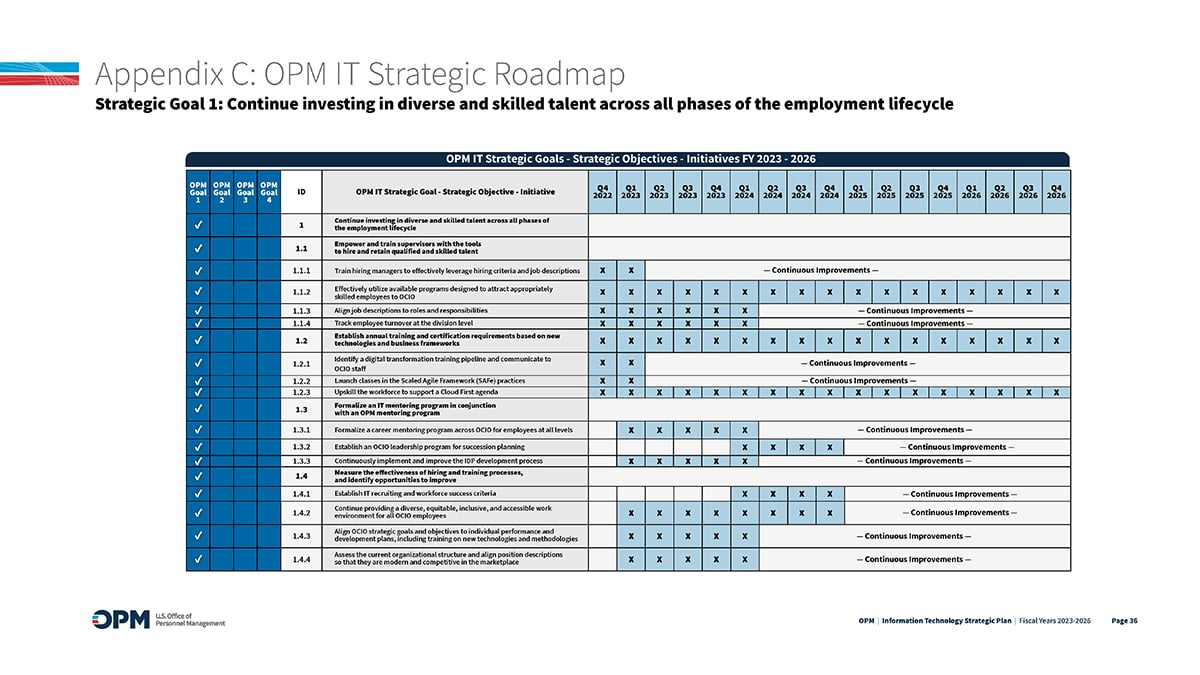
The U.S. Office of Personnel Management (OPM) IT Strategic Plan for 2023 - 2026 is a great example.
In Appendix C, the OPM publishes an IT Strategic Roadmap that lays out initiatives quarter-by-quarter through 2026, directly tied to strategic goals. It includes projects such as building a Federal Employees Health Benefits (FEHB) decision-support MVP and piloting a digital retirement system on a dated timeline.
This format is effective because leaders can see when each capability will launch, how it connects to objectives, and where to allocate budget gates for decommission, ATO and rollout.
Visme Alternative: Technology Product Roadmap Wireframe
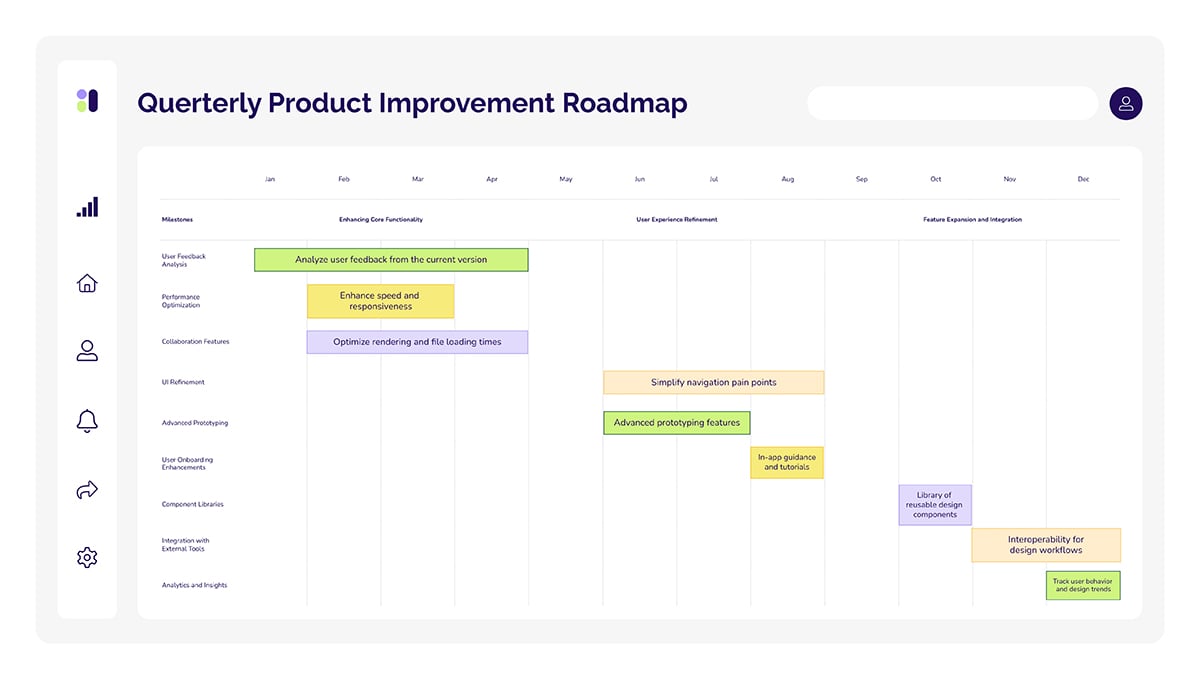
The Technology Product Roadmap Wireframe template is a good alternative for recreating a similar roadmap. This grid categorizes lanes by capability, including infrastructure, platforms, applications, data/security, along with quarterly milestones, all without visual clutter.
You can assign one lane per domain, tag each item, mark compliance gates (for example, ATO, penetration test, decommission) as flags, and link architecture docs via pop-ups.
8. Client Implementation Roadmap
A client implementation roadmap is the way to align provider and client on scope, ownership and go-live without burying them in task lists.
Choose it when service teams must coordinate week-by-week activities, clarify who signs off when, and define acceptance so there are no surprises at go-live.
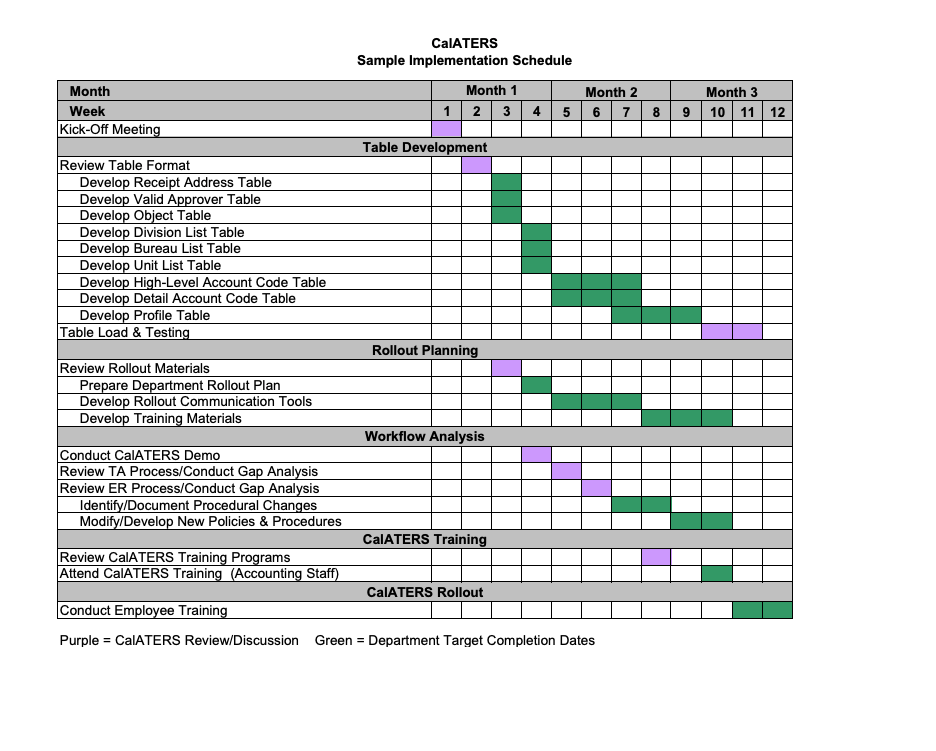
A solid example is the California State Controller’s Office CalATERS rollout. Their implementation timeline and activities page state that the average implementation takes from 10 to 12 weeks.
It points readers to a Sample Implementation Schedule that outlines week-by-week milestones, including kickoff, data table setup, workflow/gap analysis, training for accounting staff, employee training, communications and final rollout.
The schedule contains color-coded responsibilities for the project team and the client department. The result is a clear, time-boxed plan with concrete deliverables and readiness steps that stakeholders can follow.
Visme Alternative: Strategic Product Roadmap Plan
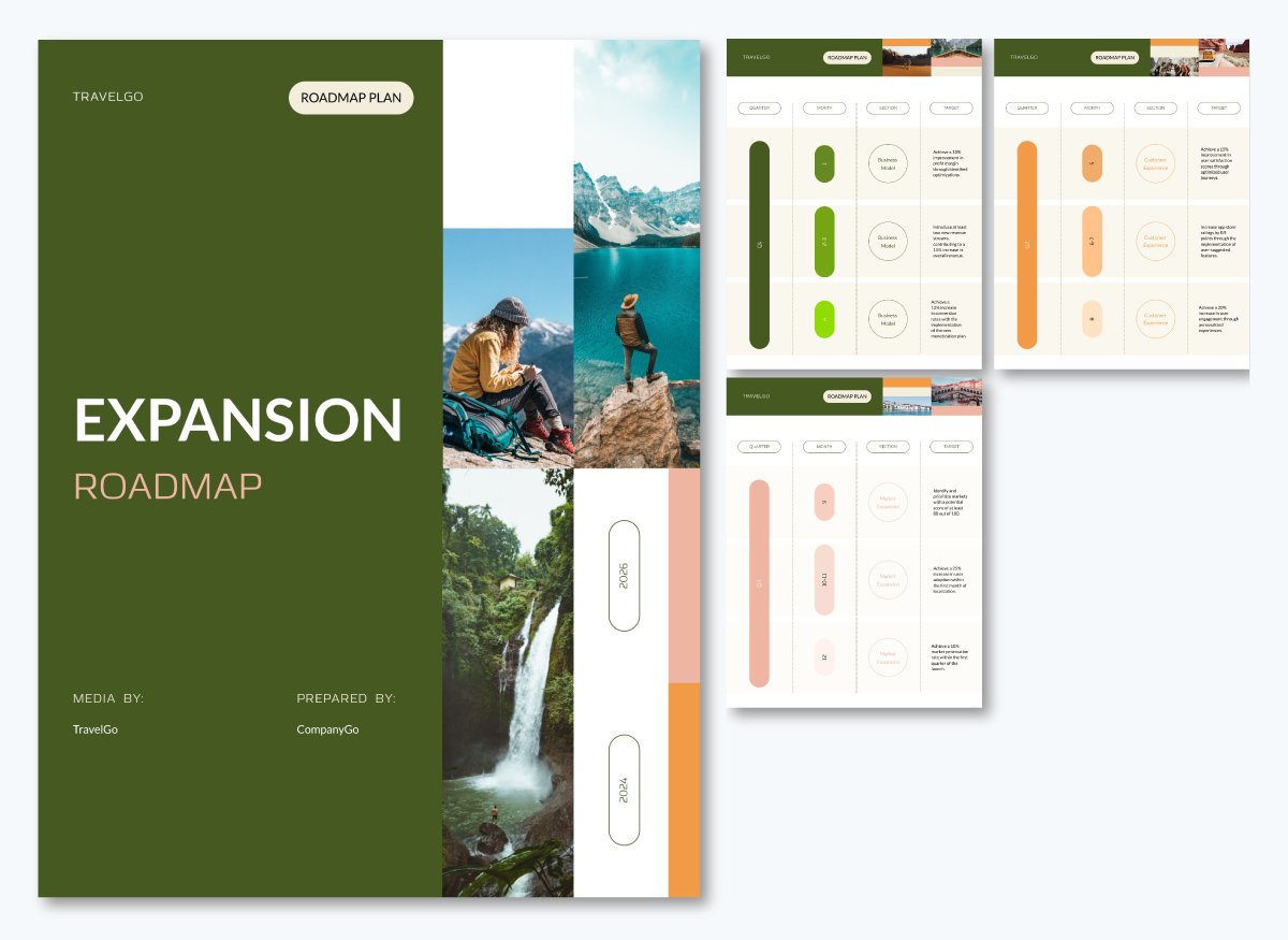
For an even better result, the Strategic Product Roadmap Plan template is a superb option. The document layout supports a service engagement better than a single slide.
To provide a concrete schedule, pair a quarter-by-week timeline with narrative sections that outline scope, roles, training and acceptance criteria, then keep both sides working from a single source of truth.
9. Software Development Timeline (Backlog → GA)
A software development timeline is a program-level, time-phased view that maps a release from discovery through hardening to General Availability.
It works best with predictable release trains, as it shows time windows and confidence levels where risk is high. That is, when the Project Manager (PM) requires a one program timeline that tracks work without dropping stakeholders to issue-level detail.
It mirrors real release practice, so dates, owners, cutovers, and gates are explicit at a glance.
Ideal for executive readouts and steering reviews when releases follow a fixed cadence like monthly or quarterly and you must expose code freezes, stabilization windows, and rollout phases without swimlane complexity.
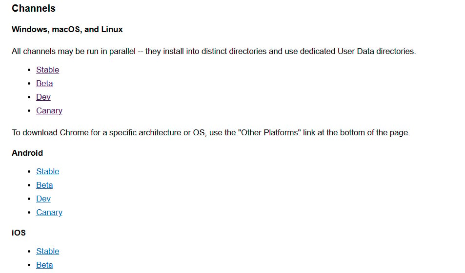
A real-life example is the publicly available Chrome release train. Google devs move changes through Canary/Dev for rapid iteration, then Beta for stabilization, and finally Stable for broad release, each with a defined cadence and calendar.
This staged flow shows decision points and timing clearly. It helps stakeholders and decision makers answer the question “where are we on the path to Generally Available (GA)?”
Visme Alternative: Software Development Timeline Roadmap
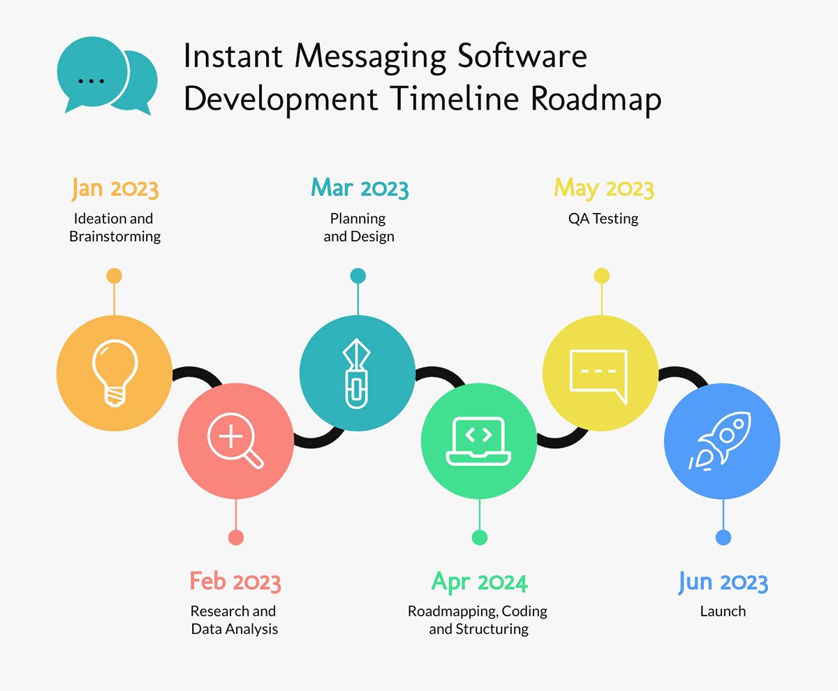
Although Google’s timeline seems straightforward, the Software Development Timeline Roadmap template provides a better and visual way to understand deployment and development schedules.
The canvas provides a clean, single horizontal timeline with dated milestone nodes that tells a straight path from backlog to GA. It’s perfect for executive readouts where you want the narrative without complexity.
It allows mapping stages like Ideation, Design, Dev, QA and GA as milestone nodes. You can also color-code phases and drop a code-freeze marker using an icon or link specs or tickets via hotspot. Hotspots let you transform any shape, text box, or graphic into an interactive link that opens pop-ups, embedded videos, or navigation prompts without cluttering the visual.
That means you can keep the timeline clean while allowing viewers to click through directly to specs or Jira tickets when needed without losing track of your presentation.
How to Create a Roadmap Presentation in 5 Steps
Building a strong roadmap presentation is about finding the structure that drives decisions.
As Khushi Arora, Co‑Founder of Crappy Presentations, puts it: your deck is the blueprint of the project and the foundation of your partnership with clients.
With that in mind, these five steps below show you how to turn strategy into a time-phased, owner-led narrative so priorities, dependencies, and confidence are visible to all stakeholders involved.
Use them to assemble a roadmap presentation that executives scan in seconds and teams execute without guesswork.
1. Define the scope and purpose: Write a one-sentence objective and time horizon, for example, “12-month product roadmap.” Specify the audience and the decision the roadmap supports to set boundaries and avoid irrelevant details.
2. Collect milestones and initiatives: Every solid roadmap slide has a list of decision-changing deliverables: releases, campaigns, or phase gates. Group by theme or workstream, and sanity-check with stakeholders and historical data to keep the plan realistic.
3. Build a timeline or framework: Place items on a clear timeline with lanes by owner/workstream and visible dependencies. Choose the right granularity (quarters, months, or weeks) and use time windows instead of hard dates where confidence is low. If you’re using Visme, drag-and-drop timelines/flows speed up layout while keeping styles consistent.
4. Add supporting details without clutter: Attach brief notes for owners, resources, risks, and 1 or 2 KPIs per initiative. Keep labels with fewer than five words and reserve longer context for notes or tooltips so the slide remains scannable.
5. Refine and adapt for the audience: Create an executive view with outcomes, themes, milestones and a delivery view with dependencies, owners, risks from the same source. You can upload an existing PPT to Visme or export your Visme deck as a PPT file when needed.
How to Present a Roadmap Presentation
When presenting a roadmap, whether it's just a roadmap slide example or a full blown presentation, your job is to facilitate the stakeholders with outcomes, options, and manage expectations and risk clearly enough to approve a path forward.
Consider these 5 tips below to structure a clear roadmap presentation.
- Design a decision-first deck: Open with a one-slide executive view with objective and scope, 2 to 5 themes, 3 to 7 decision-changing milestones, and explicit trade-offs. Follow with a delivery view that exposes owners, dependencies, and risks, then state the specific request and the next review date.
- Make uncertainty explicit: Replace hard dates with time windows where confidence is low and show confidence badges (High/Med/Low). Pair this with a simple trade-off panel so shifts in scope, time, or resources are visible at a glance.
- Tell an outcome-driven story: Frame the roadmap around business results. Lead with outcomes (OKRs), show the evidence behind priorities, then map initiatives around them. Close by naming the approval required to stakeholders.
- Show trade-offs visually: Use simple visuals like a matrix or sliders to show trade-offs instead of just listing them. Reinforce what is lost from scope, missing resources or timing shifts. Improve alignment between stakeholders and the presentation and reduce post-meeting disputes.
- Anchor priorities to realistic capacity and measurable impact: A crucial issue in roadmap presentations is the disconnect between what teams want to build and what they can realistically ship. That’s why it’s important to focus on high-impact, non-negotiable features, then frame those priorities around team capacity and success metrics. This creates trust early in the presentation and helps stakeholders weigh feasibility.
Olya Zaplatynska, Product Marketing Manager at Visme, advises making the must-ship features explicit and then placing them on a capacity-aware timeline, calling out risks upfront, and naming the KPIs that will prove success.
Roadmap Presentation FAQs
A roadmap presentation is a high-level, time-phased view of a project or strategy that maps outcomes, milestones, owners, and time windows. It aligns stakeholders by making priorities, dependencies, and sequencing clear at a glance.
The benefits of using a roadmap presentation are:
- Stakeholder alignment on goals, priorities, and sequencing.
- Expectation management via time windows and confidence levels (not rigid dates).
- Transparent trade-offs and risks for informed decisions.
- Outcome-based progress tracking and accountability.
- Early visibility into owners, dependencies, risks, and assumptions.
- A single source of truth for progress, reviews, and accountability.
To show a roadmap in a presentation, use a decision-first narrative. Open with an executive slide that states the outcome and scope, group work into themes, use time windows, and highlight 3 to 7 pivotal milestones with clear tags or status.
Follow with a delivery view that maps owners, dependencies, and risks, using confidence levels instead of fixed dates. Close by stating the approval you need and the next review date to lock expectations.
The main purpose of a roadmap is to align stakeholders on the strategic direction, including what outcomes to pursue, in what order and over what time frame, so decisions, resources, and expectations stay coordinated.
A roadmap is a strategic overview that sets direction, outcomes, and sequencing over time. A plan turns that direction into execution.
Some common mistakes when creating a roadmap presentation include:
- Treating it as a status report instead of a decision tool with a clear ask.
- Using hard dates where confidence is low. No time windows or confidence levels.
- Overcrowded slides. Owners, dependencies, and risks aren’t explicit.
- Focusing on features instead of outcomes. No link to OKRs or KPIs.
- Hiding trade-offs and options, so stakeholders can’t choose.
- One-size-fits-all deck. No executive vs delivery versions.
- Missing “today marker” or “next review” date and no decision or change log.
Manage, Share & Execute Projects & Plans with Visme
Whether preparing a quarterly plan, a product launch review, or an executive update, your roadmap presentation must drive clear decisions and set realistic expectations.
High-performing teams treat the roadmap as an operating system. They use one executive slide for requests, one delivery view to track owners and dependencies, and a dated decision log to hold everyone accountable.
To keep that standard consistently, you need a tool that makes building and updating your deck effortless. Visme gives you ready-made roadmap templates and a host of powerful features and AI tools to streamline project planning and execution.
Sign up for Visme today and start building a roadmap presentation that aligns stakeholders and keeps your projects on track.
Create Stunning Content!
Design visual brand experiences for your business whether you are a seasoned designer or a total novice.
Try Visme for free

