How to Create a Recommendation Slide that Impresses Clients & Founders

Every great presentation leads up to an aha moment.
It's when all that scattered data and ideas suddenly make sense and those suggestions morph into actual decisions.
That pivotal moment shows up on your recommendation slide.
Believe it or not, this slide carries enormous weight.
Executives rely on them to make million-dollar decisions. Founders pivot strategies based on them. Consultants prove their worth with these slides.
The best recommendation slides don't just present options; they also guide people toward the right choice.
But here's the truth: writing it is hard. Not because it’s long, but because it demands razor-sharp clarity. You need to distill weeks of analysis into one bold, actionable takeaway.
That’s where most people get stuck.
I've analyzed hundreds of winning presentations and the best recommendation slides follow a winning blueprint I’ll show you.
In this post, I’ll walk you through every step of writing a recommendation slide that gets buy-in. You'll see real examples, learn what makes them effective and get access to templates you can customize to fit your own message.
Table of Contents
- What Is a Recommendation Slide?
- When to Use a Recommendation Slide
- What to Include on a Recommendation Slide
- 3 Real-life Examples of Recommendation Slides
- 9 Steps to Create an Effective Recommendation Slide
- 6 Recommendation Slide Templates to Use
- How to Present Your Recommendation Slide
- Recommendation Slide Mistakes to Avoid
Quick Read
- A recommendation slide is that section of a slide deck that offers actionable solutions that guide decision-makers toward the next steps.
- To create an effective recommendation slide, use a clear title, briefly summarize the context and list three to five actionable recommendations with benefits and proof.
- Show priorities or timelines, customize your design and easily download or share your slide for presentation.
- When presenting your recommendation slide, start by linking the problem to your proposed actions, explain why each one matters and the benefits. Use visuals to reinforce your points, engage your audience through body language and pacing, take questions and close with a clear call to action.
- Avoid common mistakes like overcrowding your slide with too many recommendations, using weak or hesitant language that undermines your authority and ignoring potential risks.
- Visme makes creating compelling recommendation slides a breeze. Access an extensive library of customizable templates along with features like AI tools, brand kit integration, animation and interactive elements, stock photos and design assets, presenter studio and many more.
What Is a Recommendation Slide?
A recommendation slide is that part of a slide deck where you start suggesting clear next steps or solutions to a previously highlighted problem.
It's typically used in reports, pitch decks, audits and research presentations to guide decision-makers (clients, founders, investors, or executives) toward action.
The recommendation slide is often grouped with elements like the executive summary, company profile, project timeline and others, depending on the presentation’s focus and goals.
Take a look at the example below from the Visme template library:
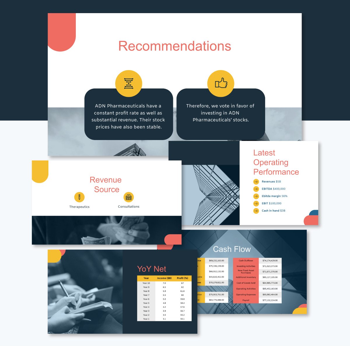
Notice how it doesn’t try to say too much. Instead, it highlights just a few key points and supports them with simple visuals, making the message easy to follow at a glance.

When to Use a Recommendation Slide
Presentations that are purely informative, educational, or for update purposes may not need recommendation slides. However, you need recommendation slides in the following scenarios.
- Internal reviews with decision makers: During team meetings, board updates, or quarterly reviews, a recommendation slide simplifies choices. It speeds up internal alignment and focuses the conversation on outcomes.
- Strategy and Planning deck: Strategy without recommendations feels like thinking without action. Whether you’re setting team goals, planning a launch, or reviewing yearly performance, a recommendation slide will be a great way to highlight action plans.
- Consulting presentation: When presenting an operational review or strategic audits, clients don’t expect you to slam them with findings and walk away. They are counting on you for interpretation and suggestions for next steps. That’s exactly what they are paying for. A good recommendation slide shows you understand their challenges and have a clear path forward.
- Post research or evaluation report: After presenting survey findings, user research, or market analysis, your audience wants to know what to do next. For instance, a recommendation after a survey could be focusing on building the features that users requested most in the survey or using insights from market analysis to adjust website copy and marketing campaigns.
- Pitch decks and investment presentation: A recommendation slide, in this case, typically outlines the specific ask and proposed next steps for potential investors. It could be along the lines of: “We’re raising $2M in seed funding and are currently scheduling follow-up meetings. We’re also happy to share our detailed financial model upon request.”
What to Include on a Recommendation Slide
Here’s a quick breakdown of what to include in your recommendation slide, plus examples to guide you:
| Element | What to Include | Example |
| Clear Recommendation | Specific action or decision | Launch pilot program in Q3 |
| Brief Context | One-sentence problem or insight summary | Customer churn has increased by 12% YoY |
| Expected Benefit | Tangible value or outcome | Could reduce churn by 25% in six months |
| Proof or Support | Data, insight, or rationale | Survey shows 60% of users want this feature |
| Timeline or Priority | When or in what order to act | Phase 1: Rollout to top 3 markets first |
| Clean Design | Focused layout with minimal text | 2–3 bullet points, simple icons, bold header |
3 Real-Life Examples of Recommendation Slides
To help you understand what works and what to avoid, here are two real-life examples of recommendation slides.
The Jazz Pharmaceuticals Investment Banking Pitch Book Recommendation Slide
Source: Goldman Stanley
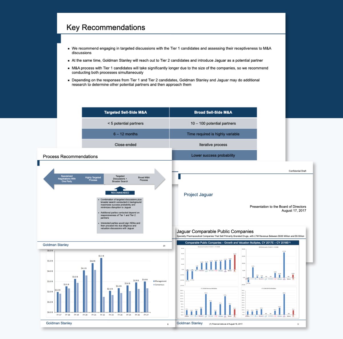
In this deck, Goldman Sachs pitched to Jazz Pharmaceuticals as the ideal advisor to help explore and execute a strategic sale or partnership. The recommendation slide is clean, well-organized and gets many things right.
The top half presents a short bulleted list summarizing Goldman’s proposed course of action. Each point flows into the next, building a case for why dual-tracking is necessary, especially given the complexity and timeline of working with Tier 1 candidates.
The language is concise, formal and avoids hedging, which strengthens the authority of the recommendation.
Another reason this recommendation slide stands out is that it goes beyond listing key recommendations; it also breaks them down with flowcharts that visually outline process improvements. Since the recommendation isn't close-ended, they also added a table that provides context about the timeline for more research.
Envisioning America’s Future Postal Service Recommendation Slide
Source: McKinsey & Company
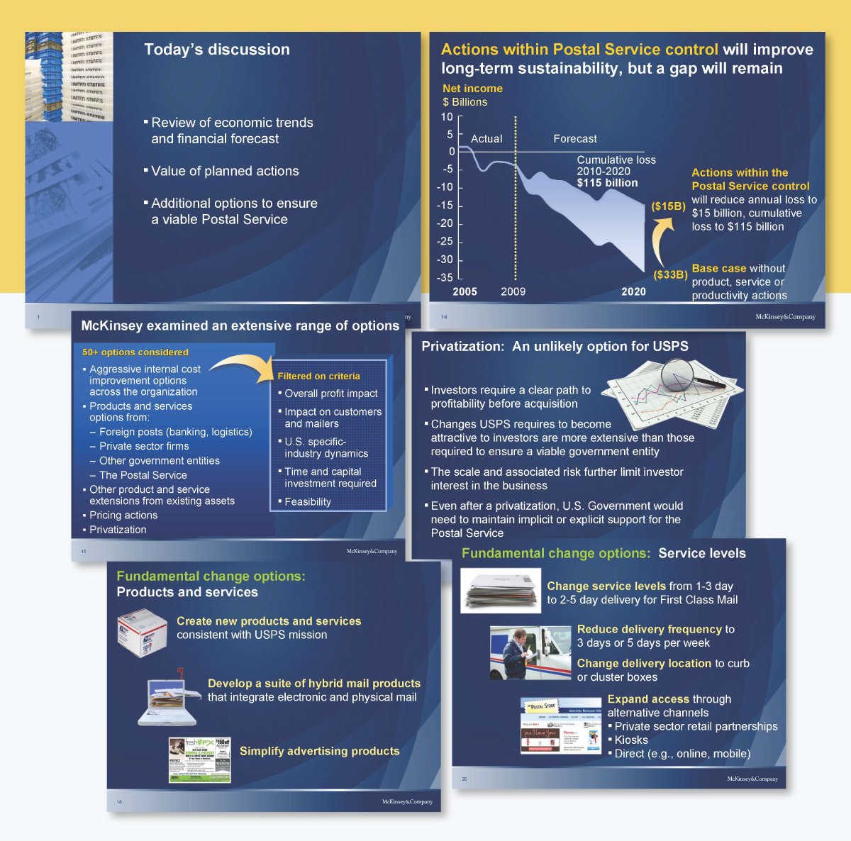
This presentation by McKinsey was created to provide recommendations on how America's postal service could be improved.
The recommendation slides begin with a solution map, which provides a quick visual overview of the five action points to address the $ 15 billion gap. It then dives into the logic and tactics under each lever. This McKinsey style works because it’s like giving executives a map before a tour. It helps them:
- Feel confident in your thinking.
- Understand the structure of your solution.
- Engage more deeply, not get lost in detail.
I also love how each of the five areas is visualized with simple, recognizable icons (e.g., a stamp for pricing, a U.S. map for service levels, the Capitol for policy). This gives visual memory anchors, which are especially helpful in executive discussions.
Project Jaguar Market Update and Summary Recommendation Slide
Source: Goldman Stanley
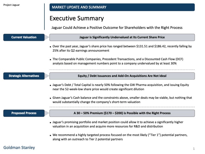
This third example is well structured and reveals a few things to watch out for in your recommendation slide.
The recommendation slide is from a progress update for an ongoing client engagement. While the structure is solid, some design and content issues dilute its effectiveness.
The slide uses a visually appealing table organized into three labeled sections. This makes it easy to scan and compare both tracks side by side. However, the slide is text-heavy.
The dual-recommendation layout, separated by a vertical line, makes the left-hand column feel secondary and less relevant. The two recommendation areas are also logically misaligned. In fact, the comparison might have been more impactful if spread across two dedicated slides, giving each approach room to breathe.
More importantly, the left-hand recommendation is vague and indecisive. Compared to the Jazz slide, the points are not actionable. That kind of ambiguity slows down decision-making.
Steps to Create an Effective Recommendation Slide
Follow these steps to build a recommendation slide that’s clear, actionable and well-designed:
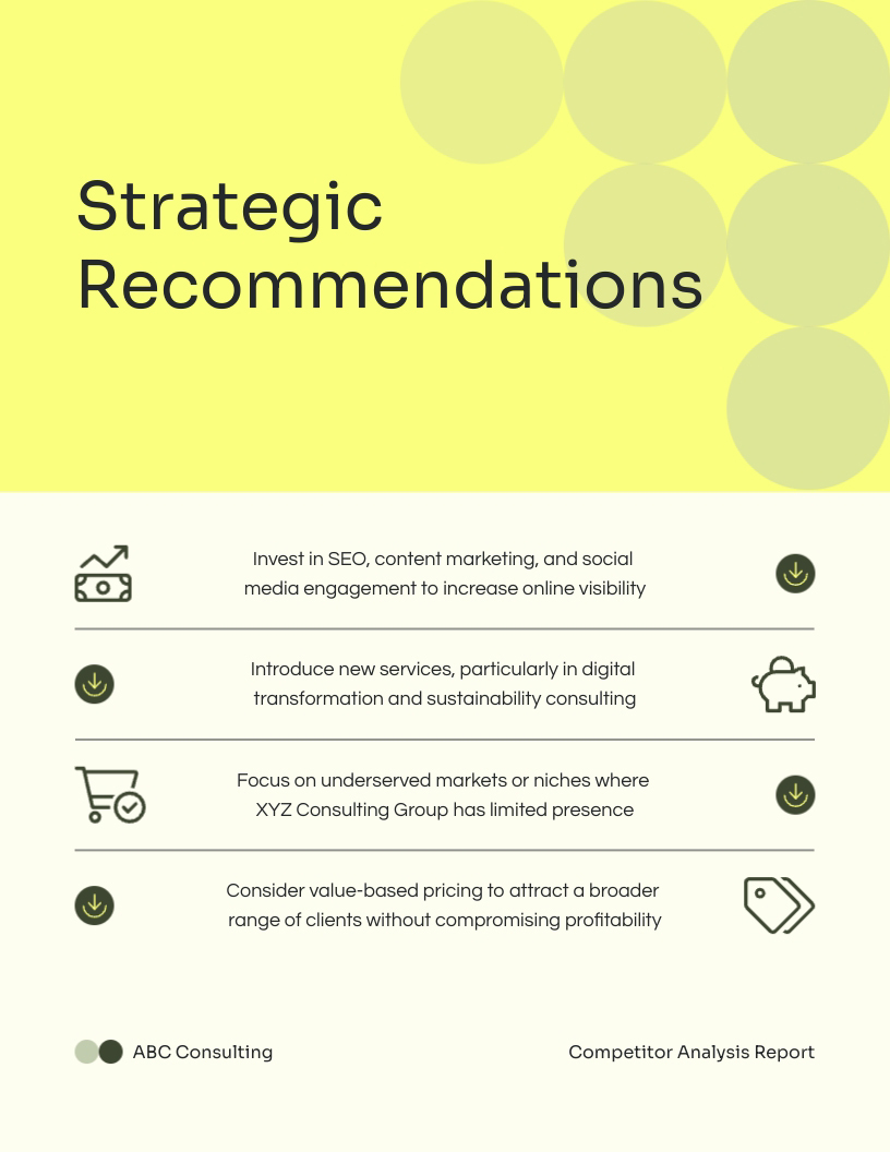
Step 1: Use a Clear, Decisive Title
Start with a title that tells your audience exactly what the slide is about. Stick with straightforward labels like “Recommendations,” “Next Steps,” or “Proposed Actions.”
Avoid vague titles like “Thoughts” or “Ideas”. This slide should reflect a confident, well-considered decision. Use a bold H1 font to make the title stand out.
Step 2: Summarize the Context
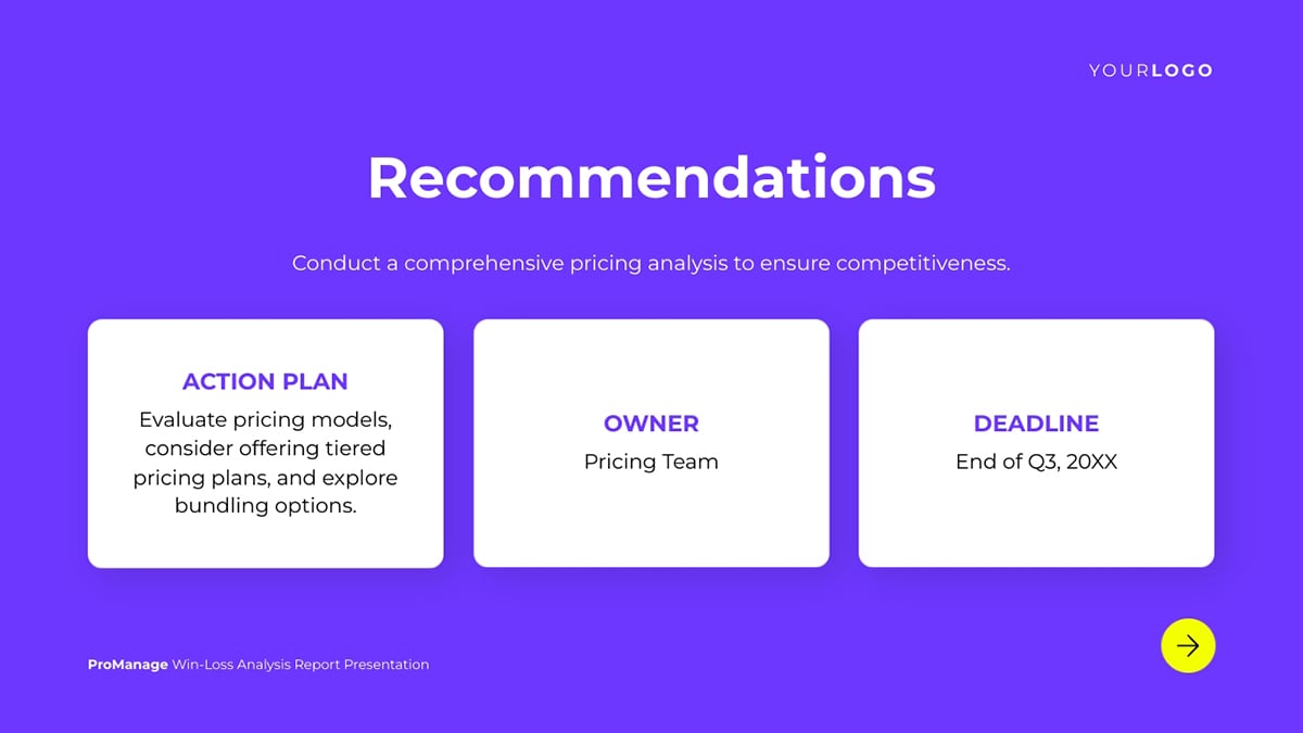
While optional, a short context line helps ground your recommendations in the bigger picture. It briefly reminds your audience what issue or goal you're addressing while serving as a natural lead-in.
Place it just below the main heading or above the recommendation list so it supports the content without drawing attention away from it. Use a medium-weight or standard-size font.
Check out how this template does that:
Step 3: List Actionable Recommendations
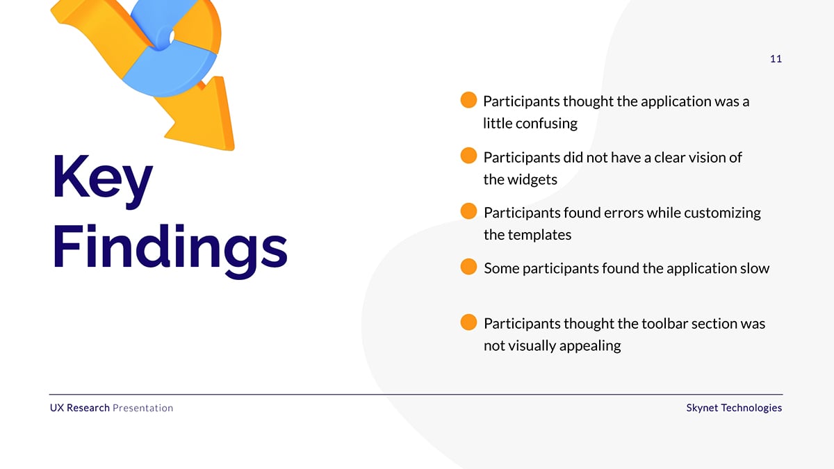
Every suggestion should be something the audience can act on, not just think about. Use short, command-style sentences that start with a verb. Say “Launch weekly email digests for top users,” not “Consider improving communication.”
Stick to three to five recommendations, especially when in sentence format. That’s enough to show thoughtfulness without overwhelming the audience.
If you're presenting live, you can expand on each point with as much detail as needed or your time permits. But keep the slide itself scannable. Aim for no more than 12 words per point.
Step 4: Attach a Benefit to Each One
Pair each recommendation with a one-line explanation of why it matters. This gives each point more weight and helps decision-makers understand the upside.
For example: “Launch a referral program will boost organic growth without extra ad spend.”
Place the benefit directly below the recommendation in smaller or lighter text. If space is limited, a side-by-side layout works too. You can also consider using icons for visual emphasis.
Step 5: Add Proof Where Possible
If you have a data point, quick insight, or example to support a recommendation, include it. You don’t need to turn the slide into a report — just enough proof to show that the suggestion is informed.
For instance: “Users who complete onboarding convert 2.3x faster”
If you lack original data, cite industry benchmarks or patterns: “Similar companies saw 20% growth after automating onboarding.”
Use callout boxes, italics, or footnotes to tuck proof under each point.
Step 6: Show Priority or Timeline
All your recommendations may not have the same urgency or impact. Adding a sense of sequence helps the audience focus on what matters most.
You can label items as “Quick Win,” “Short-Term,” or “High Impact,” or sort them by phase: “Now,” “Next,” “Later.”
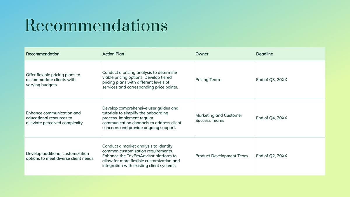
You can also add deadline dates to show when each recommendation should happen, like what was done in the recommendation slide below.
When you're presenting options, help clients prioritize by labeling items with tags, like “Essential” or “High ROI.” This makes decision-making faster and more focused.
Step 7: Find a Template that Matches Your Layout
If you don’t want to spend time designing from scratch, use templates. Visme has a wide range of recommendation slide templates for different industries and use cases.
Already working with a presentation template, but prefer the recommendation slide from another? No problem. Visme allows you to mix and match slides across various templates.
Still can’t find a recommendation slide that fits your needs? Try Visme’s AI presentation maker. Just enter a detailed prompt describing the kind of recommendation slide you want, including layout, tone, design style and content type and the tool will generate a unique, ready-to-use slide for you.
Step 8: Customize the Slide
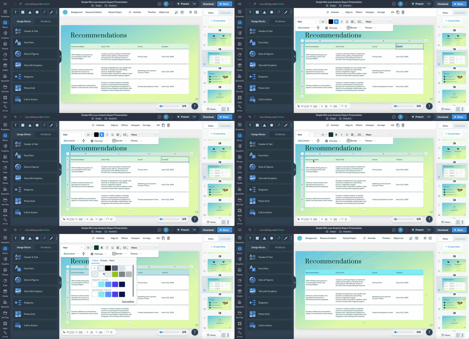
Once your template is in place, it’s time to make it yours. Visme gives you everything you need inside the editor.
Start with the content. Replace the placeholder text with your own recommendations. If you need help refining the wording, use our AI writer to phrase your points clearly and concisely.
Next, update the colors. Keep your slide consistent with the rest of your deck by applying a preset theme, or use Visme’s brand design tool to instantly pull in your fonts, colors and logos from your brand kit.
Finally, replace the icons and images to match your message. You can choose from thousands of stock photos or, if you need something more specific, use Visme’s AI Image Generator to create custom visuals with a simple prompt.
Step 9: Download and Share Your Recommendation Slide
Once your recommendation slide is polished and ready, it’s time to put it to work.
Download your presentation in PNG, PDF, or JPG format. Need just the recommendation slide? Visme also lets you download individual slides.
You can also share your slide online via a public or private link (with optional password protection), or embed it on your website or internal dashboard using Visme’s responsive embed code.
If you’re not presenting live, you can use Visme’s presentation studio to record yourself walking through the recommendation slide and send it to stakeholders. This is perfect for async presentations, client handovers, or internal updates where you want to control the message and delivery without scheduling a live meeting.
6 Recommendation Slide Templates to Use
To further make things easier, we’re sharing these templates so you don’t have to start from scratch or second-guess what belongs where.
You can easily customize these templates to fit your needs using our intuitive editor.
1. Corporate Win-Loss Analysis Presentation
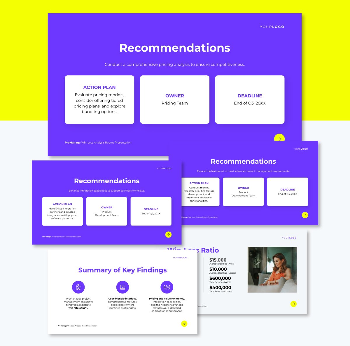
Use this template to clearly connect your insights with actionable next steps. The layout uses neatly segmented content blocks—Action Plan, Owner and Deadline—making each recommendation easy to interpret at a glance.
There’s a one-liner beneath the heading that provides just enough context. The color contrast and simple typography also keep the design visually engaging while ensuring readability.
If your audience needs a closer look at the supporting data, you can link out to detailed breakdowns and refer to them as needed. This keeps the slide focused while giving room for more detail.
2. Corporate Stock Pitch Presentation
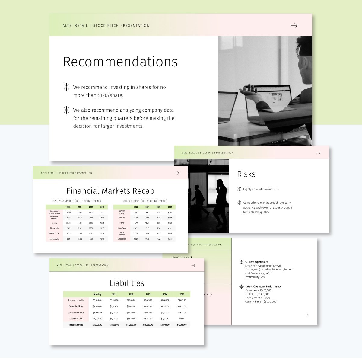
Want to help your client decide whether to invest or hold off? This stock pitch presentation template is a smart way to present your recommendations and back them up with clear reasoning.
The soft gradient header and minimalist layout keep the slide clean and modern. I love how it opens with a focused recommendation summary that gets straight to the point. The layout gives you just enough space to make your case, whether you’re suggesting a target share price or advising further analysis.
Once the design is ready, share it using a live link or download the presentation in multiple formats, including PDF, image and PPTX.
3. UX Research Recommendation Slide Template
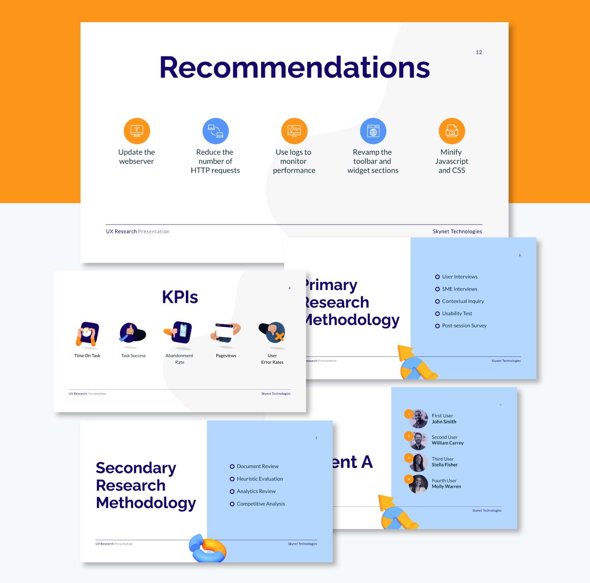
If you’re looking for a sleek way to move from research to action, this slide nails it. The recommendation slide is clean and easy to digest.
It uses a bold yet minimalist style by alternating between a dual-color scheme with plenty of white space. The horizontal layout works well for giving equal weight to each point, while the short, punchy copy lets you deliver recommendations without over-explaining.
You can easily add or replace slides, swap the icons, colors and fonts and tweak the content to fit your needs.
4. Product Win-Loss Analysis Report Presentation
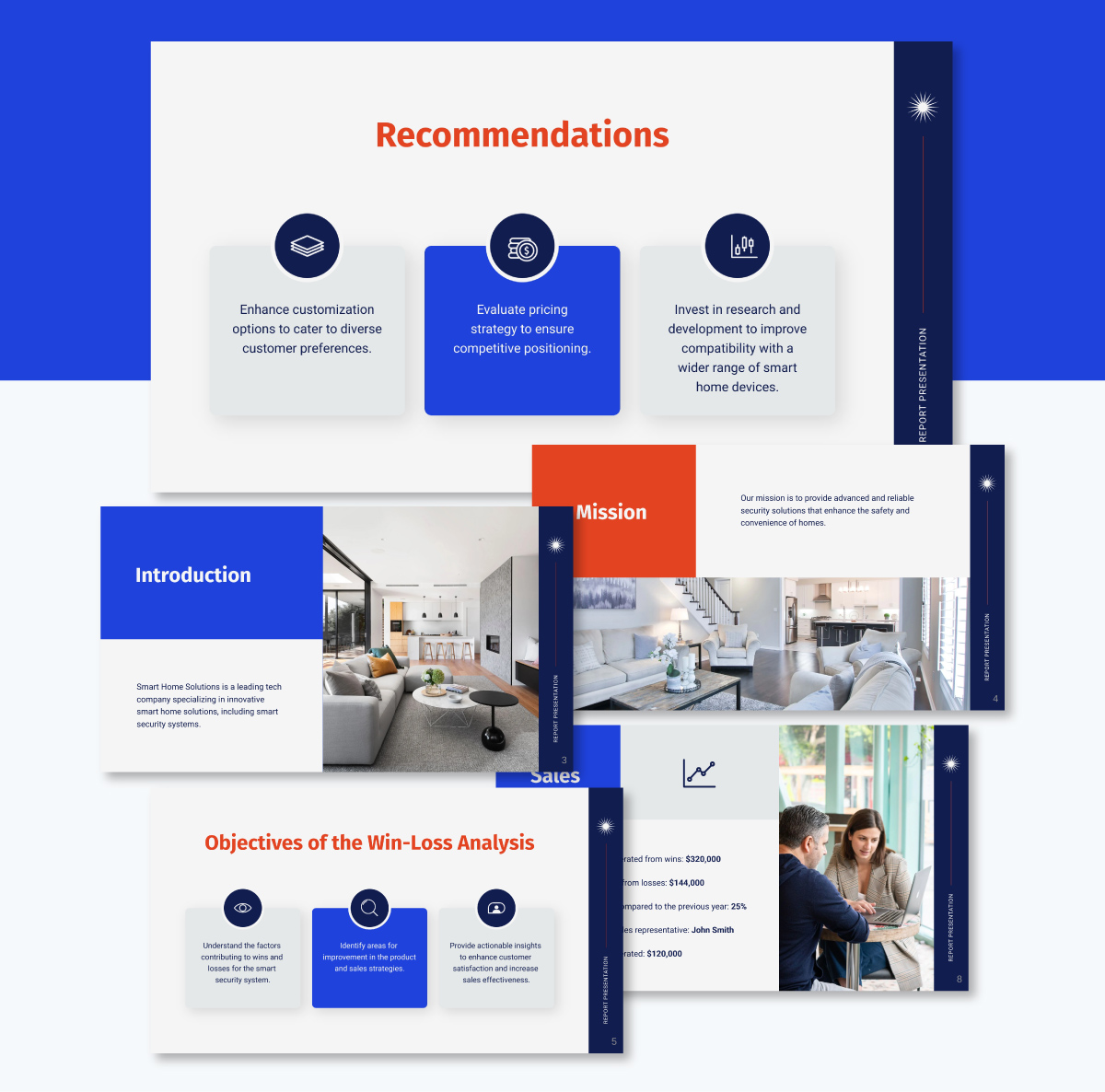
Whether you're a product manager or market analyst evaluating your product's performance, this product win-loss analysis has a structured recommendation slide that can help you communicate your findings.
It begins with an overview of your product's market status, then dives into key recommendations such as customer preferences, pricing and compatibility with other technologies.
The template features a clean, modern design with a blend of blue and gray tones, accented by icons that highlight key insights.
Do you need a second pair of eyes or extra support with your recommendation slide? Visme makes it easy to collaborate with your team in real time. You can leave comments right on specific sections, tag teammates for input and secure the document password protection so only the right people have access.
5. Employee Productivity Improvement Presentation Template
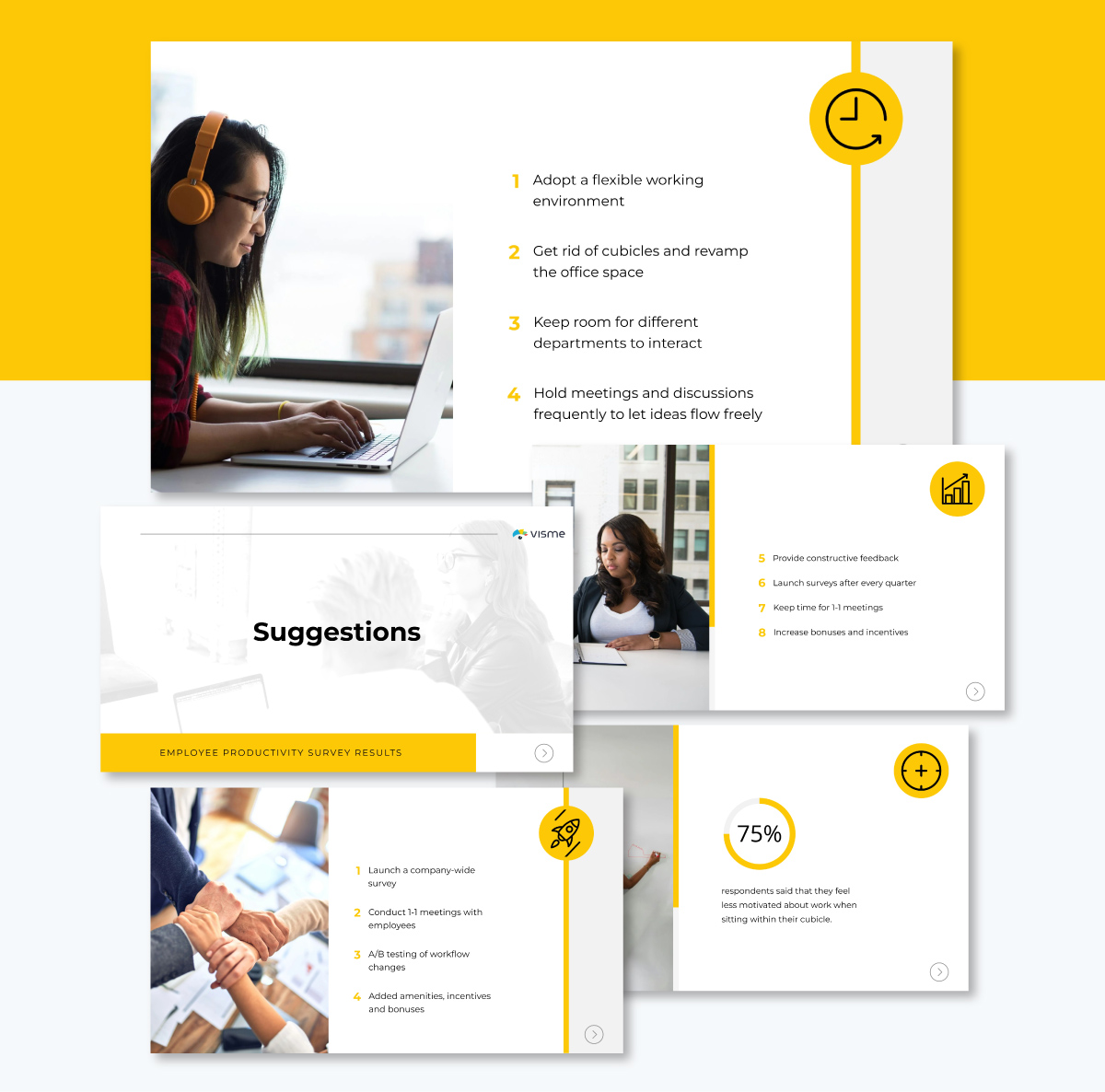
This bold, visually engaging template is ideal for sharing a long list of recommendations with detailed information. Instead of cramming everything onto one slide, it splits the recommendations across two clean, focused slides.
The structured format with numbered steps and clear section breaks ensures the productivity strategies are easy to follow and visually engaging.
I love how the minimalist design keeps the focus on the content, while subtle accents (like divider lines and bullet points) make it look great without being distracting.
Once you’ve shared your slide deck, our analytics tool helps you to easily track views, time spent on it, and other engagement metrics.
6. Company Stock Pitch Presentation Template
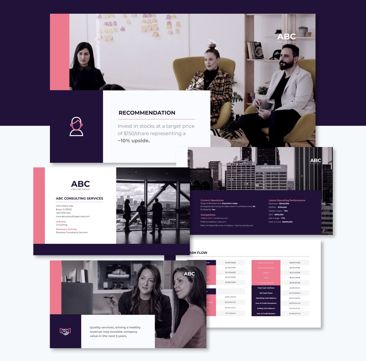
If you’re presenting to audiences like VCs, analysts, or executive teams who need clear, actionable insights that go straight to the point, this template is a smart choice.
The recommendation is displayed in a single, high-impact block with space for a concise recommendation, making it easy to absorb in seconds. Bold labels and minimalist icons add just enough visual structure to guide the viewer without distracting from the message.
With Visme’s workflow management feature, you can assign your recommendation slides for other team members to work on, set deadlines and track their progress.
How to Present Your Recommendation Slide
Creating the slide is only half of the job; how you present matters just as much. Here are a few tips to help you present your recommendation slide with clarity and confidence:
Present Each Recommendation in a Structured Way
As you walk through each recommendation, use a clear structure to keep your explanation focused and easy to follow. Start with what the recommendation is. Be direct and specific.
Then explain why it matters; key benefit or outcome. This could be improved revenue, reduced churn, or faster onboarding.
Finally, set expectations. Briefly mention any risks, costs, or dependencies that might come up. For instance, you could say, “I know some might worry about the marketing workload, but automating content curation cuts manual effort by 50%.”
This simple three-part format makes each point feel practical and complete
Use Your Slide Visuals Actively
Don’t just read it out word-for-word; use the visuals on the slide to guide and reinforce what you’re saying. According to John Medina’s Brain Rule #10, people forget words fast but remember pictures for days. Add an image to what you say and you can boost recall from 10% to 65%.
That’s why your visuals matter. As you speak, point to elements like an icon, label, or specific recommendation, using your mouse or a laser pointer. This anchors attention and reinforces your message.
If your slide includes data points or annotations, give your audience a moment to absorb them. A well-timed pause allows your message to land without overwhelming them. To make this seamless, rehearse syncing your gestures and explanations so the delivery feels confident and intentional.
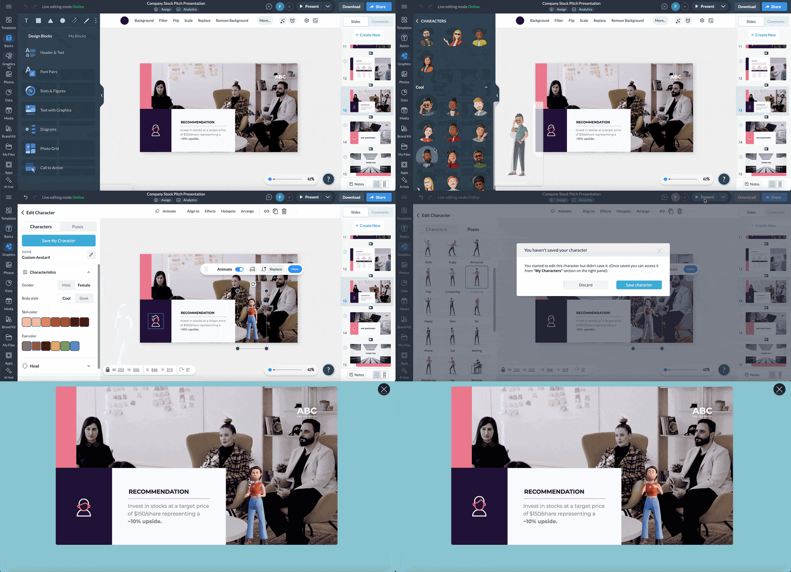
Engage Your Audience as You Present
Presentation is a two-way street. While it’s not always practical to take questions mid-slide, gather feedback by watching for non-verbal cues like nods, eye contact, or puzzled expressions.
If you notice confusion or disengagement, slow down, clarify, or rephrase your point. Use open, confident body language: face the audience, keep your hands visible and make eye contact where possible. Avoid rushing. Give each point space to land so the message sticks and your audience feels heard, not steamrolled.
Close with a Clear Call to Action
Whether your recommendation is the final slide or not, always end with a clear call to action tied directly to what you’re proposing. This helps steer the post-presentation discussion, prevents analysis paralysis and ensures the conversation ends with clarity and direction.
Use a specific and decisive line: “If you agree, I’ll prepare a detailed project plan by next Monday.” Or, if you're looking for collaboration, invite feedback: “What are your thoughts on starting with the email digest?”
Learn more about how to close a presentation in this detailed guide.
Recommendation Slide Mistakes to Avoid
Throughout the article, we’ve touched on common pitfalls, but here are a few key mistakes worth highlighting:
Burying the Recommendation
Your recommendation section is not an invitation to walk your audience through your mental process. If your recommendation is buried under a list of pros and cons, you’ve already lost them.
The best way to approach the slide is to lead with your conclusion and then justify it. As Daniel Galletta, from SlideScience, said in this video:
“Imagine that you've been working on a strategy consulting project and the project involves helping an airline determine whether they should launch a low-cost brand alongside their full-service brand. Now, you're in the elevator and you've bumped into the CEO, who has asked for a quick summary of your thoughts on their problem.
Any normal person would just start talking stream-of-consciousness. They might start with an argument for, then an argument against, then another argument for and they might realize, "Ah, I'm just rambling—I need to put some structure around this." So they wrap it up by saying, "Overall, I think you should do X."
But a McKinsey consultant would never do that. Instead, they would start with a clear recommendation, which might look something like this: "Our recommendation is that you should not launch a low-cost subsidiary at this time." That's it—that's how you start with the answer.
It's really simple. When you keep your answer concise, when you don't hedge or fence-sit and when you have the confidence to take a clear position, you come across as credible and decisive to your audience or client.”
Labeling Slides With Vague or Generic Titles
Slide titles are your audience’s first (and sometimes only) chance to grasp your point. If your title simply names the topic, you’re missing the opportunity to guide their thinking.
Use the title to deliver your takeaway in a full, clear sentence.
As Paul Moss, owner of The Analyst Academy, puts it:
“The title is the most important part of your slide. It should provide a summary of the slide content and should help your audience clearly understand the key takeaway.
A big mistake people make here is to just put the topic of your slide. This is not something that’s going to help your audience process the rest of the information quickly. Instead, put a full sentence here, 1-2 lines typically and tell your audience exactly what you want them to know.”
Using Weak Openings
Starting with phrases like "We suggest maybe considering..." or "One option could be..." undercuts your authority before you've even made your point.
Executives pick up on hesitation. If you’re not confident, why should they be? Lead with conviction. Even when elaborating, skip soft language like "consider," "maybe," or "it might help." Your tone should say, this is what we believe you should do.
Glossing Over Risks
Framing a recommendation as if it’s bulletproof is a rookie move. Executives know every strategy has trade-offs.
If you gloss over risks, they’ll either lose trust or question your grasp of the problem.
Use the structure in Step 3 of the “How to Create a Recommendation Slide” section to explicitly show the downside or what to watch out for. Anticipating objections builds credibility.
Build Better Recommendation Slides & More with Visme
By using a recommendation slide, you're doing more than sharing data or outlining tasks. You're guiding decisions. You're helping your audience cut through the noise, focus on priorities and align around clear next steps.
If you want to stand out, stop thinking of the recommendation slide as the end of your deck. See it as the starting point for action.
And if you’re ready to build your own? Visme gives you the structure, flexibility and tools to create high-impact slides, even without design skills. From ready-made templates to AI writing and robust design tools, the possibilities are endless.
Sign up for an account today and start creating slides that lead to real decisions.
Create Stunning Content!
Design visual brand experiences for your business whether you are a seasoned designer or a total novice.
Try Visme for free


