The Best AI Sales Tools for 2026 and How to Choose Them


Email newsletters are an effective method for keeping your brand top-of-mind, acquiring and nurturing leads and increasing conversions.
Successful email marketing campaigns begin with a solid email list.
But here's the catch: recent research found that 32% of internet users limit the personal data they share with companies. This means your newsletter signup form needs to be convincing enough for people to part with their email addresses.
Now the question is: how do you make your newsletter signup form more attractive and compelling to potential customers?
In this blog post, we'll be discussing how to make your newsletter registration form stand out from the rest. We'll also take a look at some newsletter signup examples that knocked it out of the park so that you can find inspiration to level up your email marketing efforts.
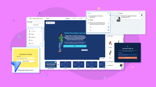
Before we get begin, here’s a short selection of 8 customizable newsletter registration form templates you can easily edit and publish with Visme. View more templates below:


A newsletter sign up form is a web-based tool used to capture information from people who have expressed an interest in learning more about your company.
This form typically asks for basic contact information such as name, email address and phone number.
Once the individual has completed the form, they are added to an email list that can be used for marketing purposes.
The primary purpose of a newsletter sign up form is to capture potential customers and build relationships with them. It allows companies to promote their products or services and build brand recognition. The collected data can also be used to create targeted campaigns and increase conversions.
A newsletter signup form is an invaluable tool for any business or organization looking to build relationships with its customers and followers. Here are some key benefits of having a newsletter signup form on your website:
When prospects sign up for your newsletters, you can reach more people with your brand messaging. This will help increase your visibility and let more people know about your business or organization.
Having a newsletter signup form on your website allows you to capture email addresses from people interested in your business or organization. You're able to send targeted emails to potential leads who may be interested in what you offer.
By sending out regular newsletters to your subscribers, you can stay top-of-mind with them and keep them engaged with your content. This can help to establish a long-term relationship with them and keep them interested in what you have to offer.
By growing your subscriber list, you can reach out to more people. Having more subscribers also allows you to promote new products and services to a wider audience.
Nowadays, individuals are wary about disclosing their emails. Therefore, you need an effective strategy to make them sign up for your newsletters.
Here are 10 best practices for designing standout forms that convert.
Want your audience to sign up for a newsletter? Your signup form should not overwhelm your visitors with too many questions. Too many fields can cause friction, making users less likely to complete the form.
When designing your form, make sure that it only asks for the most important information like name, email address and any other relevant data. Or you could keep it really simple and request only their email address.
However, before deciding on the optimal number of form fields, consider your end purpose. If your goal is just to generate new subscribers, all you need is their names and email addresses. On the other hand, if you want to further qualify the lead, you could try asking for extra specifics.
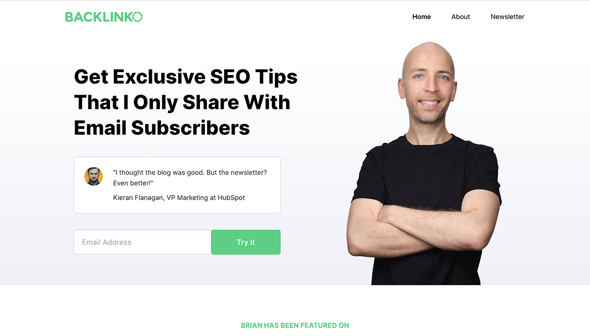
Check out this sign up form on Backlinko. Backlinko makes signing up simple by only requiring an email address, making it less complicated.
To maximize the success of your newsletter signup form, you need to make sure that you are highlighting the value that subscribers will receive from signing up. This means making it clear what kind of content they will get when they subscribe, how often they will get it and what kind of benefits they can expect.
Be sure to include the key benefits, such as exclusive offers, discounts, freebies, access to insider knowledge, early access to events, product launches or other special offers. Doing so will show potential subscribers that you have something of value to offer them.
Receiving too many emails is the main reason 69% of individuals opt out of email lists. Let subscribers know in advance how frequently they can expect to hear from you. Not only does this ensure that your subscribers won't be inundated with emails, but it also subtly reminds them to check back with you for fresh content.
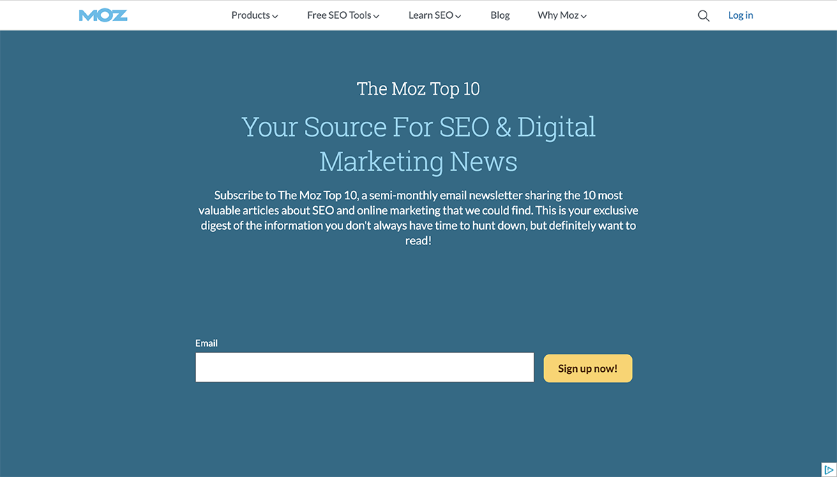
The newsletter signup template from Moz does a wonderful job of detailing the valuable content that subscribers can look forward to receiving and when they should expect it.
You can encourage people to sign up for your email list by making them consider the drawbacks of not doing so and painting the option of opting out as a less desirable one. Copies like this can boost subscription rates by making signing up seem like the smarter choice.
This could include missing out on product discounts, helpful tips or exclusive offers. By creating an atmosphere of FOMO, you can incentivize people to make the commitment and sign up for your newsletter.
People are more likely to take action when they know that something positive is at stake, so make sure to make it clear what kind of rewards await them if they do choose to subscribe.
Check out this newsletter signup example to see how Schuh does it:
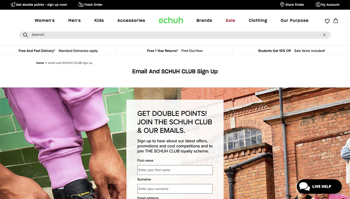
Schuh's newsletter sign up form encourages the reader to sign up by providing subscribers with a discount simply for signing up. Then, it offers less appealing offers to individuals who don't want to sign up for the service.
The "Don't want to join the loyalty scheme and earn points towards money off rewards each time you shop?" emphasizes what they'll miss out on by not signing up with the offer.
Adding social proof to your newsletter signup form is a great way to show potential subscribers that they’re in good hands. This could be numbers, testimonials, reviews or even quotes from influencers who have experienced success with your product or service.
Adding this kind of content to your form can help build trust and encourage people to sign up. It also gives potential customers an idea of what they can expect when they join your newsletter list.
As long as you make sure that the social proof you include is genuine and compelling, it can be a great tool for convincing potential subscribers to join your newsletter.
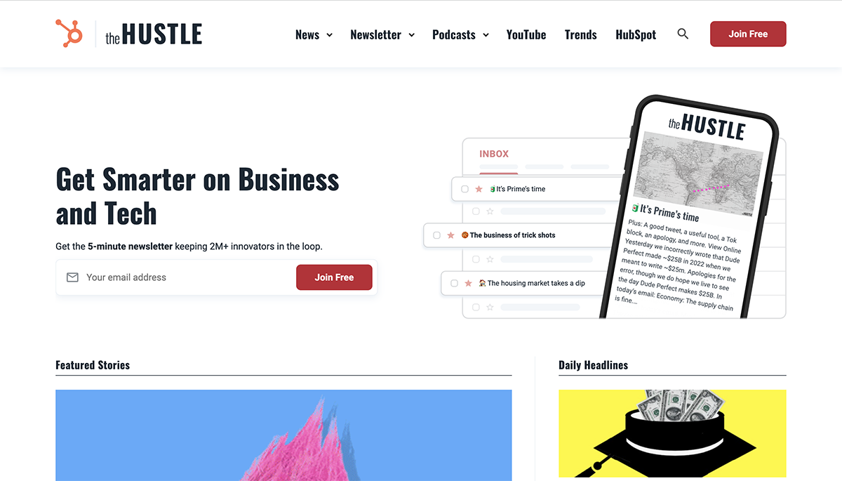
The sign-up form for The Hustle's newsletter is a fantastic application of social proof. Including the phrase "2 million plus" is a great way to tell potential subscribers that a lot of other people find the newsletter to be valuable.
When it comes to creating an effective newsletter signup form, the design of your form can make all the difference. Your form should be visually appealing and easy to read so that people are encouraged to stay on the page and complete the signup process.
Design elements you should consider include color schemes, typography, images and other graphical elements.
Choose a color palette that is consistent with your brand and will draw people’s attention. Utilize fonts that are easy to read and won’t cause strain for your subscribers. And don't forget to use high-quality images as well, which can help draw attention and make your form more aesthetically pleasing.
Also, avoid using too much text or too many elements on the page, as this can make the page appear cluttered and confusing.
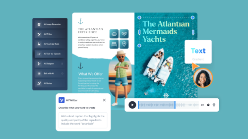
You can use Visme's design tools, such as icons, photos and videos to make a visually appealing and engaging interactive form that gets more responses.
Visme makes it simple to create consistent branded content across all of your platforms with its brand wizard and brand kit. Quickly and easily establish your brand's fonts, colors and logo and then use them on any of the included branded templates to achieve a great, uniform appearance.
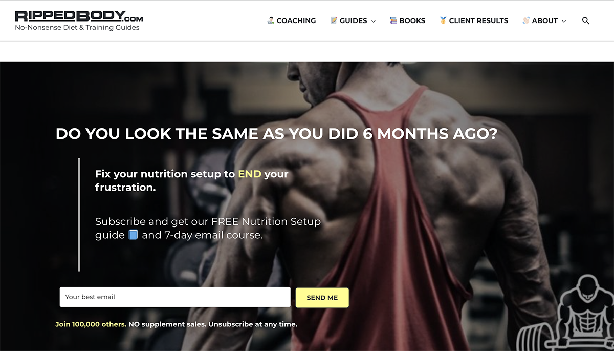
The form below is an excellent example of a newsletter form with a great design. Ripped Body employed a simple but stunning style with this newsletter design. Not only did Ripped Body keep its identity constant, but it also used contrasting colors and a captivating image to make the message impossible to dismiss.
The newsletter signup example from Visme is one of the best email signup forms you’ll find. The form uses stunning animated characters to draw the user's gaze to the form.
Make sure your call to action stands out and motivates users to take action. It should be eye-catching and communicate what they'll get when they sign up.
Your CTA should also be visible, placed in an area on the page where users can easily see it. Don’t hide it in a small font or at the bottom of the page; instead, make it prominent with bold text or eye-catching color.
Your call-to-action button's copy should be aligned with the step your new subscriber is taking. For instance, A call to action button could read, "Send me my free guide!" if you were giving away a free guide as a lead magnet.
The phrase "Subscribe to our newsletter or Subscribe to watch now" Expert photography’s CTA adds a sense of urgency to drive viewers to take action.

Offering an incentive can be a great way to encourage people to sign up for your newsletter. Whether it’s a discount code or a free ebook, people are often more likely to give their email address if they know they’re getting something in return.
You don't have to break the bank. Consider what your audience would appreciate most, whether it’s access to exclusive content or discounts on products or services
For example, you could offer a 20% discount coupon in exchange for subscribing to your latest tips, tricks and best practices.
You should also consider having your main incentive highlighted prominently on your homepage, such as at the top of the page.
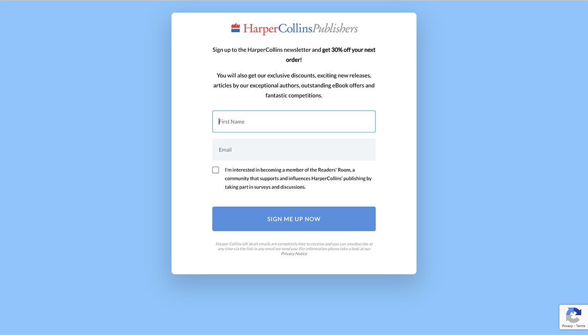
This newsletter signup example from HarperCollins sign up page is a perfect illustration. This offer from Harper Collins is too good to pass up. They offer a 20% discount on future sales, which entices potential consumers to not only provide their contact information (email address) but also make a purchase.
One of the most important steps in creating an effective newsletter signup form is to strategically place it on your website.
When deciding where to put your sign up form, a good rule of thumb is to find the most noticeable yet natural placements that don’t interrupt the experience someone has with your website. You want to make sure that it is visible and easily accessible to your website visitors.
These are recommended spots for placing your newsletter:
You can even try multiple newsletter signup placements at once. Here's an example of how SkinnyDip does it:
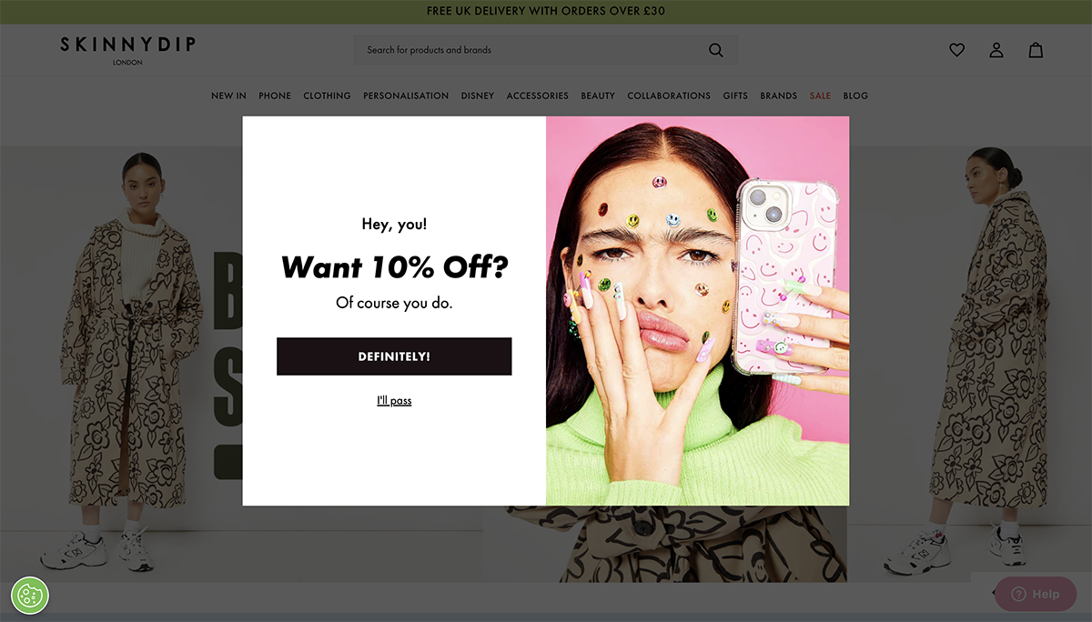
SkinnyDip has a pop-up that showcases a 10% discount as a thank-you gift for signing up. It also has a footer email capture form that appears on every page.
A\B testing allows you to test different versions of your signup form and see which one performs better. You can test different color schemes, images, text, layouts, etc.
Once you have set up the two versions of your form, monitor the results to see which one has a higher signup rate. You can then use this data to determine which version of your form works best for your subscribers.
Your newsletter signup form needs to be mobile-friendly. That way, you won't risk losing signups from mobile users that browse your site.
Visme’s newsletter signup template ticks all the boxes we highlighted in our form best practices.
Want to create a mobile-optimized signup form with tons of cool features? Visme has some of the best signup forms and you’ll find everything you need to make yours pop.

Promoting your newsletter signup form is essential if you want to capture the attention of potential subscribers. Here are some tips on how to spread the word about your newsletter signup form:
Social media is a powerful tool for reaching potential customers and promoting your newsletter signup form. Utilize platforms like Facebook, Twitter, Instagram and LinkedIn to reach your target audience. You could share a link to the signup form and include an incentive for signing up or simply add the link to sign up in your About section.
If you’re creating content, add a link to your signup form in your blog posts. This can be done in a subtle or tacky way; either way, it shouldn't get in the way of the user's experience.
At Visme, we did an excellent job of embedding a stunning newsletter signup form on our blog. Users can sign up to receive helpful design tips for creating eye-catching content right in their inbox every week.

An additional perk of conducting a webinar or podcast is that it helps spread the word that you are an expert in your field.
Gather the email addresses of anyone interested in attending your webinar or listening to your podcast through a signup form. Of course, you would get a lot of signups with this.
If you own an online store, you should incorporate a checkbox to "opt-in for our newsletter" into the purchasing process.
Pop-up forms are a great way to grab your visitors' attention and generate more signups. However, if it’s well designed, it can also impact the user experience.
Make sure that it's not too intrusive. You don’t want to disrupt the user experience by having it pop up every few seconds.
With Visme’s no-code form builder, create interactive and memorable signup forms is a breeze.
These forms aren’t just engaging; they have been proven to deliver stellar results.
Visme Forms were tested on 700,000 organic visitors and the results showed a 67% reduction in form abandonment, a 205% increase in form engagement and a 207% increase in conversions. Read the full case study.
Follow these steps to create newsletter signup forms that will increase your lead generation up to 207%
Create an account or log in (if you’re an existing user).
Next, select the type of forms you’d like to create in Visme. You can create newsletter sign up forms, lead gen forms, newsletter signup forms, lead magnets, contact forms and even custom forms.

After choosing what type of form you’d like to create, browse our library of beautifully designed form templates to select one that suits your needs. These templates give you a creative headstart and make the design process fast and seamless.
And if you’re feeling creative, you can also start from scratch. The no-code form builder is foolproof, so you’re sure to create amazing forms that deliver incredible results.

Visme forms provide different options for customizing your newsletter.
Feel free to select between multi-step or single-step forms. You can add or remove form fields like First Name, Last Name, Email, Company Name, Job title, etc. Also, select where and how you want to appear on your website: popup form, embeddable within your content, sidebar, etc.

Customize the color of the form fields, background, text, icons, buttons and other form elements.
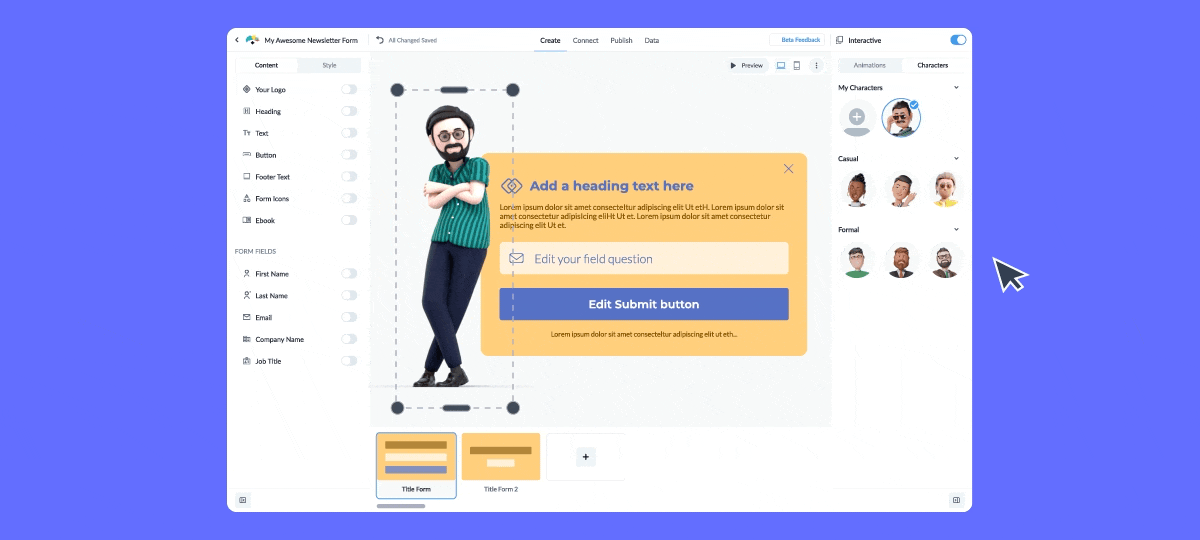
Pick already customized avatars and add them to your form. Or customize the character animations to match your brand.
You can customize the hair, facial hair, glass hat, apparel type and color and more to match your brand colors or even make them look like you. You’re also able to select the character's entrance and movement. The design options are endless!
After designing your newsletter form, you can publish your form designs with a link or QR code or simply embed them on your website using auto-generated HTML. Copy the link and place it as a popup, sidebar or embed within the content—or wherever you want to.

The best part is that Visme allows you to integrate your form with popular third-party software such as MailChimp, Active Campaign, Salesforce, HubSpot, Google Sheets and more.
Utilize Visme’s real-time analytics dashboard to track the performance of your forms with metrics like form views, completion time, form starts, submissions and more.
According to Sumo, the average signup rate for newsletters is 1.95%. However, other marketers report getting up to a 10% sign up rate.
A decent open rate depends on your industry and how well you segment your audience and target them with personalized information. In general, a successful open rate for a newsletter across different industries should be in the range of 17–35%.
AB testing in a newsletter refers to the process of evaluating different versions of a newsletter to determine which one performs better in terms of engagement, click-through rates, conversions, or other desired metrics.
When doing A/B testing, you need to create two or more variations of a newsletter and send them to a subset of your target audience. Once the results are in, you can then analyze the results to identify the version that generates the best outcomes.
Here are useful tips for creating effective newsletter forms.
1. Keep it simple: Ask for minimal information and limit your form fields to a maximum of three.
2. Create a clear call-to-action (CTA): Use action-oriented language like "Subscribe," "Join Us," or "Get Updates. Explain what your audience get from subscribing (receiving exclusive content or special offers).
3. Design your newsletter form for easy navigation: Make sure the forms is easy to find and mobile responsive. Use contrasting colors for the form and the background to make it stand out.
4. Offer an incentive to entice visitors: Provide a compelling reason to subscribe, such as a free ebook, discount, or exclusive content. Place the incentive near the signup form to drive action.
5. Ensure privacy and security: Include a brief privacy statement to reassure subscribers that their information is secure and will not be shared or sold. You can even add a link to your full privacy policy to boost visitor’s confidence and credibility.
6. Use compelling copy: Write clear, concise, and persuasive copy to encourage visitors to subscribe. Use Visme’s AI text generator to craft compelling copy, proofread your text and persuade your audience to take action.
7. Test and optimize: A/B tests different elements of your signup form, such as the CTA, color, or incentive, to see what works best. Then, use analytics to track form performance and make necessary adjustments.
8. Provide an Easy Exit: Include an option for subscribers to unsubscribe and make the process straightforward and hassle-free
9. Follow Legal Regulations: Ensure your signup process complies with anti-spam laws, such as the CAN-SPAM Act in the United States or GDPR in Europe
10. Use an intuitive form builder. With Visme’s no code form builder, anyone can build engaging and interactive newsletter signup forms that convert in minutes. In addition to signup forms, you can create memorable lead forms, contact forms, email forms, email collectors, popup forms, feedback forms, registration forms and much more.
And that’s as simple as it can get. You can even integrate your forms with your favorite tools like MailChimp, HubSpot, Google Sheets, Active Campaign, Airtable and more.
If you’re looking to nudge your audience to sign up for a newsletter, there are some effective placements you can use.
That’s it; you’re ready to start designing signup forms your visitors can’t resist.
Keep in mind that the best way to expand your subscriber base is to provide readers with a straightforward, well-planned and engaging newsletter form that highlights the benefit of joining your email list.
Visme Forms can help you take your email marketing conversion to the next level. Create interactive forms quickly and easily with our drag-and-drop form builder, or choose from our wide range of tested templates.
Integrate design tools, such as icons, images and videos into your form to help you create an eye-catching, engaging experience that encourages submission.
You can share your form via a link or embed it in a landing page. You will also be alerted whenever anyone fills out the form, allowing you to easily collect data and export leads to a CSV file or an email marketing platform.
Check out Visme's extensive library of premade templates to start creating stunning marketing assets, or learn how Visme can help your marketing team meet its goals.
Improve your data collection from emails, leads, to surveys and more, by using beautifully designed forms that convert up 2X better.
Signup Free