


The Best AI Sales Tools for 2026 and How to Choose Them


The typical conversion rate for landing pages across all industries is around 5.89%.
However, WebFx suggests that the landing page conversion rate should ideally be between 10% and 11%. To reach this level of success, you need to fine-tune your lead generation landing pages for optimal conversion rates.
If you're having a hard time getting leads from your landing pages or just want to boost your lead generation, taking a look at successful businesses that have already achieved great results can really help you out.
In this article, we'll showcase nine examples of effective lead generation landing pages and share some best practices to assist you in creating or enhancing your own.
Let's dive into these examples to elevate your landing page game.
A lead generation landing page is a special webpage designed to collect visitors' information, such as their names and email addresses. Businesses and marketers use this landing page to better understand and engage with potential customers.
A lead generation landing page typically includes:
Now that we've explored what a lead generation landing page is, let's dive into some lead generation page examples. These real-life examples will give you a clearer understanding of how effective landing pages function and what strategies they employ to convert visitors into leads.
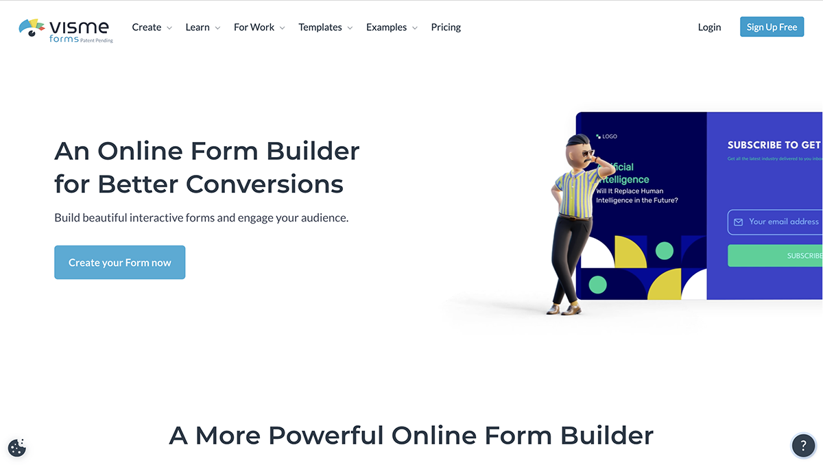
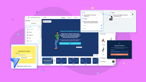
Visme Forms is an online form builder that empowers marketers and businesses to create interactive lead generation forms that engage their audience and boost conversions by up to 207%.
After you’ve designed your forms, you can publish your no-code form designs with a link or QR code or embed them on your website using auto-generated HTML.
The Visme Forms landing page is a great example of effective marketing and design.
The landing page is designed in a way that effectively communicates the value of the product to potential customers.
One of the key elements that makes this page stand out is its simplicity. The page is not cluttered with too much information, which can be overwhelming for visitors. Instead, it uses a clean layout and plenty of white space to make it easy on the eyes and encourage visitors to explore the page longer.
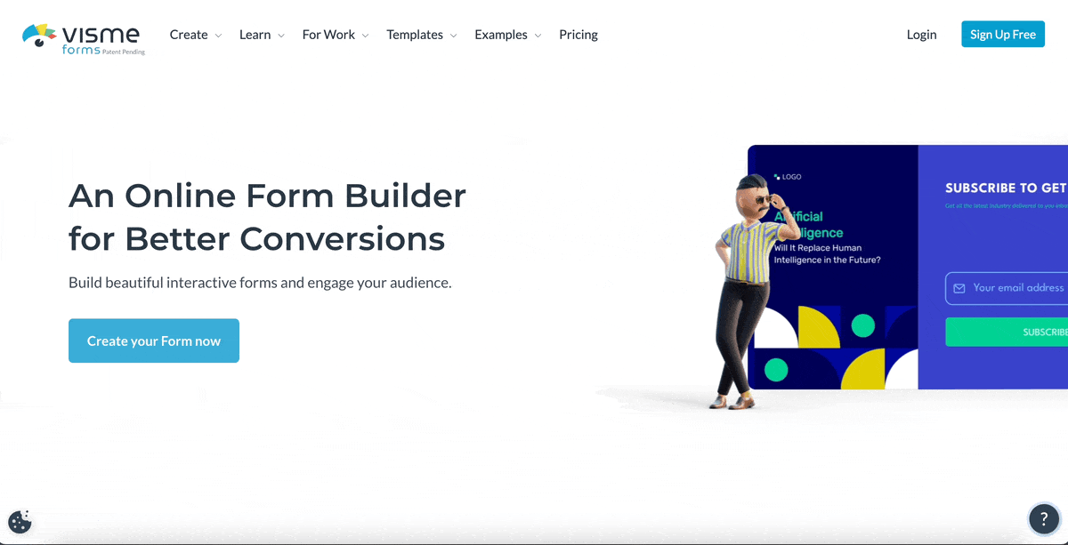
The 3D animated characters—cleverly placed at the top of the page—are designed to engage visitors and showcase the unique selling proposition of Visme Forms. This animation quickly grabs the visitors' attention and helps them understand how Visme Forms can make their data collection more dynamic and interactive.
In addition to its design and animation, the Visme Forms landing page also effectively communicates the product’s ease of use. You’ll also find clear and concise descriptions of how Visme Forms works and how it can benefit users. This information is presented in a way that is easy to understand and makes it clear why Visme Forms is a valuable tool for businesses and marketers alike.
Overall, the Visme Forms landing page is a great example of how effective marketing can be achieved through simplicity, engaging design, and clear communication of value.
We tested Visme forms on over 700K organic visitors and experienced a 205% increase in form engagement and a 207% increase in conversion rate.
The best part is that creating a form in Visme is as easy as pie. The tool is easy to use and you don’t need to write any single line of code. Visme Forms has customizable templates for creating lead generation forms, email sign up forms, website pop up forms, contact forms and more.
You can also integrate your forms with popular email marketing tools like MailChimp, HubSpot and Salesforce to capture leads directly into your CRM.

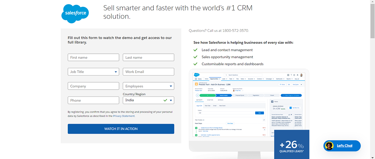
Salesforce, the global leader in customer relationship management (CRM), provides businesses with a comprehensive platform to manage customer interactions. Its CRM-centric approach streamlines sales, service, and marketing efforts.
The landing page we're talking about is a potent lead generation tool with a minimalistic design and a focus on their CRM's key benefits.
The Salesforce landing page is a great illustration of a B2B lead generation landing page that is simple and practical. It avoids overloading the user with too much text and instead focuses on the essential features of its CRM, such as lead management, sales opportunities, and report creation.
The landing page layout has a mockup of their CRM's user-friendly interface allowing potential clients to peek at the platform before committing.
The copy—"+26% increase in qualified leads"—proves the value and credibility of Salesforce. It also positions the tool as a reliable option for businesses seeking to improve their lead generation. Overall, the landing page works well for companies aiming to improve customer relationships, generate more leads and increase sales.
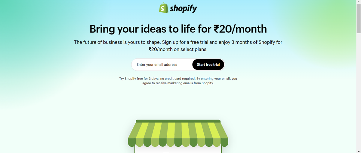
Shopify’s landing page design offers a fuss-free shopping experience to entrepreneurs and businesses eager to establish their presence online. The page promotes a free trial period, allowing prospective users to explore the functionality of Shopify's eCommerce proposition without any upfront cost.
The Shopify landing page is designed to capture visitors' attention with a clear and concise call-to-action: "Start free trial". The button is prominently displayed, making it easy for visitors to know what action they should take next. Additionally, the landing page highlights the free trial offer, emphasizing that it's a no-risk opportunity. This can help put potential customers at ease and encourage them to try the platform. It's like saying, "Hey, take a look around without any commitment or worries."
The sign-up form is user-friendly and straightforward, requiring minimal effort from the visitor. By making it easy for people to sign up, the landing page increases the chances of getting more leads. Overall, the page is well-designed and thoughtfully structured to provide a positive user experience and encourage potential customers to take the first step toward using Shopify.
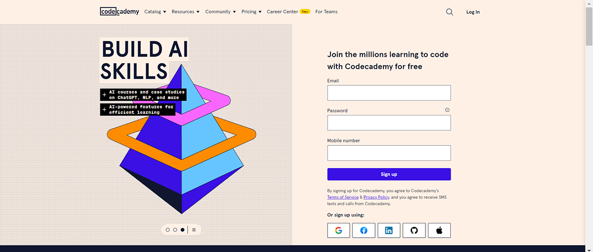
Codecademy is an interactive online teaching platform designed to teach coding through various programming languages and topics. The landing page provides a friendly user interface that guides users to kickstart their coding journey with ease. The copy clearly highlights a tailored pathway for a personalized learning experience.
The lead generation landing page emphasizes the benefits of learning to code, showcasing career opportunities and advancement possibilities. They target both beginners and experienced learners to encourage visitors to invest in their future.
The minimalist design of the landing page eliminates potential distractions, ensuring users can focus on the clear and compelling call-to-action (CTA) buttons. This approach makes it more likely for potential students to search for and select an applicable learning path.
Limiting the number of form fields to only three is one of many lead generation strategies used by Codeacademy that helps boost form completion as users find it easy to sign up for their courses.
By incorporating social login options, Codecademy simplifies the sign-up process even further. This user-friendly feature lets visitors quickly create an account using an existing social media profile.
Icons and visual cues on the landing page help visitors understand the information quickly. They visually represent the various coding languages and courses offered, making the offerings easily relatable to the audience.
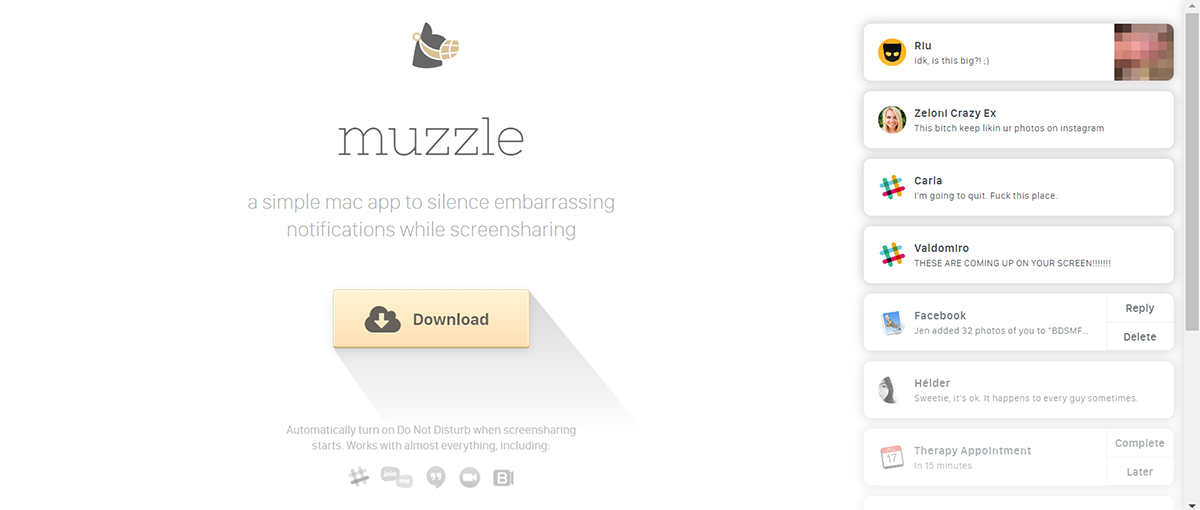
The Muzzle app aims to silence embarrassing notifications during screen-sharing sessions. The landing page is designed candidly and uses humor to illustrate the app's convenience and necessity.
The landing page is humorous! It shows a series of potentially embarrassing notifications that users would not want to pop up during screen sharing. This grabs visitors' attention immediately and shows how the app can be helpful in a fun and relatable way.
The page design is clean and straightforward, leaving no distractions from its main message: the need for Muzzle when sharing your screen. The clutter-free, minimalist approach adds to its charm.
The landing page also acts as a live demo for the app. Using real-life notification examples is an illustration of how the Muzzle app works. This quick display of usefulness can increase the curiosity of potential users.
The clever use of humor, combined with its single, noticeable call to action, "Download," makes the decision simple for visitors. The landing page's wit and clear direction create a compelling reason for users to install the software.
Muzzle is one of the many perfect landing page examples for products that want to showcase their value proposition and brand personality all in one.

Dropbox, a widely renowned platform that provides cloud storage solutions, uses a lead generation landing page to promote its Dropbox Business service. The tool offers additional storage, team management tools and advanced security features.
On this page, Dropbox uses a captivating video that showcases the added advantages of their Business Plan over the free or individual plans. The video highlights team collaboration, administrative tools and the business plan's advanced attributes, enticing visitors to upgrade.
The video is positioned close to the start of the page. This visibility ensures that every visitor, even those who may not scroll down, sees the video. Moreover, the video content aligns evenly with the overall marketing message, highlighting the benefits of Dropbox Business without overshadowing the call-to-action.
While you can consider implementing multiple lead generation ideas or techniques on your landing page, don’t forget that sometimes less is more. Dropbox was able to show and do more in less space and time with a single video.
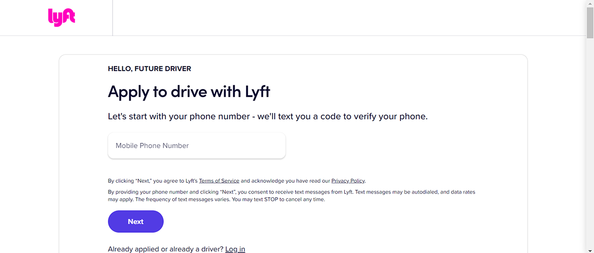
Lyft is a well-known company that pairs drivers with passengers who request shared rides through a phone app. Lyft's lead generation landing page examples for potential drivers showcase how they can benefit from being part of the app's community.
The primary appeal of the landing page lies in its simplicity. Lyft implements a simple lead capture form, which is incredibly user-friendly. By making the sign-up process straightforward and accessible, Lyft ensures that potential drivers aren't overwhelmed.
The attention-grabbing button, or call-to-action, is designed to catch visitors' eye and encourage them to click on it. It clarifies what the visitor needs to do next.
Lyft's landing page goes the extra mile by beautifully highlighting the various benefits drivers can enjoy. It emphasizes the flexibility of driving with Lyft, the earning potential and the company's unique perks.
This powerful benefits presentation convinces drivers to partner with Lyft, increasing the likelihood of sign-ups.
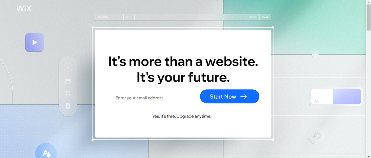
Wix enables individuals and businesses to create fully customizable websites with no coding skills required. Their landing page appeals to a broad audience, from beginners to more experienced users, showcasing the platform's versatile features and benefits.
The Wix landing page catches your eye with its clean and spacious design. They use a lot of whitespace around elements, giving it a tidy look. This way, crucial elements like impactful messages and the main "Start Now" button stand out.
The words they use aren't just informative; they aim to inspire. Phrases like "It's more than a website. The text: “It's your future" creates an aspirational tone. They want visitors to see a website as more than just an online presence; it's a step toward achieving their future goals.
Getting started with Wix is straightforward. Visitors need to enter their email and click the "Start Now" button. This straightforward approach reduces complications, making it easy for users to move through the steps toward using the website builder.
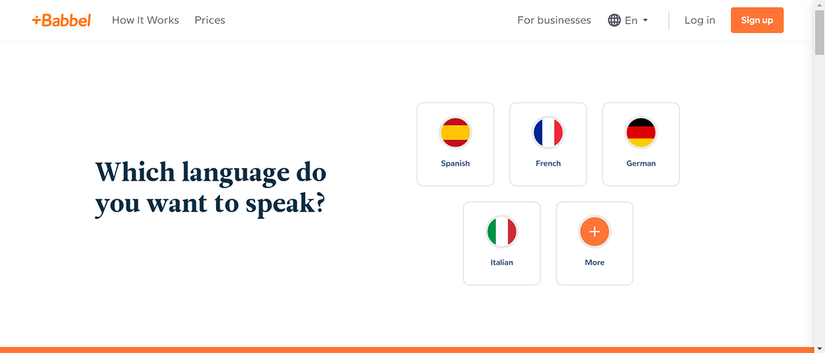
Babbel is a popular online language-learning platform designed to engage and teach users in an interactive manner. The landing page showcases various learning resources while employing a quiz-based method for signing up, making it interactive and intriguing for potential users.
Using a quiz method for the signup process differentiates Babbel from its competitors. It’s one of the best landing pages for lead generation. This interactive approach immediately captures users' attention and transforms passive browsing into active engagement.
Quizzes encourage users to think about their learning goals, preferences and styles, making them more invested in the platform and motivating them to sign up.
Emphasizing the platform's award-winning courses, flexibility and user-centric design persuades potential learners of Babbel's superiority
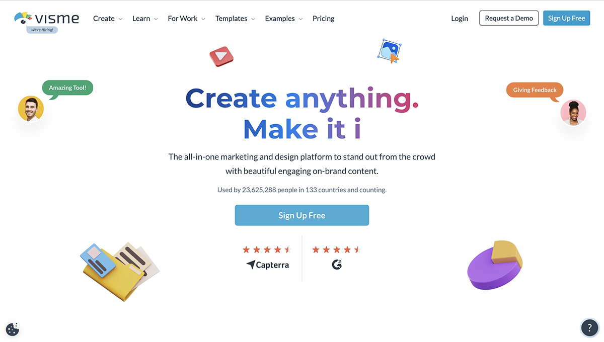
Visme is known for empowering users, both designers and non-designers, to create professional presentations with our AI PPT maker, infographics, and other visually engaging content. The platform's landing page is designed to showcase a multitude of its features and benefits.
The aesthetics of Visme's landing page paint Visme as an expert in the graphic design tool industry and capture visitors' attention immediately. The design segments are laid out engagingly, with each section revealing another reason the user should try the tool.
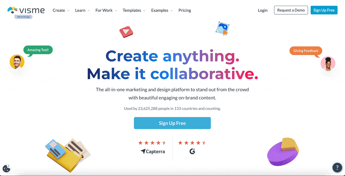
Visme's animated landing page comes with bold headlines and concise, understandable language.
The user experience is enhanced with simple sign-up buttons. Visitors can register with their email address or use their social media account for a faster, more seamless process.
One defining feature of the landing page is showcasing stunning template examples such as infographics, presentations, documents, charts, graphs and more.
Furthermore, Visme strategically uses social proof by placing a testimonial video after the call to action button. Endorsements from satisfied users build credibility and trust and reflect Visme's effectiveness.
The chatbot on Visme's homepage plays a vital role as it generates leads, qualifies potential customers and nurtures relationships to create a smooth and engaging user journey.
By adding chatbots and other AI-powered customer support features to your own landing pages, these lead generation tools help educate potential leads and streamline your lead qualification process.
Now, let's explore some helpful tips to improve your lead generation landing pages. These best practices will guide you in creating pages that attract more leads and increase your chances of turning visitors into valuable customers.
If there’s anything we’ve learned from the previous lead generation examples, it’s that you should always have a single, clearly defined goal for your landing page.
Concentrating on one goal allows you to tailor your landing page's content, visuals and CTA to achieve that purpose.
For example, if your goal is to get people to sign up for a free trial, then your landing page should focus on the benefits of using your product and how it can help them solve their problems.
If you try to show them everything you have at once, they may get overwhelmed by too much information and go away.
High-quality content is a cornerstone of any successful landing page. It not only captures the reader's interest but is also the medium through which you convey the value of your product or service.
A well-crafted page should not sound like a sales pitch. Instead, it should promote your offerings genuinely and honestly. Using the right tone can engage your audience and convince them without being too pushy.
Always keep your target audience's interests at the forefront when crafting your content. Strive to develop content that reflects their preferences, speaks their language and resonates with their needs.
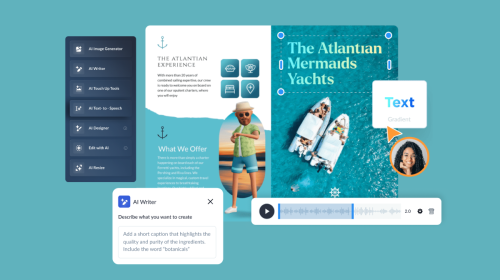
Need help writing copy for your landing page? Use Visme's AI writer to craft engaging, high-quality content for your lead-generation landing page. This advanced tool can help you generate ideas, create first drafts, craft layouts, edit and proofread your text and much more.
Having an appeal should be about more than just writing good content. Why not also use captivating images to spice up your design and text? But will any image do the trick?
Every image you use has to align with your content. Let's say, for example, you're promoting a marathon event. Using an image of a relaxed person lounging on a couch wouldn't quite work, right?
When your images are both relatable and eye-catching, visitors find it easy to remember what they've read. Simply put, adding such images makes your landing page more interesting and improves the user experience.
Use Visme’s AI image generator to create unique and relevant graphics for your lead-generation landing pages. Just explain your requirements to the tool, select the graphics style and the tool will generate it for you in seconds. With the AI image generator, you can generate pictures, illustrations, icons, paintings, abstracts and more.
In addition to images, you can use many different graphics, such as infographics, diagrams, charts, graphs and many others.
Choose a template from Visme’s extensive library of templates for infographics, charts and graphs, diagrams, and more.
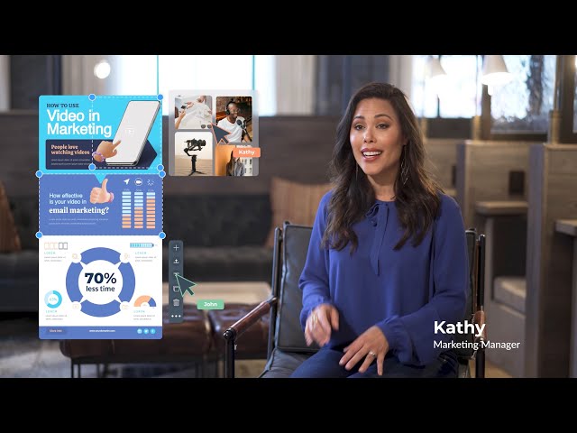
Video content has proven highly effective, especially in lead generation. In fact, according to a recent study, 91% of consumers want to see more online video content from brands. Harnessing the power of videos could be a game-changer for your landing page success.
Incorporating video content offers numerous advantages. It showcases your product's functionality and provides tangible insights, which can keep visitors engaged and drive purchase decisions in your favor.
Here’s the video we displayed on our homepage to introduce Visme to our target audience.
Put your video at the top of your webpage so visitors can see it immediately.
However, it's not just about adding a video. The content of this video should be in line with your main offering and motivate visitor actions. This way, the video isn't just an attractive visual; it's a tool for guiding your customers and achieving your lead generation goals.
And guess what? Visme can help you create videos, too. Use Visme’s online video maker to create product videos, explainer videos, testimonial video and more.
It doesn’t matter if you’re using one of the best lead generation software in the world; you’ll always need to optimize your forms.
Why does it matter? The form on your landing page is the main point of interaction with your potential leads. It's important that it's efficient and simple. This is because it affects whether visitors will stay and continue to browse the site.
Here are some tips to optimize your lead generation forms:
Visme’s online form builder makes it super easy to create interactive, animated forms for your landing pages. The forms use animations to catch the attention of your visitors and persuade them to sign up for your offerings.
Just choose a lead generation form template, customize it according to your needs using the editor and embed it on your website by generating a code snippet from Visme.

We've tested these forms and enjoyed a 207% increase in conversion rate and a 205% increase in form engagement by using Visme forms.
Optimize your lead generation page for SEO to increase your ranking on SERP. This makes it appear higher up in online search results, thus gaining more visibility.
The more visible your website, the more people will visit, and the greater your chances become to convert these visitors into leads.
How to do it: Optimization happens when good content, well-chosen keywords and strong linking come together. Create content that's engaging and relevant, weaving in your keywords naturally. Use both internal and external links to ensure search engines can index your page correctly.
Also, ensure the page is well designed, works well on mobile devices and offers a positive user experience to encourage more engagement.
Whether Facebook lead generation or a landing page is better depends on your specific business needs and goals. Facebook lead generation is effective because you can reach a broad audience and use Facebook’s engaging platform to collect lead information.
On the other hand, a landing page can provide more personalized information about your product or service, and you can tailor it to fit your brand’s look and feel. Both have their unique advantages – consider using a combination of both to maximize your lead generation.
A landing page is a distinctive webpage that aims to convert visitors into leads.
On the other hand, lead generation is a broader process aiming to attract and convert strangers and prospects into someone who has indicated an interest in your company’s product or service.
So, a landing page is a part of the lead generation process. While the landing page is more about the place where conversion happens, lead generation is about the entire journey that brings your visitors to that landing page and encourages them to take action.
Lead generation focuses on attracting and engaging potential customers to make sales, while SEO (search engine optimization) aims to improve your website’s visibility and rankings in search engine results. In short, lead generation is about driving customers to your business, while SEO enhances organic traffic to your website.
There are several types of landing pages used in digital marketing, but the two most common ones are:
Optimizing a landing page for lead generation involves various strategies, including:
That's a wrap. We've shared lead generation landing page examples and the best practices to inspire you. Now it's time to optimize yours to attract leads and drive more conversions.
With Visme's online form builder, you can create animated lead generation forms and double your landing page conversion. In addition to lead gen forms, you'll find templates for creating lead magnets, contact forms, email forms, popups, feedback and registration forms. Plus, you can craft compelling content using Visme's AI writer or generate engaging visuals using the AI image generator.
Sign up for Visme Forms today to skyrocket your lead generation!
Improve your data collection from emails, leads, to surveys and more, by using beautifully designed forms that convert up 2X better.
Signup Free