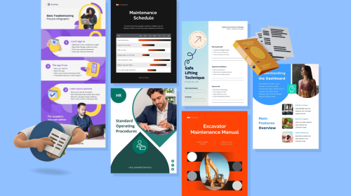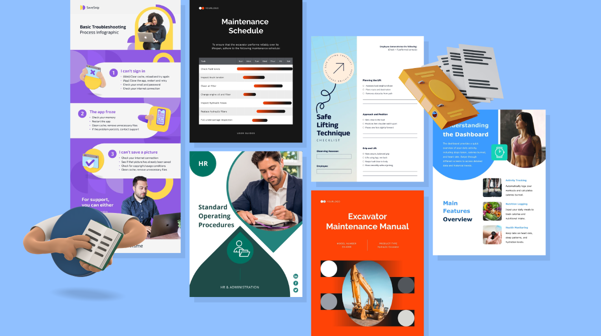
Proven Product Specification Examples That Give You Clear Decisions

Annual reports have come a long way from the dense, downloadable PDFs we’re used to.
These days, companies are designing immersive digital experiences packed with animation, clickable content and storytelling that actually hold your attention.
And it’s not just for aesthetics. Interactive content has been shown to generate 52.6% more engagement than static content and annual reports are no exception.
In fact, what we’re seeing now is a hybrid model: dynamic, web-based or presentation-style reports with optional downloads for those who prefer a static version. It’s a smart way to meet the needs of different audiences while still making a bold statement.
In this article, I’ll walk through 10 real-world examples of interactive annual reports that break the mold. Plus, I’ll show you how to create your own without breaking a sweat.
An interactive annual report is a dynamic, digital version of a traditional report that allows stakeholders to actively engage with the content rather than passively scroll or flip through it.
Instead of presenting information in a static format, interactive annual reports use animations, clickable elements, embedded media and responsive design to visualize data or convey insights.
In this type of report, you may find features like:
These interactive elements enhance the user experience and allow readers to drill into sections that interest them most at their own pace.
Romina Massa, an expert in strategic content, says it best:
“An annual report is more than a reflection. It’s a catalyst for growth. It transforms data into insight, insight into action and action into sustained optimization. Rooted in the past yet designed to propel what’s next, it bridges reflection with direction. The process is strategic: not simply reporting outcomes, but building alignment, clarity and forward momentum.”
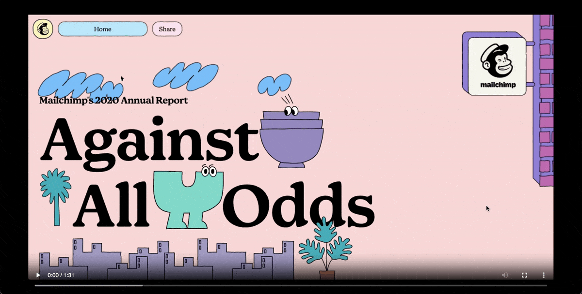
MailChimp’s Award-Winning 2020 Annual Report is a classic example of an interactive report.
Source: D&AD
Instead of scrolling down like a normal webpage, the report moves horizontally, kind of like a video game. Your guide is a cute blue animated character that takes you on an adventure through a bright, colorful world of cartoon illustrations.
As you move along, you’ll see pop-ups and text bubbles detailing company wins, customer stories, interesting stats and even some quirky fun facts. And just when you think it couldn’t get more fun, hidden mini-games are tucked inside the report. It really feels more like an experience than a typical corporate update!
Brands are breaking away from the traditional mold and Mailchimp’s example is solid proof.
Instead of pushing out another static PDF, they threw the classic playbook out the window. They turned their brand story into a full-on experience, and people loved it.
And that's really the magic of interactive reporting: engagement that actually sticks.
Beyond the wow factor, these report writing formats deliver other measurable results that traditional PDFs can't match. Users spend more time engaging with the content and retention rates skyrocket.
Let’s break down why more brands are ditching the old format and going interactive.
Michael McKormick, host of the Rediscover Your Brand podcast, puts it this way:
“Annual reports give stockholders and investors a reason to stay with your organization. Even after a rough year, you can use these reports to your advantage—build a solid structure around what went wrong and how you’ll bounce back stronger.”
When it comes to interactive content marketing, MailChimp isn't the only company thinking outside the box.
More brands are discovering creative ways to transform their annual reports into memorable experiences.
Some are using video tours of their achievements.
Others are creating interactive timelines that let you explore their history. A few have even built mini-documentaries right into their reports.
Let's dive into some of the best interactive annual reports from real brands.
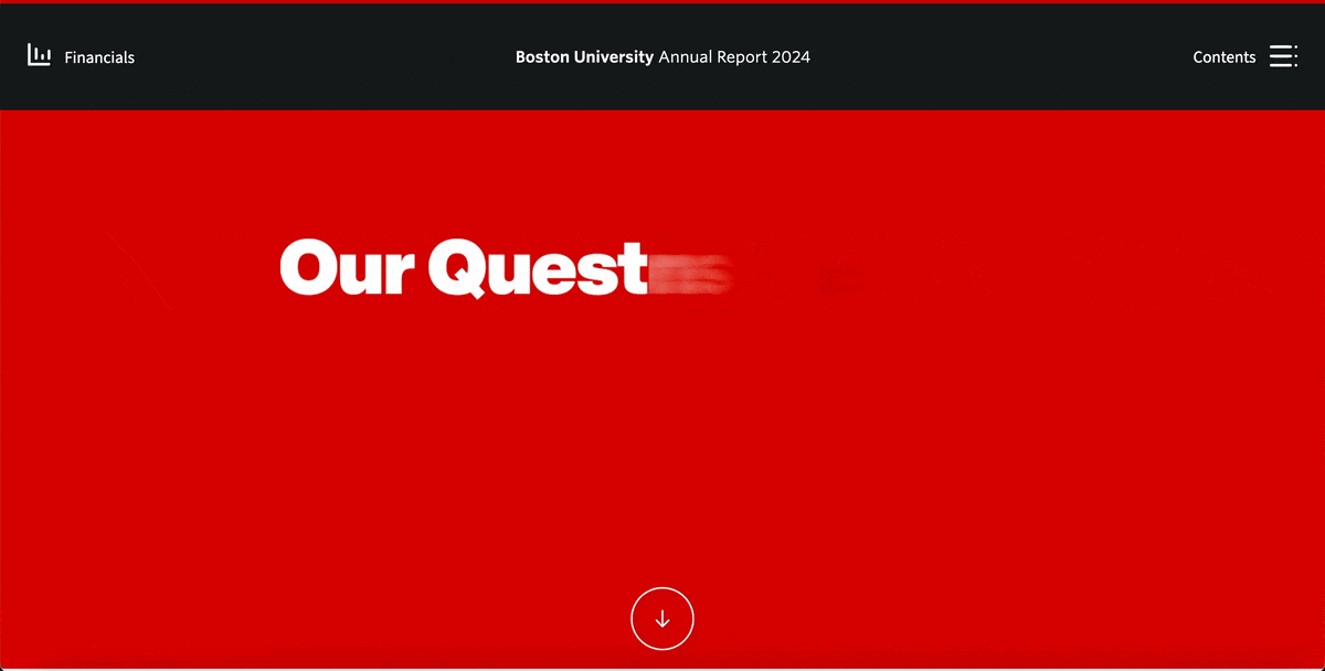
Source: Boston University
You'd never expect a university report to feel this engaging, but somehow Boston University pulled it off.
Instead of burying their achievements in dense paragraphs, BU created an entire website that feels more like exploring a thought-provoking documentary. The page opens with a bold, catchy animated message looping continuously: "Our Questions change the way we think, our answers change the way you live." It's the kind of statement that makes you pause and actually think about what you're about to read. Right below that, there’s a personal address from the university president.
What struck me most was how they frame everything as fascinating questions, such as:
These aren't just clever ways to frame headlines. They're conversation starters that made me genuinely curious about the answers.
The navigation is clean and intuitive. With a table of contents on the top right, I could easily jump to any section without getting lost. I love how each page flows into the next with clickable hotspots that let you return to the previous page or move forward.
Every is paired with stunning visuals that enhance the message. On some pages, you’ll even find hotspots that reveal extra bits of information when you hover or click. For those who still need the traditional format, there's a link to download the PDF version of their 2024 financials.
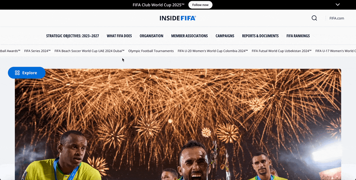
Source: FIFA
FIFA's 2024 annual report breaks every rule about traditional web design and it works brilliantly.
Instead of the standard single-hero section that most websites use, FIFA created a stunning collage-style layout where multiple hero blocks live side-by-side in a grid formation.
From a design perspective, this collage approach makes an enormous amount of content feel manageable and engaging.
Each block functions as its own portal to different sections of the report.
What makes this approach so effective is how it transforms the browsing experience. Some sections feature full-bleed images with smooth, hover-zoom effects.
In contrast, others showcase dynamic video backgrounds—each tied to different themes like tournament highlights, financial performance or their roll of honor. Every block comes with bold headlines and clear "Read More" call-to-actions that make you want to dive deeper.
The floating "Explore" button adds another layer of seamless navigation, letting users jump between chapters without losing their place. This gives readers complete control over their journey through the report. Instead of forcing everyone down the same linear path, FIFA allows people to pick and choose the content that matters most to them.
Rather than overwhelming visitors with walls of text or endless scrolling, FIFA created what feels like a digital sports magazine where each section invites exploration. It's particularly smart for organizations with diverse audiences who prefer browsing over sequential reading.
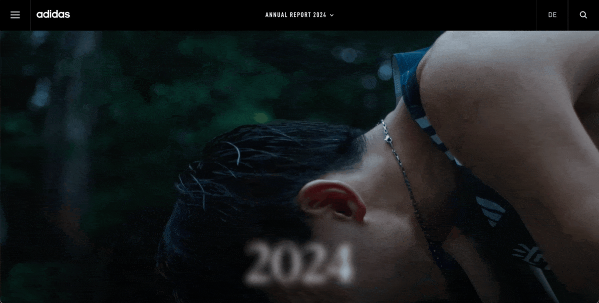
Source: Adidas
Every year, Adidas seems to raise the bar with its annual report design. The 2024 version is no exception.
From the second you land on the page, you’re greeted with an auto-play video that radiates everything the brand stands for: bold identity, pure athletic energy, elite performance and sporting excellence.
Right away, you know this isn't going to be your typical corporate report. It feels more like a campaign launch than a corporate report.
The menu allows you to easily navigate sections of the report without breaking that premium Apple-inspired aesthetic. A beautifully designed dashboard presents all the key developments from 2024 in a visually striking snapshot.
For those who prefer the traditional format, you can still download all the PDFs. But after going through the digital version, you probably won’t want to.
But the real showstopper is their interactive chart generator. Instead of the usual static spreadsheets, you get to explore data in three different views—animated bar charts, line graphs and table views. When you hover or click, the visuals respond, revealing deeper insights through color shifts and dynamic tooltips.
This kind of interactivity encourages you to engage with the numbers rather than just glance at them. It's a perfect example of how to take financial storytelling to the next level.
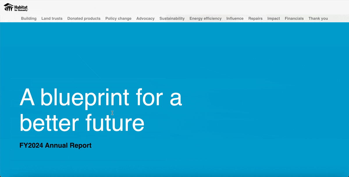
Source: Habitat for Humanity
If you're running a charitable organization, Habitat for Humanity's 2024 annual report is a masterclass in showcasing global impact.
What immediately strikes me about this business report is how it weaves together many different human stories that truly captivate readers.
Through a compelling mix of statistics, authentic photography and powerful quotes from people Habitat has helped, they transform what could be dry organizational updates into genuine emotional connections.
You can see how local campaign successes are spotlighted alongside global initiatives, creating a comprehensive picture of their worldwide impact.
The report covers important operational details like "The cycle of CLTs and Habitat homeownership." But what really sets this report apart is how they present their global reach.
The interactive map absolutely stole the show for me. As I scrolled down, the map moved horizontally across different continents, creating a smooth, cinematic journey around the world.
Each continent features a transparent visual table overlay that summarizes the number of individuals served and specific projects carried out.
When you hover over each region, detailed pop-ups reveal exactly what each project accomplished and who it helped.
At the footer, you'll find a comprehensive financial presentation with clear tables and charts, plus downloadable PDF versions for those who prefer traditional formats. Every element in this annual report sample works together to make complex data accessible and meaningful.
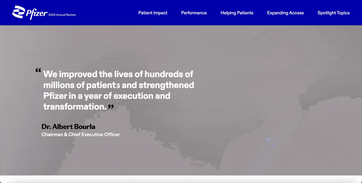
Source: Pfizer
Pfizer’s 2024 Annual Report proves that good storytelling trumps industry conventions every single time.
Rather than sticking to a traditional PDF or bloated multi-page site, Pfizer opted for a sleek, single-page website.
Right off the bat, you’re met with a bold hero section: a striking portrait of the Chairman & CEO alongside a powerful quote. It flows seamlessly into a classic letter to shareholders, but with a twist.
They've embedded a documentary-style video message narrated by the CEO that covers their strategic priorities. The report showcased real footage of their headquarters, company events and production facilities. This made it feel authentic and gave a genuine behind-the-scenes look at how the company operates rather than just talking heads in a boardroom.
Instead of overwhelming you with dense financial tables, Pfizer’s performance section offers an interactive breakdown of their top medicines and vaccines by 2024 revenue. Each item is clickable. When selected, an interactive widget pops up showing that product’s contribution to overall revenue.
The single-page format ties everything together. It guides you through the story at a steady pace but gives you freedom to click deeper where you’re most curious. Pfizer managed to walk the line between financial transparency and compelling storytelling like a pro.

Source: Google
Search might look a lot different today than it did a few years ago, but one thing hasn’t changed: Google knows how to create compelling digital experiences.
Just like in years past, the Google Year in Search 2024 edition is one for the books.
This company annual report example kicks off with a bold, colorful looped video that pulls readers right in. Right below it is a call-to-action inviting you to “Watch the full video,” and trust me—it’s worth it.
The video itself features carefully curated highlights of the events that dominated search throughout 2024. This creates this nostalgic journey through the year's biggest moments and most searched-for events
Scroll down and the experience gets even better. You can explore what the world searched for in 2024 or dig into specific countries. And if you're curious about certain topics, there are easy-to-navigate categories like Trending, Entertainment, Sports, Lifestyle and Gaming, Hum to Search and Google Maps.
Each category is laid out in a clean, visual format. Tap on one and it expands like an accordion, allowing you to drill into subcategories and even click through to the actual searches. It’s smart, interactive and just plain fun to explore.
It’s amazing to see how Google transformed what could have been a simple data dump into an interactive journey through the year's collective curiosity and interests.
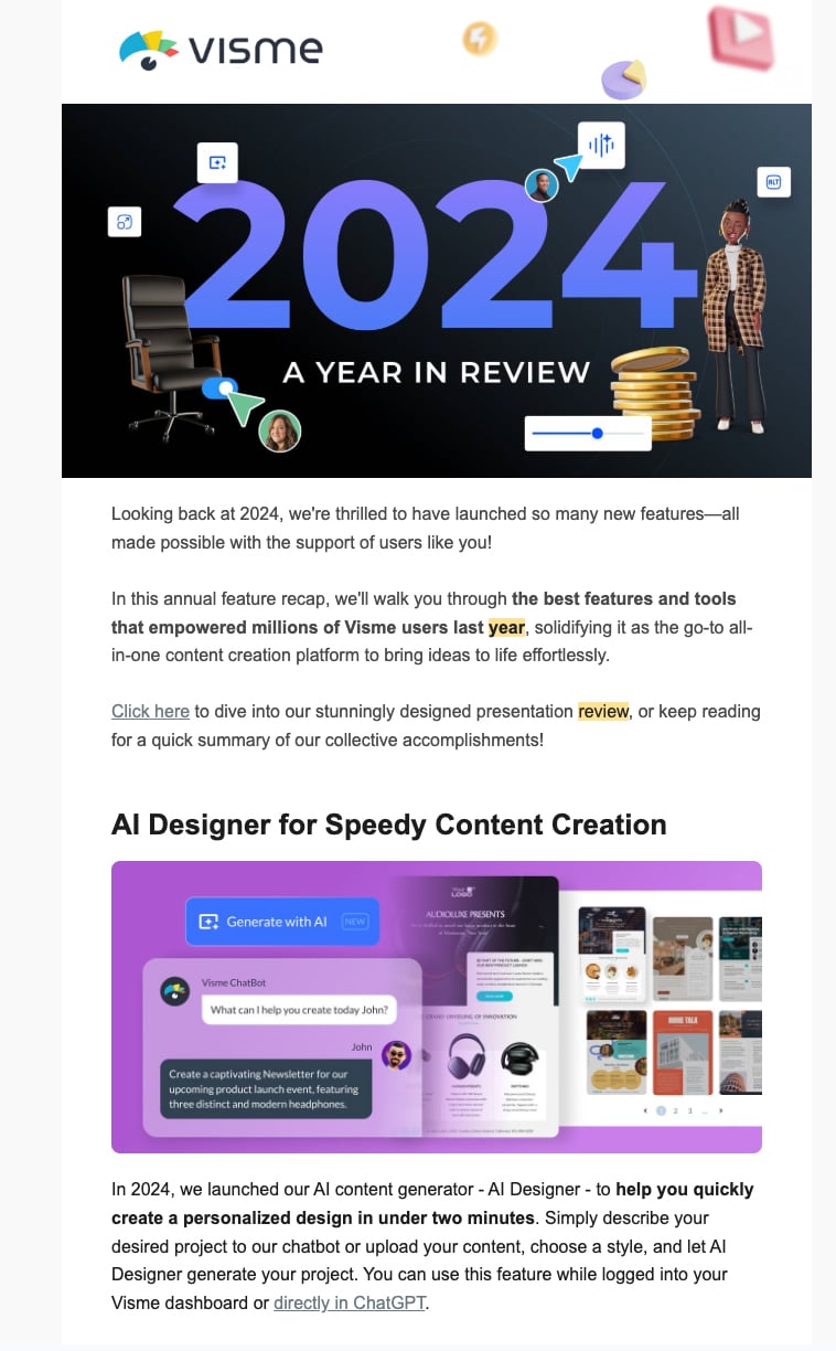
Source: Visme
What would a Visme year-in-review be if it wasn't made in Visme? We built our tool to help users transform boring content into interactive experiences. Of course, our annual report had to be nothing short of spectacular.
Each year, we put out our own annual review using our tool in a video presentation style.
Since it’s built entirely in Visme, we incorporated all of the incredible animation and interactive elements you'll find in our tool. The video presentation begins with a thank-you note featuring a typing animation that reveals the text as if someone is typing live. This effect immediately sets an engaging tone that draws you in.
What follows is a comprehensive showcase of our achievements: the number of projects created by users, templates designed by our team, bug fixes and feature improvements, plus previews of new and upcoming features.
Across all 16 slides, you'll find sleek animated icons, smooth hover effects, clickable pop-ups, polished entry and exit effects, seamless slide transitions, animated 3D characters, GIFs and embed codes.
The genius of this approach is that we aren't just listing out our features and capabilities.
Every animation, transition and interactive element serves as both content and proof of concept for what users can create with our platform.
We've made sharing incredibly flexible. You can generate an embed code to share on your website, distribute as a live link or download as HTML5 for offline sharing while keeping all interactive elements intact.
The beautiful thing about designing a report like this in Visme is that you can make it a collaborative effort. Just invite collaborators into your workspace and give them permission to view, edit or leave feedback. And it gets better: you can assign slides to different team members to work on, set deadlines and track their progress using our workflow management tool.
After scrolling through these amazing interactive annual report examples, you're probably buzzing to create yours.
The good news is that it’s achievable. You don’t need a huge budget or a fancy dev team to pull it off.
With the right interactive report software and the steps below, you can turn your traditional PDF into a scroll-stopping digital experience, just like the ones we’ve looked at.
In this section, I’ll walk you through the process step-by-step.
Before you dive into charts, animations or fancy transitions, hit pause for a second. Ask yourself this: What’s the core theme of this year?
Every great corporate report design needs a unique narrative to connect the dots.
Maybe your year was about resilience during tough market conditions. Maybe it was record-breaking growth. Or maybe it was culture transformation or social impact.
Whatever it is, let that theme take center stage.
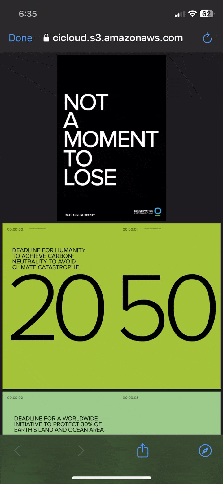
For example, Conservation International’s 2021 Annual Report begins with a core theme, “Not a Moment to Lose.”
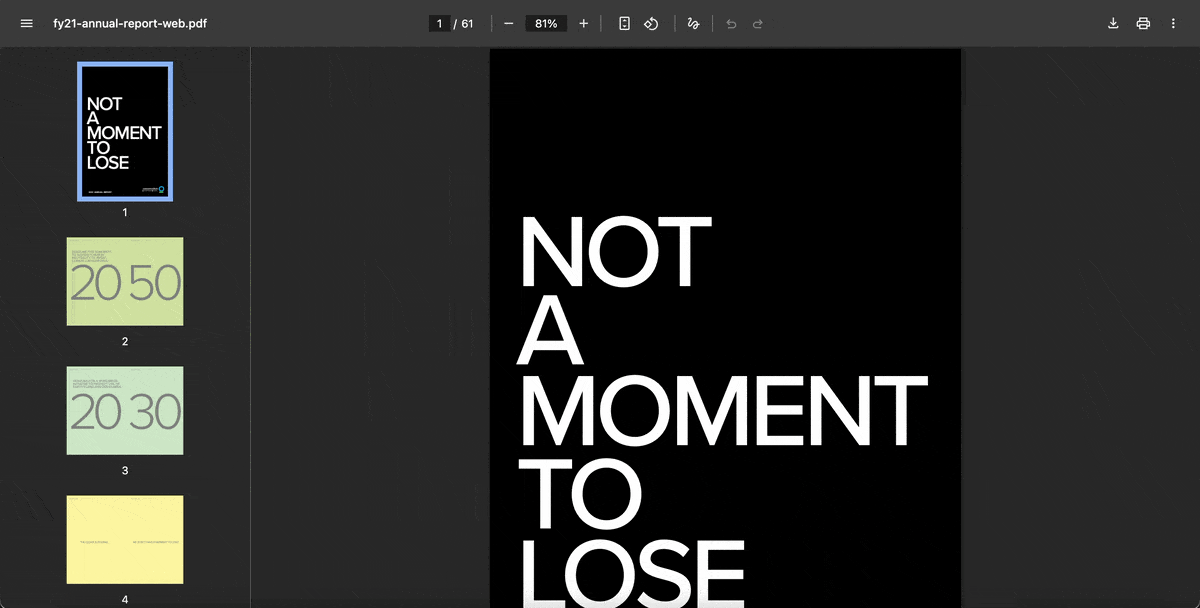
Source: Conservation International
This type of compelling storyline lends structure and coherence to your report.
But much more than that, it helps you decide which metrics deserve the spotlight, which testimonials to include and what kind of interactivity makes the most sense.
Without it? You might still end up with a decent-looking report. But trust me, if you skip the narrative and it’ll feel more like a data dump in disguise than a report with purpose.
Start by drafting 3–4 sentences that summarize the heart of your year. What changed? What mattered? Who did you impact?
Once you’ve nailed that summary, use it as your north star. Let it guide your section titles, the tone of your copy, the visuals you choose—and yes, even your interactive elements.
Not sure where to start? Visme’s AI writer can help you generate first drafts, proofread copy, tweak your tone and so much more.
Once your storyline is clear, it’s time to do a content audit.
Start by pulling together everything you’d normally include in your annual report. This includes financial statements, executive letters, sustainability updates, donor highlights, customer success metrics, impact statistics and more.
Then figure out which of these elements would benefit from interactivity.
The trick here isn’t to make every section flashy or dynamic just for the sake of it.
In fact, some content works best when kept simple, like legal disclosures, audit details or lengthy balance sheets.
But there are others that are best suited for interactivity.
A smart way to approach this is by categorizing your content based on its “interactive potential.”
Look for content that either:
(a) has layers of detail that could be progressively revealed or
(b) tells a better story when presented visually or experientially.
These are your high-value targets.
For example:
Use this step as an opportunity to trim the fat. If something doesn’t align with your core theme or deliver real value to stakeholders, cut it out.
Your format influences how your audience experiences your content, so it needs to match your goals and how people actually engage with your brand.
Microsites offer the richest interactive potential. They support smooth scrolling, video embeds, animated charts and responsive design. They're perfect for brands that want to impress investors, media or customers.
But fair warning: they require more resources to build and deploy. Plus, you'll need developers or a robust no-code tool, along with a plan for secure hosting and ongoing maintenance.
Interactive PDFs offer a middle ground. You can include clickable menus, expandable sections and light animations.
Plus, they’re portable and can be viewed offline. But they come with limitations: poor mobile responsiveness, file size bloat and compatibility issues across devices. They can feel clunky if not carefully designed and tested.
Doing live walk-throughs or one-on-one presentations? A presentation-style format tool like Visme or PowerPoint alternatives like Prezi could be the way to go. These are great when you want to control the narrative with a built-in sense of pacing.
I particularly love the fact that you can make all the report elements—fonts, images, color, icons authentically connected to your brand, using Visme’s Brand Design Tool. You can use them in board meetings, donor briefings or investor pitches. However, they lack the type of depth you’ll find in web-based reports.
The thing is, there’s no one-size-fits-all format. You simply need to choose a format that matches your story. When selecting your format, think about hosting, shareability, loading time, accessibility and how analytics will be tracked.
Whatever format you choose, you need a structure that makes sense. This is where most digital annual reports succeed or fall apart.
Here’s why this matters so much. Even the most beautifully designed report can fall flat if your audience doesn’t know where to click, scroll or swipe next. Worse off, people will bounce fast if the layout feels confusing or the flow is off.
Start by sketching your report architecture. Your entry point (homepage, cover slide, opening screen) should present your main theme and offer multiple ways in.
Whichever format you choose, keep each section digestible. Don’t overload a single screen with five charts, two videos, a timeline and a 500-word narrative.
That’s too much, both for your audience’s attention span and their device’s loading speed.
I recommend using tabs, collapsible content or progressive scrolling to break up the content and maintain a comfortable pacing.
Remember, your audience won’t all read your report in the same order. And that’s a good thing! Interactive formats shine when they let users explore based on what they care about. Your job is to make sure they can do that without hitting dead ends or getting lost.
Finally, keep testing your structure with real users. If someone can’t find what they’re looking for in 10 seconds, something’s off. Streamline, rename sections or rethink how you present entry points.
Every interactive element and data visualization has to earn its place. If it's not making your content more meaningful or accessible, it’s definitely doing the opposite: distracting, overwhelming or frustrating your reader.
Let’s start with interactivity. Think of it like seasoning—a little enriches the flavor, but too much ruins the dish.
Every video, audio, animation, scroll effect, filter or clickable hotspot should complement the story without stealing the spotlight.
Data deserves the same care. Your charts, graphs, dashboards and data visualization tools shouldn’t just spit out numbers. They should help users find patterns and stories within them.

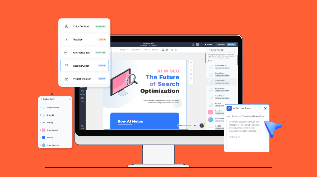
Let your readers be able to drill into things like revenue segments, filter regional results or hover over milestones to see what caused changes.
If your interactive chart needs a user manual, it’s probably too complicated. So, make sure to include tooltips, labels and consistent color schemes to help guide users.
Without context, your data is just noise. That's why I recommend pairing your charts with short narratives or quotes that explain the why behind the numbers. A simple insight transforms raw data into a memorable story.
You’re building a digital report, which means you can’t predict how or where someone will view it.
It could be a flipbook on their phone, an interactive PDF on a desktop, or a presentation on a touchscreen display. No matter the format, your annual report needs to function smoothly on any screen.
Stick to mobile-friendly design choices: single-column layouts, large tap targets, legible font sizes and enough spacing to prevent misclicks.
Interactivity can behave differently across devices and platforms. For instance:
That’s why testing is non-negotiable.
Check everything—buttons, tooltips, expandable sections—on different browsers, screen sizes, operating systems, and orientations. Your multimedia should load fast, play smoothly and never autoplay with sound.
And don’t overlook accessibility. Make your interactive report work for people with disabilities. Use logical reading orders, alt text for images, keyboard-friendly navigation for interactive elements and strong contrast ratios for readability. Also include icons, underlines or labels to indicate clickable areas.
Creating your interactive annual report is only half the job. The real impact comes when you publish, promote and measure how it performs.
Choose a publishing format that fits the experience you’ve built. For example, if it's a digital flipbook, host it on a dedicated landing page.
If it’s a presentation-style report or interactive PDF, embed it on your website or share via private links with key stakeholders like board members, investors or partners.
Next, treat your report like a full-blown marketing campaign. Promote it across multiple channels to reach your different audiences. For example, you can:
Visme, for example, shares curated highlights on LinkedIn and through email newsletters, always with a link back to the full interactive experience.
Premier Foods took a slightly different but equally smart approach. They shared a 16-second video highlight of their 2024 report on LinkedIn. And you guessed it—it featured a sprinkle of animation and interactivity to draw attention.
Finally, don’t forget to measure performance. With Visme’s analytics feature, you can track page views, click-through rates, time spent on page and engagement with interactive elements. These insights can help you make next year even better.
A classic annual report is a static document—usually a PDF or printed booklet—that presents financials, milestones and key achievements in a linear format. Compared to digital formats, it has minimal visual engagement beyond charts and photos.
An interactive annual report, on the other hand, is built for digital platforms. It includes clickable navigation, animations, videos, hover effects and responsive charts. Rather than passively reading, users explore the report at their own pace, focusing on the sections most relevant to them. This format is more engaging, easier to digest and ideal for showcasing data in a dynamic, visual way.
The main purpose of an annual report is to communicate a company’s performance, direction and accountability to stakeholders. This includes shareholders, investors, customers, employees, partners, regulators and in many cases, the general public.
Beyond the numbers, a good annual report reinforces brand values, builds trust and positions the company as transparent and forward-thinking. It’s both a compliance tool and a storytelling opportunity. One that can influence perception, attract investment and boost credibility.
Despite its importance, an annual report has a few downsides. First, it can be resource-heavy, requiring extensive input from multiple teams, along with careful design, writing and review. For some organizations, this means long production timelines and high costs.
Second, traditional reports can feel dry or overwhelming, especially when packed with technical language or dense financial data. If not designed thoughtfully, they may go unread or fail to make an impact.
Lastly, annual reports often try to serve too many audiences at once, leading to vague messaging or surface-level content. And by the time they’re published, the data can already feel outdated, especially in fast-moving industries.
Creating an interactive annual report goes beyond keeping up with digital trends.
It's about fundamentally improving how you communicate with stakeholders.
When you do it right, these reports can turn casual readers into curious explorers who actually understand and remember your company’s story.
Remember, you don't need a massive budget or development team to get started.
Visme makes it easy for you to create engaging, scroll-stopping interactive annual reports without the steep learning curve or coding experience.
With an intuitive drag-and-drop interface, you can transform boring report content into dynamic experiences with custom animation and interactive features, such as video, audio, hotspots, pop-ups, hover effects, clickable menus and animated graphics.
Sign up to transform your annual report into engaging digital stories.
Design visual brand experiences for your business whether you are a seasoned designer or a total novice.
Try Visme for free