


Typography Infographics: 12 Inspiring Examples & Techniques

Infographics are among the most powerful and shareable content formats online.
A PubMed-indexed study found that 72% of respondents were more likely to share infographics than written articles because of their visual appeal.
But not every infographic benefits the reader or earns that share. Some unintentionally mislead their audience.
This Apple infographic, for example, sent people into unnecessary panic, according to the BBC. Good design, terrible outcome.
That’s the real challenge most teams face: how do you generate a steady stream of relevant and timely infographic ideas that resonate with your audience?
That’s exactly what this guide will help you solve. I’ll share practical techniques for building a steady stream of strong infographic ideas, plus 30 real-life and editable Visme templates across different niches that you can start customizing immediately.
Before we get started, just remember that making an infographic is super easy with Visme's infographic maker. Or you can use our infographic templates and create one in minutes.
So, where do great infographic ideas actually come from? Here are five reliable methods to keep the ideas coming:
If your team keeps asking the same question in meetings or customers repeatedly stumble over the same concept, that’s a signal. The information either doesn’t exist in a useful format or is buried inside a dense document.
Visuals can help explain concepts better than blocks of text alone.
Scan the areas where questions often appear: support tickets, onboarding calls, sales objections, comment sections and training feedback. Any question you answer more than twice is an opportunity for an infographic.
For a faster, more systematic approach. Here’s a simple method with AI:
If you see both engagement and search volume, you have an idea that is needed and discoverable.
Most strong infographics are not brand new ideas. They’re visual versions of your content that already perform well in another format, such as blog posts, long-form articles, research reports and survey results.
If people already find them useful, a visual version can improve clarity, reduce reading time and make the same insight more shareable.
If a piece is broken down into sections, steps, hierarchy, comparisons or key data points, then it’s easy to repurpose. Choose a layout that matches the structure. For instance, a process becomes a vertical flow, a comparison becomes a side-by-side split and a research summary becomes a series of bold statistical blocks.
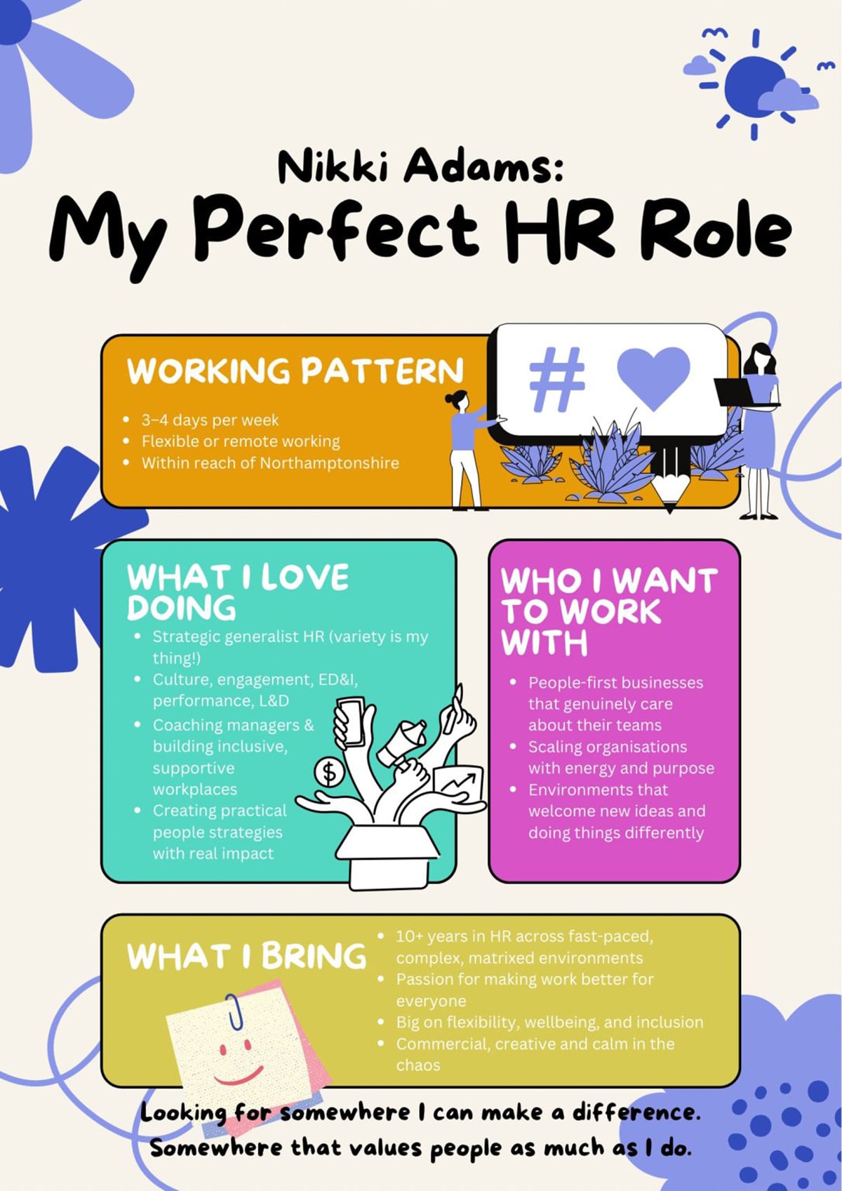
Nikki Adams had been sharing her job search journey on LinkedIn for a while. But when she created a visual infographic outlining her ideal role rather than writing about it, something shifted.
The post drove significant engagement, helped her get hired and inspired others to do the same.
If you want to know what your audience wants to see, look at what they've already engaged with. The evidence is sitting in plain sight on every platform you use.
Study the underlying structure and angle to understand why it resonated. Then add your own insights and turn it into a more engaging infographic.
Go to Google and type "recent [your niche] reports." You'll find annual reports, market research, trend forecasts and government statistics published within the last year, filled with accurate data.
That's your opportunity. Don't just share the link. Pull the two or three findings that would most surprise or challenge your audience's assumptions and build an infographic around those.
You become the person who made the research accessible, while earning yourself visibility
If you struggle with a lack of visual concepts for your next infographic design project, design platforms are where you train your eye.
Search any topic on Pinterest and you'll find hundreds of layouts, color palettes and structural approaches you wouldn't have thought of on your own.
Behance and Dribbble show you what's possible at the highest level of design execution. And a template gallery like Visme's lets you see different infographic layouts. Of course, with the added advantage of being able to start designing directly from what inspires you.
The table below outlines different infographic layouts and their best use cases.
Use it as a quick reference to help you decide which layout best suits your goals.
| Infographic Type | Best Use Case |
|---|---|
| Interactive Infographic | Driving engagement through clickable links, pop-ups, video embeds, or animations. |
| Timeline Infographic | Showing chronological events, milestones, or progressions. |
| How-To Infographic | Explaining a process or providing a step-by-step guide. |
| Statistical Infographic | Presenting data, percentages, trends, or survey findings visually. |
| Process Infographic | Illustrating sequential stages, systems, or workflows. |
| Informational Infographic | Summarizing dense or text-heavy content such as reports or blog posts. |
| Geographical Infographic | Displaying region-specific trends like demographics, climate, or economic data. |
| List Infographic | Presenting grouped items, tips, or facts in a structured layout. |
| Comparison Infographic | Contrasting products, features, or ideas side-by-side. |
| Anatomical Infographic | Breaking down parts of a subject (e.g., body, tool, or system) visually. |
The following are real-life examples that can give you an idea of how different infographic layouts work in practice:


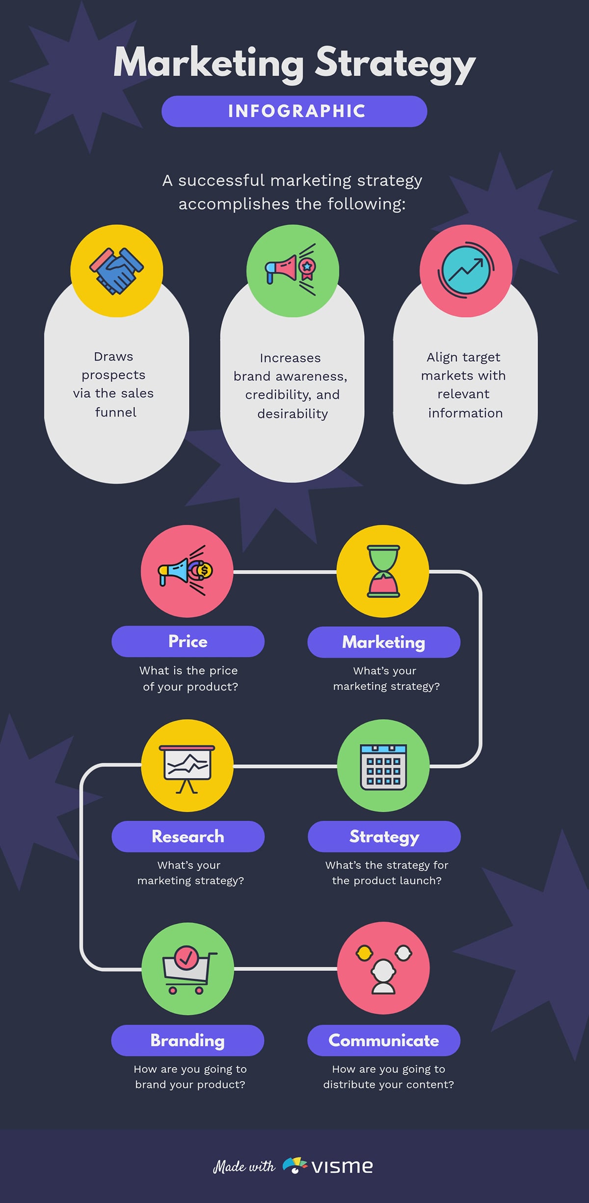
This stunning template design summarizes a marketing strategy on a one-pager. It's divided into two parts: the first list explains why having a documented marketing strategy matters and the second uses a flowchart to map the key components of a content strategy.
It's the kind of marketing infographic you can share with stakeholders or team members and watch people actually engage with it.
Each point gets one bullet. The flowchart makes it easy to follow the logic from one step to the next without getting lost in explanation.
If your team has a content strategy that nobody reads or follows, convert it into an infographic. Upload the document to an LLM like ChatGPT and prompt it to summarize the key sections in plain language.
Feed those outputs into Visme's AI designer with a prompt that describes your brand tone and visual preferences and let it draft the structure for you to refine.
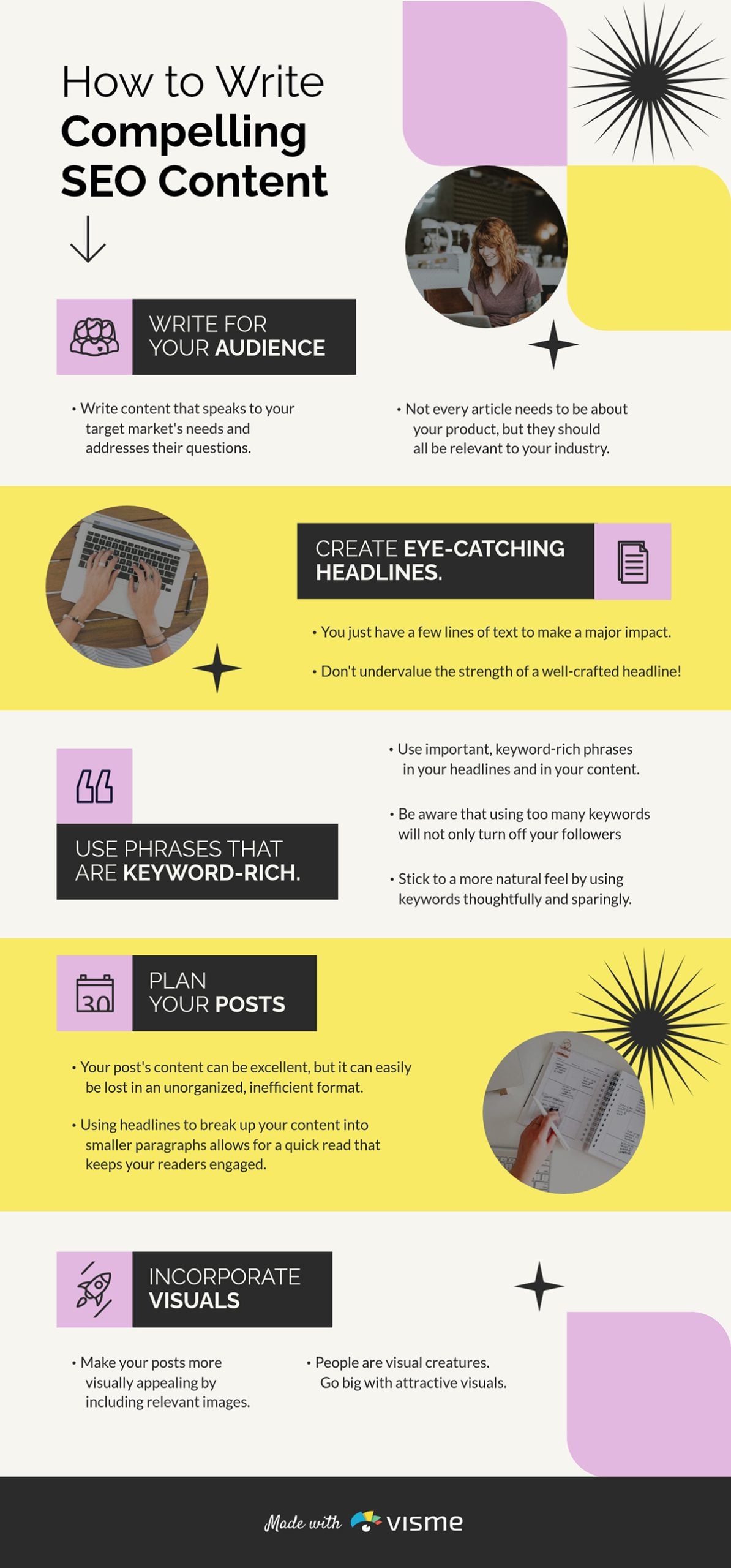
SEO advice is everywhere, but most of it lives in dense blog posts that take 20 minutes to read and are forgotten just as quickly. This infographic solves that by distilling the entire writing process into a format you can scan in minutes. It can be a great supporting resource for articles.
Why it Works
Instead of stacking all the points on one side of the page, the layout alternates: one point on the left, the next on the right, then back to the left again. That zigzag creates a visual rhythm that keeps the reader moving through the content without realizing it.
If your blog article, onboarding or process documents include repeatable processes, steps or frameworks, an infographic is the most shareable way to package them.
Use Visme's interactive capabilities to embed your URL directly into the graphic and link readers back to the full piece.
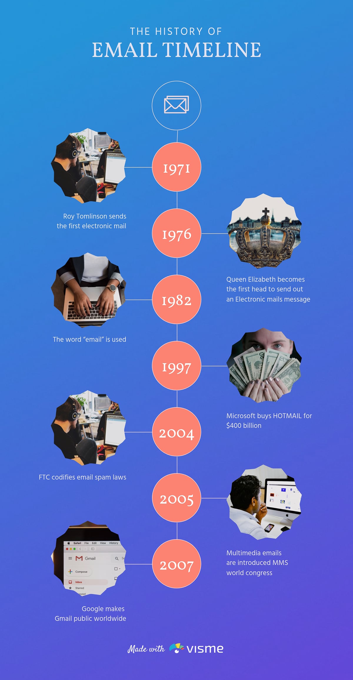
Like most people, I'd bet you use email every day without ever thinking about its history. That's exactly what makes this infographic interesting.
The history of email is full of quirky milestones like Queen Elizabeth sending her first email in 1976. For startups or an email marketing software, this is the kind of content that earns attention without selling anything.
The vertical timeline format keeps the story easy to follow. Each milestone gets its own image and a short, punchy description that informs.
Whatever niche you're in has a history worth telling — the evolution of social media, the rise of a sport or how technology shifted over decades.
Visme's free timeline maker lets you turn any origin story or evolution into a clean timeline infographic quickly.
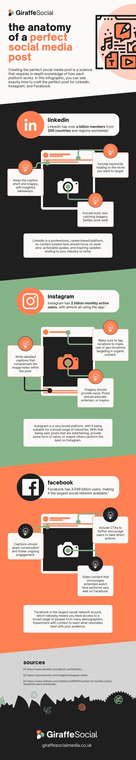
Justifying content production is one of those questions content marketers are constantly asked, usually by stakeholders. Georgios Chasiotis, as the owner of a content agency, has almost certainly heard it hundreds of times.
So instead of writing another LinkedIn essay defending content marketing, Georgios did something smarter: he turned the answer into an animated, interactive infographic. Content marketers can share directly with their own clients and stakeholders as a sales enablement tool.
It answers a recurring question in a format that's easy to digest and even easier to forward. And the use of animation is superb. It flows from one point to the next, lighting up each square with color as it progresses. That sequential reveal keeps the eye engaged and makes a logical argument feel like a conversation rather than a lecture.
Pull your last few discovery call transcripts, drop them into LLM and prompt it to surface the most common objections your clients raise about your recommendations. Convert the most frequent one into an infographic in Visme
Use Visme Analytics to track views and shares after publishing. The data tells you how effective your design is.
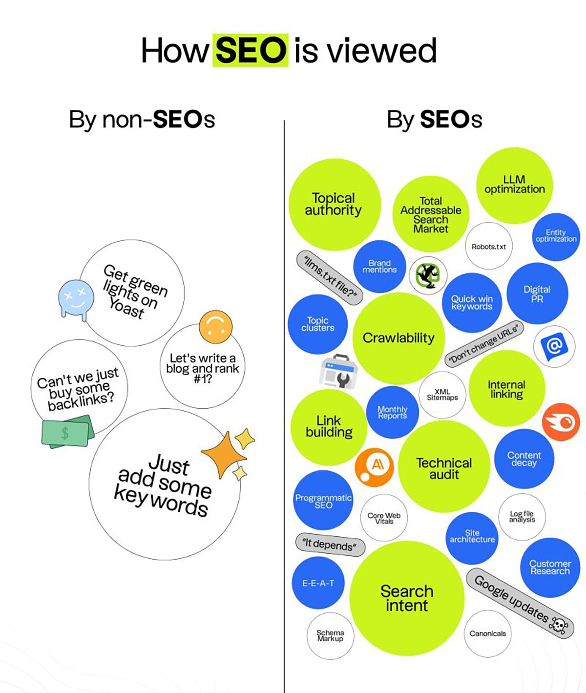
Jake Ward is one of the sharpest infographic creators on LinkedIn and this example shows it. He uses the comparison format to highlight the gap between how SEOs view their craft and how others do.
This format creates a tension that allows readers to place themselves on one side of the divide. Guess what? Jake pulled 219 reposts and 227 comments on this post.
Instead of using a standard two-column table, Jake used a word cloud layout on both sides of the divide. And the color contrast seals it: the circles on the negative side are plain, while the circles on the positive side are full of color. This allows you to feel the difference before reading a single word.
Pick any trend or practice in your industry that's quietly outdated and put it head-to-head with the modern alternative; "before and after" or "old vs. new".
Once your infographic is ready, use Visme's Social Media Scheduler to plan and publish.
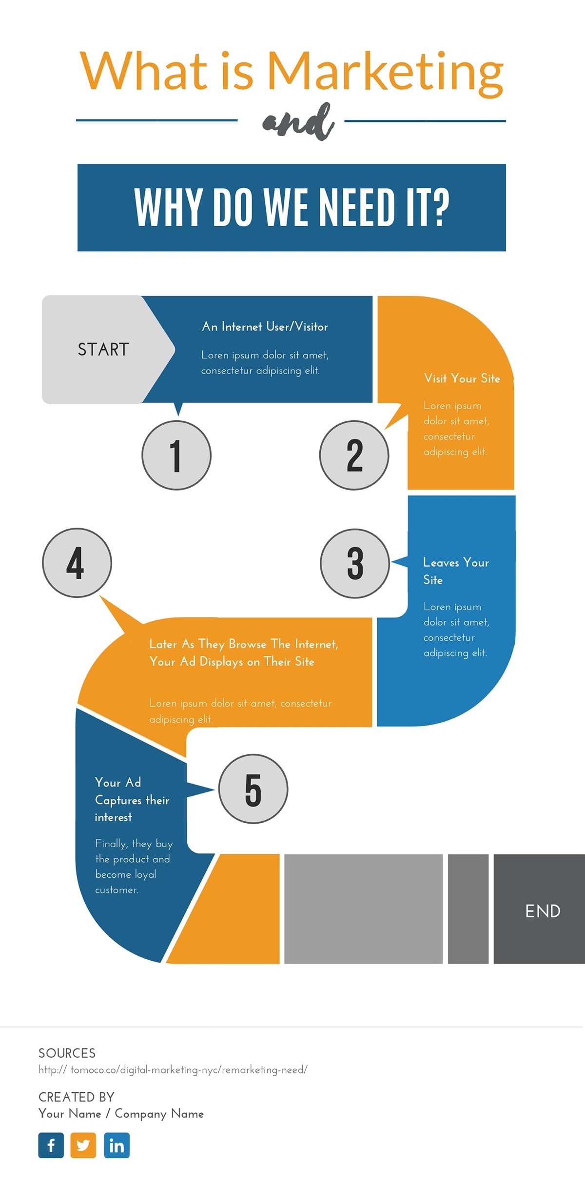
Whether you’re preparing for a team presentation or creating an internal guide, this kind of infographic can be a great visual resource. It shows why marketing matters by mapping the customer journey and explaining its role at every stage.
Why It Works
The ideas are presented through concise text blocks and circular icons, with supporting visuals providing context.
The color contrast between bright blue, warm orange and neutral gray also creates an engaging yet professional tone that highlights each stage distinctly.
Use icons and visuals that support your message and keep their style consistent throughout the design.
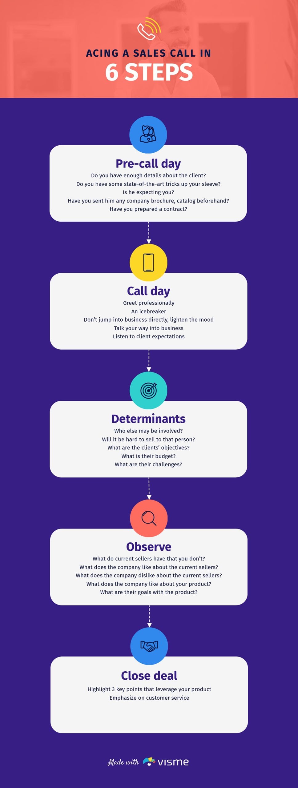
A sales call is only as good as the preparation behind it. That's the entire premise of this editable infographic template and it delivers. The mind map lays out everything a rep needs to think through, from pre-call research all the way through to closing in a scannable visual.
What makes this template effective for sales prep is its simplicity. Short text blocks arranged in a clean vertical flow mean a rep knows exactly what comes next, even under the pressure of a live call.
Drop your last 10 closed-won and closed-lost call transcripts into LLM and prompt it: "Compare these sales calls and identify the preparation patterns that appear in won deals but are missing in lost ones."
The gaps it gives you are the branches your current call prep map is missing. Add them to this template in Visme and you've turned a generic mind map into a custom playbook built from your team's own wins and losses. You can also choose from any of Visme’s presentation templates and add this infographic to the slides.
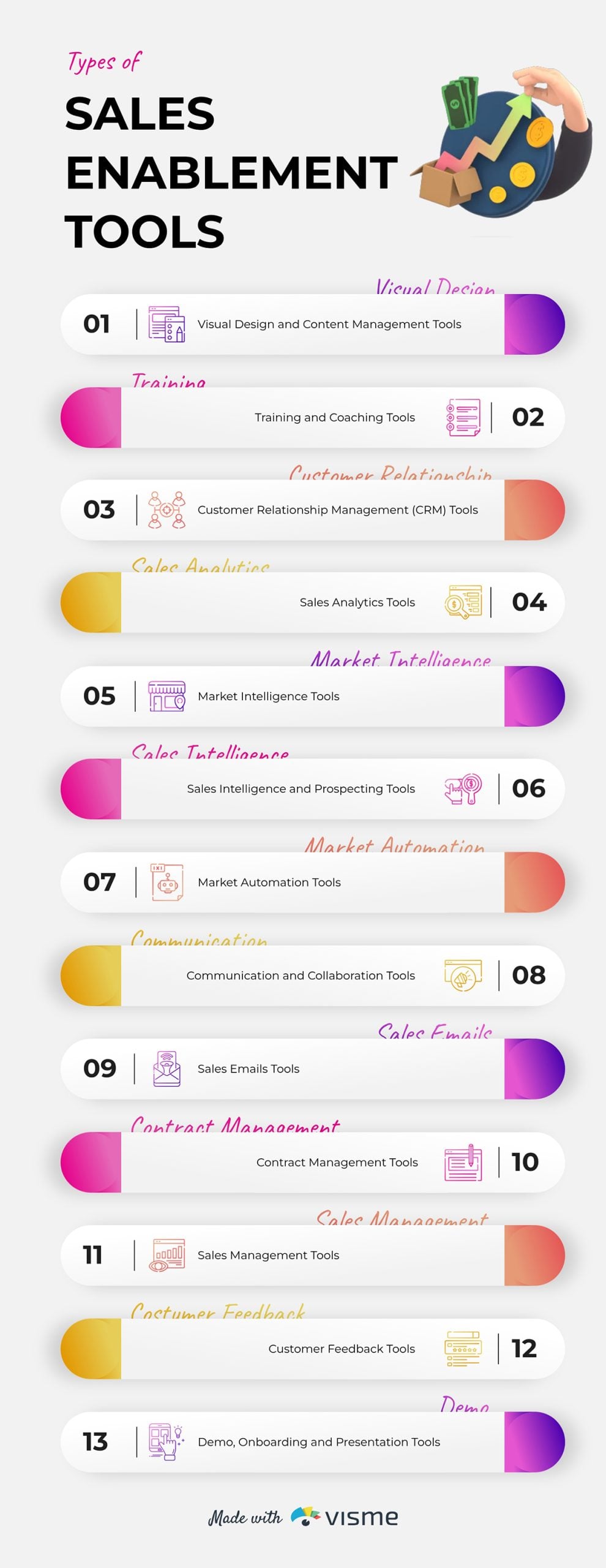
Sales teams need a range of tools to work efficiently. But only a few reps have a good picture of what they are and where they fit into their workflow.
This infographic solves that by listing the tool categories needed at each stage of the sales cycle.
This minimalist business infographic keeps things organized without feeling like a product catalog.
Each category gets its own visual block, making it easy to scan whether you're a sales leader auditing your current tech stack or a rep trying to understand why your manager just added yet another platform to the workflow.
Check all the sales tool stacks you have, categorize them and put them into a visual like this template. You can also create a bullet list of tool names for each category and share it during sales onboarding or team alignment sessions.
Use the Visme brand toolkit to keep it aligned with your web design and overall branding. Simply upload your website URL and it will automatically extract your font, logo and colors and apply them to your design.
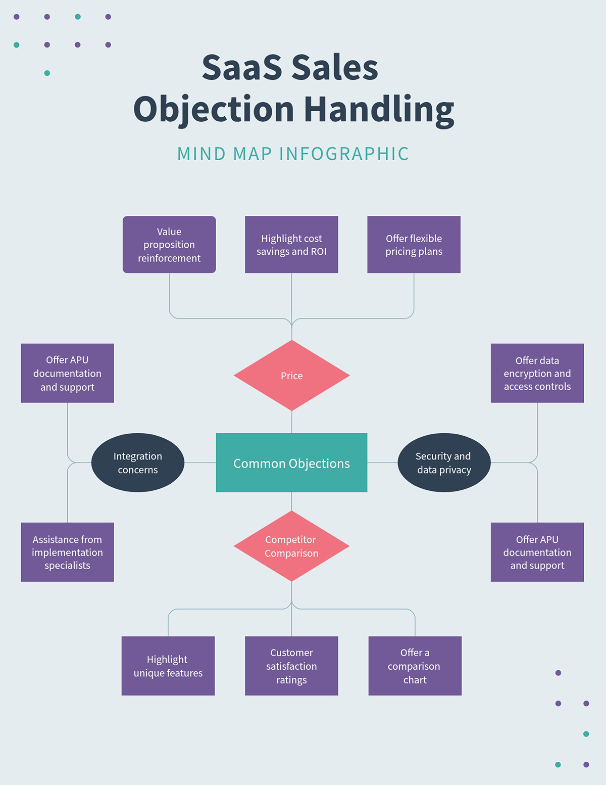
Think of this as the bigger-picture companion to the Sales Call Mind Map. That template zooms out to help sales reps prepare, while this one zooms in on the conversation. With this insight, your team can tackle objections from any angle.
This mind map helps reps see all the ways an objection can go so they can prepare the right responses in advance. The use of color makes it easy to spot each objection category and understand it better quickly.
Use Visme's collaboration feature to invite your sales team to build the mind map together. This way, each person can contribute to the branch based on their experience.
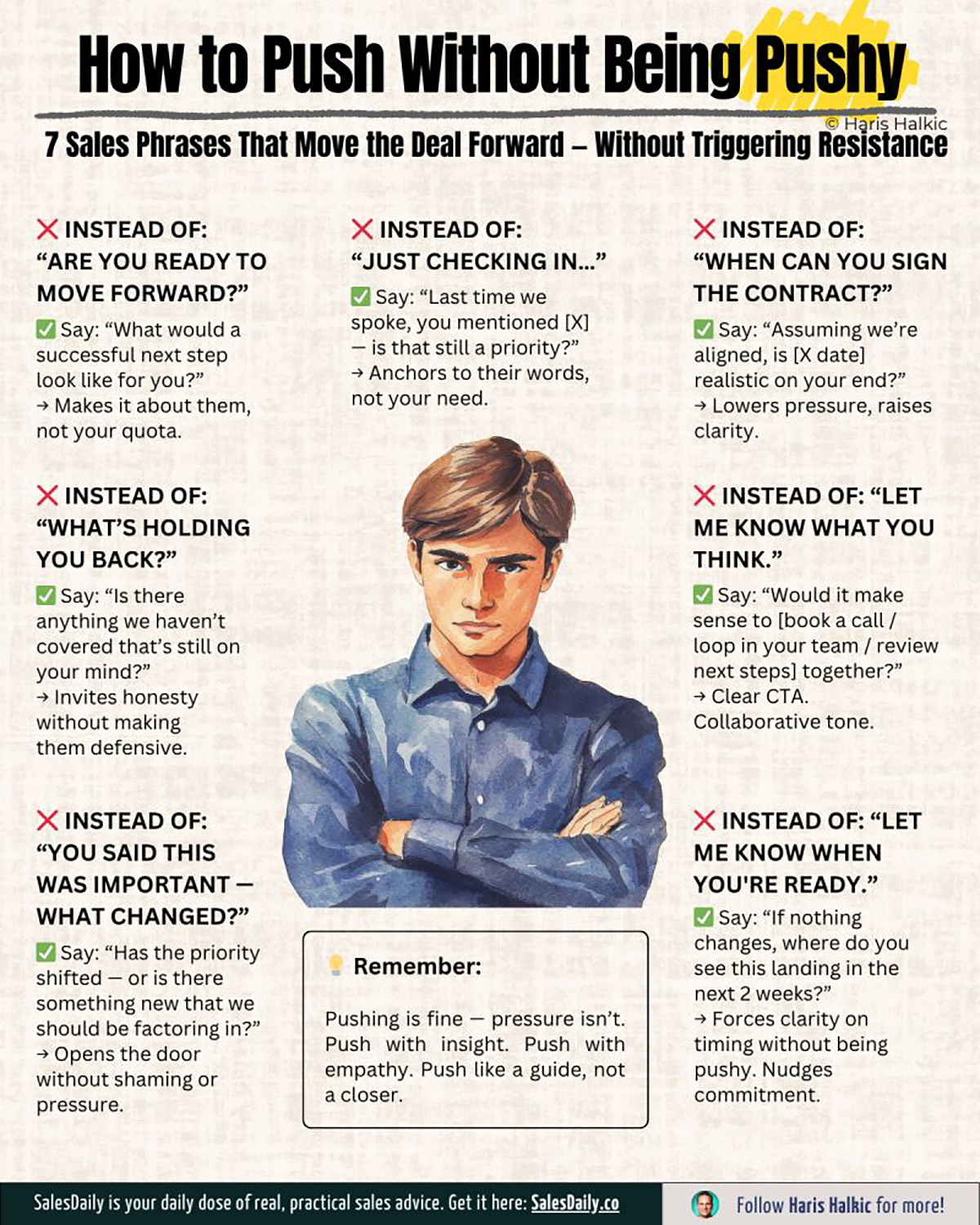
Every sales professional has felt the tension between persistence and pressure. Most have probably crossed the line without realizing it.
This infographic addresses that exact gray area by offering seven concrete techniques for staying present in a prospect’s world without making them uncomfortable.
The design feels cohesive from top to bottom; the font, illustration style and layout all align.
The use of “wrong” and “right” emojis signals the verdict before readers have even processed the text. That visual cue reduces friction and speeds up comprehension.
The central illustration, with its stern expression, reinforces the emotional tension of the topic without adding extra explanation.
Design your next sales training infographic around a tension rather than a topic. e.g., "How to follow up without being annoying", instead of "Best follow-up practices".
Once you've mapped out the contrast, use Visme's AI Writer to sharpen each tip's phrasing and make it more concise.
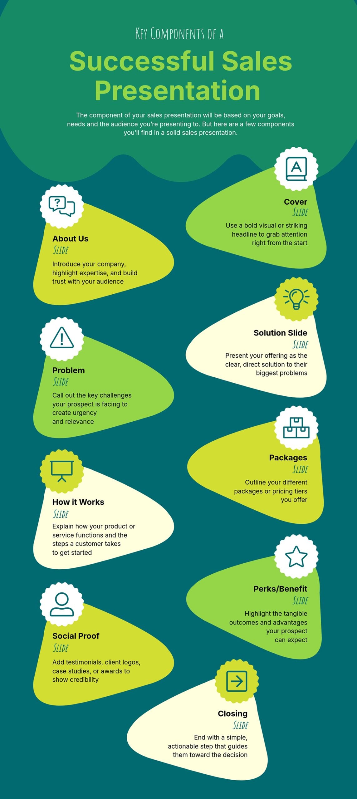
A bad sales presentation is one of the most expensive things a business can produce: hours spent designing slides that don’t convert the prospect. This infographic can be a roadmap to avoid that.
It breaks down every structural element a strong sales presentation needs, from the cover and about us slide to the problem statement and pricing packages.
The template functions as both a planning tool and a quality check. You can use it to build a presentation from scratch or run your finished deck against to spot what's missing.
The colors are captivating and the icons just make it easy to understand what each section covers.
Think about any multi-part process your team follows inconsistently and build an anatomy infographic that maps every component it should include.
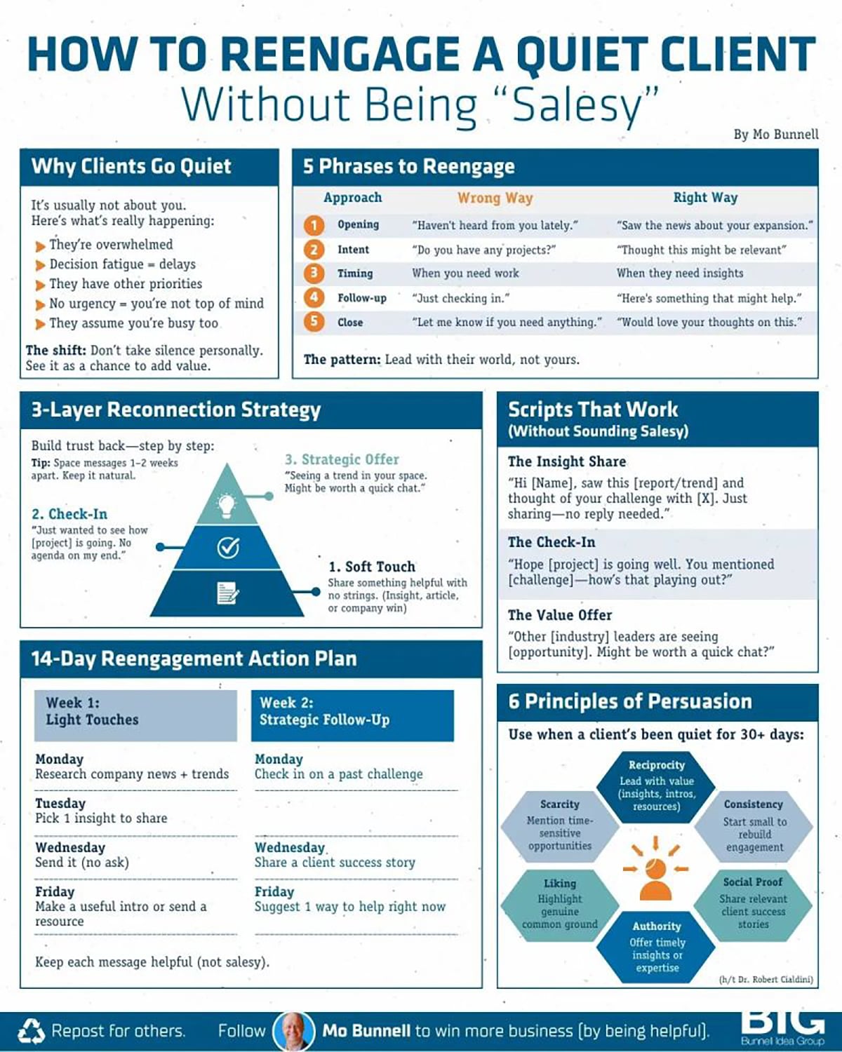
Mo Bunnell turned one of the most stressful moments in sales into a structured, visual framework. Instead of publishing a long article about re-engagement, he packaged the strategy into a comprehensive infographic design.
The most impressive part of the infographic is how organized it feels despite its text-heavy nature. Each section is contained within its own border, but creates the visual effect of six separate infographics living inside one.
That compartment reduces cognitive overload, helping readers process one section at a time.
If your infographic idea requires depth and it’s the primary format, focus on strong visual hierarchy, good sectioning and spacing to keep it digestible.
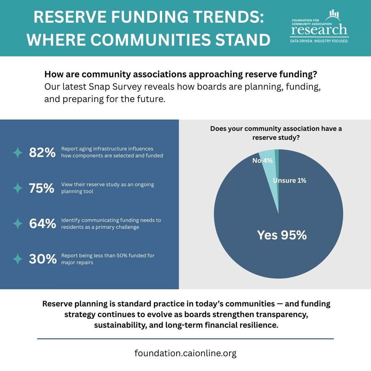
Jake Gold posted this research from his Foundation for Community Association Research on LinkedIn. It revealed trends in reserved funding and practical guidelines for how community leaders are approaching them.
Rather than sharing only the link to the full report and hoping people clicked, he repurposed the key findings as an infographic to gain more attention.
The complete research is a six-page, data-filled paper. Jake simply added the five findings community leaders can act on immediately and presented them in clean bullet points supported by a pie chart.
The bold headers and question-based subheadings immediately spark curiosity and draw the reader in.
If your NGO publishes research or annual reports, you can create an infographic to summarize the key findings. This can make people curious enough to look for the original report.
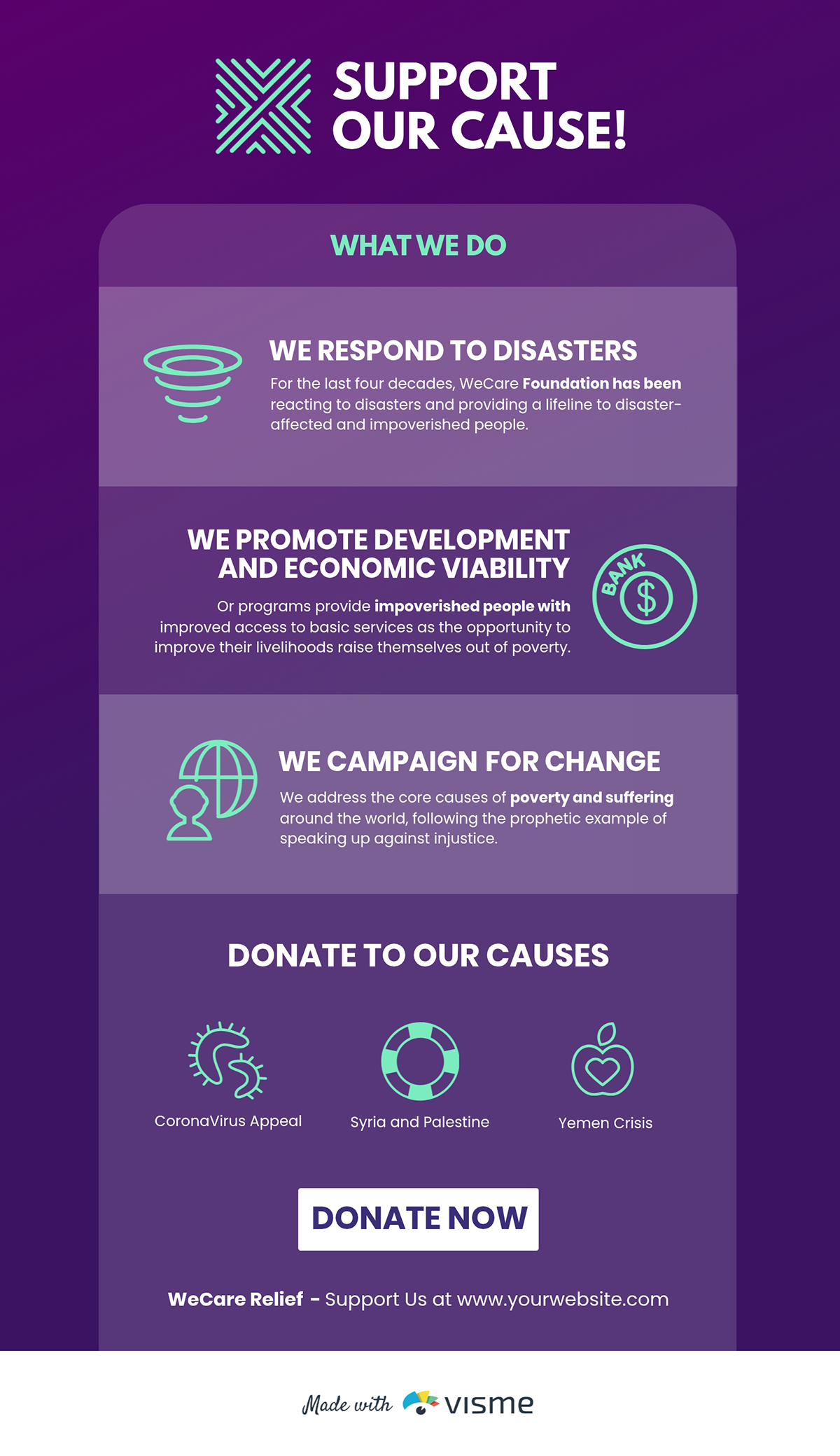
One of the hardest things you can do as a nonprofit is to convince someone that your work is worth their time, money or attention. This template is built for that moment.
It combines short text blocks with visual elements to present key information in a way that works equally well in presentations, pitch decks, business plan or on social media.
The focus is on the cause, values and ask in a natural, cohesive sequence.
Build a promotion infographic that a stranger could read in 60 seconds and walk away from understanding exactly what you do, who you do it for and how they can help. Think of it as your organization's visual elevator pitch.
NGOs running poverty alleviation programs, such as education, food security and housing, can learn from this template’s structure. It moves from current impact to program goals and then to a call to action, showing donors the value they have delivered before presenting the ask.
Too many nonprofit infographics focus on the problem without giving equal weight to their offerings. This template flips that by making the organization's solution the centerpiece.
Also, it supports every claim with data, charts and visualizations that make the impact feel real and verifiable.
The solution you’re offering should be at the heart of your infographic and mapped to measurable outcomes.
Use Visme’s data visualization tools to link the infographic to your live Excel data so the charts or graph update automatically, making it easy to share.
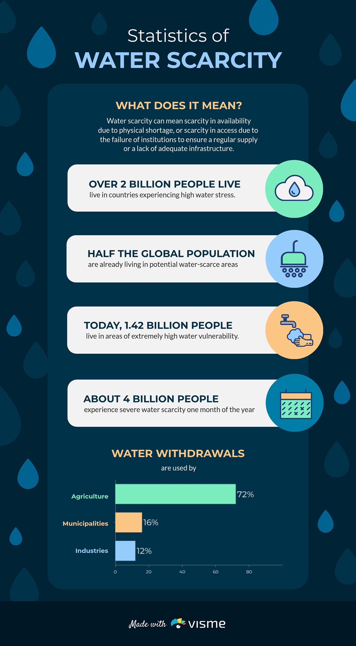
Water scarcity has staggering statistics. But without the right presentation, those numbers won’t move the needle. This infographic highlights the issue in an easy-to-understand way.
It works well for World Water Day campaigns, donor appeals and government briefings.
The blue tones, water icons and fluid layout reinforce the water scarcity message. Readers can quickly understand what the infographics mean because the design mirrors the topic.
Build an “[X Crisis in Your Region]” infographic that localizes issues for your audience. Show the impacts and damages on your community with statistics. A local stat almost always hits harder than a global average.
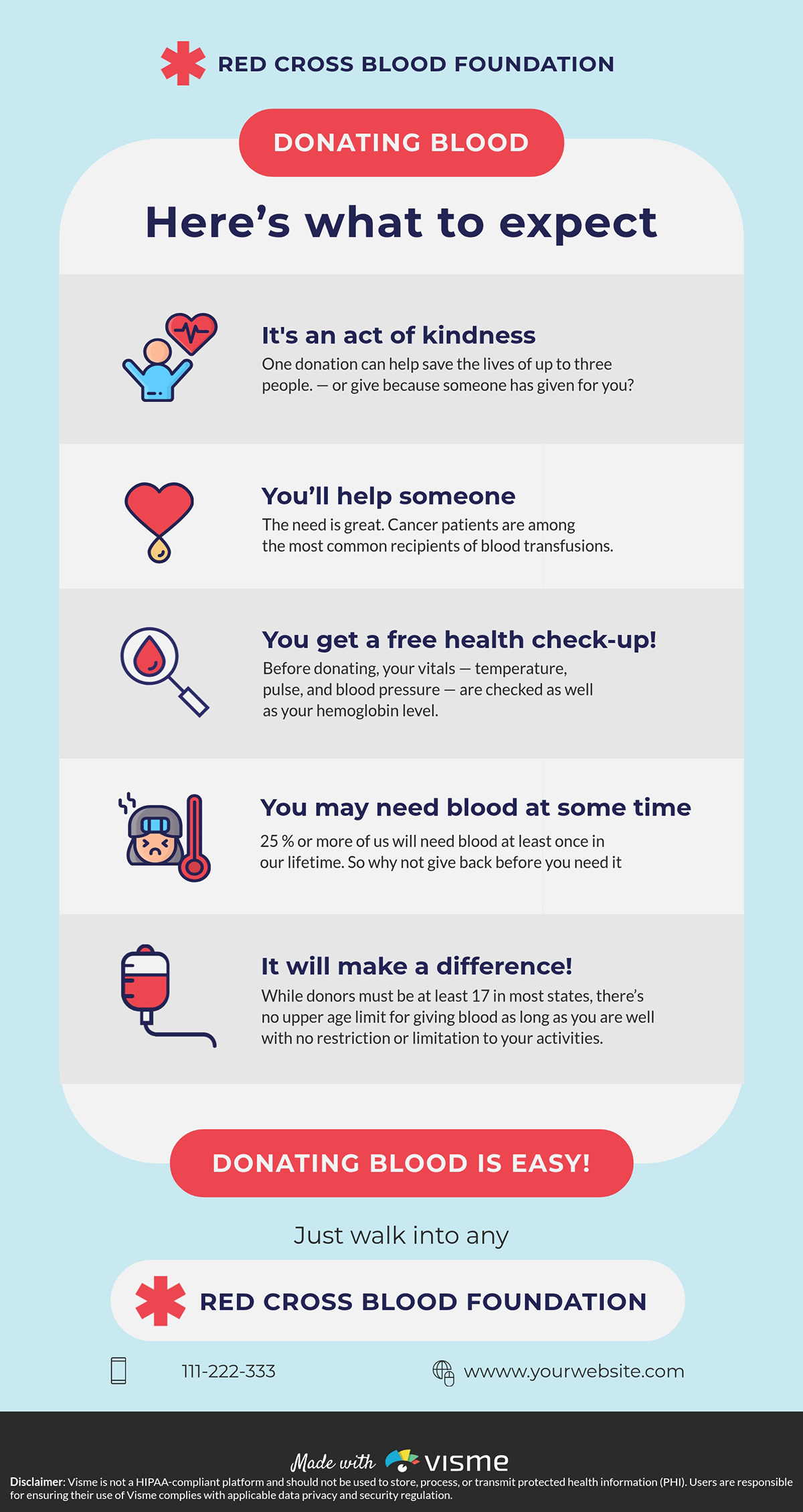
Most people aren't opposed to donating blood; they're just uninformed of the benefits. This structured infographic walks potential donors through the impact of donation to remove the barrier between intention and action.
The warm design signals human care rather than clinical procedure, which matters for an ask that is literally physical and personal.
Use approachable visuals and explanations that help people feel informed, comfortable and ready to act.
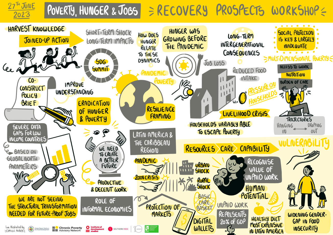
The Chronic Poverty Advisory Network team created one of their most insightful pieces, Pandemic Update and Recovery Prospects, to highlight the short-term shocks and long-term consequences of COVID-19 on poverty, hunger and employment.
The design uses a handcrafted visual style, with flowing sketches, clustered keywords and arrows that make it feel very engaging. This informal aesthetic contrasts beautifully with the gravity of the issues being addressed.
A fun, slightly informal style, like a handcrafted visual style, can make complex issues such as poverty, hunger and employment easier to understand while helping people feel included in the conversation.
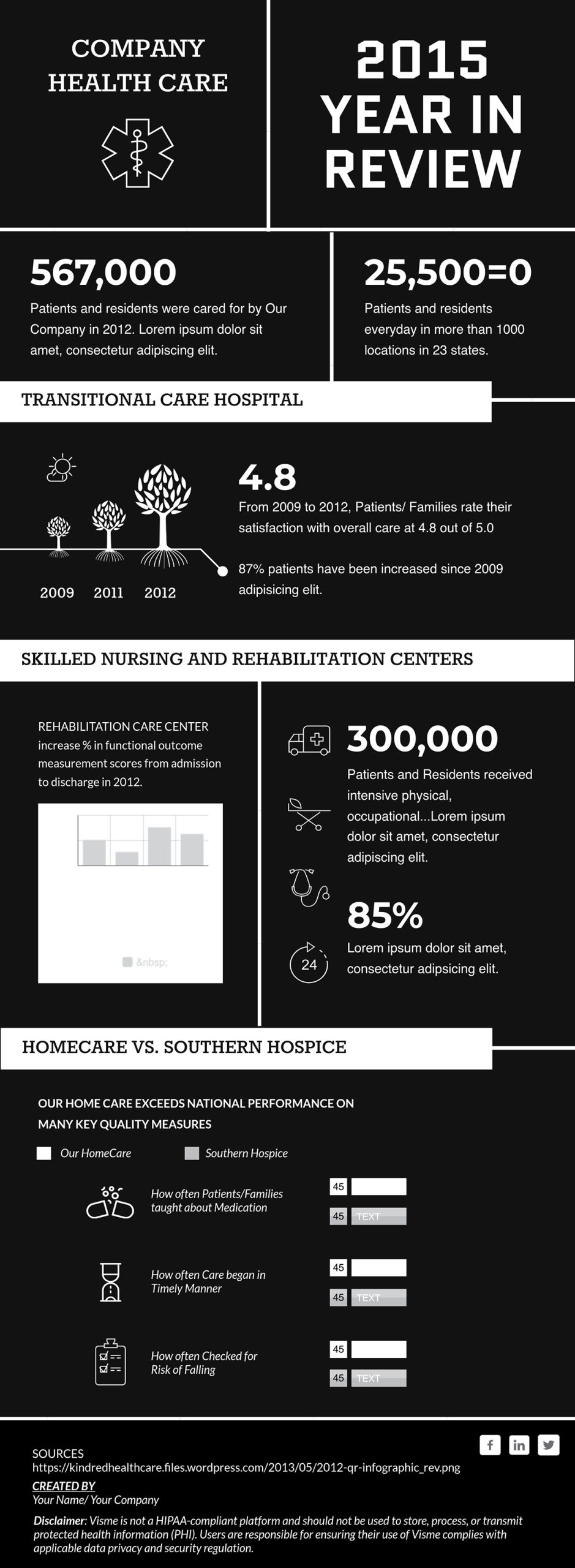
Annual reports have a reputation for being dry. This template is proof that they don't have to be. It condenses an entire year into digestible sections that a board member or investor can scan in two minutes.
Modern typography and clean data blocks break information into visual chunks that are easy to absorb. The use of icons, illustrations and charts replaces long text descriptions, making the important details easy to spot.
If your last year-in-review report barely got noticed, it was probably too bulky. Distill the next one into an engaging infographic that highlights your organization’s biggest wins, such as income growth, team expansion and funding impact.
Use Visme's Dynamic Fields to easily update metrics across multiple documents without rebuilding the design each time.

AI in healthcare is one of the most talked-about and misunderstood topics in modern medicine.
This template makes a complex subject more accessible by focusing on what the technology does for people
It is a long infographic, but it doesn’t feel overwhelming. Each section focuses on a specific area of medicine where AI is making an impact.
The visual format shifts across sections to keep the design engaging, from horizontal lists paired with icons to vertical bullet points and pie charts.
Use infographic formats like this when covering topics with multiple components, such as product comparisons, technical explanations or multi-part processes.
Build them as self-contained sections rather than one continuous block of information. It’s also easy to resize your infographic to fit your needs on Visme’s editor.
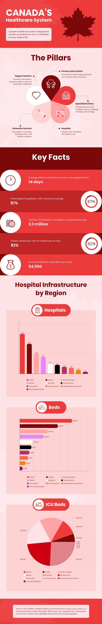
Most people interact with their healthcare system daily without truly understanding how it works or where it falls short. This infographic makes it digestible for a general audience. It breaks down Canada's system through its core pillars and key statistics, like hospital and bed distribution across provinces.
The bold red color scheme leaves no doubt about the country. From there, the layout earns trust by moving logically: how the system is structured, how it's performing and where the gaps are.
Create a state-of-healthcare infographic presentation for your country, region or organization. Break it down into key layers such as funding, coverage, facilities and access and support each with relevant statistics. Make sure the design is culturally relevant to your audience.
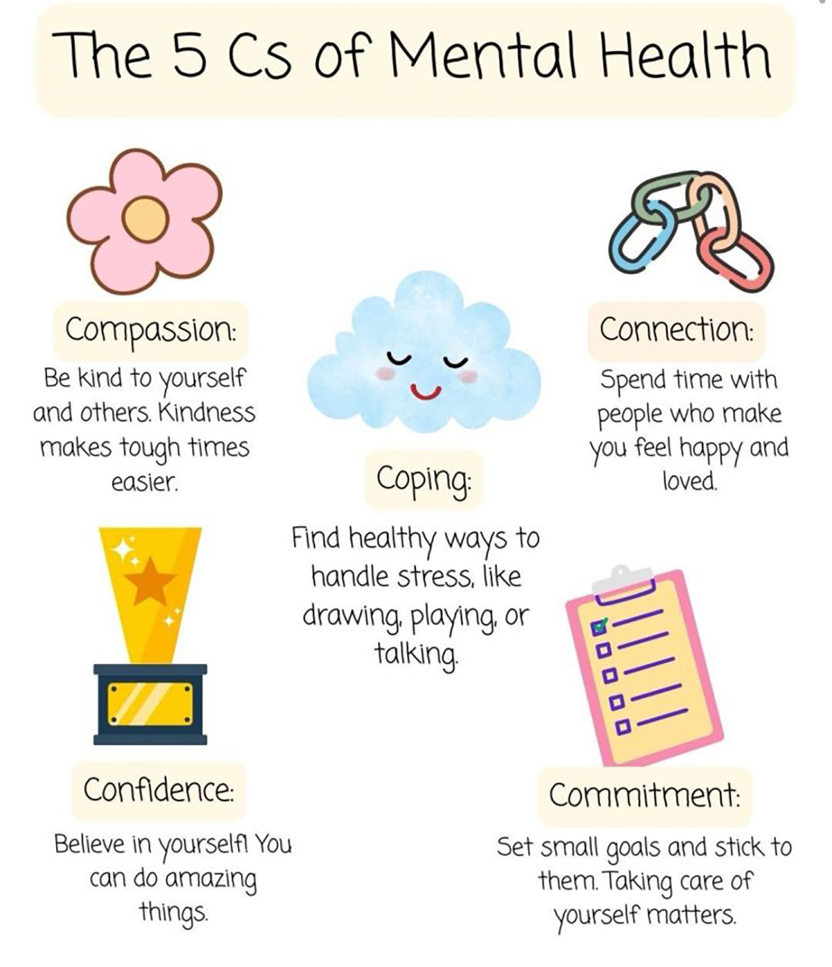
Mental health has become one of those subjects that risks feeling like a cliche. Yet Therapy by Empathy Junction managed to get a post on it, earning 442 reposts.
He simply paired the message with a visual that made a serious subject feel engaging,
The playful illustration style does the heavy lifting. It lowers people's emotional guard, encouraging them to stop, read and share. This is exactly what you need when your audience has heard the message before but stopped listening.
If your organization champions a sensitive health topic that people are growing numb to, create this kind of infographic.
Frame it in warm, illustrated visuals rather than clinical language. Make them more engaging by using relevant images and icons from Visme’s stock library.
CISH’s annual report looks at suicide deaths across the UK. Each year, they include an infographic alongside the full report to make the key findings easier to understand and more accessible.
The 2025 report highlights that not receiving planned care is often a major warning sign before patient suicide. It also shows that many patients who died were dealing with isolation and social or economic hardship.
This infographic captures attention at first glance. The use of icons keeps it visually engaging, while bold numbers make it easy to scan and digest.
Whatever data your health organization produces, design the infographic into the publication process from the very beginning, rather than treating it as an afterthought.
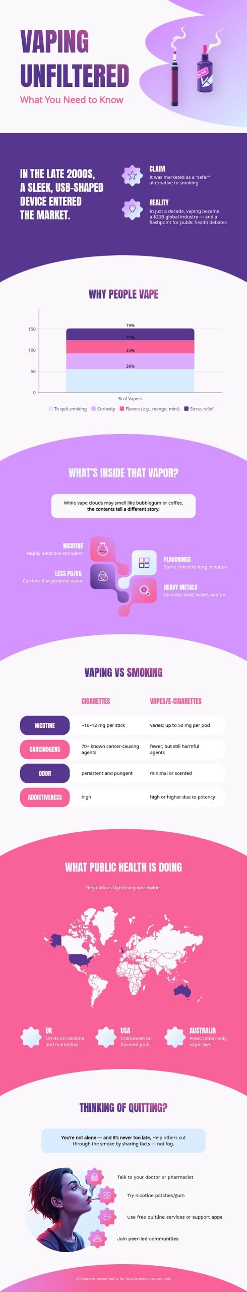
This infographic is a great example of how to manage layered information without overwhelming the audience. It provides an engaging visual overview of why people vape. Plus, it breaks down motivations such as stress relief, curiosity, flavors and smoking cessation.
Instead of drowning everyone in dense medical reports, this infographic pulls out key stats and turns them into colorful, easy-to-digest charts, maps and trends.
To recreate an infographic like this, try this prompt:
“Take this vaping dataset and shape it into a compelling infographic. Focus on the story behind the numbers, highlight why people vape and emphasize the health-related insights. Propose visuals such as a bar chart for motivations and icon-based callouts for vapor contents to make the information memorable for students, parents and health educators.”
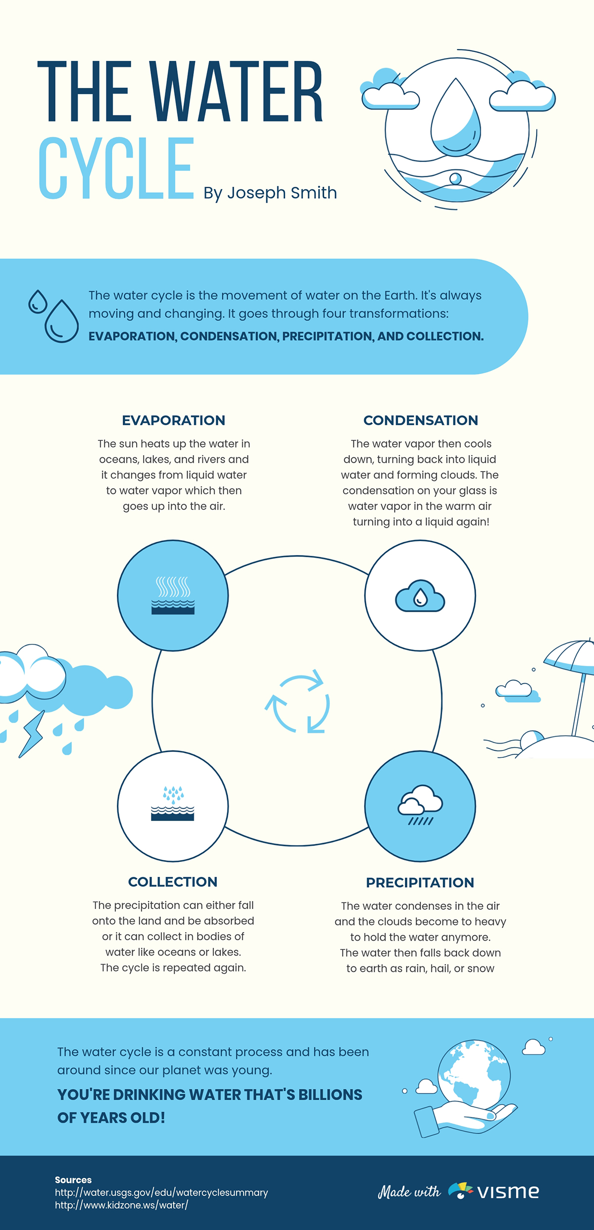
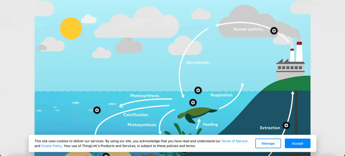
A review of 12 studies found that students learned much better with infographics than with traditional teaching methods. This water cycle infographic is a great example of an infographic that’ll help students actively process concepts and find lessons more enjoyable.
It uses illustrations of clouds, droplets and arrows to show how water moves through evaporation, condensation, precipitation and collection. Each concept is easier to understand because it’s accompanied by a visual cue that reinforces the explanation.
If you’re creating materials for learners, ask: Does the layout teach the concept before the words even begin? That’s when design becomes a teaching tool, not just a visual aid.
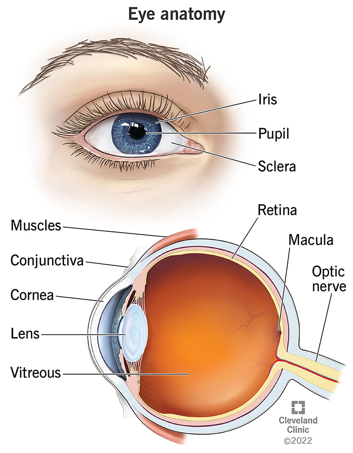
Students often struggle with anatomy because they memorize terms without understanding what each part does. This anatomy of the eye by Cleveland Clinic is a perfect example of how you can transform abstract terminology into something students can see, trace and understand in context.
Simple lines and labels make it easy to follow without overwhelming text. Combining the two perspectives provides a complete view of how the eye works, which would have been hard to achieve with just text alone.
If the concept demands visual detail, especially in subjects like anatomy, use an anatomical infographic. Focus on simple labeling and good visual hierarchy to make the information easy to follow and understand.
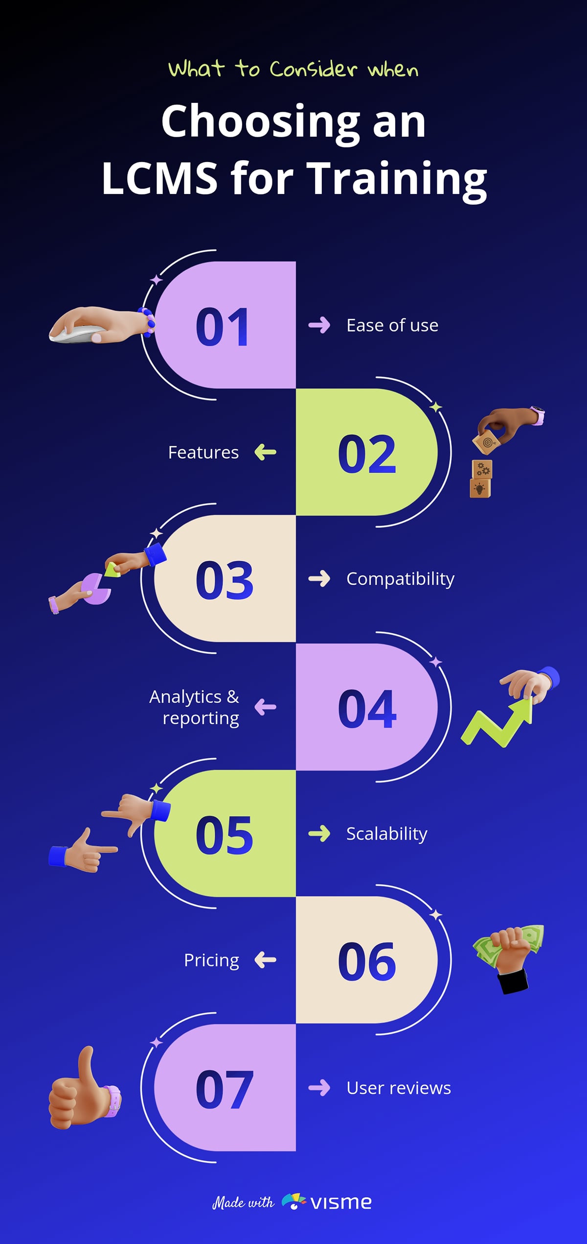
Choosing the right training system can feel overwhelming, with multiple factors and trade-offs to consider. But when you present the decision-making process through a visual framework like this simple infographic, everything clicks into place.
Simplicity in structure makes the message in this infographic stick. The layout also comes paired with contrasting icons and segmented blocks, which make each consideration point stand out.
A selection or evaluation guide infographic should not try to explain everything at once. Focus on organizing key factors into a logical sequence, using visual cues to help readers move smoothly from one idea to the next.
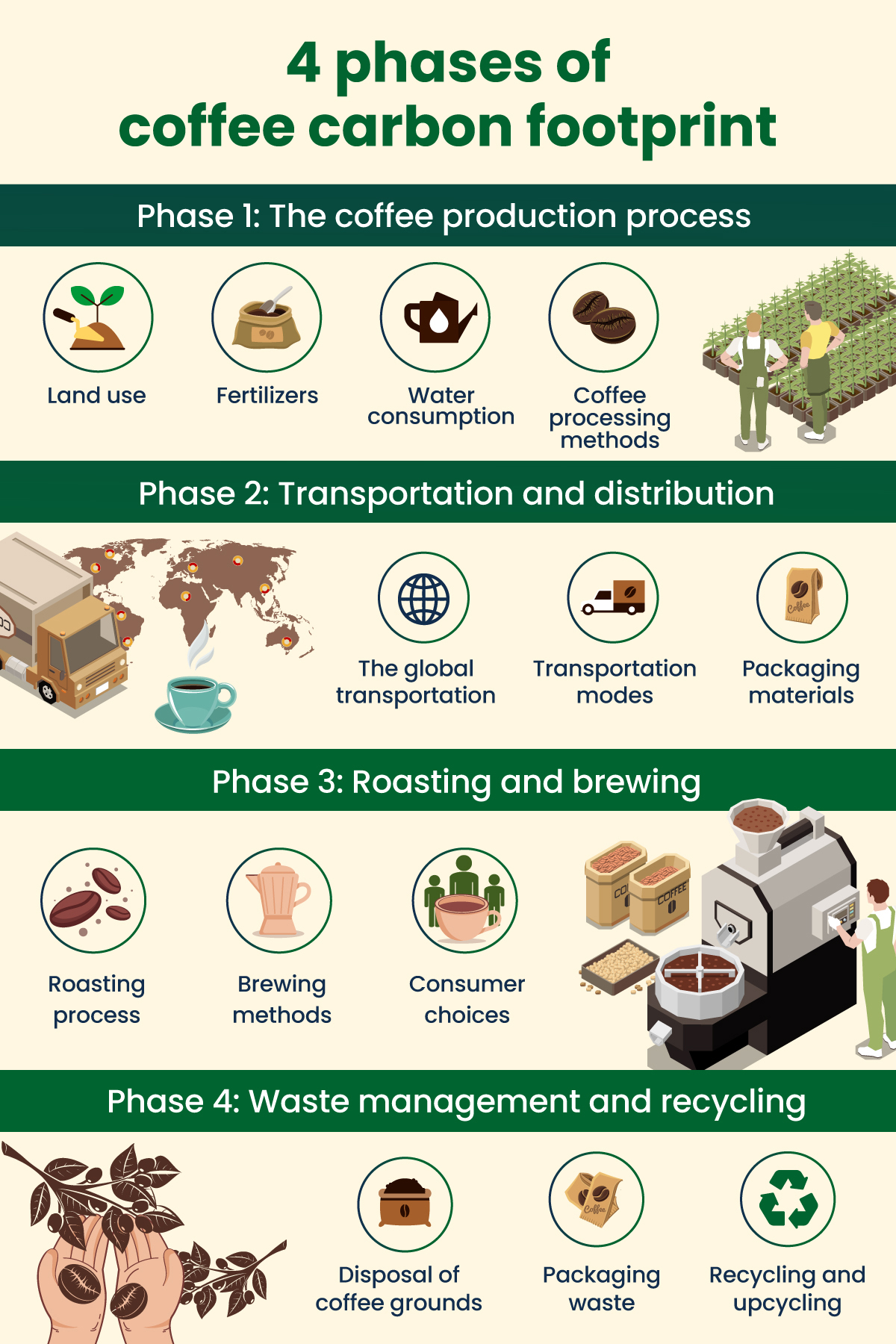
The journey from coffee farm to cup is more complex than most people realize. To make the process easier to grasp, Regenx set out to show exactly how coffee is grown, processed and consumed and how each stage contributes to its carbon footprint.
They turned the entire supply chain into a visual sequence that walks the audience step by step through each phase.
It uses images to show where carbon is released at each stage of the supply chain. Each phase is also separated with bold section headers and consistent icon clusters. This type of infographic works because it:
Use visuals to anchor key moments, icons for clarity and images for depth. And always guide the eye with a clear flow, like headers, to make the design easy to follow.
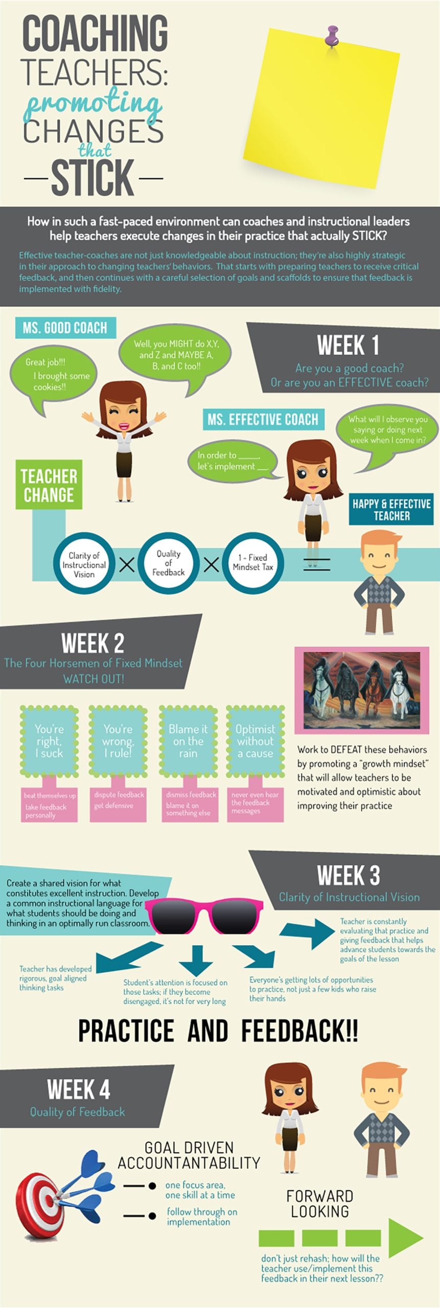
This educational infographic shares some interesting insights from Kristen Houser on how instructional coaches can help teachers make impactful changes in their practice. She revealed how clarity of vision, quality feedback and mindset directly influence teacher growth and classroom effectiveness.
The bold headline at the top immediately anchors the theme, while contrasting background panels help separate major ideas. Speech bubbles, character illustrations and labeled callouts act as visual cues that guide readers through different scenarios. These visuals reinforce the message without requiring long explanations.
Color also plays an important role here. The mix of teal, green and neutral tones creates warmth while giving clarity.
Always design your infographic to guide thinking. Visually separate concepts with characters, icons and illustrations so readers can immediately understand your points. Keep your color palette purposeful and use contrast to highlight key ideas rather than decorate the page.

This infographic shows the six biggest challenges in the education industry, organized into sections such as curriculum, testing methods, student performance and more.
The first thing that stands out is the clean layout with bold yellow highlights. The color blocks make each challenge easy to notice.
Each distinct block flows neatly down the page so that readers can scan the content. The round images next to each heading add context and make the infographic feel more engaging, not text-heavy.
You can include a good amount of text in an educational infographic and still keep it engaging. Simply use visual markers (whitespace, bold highlights, icons or section headers) to guide progression.
The secret to making engaging infographics is to stick to a specific topic, use visuals to illustrate information, use color psychology to choose interesting and relatable colors, establish visual hierarchy, use lots of white space, and even add animation or interactivity to take things up a notch.
To choose an interesting infographic topic, you need to put yourself in your audiences’ shoes. Do some research, such as on social media, forums and even through surveys to identify the pain points and problems of your audience. Then, choose an infographic topic that will educate or help solve that problem for your readers.
Another way to choose a topic is to find out what your audience likes to share on social media. Do they like humorous content? Do they appreciate statistics and factual information? Or are they more interested in how-tos and guides?
You can easily create a process infographic in Visme for free. Use icons and illustrations to visualize the steps in a process. You can also use images with text captions to show each step. Other ways to make a process infographic including using a flowchart or a timeline to illustrate steps in specific order. If there’s no specific order, you can use a concept map or web diagram.
You can publish your infographic on your blog or share it on social media platforms. Make sure you add your logo and company name on your infographic, and link back to your website or blog in the description. To get more eyeballs on your infographic, you can reach out to other blogs and websites to ask if they’d like to publish it on their blog or share it on their social media.
The best software for infographic design is Visme. You can easily create professional infographics for business, educational, research, medical, sales and other purposes in minutes.
Browse hundreds of infographic templates and customize them with your own colors, fonts, images, icons and graphics. Make them animated or interactive by accessing a range of creative tools that come built-in with Visme’s drag-and-drop editor.
A good topic is useful, timely and relevant to your audience’s needs.
It can be based on your audience’s frequent questions, problems they’re looking to solve, existing research reports, what’s trending in your niche and more.
The 7 common types of infographics are statistical, informational, timeline, process, comparison, hierarchical and geographic.
The 13 types of infographics include statistical, informational, timeline, process, comparison, hierarchical, geographic, list, resume, visual, interactive, flowchart and map-based infographics.
An infographic should include the following:
Infographic ideas are everywhere. You’ll find them in the questions your audience keeps asking, the content you've already created and the posts that keep showing up in your feed. You just need to know where to look.
The infographic examples in this article are a great place to get your creative juices flowing. Each one stands out because it delivers a solid message, uses a smart structure and features visuals that do the heavy lifting.
Visme is built to help you do exactly that. With an infographic generator, hundreds of free infographic templates, a brand wizard, analytics and more, you have everything to go from idea to published in one place.
Whether you're a marketer, an educator, a healthcare communicator or an NGO, try Visme infographic maker today to scale your visual storytelling to the next level.
Design visual brand experiences for your business whether you are a seasoned designer or a total novice.
Try Visme for free


![How to Make an Interactive Infographic [+Templates]](https://visme.co/blog/wp-content/uploads/2023/11/How-to-Make-an-Interactive-Infographic-Quick-Guide-8-Customizable-Templates-Thumbnail.jpg)


