


Healthcare Data Visualization: How to Turn Data into Impactful Stories


Creating a choropleth map is a data visualization technique to show data trends and patterns across geographic regions, and they're much simpler to make than I initially thought.
As I researched further, I realized anyone can create one with the right tools like Visme and by following a step-by-step guide.
In this blog, I'll walk you through how to make a choropleth map, even if you're a beginner. We’ll also share Visme templates for choropleth maps and best practices for creating these maps.
Visme will take care of the rest by giving you predesigned world, country and regional maps, ready-to-use templates to design a choropleth map and the ability to import geospatial data.
So, let's get started.
A choropleth map is a thematic map that represents statistical data using symbols or shading — technically, the color mapping symbology technique.
These maps are made on set geographic areas, for instance, a country’s map, the world map and so on. Since the map sketches data for set value on another dataset, a choropleth map brings two datasets together.
The numeric values in the dataset that you want to represent on a choropleth map are assigned a color. The correspecting map areas are then color-coded to match the value.
Essentially, a choropleth map is a handy data visualization tool for answering data-based questions like how percentages or rates compare by geographic regions.
For example, how does the population data for continents compare. Or, how do election results for each US county compare.
Here are more choropleth map use cases:
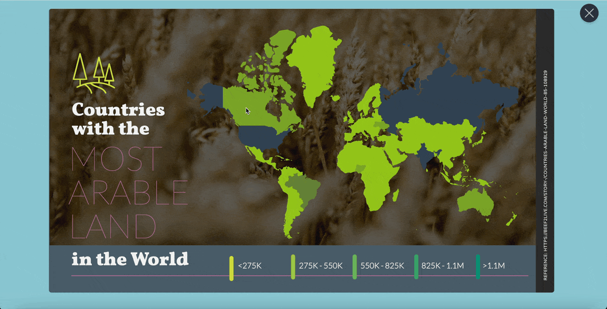
For a practical example, here’s a choropleth map showing the world’s most arable areas:
Basically, the simplicity of a choropleth map makes it easy to make and understand.
From a map maker’s lens, this means you only have to pull out a premade map of a geographical area and add colors based on the data to it.
Okay, well, that’s oversimplifying things.
But as we dive into how to make a choropleth map below, you’ll see that making it is easy. It also doesn’t take much time.
From a viewer’s perspective, the color variants make it easy to understand the data at a glance. Not to mention, your audience doesn’t have to be skilled at map reading to read the data shared in this type of map.
However, this upside of a choropleth map contributes to its limitation too. Why? Because the resulting map gives a false impression of the abrupt change in data at the boundaries.
Hence, if you’re trying to deliver a presentation of accurate data, a choropleth map won’t cut it. Instead, you’ll need to settle on another data visualization type depending on your needs.
With that, let’s give you the step-by-step breakdown of how to make choropleth maps with Visme.
In case you prefer to watch, here’s a video tutorial to walk you through the process.
Choropleth maps are one of the most popular choices when you want to visualize geographic data. Their simplicity and effectiveness in presenting data patterns at a glance make them a go-to for many users across different fields. However, like any data visualization tool, they come with their own set of advantages and disadvantages.
Before moving on to the steps, take a look at the advantages and disadvantages and decide whether a choropleth map is right for your data visualization needs.
So, how do you create a choropleth map?
Well, the process might seem difficult, especially if you are a beginner, but breaking it down into manageable steps can make it a lot easier.
In this section, we’ll walk you through the essential steps for creating a choropleth map, from defining its purpose to customizing your template and downloading it.
The first step of creating any choropleth map is defining its purpose. You need to clearly understand why you're creating the map because the rest of the design process will significantly depend on it.
Are you highlighting regional distinctions, visualizing population densities or showcasing economic trends? A well-defined purpose ensures that your map serves its intended function and communicates the right message to your audience.
Your purpose of creating the map will help you select the appropriate data and tailor the map's visual aspects to best convey the story you want to tell.
Once you know your purpose, the next important step is to gather and prepare your data. Start by finding reliable and relevant data sources that match your map's goal.
Make sure your data is clean, accurate and current. The quality of your data affects how credible and effective your choropleth map will be. While preparing your data, try to organize it correctly, look for missing data and ensure the geographical units in your dataset match those on your map.
Well-prepared data helps you design your map smoothly so you can focus on visualization rather than fixing data problems.
map template. You can always start off with a blank canvas. A map template, however, speeds things up.
Visme’s choropleth map maker comes with a drag-and-drop editor and fully customizable templates to make the process faster and easier.
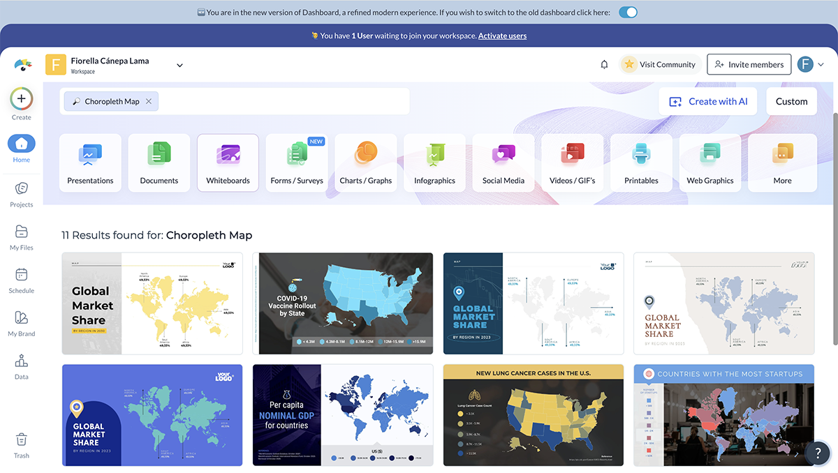
Taking the fastest route to designing a choropleth map, search for relevant templates by typing “choropleth maps” in the search bar on Visme’s dashboard. From there, choose your map template.
To start on the right foot, try to find a choropleth map template that aligns closely with your data’s geographical region. For example, if you want to show data for a specific state, look for a template that includes that state. Think about what you need, such as the geographical location and the colors you want to use.
Additionally, you can explore this article to get 15 interactive map templates to find more relevant choropleth map templates according to your needs. The article includes a step-by-step tutorial as well to make the process easier for you.
Chances are the region you want to create a choropleth map on doesn’t have its own template. Or, the template you've selected might have some of the regions you aim to cover but not all.
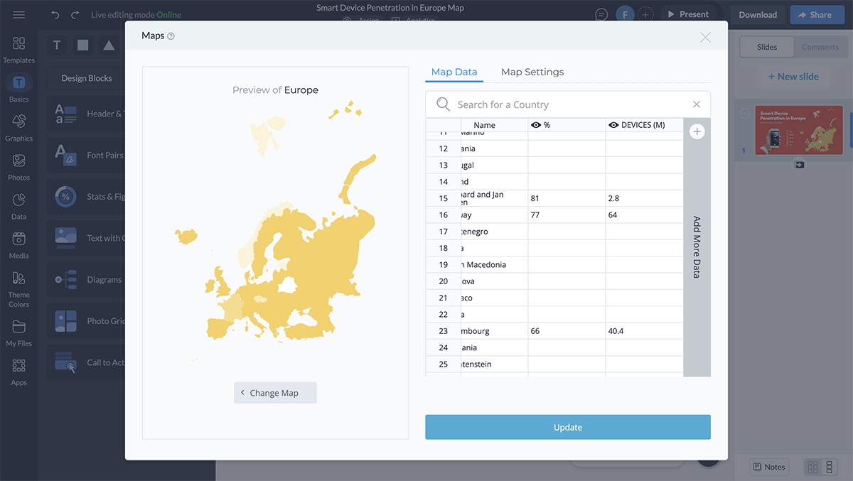
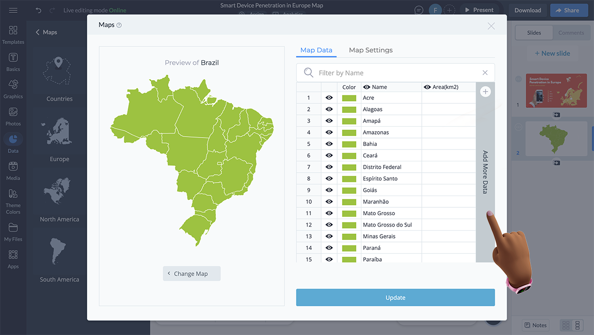
Either way, Visme has custom maps stored under the Data tab on the left side of your dashboard.
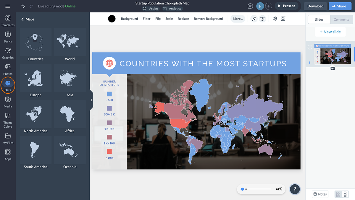
If you’re looking to create a country-based choropleth map, select Countries from the tray that slides out and choose the country you want to feature.
If you want to feature a specific continent or region instead of a country, pick from the other available options.
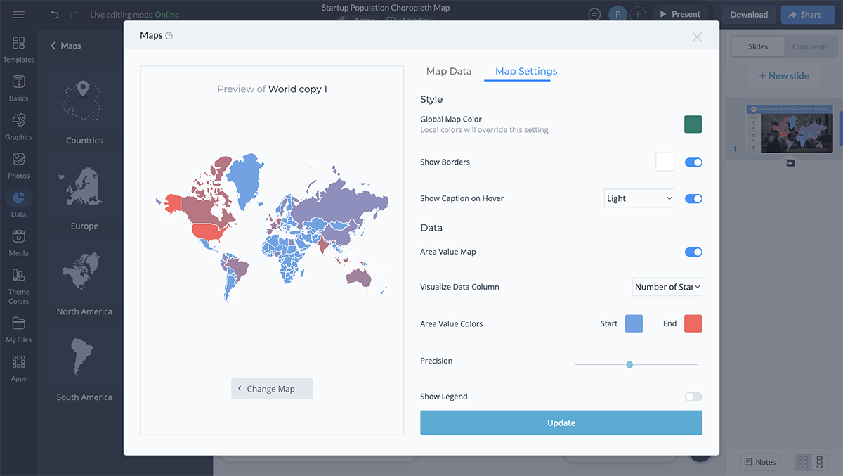
It’s also here that you can alter your map’s color scheme — an option that’s available both under Map Data and Map Settings that show when you’ve selected a map.
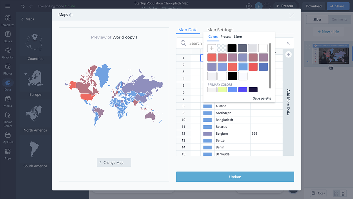
You can also explore more color palettes here or select the palette that you’ve already created.
Keep in mind that choosing the right color ramp takes some thought.
According to Alejandra Mariscalez, the Head of Design at Visme,
“When creating a choropleth map the first and most important thing is to find a color palette that fits your topic, ask yourself what this map is for and identify colors that relate to that topic”.
To begin with, you have three options at your disposal:
So when should you choose one color scheme over another?
Use the sequential styling if you plan to get attention on high values, such as in a choropleth map on unemployment rates or showing viral cases in US states as this template does:

Be careful when choosing color contrasts though. You don’t want the contrasts to be so minimal that the bare human eye can’t catch the difference in shades.
Use a diverging color palette to drive attention to extreme ends of a scale.
Alex recommends that you "try to select colors that have enough contrast between each other so that it is easy to differentiate the multiple states/countries you are trying to highlight in your map. You can easily change each state/country's individual colors using the map tools in the Data section."
Let’s say a map showing differences of population between two states or lung cancer cases by state data as in this template:

As for qualitative color schemes, use fewer than three colors. Why? Because map readers can easily commit to recalling what each of the three colors stand for and won’t need to revisit the legend often. Put simply, few color combinations make it easy to read the map.
Also, make sure colors in the qualitative scheme are different from each other and don’t leave any diverging or sequential color effects.
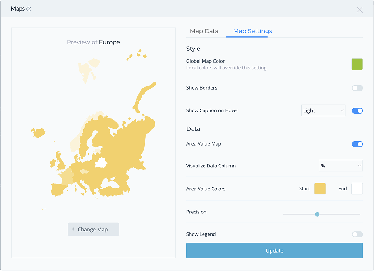
Pro tip: If you don’t have a brand color ramp or gradient for your choropleth and want to leave a specific impression on your audience, dig into color psychology before settling on a color scale for your map.Moving on, it's time to work out the map details under Map Settings.
Below are three options you can play with.
In several instances, these make it easy to differentiate between boundaries, particularly, if the areas or regions are small.
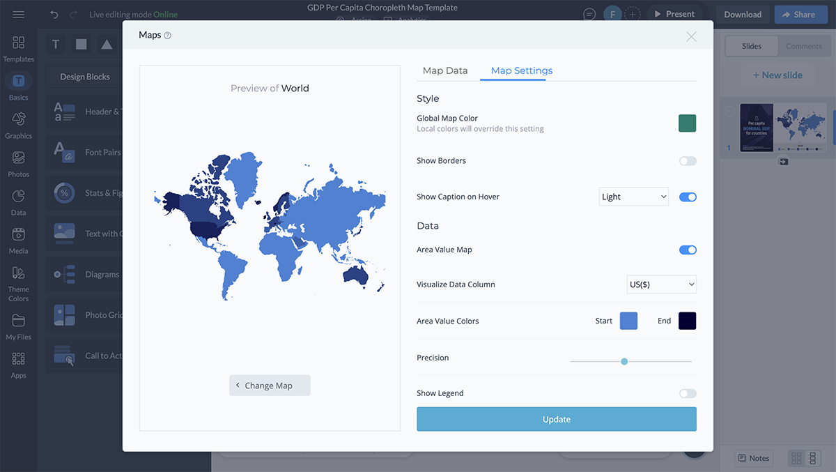
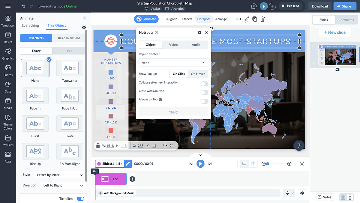
You can also decide to make your captions — also called tooltips — light or dark. Tooltips are a valuable addition to your choropleth map as they add to its functionality.
How? By communicating the name of each region/area and any extra information that you want to share with readers.
If your project doesn’t need extra details like the country name and area size, Visme allows you to customize this. You can easily hide these details by going to Map Data and clicking on the eye icons next to the values.
This will make the tooltips in your published project show only the name of the area when you hover over it, helping to keep the focus on your map’s main message.
Once you turn on the Show Legend option, use the drop down menu to select the legend’s position. Remember to position the map’s legend in a breathable area so reading it is easy. If you’ve used any symbols or shapes on the map, explain them in the key.
Look at this choropleth map template to see how well the map key is arranged. There’s also a reference section to share the data source with the audience.

If you’ve used any short forms such as state abbreviation, add them in the legend too.
With Visme’s collaborative design features, you can actively involve your team members in the customization process. Just send an email invite or a shareable link and allow them to comment, annotate and live edit the map. This way, you can make sure that everyone is on the same page and that your map is as accurate as possible.
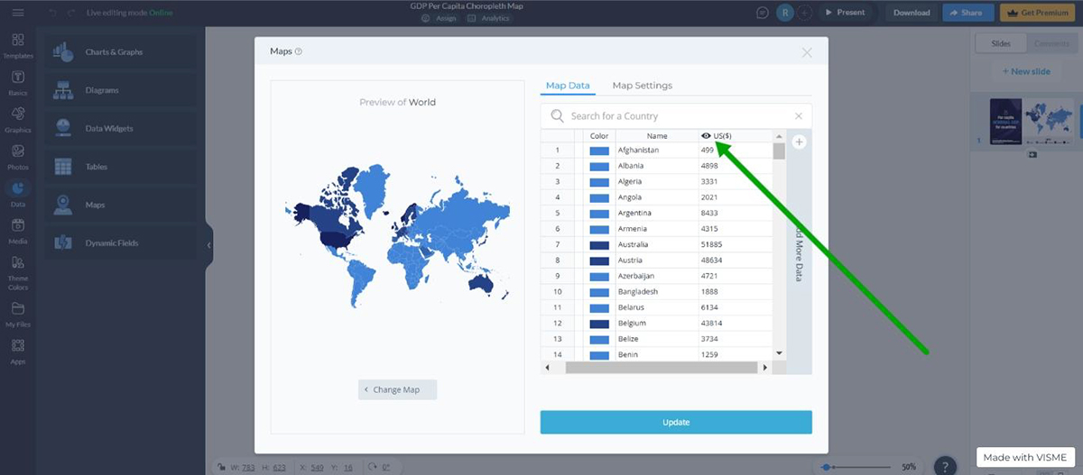
In this step, you’ll focus on editing the details inside the map including adding your data.
When designing a choropleth map, a good rule of thumb is to use the smallest unit for the data. This means giving preference to units such as counties instead of states, or countries instead of continents. This helps give your reader a refined image of the data.
To choose a type of map, such as a country or region, double-click on your map and select Change Map.
Once you've decided on the type of map you want to use, click on Edit This Map.
Here, you’ll see that each region or country’s area is shown by default. You can either display this column or get rid of it completely by right-clicking over the cells in the column and using the Remove This Column option.
To add your own data range, click on the Add More Data bar at the right side of your Map Data screen.
Now, paste the numeric data from Google Sheets or Excel into the new data column.
Don’t forget to ensure the data table in your CSV file is in the same order as the countries or states in Visme’s Map Data spreadsheet.
Note that you can add as many columns as you like for featuring additional information.
With each column you create though, remember to name it with a relevant title. For this, tap on the tiny pen symbol on each column’s right and type in the name.
Now, click on Insert Map to add the map to your canvas or template.
Sign up. It's free.
Create interactive maps easily with Visme!
You’re almost done creating your map.
All that’s left now is a bit of map personalization so that it aligns with your brand.
Since you’ve already tweaked the color palette, consider half the job done. The rest boils down to changing the fonts in your title and caption.
Simply click on the caption in the template and head over to the fonts menu. Click on the drop down menu to view a variety of font options.
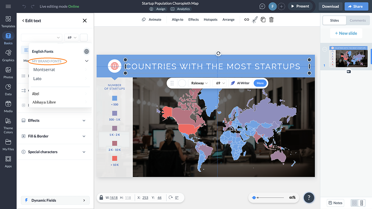
If you’ve already set up your brand kit or have created a couple of designs in Visme using specific brand fonts, you’ll get the option to pick from My Brand Fonts.
Pro tip: Design for accessibility. Make sure the colors and fonts you use are easy to understand. To this end, ensure the changes in your color gradient are easily recognizable for someone who is color blind. For fonts, ensure you’re using a clear font like Roberto with a minimum 5 points size.Design Manager at Visme
Don’t like the background image in the template you’re using? Change it!
Here’s how: click on the background image and the left panel will open up with various editing options. You now have the option to remove the background altogether, change it or flip it using Visme’s AI background remover tool.
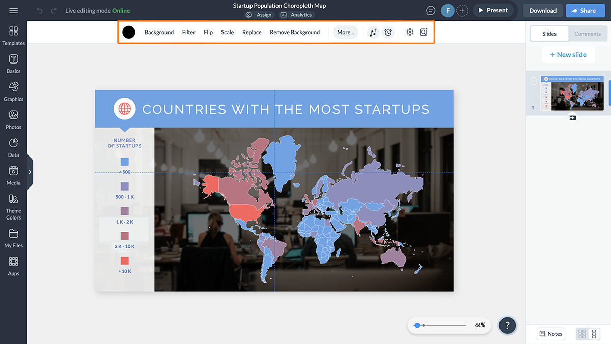
Visme gives you tons of options when it comes to editing images. With Visme’s AI image editing tools, you can resize, unblur, upscale and edit your images in a few seconds. All you have to do is select the image and explain the tool about your requirements and the tool will do it for you.
If you plan on adding a new background, click on background and you’ll get a drop down menu with the following options:
Clicking each will give you options to pick from.
For an interactive experience, select an animated background. If you plan on downloading and printing the choropleth map though, consider using an image, gradient or pattern for a background.
That said, you can also upload your own background image.
You can also change your canvas size by clicking on the Resize Project button next to the Background on the top panel. If you didn’t select the size at the start when you were picking a template, you can do so now.
Want to make a full-blown interactive map? Great. There’s a lot that you can do with Visme’s interactive and animation features.
For example, click on the caption area and:
You can read this article about creating interactive maps using Visme. It includes a step-by-step guide and fully customizable templates for you to get started. Alternatively, you can watch the video below.
If you want to share additional data along with the map with your audience, you can use Visme’s data visualization tools. Visme comes with 30+ types of data widgets like progress bars, radial gauges, population arrays and more. These data widgets can complement your map, help visualize complex data, and make it easily understandable.
When it comes to easily turning complex data into meaningful insights, Visme is one of the best tools in the market. But we are not saying this out of thin air. Here’s what one of our satisfied clients has to say about Visme:
Economic Research Analyst at Greater Memphis Chamber
I personally had experience with similar applications before Visme and found their tools weren’t as user-friendly as Visme, and their tools didn’t handle data very well. They didn’t provide the solution I really wanted.
MacKenzie Stonis
Before you move on to the next step, know that you can duplicate the map you’ve created or make another map too.
In the header that shows when you click anywhere on your canvas or template, you’ll see a double page icon near the trash bin sign for delete. That’s where you can duplicate your design.
As for adding another page to your canvas, click on + New Page from the right side of your dashboard.
Your choropleth map is now ready. Whoop whoop!
At this point, you have the options to download the map as a high-resolution image — PNG or JPG — or PDF.
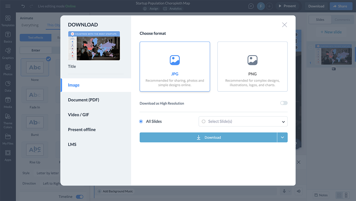
You can download the design directly to your desktop. Or, assign a destination in Dropbox, Google Drive, OneDrive or HubSpot and Visme will save your design there.
Or, you can share the choropleth map via a shareable link or generate an embed link to embed it anywhere on the web.
But that’s not all! After sharing your choropleth map, you can get insights into how users interact with it using Visme’s advanced analytics tool. Visme allows you to track metrics like unique views, average time spent, visitors’ IP and more. You can use these metrics to track the performance of your map and update it accordingly.
Interpreting choropleth maps is mostly easy but it's better to have a guide sometimes to ensure you are on the right track. Therefore, we'll now explain how to read a choropleth map to make the process easier for you.
Start by examining the map's legend, typically located at a corner or bottom. The legend explains the color gradients or shades used on the map, representing various data values. For example, on the GDP Per Capita Choropleth Map template, darker shades indicate higher GDP per capita values. This visual cue is crucial for interpreting data accurately.

Next, learn about the geographic areas shown on the map. These areas can be countries, states, or other regions. Knowing these boundaries helps you assign the data correctly.
The choropleth map example below clearly shows each country's borders, making it easy to link data to the right regions.

Look at how data is spread across different regions. Pay attention to areas with similar colors to find patterns or trends. This can help you understand things like population density groups or economic differences.
Check if the data is normalized. Choropleth maps should ideally display normalized data like percentages and rates, not raw counts, to avoid misinterpretation. For example, our map template above normalizes data by presenting GDP as a per capita value.
Finally, it's important to consider outside information and context. Things like unusual values or past data can influence how we understand the situation.
Now, we will look at some real-life examples of choropleth maps that show important global trends, like population density and renewable energy use. Understand the design and features of these maps to find ideas for creating your own.
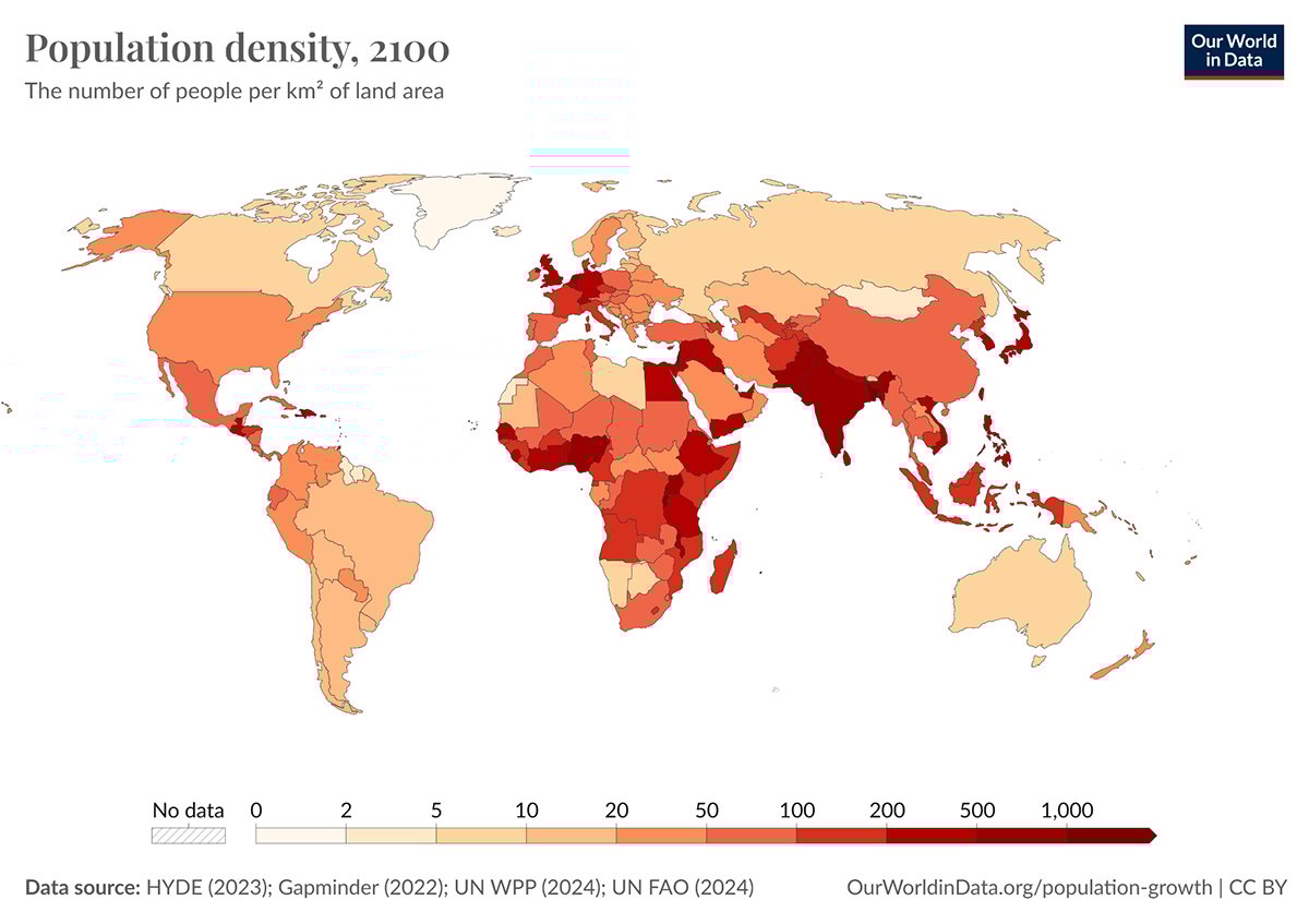
This choropleth map shows the population density of each country, measuring the number of people per square kilometer. It covers the time from 10,000 BCE to today. The map has an interactive timeline, which lets users see how global population density has changed over time.
When you hover over a country, you can see its name and population density by square kilometers.
The map’s sleek and minimalist design uses a clear, sequential color gradient to indicate population density. The light-to-dark color scheme helps users easily see areas with high or low populations. A key feature is the interactive timeline, which lets users explore trends over thousands of years. Tooltips keep the map neat while still providing detailed information when needed.
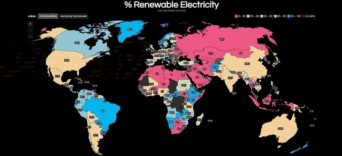
This choropleth map shows the percentage of renewable electricity usage across different countries. It includes an interactive legend where users can filter countries based on their renewable energy percentages.
You can also exclude hydropower from the data to get a more focused view of renewable energy sources. Additionally, the map offers zoom-in and zoom-out functions.
This map shows the per capita GDP of countries around the world, using data from the International Monetary Fund. It uses color gradients to represent how wealthy each country is. Darker colors mean wealthier nations, while lighter colors indicate less affluent ones. You can hover over each country to see its specific per capita GDP value.
The map design is simple and effective, using a clear color gradient to show economic differences.
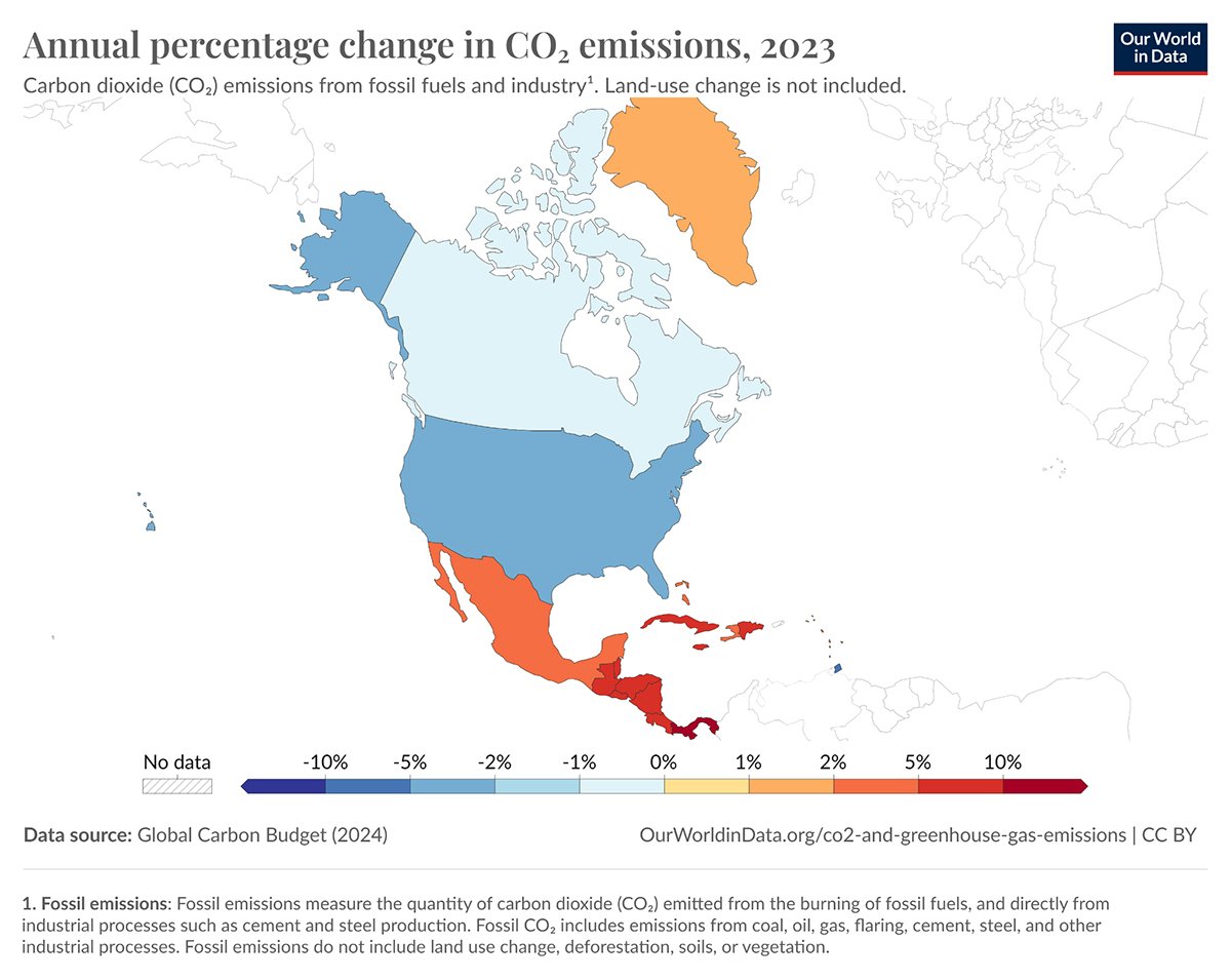
This is a map of how the CO2 emissions changed each year across the USA. It uses colors to highlight areas with increasing or decreasing emissions. Warmer colors like red represent positive changes, while cooler colors like blue indicate negative changes. When you hover over each state, you can see the specific data on emission changes.
A choropleth map uses different shades or colors to represent data values across predefined areas, like countries or states. An isopleth map, on the other hand, uses lines or color bands to represent continuous data that doesn’t adhere to boundaries, like elevation or temperature.
Choropleth maps are best suited for representing normalized data, such as population density, income per capita, or percentage values, where data can be aggregated over specific geographic areas.
To create a choropleth map in Excel, follow these steps:
To create a choropleth map in Google Sheets, first, prepare your data in a spreadsheet. Then use Google Sheets’ built-in ‘Chart’ tool to create a map chart. Customize the chart by selecting “Map” under the chart type options, adjust data ranges and apply colors to represent your data values across regions.
Choropleth maps can be misleading if the data is not adjusted for size, as larger areas may seem more important. They do not show differences within regions and can simplify complex data too much.
Choropleth maps are useful for showing patterns and trends in data across different areas. They help visualize information like state election results or county demographic statistics.
You have explored choropleth maps and learned how they can effectively show geographical data using colors and clear images. Also, you understand their benefits and the step-by-step process to create them. Now, it’s your turn to transform data into engaging visual stories using Visme.
Visme offers all the tools you need to create your choropleth maps. With customizable templates, drag and drop editor and interactive options, you can make maps that inform and engage your audience.
Are you ready to enhance your data with clear choropleth maps? Sign up for a free Visme account today and start turning data into captivating visual stories.
Design visual brand experiences for your business whether you are a seasoned designer or a total novice.
Try Visme for free