


Typography Infographics: 12 Inspiring Examples & Techniques

Can a font influence decision-making, emotional reactions and predetermined actions?
It most certainly can.
Everything we read on a screen, book, magazine or packaging label sparks our subconscious cognition. Font psychology taps into the connection between the appearance of words and how our brain processes, retains and makes sensory associations with them.
This guide will walk you through the basics of font psychology, why it matters and how it’s being studied. We've also included some actionable tips for applying font psychology to your visual marketing projects to make them more effective.
Let's get started.
Font psychology is the study of how typography can affect the mind, influencing decision-making and emotional cues.
The word font in “font psychology” is a convention for simplicity; the correct encompassing term is typography. In formal terms, a font is only the group of letters in a specific weight, bold or italic. The entire group in all weights and variations is called a typeface.
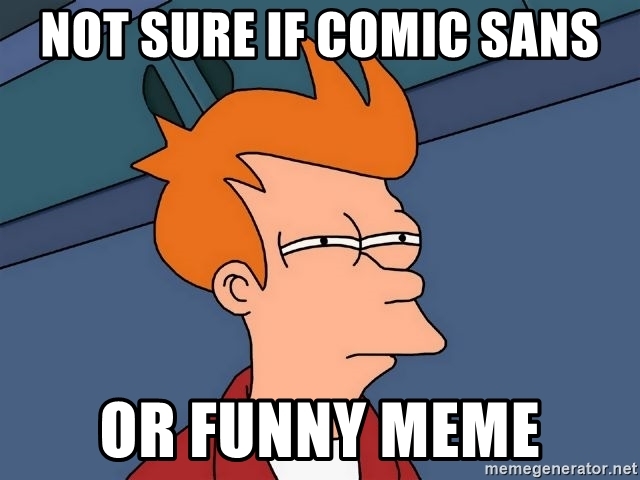
Describing the effects of font psychology is best done visually — and what better resource to use than a meme? Take a look at the image below.

The text “You’ll always be mine” has a different meaning when written in a script font versus in a bloody, handwritten one.
Memes like the one above have done the rounds many times, making designers chuckle. They're also great examples of how two fonts can carry different messages, even in the exact wording.
The main psychological factor in typography is the deep cultural cues ingrained in the letters’ forms and shapes. Thousands of years of history and evolution of language are ingrained in all the fonts we use today.
In an interview, designer Laura Csocsán said that typography is“not meant to be decoded only from letters but rather from the atmosphere, moods and delicate references that are packed into them.”
In the same article about the connection between stone lettering and variable fonts published by It’s Nice That, Morgane Vantorre also said, “it’s like listening to a silent story through the eyes.”
Fonts, typography and letters tell stories, and transmit feelings and emotions. They aren’t just an add-on to a visual in a design; they are part of the overall story.
When you understand this critical link between words and visual cues, you’re on your way to mastering font psychology and using it to enhance your branding and marketing strategies.
Great design is made up of a combination of four essential building blocks; shapes, colors, imagery and type. Therefore, it’s not surprising that fonts are crucial to the way stories are told and ideas communicated to the reader.
Cognitive psychologists have studied the effects of typography on memory, information retention, emotional reactions and behavior.
One of the most telling tests conducted was where one text was printed with two different fonts.
Test subjects were asked to read the text and answer some questions in two groups. Psychologists gathered data that led to insight about information retention and reading speeds, and opened the door to many more detailed studies.
The base of all font psychology research is the knowledge that humans perceive information with their senses, absorbing meaning and understanding through both messaging and aesthetic capacities.
With so many studies on the subject, we know that typography most definitely affects behavior, information retention and sparks emotional cues. As communicators, font psychology is a tool we can tap into for telling our stories better and receive reactions we can expect.
This section will cover the basic elements of typography and how they relate to font psychology. We’ll analyze their parts and how they’re used in design to influence behavior.
One of the aspects of typography that designers learn is type anatomy. Ironically enough, many of the letter sections are named after human and animal body parts, further cementing a psychological aspect to how letters communicate ideas and stories.
The infographic below shows a selection of letter parts with names related to body parts.
For example, straight lines of letters connected on one side and expanding out diagonally, are called arms and legs. Likewise, the decorative curved descender of Q, R and sometimes the lowercase g and j is called a tail.

Every little bit is important when analyzing fonts and their parts to find a psychological connection. People relate to letters by subconsciously associating them with body types and sound associations.
Let’s recreate a couple of associative psychological experiments right now. Ready?
Take a look at the two shapes below. Now pick which one you associate with the word “Kiki” and which one with the word “Bouba.”

Most of you probably chose the pointy shape for “Kiki” and the bubbly shape for “Bouba.” The word “Kiki” sounds pointy and sharp, while “Bouba” is round and feels like a bubble.
This test is called the Kiki Bouba effect — it's part of cross-modal correspondence research, the study of how the senses communicate and affect decisions and associations.
Let's take it one step further into font psychology. If you look at the words “Kiki” and “Bouba” in terms of shapes, “Kiki” is most definitely pointy and made up of open triangles. “Bouba” on the other hand, is round and maybe even soft.
In the psychology of shapes, triangles represent motion and hierarchy, while circles are completion, comfort and endless cycles. The shapes, sounds and cultural associations, all together, inspire emotions and feelings in the viewer.
When laying text, consider how words fit with each other visually. The visual hierarchy of text is an important design principle that optimizes line spacing, spacing between letters, margin sizes and alignment. These are all elements that impact the reader psychologically.
When the text is too close together and difficult to read, the experience is hindered by a negative feeling straight away. The initial reaction is pleasant and agreeable, with just a bit of white space and a comfortable separation between titles and paragraphs. Visual hierarchy is especially crucial for the design of infographics.
Take a look at the poster design below.
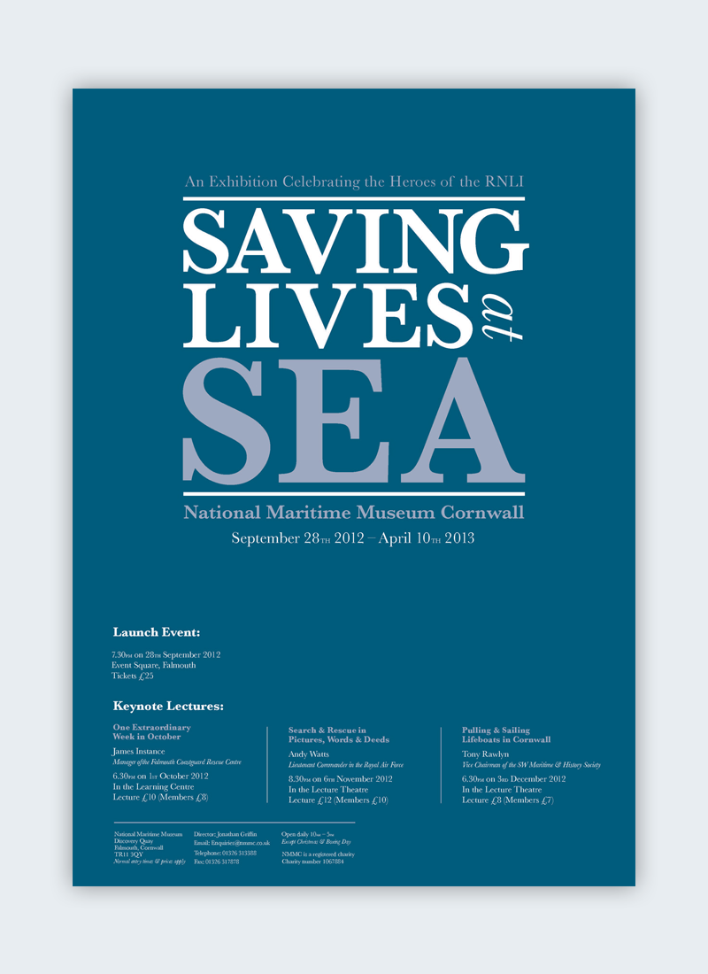
The visual hierarchy of the text is very noticeable, with a title in large text and other information in progressively smaller text. The top section is boxed in the center, and the information at the bottom is wider.
This visual effect brings more attention to the top section, with the largest word, SEA. The psychological factor here is doubled with the color and background combination.
Fonts, or typography in general, have evolved through history alongside humanity — changing, transforming and adapting to the consequences.
What we know of typography and fonts now is a rich combination of everything humans have experienced since we could capture information into shapes that others could understand.
Here's an interesting timeline that shows how serif fonts have evolved over time.

Every font has a chronological or historical aspect to it. The oldest writing style is the swashy calligraphy from illuminated manuscripts, which expanded into many calligraphy types from the monks copying books.
With the printing press, letterforms needed a blocky format. The solution was calligraphy without ligatures between letters, like Blackletter. Other strong serifs then expanded to all sorts of serifs.
In the 1800s, sans serif fonts — Grotesk — came into the picture. From there, typography styles have gone in all directions, from retro-futurism to classic apocalyptic.
These historical associations are part of the written word’s influence over our actions and behavior. You could say that our fonts carry the baggage of all our actions since the beginning of language.
Sign up to receive weekly tips in your inbox that help you learn more about Visme and all of the content you can create.

In this section, we'll look at the most important denominational groups within the realm of typography. This includes serif, sans serif, script and other types of fonts.
Since we’re talking about the psychology of fonts, we’ll look at the most common sensory associations, cultural cues and historical values of each style.
To better visualize this idea, we’ll use people as a base of comparison.
The connections between every visual aspect and a psychological association are vast. Nick Kolenda has a great resource to read more in detail about all font shape associations.
Look at the fonts below; the left column is a list of serif fonts. Don’t some of them look like people, smartly dressed with shirt collars and fancy shoes?

Descriptive associations generally describe serif typography as elegant or authoritarian. Any synonym of those two words could very well describe other serif fonts.
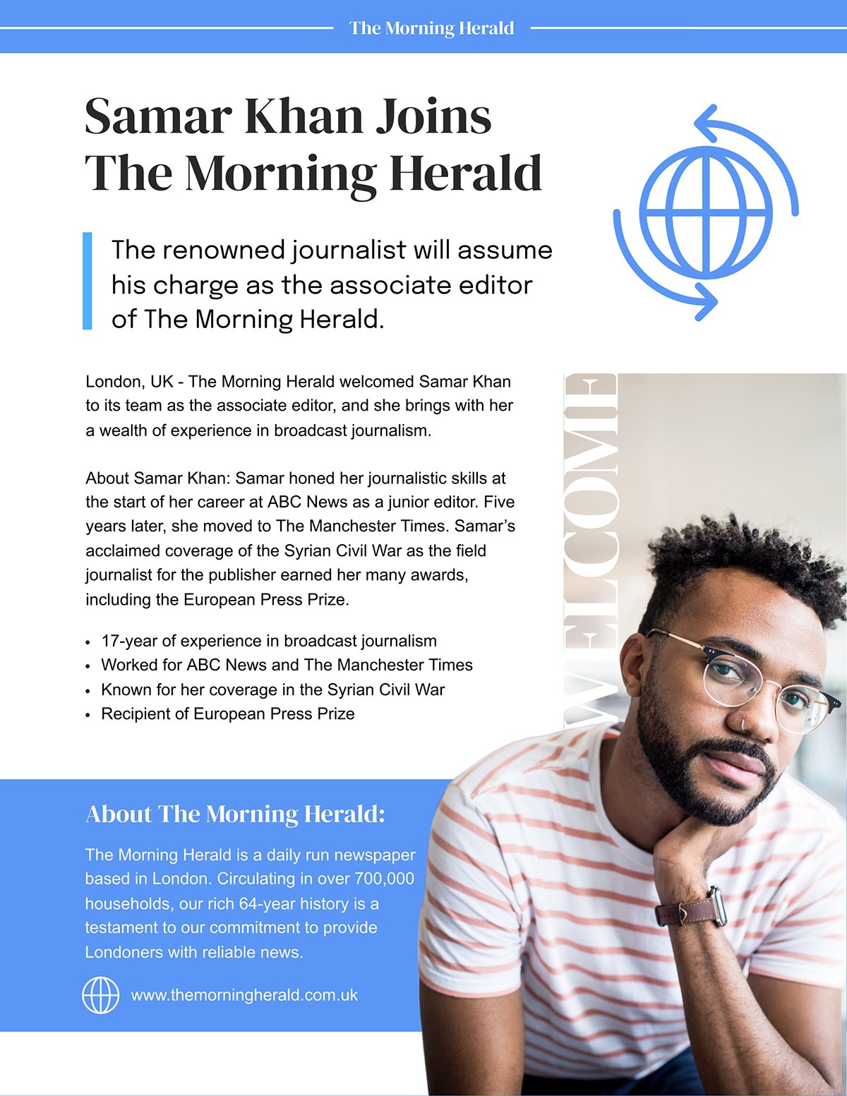
Here's a press release template that uses a serif font for the headings.
Think of the slab serif as the elegant person wearing the fancy outfits, the penguin tuxedos and velvet magician outfits for special parties.

The difference between a serif and a slab serif is the noticeable difference in the width of the strokes. Regular serifs are letters with extra bits on the ends, while slab serifs are an exaggerated variation.
Below is an example of a report template that uses a slab serif font.
A sans serif is easy-going, upbeat and wears loose and casual clothing. There are different nuances to sans serif fonts; some feel very circular, while others are thin and elongated.

When sans serif fonts came into the printing industry, classic font designers saw them as grotesque renditions of letters, inspiring the Grotesk denomination. The meaning got lost in translation when it was transformed into Gothic in America, creating confusion with the Blackletter style.
Most SaaS and marketing companies prefer using sans serif fonts in their branding to connect with customers and clients, and to feel more relatable and approachable.
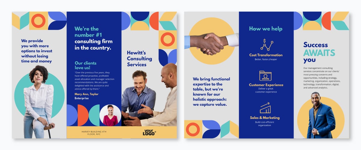
The brochure template below uses sans serif fonts in a contemporary style.
Handwritten fonts are like the journal or notepad where you quickly write down ideas, morning pages or quick memos.

They’re casual, like your neighbor coming over for a drink.
No complications — just human connection.
Here's a social media graphic template that uses a handwritten font.
Script fonts are a varied bunch. Depending on the stroke, terminals and ligatures, they can be elegant or casual. Think of script fonts as the dancers of the font world — the ballet dancers and contemporary stage performers.

What differentiates a script font from a handwritten font is that the script resembles calligraphy and cursive writing in neat strokes; handwritten fonts are more wild and free.
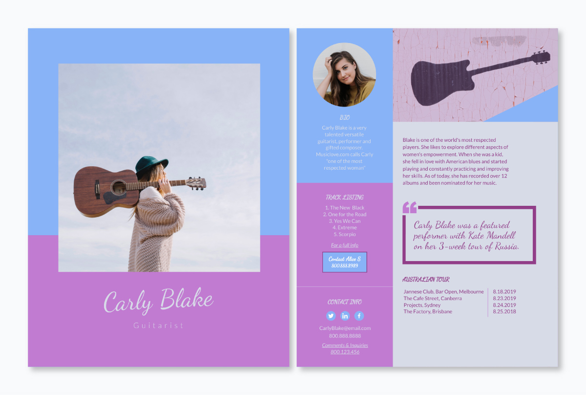
Here's an example of a guitarist media kit template that uses a script font.
In every family, there’s always the rebels, the cool kids. The uniqueness of every decorative and novelty font is extra fun to browse through.

Novelty fonts, you could say, are the least subtle in the psychological sense. They wear their heart on their sleeve and tell a story themselves.
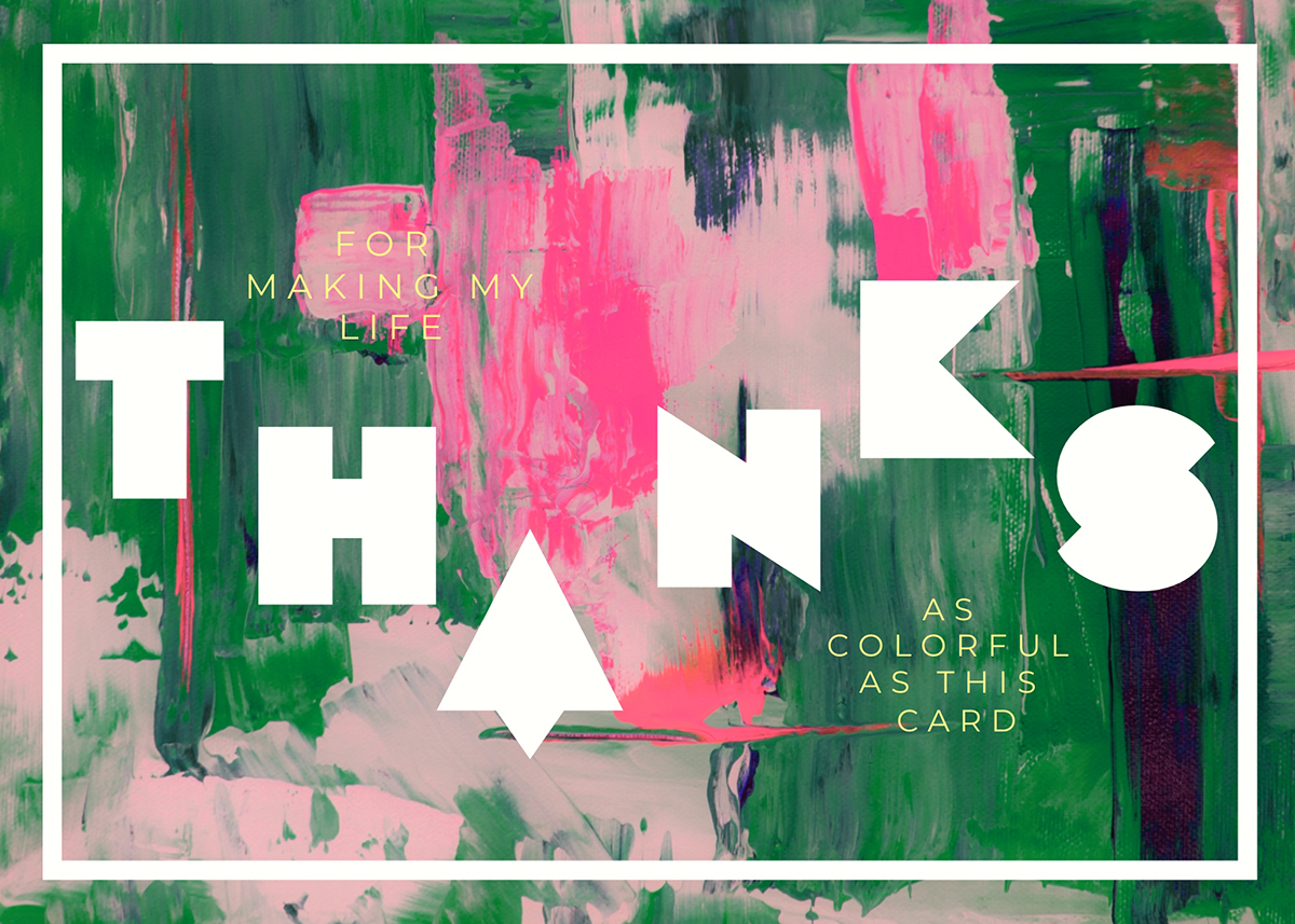
Below is a greeting card template that makes use of a decorative font.
Let’s look at some examples of font psychology in action. After reading this article, we suggest you go out into the world with your eyes wide open and start to look at how typography makes a difference in the decisions you make.
You might find that you’re drawn to a specific type of font or even one font in particular. Look closer at how this attraction affects your decisions in terms of consumerism, action and communication.
When it comes to communicating your brand strategy, font psychology plays a crucial part. Your brand font carries the weight of your brand’s story, purpose, mission and vision.
Take a look at the three text-based logo examples below. Notice how each logo exudes a different personality based on the type of font it uses.
Thanks to the research into the psychological effects of typography in human cognition, brand strategists can use this knowledge to design or choose the perfect brand font.
Now, let's take a look at some examples of how real-life brands are using font psychology to amplify their message and strengthen their brand.
Effective font psychology in branding depends on balanced conjunction between the brand logo and the overall typography.
Take a look at the brand font for Duolingo.
The psychological objective is playfulness and positive results to learning a language.
The designers used the brand mascot — the owl — as the basis for their font. If you look at the letter terminals, you’ll notice the resemblance in the owl’s wings and eyebrows.
The name of their brand font is “Feather Bold.” Quite appropriate, don’t you think?
The Duolingo branding is a great example of how important it is for these two to be linked visually. Users feel connected to the Duolingo font while using the app and never forget it.
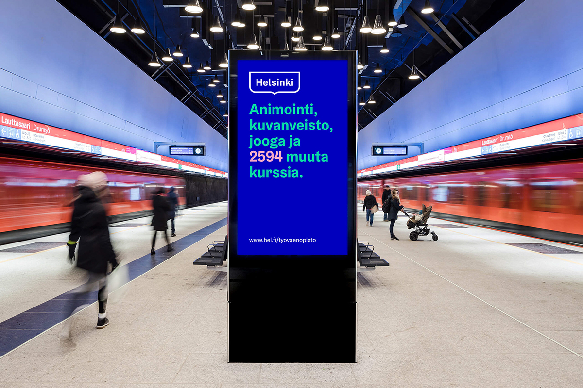
Creating the perfect brand font to represent an entire city is no easy feat. The rebranding for the city of Helsinki was a huge project that centered on this very idea.
The chosen logo, font and colors were to be used in every single piece of official communication throughout the city, from bus tickets to the electricity bill that comes in the mail. With a target market of everyone in the capital city of Finland and all visitors, the brand strategy and font had to be all-encompassing.
The brand strategists in charge of this project tapped into the psychological emotion of nostalgia. They used the Helsinki coat of arms as a starting point for the overall look and feel of the designs. This sociological and anthropological choice led to the creation of an empathic brand that's both wide-reaching and relatable.
The Helsinki Grotesk typeface was designed to be dependable, flexible and relatable. The wavy designs in the letter forms are directly influenced by the shapes in the coat of arms. This is an example of a well-executed city branding and custom font that taps into the psychology of an entire culture.
The role of font psychology in marketing is all about influencing an emotion or behavior in the consumer. Ultimately, the bottom line for any marketing strategy is to convert, so why not use the power of typography for conversions?
Psychology in marketing is rooted in behavioral psychology and the power of emotion and connection to influence a specific action.
Some marketing strategies rely on storytelling and a font that doesn’t help convey much emotion. These are fonts that are “just there.” Other techniques rely more on color and shapes to tell animated stories that use no text at all.
Then, there are the campaigns that use font psychology as the main point of impact with the consumer. Here’s a selection of marketing examples that do just that.
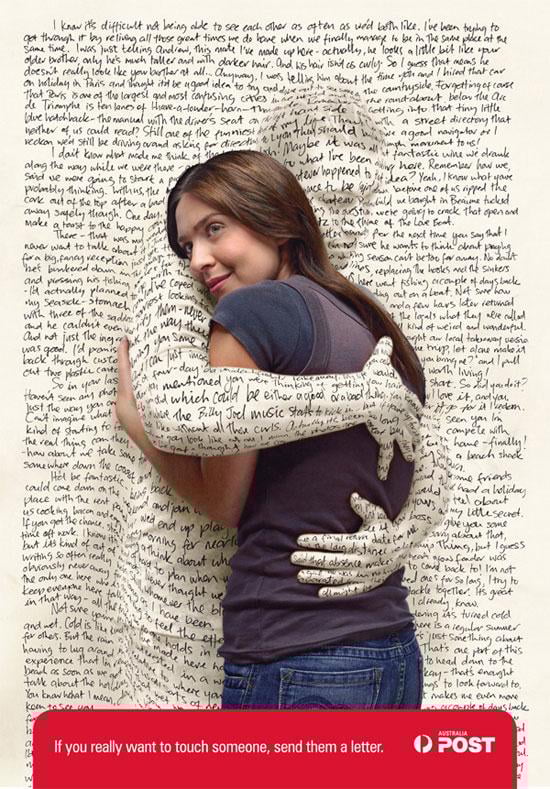
This advertising campaign for Australia post used handwritten fonts to visualize how paper letters make recipients feel. A handwritten letter is like a hug, and this ad is the perfect example.
Handwritten fonts, in general, feel personal, lighthearted and thoughtful. The psychological factor in this use of typography is the sense of familiarity and closeness.
To show the power of font psychology in packaging, we chose this minimalist design concept that shows the power of memory and association by simplifying recognizable packaging designs.
The visual below shows a Nutella jar stripped of everything except the font in a solid white color.
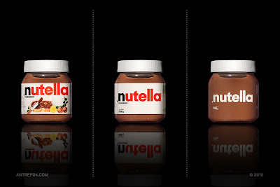
Take a look at the rounded shapes of the letters in the logo; they’re round, like a hazelnut. The shapes are comfortable, like how Nutella tastes. Don't forget to check out the other packaging designs used in the project for a healthy dose of inspiration.
The power of memes is to take a seemingly regular thing and turn it into a viral sensation. That’s exactly what happened with the font Impact.
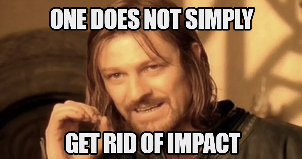
Back in the mid-1990s, Impact was part of the key fonts available for the web, along with Comic Sans and Arial. Now, it's simply called “the meme font” and there’s no indication of that changing any time soon.
On a psychological level, Impact is a unifying font. It connects people from all corners of the internet through the magic of meme-sharing. It creates community and inspires humor — something everyone needs.
Few marketing teams are as innovative, witty and awkward as Innocent Drinks. To show the power of font psychology in billboards, we chose this tweet by Innocent, where they show photos of billboards they put up around the city.
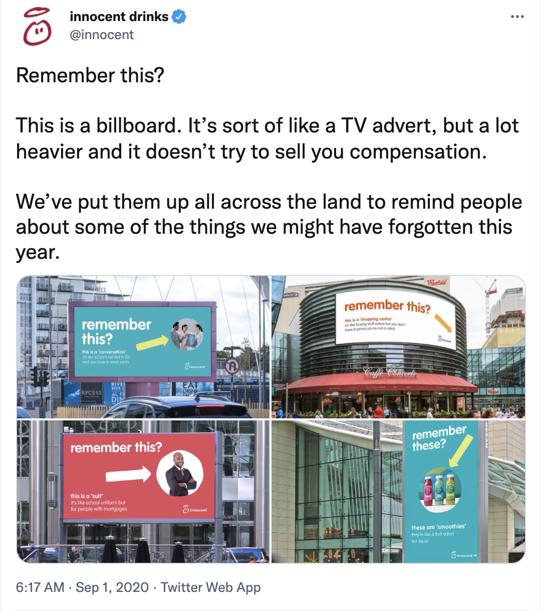
They wrote “remember this” in large letters in their brand font, pointing at activities we stopped doing at the beginning of the pandemic.
Their choice to use all lower case letters for these billboards is a note of their quirkiness and relatability. Innocent makes sure to stand out with its unique messaging style at every touchpoint.
Not surprisingly, the Innocent marketing team has quickly become an internet sensation.
An analysis of font psychology wouldn’t be complete without looking at how it plays a part in publishing, specifically newspapers, books and magazines.
The role of fonts and typography in the written word is influenced by history. We can go as far back as engraved Sumerian tablets through Illumination and the introduction of the printing press.
The way readers perceive fonts in their reading is primarily a subconscious process but still very important. Through tried and tested processes, publishing designers follow design principles to maximize the psychological effects of fonts in reading material.
Let’s take a closer look.
Newspaper fonts are first on the list because they’ve been around for so long with little change. The title font for the three newspapers in the graphic below uses an old-style Blackletter font, also called Old English or Gothic.

Why are these publications still using the same fonts after so long? Because the readers have an affective attachment to these fonts and feel a sense of connection.
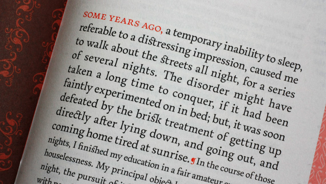
There are two primary levels of font psychology in printed books, the cover and the inside pages. On the cover, the typography in the design helps the reader feel what story the book will tell.
The font in the pages is a bit different; it has to be legible and relatable. Some fonts, like Garamond, are a safe choice for printed books, just how Arial and Verdana are ideal for digital documents.
The graphic below is from a type foundry that offers a selection of fonts specially designed for the printed pages of a book. This particular font is called Essay Text, and it’s easy to read with good flow and minimal effort.
When well aligned, body text in a book — at the perfect size and pleasantly laid out — can make a huge difference to what the story in the book makes you feel.
Think of how different it is to read a print-out in Arial than a book with a font like Essay Text. The second is much more pleasurable.
Magazines and posters bridge the creative gap between books and complete creative freedom, both in terms of typography and design in general design layouts.
Look at magazines and posters to see where designers are pushing the boundaries with type. In these cases, the use of font psychology inspires a sense of wonder or visual excitement.
There’s no action for the reader to partake in apart from simply enjoying the moment or associating it with their own personality, likes and dislikes.
Font psychology in ebooks mixes comfort-inducing printed books and experiential digital magazines. For these publications, the fonts must have high legibility on digital screens.

Even though simple serifs are better for reading printed text, sans serif is better for digital text. The newest devices with high-quality screens can handle serifs quite well, though.
Next up, let’s talk about font psychology in the entertainment space, two classic television programs that used typography as part of their identity.
Many brands in this space create their own fonts, and after they become well known, designers recreate the font for anyone to use.
For example, the Disney font, the Netflix font and the Simpsons font are all common categories in free font directories. These fonts have a high direct association for the readers, so use them cautiously.
Look at The Simpsons logo. The letters look like Simpsons characters, specifically Homer Simpson’s family if you squint.
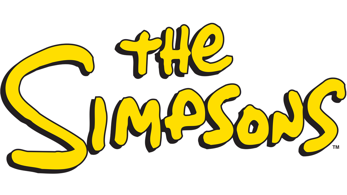
This logo is the digital representation of Matt Groening’s hand-drawn The Simpsons opening sequence titles. Plus, there’s a strong contrast with the color layering, just like in the animations.
There are quite a few Simpsons-style fonts out there, inspired by Matt Groening’s handwriting for the show. They’re aptly called Simpsons fonts.
Another TV show with great visual and associative font psychology is Breaking Bad. The show’s logo is made up of what looks like two squares from the periodic table and the rest of the word in an apocalyptic grunge font.
This combination does a fantastic job at telling a visual story of what the show is about; a chemistry teacher partners up with a drug dealer to make the best meth in the world.
Finally, the last branch of font psychology that we’ll look at is user experience, user interaction and digital design.
These are spaces where people regularly interact; font psychology is important because people are easily attracted to the design without it making them feel worried, confused or put off.
In general, the objective of a website or landing page is to convince the visitor to take some sort of action. One of the most significant psychological factors, in this case, is the use of larger fonts.

Reading words in large fonts is easier and faster than small fonts; they’re also better at helping the reader remember what they’ve just read.
Copywriting, psychology, and typography work together to inspire actions, such as tapping a button, scrolling down the page, signing in or registering.
Web and mobile apps mostly use font psychology to achieve easy visual legibility. Apps are digital products meant to make a person’s life easier or more enjoyable.
The role of typography, in this case, is about relaying a sense of positivity, productivity or contentment. When an app has an unfortunate font or bad typographic design, it distracts the user and hinders usability. This mistake can be a visual blunder or an emotional perception failure.
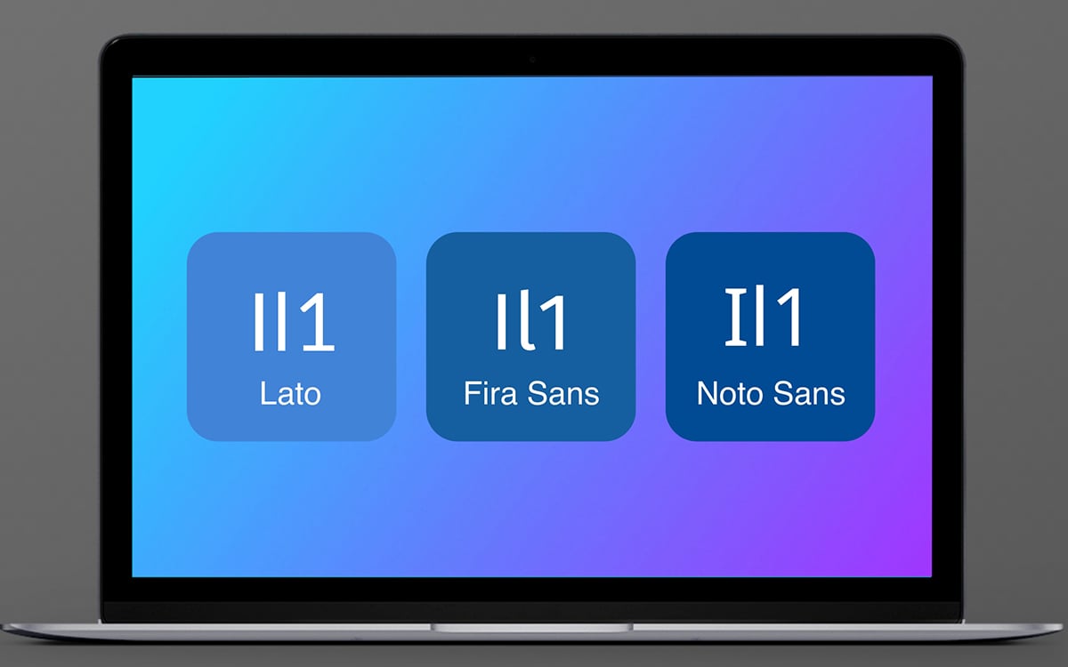
Below, you see the visual test for functional text; if the capital i, lowercase l, and number 1 look too similar, the font will be difficult to read, especially on screens.
If you look at all the apps on your phone right now, you’ll notice that most of them use a sans serif font. If it’s a serif font, it’s not one of the literary classics but a modern one. This is because fonts also have historical ties to them; apps are modern, and so are the fonts used in them.
You’ll see modern serifs because they are easier to read due to the optical baselines they create. On the flip side, some sans serifs are so minimalistic that they’re unusable for app design.
Before we end this article, let's take a look at some more examples of font psychology, and how it impacts our thoughts, perceptions and decisions in our everyday lives.
As we’ve seen in sections above, font psychology is important in many realms of marketing and creative support for businesses, entertainment and more.
But there’s also a dark side. That’s where the story of Comic Sans and Papyrus come into play.
You don’t need to be a designer to know that the font Comic Sans is often the butt of the joke. The whole thing about how hated Comic Sans is has become a widespread meme with many variations.
Papyrus is in a close second to the status that Comic Sans holds.
Nevertheless, there have been some well-known uses of these font. For example, Papyrus is the movie Avatar's main font.
And Comic Sans, regardless of how hated it is by designers and marketers, is a highly legible font that's often used for preschool, elementary and dyslexic students.
How does a font become so famous and intrinsic in society that it ends up having an entire documentary about it?
That’s what happened with Helvetica, a typeface designed not to be affected by or be a carrier of font psychology. The purpose of Helvetica was to be so versatile that designers could use it for many solutions without carrying any meaning of its own.
Helvetica was so keen on being uninfluential to the human psyche that it ended up being the most widely used font for logos and branding identities.
Earlier, I mentioned how fonts are associated with different periods. Much how calligraphic and strong serif fonts are bundled up in the perception of ancient times, there are plenty of other styles reminiscent of eras like the 80s, for example.
Such is the case with the typography used in the Stranger Things logo.
The designers behind this iconic font choice used visual memory cues from Stephen King books published in the 80s. ITC Benguiat was one of the fonts used to write Stephen King’s names on many books, and the creators of Stranger Things felt a deep connection.
They knew that other people out there would make the same association. Those people would turn out to be the show’s greatest fans. The Stranger Things font is an excellent example of font psychology and how letters are designed to influence emotions and associations in people.
Below is the design for a Labor Day campaign by Budweiser.
The designers used the iconic shapes, lines and colors of the Budweiser brand to create a special edition design that matched the branding perfectly while also grabbing your attention with the “This Bud’s for You” message.
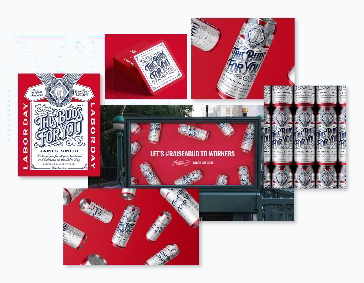
The interesting part is that they didn’t use the brand font in the cursive style for the main message. Instead they used a font that looks like a blend between the old logo font and the all caps serif in the font pairing.
So, how is font psychology used in this design? The font you see on the Budweiser logo feels like it’s been there forever, but it hasn’t. Budweiser introduced this script font in 2000, 60+ years after the birth of the brand.
In 2011, the iconic blue and white cans underwent a massive rebranding that introduced the “bow-tie” to the logo and a primarily red design with gold accents. This design lasted for around five years until the company underwent a 13th rebranding.
The designers looked back through the history of Budweiser and created an entirely new branding that not surprisingly felt familiar. This particular campaign, for Labor Day, uses a font that instantly feels relatable to the Budweiser brand and its vast target market.
Burger King was another brand that did a 360 with a new rebrand, bringing back their history into the digital age.
In early 2021, Burger King unveiled a new identity, complete with the recreated iconic logo and a fun new font. Burger King’s new font is called “Flame” and, according to the Burger King global CMO, “is round and yummy like our food.”
Along with the new Flame font, the design of the logo is rounder with no right angles or pointy bits. Designers made the burger buns on the logo look like authentic buns in their burgers, further cementing the visual memory in the viewer.
The new font and identity appeal to both younger and older audiences. The letterforms and colors are slightly reminiscent of the 70s and 80s.
This trend is becoming popular with Gen Z while inspiring nostalgia in their parents and grandparents. By blending these stories into their visual identity, they grab the attention of all generations.
The last example is the branding identity for Darling! The photographs in this collection show the typographic escapades for the logo and packaging designs, paired with feminine and passionate visual cues.
What’s notable in the realm of psychology with this font is the sensual nature of the design.
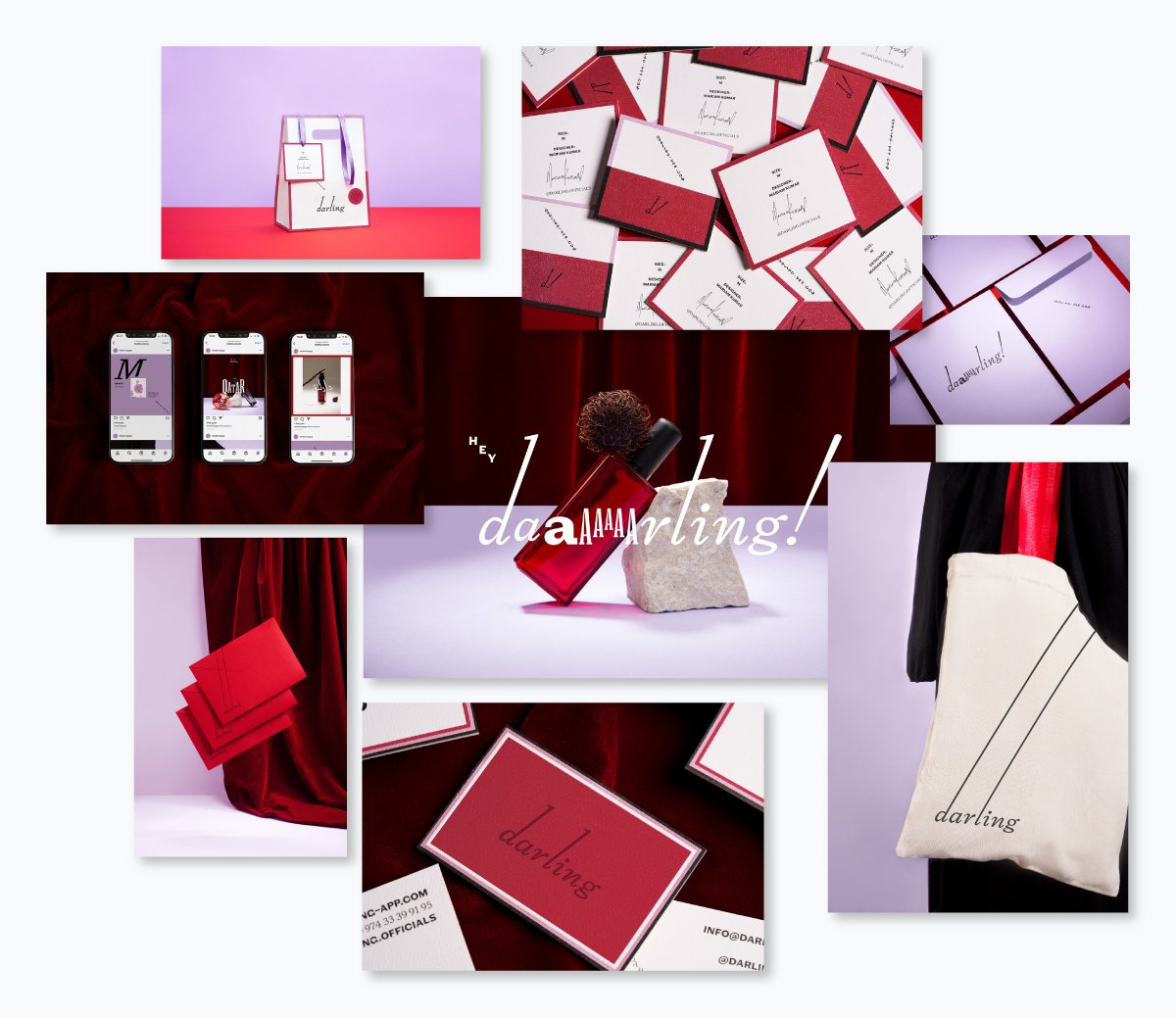
I mentioned before that script fonts were the dancers in the pack; the font for Darling! is the prima ballerina. And what makes the marketing identity special is the accompanying typographic tidbits in a chunky lowercase and three elongated all-cap serif As in an escalating pattern.
The ascenders of the d and the l are super long in the logo, as is the exclamation mark. This branding is like watching the ballet of human interaction on a shopping bag.
What do you think, Darling! sells? Their business sells Abayas; you can’t tell, neither from the logo nor the packaging. But I have a feeling it was on purpose. What do you think?
The written word is, in essence, a source of information. But the way the information is received and perceived depends on how the human brain processes it.
With so many factors to consider, it’s not surprising that the study of font psychology is only getting more detailed and elaborate.
Did you ever consider how important this connection was for your branding and marketing strategies? Taking into account these significant factors can make a big difference for the outcome of your campaigns.
And if you want to put this knowledge to practice, sign up for Visme and start creating all kinds of visual content using ready-made templates, built-in fonts and pairs, color schemes and more.
Create branding materials, presentations, infographics, reports, proposals, social media ads, videos and more using the easy, drag-and-drop editor, and take your brand to the next level.
If you're looking for additional resources to help you enhance your branding, check out the following articles from our blog:
Design visual brand experiences for your business whether you are a seasoned designer or a total novice.
Try Visme for free