Typography Infographics: 12 Inspiring Examples & Techniques


Knowing how to choose the best font pairs for presentation and infographics takes skill and practice.
This is why we’ve created a list of 15 font combinations that match perfectly together.
From science to resume and even health designs, these font combinations and color pairing will help you level-up your designs.
Let’s get started.
#1 Science: Exo & Web Serveroff
#4 Technology: Rokkitt & Hattori Hanzo
#6 Medicine: Helvetica & Georgia
#7 Travel: Pacifico & Junction
#8 Charity/Nonprofit: Cabin Sketch & Source Sans Pro
#9 Marketing: Trebuchet MS & Fjord
#10 Business: Trocchi & Source Sans Pro
#11 Finance: Open Sans Condensed & Verdana
#12 Education: Archistico & ST Marie
#13 Environment: Yellowtail & Amaranth
#14 Food: Dancing Script & Josefin Sans
#15 Sports: Trump Town Pro & Titillium
Additional Font Pairings to Use In Your Designs


This three-font combination comprised of Exo for the title text and Web Serveroff for the subtitle and body copy is ideal for any science-related content.
As a display font that can also be used at smaller sizes but in this case is used entirely in upper case, Exo has a futuristic feel to it, while Web Serveroff is a cool, narrow sans serif font that adds to the overall techy feel of this combination of imagery and text.

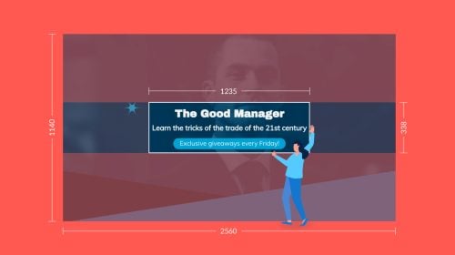
As a strong and bold sans serif font, Oswald works well in a variety of design projects, including resumes. It not only communicates confidence, professionalism and stability, it also combines well with a variety of other fonts for body copy.
In this case, a second sans serif font, Lato, was used for smaller text for its readability and rounder, friendlier appearance to counterbalance Oswald.

Montserrat, a vintage font reminiscent of urban typography of the first half of the 1900s, is here used in combination with the sans serif font Lato. Very legible at smaller sizes as well, Montserrat is also used for the subtitle in this visual piece.
As a geometric font comprised of simple shapes, Montserrat fits well with a versatile font like Lato, which combines both seriousness and warmth in its personality. Both are clean and sleek, which always works well with any design-related project.

Rokkitt, a display font which is ideal for headlines and title text, is here combined with Hattori Hanzo, which is a clean and modern-looking font that works especially well for short pieces of text in charts and infographics.
The use of lots of white space and a muted color combination also help make this a harmonious and effective design.
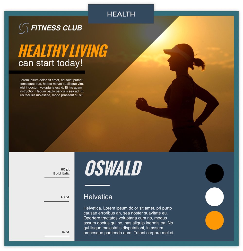
Oswald is once again used here, but in bold and italic. As a very clean and legible typeface, Oswald works especially well in titles and headers, as seen here; slightly slanted to the right, it also adds a sense of motion and dynamism to this piece focused on healthy living and exercise.
For the sake of clarity and legibility, the timeless and very popular Helvetica font is used for both the subtitle and body copy.
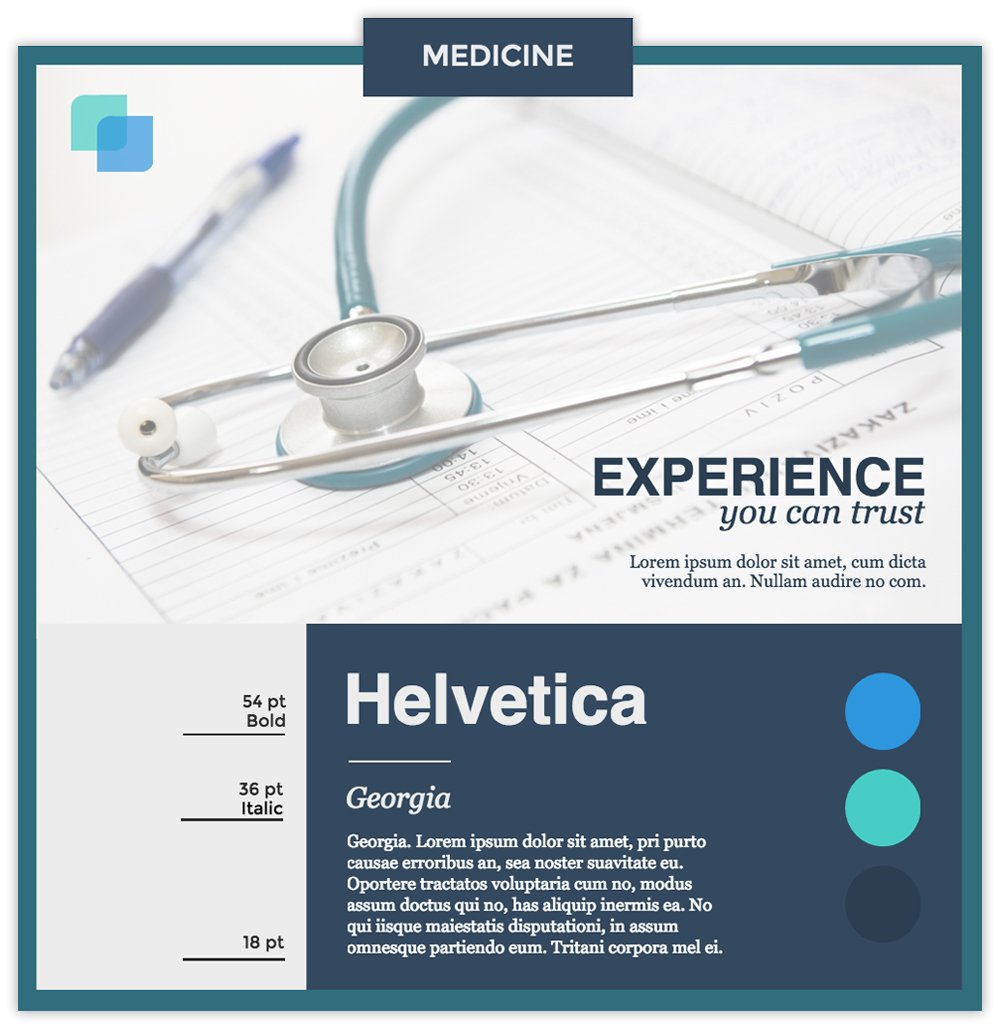
Helvetica is once again used here for the title, but in bold. As a clean, sans serif font, it reflects the stability and professionalism of the message it is communicating.
Georgia, a very legible serif font with ample letter spacing, was used for the subtitle and body text. Both of these are very common fonts that can be used in a variety of design projects, not just those that are medicine-related.

Inspired by the American surf culture of the 1950s, Pacifico is a fun and creative handwriting font that can be used to add a casual, lively feel to your project.
Here, it is combined with Junction, a font that is said to offer the best of both serif and sans serif fonts by combining the hand-drawn, humanist qualities of serifs with the clean and minimalist look of sans serifs.

Another humanist sans font, Cabin Sketch has the texture of a kid's doodle--while still very legible--that is both playful and creative.
It is combined here with Source Sans Pro, which is very readable at various sizes and resolutions and combines very well with Cabin Sketch due to the similar dimensions and letter shapes.
As in the rest of the examples showcased here, the personality of the fonts reinforces and is in sync with the brand, its main message and tone.

Trebuchet is a common font that is useful for a variety of projects due to its open forms, round features and large x height, all of which promote readability.
Here, it is harmoniously combined with Fjord, which is ideal for large blocks of text at small sizes, such as in this case. As indicated in our non-designer's guide to pairing fonts, it's recommended to combine a serif font with a sans serif to heighten contrast.

A casual slab serif inspired by earlier typefaces, Trocchi is here combined with the clean Source Sans Pro both in the subtitle and body copy. A bright and vivid cyan, along with variations of gray, are here used to achieve a general look of professionalism and create visual interest at the same time.
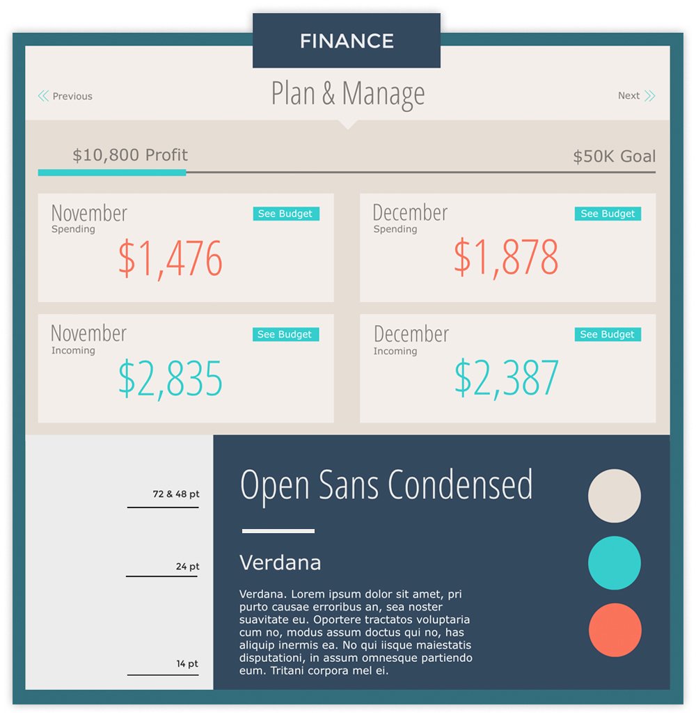
Open Sans Condensed is a highly legible and neutral yet friendly font that is characterized by an upright structure and open forms. Its understated elegance is a nice fit for a finance or corporate project striving to communicate excellence and professionalism.
It's combined here with Verdana, which is ideal for smaller text due to its generous spacing and width. This also makes a fan favorite combo for infographic typography.
As in the previous example, bright, vivid colors are combined with more neutral, subdued tones to simultaneously attract the reader's eye while maintaining a sense of balance and reliability.
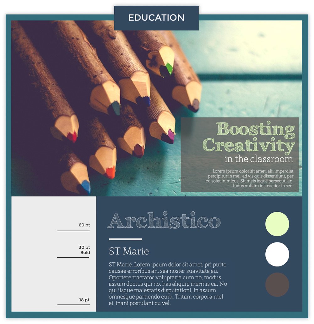
In this example, a good amount of contrast is achieved through the use of Archistico and St. Marie. While Archistico is a playful display font that looks like it was hand-drawn, St. Marie is narrower and more formal. They combine perfectly in this example project with an educational theme.
When choosing images for your project, make sure to select those that give you enough space to easily allow you to overlay text, such as in the example above. You can also use letterpress and stamp fonts in place of handwritten fonts when going for an old-fashioned academic or educational theme.
Also, when choosing a color combination, you can use the same hues found in your image so as to create a sense of visual harmony and cohesiveness.

Yellowtail is unique in that it combines non-connecting letters with connecting ones, which gives it a good amount of legibility despite being a script font.
Here, it's combined with Amaranth, a friendly font with distinctive curves. Note how this high-contrast combination with a lot of personality works well with this environment-related theme.
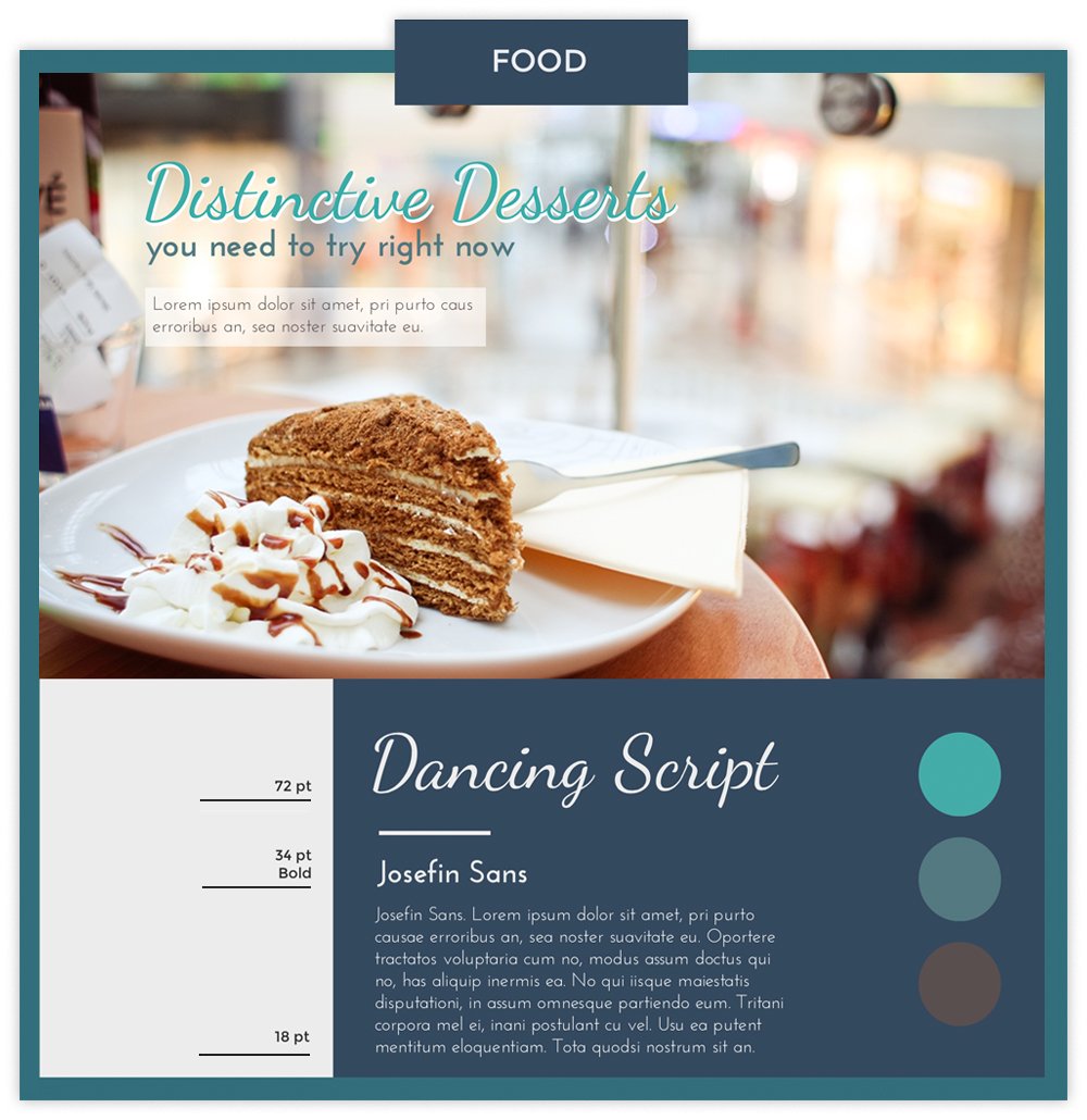
If you're looking for a lively and spontaneous look, Dancing Script will do the trick. Informal and friendly, with letters that slightly change size from one to the next, this font is well-suited for a casual and entertaining subject such as food and cuisine.
Here, it's combined with a much more legible and elegant font in the sub-header and body copy, Josefin Sans.
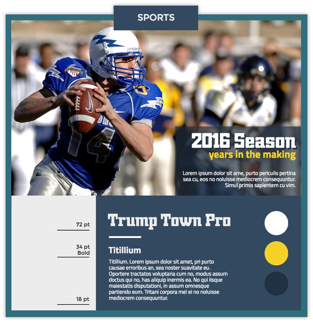
A serif font with a bold and eye-catching personality, Trump Town Pro is well-suited for sports-related topics, such as this one. It can be easily combined with a more neutral and readable font such as Titillium to balance it out.
Like in the previous examples, the colors used here were extracted from the image to create visual harmony.
Still haven't found what you're looking for? Here are a few additional font combinations that could be perfect for your next design.
Get started with each of these fonts by creating a design in Visme, whether for an infographic, presentation, document or something else entirely. The possibilities are endless.
Ready to start experimenting with fonts? Regardless of what you set out to create, you can do it in Visme. Sign up for a free account today, or start browsing our recommended selection of modern fonts to find even more options.
Design visual brand experiences for your business whether you are a seasoned designer or a total novice.
Try Visme for free