A Quick Guide on Sponsorship Marketing: Best Framework, Examples & Tools


If you don't have a website, you don't really exist.
Thanks to the ongoing pandemic, eCommerce has taken the forefront in retail with consumers spending close to $861.12 billion online in 2020 alone in the U.S.
With a majority of people shopping online, it is almost a mandate for brands to have a website — one that is designed with their consumers in mind.
eCommerce companies, big and small, are seeing double (even triple) digit growth. Reports show that e-commerce giants like Walmart saw a 97% increase in their online sales while Amazon noted a 40% spike in profit in one quarter.
While there are many factors that contribute to the increased revenue, such as avoiding common eCommerce email marketing mistakes, one important and basic factor is the website.
If you are looking to join the bandwagon of eCommerce websites that are tasting success like never before, it's time to invest your time and energy in designing the right kind of eCommerce website.
So, let's get into it straight away.
Did you know almost 48% of your target buyers decide whether they want to navigate through your website or not just by looking at the design?
Having a neat and easy-to-understand design is essential for your buyers to navigate and find items to buy. A complicated website design will only frustrate your buyers.
Now that you know what your buyers expect, the next thing to decide is where to start.
Whether you are looking to start a salad business, a garment shop or anything in-between, you need to pick a platform where you will build your online eCommerce store.
An eCommerce platform is an online software application that lets you build websites with a lot of design flexibilities. Plus, these online platforms have room for a lot of integrations that come in handy when you start running your business.
You can choose platforms like Shopify, which is a SaaS platform, using a multipurpose theme like Vendy or other popular Shopify themes, or Magento which is an open-source platform. Another option as a Shopify alternative is ShopWired. A SaaS platform like Shopify offers extraordinary eCommerce designs and an elaborate toolkit. You can build your store using the drag and drop visual editor in hours. Another good example of a drag-and-drop builder is Zyro by Hostinger.
Most people opt for SaaS tools because they are hassle-free. With an open-source platform, you will need a coder and a designer, unlike a SaaS platform. Another platform that is winning hearts is WooCommerce, which is technically a plugin. Some hosting providers also specialize in supporting specific open source platforms, so it’s worth ensuring full compatibility when considering your eCommerce hosting. Cloudways provides fully managed Woocommerce hosting at an affordable price point, but be sure to shop around when searching for your next host, as migration can be tricky if your initial selection is a misstep.
If you're using Shopify and your Shopify store isn't able to cater your business as you wish, you might consider migrating from Shopify to WooCommerce.
WooCommerce is considered one of the best alternatives to Shopify by offering customization and has a wide range of apps and extensions available to expand your store.
These platforms let you design unique and beautiful websites with all core eCommerce functionalities already pre-set in them. Just get started with premium WordPress WooCommerce themes.
Now that you are aware of where to start with your eCommerce website, let’s look into the primary design elements that you need to take care of.
Experts suggest that for any eCommerce website, there are around 8 key pages that impact the conversion rate:

Adding to this, it is important to have a design that's easy to navigate, takes less time to load and connects with your target buyers.
The key is to NOT put everything on your homepage. It's about having the right balance on showcasing your products, product descriptions and creating brand consistency.
Let’s see how.
Whatever is your product category, your website must have consistency when it comes to the colors and fonts. Not just websites, this color will reflect in your social ads, landing pages, social profiles, emails, confirmation slips, et al.
The color you pick will determine how your buyers will interact emotionally.
Each color triggers a specific kind of emotion. If you're unsure about the color that will suit your eCommerce business, check out our infographic below on color psychology for a quick overview.

Having a well-defined color palette is essential before you start building other design blocks. Based on your target buyers, your products, and your value proposition, pick a color that attracts and accelerates conversions.
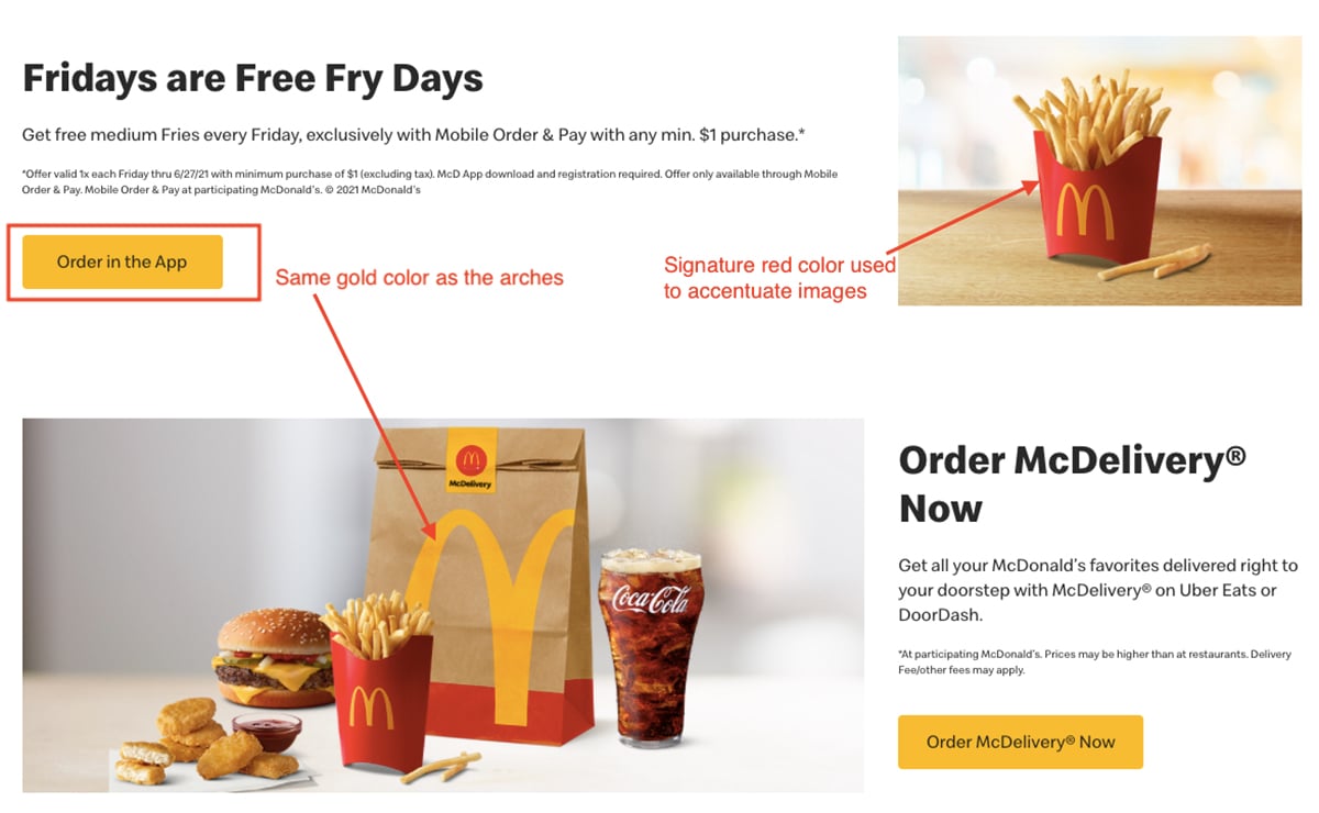
For instance, McDonald's immediately makes us think of golden arches or what we perceive as the classic M on a red background. If you see their website, you will see the primary golden color to match the logo and the red color used to accentuate the images.
This same color consistency is maintained throughout their ads, social pages, landing pages, offline-stores, and everywhere else you see a McDonald's.
Dame Downer from Brand Labs suggests incorporating Google's Material Design philosophy for your eCommerce store. Say yes to flat designs because they look neat and trigger actions.
A neat website with a clear purchase path is essential for your eCommerce store to generate revenue. If your buyers have to scout for information, they will immediately discard your website.
When you are adding a design element to your website, make sure you always have a concrete answer to "how will this catalyze the conversion journey of my buyers."
For instance, if you look at Nike’s website, you will see all the elements right in its place designed to help you buy immediately.
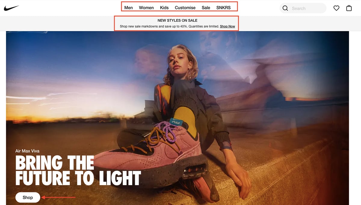
The categories are mentioned clearly, the new sales message is added on the homepage, and a bold image highlighting the shoe with a CTA "Shop Now" makes it appealing, neat and easy to navigate. That’s one classic neat design.
Product categories form the crux of your website. Your buyers should be able to easily browse the product categories you offer and also filter through them.
Instead of pushing your buyers to scroll all the way up and down, providing categories and filtering options cuts down the browsing time and gives buyers easy access to their choice of product.
For brands like Amazon that sell almost everything that you can think of, imagine if they didn't have a category option! It would be a mess with so many products of different pricing ranges.
When designing your eCommerce website, always ensure that your product categories are displayed in a place that is easy to find.
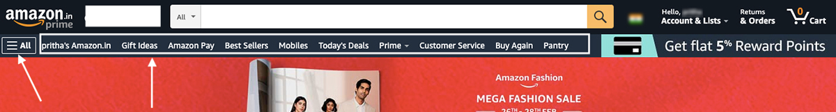
If you look at Amazon, you will see a broad overview of categories as well as an ALL option to see the entire list.
Most websites pick the top of the website to include an option to see all categories as well as use the footer to display the entire list. If you look at the previous example of Nike, you will see Nike has limited categories that they have mentioned at the top of the homepage.
You will notice that every eCommerce website will have a small cart icon placed on every page, ideally on the top right. This allows the users to see how many items they have in their cart. In terms of design, this element is extremely important for any eCommerce website.
If you look at Amazon's website, the shopping cart icon is in white color but the number of items is highlighted in bold orange against a black background, making it prominent and easy to locate.
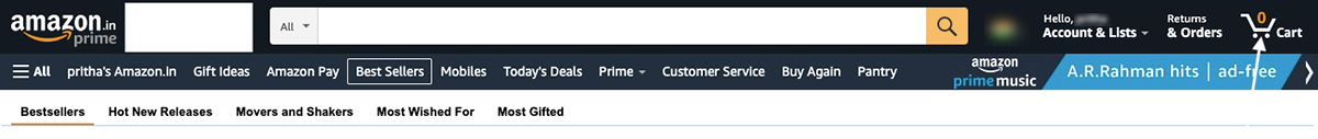
Making this button visible on every page throughout the browsing time increases the chances of conversions. Often users add items to the cart and then leave without checking out.
The next time they log in, they might have forgotten about it. This small icon will show up with the list of items in the cart, pushing users to complete the purchase the second time.
The key is to add an icon that is easy to comprehend. Most websites have the standard 'shopping cart' icon. Having complicated icons can confuse your buyers and you don't want that.
Having quality product images on your website solves the long-standing pain point of your users of not being able to see the products before they purchase.
In an offline store, people get to see the product in person and then make a purchase decision. While it's not possible to hold a product online, it is possible to enhance the shopping experience with high-quality images of the product from all angles.
Quality images are a must. If your images are blurry or pixelated, your products may come across as cheap. So, when you are designing your website, reserve the center spot to highlight your products with quality images to create an impressive gallery.
Give your buyers the option to view images by having the zoom option so that they can have a closer look at the finer details. If possible, add videos of the product.
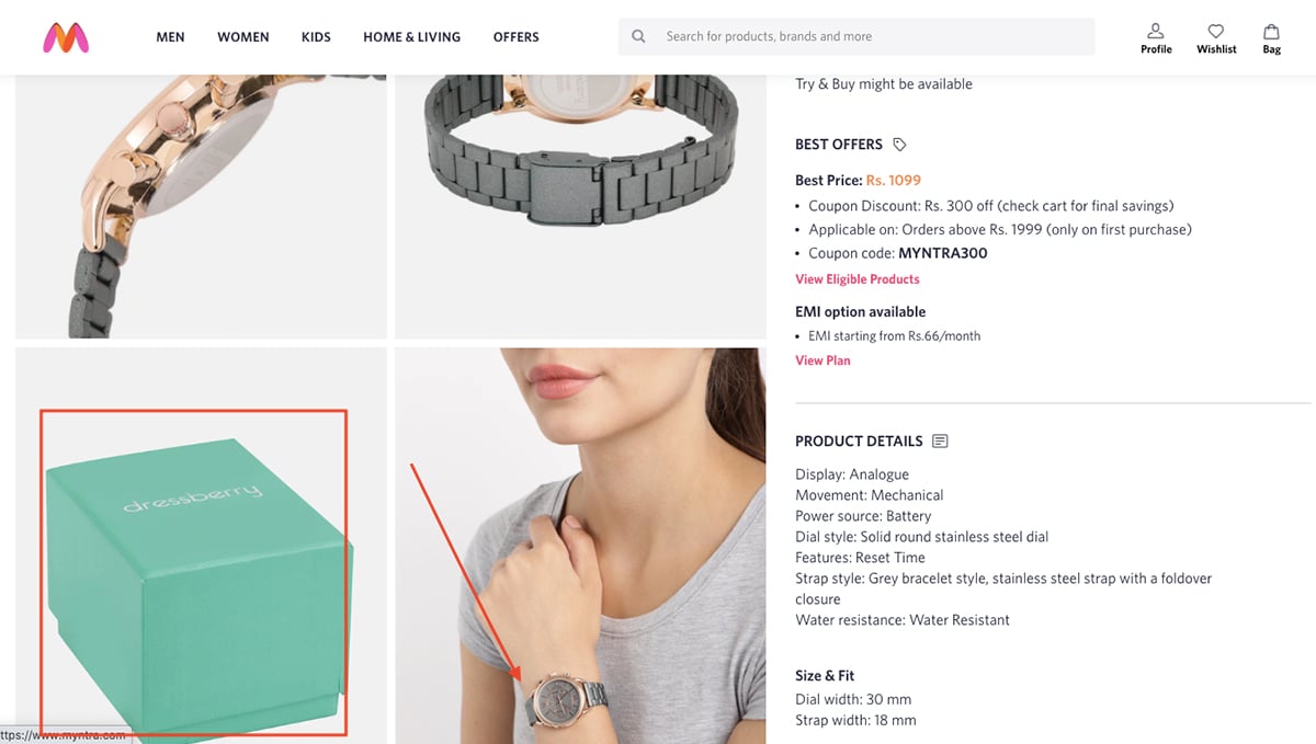
When you search for a watch on Myntra, you will see a close-up look of that watch, an image of a model wearing the watch and a picture showing how the packaging will look.
Similarly, if you are selling items of clothing, you will notice that brands often have models wear the clothes in the images rather than just the image of the clothes. This kind of display gives an idea of how the dress will look when your users will wear it.
These are a few of the most important things to keep in mind while designing your eCommerce website. Along with these, there are some additional tips to take care of while designing and setting up your eCommerce website.
Sign up. It's free.
Create stunning website graphics with Visme!
Aside from optimizing the design of your eCommerce website, there are several best practices you can adopt to deliver a great customer experience in your store.
When you choose an eCommerce platform to set up your eCommerce website, make sure you also have an idea of what kind of CRM you want to use to track your visitors and customers.
Pick a CRM that you can integrate with your website without much hassle. Having a CRM is essential because it will give you detailed insights into where your customers are interacting with you the most and where they are leaving your brand.
These insights will help you design a buying workflow to reduce any friction your buyers might be facing. Be ready to do a lot of A/B tests for your website. From planning your subscription forms to monitoring lead capturing, each element plays a pivotal part in your design plan.
From changing the position of banners and texts to altering the CTA button, there will be several iterations on your website design as you get to know the ideal browsing pattern of your buyers.
The journey from point A to B may look like a straight line but it means a lot of to and fro for your customers before they decide to hit the buy button. Knowing more of your traffic also helps you optimize your website’s funnel. Make sure your design is equipped for that.
One of the most crucial parts of an eCommerce website is transactional activity — you don’t want any friction here.
Customers must have a smooth transaction experience from the time they hit the "Buy" button. Pick a website platform that integrates with major payment gateways like PayPal or Stripe, especially if you are selling to an international audience.
For instance, if you are using a SaaS online platform like Shopify, you will see the option to set up payment options as soon as you start building your website. You can integrate Shopify with PayPal or Stripe.
Include multiple payment options like PayTM (which is very popular in India), debit and credit cards, net banking, and UPI payment. Your customers must find all the options to do a transaction, including the Pay at Delivery option.
When you integrate any payment gateway with your store, it automatically sets up workflows to send immediate confirmation emails to customers on each transaction. These confirmation emails are extremely important for a buyer and you must ensure that these workflows are properly in place.
Designing is all about iteration. You start with the essential pages and the basic setup done for an eCommerce store to function. Keep testing with your team to see what works and what doesn't.
Also, make sure your design is compatible on all devices and you are ready for a digital interaction across multiple channels. Each design variation will be backed by conversion reports, new products, landing pages and customer browsing patterns.
So, don't worry — you'll have plenty of time to iterate your design and make it a better version every single time.
If you're looking to create stunning visuals for your eCommerce store, such as headers, product images, marketing videos, social media posts, ads and more, make sure to check out Visme.
You can sign up for a free Visme account today and take it for a test drive!
Design visual brand experiences for your business whether you are a seasoned designer or a total novice.
Try Visme for free