Typography Infographics: 12 Inspiring Examples & Techniques

Designers aren’t the only ones that benefit from design trend inspiration. Marketers, product managers and sales teams can also gain valuable knowledge for their work by knowing what designers are creating. Cross-team collaboration also benefits from inspiration and sharing of information, for example, about the most inspiring graphic design trends .
We’ve put together 15 of the best examples of graphic design trends to inspire you and your team when planning and creating new products, projects and designs.
Let’s get started.
The one most important graphic design trend that year over year keeps evolving into being a regular thing instead of a trend, is inclusion and diversity. The fact that it’s still a trend means we still have a ways to go in this regard.
Most noticeably, we’re seeing more diversity and inclusion in illustrations of people as well as stock photography. But a more notable example is the one below, depicting the packaging design for a sunscreen formulated specially for different skin colors.
The bottles are the color of the skin of the product formulation it carries. Not only are they diverse, they’re also sustainable as they are designed with recycled papers. This product isn’t available on the market yet, but the design concept has made waves.
The Adidas Mother’s Day campaign included moms of all colors, shapes and in different day-to-day exercise situations. In all the scenes, the children are part of the composition, from babywearing to kids running alongside the mom. This style of visual campaign is what we should be seeing more of.
The illustration below is another example of this trend. There is only one variety of skin color, but it does depict different body types and disabilities. Disabled people are hardly ever depicted in illustrations like these, we’re happy to see this changing.
The next graphic design trend we’ve noticed and are quite excited about is minimalist data visualization.
These are designs created with one data set and in the most appealing way possible. The visualization technique can be anything from an infographic illustration to a line chart. As long as it’s not complicated and the viewer can identify the information straight away, the design is a success.
A great example, and a leader in this field, is the Beautiful News website from Information is Beautiful. Every day, a new data visualization is added to the site, some more minimal than others. The example below is about how the US could meet its electricity needs by 10X over with wind power alone. It uses only two colored squares to visualize the message.
The minimalist data viz below is one in a series called Little Bits of Big History. In this case, the data is about the 64 moons of Jupiter and that the biggest one, Ganymede is bigger than the planet Mercury. The example below from Column Five Media and The History Channel relies on infographic illustrations to get the point across.
Another example, this time more on the classic style, is a simple line chart. The difference is that the yellow lines resemble a highlighter. This small detail is what makes this line chart special over any line chart with a thin line. These minimalistic data visualizations are great additions to your blog posts.
And finally, this is a minimalist data viz template from Visme. The data is a statement that’s supported by a donut chart in a color that contrasts with the background. These types of graphics are insanely easy to customize or make from scratch. They’re also extremely easy to share on social media. What are you waiting for to start using them?

Social media carousels aren’t a new thing, not even close. In fact, Gary Vaynerchuk have been making these for years! Below is an example of one of the latest social media carousels he posted on LinkedIn. But his style didn’t cause a trend wave, Chris Do’s social media carousels did. Let’s take a look.
Chris Do is a well-known and respected designer who has inspired hundreds of thousands of designers around the world. His company, The Futur, offers training and resources for designers who want to grow in the industry and need just that bit of Chris Do magic to do it.
A while ago, Chris Do started sharing social media carousels with design tips on his Instagram account. Below is an example of a Chris Do — The Futur social media carousel.
View this post on Instagram
Shortly after, Chris Do and The Futur started posting guest posts in the same carousel style. Notice how the font is the same and the location of the details on the borders is the same. Chris Do and The Futur even shared some carousels with tips on creating carousels, never saying that their style was copyrighted and inviting designers to use it.
View this post on Instagram
It wasn’t long before hundreds if not thousands of content creators started flooding Instagram and LinkedIn with social media carousels that use the same font and layout as the Chris Do carousels. This trend doesn’t look like it will die down any time soon, but we have seen a slow rise in variations from the classic Chris Do style.
View this post on Instagram
Geometry is another design element that is most definitely not new or novel, but what’s trending is the way geometry is used. The use of flat geometric compositions in branding strategies has made noticeable waves, utilizing the geometric shapes in all the brand assets.
Not every piece of collateral uses the composition in the same way, but they all fit with each other. The trick is to create a geometric design system that can be replicated and adjusted for different assets.
Take for example the branding assets below. The lanyards and the bus stop designs look different, but you can still see the connection in the shapes and colors and how they’re angled against each other.
Flat geometric shapes can be as corporate or as fun as the designer wants to make them. The business card design below uses geometric shapes that are playful and vibrant. Even though they look like they might be in a shamble, they’re actually strategically placed so that the viewer can read “We Build Relationships.”
Another brand that uses geometric shapes, and has for a while, is Buffer. You could say that they are trendsetters in this respect. Their geometric shapes are a bit more on the loose and scribbly side but are still quite effective when mixed with photography.
Finally, we’re also seeing this trend in illustrations used for blogs and articles. In the example below, designer Ray Dak Lam uses geometric shapes to visualize a person using mental health tech. We’ll surely be seeing a lot more of this trend through the rest of the year and on to 2024 as it can be used in different ways.
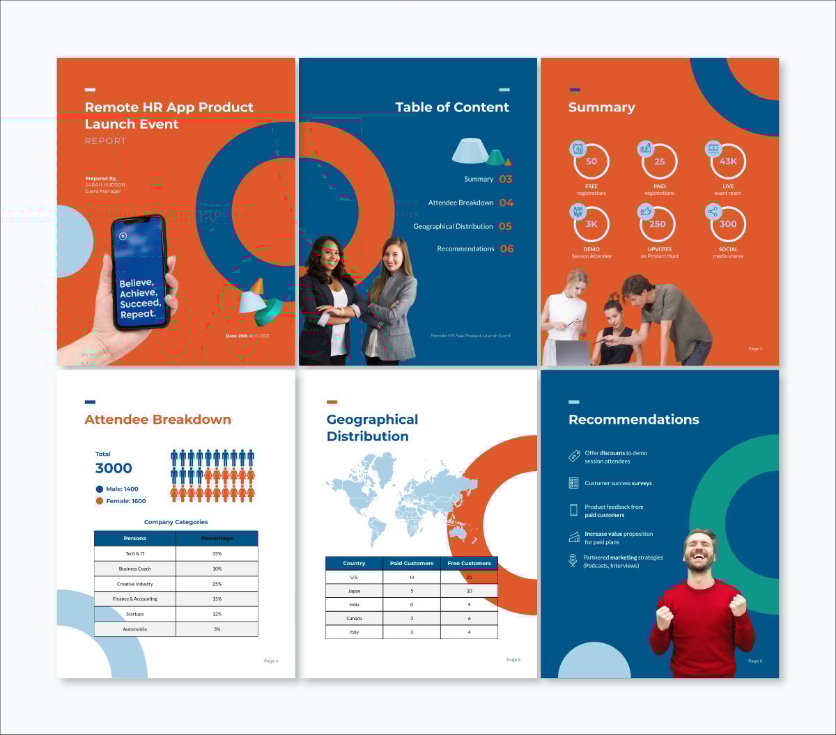
The Visme template below for an event report uses flat geometric shapes as background elements and widgets to visualize key points. Inside your Visme dashboard, you’ll find plenty of flat geometric shapes to use in your own trendy designs.
READ MORE: 40 Brilliant Geometric Patterns (And How to Use Them in Your Designs)
Much like diversity and inclusion, the fact that sustainability and nature-related design is still a trend means we have a long way to go. This design style should be a norm and not a trend. With that aside, let’s take a look at what’s trending in terms of sustainability and design.
The tea packaging concept below goes beyond using recycled materials and unbleached tea bags. They include a seed inside each bag with instructions on how to plant it after drinking the tea. It’s innovative, interactive and makes an impact.
The sustainability and nature trend doesn’t just encompass the type of packaging used for a product so that it’s sustainable. The trend also has to do with brand storytelling and impact. For example, the Lavazza infographic below visualizes how the company works directly with coffee cultivators to contrast climate change.
The white paper template below is perfect for companies working hard on their sustainability and climate impact. For an added “natural” feel, use textures like the Lavazza infographic above. Show how your company is minimizing your carbon footprint by sharing the final white paper as a live link instead of a printed document.

Coming up next in our list of inspiring graphic design trends is one about typography. What we’re seeing is a new way to use letters and fonts, a more free and playful angle that doesn’t resemble others before it. This is a great opportunity for brands to stand out and be different, the trick to get this right is in the balance of the letterforms and colors used.
The example below is a design for the shoe brand Vans where they share their support towards stopping Asian Hate. The letters are tight against each other, some are angled and others aren’t. The O is slanted, and the L’s look like no L we’ve ever seen before. The colors are contrasting from letter to letter and the entire design is flanked by geometric shapes that don’t compete for attention but rather complete it.
The typographic illustration below from WePresent is a great example of unexpected typography. Different from the example above where the font was manipulated to look different, this is a hand-drawn design where each letter has its own personality. The way the letters fit into each other completes the effect.
The example below takes the unexpected typography trend to another level, getting a bit psychedelic. The letters seem to come out of the handheld device to relay a message that is very relevant today, The Future of E-Commerce. This would be a great illustration for a blog post or article.
We’ve been seeing 3D in design for a while, but until recently it was unattainable for the regular brand. 3D illustrations, both static and animated were everywhere in design forums and blogs. But now, 3D design is much more accessible. We’re seeing it on landing pages, infographics, presentations, branding strategies. They’re everywhere.
The example below goes beyond the 3D hands used by SaaS companies and illustrates a human person in bubbly 3D style, complete with green hair and beard. You can be sure that you’ll be seeing a lot more of this style of design through the rest of the year and the next.
Above, I mentioned that we’re seeing the 3D trend in landing pages. Companies are moving away from the human illustrations of last year and now are using 3D assets to visualize their brand’s products and services.
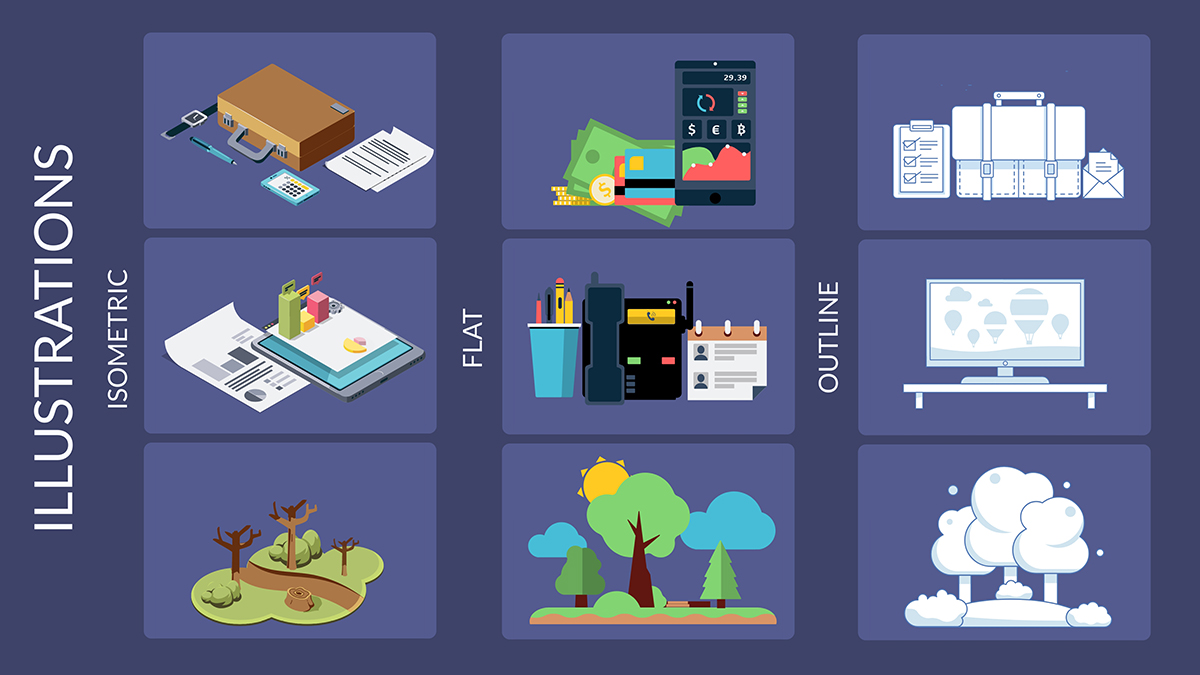
Visme has thousands of 3D assets to help you create anything you need for your company. From static 3D illustrations to animated 3D shapes and arrows. The Visme graphics library is constantly growing and you can be sure we’ll be adding more 3D assets in the near future.

The serif typeface was the first to ever be used in design. It evolved from calligraphy and hand-drawn type. By the way, a serif font is the one that has small bits that extends outward from the vertical and horizontal lines.
Serifs are making a comeback in headlines and titles, in some cases also branding. More brands are moving towards using serif type, in comparison to the sans serif trend a few years back.
The website design below for a beauty brand uses serif fonts front and center. Notice that these serifs are quite classic in their style, but still manage to look modern and enticing. Also, did you see the geometric shapes making an appearance and the nod to sustainability and natural aspects?

The brand concept for Mara Camps uses serifs in both the logo and the main titles of the website design. What we’re seeing with this trend is that the serif fonts are the centerpiece in the design; they’re not just a body font, they’re the main player.
In this last example, for another beauty brand, the design also uses serifs in the brand assets and important titles. These serifs aren’t here to be subtle, they’re making an impact, and we can’t wait to see who else starts using more serifs in their designs. Especially since two years ago, the majority of brands that had serifs in their logo, changed to sans serifs.

The proposal template below uses serif fonts throughout the pages in a style that‘s reminiscent of classic typefaces while also staying relevant to the present. Use this template if you want to be both trendy and timeless all at once or explore other proposal templates for more inspiration.

Another graphic design trend that’s growing this year and will surely grow towards the next, is the implementation of the fine arts. What does this mean for design?
Designers are bringing in concepts that are more often seen in art, like collage, paint strokes and watercolor. None of these are new to design, but what the trend is about is how it’s all mixing together to create a new and unique style.
The example below, from a Patagonia campaign called “We The Power,” uses collage and paint strokes to create compositions that stand out. Note the use of serif fonts as well in these designs. The colorful brushstrokes surround the collage pieces, the entire border of the poster and are even underneath the text. This is a great example of how art and design can come together.
Tea brands have a lot of competition and designers are always pushing the limits to what tea brands look like. In this case, designers for Yama Moto Yama use brush strokes and textures to create leaf and hill shapes, plus ornamental curved lines for emphasis.
When it comes to collage, there are no rules as long as the finished design looks like it was made with pieces of something else. In the example below, the designer used textured geometric pieces to create a salad that looks like it was made with pieces of paper. This is where the handmade and the digital intersect.
Retro Futuristic and psychedelic design first made waves in the late 60s and 70s. Since then, it has been making comebacks through the years, but this year it’s back in a big way. The style is being used in new ways, with different colors and composition styles but still very much inspired by the psychedelia of the 70s.
The busy design below shows a mix of vintage games and current devices. It speaks to people that like retro objects and collect them. The message is all about staying indoors during the lockdown and enjoying the things you love.
The designs below are a series of social media graphics for a Facebook Group called Vinyl Junkies. Vinyl records have been coming back into our lives faster than you think. And since vinyl is inherently retro, the designs for the group take a nod from the style and create a new approach.
Notice that the font is not psychedelic, it's actually quite common. The combination of this font and the psychedelic illustrations is a great combination that illustrates this trend perfectly.
The poster designs below are retro in a different way. They’re a mix between psychedelia with brutalism and a bit of Tron neon. You can see the retro-futuristic trend in them, but also the timely details that make them fit into this year’s graphic design trend.
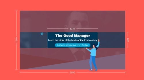
The next graphic design trend is one that we hope to see more and more of. It’s perfect right now as the world has gone through so much change, a bit of playfulness can make things feel better. This trend is more about the story it tells, and the vibrant colors used to tell it.
The illustration below is a design for a collaboration between Ellesse and Bazbon, a design and illustration team from South Korea. The colors are trendy as is the story, the girl is wearing training clothes by Ellesse but isn’t actively playing the sport. This is a fun way to promote athleisure from Ellesse with a playful design.
Below is a concept design by a Freepik illustrator. The bubble letters, geometric shapes and the fun color palette is a style we’re seeing a lot of. This style of design makes people happy and feel good.
This brand packaging concept for the brand “Over the Spoon” uses playful tactics to show animals doing silly things inside the logo. This is a small playful detail that makes both the brand and the packaging stand out from the rest.
Below is a Visme template for a pricing comparison infographic. We wanted to show you that even something as simple as a pricing table can be elevated with a bit of playfulness. Notice the 3D elements as well from the trend we mentioned above.

Color palettes are one of the trends that change quickly. That’s why sometimes it’s not a great idea to base your entire brand on a color palette trend, as it will likely change soon.
That said, we’ve noticed that the muted color palette trend is lasting longer than others. Maybe it’s the relatable quality to it that makes you feel at home and content when looking at it. Muted means that the color isn’t a pure hue but rather has been mixed with white or gray to make it less vibrant.
The branding colors for Vera are all in muted pink hues with a contrasting cobalt blue. The blue represents the elderberry, which is the main ingredient in the gummy vitamins that this brand produces. None of the colors jump out at you but rather make an impact subtly.

Marta Rabassa is an interior designer and this is her brand identity. Her muted color palette includes a muted black — which is essentially a very dark gray. The creamy background pulls it all together and the white adds a bit of contrast.
This branding concept uses a muted palette in blue, orange and cream. Even the white is muted. To achieve a muted white (sometimes also called off-white) designers add a little of another color to create a subtle difference in the shade. In this case, it’s a very light gray. The texture of the paper adds to the overall effect.
The Visual Identity presentation template from Visme uses muted yellow and gray for a complete visual effect in all its slides. It’s not only muted but also reminiscent of the Pantone Color of The Year.

Illustrated humans have been a trend for a few years already, but what we’re seeing now is a greater variety in styles. Not only in diversity but also in an illustrative style.
The three examples below depict a muted watercolor style, a black and white charcoal striking design and a geometric-inspired composition with artistic nods.
Let’s not forget the 3D illustrated people! These were popping up last year and now are becoming more and more popular. Makes sense, since the more accessible 3D design trend is a big thing right now. Note the muted color palettes in this 3D example and the geometric one above.
In your Visme dashboard, you’ll find a large collection of illustrated people and avatars. You can use them in any project, from presentation to infographic and anything in between. Add a bit of personality to your designs with illustrated people.

Sign up. It's free.Create engaging animated content with Visme.
When it comes to color palettes, black and white are inherently timeless. But now that we’re seeing so much of it, you can safely say it’s become a graphic design trend to look out for. By saying colorless instead of black and white, the trend isn’t limiting to designers.
If they wish to follow the trend but not be duotone, they also sometimes use gray. It’s colorless as long as there’s only black, white and gray.
The example below uses the drastic contrast of pure white and pure black. Not only in the labels, but also in the physical packaging. It’s impactful, beautiful and memorable.
This beer branding uses a muted black and a soft gray to create a monochromatic palette that is striking yet still attainable. The use of orange for the linkable buttons is done for accessibility purposes, as a design in this color palette is difficult to make accessible for screen readers and people with color blindness.
This Color-Less book cover design template by Visme uses a black and white photo with a dark overlay to make the white text pop. This is an effect many designers use for creating contrast and depth.

Finally, the last graphic design trend on our list is one we’re particularly excited about. Above, we mentioned the increasing variety of illustrated people, but this takes the trend to a whole new level. We’re talking about customizable illustration sets, not only of people but also of objects and scenes.
The first example is Blush, a website where you can find illustrations in lots of styles for any industry. All are customizable with different apps like Figma and Adobe. Blush also offers on-site customization for quick results. This is a paid service, but there’s a free trial.
Another example of this trend is the StorySet library from Freepik. These illustrations can be customized to fit any brand and style. There are many scenes to choose from in five visual styles. You’ve surely seen these in many places, as they’re free with attribution. If you buy a Freepik license, you can use them without attribution.
Above in the trend about more variety of illustrated characters, we mentioned that Visme has a whole selection of these in the editor. But what you might not know is that all these characters and elements are fully customizable. You can create all sorts of scenes with customizable Visme illustrations for any project. Take a look below at how it works.
We hope you enjoyed our list of graphic design trends! We definitely enjoyed putting it together for you. Our designers made sure to create examples of how you can use any of these trends with Visme. Those are up above, included below each trend, just in case you missed them.
Which of all the trends is your favorite? Ours is the customizable illustrations and the 3D elements. We’ve been using these for a while now and are happy to see that more brands have incorporated them into their designs as well.
Would you like to use the Visme assets that will help you create projects that follow these trends? All you have to do to get started is to create a FREE account and start designing! Best of all, there’s plenty of templates to get you started if you have little design skills.
What are you waiting for? Let’s go!
Design visual brand experiences for your business whether you are a seasoned designer or a total novice.
Try Visme for free