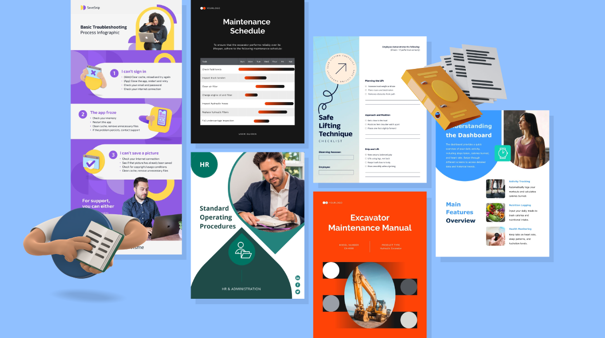


Proven Product Specification Examples That Give You Clear Decisions
![A Detailed Guide to Color Blind Friendly Palettes [+ Hex Codes]](https://visme.co/blog/wp-content/uploads/2025/05/A-Detailed-Guide-to-Color-Blind-Friendly-Palettes-Hex-Codes-Header.png)
Have you ever encountered a data visualization that makes you ask yourself, “Wait… what am I supposed to be seeing here?”
Now imagine feeling that way all the time, just because your eyes interpret colors differently. That’s the everyday reality for over 200 million (4%) people around the world living with color vision deficiency.
In fact, 90% of color-blind individuals say it affects their performance at work. And it starts early; 30% of color-blind kids say it makes them feel slow in school, chipping away at their confidence.
For brands, designing for accessibility isn’t a “nice-to-have,” it’s a must. Using color-blind friendly palettes ensures your visuals, infographics and charts are clear, legible and inclusive for everyone.
You’ll be happy to know that it doesn’t just help people with colorblindness. Color-accessible design improves overall comprehension and user experience across the board.
In this guide, I walk you through everything you need to know about color-blind friendly palettes, including what they are, how they work, and how to create them. I also share real-life examples, inspiration, and expert tips to help you design with accessibility and impact in mind.
A color-blind-friendly palette is a combination of colors that are easy to discern and tell apart by anyone, including those with color blindness.
The best examples of color-blind friendly palettes include colors that contrast well with each other and can be differentiated even when viewed through a color visual deficiency simulator.
Having accessibility front of mind when designing is important because your content or data must be legible for everyone.
In their research paper Color Universal Design (CUD), Masataka Okabe and Kei Ito, emphasize that, “Being friendly to colorblind people does not necessarily mean that one should not use colors. Even for the colorblinds, colors are very useful cues to distinguish different objects easily and quickly. By carefully selecting colors that are easily recognizable to people with all kinds of color vision, one can maximize the effect of her/his presentations.”
That’s one of the main reasons why accessibility in color design matters. Here are four more reasons:
Color blindness is a genetic Color Vision Deficiency (CVD) where part of the color-sensing functionality in the eye is missing or defective.
To be able to see and differentiate colors, the eye has a set of cones that help you see red, blue and green. These cones work together in unison to create all the colors you can see.
When some or all of the cones of a particular color are missing or defective, that person has some level of color blindness.
In short, as Curran Eggertson from Chromaphobe says, “Color blindness arises when an individual cannot easily distinguish between two colors that would normally look quite different to a normal-sighted or color-normal person. Blue and purple, green and yellow, brown and red—these are all pairs of colors of confusion that, depending on their shade, I will perceive as the same color.”
So, what colors are color blind-friendly?
Mostly blue and orange, which are the colors everyone can discern regardless of being color blind.
There are several types of color blindness that your audience can have.
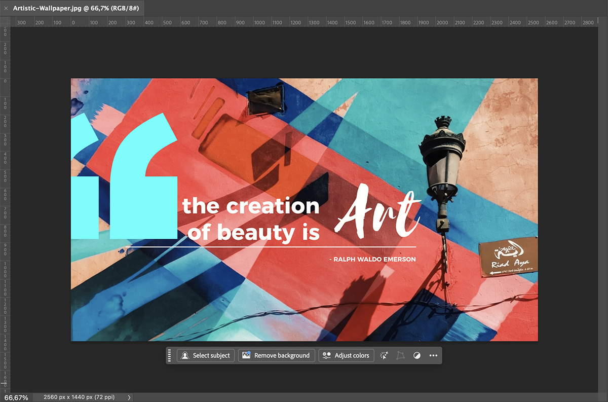
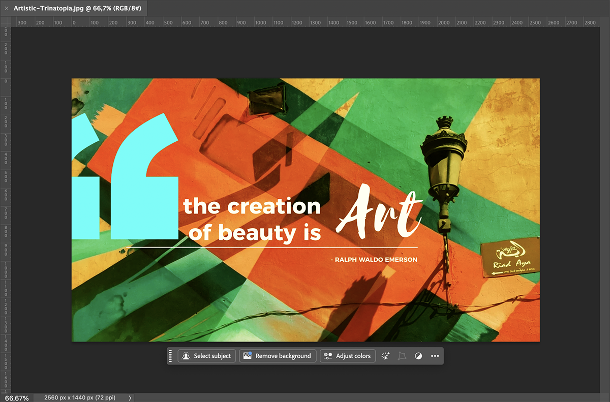
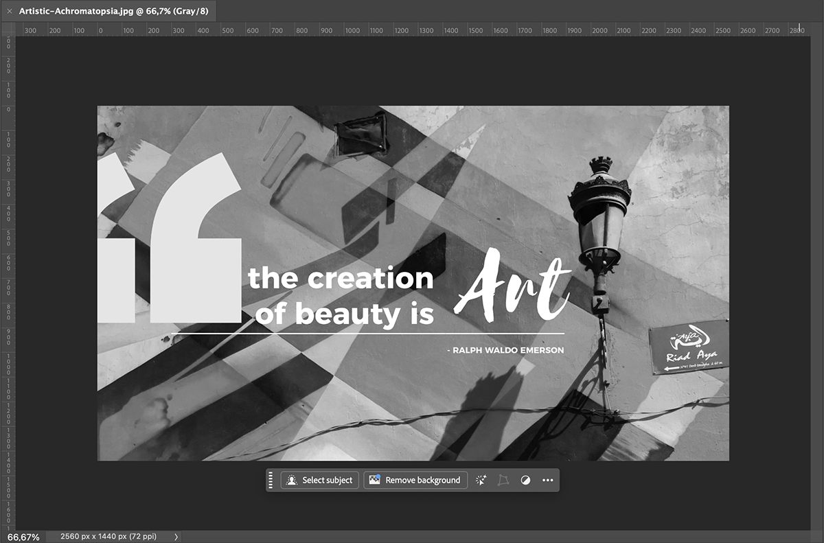
For visual reference, let's show you what normal vision looks like:
This type of color blindness is the most common. In this case, a person has trouble distinguishing between reds and greens. Of course, there are several levels, from subtle to intense.
Here's how it breaks down:
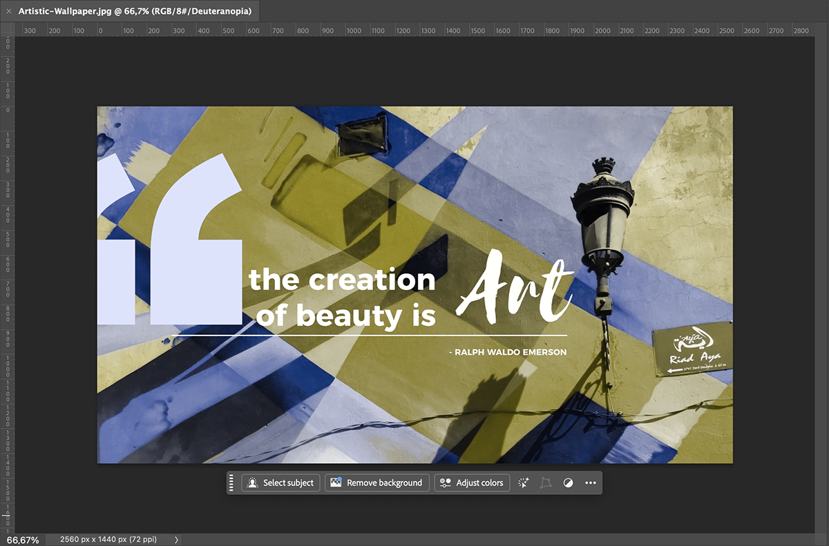
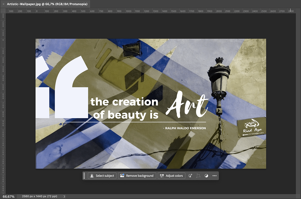
In color simulations, the examples for these deficiencies look similar. That’s because when you’re missing either red or green cone effectiveness, you’re losing the ability to compare green and red to each other. That’s why the outcome is mostly blues, browns and yellows.
Although less common, blue and yellow deficiency also changes the way people see colors.:
The best accessible palettes are those that follow Paul Tol´s guidelines for data visualization color mapping.
His rules state that for a palette to be accessible, all colors in design must be:
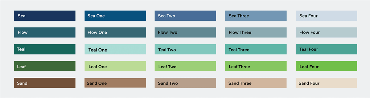
Here’s a collection of color palettes inspired by Paul Tol’s data visualization color maps and some others, which all follow his guidelines.
This palette is a divergent set of color hues, spanning from dark blue to dark red. Since it has this many colors, it’s perfect for data visualization with multiple categories or datasets.
Made with Visme Presentation Maker
Here’s another data viz-friendly palette. This combination is perfect for qualitative visualizations, like bar graphs and pie charts.
Made with Visme Presentation Maker
This palette is another color-blind friendly option for data visualizations or graphics. You don’t need to use all the palette colors in your design; just three or even two is enough. Just remember to use the contrast checker when placing a light color over a dark color or vice versa.
Made with Visme Presentation Maker
Magma is another color palette with good color contrast. The hues span from light yellow to almost black and look very nice together.
Made with Visme Presentation Maker
Color palettes that travel from almost black to almost white are a great option for all sorts of visual designs. This one progresses in consecutive color hues with strong contrast ratios from one to the other.
Made with Visme Presentation Maker
Some brands consider color accessibility at every touchpoint. These companies tend to have color palettes and brand guidelines that explain how to use them properly for accessibility.
I searched the web for brands like these and found three great examples. Interestingly enough, all three of them have a hue of blue as their primary color. From which they created combinations for optimal color-blind usability and comprehension.
Let’s get to know them.
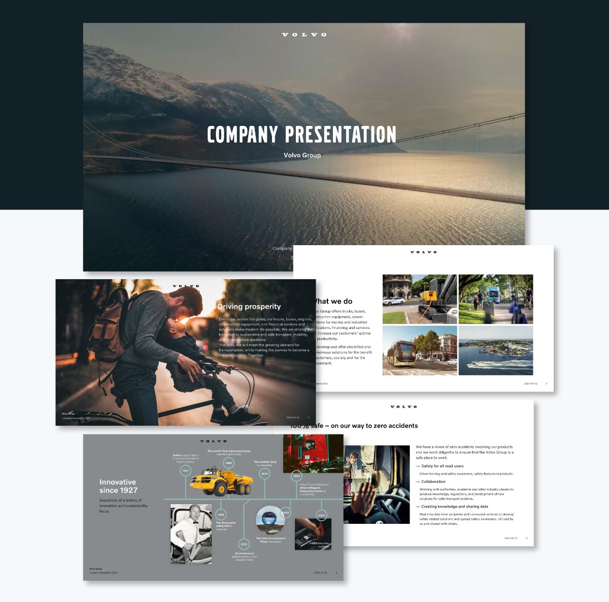
The Volvo Group's website, presentations and social media content are all in color-blind friendly palettes. As a large, publicly traded company, Volvo has their brand guidelines published on their site. Having this type of guide helps everyone, from company designers to social media managers.
I researched the guide to see how they approached color accessibility issues and was pleasantly surprised. At the foundation of everything is Volvo Dark Blue, the primary color for the brand. Aside from white and almost black, the secondary colors are a set of grays that are increasing in intensity. Lastly, there are 15 accent palettes in 5 main hues.
To ensure that Volvo designers are combining the colors for accessibility, they have a visual chart of acceptable color combinations.
After looking at their guidelines, I reviewed some of their different brand touchpoints. Some of these included their website, social media posts and presentation slides. As you can see below, all of them use the Volvo brand colors in combinations that are color-blind friendly.
View this post on Instagram
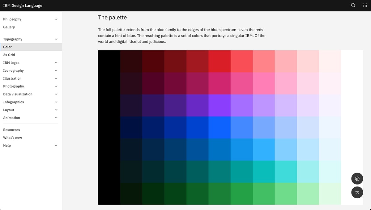
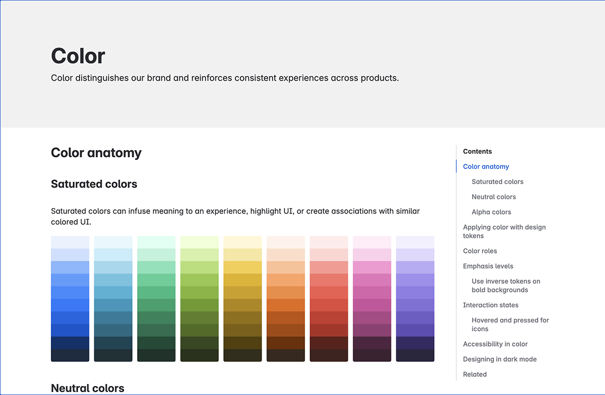
Another great brand I looked at was IBM. They, too, do a great job of both designing for accessibility and sharing their guidelines with developers, data designers and researchers. Like Volvo, the IBM brand stems from one particular tone of blue.
From this blue, the design team created a comprehensive palette in both directions of the spectrum and in all levels of brightness, from black to white. Inside the IBM design language site, they offer several color combinations for color blindness. The idea is that IBM designers stick to these palettes to ensure both accessibility and visual identity.
I found this documentation very extensive and helpful. The explanations were easy to understand. I’m sure I could follow this guide if I worked for IBM’s design department.
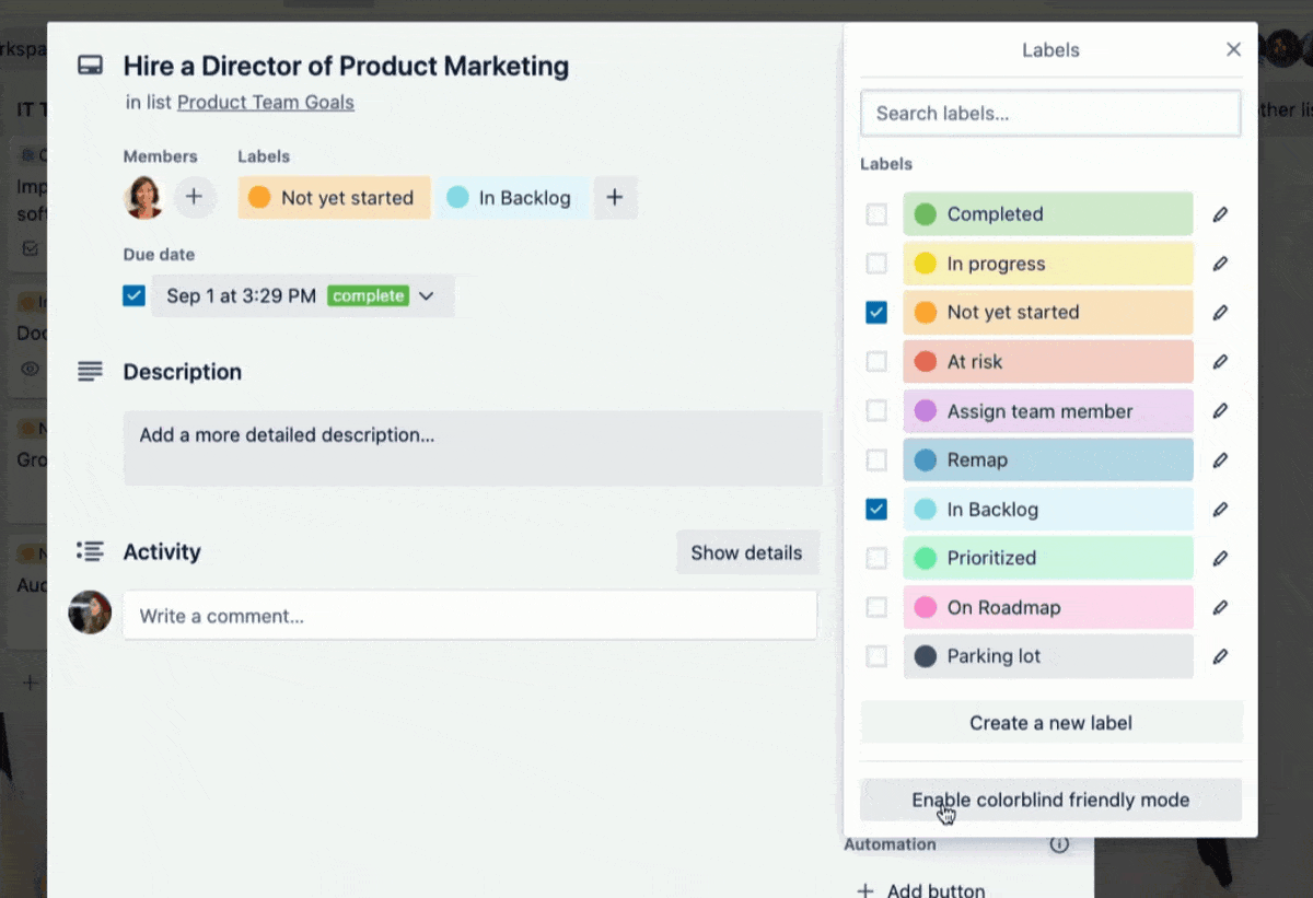
The last example is Atlassian and Trello. I chose Trello at first because of their color-blind feature in their card design. This led me to investigate Trello’s parent company, Atlassian. They also have a comprehensive brand guidelines web page, which you can view in either white and dark mode.
The Atlassian design system starts with a blue hue and expands to nine monochromatic palettes in contrasting colors. The section in the guidelines that explains about color accessibility also covers how to design for color blindness in both dark and light screen modes.
And finally, this is what the Trello card labels look like. They use both color and texture to differentiate them and be easy to distinguish.
It’s not about which colors to avoid individually, but rather which color combinations to avoid altogether.
As Aaron Tenbuuren shares in his article about designing for and with color blindness,
“When designing apps, we should not look at individual colors and ask if they are ‘visible’, but rather look at groupings of colors, and see if they are distinguishable.”
In general, there are several combinations you should avoid:
To create a color-blind-friendly palette, you first need to understand the principles of creating a good palette, regardless of color blindness and beyond color meanings.
For starters, always consider the 60-30-10 rule.
This rule states that:
Check out this video from The Futur Academy where Greg Gunn explains the 60-30-10 rule for color palettes. Then implement the rules to your own palettes.
To select the initial colors for your palette, you can use several techniques:
Then, follow this checklist to make sure your palette is color-blind friendly:
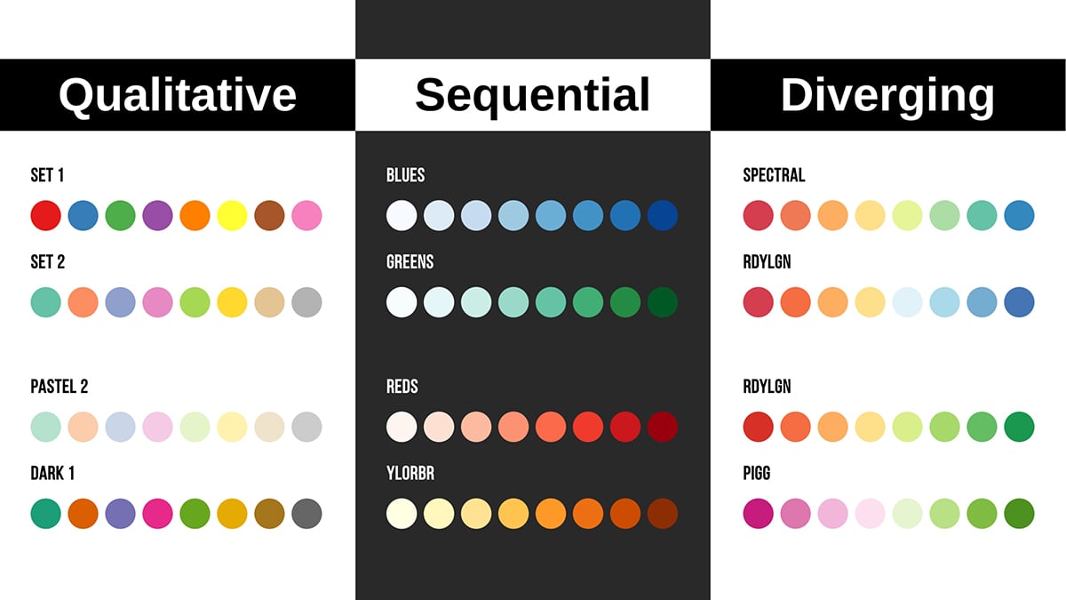
The best and most effective way to create a color-friendly data visualization is to start with a color-friendly palette as the default. You have the choice of three color palette styles, depending on the type of data you are working with.
They are:
In the visual below, you can see the three types and how they work in terms of color.
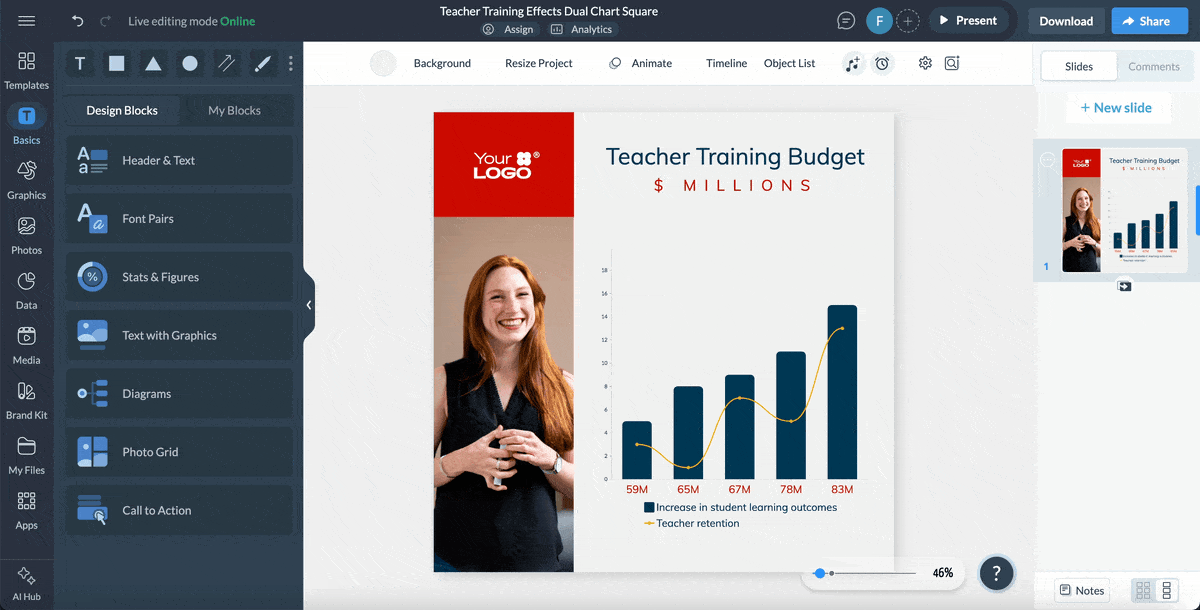
This is a Visme data visualization template that uses a color-blind friendly palette. The dark blue and bright yellow combination in the chart is easy to differentiate under all the simulators. Plus, the legend shows the physicality of each color aside from just labeling the color itself.

Here’s a quick how-to for creating a data visualization that’s color-blind friendly.
You don’t have to design for color accessibility on your own. Nor do you have to guess if the palette and contrast you’re using are good enough. There are plenty of tools to assist you in determining if your design is accessible for color blindness.
Here are some of the most practical:
| Tool | Pricing | Standout Features | Pros | Cons | Best For | Checks for Color Contrast? |
| Chrome Inspect | Free | Code inspection, Accessibility Analyzer | Free online access | Confusing if you aren’t a developer, Can’t create anything, only analyze | Designers, developers, QA testers | No |
| Visme Accessibility Tools | Free | Visual simulator, Contrast checker, Palette maker, Color extractor from images, Alt text tool and reading order. | It’s right inside the Visme editor. There’s lots more you can do with Visme beyond checking for accessibility. | None | Business owners, marketing teams, sales departments | Yes |
| Who can Use | Free | Text over background contrast checker | No sign up required. | You can’t analyze complete palettes. | Designers, Social media creators | Yes |
| Adobe Color | Free | Palette creator, Color extractor, Color palette library. | It’s very comprehensive for creating color palettes. You can save palettes in a personal library and name them. | No integrations with other tools apart from Adobe. | Designers of any level, Adobe users | Yes |
| Coblis | Free | Online color accessibility checker. | No sign up required to use. | You can’t create palettes. | Photographers, social content creators | No |
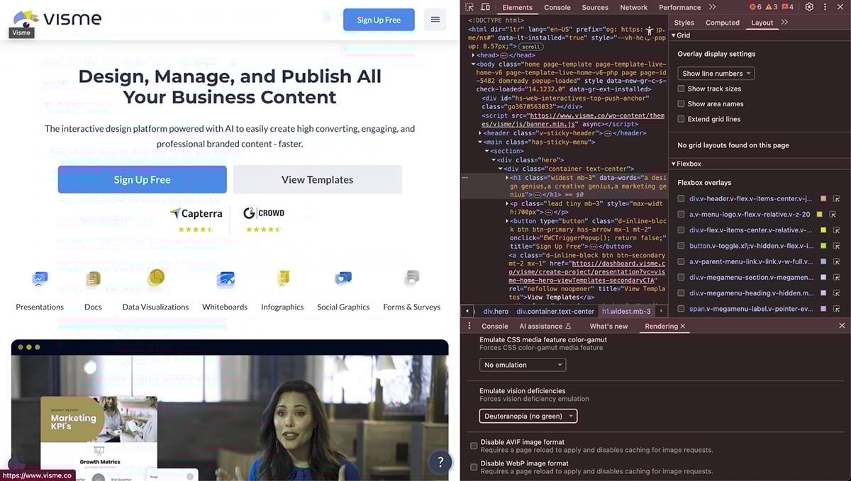
The easiest way to check if a website´s color scheme is accessible, including for colorblind people, is to use Chrome’s Inspect feature.
Here’s how:
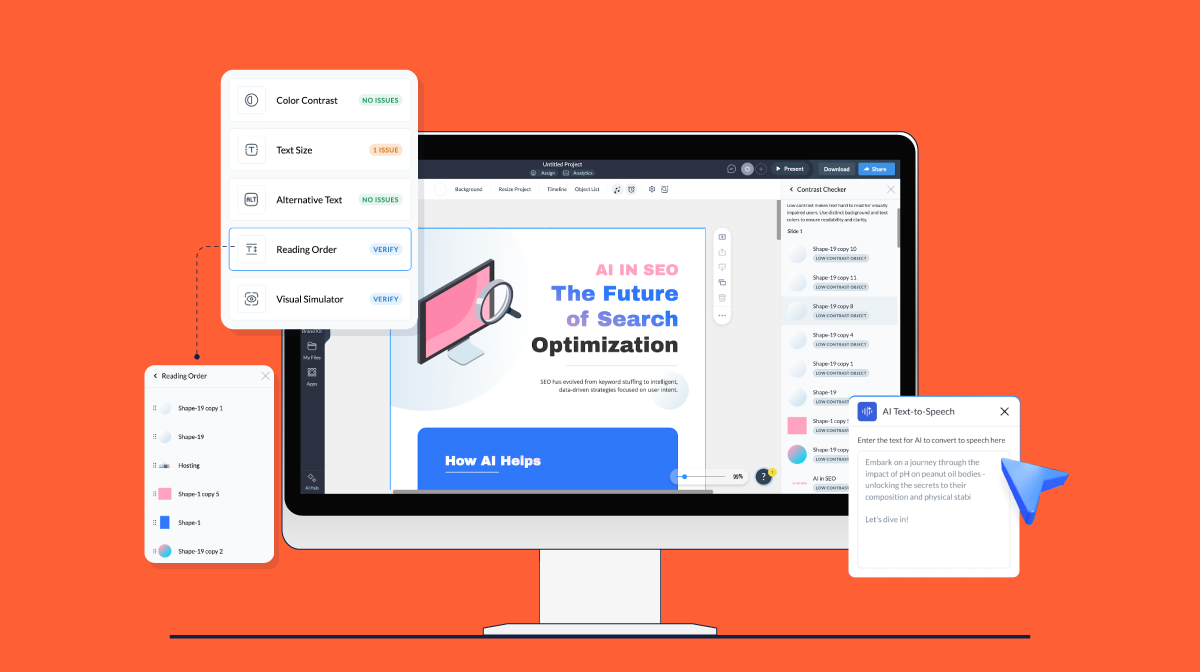
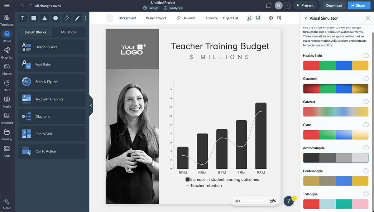
When designing with Visme, open the accessibility checker to check the contrast ratio of your design and try all the visual simulations. You’ll find the accessibility checker in the hamburger menu on the top left.
Other useful things you can do with Visme to help with color accessibility are:
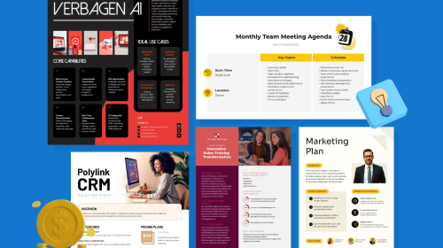
The best part about using Visme is that the platform is much bigger than just an accessibility tool. It’s an all-in-one content creation suite where you can design and manage lots of content types for your business.
Can be difficult to navigate if you’re not a developer or don’t know your way around the tool.
Who Can Use is a simple website that analyzes color combinations under various visual and environmental conditions. You can also test the color contrast ratio and the WCAG grading.
To use the tool, enter the HEX codes into the dialog and check the results on the left side panel.
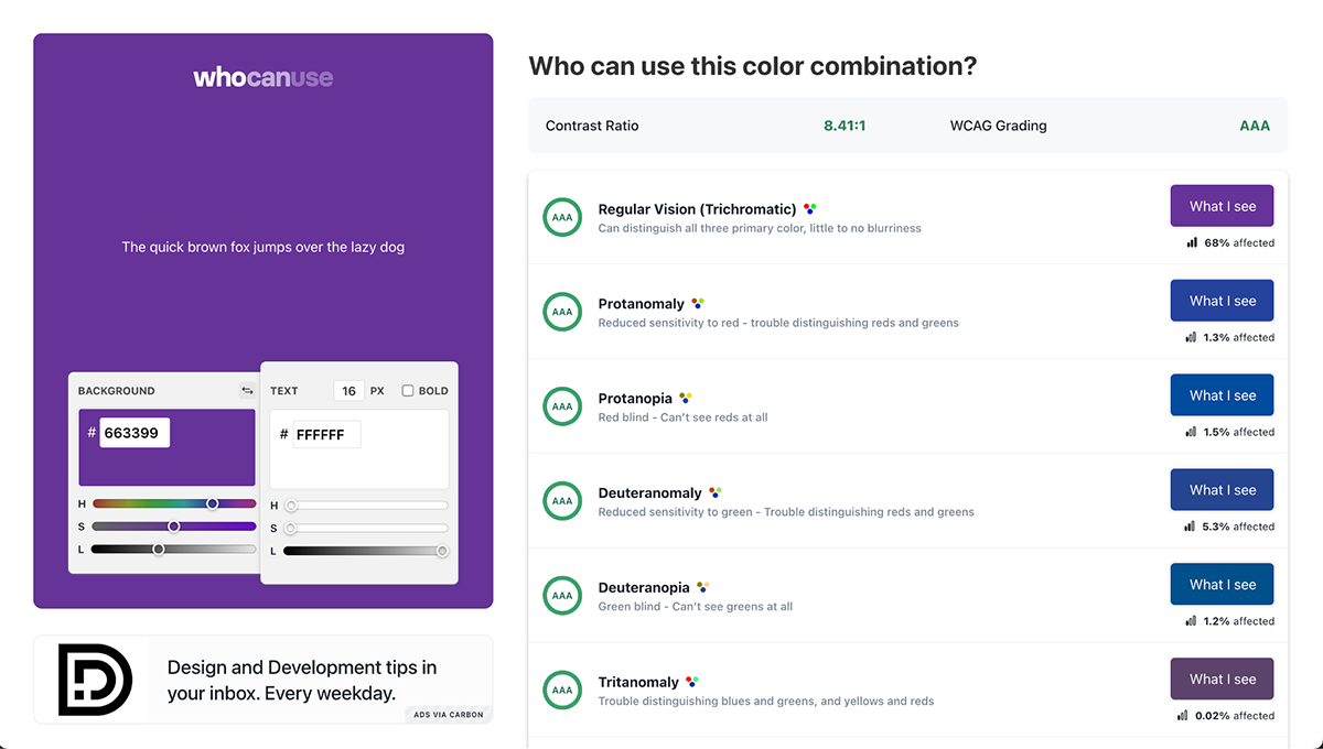
This tool is free to use and works well on both desktop and mobile.
I found it limiting that you can only compare and contrast two colors and only as text over a background. You also can’t create any palettes here.
Adobe Color is part of the Adobe Creative Cloud and functions well as a color-blind-friendly palette generator. It has been a practical tool for designers and non-designers alike for a long time. Adobe Color helps in many ways:
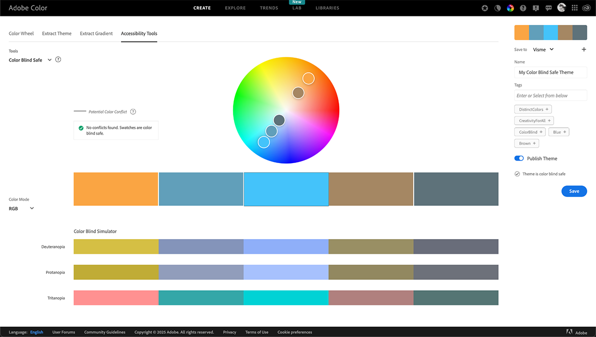
The best aspect of Adobe Color is the fact that it’s completely free to use and access. It’s even better if you’re an avid Adobe user because then you can export your palettes to any ongoing project.
There are no significant drawbacks to Adobe Color apart from it not integrating to other tools apart from Adobe ones.
Coblis is an online visual simulator. To use it, upload your image, graphic or color palette you want to analyze. Select between the color-blind simulation types and see how the visual changes.
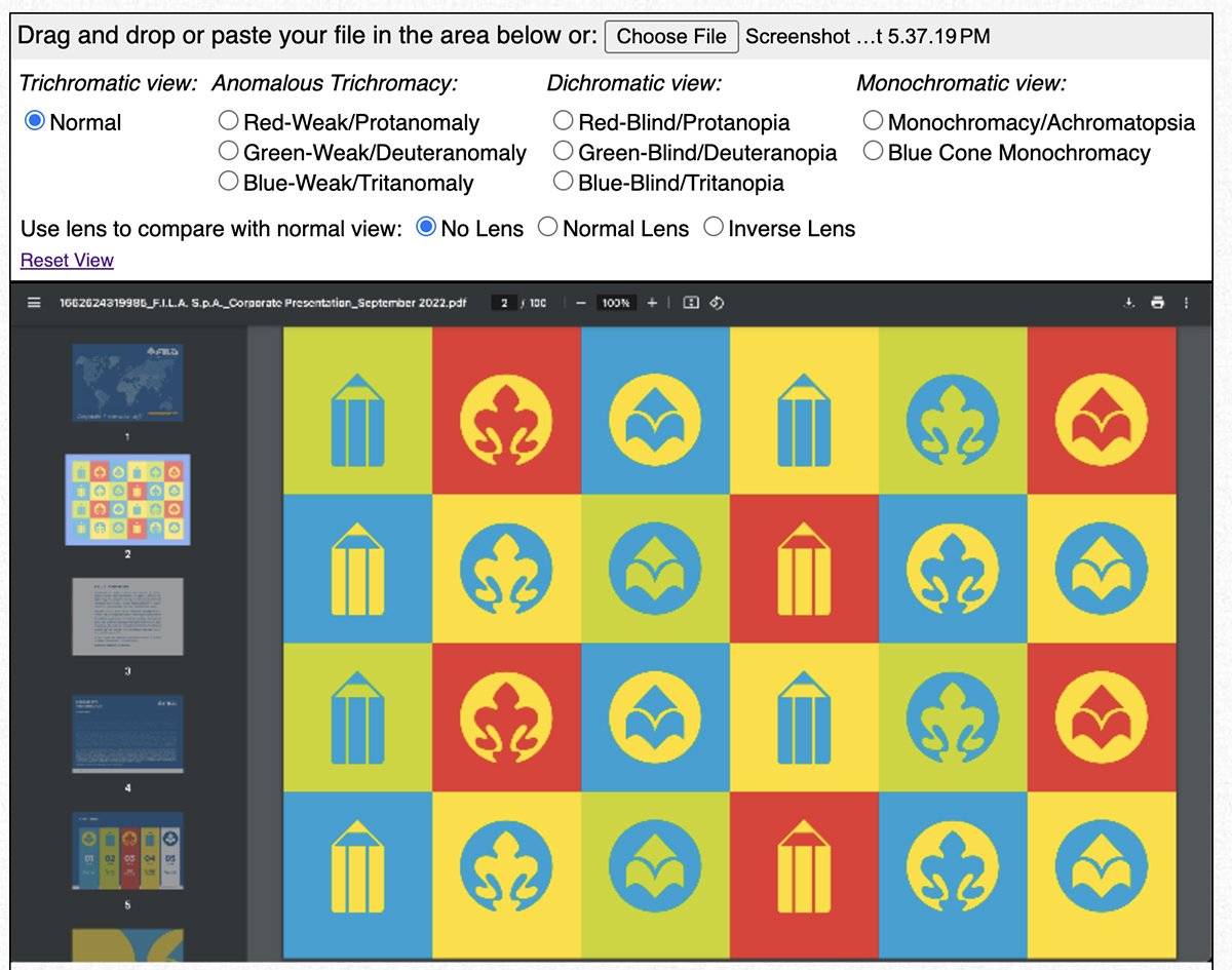
The tool is simple and fast for analyzing any uploaded visual file on desktop.
Coblis doesn’t work properly on mobile and has no option for checking color contrast levels.
Designing for color-blind accessibility involves several steps, and it’s easy to make mistakes along the way. Data visualizations, in particular, can become inefficient if there’s a color inefficiency.
I had some conversations with design professionals from different fields and deduced that these three are the most common mistakes people make when designing for color accessibility:
The first mistake is relying solely on color to create differentiation and contrast, especially in data visualizations and information design.
A good rule of thumb is to combine color and texture, like Mark Harrower from ESRI suggests in an interview about designing for colorblindness:
“My advice is always the same: Stop so highly favoring just one visual variable to distinguish differences in kind. Better yet, double-up with other visual variables to do the heavy lifting (like texture). That is just better design, less error-prone, not just for us colorblind individuals.”
It’s easy to fix this mistake in your data visualizations or other visual projects. For starters, a good technique to ensure everything is discernible from each other, is to do as Mark always tells his students and, “Look at it in grayscale. Still understandable? You’re bullet-proof.”
If after analyzing your design in black and white, it’s still difficult to discern colors apart, add a texture or change the shape, so there are more variables to help with comprehension.
This technique works well on data visualizations like bar graphs, Mekko charts and histograms. It won’t help with line charts, though. But another practical use of this technique is for geographical maps, where you need to differentiate between regions.
The second mistake is to rely solely on your own or your company’s brand colors when creating a new palette.
I had a conversation with Seth Thomas, a UX/UI designer, about this mistake. We were discussing his app design process when he mentioned how he works with color to make it accessible.
Seth explained that, “brand colors don’t always translate well when used for UI components. So, you usually begin with brand colors but expand from there, creating variations that meet accessibility requirements while maintaining brand identity. You need to adapt the brand colors for practical application, like an app’s interface or the brand’s design system. This creates visual consistency while ensuring functionality.”
He shared an example about a company he designed for that had bright blue as a primary brand color. To make it work for their app’s UI, Seth infused the gray tones with blue and created a monochromatic palette that transitioned to darker and lighter at each end.
If you find yourself in a situation where you need to incorporate a set of brand colors, analyze what exactly you want to visualize in your project. Make decisions about how to use these colors in a way that makes your content well contrasted, plus easy to read and comprehend.
Let’s say, for instance, that you’re designing a presentation which includes several data visualizations of varying complexity, along with text pages and photographs.
Use the primary, secondary and accent colors for the majority of the design. But for the data visualizations, expand from the brand colors and create a new palette. This extended palette must tie back to the brand palette and feel like they’re part of the same system. Your charts and graphs must complement the rest of the design while also being legible by people with visual deficiencies.
The last mistake, one which is made often but thankfully easy to fix, is forgetting to analyze the contrast ratio between colors. When designing presentations, slideshows, etc., you need to use the best contrasting colors for color-blind audiences.
Nobody covers this technique better than Di Mace, from Accessibility Checker:
"For those people with color vision deficiency, the more contrast between foreground/focus color and background color (ie. higher the color contrast ratio) the easier it is for people to see. If low-contrast text is difficult to read on a desktop, it's even more difficult on mobile, while walking in bright sunlight. Scenarios like this are a great reminder that accessible visual design delivers better design outcomes for all users."
And she’s right, when you make mistakes that affect color-blind people, you’re actually worsening the experience for everyone.
Unfortunately, when WebAIM analyzed over a million webpages for accessibility, they found that 79% of them didn’t comply with the WCGA’s contrast ratio thresholds.
To fix this mistake, easily check the color contrast of the colors you’ll be using, with one of the tools I mentioned above. According to the WCAG rules, the ideal contrast ratio is 1.4.3 minimum. But there are some exceptions:
If you still have some questions about designing for color blindness and color accessibility, these FAQs should help.
This is what color-blind people see according to their particular deficiency.
Regarding fonts, the best colors for color-blind users are the ones that contrast well with their background. Almost black text on an off-white background is one of the most used and easily legible combinations.
The best way to make color-blind friendly charts is to use an accessible palette to begin with. If you have to make your own, use the 60-30-10 rule. Select colors in that order of importance to create a balanced combination. Check the color contrast ratio and make sure it’s above 1.4.3.
Remember that accessible design doesn't mean abandoning color altogether. It means making thoughtful choices about color combinations, contrast levels and incorporating additional visual cues like patterns and textures when needed.
By following the guidelines in this article—from choosing appropriate color palettes to testing with simulators and avoiding common mistakes—you'll create designs that are not only beautiful but also inclusive.
Whether you're designing websites, presentations, data visualizations, or any other visual content, making accessibility a priority from the start will improve comprehension, user experience and ultimately the effectiveness of your message.
Visme’s accessibility checker helps you check for color contrast, add alt tags to images and view your design with a visual deficiency simulator. Likewise, you have access to countless editing features to help you create not only color-blind friendly content, but fully accessible for everyone.
Your color-blind audience will thank you and everyone else will benefit from clearer, more intuitive designs.
Start implementing these color-blind friendly practices today with Visme's accessibility tools and make your visual content work better for everyone.
Design visual brand experiences for your business whether you are a seasoned designer or a total novice.
Try Visme for free