Healthcare Data Visualization: How to Turn Data into Impactful Stories

Project and task management require a lot of organization, and project management charts are a great way to keep track of a project. One useful project management chart is a burndown chart.
A burndown chart is a handy tool that showcases how much work has been completed in a project or a sprint compared to how much work needs to get done to hit the timeline. This visualizes your team’s progress, helping (a) keep them accountable and (b) motivate them to keep the pace and finish the project.
Here’s a short selection of 6 easy-to-edit burndown chart templates you can edit, share and download with Visme. View more templates below:


Throughout this article, we’ll talk a bit more about what a burndown chart is, what goes into one, why you might want to use one and how to create your own burndown chart.
What Are the Benefits of a Burndown Chart?
How to Create a Burndown Chart
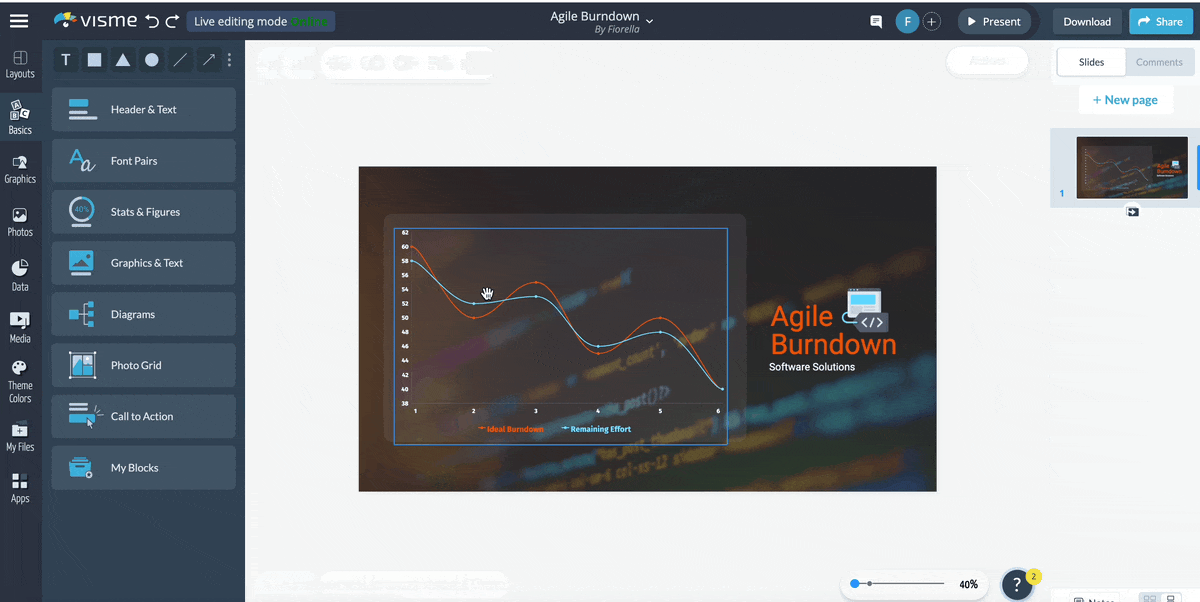
A burndown chart is a graphical representation of a project’s timeline and the amount of work being completed. It helps teams to see if they’re on track or need to pick up the pace (or perhaps take on less work in the future).
Here’s an example of what a burndown chart might look like:
It’s always going to be two lines, comparing the ideal amount of work that needs to be done versus the actual amount of work getting done.
If your burndown chart showcases that the amount of tasks left is much higher than the ideal timeline, you may need to adjust your scope creep. It also may mean that some of your teammates bit off more than they could chew and need to reassess their bandwidth for future projects.
A burndown chart is actually extremely simple and only includes a couple of elements.
The actual work line may fluctuate depending on any blockers or issues that come up throughout the project, but should hopefully end up in the same place as the ideal work line.
A burndown chart has many unique benefits for your team:
Plus, if you create a burndown chart with a tool like Visme, you can provide a shareable link with each person on your team that automatically updates each time you input a new day’s data points.
This makes it easy to keep your entire team regularly updated with a burndown chart like the one below:
Ready to create your own burndown chart? You can easily put together a burndown chart that monitors progress using our DIY design and visual communication tool.
Just follow along with these quick steps and you’ll be on your way to visualizing your next project’s progress.
It’s always easier to create something when you have a great starting point—like a premade template! We have a handful of burndown chart templates to get you started so you don’t have to worry about the design—just inputting your numbers.
Use a template like this one below for your burndown chart:
There are three main data sets you’ll need to gather to create your burndown chart.

Click the chart in the Visme editor to open up the spreadsheet. If you already have your data in a Google Sheet or Excel spreadsheet, you can import that. Public Google Sheets can be connected so that your burndown chart updates automatically whenever you update your data in the spreadsheet.
Or, you can simply input your data into the built-in spreadsheet like so:
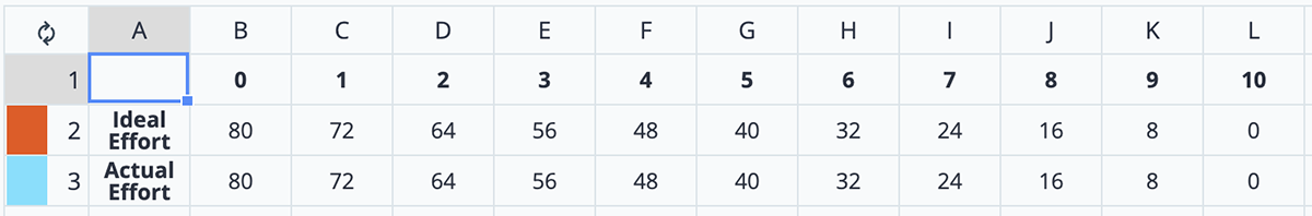
At first, your actual effort can just match the ideal effort. Then you’ll go in each day and update with how many hours you actually have remaining until the project is complete.
In our example, we’re estimating about 80 hours over the next two weeks. Spread out across several team members; they should easily be able to get eight or more collective hours of work done on the project—as long as nothing else comes up.
However, sometimes there are roadblocks. Or, on the other hand, there could be more productive days. So, in the end, you might end up with something that looks like this:

Your chart would reflect this like so:
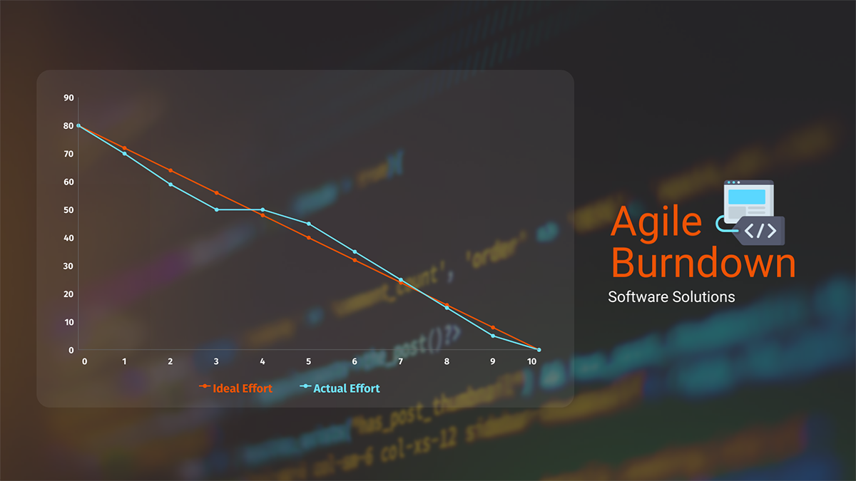
The parts where your actual effort line is below the ideal effort mean your team is working more productively than you expected. Any time the line starts to creep above the ideal effort line, it means your team is starting to get behind.
Keep an eye on this each day to see where you might need to assist your team in making sure the project gets completed on time.
Pro Tip: Go into your chart settings and select the “Line” graph type under the “Appearance” tab to get straight lines instead of curved lines in your burndown chart.
Although you’re always welcome to keep the template as is, you may want to customize it to fit your team or match your brand colors.
Customization options within Visme include:

Finally, you’ll want to share your burndown chart with your team. There are a few ways to do this. First, you can publish it and get a public link. However, if you only want this to be shared with your team, you can restrict access to specific people and share a private link.
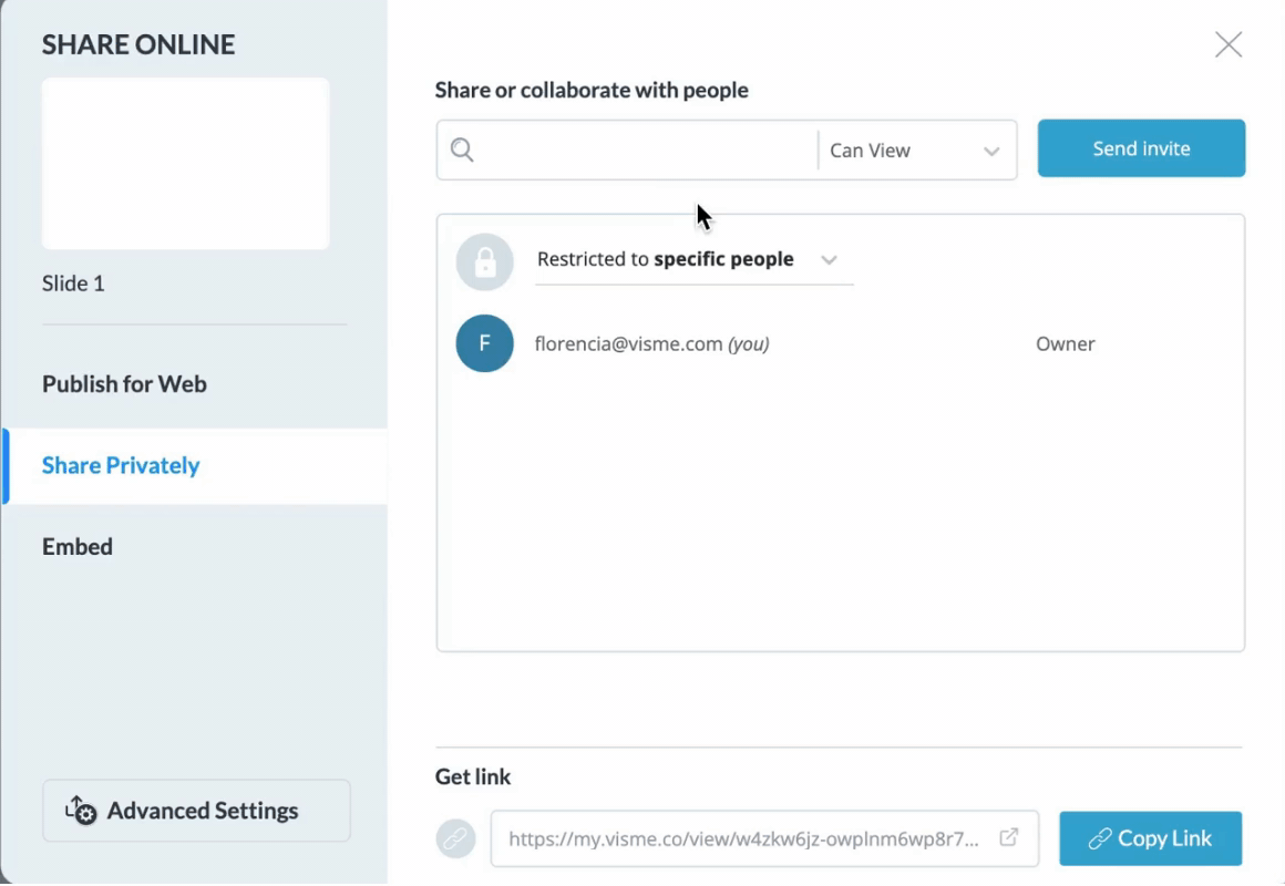
Or, you can also embed it on an internal website so everyone on your team can access it.
There are also several ways to download your chart, but if you want a dynamic burndown chart that automatically reflects your updates, you’ll want to share via link.
Get started creating your own burndown chart with Visme. With extensive chart and graph options, you can visualize your project management in any way you want, whether it’s with a burndown chart, Gantt chart or something else entirely.
Design visual brand experiences for your business whether you are a seasoned designer or a total novice.
Try Visme for free