


Typography Infographics: 12 Inspiring Examples & Techniques

Print advertising, including brochure design, took a step back with the introduction of the Internet. But now, it’s making a comeback. In fact, according to data from The Business Research Company, print advertising will grow at a rate of 3.2% from 2024 to 2025.
Now is the perfect time to create a printed brochure for your business!
Because like Ryan Battles, brand, marketing and content strategist, shared after a conversation with print marketing experts during the latest CMA Summit,
“As brands wrestle with algorithms and digital ad spend, blasting customer inboxes and their social feeds, this year is maybe the year to pause, rethink and ask, do you want to keep adding to the noise or do you want to think differently, stand out from your competitors and truly make your customers feel special? Print could be the answer”
Are you interested in taking your business in this direction? If so, I want to help you. I put together this ultimate guide to designing and distributing a stunning print brochure in just nine steps. I included several brochure templates and ideas to help you get started.
To get your feet wet, here's a quick video on how to create any sort of printable with Visme. Or, you can skip the how-to and dive right into Visme's brochure maker.
Here’s a short selection of 8 easy-to-edit pitch brochure templates you can edit, share and download with Visme. View more templates below:


Brochure design is the practice of creating visual brochures for advertising and brand awareness purposes.
The process of brochure design starts with knowing your audience and strategizing a design with compelling copy that speaks to your consumers’ needs and pain points. And finalizes with the distribution of a finished design that promotes or shares important information about your business.
Brochure design options include bi-fold and tri-fold layouts and booklets. Sometimes they’re designed in unique shapes and have interesting folding patterns. We’ll look into that a bit later on.
Brochures are typically printed and distributed locally or in the mail. Sometimes they have their own stand where people can pick them up from, other times they’re handed out in person.
As printed material, bi-fold, tri-fold and booklet brochures can be an essential part of your offline advertising and marketing strategies. Since they’re tangible and easy to distribute, they can reach a wide range of audiences across several touchpoints, such as at events, in hotels, academic centers, financial institutions, cafes, tourist spots and more.
A brochure, sometimes also called a pamphlet, serves as a comprehensive introduction to your business and what you offer. In a brochure, you have enough space to share essential information alongside contact details and special offers.
The best brochures are the ones that combine offline and online strategies by including a QR code that directs your audience to your digital touchpoints, expanding your reach.
I’ve put together this tutorial on brochure design best practices to help you create yours. Open your Visme account and start on the whiteboard for the planning phase. Then move on to the editor to start designing.
If you’d like to jumpstart the creative process for your brochure, try out Visme’s AI Brochure Generator, which will design a brochure based on your prompts and chosen design.
Do you feel like your design skills need a bit of help? Then, the Visme free design course is just what you need. Go ahead and take the course and then come back to create your brochure with an improved skillset!
The first step to creating a successful brochure is to define its purpose. Do you want to promote a particular service, sell a new product, or showcase your best offer? Start putting down your ideas on the whiteboard; you can use sticky notes or just text in a bullet list.
More often than not, a brochure’s purpose is to reach new clients and build brand awareness. Other times, they’re informative, like the brochures a healthcare center distributes about health topics.
In some cases, a brochure is part of a broader marketing campaign, which can include any number of visual assets, from the brochure itself to social graphics, landing pages and more. In this case, your design will have to align across the board on all assets, creating a unified visual brand identity.
Here’s a tip from our content manager Victoria Taylor about how to plan your brochure properly:
“Think about the one thing you want your audience to remember—whether it's the product, the vibe of your brand, or the action you want them to take. Once you’ve got that, everything else falls into place. Keep it clean, simple, and aligned with that core takeaway. Trust me, that’s what’s going to make it stand out.”
Whether it's a real estate, travel brochure or anything in between, you don’t want to overwhelm people. So only plan to share information that aligns with the purpose.
Remember to stick to your brand guidelines in terms of visuals and content as you plan. Don’t steer away from what makes your business special and unique.
The purpose of this template below is to share travel packages tailored for business travelers who are interested in going to China. The content in the brochure describes each travel package’s details.
Consider using a template like the one below to guide your brochure design.

As always, when designing for client-facing material, you need to think of the intended audience when preparing your brochure design. How will your design stand out and grab the attention of your intended audience?
Ask yourself, "Who is the brochure for? Who is it directed at?"
For example, a brochure for a summer camp for middle schoolers is directed at both potential students and their parents, while a brochure for a Master’s degree program is directed towards those who have already graduated college. These brochure designs will be vastly different as they have two completely different audiences to target.
Another question to ask is, "How will I distribute my pamphlet?"
The design for a brochure for a yoga studio that will be displayed in hair salons, coffee shops, and sports clothing stores needs to be inviting and inspirational. How will your design stand out and grab the attention of your intended audience?
Pro Tip: Your brochures are most likely not the only ones on display. Consider how yours will look alongside others.
Collect brochures from places that display brochures for businesses like yours. Pay attention to the stacks of brochures with fewer copies than others — that's a pretty good indicator that those brochures are more popular.
Take notes and do some research. Ask your friends and colleagues what makes them pick up a brochure over another? Find out what types of brochures they keep and which ones they end up throwing away.
Use the whiteboard to annotate what you find and create an ideal target audience profile. If you want to go further, create a customer persona or ICP (Ideal Client Profile) for your brochure campaign and align all the content to speak to that profile directly.
In his article about ICPs, Unenabasi Ekeruke, a marketing strategist, explains why getting your ICP right is a game-changer:
“An ideal customer profile (ICP) helps you identify, target, and prioritize prospects most valuable to your business. When an ICP is well executed, it can help you speed up your sales cycle, gain more customers and increase sales conversions.”
A template like the one below, for instance, is perfect for attracting audiences that like eating out and trying dishes from different parts of the world.


Before you start creating content for your brochure, you must choose the layout design you want your brochure to have. There are a variety of ways to design, print and fold your brochure, so pick the one that you think will make the biggest impact.
The most common folds are:
See a few of these in action below:
The standard fold for a brochure is the tri-fold. This folds the two sides in towards the middle so that it opens almost like a booklet.

The z-fold is a variation of the same fold. This can be achieved with the same template as the tri-fold, you just have to make sure you understand which panel ends up at the back.

This is a classic two-fold brochure design. It has four large content spaces and looks like a simple booklet.
Brochures with multiple pages can be stapled or bound. These are great for showcasing many services in one go. Technically it’s almost like a web page on paper. Businesses that might need a brochure like this are hotel spas, wholesalers and realtors.
Some printing shops offer unique folds and cuts for brochure design. If you want your brochure to really stand out, try a completely different style. You might need help from a printer to achieve this type of brochure but you can still design the visuals with Visme.
Keep in mind that these specialty styles are much more expensive than regular tri-fold. If what you are looking for is affordability, stick to the standard brochure design and keep these in mind for when your business grows.
Once you've decided which brochure layout you want, you can easily get started designing with a template, or start from scratch with our brochure maker.
Sign up. It's free.
Fully customize your brochure design with Visme.
Our brochure templates are designed with the folds in mind. Thankfully, your Visme editor includes a grid view option to mark the folds as you design.
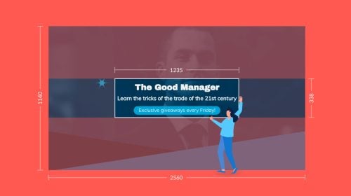
The templates come in the industry-standard "letter" size. In pixels, this translates as 1100 pixels wide and 850 pixels tall. Use the grid view to add the fold lines and design accordingly.
These are the grid view measurements for a tri-fold or z-fold brochure.
To apply the grid view in your editor, click on the hamburger menu on the top left of your screen and click on "view options."

Now it’s time to create the content for your brochure. This is where your copywriting skills come in. Or better yet, delegate this task to a freelance writer or someone on your content team who is already well-versed in your brand voice.
Taking into account the brochure’s purpose and the intended audience, start drafting some ideas for the cover title and think of different ways it can be worded.
Use your whiteboard environment to put together an outline separated into sections. Remember that if your brochure is folded, break up the content section by section. For booklet brochures, just go page by page.
Craft the message in a way that will entice the reader to act. Calls to action in a brochure are not as easy as they are on a website or landing page. You have to convince them to find you on their phone or laptop after seeing your brochure. Or to call or add you to WhatsApp in order to get in touch. Again, a QR code is a perfect touch to make taking action from a brochure easy.
Take note from our design manager, Alejandra Mariscalez, about this step in brochure design,
“Choose content that informs, engages, and inspires—every word should serve a purpose, guiding your audience toward action.”
Use this opportunity to put your value proposition front and center. There's no room for fluff here. Speak directly to your client and tell them how your products or services will solve their problem. Explain in a few words why your business is better than competitors.
When putting together the content, remember how it needs to fit within your brochure. Make the paragraphs short and choose your words well. You have to think about the space that the text will take up.
These are the elements every brochure must have:
The fonts you choose for your brochure will help transmit your purpose through visual storytelling. For example, some serif fonts have elegant characteristics that feel professional and stable. Sans serif fonts, on the other hand, are more neutral and feel more modern and stylish.
Display and novelty fonts can give your brochure a unique angle by standing out and being noticeable. When using special fonts like these, ensure that they make sense with your purpose and target audience.
Take note that your brand fonts should be your first choice but there’s always room for an exception if the brochure’s purpose deems it.
The best middle ground, in this case, is to incorporate a unique font to the titles and stick to your main brand font for the rest. Just make sure they sit well together. If you need help with a font pairing, you can read our comprehensive guide on the topic.
Also consider that when you add the content to your template, you might have to adjust the size, weight and spacing for it to look good and be legible.
After finalizing your typography choices, it’s time to come up with a color scheme. To create a successful color scheme, consider the brochure’s purpose and target audience, then group colors into a set of one main color, two complementary colors and an accent color.
Visme designer Fiorella Canepa Lama has a suggestion to help you with this part of the creation process:
“Once you have a clear idea about the brochure’s purpose and target audience, Do some research and start looking at references of what has already been designed that fits those characteristics. Then, you can apply color theory to create a color scheme that fits your unique needs.”
Ideally, you should use colors that are part of your brand guidelines to create the scheme for your brochure. If you haven't already, put a brand kit together that outlines exactly which fonts, colors, and logos should used in your designs. This is the only way to ensure your designs are cohesive, especially when the brochure is part of a larger campaign.
You want people who are aware of your business to see your brochure and instantly recognize your brand. And you want people who haven't heard of your business to start recognizing your logo and colors whenever they come into contact with it.
To create a brand kit in Visme, use the Brand Wizard feature. Add your website URL and follow the steps to pull the assets and create your brand kit.
With your content ready, a good idea of what brochure style you want, a font selection and a color scheme, it’s time to start designing.
Here’s a quick how-to for doing it with Visme:
So, first, choose one of our brochure templates. Select the one that makes the most sense with your vision and your brand. Open the brochure in the editor to start adding all the content into the layout.
Then, copy the content from the document where you wrote it and paste it into the placeholders. You can also use Visme’s AI Writer to help you finesse the text so it reads better or fits better in the space. Repeat until all your content is in the template.
Now, replace the image and graphic placeholders with your own visuals. Click on an image and press Replace, then search for another in the stock photo gallery, upload your own or generate a new one with Visme’s AI Image Generator.
Use Visme’s AI Edit Tools to remove backgrounds from images, remove or replace objects and upscale or deblur uploaded photos.
Aside from images and photos, add graphics to your brochure design, such as icons, illustrations, data widgets or data visualizations. You can even create a custom 3D scene that tells a story relevant to your content. Remember to personalize them all to align with your brochure’s design and your brand identity.
Here’s a tip from our designer, Daniela Verduga, to help you complete this step:
“When designing brochures, strategically use graphics, photos, and other visual assets throughout the pages. This not only enhances flow and navigation but also adds depth and visual interest, making the final piece more engaging and dynamic.”
Now that you have all the content and images in the layout, you’ve made sure that everything is on brand and that there are no typos, it’s time to get a bit nitpicky with the structure.
If you used a template, it’s likely that you moved some of the placeholder elements around, made text boxes bigger or smaller, changed colors and switched fonts.
Our designers create the templates so that they’re ready to go with a clear hierarchy, balance and flow. But not everyone’s content is the same, and things often change along the way, so it's good practice to review the overall design and see if the layout and structure still work as they should.
I asked our content manager Vic for some tips to share with you, and she had this great nugget of knowledge, “Don’t clutter the design with unnecessary text or graphics—keep it focused. Let the design do the talking. If it’s too busy, your message gets lost.”
To optimize and finalize the design, ask yourself the following questions:
As you get ready to finalize the design and share it with your audience, test it first. Have your team members or peers take a look at it. Use Visme’s collaboration features to give anyone on your team access to view, comment or even edit your design before sending it out for print.
Incorporate workflows into the process and assign sections of the brochure design to subject matter experts in your company to confirm that all the content is correct.
Test the printed version as well. Print out a single copy using an available printer, then fold it to see if the sections are aligned with how they’re meant to be.
For example, if one of the sections has a full color that’s different from the section next to it, you need to make sure that the fold is right on the line where the color changes.
Review the folding parameters I shared above. Make any necessary changes and get it ready to print.
At this point, if you’d like to have a copy of your brochure in another language, use Visme’s translation feature and choose from 190+ languages.
Download the design as a PDF with bleed marks — this will show the printers where the brochure must be cut.

Use a service like Vistaprint to print your brochure. You can upload your design to their system and they'll print and fold all your brochures for you.
If you choose to go this route, there are a few things to consider. These are printer-related brochure design guidelines that will change the cost of the printing, so it’s best to know your choices.


Success! You’ve now got a set of brochures ready to attract customers and clients. How will you make sure they see them? Here are some marketing tips and tricks.


Before we finish, I’d like to share some real-life examples of brochures in different styles.
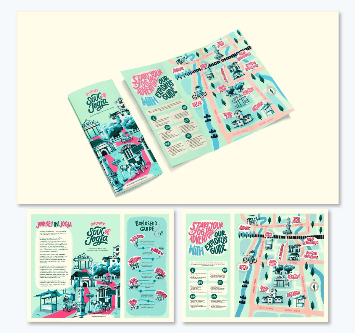
This is a tri-fold travel brochure example designed for visitors to the city of Jogjakarta in Indonesia. The design has a unique pastel color scheme and its used evenly across all the graphics, text and map in the layout.
As you can see in the visual below, the three sections are separated into two content panels, one with information and the other with a map. This composition makes the brochure look interesting and engaging.
This z-fold brochure was designed by Design Perth for The Pelican Charters. It’s an overview of what the company offers to its clients; services and events on a charter boat in Perth, Australia.
This design is mostly images with minimal text. Clearly, the idea is to grab the attention of the viewer by showing them what they can experience when they rent out the charter boat for their event. The catchy title on the front page calls attention and targets consumers looking for a fun and unique way to celebrate an important moment.
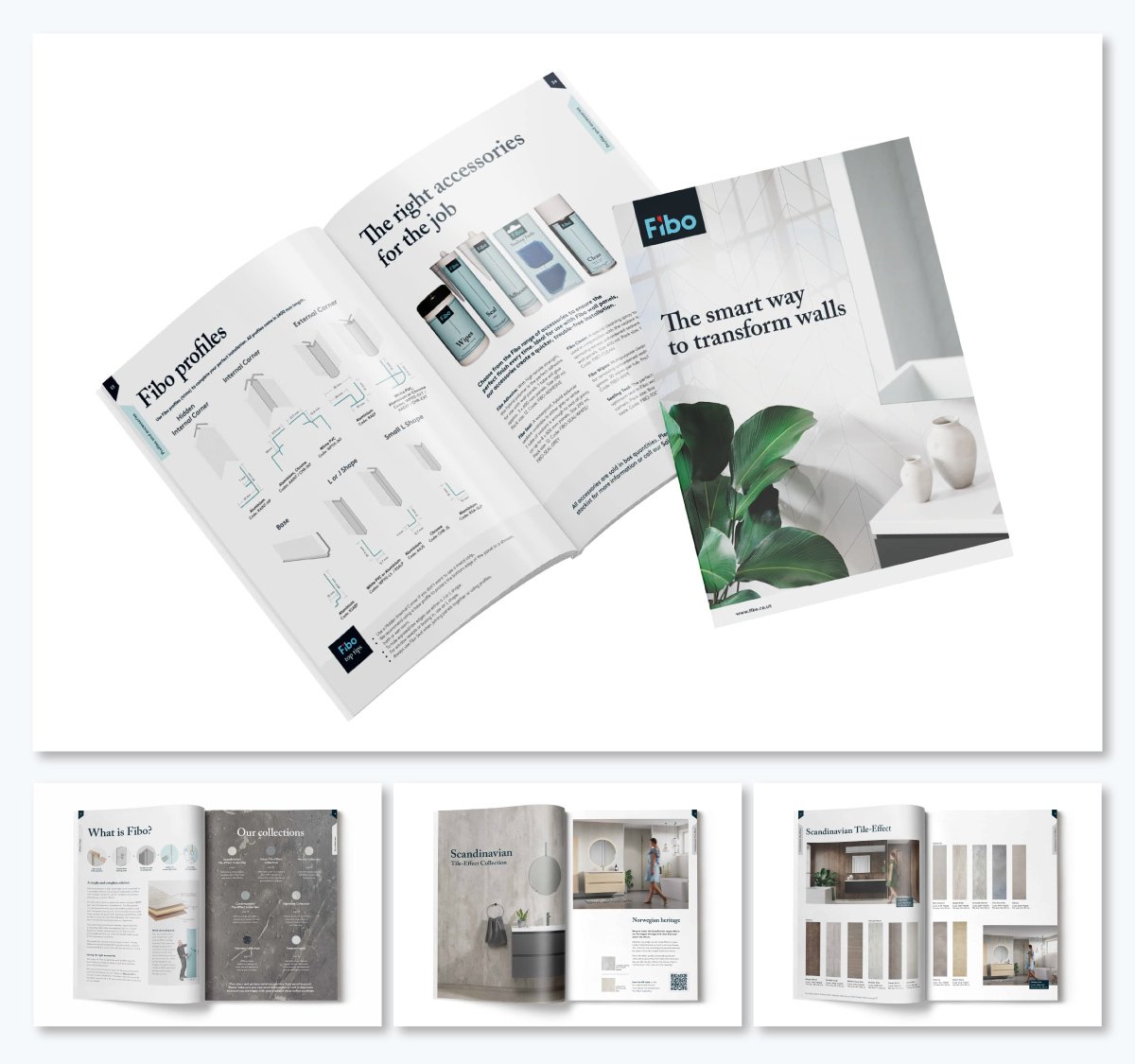
This booklet brochure was designed by Toast Design for Fibo, a door manufacturing company. Because this is a booklet, the designers had a lot of space where to share information about the business.
As you can see in the design, the brochure titles, including the cover, use the same font in the same weight and style. They’re also all aligned to the left at the same distance from the edge of the page. This helps create a unified visual style throughout the brochure.
The six parts of a brochure are:
Any business looking to integrate offline marketing needs a brochure. Brochures aren’t just for local businesses, they’re also for academic institutions and healthcare providers that cater to a wider geographic audience.
Your brochure should answer your ideal client’s questions regarding their pain points. The brochure’s cover needs a title that answers one of these questions directly. That’s why it’s important to know your brochure’s purpose and target audience before designing it.
Print brochures are better than digital brochures because that’s their inherent purpose. People are accustomed to print brochures because they feel connected to the business when they have one in their hand. Even if digital marketing is widespread, brochures are still relevant for that reason. Also digital brochures don’t look like print brochures at all and are more like regular promotional graphics.
From a design perspective, good brochures look visually balanced and engaging. In a physical sense, they have a defined, clear layout with crisp folds that make reviewing the document easy and enjoyable.
You can use Visme’s desktop or mobile app to create a brochure for your business. Visme has everything you need to design attractive and engaging brochures, from customizable templates to endless design elements that are easy to align with your brand.
Creating a brochure for your business is more relevant than ever, especially if you want to reach a wider audience than you can do online. Hopefully, my guide and the unique pamphlet ideas I shared will set you on the right path to creating an impactful and engaging brochure with Visme.
When you log in to Visme to design your brochure, you’ll have access to thousands of templates, a full suite of AI-powered tools and other amazing features like dynamic fields to streamline your brochure design process.
Sign up for a free Visme account today and get started with your brochure design straight away.
Design visual brand experiences for your business whether you are a seasoned designer or a total novice.
Try Visme for free