


Insurance Data Visualization: Turn Raw Data into Revenue-Ready Visuals
The healthcare industry is drowning in data but starving for clarity.
Global healthcare data is projected to hit 2,314 exabytes, and it is growing faster than any other industry.
The real challenge isn't the sheer quantity of data. The problem is that critical insights stay buried in dense reports, clunky dashboards and exports nobody has time to read.
Patterns that should take seconds to spot take hours and decisions get delayed. And when visibility is that poor, leaders end up flying blind on critical operations.
That is exactly the gap healthcare data visualization closes.
It reveals key trends, helps teams focus on what matters, and speeds up decision-making.
In this guide, I’ll show you what healthcare data visualization makes possible and how it helps teams make confident decisions. You’ll also see practical ways to apply it and the common mistakes to avoid.
If you’re new to the concept of data visualization, this video will give you an in-depth explanation of what data visualization really is, the different types of charts and graphs to use and how you can make them.
Healthcare data visualization is the practice of translating clinical, operational, financial, and patient data into visual formats that are easier to read and act on.
Visual formats such as charts, dashboards, infographics, heat maps, geographic maps and interactive reports all fall under this umbrella.
The main goal of visualizing data in healthcare is to make it easier to go from collecting data to making decisions. Patterns that might take hours to uncover manually can be spotted in just seconds. And insights that usually end up buried in reports become visible for effective decision-making.
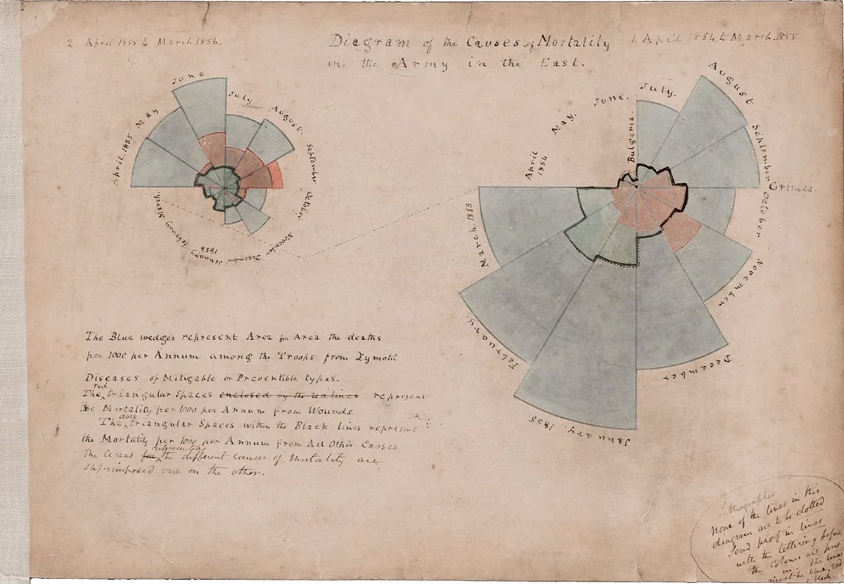
Data visualization has been around in the healthcare industry longer than most people realize. Florence Nightingale is widely credited as one of the earliest healthcare data visualizers.
Back in the 1850s, she used polar area diagrams to show the British Parliament that soldiers were dying more from preventable infections than from their battle injuries. Her visuals directly influenced military health reform.
The tools or applications might have evolved, but the core idea remains the same. The right visual, presented in the right setting, can improve data storytelling and influence decision-making.
Why is data visualization important in healthcare? Because clarity is everything.
For most teams, the story in their data is buried in raw numbers or scattered across systems and reports.
As Rasu Shrestha, MD, MBA, then Chief Innovation Officer at UPMC, put it:
"It's one thing to aggregate data; it's a whole different ball game to harness it, or bring out the meaning of the data elements."
Instead of helping teams move faster, poor data visualization — or the lack of it — adds friction to every decision.
When health information is unclear, patients become confused, lose trust, and struggle to adhere to their treatment plans.
Here is how effective data visualization addresses both sides of that problem.
For healthcare teams and decision-makers:
For patients:
In our guide to healthcare marketing, I pointed out that the stakes in healthcare are way higher than in most other industries.
The same goes for data visualization.
A misleading chart in a financial report can cost investors money.
But in healthcare, it can cost a patient their life.
For example, a poorly designed clinical dashboard could hide a patient’s decline, misroute a critical discharge, or even bury a warning that needs immediate action.
Healthcare teams operate within layers of regulatory, clinical, operational and organizational constraints that directly shape how data is presented and used.
Here are five main ways healthcare data visualization differs from standard business intelligence practices, and what that means for your team
Healthcare communication, visuals, patient-facing materials and anything referencing clinical outcomes must comply with HIPAA, FDA advertising guidelines, CMS rules and FTC requirements. If a chart makes unsupported claims about results or has misleading data, it could lead to serious problems.
In 2024, the FTC enforced new rules to curb deceptive health claims. These rules ban misleading health content, including AI-generated materials, with fines reaching $51,744 per violation.
A non-compliant chart is just as risky as a non-compliant paragraph. Any visual that discusses patient data or clinical outcomes should go through the same review process as any other regulated material. That means getting approvals, managing different versions, and keeping accurate records of sign-offs.
A clinical director, a payer partner and a board member can all be looking at the same population health dataset and need completely different things from it.
Take readmission rates as an example. Operations wants to see which units are driving them. Finance wants the cost impact. The quality team wants the root cause breakdown by diagnosis. Clinical leadership wants to know which care pathways are underperforming.
That is four different visualizations from one dataset, each designed for a different decision.
When teams build one chart and share it across all four groups, they shift the burden of interpretation to the audience. The visualization should do that work upfront.
In most industries, a confusing dashboard delays a decision. In healthcare, it can trigger the wrong one.
Consider what happened at several UK hospitals where a poorly designed early warning score dashboard caused clinicians to overlook deteriorating patients. The alert thresholds were visually indistinguishable from normal ranges, so warning signs that should have prompted immediate intervention blended into the background noise of routine data. The design failure became a clinical failure.
The same dynamic plays out in readmission risk tools that bury the highest-risk patients in an unsorted table. When the list is reviewed in order of arrival rather than clinical urgency, the patients who need the most attention are the last to receive it.
The financial case supports the clinical one. Unplanned Medicare readmissions alone cost $15 to $20 billion annually, and many trace back to gaps in care coordination that better data visibility would have flagged at the point of discharge. When a risk dashboard is too hard to scan, clinicians skip it. The repercussions of this cost are delayed treatments, readmission penalties, and wasteful spending.
The healthcare audience is more diverse than that of almost any other industry. Patients, providers, community health workers and administrators all consume health information.
That diversity means you need to make deliberate design choices for each group. Patients need plain language labels and simple chart types that don’t assume they have any medical knowledge.
Frontline staff prefer layouts that are easy to scan, with urgent information right at the top. Executives want to see the main metric first, followed by supporting details. Community partners need data broken down geographically and demographically related to the populations they serve.
Approximately 36% of US adults have basic or below-basic health literacy. Building one visualization and distributing it to all of these audiences is efficient on the production side and ineffective for your audience.
WCAG 2.1 standards covering color contrast, font size, label clarity and screen reader compatibility exist precisely because good design intent doesn’t mean it’s accessible. Every healthcare visualization should be tested against these baselines before it’s shared with your audience.
Healthcare teams really need reliable data to make important decisions, but that only works if they actually trust the information. When formats are all over the place, dashboards clash with each other, and metrics aren’t clear, it’s easy for that trust to vanish.
Once trust is gone, teams often rely on gut feelings or past experience rather than data. It’s like the investment in analytics just fades into the background.
Good visualization is about making sure people feel confident enough in what they’re seeing to take action.
Healthcare data visualization appears in the systems that teams rely on every day.
Here are the most common use cases with practical examples of what each looks like in practice.
Clinical teams are sitting on a goldmine of data: outcomes, lab trends, readmission rates, medication adherence and length-of-stay benchmarks.
But if that data just sits in tables, important patterns stay hidden.
As Alberto Cairo writes in How Charts Lie:
"Well-designed charts are empowering. They enable conversations. They imbue us with X-ray vision, allowing us to peek through the complexity of large amounts of data. Charts are often the best way to reveal patterns and trends hidden behind the numbers we encounter in our lives."
When visualized effectively, this data can show which patient groups are at risk for readmissions, pinpoint where care gaps exist, and track outcomes against benchmarks before any major problems arise that could require costly interventions.
For example, the University of Kansas Health System used predictive analytics with visual dashboards to spot high-risk patients early on and ended up reducing all-cause 30-day readmissions by 42%. The real magic happened with the visualization, which made the data actionable right at the point of care.
The most useful data visualization techniques for clinical reporting teams include:
And there are templates available for exploring clinical operations and leadership reporting, too!
Operations dashboards are super helpful for teams managing staffing, bed availability, supply chains, patient flow, and billing all at once. The main question they’re trying to answer is simple: where are we right now, and where are we heading?
These real-time operations dashboards answer that at a glance. Instead of the usual 7 am email updates, everyone can rely on a single source of truth.
AMA data shows physicians spend an average of 5.8 hours on EHR tasks for every eight hours of scheduled patient time. Operations dashboards that surface the right information upfront, rather than requiring clinicians to dig through charts, directly cut that burden.
The most common formats healthcare ops teams build include:
Healthcare marketing teams are feeling the heat more than ever to prove that every dollar they spend is worth it. They’re getting a lot of scrutiny over campaign performance, patient acquisition costs, and which services are actually taking off, often from clinical and finance leaders.
This disconnect is where many teams lose their credibility.
A spreadsheet packed with impression data doesn’t mean much to a CFO worried about costs or a CMO trying to figure out which services are actually growing.
But when those same numbers are shown on a single dashboard that links marketing spending to patient numbers and revenue, the conversation shifts from justifying the budget to figuring out how to expand it.
Some of the best ways to visualize data for marketing and growth reporting are:
Board members and senior executives are not looking for more data. They are looking for a clear answer to one question: are we on track or are we not?
The organizations that get funding approved, strategies greenlit and initiatives moved forward show up with one key takeaway per slide, backed by one visual that makes the point before anyone has to ask.
At this level, a well-structured executive dashboard is as much a persuasion tool as a reporting one.
Formats that resonate best with executive and board audiences are:

Payer contracting, broker presentations, and employer group negotiations are won or lost on credibility. Walking into those conversations with raw utilization exports and unformatted claims data places the burden of interpretation on the other side of the table. And that’s not a position of strength.
Visualized outcomes data changes the dynamic. A one-page performance summary showing cost-per-episode trends, quality benchmark comparisons and utilization patterns tells a story the payer can act on immediately. It signals that your organization understands its own performance well enough to stand behind it.
The most effective formats for client-facing and payer materials include:
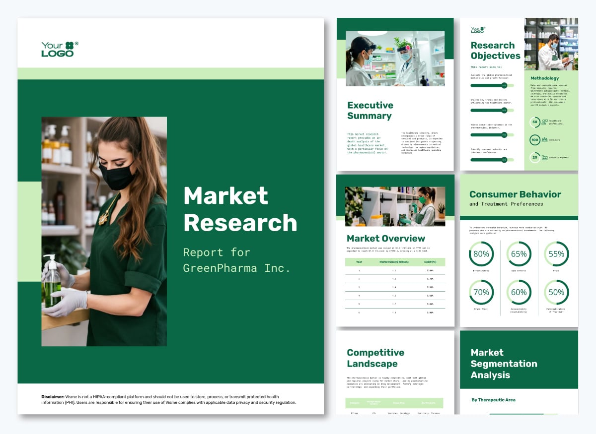
Market research underpins every major healthcare decision. This includes entering a new service line, evaluating the competitive landscape, and understanding how patients choose providers.
The data involved is rarely simple.
A single research report might combine survey responses, demographic breakdowns, geographic distribution, competitive benchmarks and trend data across multiple time periods.
The most effective formats for healthcare market research reporting include:
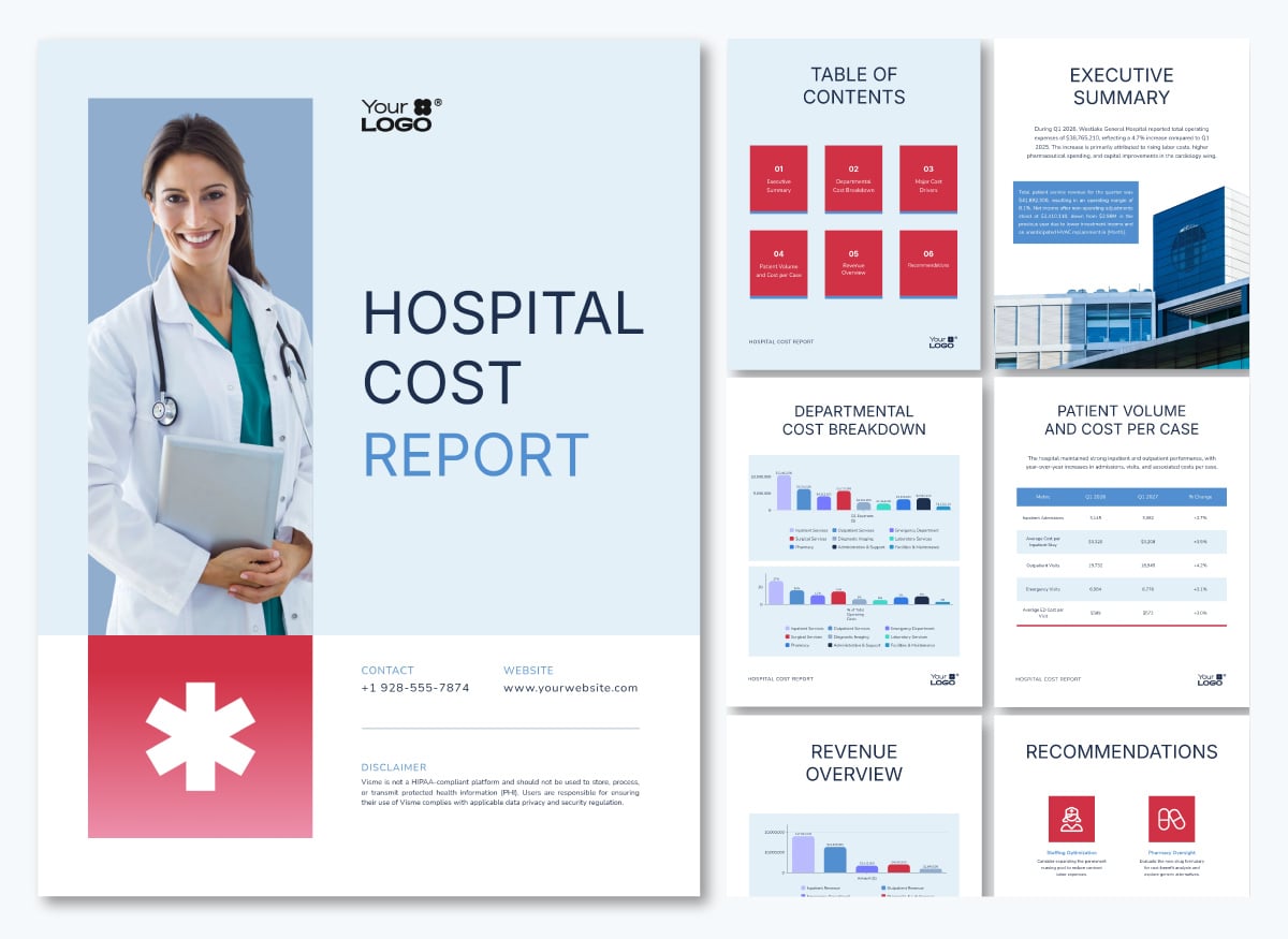
This healthcare market research report template puts this into practice across a single document. It uses radials, progress bars, vertical and horizontal bar graphs, maps and tables across different pages, each matched to the type of finding it is presenting.
Wondering how healthcare organizations are turning data into beautiful stories?
Below, I’ve shared six publicly accessible real-world data visualization examples in the healthcare sector. Each one illustrates a different format, a different audience and a different decision it is designed to support.
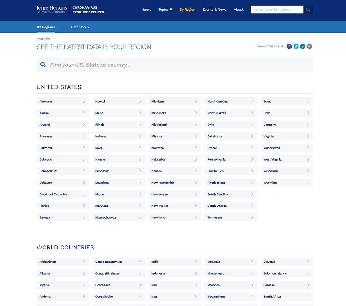
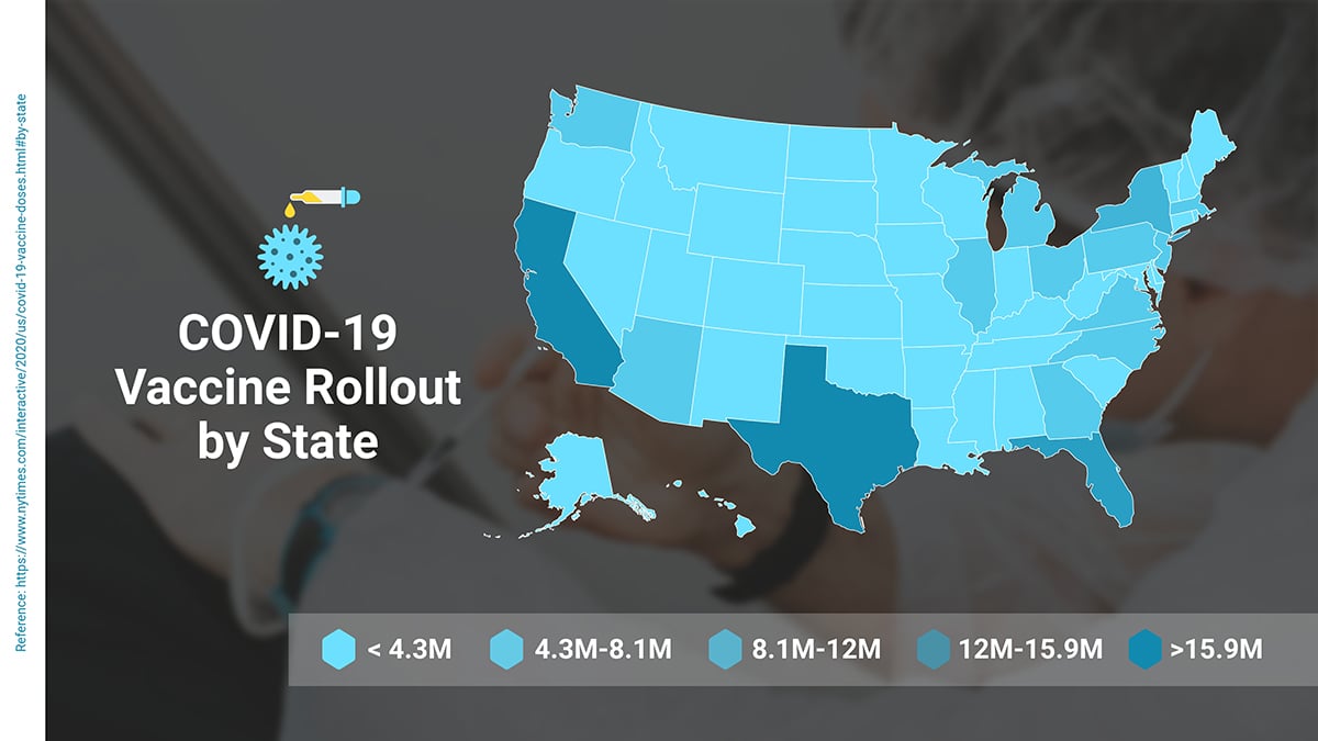
When COVID-19 hit in January 2020, the Johns Hopkins Center for Systems Science and Engineering built a real-time tracking dashboard covering confirmed cases, deaths, recoveries, hospitalizations, test positivity and vaccination rates by country, region and US state.
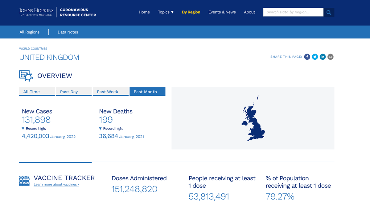
At its peak, it recorded over 4.6 billion data requests and 69 million views in a single day. It became the primary reference point for governments, health agencies, journalists and the public worldwide for three consecutive years.
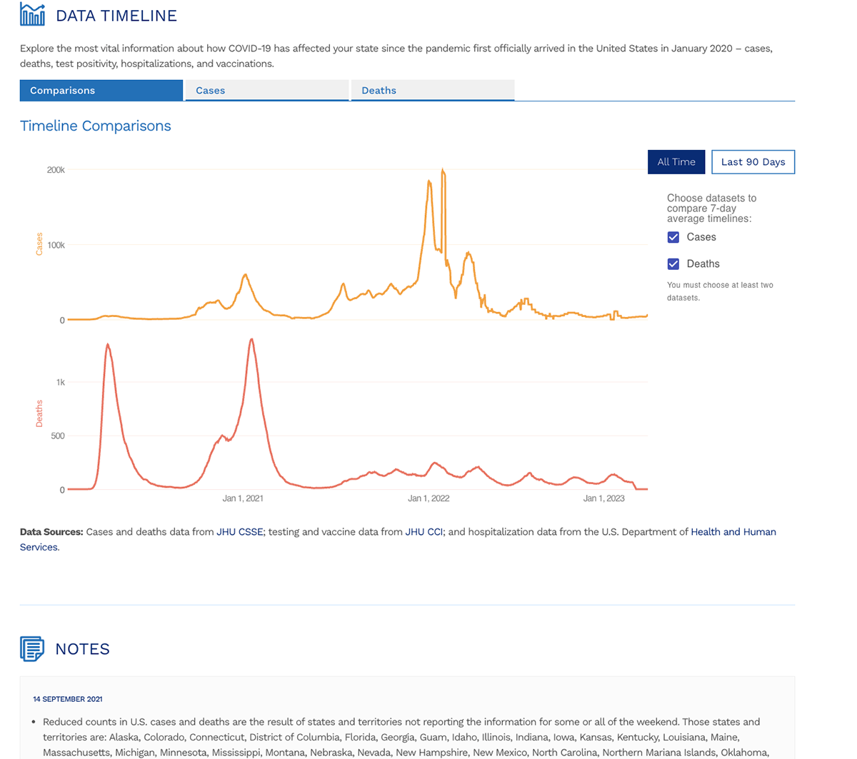
The dashboard handles an enormous amount of data without overwhelming the user. The timeline view uses dual-axis line charts to show cases and deaths on separate scales within the same visual, letting viewers compare two trends without one flattening the other. Country-level pages, like the UK view shown here, lead with the numbers that matter most: new cases, new deaths and vaccination coverage, each with its record high noted for context.
Users can toggle between all-time and recent windows depending on what they need. Every layer of the dashboard answers a different question for a different audience without requiring them to navigate to a separate tool.
Notice that the dashboard never tries to show everything at once. Each view is scoped to a specific question. The timeline comparison page answers how trends have moved over time. The country page answers where things stand right now. The regional navigation answers how my area specifically compares.
That scoping is a design decision most healthcare teams skip, and it is usually why their dashboards feel overwhelming rather than useful.
Use the 3D chart template below to replicate this visualization with your own dataset.
The Institute for Health Metrics and Evaluation (IHME) built GBD Compare, an interactive visualization tool that covers data on hundreds of diseases, injuries and risk factors across 204 countries from 1990 to 2023.
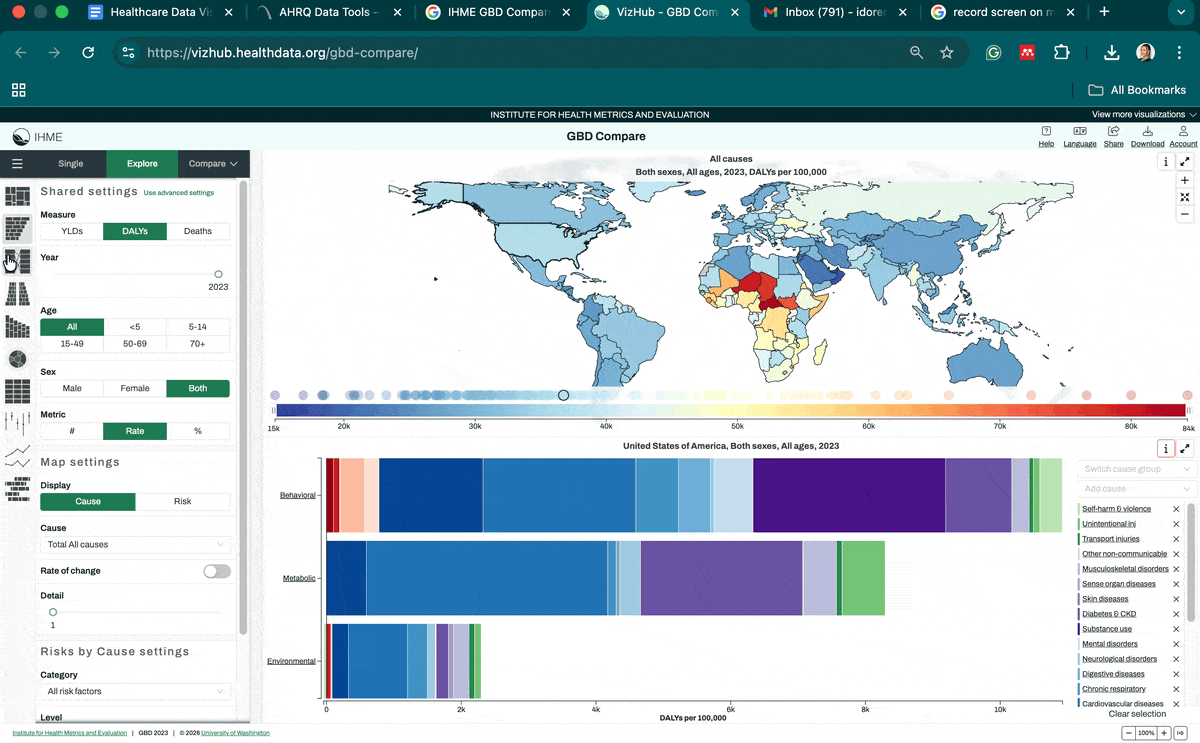
Users can build maps, treemaps, arrow diagrams, scatter plots, line, pyramid and trend charts on demand across any condition, country and age group.
The tool does not lock users into a single view. A policymaker asking which conditions are driving the most disability-adjusted life years in their country gets a treemap that ranks causes visually by size and color. A hospital strategy team tracking how cardiovascular disease mortality has shifted over 30 years gets a line chart with country and regional comparisons.
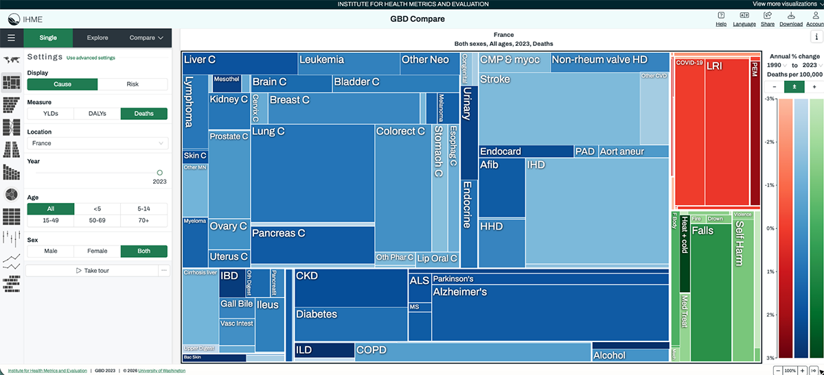
A public health team examining how risk factors like smoking or air pollution correlate with specific outcomes gets an arrow diagram showing the directional relationship between exposure and burden. Each chart type is matched to a different kind of question, and users switch between them without needing to understand the underlying data structure.
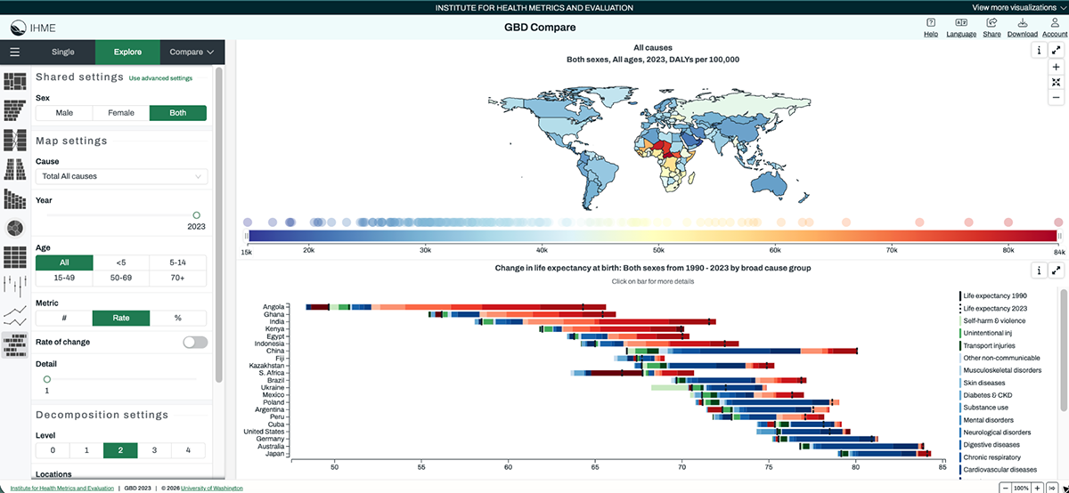
The tool is available in 16 languages and all underlying data is downloadable, which means it serves both the policy audience that needs a quick visual answer and the research audience that needs the raw numbers to build on.
This is the gold standard for interactive data visualization in healthcare. Most healthcare dashboards are built around the data that is available rather than the questions stakeholders actually need to answer. GBD Compare flips that.
It does not just display data; it gives the user control. When you are building dashboards for mixed audiences, including clinical, operational and executive stakeholders, that self-service capability changes the dynamic of every meeting the dashboard appears in.
Use a Mekko chart to show how different segments contribute to the whole, especially when you’re comparing multiple variables at once.

And when you need to compare two related metrics, this dual-axis chart template gives you that side-by-side context without clutter.
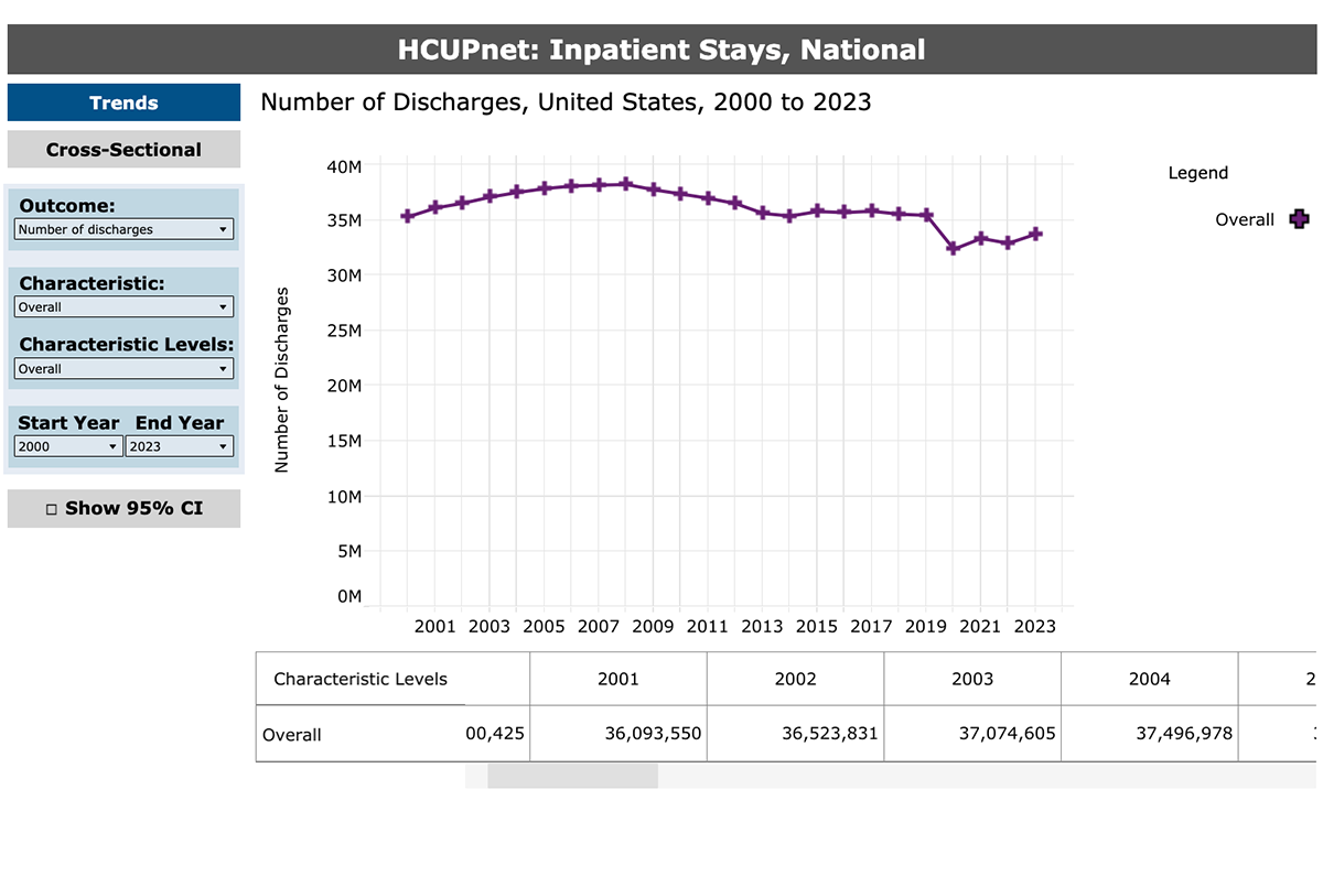
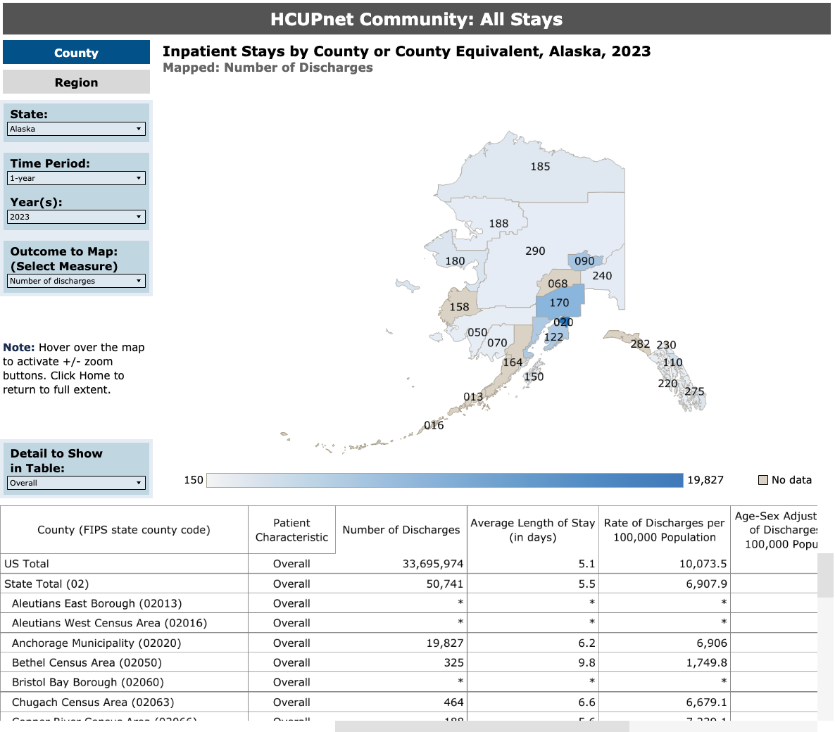
The Agency for Healthcare Research and Quality's HCUPnet is a publicly accessible data tool that visualizes inpatient and emergency department statistics across the US. It covers diagnoses, procedures, costs, utilization trends and patient demographics, all broken down by state, hospital type, payer and year.
The chart below visualizes the number of discharges in the United States from 2000 to 2023
The map below visualizes the number of discharges in Alaska within a one-year period (2023).
Rather than publishing static PDFs that are outdated the moment they are released, AHRQ built a tool that generates charts and maps directly from live underlying data. The national discharge trend chart, which tracks total discharges from 2000 to 2023, gives health system strategists and policy researchers a 23-year view of how hospital utilization has shifted over time, including the sharp drop during COVID-19.
Zoom into a single state like Alaska for 2023 and the same tool switches from a trend line to a geographic breakdown, showing where utilization is concentrating at the regional level. A hospital administrator, a health economist and a state health official can all extract what they need from the same tool without touching a spreadsheet or submitting a data request.
HCUPnet works because it removes the middleman. Stakeholders do not have to wait for an analyst to pull a report, format it and schedule a meeting to present it. The data is there when they need it, in the format that answers their specific question.
When you design healthcare data dashboards for self-service use, you shift your organization from reactive reporting to always-on intelligence. That shift changes how quickly and confidently decisions are made.
Some of the best data visualizations are built with this in mind. They are easy to navigate, focused on specific questions and designed so users can get answers without additional support.
Use the template below to design your own version of this chart
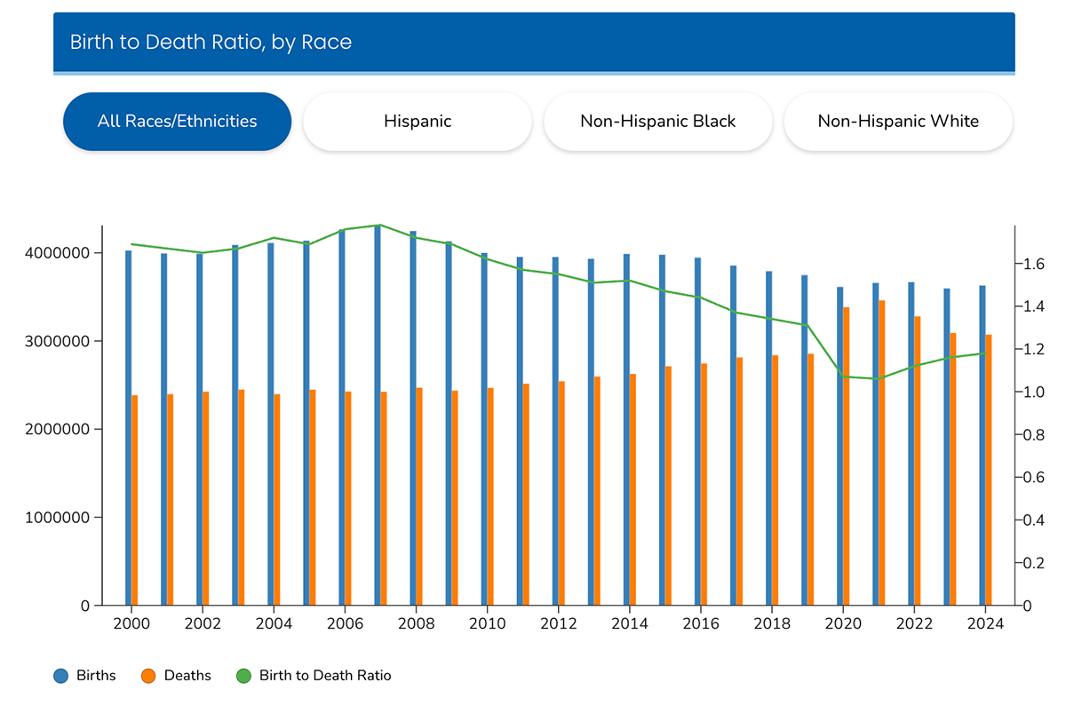
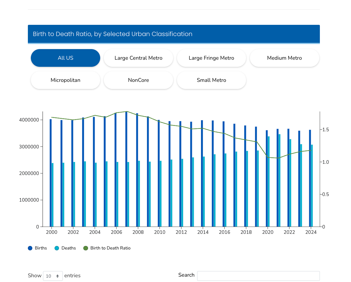
The CDC's National Center for Health Statistics publishes a suite of interactive dashboards covering birth rates, mortality causes, drug use, emergency department diagnoses and more. Each dashboard is filterable by race, geography, urban classification and year.
The Natality and Mortality Trends dashboard covering 2000 to 2024 is a strong example of how to handle multiple dimensions of the same dataset without overwhelming the viewer.
The first visual is a combined bar and line chart showing births, deaths and the birth-to-death ratio from 2000 to 2024, filterable by race and ethnicity across four groups: All Races, Hispanic, Non-Hispanic Black and Non-Hispanic White.
The dual-axis design lets users track raw volume on the left and the ratio trend on the right simultaneously. What stands out immediately is how sharply the birth-to-death ratio dropped around 2020, a visual signal that would take several paragraphs to communicate in a written report.
Below that, a choropleth map b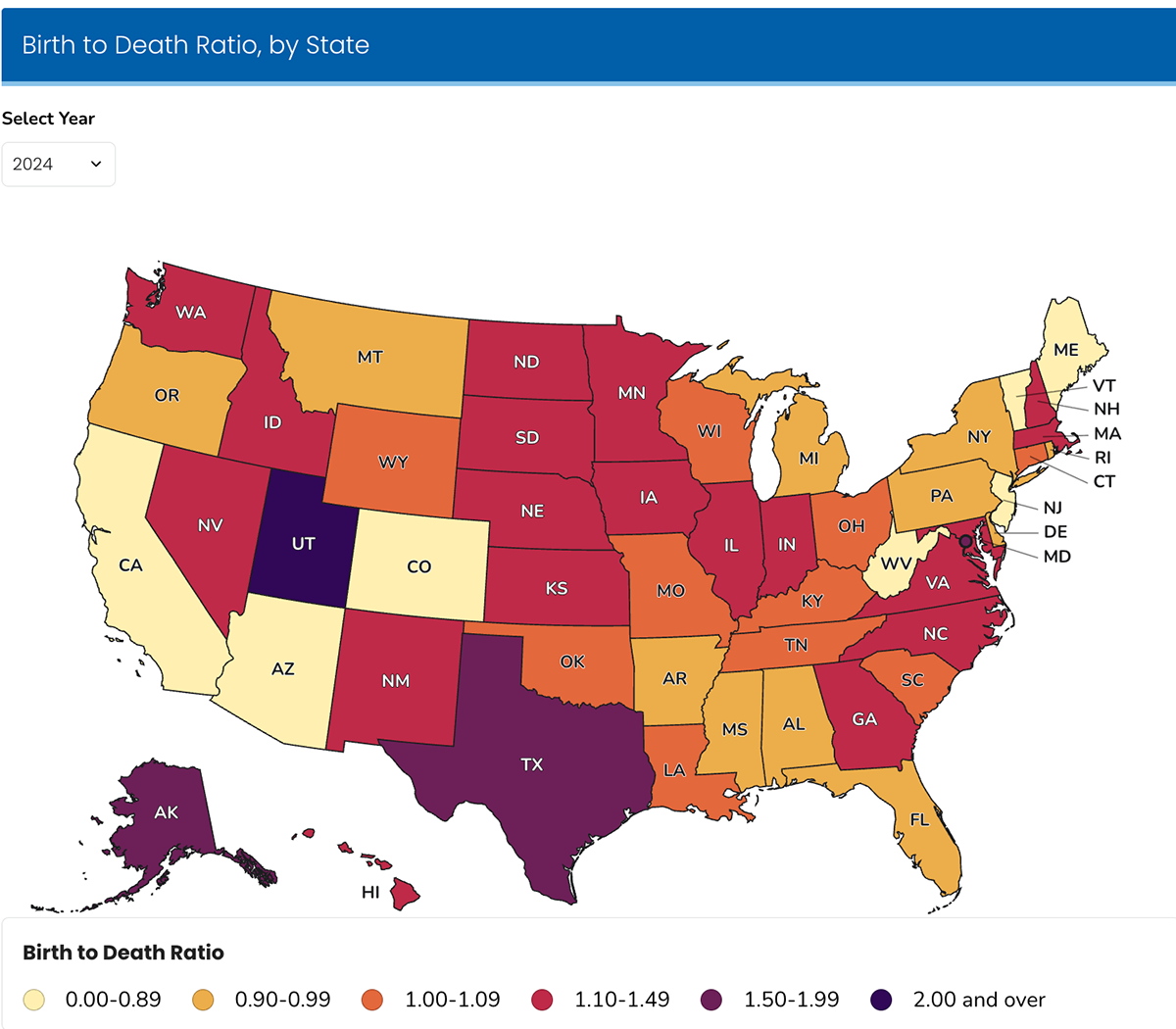 reaks the same birth-to-death ratio down by state for any selected year. In 2024, Utah and Texas sit at opposite ends of the spectrum from states like Maine and West Virginia, a geographic pattern that points directly to where maternal and pediatric health investments are most urgent.
The third visual segments the same data by urban classification, from Large Central Metro to NonCore rural areas, letting users compare how natality and mortality trends diverge between urban and rural populations over the same 24-year period.
Underneath all three charts sits a downloadable data table for users who need the raw figures.
Each visual answers a different version of the same question. The trend chart shows how things have changed over time. The map answers where the disparities are concentrated. The urban classification chart answers how geography and community type shape the picture. None of them tries to answer all three questions at once.
When a dataset has multiple meaningful dimensions, such as race, geography, urbanicity and time, the instinct is often to build one chart that tries to show all of them. That chart pleases nobody. The NCHS approach of building three focused visuals from the same data, each scoped to a distinct question, is worth replicating in any health system reporting environment where multiple stakeholder groups need to draw different conclusions from shared data.
The map view can be easily replicated using the template below.
The WHO Global Health Observatory is an interactive data platform covering more than 1,000 health indicators across 194 member states. The homepage organizes data across 30-plus themes, from air pollution and antimicrobial resistance to maternal health and road safety, each linking through to its own data environment with indicators, country profiles and downloadable datasets.
Clicking into the Public Health and Environment theme shows how the GHO handles a complex, multi-variable topic without losing a general audience. The page opens with three bold stat callouts: 24% of all estimated global deaths are linked to the environment, 3.2 million deaths annually from household air pollution and 4.2 million from ambient air pollution. Those numbers are not buried in a table. They are the first thing a visitor sees.
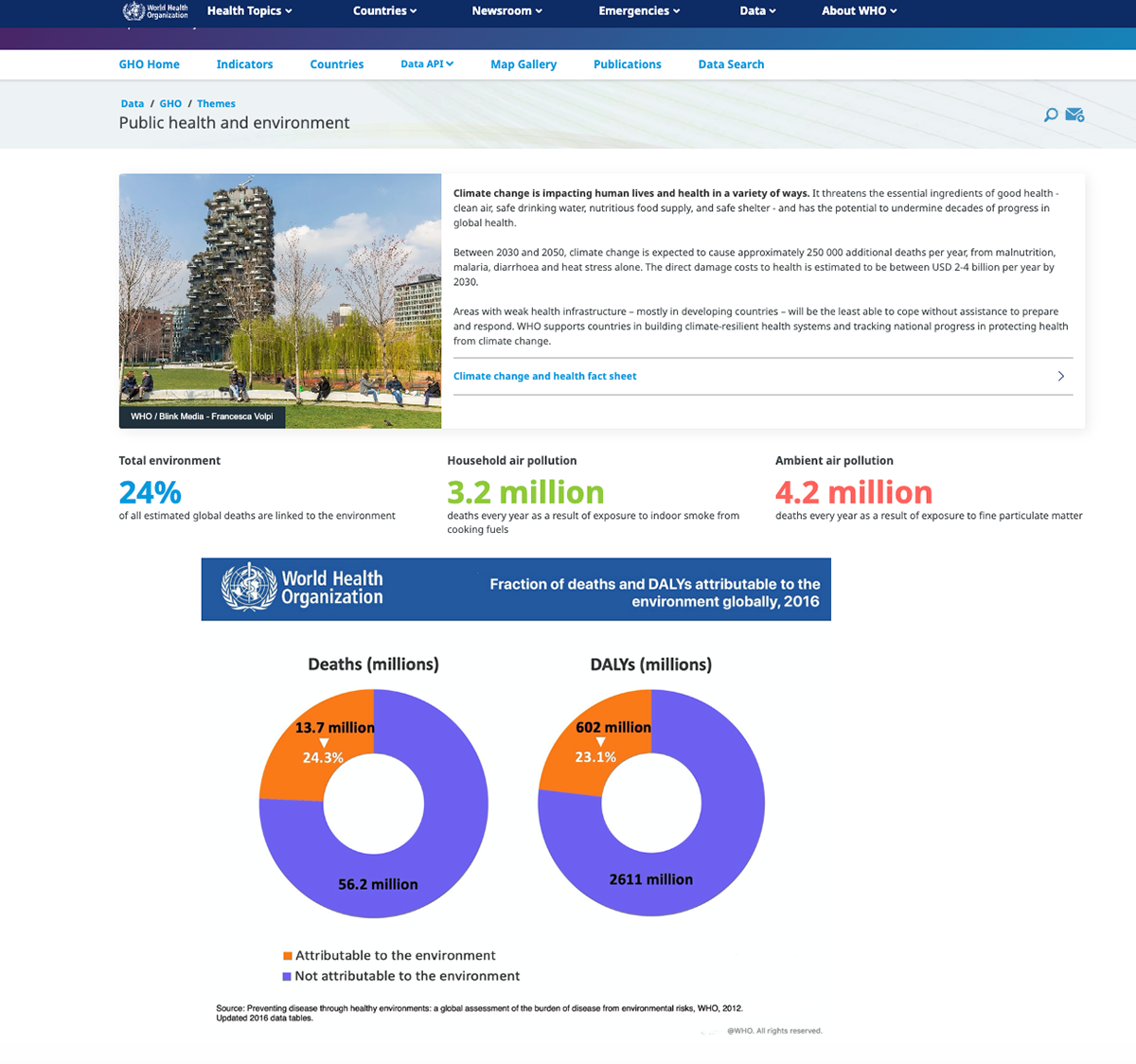
Below that, two donut charts visualize the fraction of deaths and disability-adjusted life years attributable to environmental causes globally as of 2016. The deaths chart shows 13.7 million deaths, representing 24.3% of the total, in orange against the larger 56.2 million total in blue. The DALY chart runs the same comparison for 602 million DALYs against a total of 2,611 million. The side-by-side format lets the viewer compare not just scale but the relationship between mortality and disease burden in a single glance.
The GHO does not ask visitors to know what they are looking for before they arrive. The thematic navigation lets a health minister, a climate policy researcher and a hospital strategy leader all find relevant data through their own entry point. Once inside a theme, the page leads with the most important numbers in plain language, then supports them with visualization for those who want more depth.
Most healthcare data portals are built around the data structure, not the audience's questions. The GHO inverts that. If your organization publishes population health data for external audiences, the structure here is worth studying. Lead with the finding, support with the brand-compliant visual and make the detailed data available for those who need to go further. That sequence works regardless of whether your audience is a policymaker, a clinician or a community partner.
Replicate your own chart using the template below:
Now you’ve seen incredible examples of healthcare data visualization. The tools, templates, and processes to help your team make even better visuals are all right at your fingertips.
Here’s how to build that capability at scale.
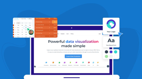
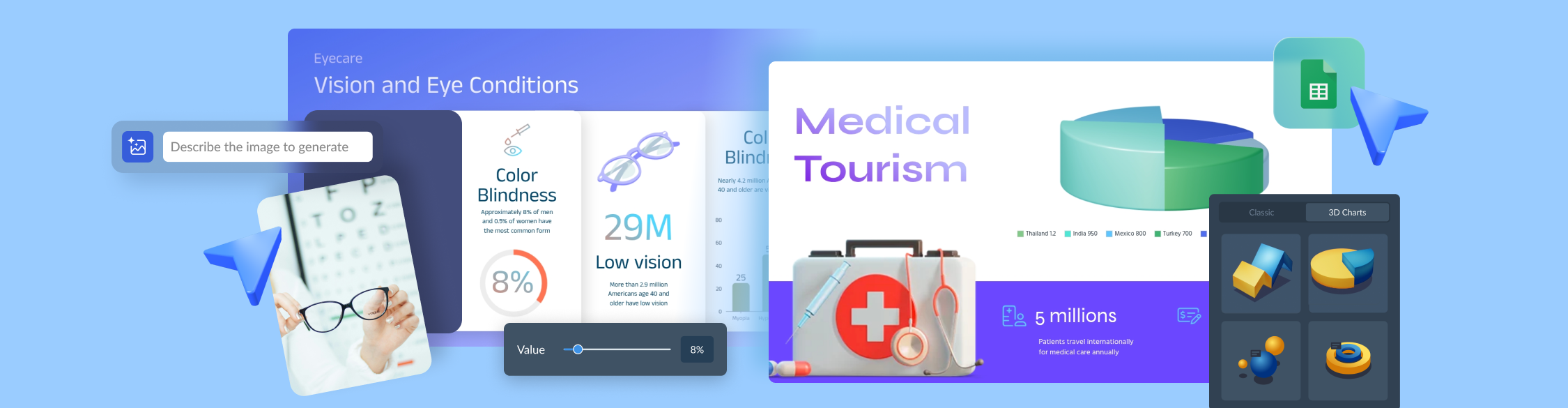
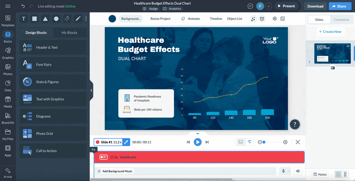
Creating healthcare visual content from scratch isn’t just time-consuming but also leads to inconsistencies. Visme is loaded with templates for healthcare communication, marketing material and sales enablement content. This includes:
This template can be fully customized. You can edit content, change image(s), apply custom colors, input your own fonts and logo, and more. Keep it consistent with your brand using Visme’s brand wizard. Enter your URL and the tool will import your assets (logo, fonts, color) and save them in your brand area for future use.
Not every dataset is suitable for a bar chart. One of the most common healthcare data visualization mistakes is defaulting to the same chart type regardless of what the data actually needs to communicate.
As data visualization designer Dieuwertje van Dijk puts it:
"Choosing the right types of data visualizations for your report is an important topic. When deciding on which type to choose, you can think of the purpose of the report and the audience you are designing for. It is very important to pick the right chart for the data you are working with."
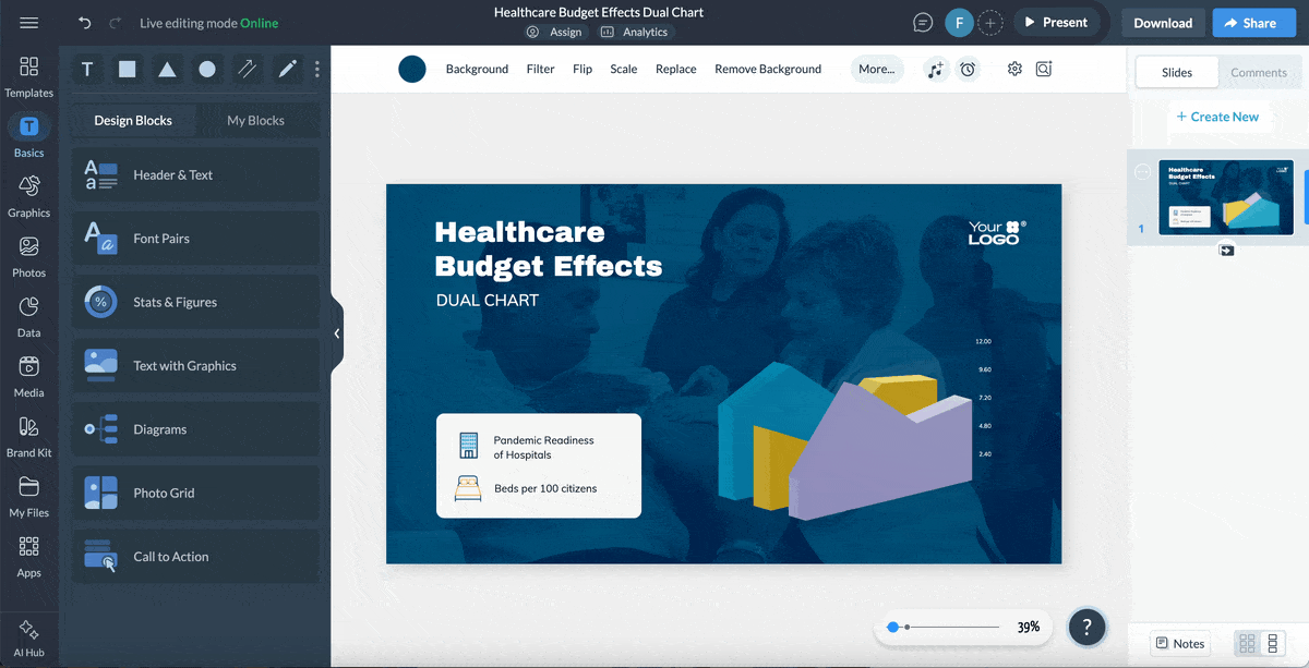
Visme's platform includes over 33 chart and graph types in both 2D and 3D formats, including
Each is fully customizable with your brand colors, labels and data formatting.
Once your chart is ready, you can publish it as a standalone visual. Or embed it in a report, presentation or case study. Include it in a patient-facing or provider-facing document. Or share it as a live web link that updates automatically when the underlying data changes.
For healthcare teams that need to move from raw data to a presentation-ready visual quickly, Visme's AI chart maker cuts the production time significantly. Rather than building a chart from scratch, you describe what you need and the tool generates a customizable first draft in under two minutes.
Here is how it works:
The chart maker is particularly useful for healthcare reporting teams working across multiple service lines or departments, where the same chart format needs to be rebuilt repeatedly with different data. Generate the structure once, then adapt it rather than starting over each time.
Inside the Visme’s AI Hub, you’ll also find the AI Writer and Image Generator, which support the rest of the reporting process.
Use the AI Writer to draft the data narrative around your charts. Or turn numbers into plain-language summaries that clinical and executive audiences can follow without a statistics background. For patient-facing materials and public outreach reports, it also helps adapt technical language to a lower reading level without losing accuracy.
The AI Image Generator fills visual gaps in reports and presentations. You can generate custom images that fit your content without requiring a stock photo search or a request to a design team.
Static charts have limits. When a dataset has multiple variables, including geographic, temporal, demographic and clinical dimensions, a flat chart cannot carry the full story without either oversimplifying it or overloading it.
Interactive data visualization lets your audience explore the data on their own terms. And this changes the dynamic of a presentation. When stakeholders can engage with the data, they're more confident in the findings and take ownership over the decisions that follow.
Visme's interactive data visualization tools support clickable hotspots, animated transitions, drill-down charts, embedded forms and navigation menus. The 3D visualization capabilities add depth to multi-variable datasets that need to communicate both scale and trend at the same time.
If your team produces the same report format for multiple service lines, departments or payer partners every month, building each one from scratch is time your team cannot afford.
Visme's Dynamic Fields let you build one master template and populate it automatically with audience-specific data. For example, build the payer utilization report once. Adapt it for eight partners without rebuilding it from scratch. The time savings compound quickly when you are running reports monthly.
Not every stakeholder reads a report. Some need to watch it.
Visme's AI Text-to-Speech tool converts any data visualization or infographic into a narrated walkthrough without a recording studio. Type your script, choose a voice and generate a realistic voiceover in seconds.
A community health report becomes a narrated explainer accessible to patients with lower health literacy. An executive scorecard becomes a 90-second video a board member can watch before a meeting. Patient education and outreach materials that previously required a production team can now be built by your communications team in an afternoon.
Combine audio with interactive elements, animations, clickable hotspots and embedded forms and the same visual your team uses to report internally becomes something patients actually engage with.
The content creation and data visualization process is usually a collaborative effort. It also involves multiple layers of review. Visme's collaboration feature makes the entire process a breeze. Multiple team members can leave comments, make edits, approve content and track every change without back-and-forth emails.
For larger projects with multiple contributors, the Workflow feature lets you assign specific sections to specific team members, add instructions alongside each assignment and set deadlines for completion. Use the version history to track every change made throughout the process. That way, if a chart is revised after clinical review and a question later arises about what changed and why, the answer is already documented.
Poor data visualization has a lot of consequences. It turns data into a bottleneck.
Having reviewed many healthcare data visualizations, the mistakes below are the most common and cost the most when they occur.
| Mistake | Why It Fails | The Fix |
|---|---|---|
| Using the Wrong Chart Type | A pie chart with 11 segments tells you nothing. A line chart for a one-time comparison misleads more than it clarifies. | Match the chart to the question. Use bars for comparisons, lines for trends, scatter plots for relationships and stacked bars for proportions. |
| Showing Data Without Context | A 12% readmission rate means nothing without a benchmark, target or prior period. Your audience cannot tell if it is good or bad. | Always include a reference point such as a goal, national average or prior period so the meaning is immediately clear. |
| Designing for Yourself, Not Your Audience | Analysts include every metric. Executives need three. Patients need one. Too much data reduces clarity. | Start with the decision. Remove anything that does not directly support it. |
| Ignoring Accessibility | Red-green indicators fail for colorblind users. Small labels fail on mobile and for older audiences. | Use color, labels and shapes together. Validate against WCAG 2.1 accessibility guidelines before publishing. |
| Inconsistent Data Definitions | When metrics mean different things across teams, trust in the data breaks down. | Standardize definitions across departments and enforce them at the template or system level. |
| No Narrative Structure | A dashboard without a story overwhelms. Viewers see numbers but miss the meaning. | Lead with the key insight, support it with data and end with a clear implication or action. |
| Skipping Compliance Review | Healthcare data often requires regulatory review. Skipping this step introduces serious risk. | Build compliance into the workflow early. Prevention is faster and safer than rework. |
| Overloading a Single Visual | Trying to show too much in one chart confuses the viewer and dilutes the message. | One chart should answer one question. If you have three insights, use three visuals. |
Healthcare generates enormous volumes of clinical, operational and financial data every day. Without visualization, that data stays trapped in reports that few people have the time or expertise to interpret.
Visualization makes patterns visible, accelerates decisions and aligns stakeholders across clinical, operational and executive levels, all of which directly affect patient outcomes and organizational performance.
Visual formats reduce the cognitive work required to interpret data. A clinician scanning a risk dashboard identifies the highest-priority patient in seconds. An executive reviewing a visual scorecard flags a performance gap in a fraction of the time a spreadsheet would require.
Allina Health cut variable readmission costs by $3.7 million after embedding predictive analytics into visual workflows that clinicians could act on directly at the point of care.
Patients with access to clear visual health information, including condition explainers, treatment timelines, medication guides and lab result summaries, understand their own care better and adhere to treatment plans more consistently.
Research in PMC found that patient-facing visualizations helped patients ask more sophisticated clinical questions and better articulate specific health concerns during visits.
Public health agencies use visualization to communicate population-level data to policymakers, community organizations and the public. Geographic maps, trend dashboards and infographics make complex epidemiological data accessible to non-specialist audiences, enabling faster policy responses and more targeted community health interventions. The AHRQ’s interactive data visualization tools are a strong benchmark for what population-level health communication can look like in practice.
The right tools eliminate the gap between data collection and a decision-ready output. Platforms that combine chart generation, dashboard building, template libraries and collaboration workflows let teams move from raw data to a shared visual in hours, not days.
Interactive data visualization tools let decision-makers explore the data themselves rather than waiting on an analyst to answer every follow-up question. That self-service capability changes the tempo of decisions at every level.
Start with the audience and the specific decision they need to make. Select only the data that directly informs that decision.
Choose the data visualization technique that makes the pattern or comparison immediately visible.
Add context: benchmarks, targets, prior periods. Remove everything else. Then route the visual through your compliance review before it goes anywhere.
Any tool that handles protected health information requires a Business Associate Agreement with the vendor before any patient data touches it.
Visme’s healthcare compliance and brand governance tools include built-in review workflows to help your team manage that process.
In this article, we covered what healthcare data visualization actually is and why it demands a different approach than standard business intelligence.
We looked at six real-world examples of visualization done well and the most common use cases. And we walked through the tools, workflows and design principles that let healthcare teams produce clear, compliant visuals consistently and at scale.
The data your organization collects every day already contains the insights that could improve patient outcomes, sharpen financial performance and strengthen stakeholder relationships.
The story is in the data. It just needs to be told. And that’s exactly why you need to invest in tools that turn data into actionable insights.
That starts with having the right tools in place. Visme's healthcare hub gives your team an extensive library of healthcare-ready templates, AI tools, collaboration and workflow features, data visualization tools, design assets and more.
Book a demo to see how Visme can help your healthcare team turn complex data into clear, confident decisions.
Design visual brand experiences for your business whether you are a seasoned designer or a total novice.
Try Visme for free