


14+ Employee Newsletter Examples, Ideas & Templates

In today’s competitive business landscape, data is everything. You need to keep a pulse on your organization's or project's performance by tracking data, metrics, and KPIs. Else your team will rely on guesswork or sheer luck to hit the mark.
But with a sea of metrics and numbers, it can be overwhelming to decipher what truly matters. That’s the beauty of having a performance dashboard.
A performance dashboard unlocks actionable insights that help businesses drive valuable results. Businesses can make data-driven decisions that propel their organization toward unprecedented growth.
So how do you create and use dashboards to monitor progress? Roll up your sleeves as we take you on that journey.
In this article, we’ll explain what a performance dashboard is, its key elements and how to use a performance dashboard to track your essential KPIs & analytics. We've also included 10 practical templates to help you get started.
A performance dashboard is a visual tracking tool that highlights performance metrics, KPIs, insights and trends for a business entity, group or campaign. Performance dashboards are management tools and business communication solutions for any type of workplace.
Incorporating dashboards into performance management provides visibility at a glance for all data related to an employee's, a team's or a campaign’s performance. Having all relevant data in one location saves time and resources for everyone involved, especially the end user. In this case, the end users of performance dashboards are managers and employees.
The McKinsey Group lists performance data systematically organized in dashboards as one of the three elements shared by the best B2B performance-management teams. The other two elements are dynamic sales targets developed with the help of analytics and action-oriented culture. These elements enable high-performance teams to translate insights into impact.
Performance dashboards are useful in sales, marketing, human resources, business development, production, learning and development.
There are many types of dashboards, each with its own best practices regarding their characteristics. So, what should be included in a performance dashboard to make it easier for executives, CEOs and project managers to track performance?
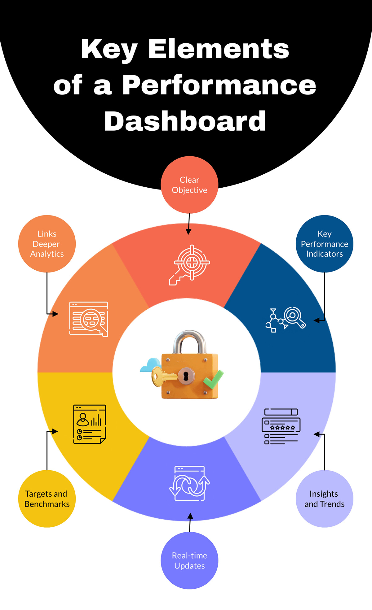
We’ll answer that below:
Before starting to build your performance dashboard, it needs a clear objective. For example:
Performance dashboards share KPIs relevant to the objective and goal. Visualize the most important KPIs with big numbers at the top of the dashboard to make them noticeable. Use bold fonts like Raleway or Montserrat for the numbers to stand out.
With the KPIs, add metrics and charts providing insights about each KPI over time—did it go up or down? Visualize that with arrows, icons and numbers. Use line graphs, percentages, and histograms to visualize trends. The Visme graph maker has all the options to customize your charts to fit the dashboard perfectly.
Real-time updates are key to effective data tracking on a dashboard. Many metrics can be connected to a Visme dashboard, even if you have them on Google Sheets and Google Analytics.
That said, not all performance dashboards can show 100% live data, as not all data sources are integrative. For all manual data updating, include the date of the particular view or current state.
Use dynamic fields to update information like dates and names across all slides or instances in a project.
Highlight targets and benchmarks to be achieved and pinpoint areas of improvement vs problematic areas. Use visual metaphors like up and down arrows or colors like red and green.
Access all the arrow icons and other assets within the dashboard quickly by using the shortcut feature. Just click the forward button (/) and you can use the search bar to find anything you want.
Highlight a section with target amounts for different metrics on one side or across the bottom of the dashboard.
Dashboards are designed to show a data overview of a performance objective, but sometimes people want to know more. So add visual hotspots with a hover effect so visitors can click and either see a popup, open a new slide (if the dashboard is inside a bigger project), or navigate to another site, spreadsheet or digital document.

Using templates for any type of business communication is always a good idea. Here are three benefits we believe make templates worth their digital weight in gold.
Using performance dashboard templates makes it easy for non-designers to create effective dashboards in considerably short amounts of time. Templates save both time and effort. When you follow the layout in the template and keep the alignments unchanged, all you have to do is change the data, colors and font.
Creating a performance dashboard with your team can guarantee the data accuracy of the KPIs, metrics and trends.
Collaborate with your team effectively to build and keep the dashboard up to date. Many of the dashboard templates in Visme are accessible on our infinite whiteboard, where your team can work together without limits.

Every new template you use can become a branded template for business communication in your company. A performance dashboard for a podcast project can be reused for an influencer campaign and a team performance dashboard for one team can be rebuilt for another.
Watch this video to hear what our users have to say about our all-in-one design and data visualization platform.
To get more insight into the value of dashboards, read our article on 11 Editable Executive Dashboard Templates to Make Better Business Decisions.
One of the best aspects of using Visme dashboard templates is their versatility. Not only do they help you get started quickly, they are also 100% customizable. Here are 11 effective and adaptable performance dashboard examples to help you get started.
The Visme infinite whiteboard has more than enough space to create an ad performance dashboard exactly how you want it. Use the bounding boxes as section separators and KPI grouping.
To populate the map data, double-click on it and the charts dialog will appear. Add all your data, color code it and the map will change automatically.
Performance dashboards with layered tabs let you separate and categorize data by metrics that support the objective and goal. Use big-number KPIs mixed with color-coded charts and line graphs showing trends. Create a data composition using a table and corresponding chart.
Create a wide performance overview dashboard for your business with this template. Place one high-level KPI in each box and highlight their trend from the previous month. Highlight recent leads, deals, revenue, campaigns and other customer-related business metrics to keep your customer success team synchronized.
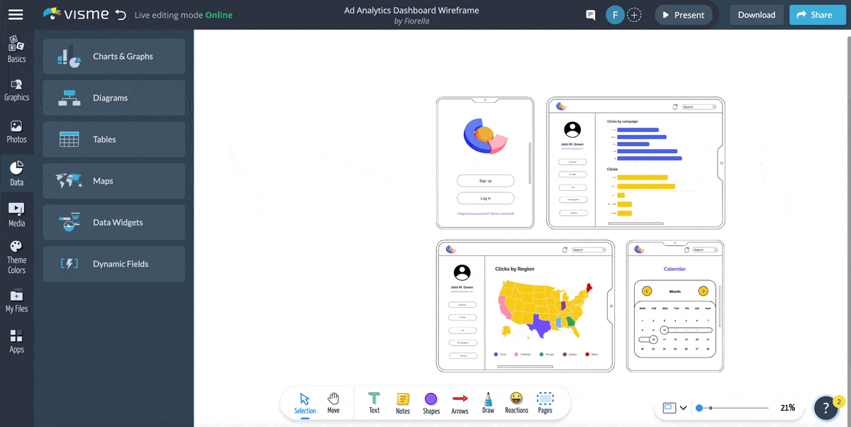
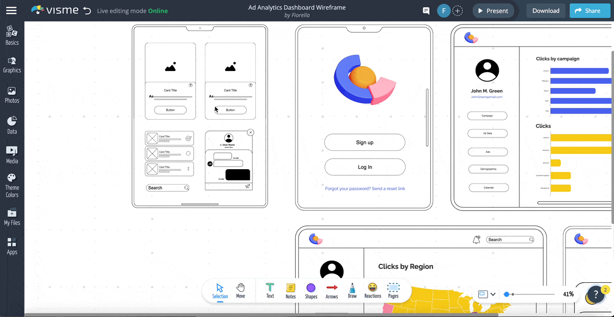
Build a client-facing performance dashboard highlighting information relevant to their accounts. Use this wireframe template as the visual foundation for a dashboard development project.
To share with editing permissions, add team members to the workspace. To share a view and comment-only dashboard, use a live Visme link.
MobiIe sales dashboards designed for use on tablets are practical for hybrid sales teams that need to access performance information on any device. In this wireframe dashboard example, tabs on the left highlight categories, while the main area shares sales metrics about agents and their performance as a group.
This dashboard template uses color to highlight KPIs in unique sections. Place big number KPIs at the top of the dashboard and place trend charts below them. To create more views for the dashboard, select all the elements in one view and copy it. Paste it somewhere else on the whiteboard and adjust the elements to highlight another metric.
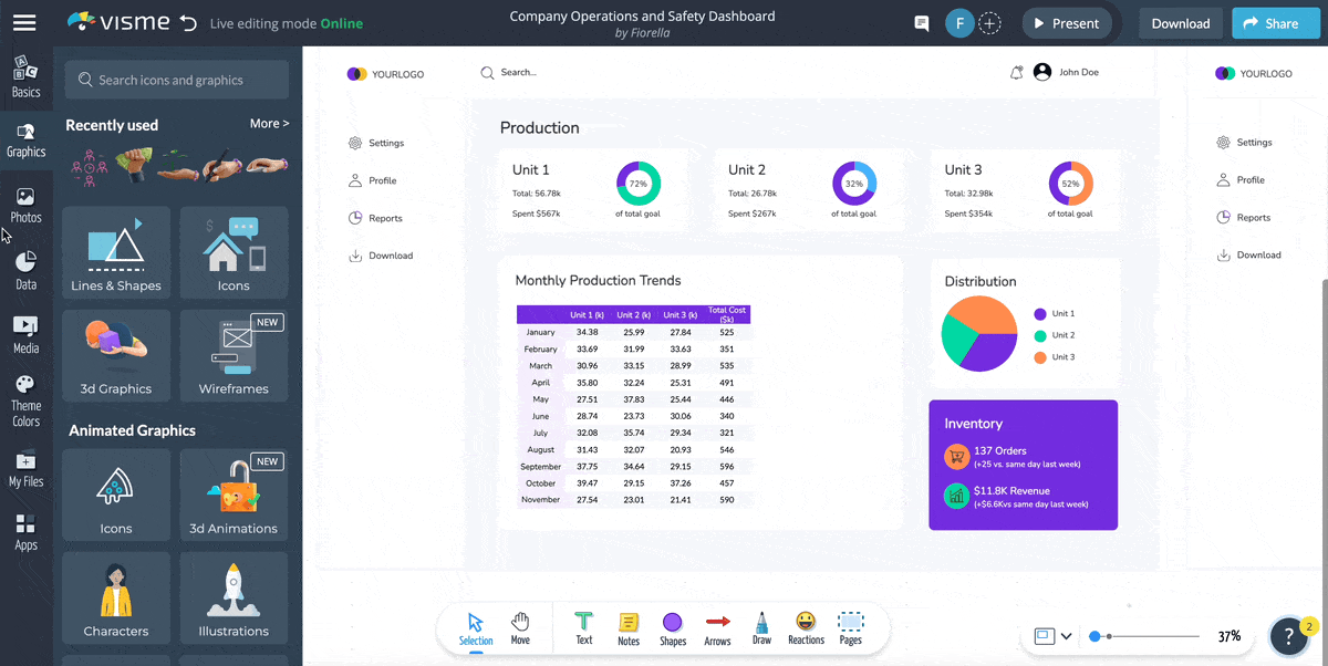
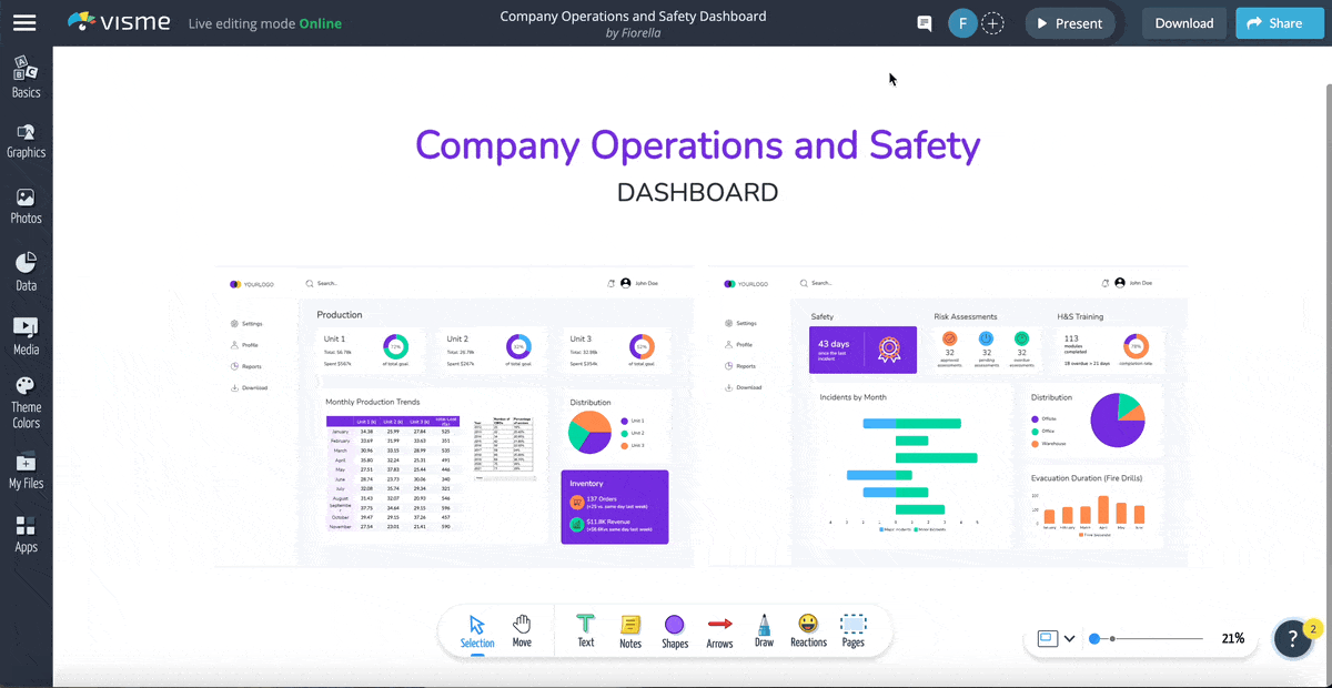
Visualize your KPIs with data widgets, pie charts, tables and graphs in a color-coded layout. Highlight metrics like distribution, monthly production trends, inventory, risk assessments and incidents by month.
Not every dashboard needs to have big numbers and small charts. Go against the grain and create your dashboard with big charts and small numbers. Use highly contrasting colors and the grid alignment features in the editor to simplify charts to their minimal characteristics and create a subtle yet effective dashboard.
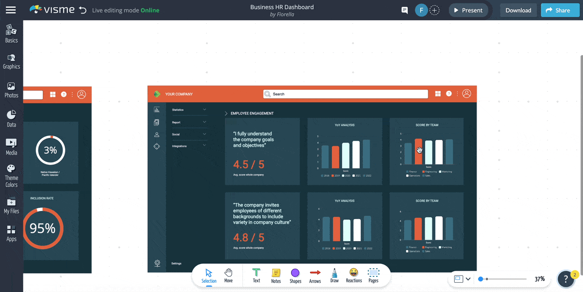
Create an HR performance dashboard to help your HR teams track performance analytics across the company. Pull in data from Google Analytics, Salesforce, and Hubspot to populate the charts and graphs in the overview. Highlight metrics like turnover, diversity and compensation.
Track leads, users, sales and wins with this digital marketing performance dashboard with big numbers. Place the most impactful KPIs at the top left as big numbers.
Continue the layout in a Z shape to mimic natural eye movement and create a visual hierarchy. Big numbers look better with a strong, bold font like Raleway.

The most effective way to create a performance dashboard with Visme is by using the infinite whiteboard. Start with a template or build the dashboard from scratch. Follow these steps to create a performance dashboard that tracks essential KPIs and analytics.
To create a performance dashboard that does what it’s meant to, you’ll need to define an objective first. Having a clear objective or goal helps you choose the KPIs, metrics and trends you’ll track.
For example, your objective could be to:
When sharing the dashboard, include the objective and goal in the explanation or documentation.
Using the dashboard’s objective as the starting point, pinpoint the essential KPIs to measure performance towards your goal. Let’s use the first example of the list above to build upon.
For a dashboard that compares performance across the sales, marketing and customer service teams, these are the KPIs you’d need to track.
You’ll also want to use visual separation or tab navigation to group KPIs by category.
Make a list or spreadsheet with your chosen KPIs and pinpoint the data source for each. Data locations you’ll be looking at include:
In your Visme editor, click on Apps on the left side menu and connect with the apps you’ll need to populate the performance dashboard. Next, choose from the selection in the menu and follow the instructions.
For example, to track the performance of survey results, connect your dashboard to a SurveyMonkey account and update the data periodically.
Dashboards are like puzzles where all the pieces fit together to tell a data story. Wireframing the layout before placing data on it will not only save time, but it’ll also make it easier and faster to build and maintain.
Decide on a visual style early on. For example;
Build the dashboard wireframe collaboratively and make decisions early on as well. Test locations for the KPIs and layout compositions for metrics and charts and give each other feedback until you come to the best solution for your performance dashboard.
For a quicker start, use a dashboard wireframe template from our template library and build a custom dashboard with drag-and-drop wireframe elements and shapes. The infinite whiteboard gives you free-range creativity for setting up an effective and attractive dashboard.
With a wireframe in place, it’s time to start choosing the visual metrics and data visualizations. Options include big numbers, percentage widgets, progress bars, bar graphs, tables, pie charts and line graphs. Place the data visualizations into their sections and adjust them to fit.
Here are some ideas:
The trick for this step is to lay out all the data elements in an effective order and group them into relevant categories so it’s easy to understand at a glance. Use a variety of techniques to bring attention to the most important KPIs, like hover effects, animations and contrasting color schemes.
Populating charts, KPIs and metrics on your dashboard is simple; you just need to choose the right solution for the data source and a relevant visualization type. With Visme, you can connect sources to the editor in the following ways:
Read our support guide in the Visme knowledge base on connecting your live data sheet to a chart in your dashboard for detailed instructions.
Check out what our users have to say about the embedding capabilities available in all Visme projects:
“The ability to enrich our presentations with embedded media like Tableau or embedded posts from our partners’ social accounts is huge. Being able to incorporate those different elements of media into a live presentation has been a game changer.”
- Jaime Kelm, the Director of Business and Data Strategy at LAFC
Double check all data connections and integrations to ensure the ones that pull live data are regularly updating and that the manual metrics are easy to update, either in the dashboard or on a live Google sheet.
Ask team members to give feedback about the choice of KPIs and their layout. Do they achieve in highlighting performance for your dashboard’s objective? Collaborators can leave digital post-its with comments, add freehand notes with the Visme freehand tool, or add shapes, arrows and speech bubbles.
When your performance dashboard is ready, you have several options to share and distribute with your stakeholders. For example:
Download a static PDF view of the dashboard with the current date. Send the PDF to your desktop or one of your cloud storage spaces. Cloud integrations in Visme include Dropbox and Google Drive.

Publish the dashboard privately online and share it with a link and password. In the settings panel, toggle the option to be tracked by bots to ‘off.’ Track dashboard opens and views in the analytics panel.
Publish the dashboard publicly and share with a free-access link. Select your bot tracking settings and give the project a descriptive name. Viewers will be able to download a PDF if you choose that setting to ‘on.’
Embed the dashboard into your website, productivity app or digital document. To access the embed code, click on the ‘share’ button at the top right and copy the snippet to your clipboard.

Include a slide with the dashboard in a periodical report. First, turn the dashboard into a content block and save it to your library. Select all the content in the dashboard and click on the button in the top bar to save.
Deconstruct the dashboard and create a presentation that goes deeper into the details of each KPI or dashboard section. Give your viewers an interactive overview by choosing the flipbook effect in the share settings.
When sharing company data with the public, always remember to include your logo and brand elements in the design.
If you’ve been looking for a solution to branding all your digital content for business communication, check out the Visme brand wizard, it’ll revolutionize the way you see business content creation.
To get the most out of the tab navigation in our whiteboard templates, use the My Blocks feature. Save each wireframe as a reusable block by selecting everything inside it and clicking “Save to My Blocks” in the top center of the canvas. Then do the following:

Another option is to use layered popups that open when you click the tabs—or buttons—on the left.
Try both ways and see what works best for your dashboard.
Custom built performance dashboards are useful in all areas of business, from email campaigns to international sales. In short, performance dashboards are a business necessity.
With a performance dashboard, you can monitor and manage performance. But you can also improve collaboration within your team and boost employee satisfaction.
A performance dashboard is an essential management and communication tool for your team. You need to create and manage dashboards effectively to help you make informed decisions, and Visme can help you make that happen. With an enterprise account, you have access to all of Visme’s business design features, where you can create all types of business communication and management solutions.
Design visual brand experiences for your business whether you are a seasoned designer or a total novice.
Try Visme for free


![How to Create a Practical Crisis Management Plan [+ Templates]](https://visme.co/blog/wp-content/uploads/2025/07/How-to-Create-a-Practical-Crisis-Management-Plan-Thumbnail.png)