How to Make a Gantt Chart in Excel + Easier Alternatives

Are you working on a visual project that must include accurate and up-to-date geographic data? It’s time to integrate interactive mapping tools into your design processes.
Whether you’re working on a document to pinpoint market expansion opportunities or a presentation that unravels intricate global patterns, the map templates in this guide serve as valuable tools for business designers, marketers and data enthusiasts.
Furthermore, we share an easy step-by-step guide to creating interactive maps with Visme, plus some frequently asked questions that you might be wondering about.
If you prefer a visual guide, this video will show you how easy it is to create an interactive map in Visme.
Now let's dive in.
An interactive map is a digital resource that visualizes different layers of geographical data. In a business design setting, this practical tool facilitates fast data visualization analysis. It helps teams analyze market trends, track sales performance across regions, and optimize chain logistics.
Interactive maps enable decision-makers to make informed choices by offering a platform to explore geographical insights easily.
An interactive map can be a slide in a presentation, a page in a document, a section in an infographic or a graphic in and of itself. By incorporating interactivity, you can transform a static map into a dynamic experience that not only conveys essential information but also elevates engagement.
Here are 15 interactive map templates you can use immediately in your projects.
The examples are all in horizontal format, but you can change the dimensions to another size. Likewise, you can save these maps as content blocks and add them to any other project you’re working on.
Choropleth maps use differences in color shading or symbols to indicate the values of a property in each area. This map template visualizes per capita GDP for countries around the world. It has five colors with average values and a side section with a noticeable title.
This template is one graphic, but that doesn’t mean you can’t use it in another project. Save the entire slide as a content block and then get it from your My Content gallery and add it to a presentation, document or infographic.

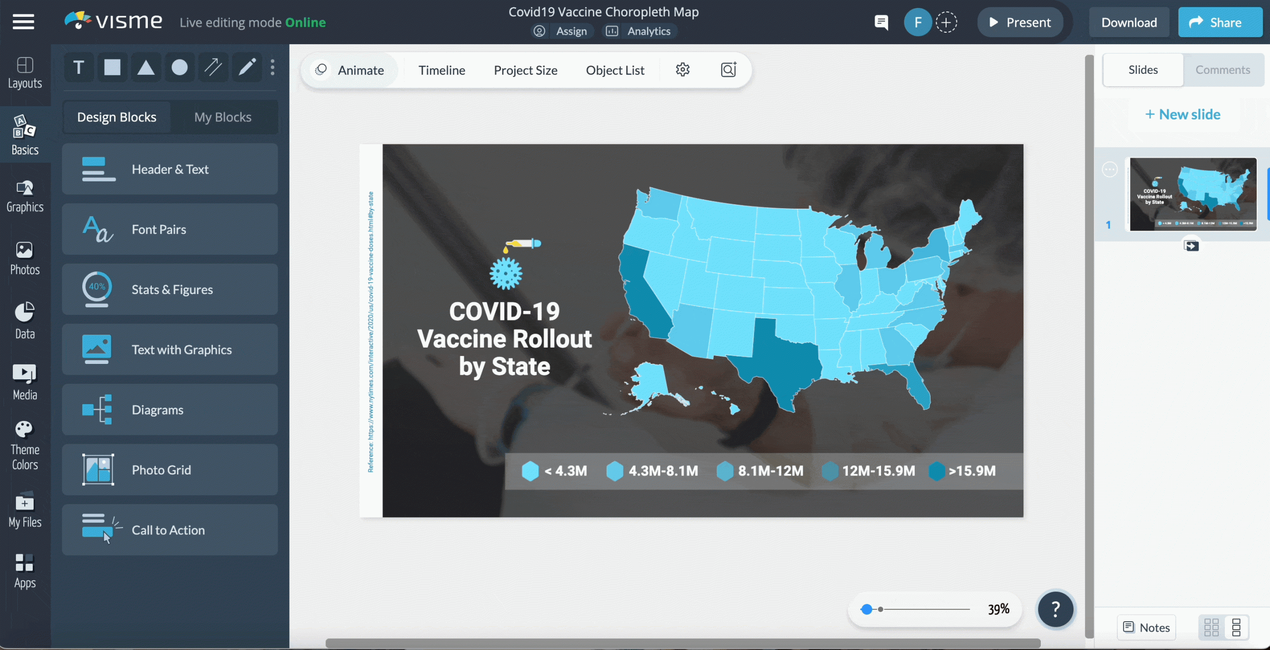
With this COVID-19 template, you can visualize five different values for a vaccine rollout nationwide. This template uses hexagon shapes to identify the color and its related value, but you can use any other shape you wish. Just choose one that matches the rest of the design.
Build the map with your team using Visme’s integrated collaboration and Workflow features. Assign this map to one team member in particular and set a due date. Keep track of the progress using the content calendar. Use one unified workspace to work with everyone on your team.
In this worldwide choropleth map, the five colors visualize the countries with the most startups. The map graphic is laid over a photo background that helps with the visual storytelling of the map graphic itself.
When using images in your map graphics, take advantage of the AI Image Edit tools and remove backgrounds and upscale or deblur photos with one click.

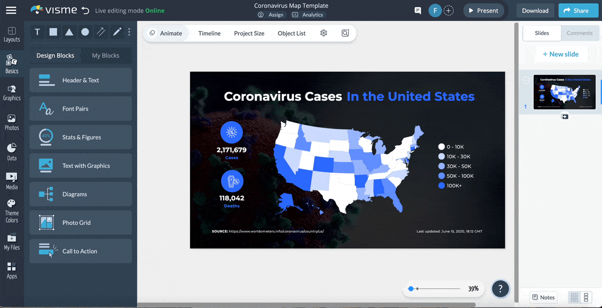
Use contrasting colors to depict statistical information on your map, like in this template. The data in this example is about lung cancer cases but you can use it for sales amounts, new customers or retail locations where your product is in stock.
Use a photo background with a dark color overlay to give the graphic some texture and depth. Don’t forget to include a reference to where the data came from. Use a hyperlink to let viewers see the complete data set.
Use the pre-designed color themes to try new combinations for your map. If you’ve created any branded color themes, you can use those too; they’re available with all the other themes.

When choosing the colors for your choropleth, consider the data story you’re telling. In this case, for a map of countries with the most arable land, the color coding is in tones of green. Make sure the colors you choose contrast each other so they’re easy to differentiate.

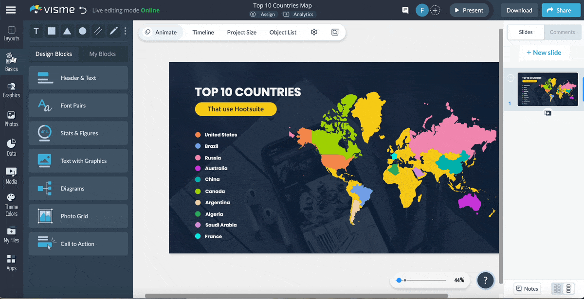
Use this template to visualize ten ranking countries on any topic. In this case, it's about countries that use Hootsuite for social media marketing. Set up the interactivity features so that when you hover over a country, you can see the value for each.
After sharing your map with colleagues, stakeholders or your audience on social media, use the analytics dashboard to track who has seen your content and where from. Having analytics data helps you consistently create better content that your audience will react positively to.
Visme interactive maps can show or not show outlines for regions. In this case, the map uses dark outlines to differentiate the countries better. To make the visualization more interesting, each country legend uses a small region map as the icon. You can add hotspots to each country for more information about them.
When the data set has only two values, you need to choose a base color for the regions that aren’t involved. This map keeps the color white for states that don’t match one of the two main values. The legend is depicted as two buttons that can be easily turned into interactive hotspots.
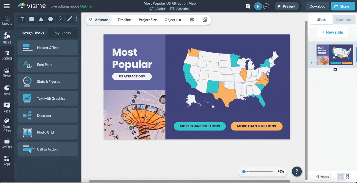
In this template, the data visualizes the most popular attractions in the US and can be adapted for your content. Some possibilities include your highest-selling locations or forecasted regions for new markets.

Get creative with your map design using this unique template. The neon colors stand out over the gray background and are accompanied by design elements that give this map graphic a unique personality. The legend is separated on the left and right of the map so that it's balanced and easy to read.
Aside from the region and the color-coded legends, include more data or information using icons inside circles. It’s a great way to depict overarching numbers that cover the entire area of your map or to explain other topics in your data.
Minimal maps are a great starting point for interactivity. This template uses circular labels for each region from which you can add interactive hotspots. A hotspot can be a small popup or as big as the entire slide, where you can include information pertinent to your map.
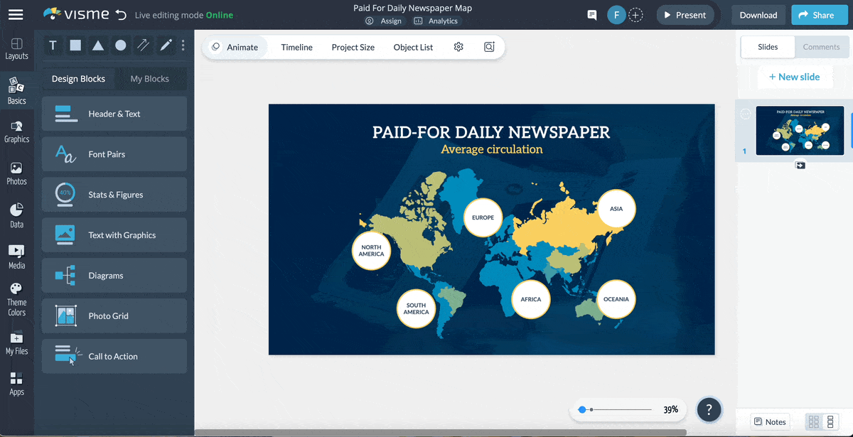
When creating maps with Visme, you can show countries, regions or the entire world. Furthermore, you can select which countries to show and which to hide. This map shows Europe and how many smart devices are used. Since this map is about smart devices, we’ve added a device mockup to help illustrate the story.
Visme also offers access to an integrated feature called the brand wizard. With this tool, you can generate branded templates in minutes, including maps and many other types of content.
Incorporate a detailed legend with values per country in your map, especially when the data has sub-data. Here’s an interactive suggestion: when you hover over a country on the map, make a highlight appear for this value on the left side legend.
The legend on this map includes five color-coded sections with value lists to visualize active users of several social networks in Asia. The legend is separated into social networks and highlights the number of active users per one for a group of countries.
Use a monochrome color palette for your map, like in this world forecast template. This example uses the color blue in different tonalities for every aspect of the data and white for the text. Use a gradient background to give the design a bit of depth.
Combine your map with dynamic fields to create tailored content. Create and set up custom fields that will help you make several versions of one template, saving time and effort.
Add creative design elements to your maps with textured borders and illustrative icons to pinpoint different data sets in your graphic. Add hover interactivity to your map to showcase numerical values per region or country.
In this map’s legend, each item is color-coded and visualized with a relevant icon. This technique makes your map more accessible and easy to understand. Furthermore, you can add animation to the icons for attractive interactivity.
Now it’s time to create your own interactive map with Visme. By following these four steps, you’ll have an engaging,clickable map in no time.
Here’s a quick tutorial video to give you an idea of how easy it is:
Log in to Visme to enter the dashboard. If you don’t have an account, you can create one easily with your Facebook or Google login. Signing up is free. There’s no need to enter credit card details.

To use the Visme map maker, you can either start with a map template or open a new or existing project and access the maps from the left-hand toolbar.
The maps in the Visme editor are housed in the data visualization section, where you’ll also find charts, graphs and data widgets, along with other types of data visualizations.

To start inputting and plotting your data, select the map on the canvas and click on Settings. In the Setting dialog, choose the Map Data tab and add your data to the relevant columns provided. Toggle the eye icons to show or hide a region of the map.
Select the color for each region by selecting the color block and changing it with the color picker. Click on the Add More Data button if you have more than two data points for any location.
Now it’s time to add interactivity. Click on the Map Settings tab and choose whether to show a popup on hover and the color you’d like it to be: dark or light.
The popup is a small legend that appears when the viewer hovers over a region in your map; it shows all the inputted data for that region.
Furthermore, you can add interactivity with the hotspots feature of the Visme editor. This will permit you to create custom hotspots for regions or legends. Hotspots can be popups or links to other slides or external pages.
Collaborate easily with your team to create maps that are both attractive and informative. Leave each other feedback and comments on the project with details to improve the map.

Ensure that all map data is correct and there are no errors in the content accompanying the map. Double-check that the fonts and colors in the map match the rest of the project by customizing the options in the Map Settings. Apply all the feedback from your team and finalize the map.
To share the map, you have numerous options inside the Visme editor. If the map is part of a larger document, share it as a digital flipbook, printable PDF or interactive HMTL5 file. You can also share them publicly or privately as a PDF or image file. Finally, you can publish to social media using the integrated social media scheduler.

Do you still have questions about interactive maps? These frequently asked questions will help clear your doubts.
The three most essential things on a map are: distance, direction and symbol. With these elements, you can:
Interactive maps use GIS (Geographic Information System), JavaScript, HTML5 and map APIs.
GIS is used for storing, analyzing and managing spatial data. Javascript and HTML5 are employed for developing interactive features in web-based maps, and integrations with map APIs enable developers to enhance functionality and access additional data layers.
Visme is another great technological tool for creating interactive maps. Geographical data is mapped seamlessly, thanks to a professional drag-and-drop interface and integrated map APIs.
For an interactive map to be truly effective, it must have a user-friendly interface, provide accurate data and offer customization options.
An intuitive design allows users to navigate and interact with a map easily, and reliable and up-to-date information ensures the map’s utility and credibility. Finally, an excellent interactive map allows users to tailor the display to their specific needs, promoting a personalized and efficient user experience.
Visme has all the features you could ever need for a full interactive map experience. Not only does it offer intuitive map creation, but you also have access to limitless design elements to create projects with maps as part of the content.
An interactive map can make your projects more impactful, memorable and unique. They also support informed decision-making with practical and intuitive data visualization.
Creating maps with Visme is easy and straightforward. All you need is a Visme account, the relevant map data and a few minutes. The pre-designed map templates give you a solid foundation to work with, and the design options offer endless possibilities.
Aside from maps, Visme also offers a variety of data visualization solutions for businesses, marketers and data enthusiasts. Choose from a large selection of charts and graphs, data widgets, arrays and many more data visualization tools.
Visme is more than just an interactive map maker. It’s an all-in-one content authoring tool that’ll help take your business to new heights. Try it out today.
Design visual brand experiences for your business whether you are a seasoned designer or a total novice.
Try Visme for free