23 Trusted Tips for Delivering a Conference Presentation

Pulling off a conference presentation that resonates is harder than most people admit.
You’re expected to read the room and deliver your tailored message with confidence, all while keeping your audience engaged.
That’s a lot of pressure, and even experienced speakers struggle with it. A Mindful Presenter survey found that 82% of speakers finish a presentation wishing they had done more, even the seasoned ones.
This guide will help you make that change. Inside, you’ll find 23 expert-backed strategies to plan your content, improve your slide design, sharpen your delivery, and present with confidence.
You’ll also get customizable presentation templates to jump-start your next deck without starting from scratch.
If you’d like a quick head start, watch this short presentation tips video:
Table of Contents
- How to Prepare Your Presentation for a Conference
- How to Design Your Conference Presentation
- 3 Pre-Presentation Preparation Tactics
- 6 Presentation Delivery Techniques to Use
- 4 Post-Presentation Tactics
- Conference Presentation FAQs
Quick Reads
- Strong presentations begin with mental and physical preparation: transforming fear into fuel, adopting a service mindset, rehearsing with others and using physical routines to manage nervous energy.
- Effective conference slides focus on clarity, simplicity and strong visuals. Keep text minimal, highlight one idea per slide, use clear, accessible design and purposeful images and select the right data visualizations to help your audience process and retain your message.
- To ensure a good presentation, tailor your content to your audience, script a compelling opening, and plan for potential challenges.
- Make your presentations memorable with delivery techniques such as pattern interrupts, callbacks, cliffhanger questions, strategic pauses, verbal highlighters and emotional triggers.
- Strengthen connections, reinforce your message and build your reputation with post-presentation tactics such as following up promptly and monitoring audience feedback on social media.
- Visme offers a wide library of customizable conference presentation templates and robust features to help you create polished and awe-inspiring presentations.
How to Prepare Your Presentation for a Conference
Before your slides or speech, your mindset is the first stage to master.
Here are some strategies to help you prepare mentally for a presentation.
Transform Fear Into Fuel for Preparation
The nervousness you feel before a conference talk is not a sign that you are unqualified. It is a signal that the moment matters and deserves your full preparation.
Chris Anderson, curator of TED, explained in an interview that:
“The best way of managing fear is preparation and amazingly, unlike other types of public appearances that involve major planning and rehearsals (for example, theatre), people don’t often prepare enough for talks. The right preparation and the right rehearsal really matter.”
In essence, the antidote to fear during presentations is thorough preparation.
Here’s a simple way to build a preparation map:
- What does my audience need most? Write down the top three things your audience cares about or struggles with. This shifts your focus from your feelings to “How can I help?” and immediately calms self-focused anxiety.
- What is the one message I want them to walk away with? Choose one sentence that captures the core idea of your talk. This becomes your anchor. If nerves make you feel scattered, this line gives you something solid to return to.
- The transformation you want to create
Describe the shift your talk should produce (from confused to confident, unaware to capable, resistant to open, etc. ).
With this, you can approach every presentation with a calm, structured sense of control.
Practice in Full, Thoroughly and in Front of Real People, Not a Mirror
Many presenters underestimate how much rehearsal is needed and then wonder why their talk doesn’t land. Chris Anderson emphasizes this:
"The single most important thing someone can do for a talk is to plan three or four rehearsals in front of people who are like the audience who will be receiving it."
Here’s how you can perform a three-time rehearsal:
- Do a full solo run with your slides: Deliver your oral presentation from beginning to end without stopping to fix anything. This shows you where you stumble, where you rush and where your ideas feel thin. Record yourself practicing using Visme’s presentation recording tool so you can review your delivery afterward. It’s the fastest way to spot habits, filler words and pacing issues that would otherwise slip into your final performance.
- Rehearse in front of a real person: Share your slideshow with someone who mirrors the type of audience you’re preparing for—a colleague, friend or mentor. Deliver it exactly as you would on stage and ask them to note moments where they felt confused, disengaged or particularly interested. Their reactions reveal what genuinely resonates and what needs strengthening.
- Do a final run incorporating their feedback: Tighten the weak spots they flagged, then do one last full run within the allotted time. This locks in flow and pacing so your delivery feels natural and smooth on stage.
Create a Pre-Talk Physical Ritual to Discharge Anxiety
A little anxiety before a conference talk is normal. What matters is having a short routine that helps your body release tension and puts your mind in a calm, steady place.
Try these exercises:
- Breathing exercise: Slow breathing tells your nervous system that you are safe.
- Try this: Take a deep breath and count 1 to 10 in a relaxed mood. Repeat this four or five times. Your heart rate drops and the rush of adrenaline starts to settle.
- Body movement exercise: Nervousness often shows up as physical restlessness. Instead of fighting it, channel that energy with these movements:
- Shake out each of your hands and count 1 to 4
- Roll your shoulders
- Take a quick walk around the hallway
- Posture exercise: Your body influences your mindset. Stand tall with your shoulders open, hands on your hips, legs apart and hold it for 10 seconds. This posture signals readiness and helps you feel grounded before you walk on stage.
Anticipate Possible Questions
According to the Mindful Presenter survey, one of the top causes of presenter nervousness is the fear of being asked a question they don’t know how to answer. If you feel the same, the key is to anticipate questions and spend as much time preparing for them.
This doesn’t mean memorizing hundreds of exact answers; that’s impossible and unnecessary. Instead, use these methods to identify the most likely questions:
- Use the Socratic questioning method: Ask yourself, “If someone were to disagree with me, what would they say?” Then prepare key points to address these potential objections.
- Focus on the weakest points of your presentation: Any debatable conclusions, evidence that’s less robust, or research that could be questioned are likely targets during Q&A sessions.
- Walk through your slides: Identify where someone might challenge your data, assumptions, or reasoning. Write down the likely questions and follow-ups for each major point.
- Rehearse with others: Encourage your practice audience to ask tough questions. If certain questions need extra data or explanation, prepare additional slides or resources in advance.
Once you’ve identified the likely questions, plan your answers and gather the resources you’ll need. This kind of preparation makes answering questions feel easier, helps you respond with confidence, and allows you to stay in control of the discussion.
How to Design Your Conference Presentation
Now that you’ve set the foundation, the next step is to start designing your slides. The way you design them plays a major role in how your audience perceives you and how engaged they remain throughout your presentation.
Here are a few expert tips that’ll make your PPT presentation design very impressive:
Keep Slides Concise and Focus on One Concept at a Time
Take a quick guess at what’s wrong with this slide:
The first problem you likely noticed is the heavy wall of text.
Garr Reynolds, author and presentation expert, calls this a slideument.
When we are experts in a topic, we fear leaving out anything we consider important, so we overload the slide with far more information than the audience can handle.
Dr. John Medina, molecular biologist and author of Brain Rules, explains why this backfires:
“We cannot multitask. The brain is biologically incapable of processing attention-rich inputs at the same time. It focuses on ideas in sequence, one at a time.”
This means people struggle to read dense text while also listening to the speaker.
To help your audience process ideas in a natural sequence, avoid packing too many points into one slide. When each slide has minimal text and enough breathing room, the audience processes information with ease and does not feel overwhelmed.
Alejandra Mariscalez, Visme’s design manager, also emphasized this:
“If you need to present a large amount of content, divide it across multiple slides rather than condensing everything onto one. This approach prevents the design from feeling cluttered or overwhelming.”
However, avoid going overboard with too many slides, especially when presenting to graduate students or even executives who have limited time.
A practical guideline for keeping your slides concise is Guy Kawasaki’s 10-20-30 rule.
The rule says your presentation should have 10 slides, last no more than 20 minutes, and use at least a 30-point font.
Why 10 slides? A typical human brain, even one belonging to a venture capitalist, can only handle so many concepts in one sitting—10 slides is just the sweet spot.
Here's a Visme presentation template with just a few slides.
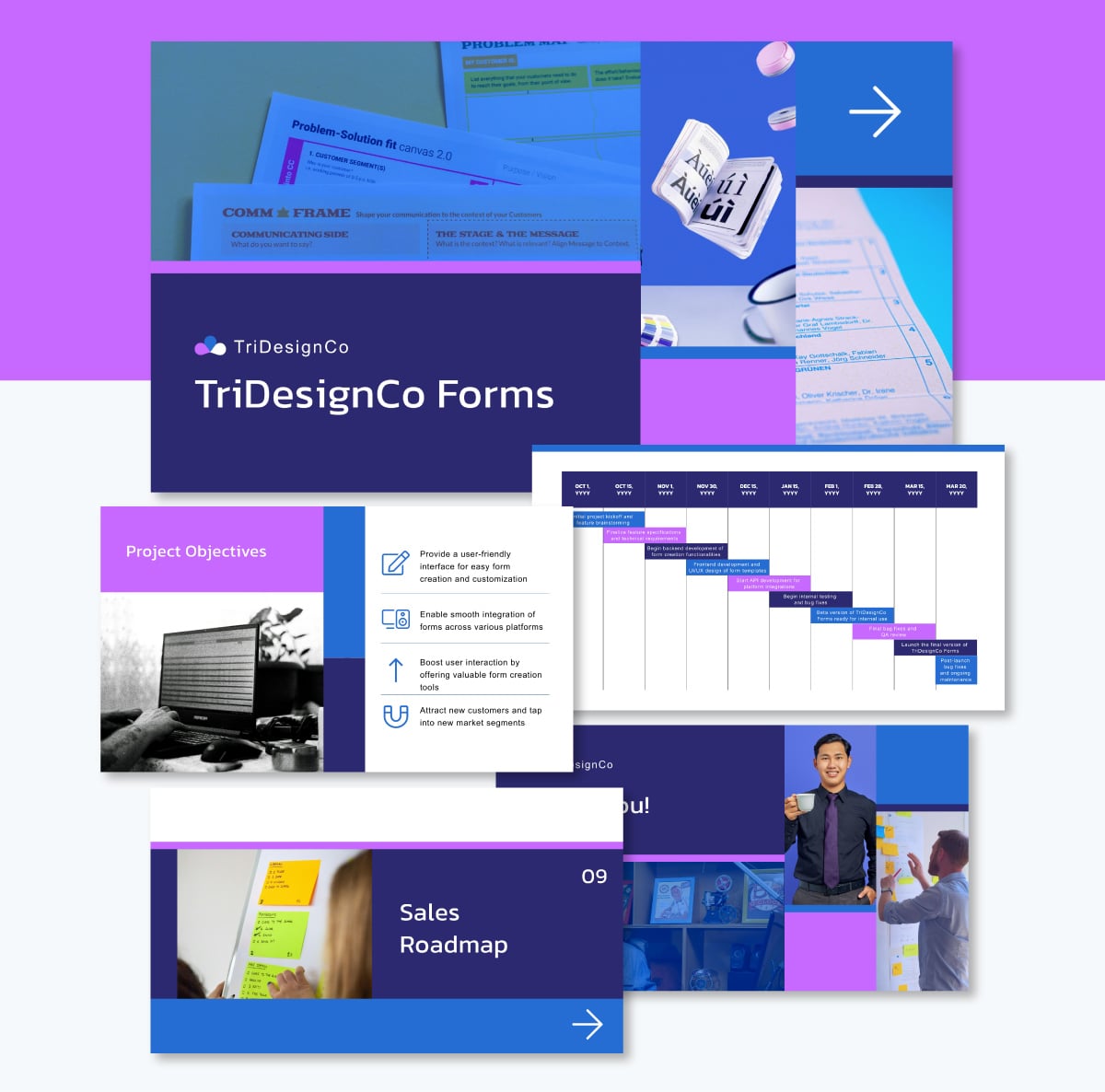
Visme offers more of such presentation slide templates if you want consistent layouts without the clutter.
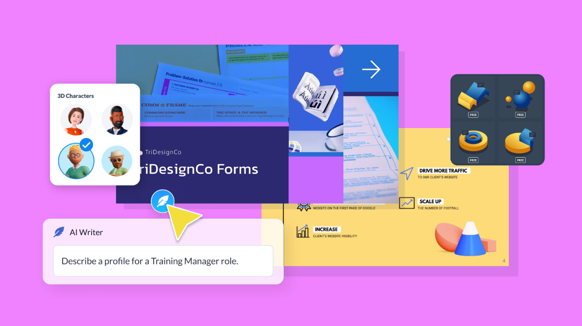
If you struggle to make your text concise, try the Visme AI writer. Select the text box you want to refine and click the feather icon. The tool will appear on the left. You can enter a prompt such as “make this more concise and easier to read”. The tool will rewrite it instantly.
Design for Readability and Accessibility
One other thing you must have noticed with our bad slide example above is the lack of sharp contrast between the background and the text color.
This kind of low-contrast design is common among presenters who overlook readability and accessibility.
To avoid this mistake, always ensure a strong contrast between your text and background. A white background with black text is almost always reliable, though you can dim the background by about 10% when presenting to photosensitive audiences.
Never use red and green and blue-yellow together, as they're problematic for colorblind viewers. To play it safe, choose from Visme’s colorblind friendly palettes.
Read this comprehensive guide to learn more about these colorblind friendly palettes.
Choose sans-serif fonts like Arial, Calibri or Helvetica for on-screen readability. Avoid curly, decorative fonts or those that mimic handwriting; they're significantly harder to read on screens. For font size, aim for 28pt as a baseline, adjusting slightly larger or smaller as needed.
Here’s what Yetla, Designer at Visme, says:
“Every presentation deck should be clear and readable, with a structured layout, a clear information hierarchy, two or three fonts and a consistent color palette.”
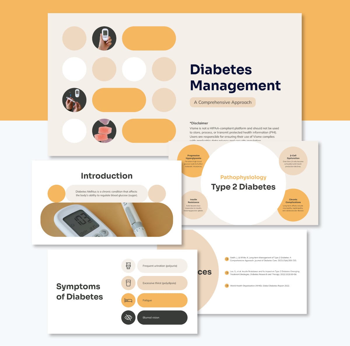 Pro Tip: You can quickly apply your brand colors, fonts, and logo across every slide using Visme's brand kit. Just paste your website link, and the tool will automatically pull in your brand elements. You’ll even receive branded template suggestions for future designs.
It’s also important that your design is accessible to everyone, regardless of their physical or mental abilities. Remember that many audience members will view your presentation on a laptop, where smaller screens and lower brightness can make low-contrast text harder to read.
I recommend using Visme’s accessibility checker to assess the color contrast in your design. The tool will notify you of areas in the design with a low ratio so you can fix them easily.
Read this comprehensive guide to learn more about how to create accessible presentations.
Make Data Easy to Read by Focusing on Clarity and Contrast
Does this data infographic help you understand the data better?

Probably not.
Garr Reynolds emphasizes that “the only rule for displaying data—besides telling the truth—is simplicity”.
One way to simplify your data slide is to add a sentence-form title across the top that tells your audience exactly what they should notice. (This is one thing our bad infographic example actually got right.)
Use contrasting colors to highlight the most important data point. For example, make one bar in a bar chart stand out in your brand color while leaving the others neutral.
Avoid complicated charts and infographics, even if they already exist. Find ways to make visuals more digestible. Simplify the design, clarify the message and make it easier for your audience to understand.
Also, choose the right type of visualization for your data, such as bar charts to compare quantities across categories and pie charts to show proportions or percentages of a whole.
In contrast to our bad example, this template below uses the right visual type, employs consistent shades to show differences and includes clear headings that tell the audience exactly what the slide is about.

Fortunately, Visme offers over 44 types of data visualizations, including 2D and 3D charts, graphs, tables, and maps, so you can always select the right format for your data story.
Leverage the Power of Visuals
According to Dr. Medina’s Brain Rule #10, we remember only about 10% of what we hear after three days. When a relevant image is added, recall skyrockets to 65%.
So why create presentation slides without compelling visual aids? To make your message stick, aim to use more images and fewer words.
But more images only help if they’re used well. Presenters sometimes throw multiple photos onto a single slide, leaving the audience squinting or unsure where to focus.

A better approach is to use one photo per slide when the visual carries the message. For emotional impact, make it large. Full-bleed layouts that stretch edge to edge are especially effective. Here’s an example:

This doesn’t mean every slide needs a photo, but when you use one, make it bold.
With Visme, you never run out of visuals. Browse millions of stock photos, generate custom imagery with the AI image generator or import your own. You can also refine any image with Visme’s AI editor to sharpen, blur and adjust for clarity.
Pro Tip: Make sure to reveal your points gradually so your audience stays with you moment by moment. Visme’s entry and exit animations make this effortless. Use clean effects like fade-ins and fine-tune the timing so each idea appears exactly when you’re ready to emphasize it. If you need to return to a point and emphasize it, use animation to highlight it with shapes like circles.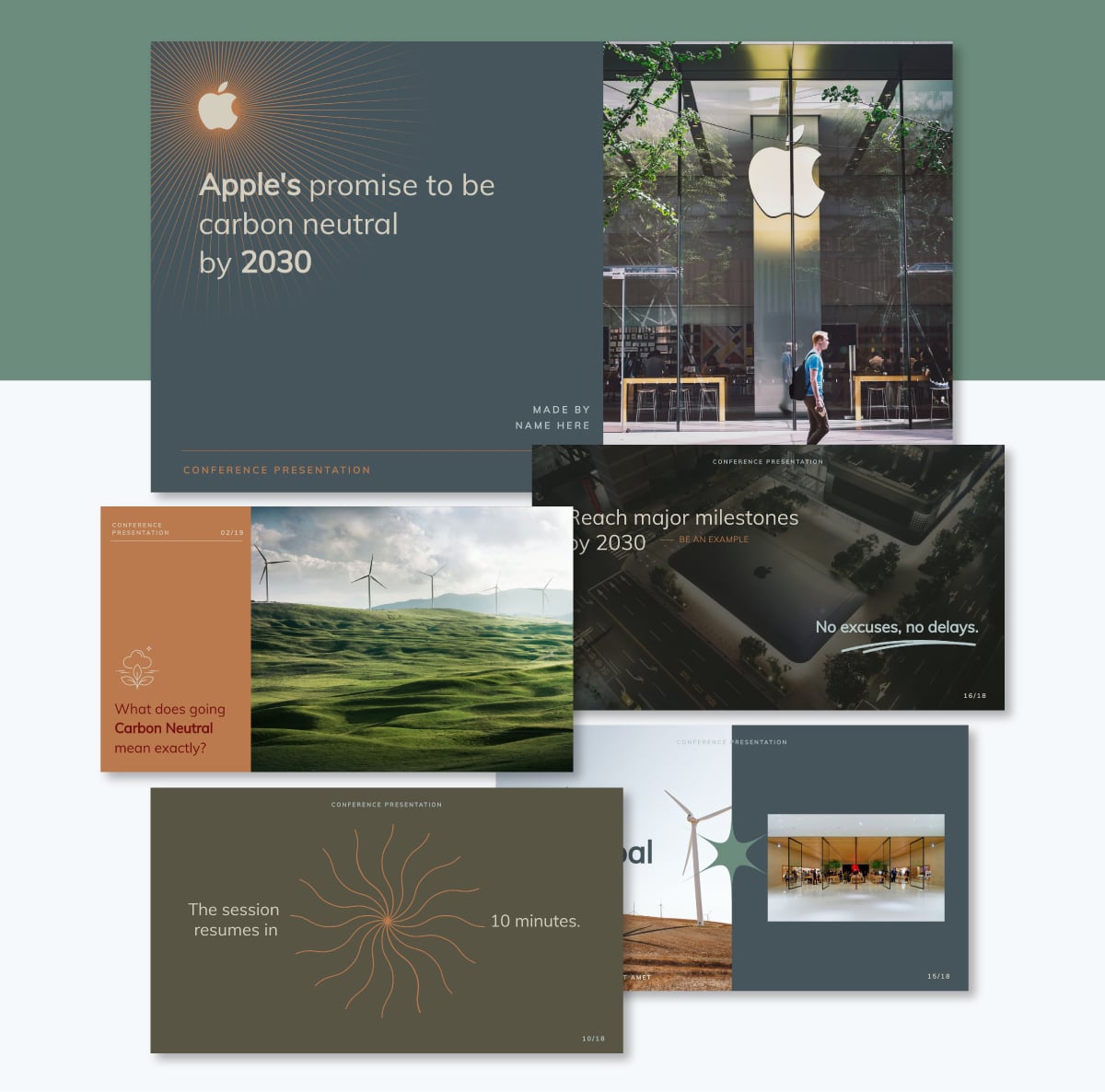
3 Technical Pre-Presentation Preparation Tactics
In this section, we'll look at practical pre-presentation tactics to help you shape your presentation content for your audience and deliver with confidence.
1. Distill Your Core Message for Your Specific Audience
When planning your PowerPoint presentation, you need to start by considering your audience’s baseline knowledge.
For instance, presenting SEO at a general marketing conference requires a different level of detail than presenting at a technical SEO summit. Focus on what they can realistically absorb within the given time limit and distill your message around that.
Then make your message easy to absorb. An adult learning principle called “making meaning” explains that people struggle to learn something new if they have nothing to connect it to. To create connections:
- Make it relevant to what matters to them: work, community or society at large.
- Use social math to make numbers relatable. Instead of “12 million people,” say “enough people to fill every seat in Madison Square Garden 600 times.”
- Use relatable examples, anecdotes, stories or metaphors to explain concepts.
2. Script Your Opening With a Three-Part Structure
Most speakers overlook the intro, but it’s one presentation skill that instantly affects whether your audience pays attention.
Dr. Medina explains why:
“A compelling introduction may be the most important single factor in the success of your mission.”
Here’s a three-part format that works well.
Start With Impact
Most presenters begin with polite greetings and a list of experience and qualifications. Simon Sinek calls this a mistake because the speaker ends up focusing on credentials instead of connection.
Instead of that cliche opening, begin with something that pulls people in: a question, a surprising fact, a quick story or a clear problem they care about.
Introduce Yourself
Once you have your audience's attention, then introduce yourself. Keep it tight with this simple formula:
"My name is (NAME) with (COMPANY) and I help (WHO) do (WHAT)."
For example: “My name is Allens Jones with Zebra Health Center and I help clients improve their skin health through customized treatments and education.”
Keep your intro slides simple. Show your photo only or include a short caption at best. Let your spoken introduction carry the details.

State Your Key Message
Give the big picture before the details. Dr. Medina said that when we provide the big picture before getting into the details, it increases people’s understanding by 40%.
If someone walked away from your talk remembering only one thing, what would it be? Put that message on a slide in one clear sentence.

Place this key message twice in your presentation: once near the beginning, after your introduction and once near the end, before your question slide. Repeating it helps anchor the idea.
3. Build Your Emergency Response Plan
Things can go wrong during your presentation. So, plan intentionally for it.
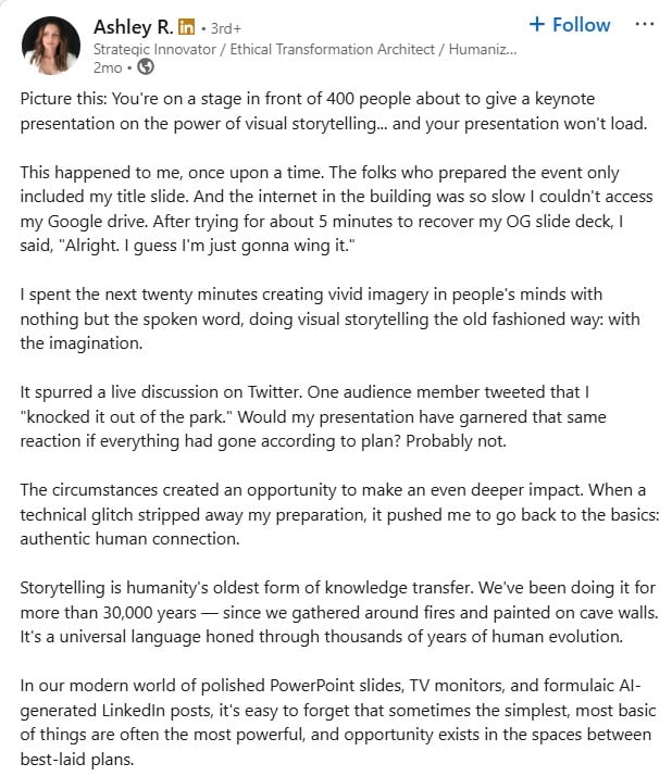
Ashley R. shared a perfect example: the organizers failed to upload her full slide deck and couldn’t access her Google Drive either. She had to present with no slides at all, yet still delivered an excellent session:
Here are a few scenarios you can prepare for ahead of time and what to do:
- If you lose your place, pause, breathe and say, “Let me reframe that.”
- If your demo fails, keep a screenshot in your deck and walk them through what should happen.
- If someone asks a hostile question, acknowledge the concern, then bridge back to your main point.
- If your slides won’t load, keep a backup on a USB and be prepared to present without slides entirely.
Having these protocols in place removes the stress of deciding what to do in the moment. Instead of panicking, you follow your plan and move forward with confidence.
6 Conference Presentation Delivery Techniques to Use
Now it's time to deliver what you've been preparing for. Here are some techniques you can employ to make your conference paper delivery engaging:
Pattern Interrupt
Few things feel as discouraging as watching your audience slip into checking their phones or mentally drifting off.
One smart strategy to snap them back into attention is by pattern interrupting. It simply means breaking the predictability of your delivery with a shift that re-engages the room.
Justin Patton uses this masterfully in his presentation. At several points, he changes the audience’s state so they stay energized throughout:
- Around 5:40, he uses call-and-response.
- At 13:00, he prompts the audience to interact with each other.
- 26:20, he shifts into a physical demonstration by sitting.
- And he continues interrupting the pattern at 30:56, 34:36 and 45:47.
Even though the session is long, it never feels boring because he keeps shifting the rhythm and drawing people back into the experience.
Other pattern interrupts you can try include:
- Ask a surprising question.
- Use a quick poll.
- Change your stage position.
- Share an unexpected story.
- Bring out a prop to illustrate your message
The Callback Technique
You’ve probably noticed speakers saying things like, “This brings us back to the story I opened with” or “Remember when I said earlier…” That’s the callback technique — the deliberate act of referring back to an earlier point in your presentation.
According to Gerry Sandusky, communication coach and founder of the Sandusky Group:
“Comedians use this technique all the time. If something in their routine lands big or flops, they revisit it throughout the performance. If early in your presentation, you say or do something that really resonates. If a moment in your presentation truly resonates with the audience, using a callback shows you’re in the moment and not merely delivering a canned presentation.”
Beyond making your presentation feel dynamic, callbacks tie threads together so the message feels whole. They show that you’re not just listing points, you’re weaving a narrative with intentional design.
The Cliffhanger Question
You already know the power of a strong opening. What you may not be using intentionally is the cliffhanger question.
It is a familiar tactic from storytelling: pose a compelling question, then hold back the answer long enough to create healthy tension and keep the audience mentally leaning forward.
For example, in his video, Chris Caldwell opened with the quote that ends with the line.
“Tomorrow is too late,” then asked, “But what if today is actually too late?” Instead of answering immediately, he promised five personal stories that would reveal why.
Such techniques keep the audience engaged because they want closure.
You do these with a story or a question your audience cares about. Signal you'll return to it ("Hold that thought" or "We'll come back to that"), then circle toward the answer as you progress through your points. By the end, resolve it naturally or with a direct explanation.
Strategic Pauses
If you’ve ever lost your train of thought mid-presentation or forgotten your next line, you know the instinct: panic and fill the silence with “um” or “ah.”
Most presenters do it. But here’s the secret: pauses are your friend. Embracing them puts you in control, gives your brain a moment to catch up and helps your audience refocus, because silence naturally draws attention.
The most effective presenters don’t just pause when they stumble; they use pauses intentionally. Pauses can:
- Give listeners time to process what you’ve said.
- Emphasize key points
- Signals composure and authority, especially when supported with purposeful eye contact.
For example, in this video, Renfew uses half- to one-second pauses, especially after rhetorical “what if” questions. These short pauses create rhythm and give the audience space to reflect.
You can extend your pauses for up to five seconds for dramatic effect or to highlight emotional moments.
The Verbal Highlighter
If you struggle with boring, monotonous presentations, verbal highlighters are your friend. The concept comes from Carmine Gallo’s Talk Like TED, where he explains:
"The verbal equivalent of a highlighter is to raise or lower the volume of your voice, change the speed at which you deliver the words and/or use short pauses to punch key words."
Use this technique intentionally: vary your pitch, volume and pacing in alignment with the emotional weight of what you’re saying. These variations emphasize key points and make your talk more engaging.
Example: "The difference between companies that succeed and those that fail comes down to one thing..." (pause, raise your voice a bit) "...execution" [pause, return to normal volume].
Emotional Triggers
If your slide presentations convey information effectively yet it's easily forgettable, it’s often because they lack emotional weight.
Dr. Medina notes that when we experience an emotionally charged moment, the amygdala releases dopamine, which boosts attention and memory. In simple terms, emotion helps your audience remember what matters.
You don’t need dramatic stories to do this. A short anecdote, a relatable scenario or a moment of tension or curiosity is enough.
For example, instead of saying, “Employee turnover is expensive,” tell a quick story about Sarah, the high performer who left after feeling unnoticed. The point becomes more human and far more memorable.
4 Post-Presentation Tactics
You’ve delivered your presentation. What’s next? Don’t just head home and wait for the next opportunity. Here are the key steps to follow after your talk.
Network After the Event
Don’t rush out right after your presentation. Staying a little longer gives you a chance to gauge how people actually felt about your session and hear immediate reactions.
Some attendees may have questions they were too shy to ask publicly and seeing you mingle makes you more approachable.
This follow-up interaction helps you build stronger connections and reinforces the impact of your talk.
Follow Up Within 24-48 Hours
Event organizers typically send thank-you emails within 24 to 48 hours while the event is still fresh in attendees’ minds. Use the exact timing for your own follow-ups with individual connections and the organizers.
Express appreciation, ask for feedback and include a short survey if you want more structured responses. Send any promised resources right away. Waiting for longer means fewer people remember the interaction and makes you appear less committed.
Monitor Social Media Immediately
Check social platforms as soon as possible to see what people are saying about your talk. Look for the event hashtag and skim comments, mentions and shared clips.
This real-time feedback shows what resonated, what caused confusion and which ideas are gaining traction. It also lets you engage with attendees while the conversation is still active.
Reflect and Evaluate
Take time to review all feedback and reflect on your performance. Note what you did well and what you want to improve. If a recording is available, watch it to evaluate your delivery and identify patterns you may not notice in the moment.
This isn’t about criticizing yourself. It’s about reinforcing your strengths and addressing areas for growth. Becoming a strong speaker is a gradual, ongoing process.
Conference Presentation FAQs
A conference presentation is a structured session where a speaker shares research, insights or expertise with an audience at a professional event.
The 5-5-5 rule suggests using no more than five words per line, five lines per slide, and five slides with dense content to keep presentations clear and readable.
The best sentence to start a presentation is one that grabs attention, such as a question, a surprising fact, a short story or a clear problem your audience cares about.
Introducing yourself in a conference presentation involves briefly stating your name, your role and who you help or what you focus on before moving into your main message.
Most conference presentations last 10 to 20 minutes, with some formats allowing up to 30 minutes depending on the event and session type. Check the conference agenda or guidelines for an idea of what length conference organizers expect the presentation to be. And remember to leave a little buffer at the end for panelist discussion or audience questions.
Create & Present Amazing Presentations with Visme
Great presenters are not born confident. Nearly all of them had moments when they struggled, doubted themselves or delivered talks that fell short. What changed was consistent practice and steady refinement.
You can achieve the same progress by applying the expert strategies outlined in this guide. And remember, your content is only half the story.
Your slides also need to work hard for you and leave a strong impression.
With Visme, you can jump-start your designs using thousands of professionally crafted presentation templates across education, health, marketing, HR, consulting and more. Access a wide range of design assets, data visualizations, interactivity tools, collaboration tools, analytic tools, AI-powered tools and more.
And if you’re starting from scratch and need design inspiration, let Visme’s AI Presentation maker do the heavy lifting.
Ready to start creating memorable presentations? Start designing with Visme’s presentation maker today.
Create Stunning Content!
Design visual brand experiences for your business whether you are a seasoned designer or a total novice.
Try Visme for free


