


Typography Infographics: 12 Inspiring Examples & Techniques

Climate change is a heated topic. It’s on everyone’s mind. Unfortunately, the global warming controversy still rages on--especially in politics--and this is why data visualization is one of our best allies in this debate.
We’ve scoured the Web to find the best visualizations on climate change facts from the last few years. All these are incredibly educational and quite eye-opening. Every visualization in this list has a link next to it which will take you directly to the original study or research project.
The main purpose of the COP conference in Poland this year was to finalize the Paris agreement. The hope is that with the right amount of action towards change, global warming will not rise by 2.0 degrees or even 1.5 degrees.
At the rate global warming is rising now and with no great actions being taken, the global changes will be drastic for humans and all living creatures. The WWF created this visual infographic to show the possible outcomes, and raise a clarion call to all big companies to step up their climate efforts.
Scientists have confirmed that carbon emissions during 2018 have peaked to dangerous levels, way above what will keep the world climate stable. Scientists presented the data at the recent COP24 climate conference in Poland.
This visualization represents how much of the carbon emission “budget” has been used and how much is left. Click on the image source link to see the interactive version.
The visualization below is a gif showing how the ice in the Arctic cap has diminished in the past twenty years. The lowest record point was in 2012. The data used for this visualization was sourced from the National Snow and Ice Data Center. It was created for the BBC science department.
Icecap melting includes not only the melting of the ice but also the melting of permafrost which also releases gases into the atmosphere.
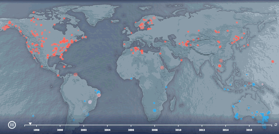
Antti Lipponen, a research scientist from the Finnish Meteorological Institute created this bubbling visualization about temperature anomalies. Blue circles show temperatures below normal and red ones show above normal.
The data used was from the NASA GISS, Land Ocean Temperature Index. This type of visualization borders on contemporary art and is the kind of thing that should go viral.
As cold areas warm up and warm areas heat up even more, things are changing in the way our food is sourced. The temperature changes affect the kind of sea life that thrives in certain areas and the types of crops that grow.
This visualization shows the projected wheat yield, specifically in areas where it wasn’t as large before. By clicking through this link to the Bloomberg article, you can find other visualizations about how climate change is messing with your food.
The following visualization is part of a study by Verisk Maplecroft, a global risk analytics, research, and strategic forecasting company. It shows how fast-growing cities are more vulnerable to climate change.
The red dots at the bottom, which are the cities at a higher risk are mostly in Africa. The “safer” cities are located in Europe and the Americas. The cities at greatest risk are the ones that grow exponentially without proper urban planning and little to no environmental infrastructure.
Ed Hawkins, a climate scientist at the University of Reading, created this colorful spiral chart a couple of years ago and it went viral. He updated it this year with new information, further proving how global temperature is a real problem.
The red outer circles represent the worrisome limit of temperature rise, 1.5 and 2.0 degrees. It also shows how during the last few years, the warming has increased in relation to previous years.
This visualization was created by Ed Hawkins, the same data scientist behind the viral spiral visualization about global temperatures. The approach behind this data viz was to take a minimalistic stance which didn’t need to show any numbers or figures.
This beautiful climate change data visualization has taken the world by storm. It's been turned into wall art and even neck scarves.
The Milken Institute School of Public Health created this graphic back in 2015 as a comparison between two data groups. In this visualization, the red circles represent countries which emit the most carbon dioxide.
The blue circles represent the countries which are the most vulnerable due to carbon dioxide emission. This data viz is not from this year, but it’s still very impactful, not to mention beautiful. The data for this graphic was sourced from the Carbon Dioxide Information Analysis Center.
This visualization is a visual summary of a larger project by a team of Italian data visualization scientists and artists. Their project, The Point of No Return (featured in the next example) was one of the winners of the Information is Beautiful Awards in 2016.
This visual summary showcases one of the sections of the larger project, specifically how different countries fund the efforts to not reach the point of no return, and which countries are benefiting from it.
The purpose behind this scrolling visualization is to show how the world is reaching the point of no return and how it’s becoming increasingly hard to convince the deniers. The data is sourced from the IPCC and COP conferences, and the UNFCC.
This visualization is an important addition for science and climate educators. It can be used as a conversation starter between students.
Data visualization design lab, Flourish, created this data point visualization with a spreadsheet about temperature differences through the years. The purpose was to show the freezing winter of 2018 in relation to the rest of the world.
The data demonstrates temperature anomalies in different locations throughout the entire globe. Climate change deniers used the Big Freeze of 2018 as proof that climate change was a hoax when ultimately it was actually proof of how the world is in real trouble.
One of our favorite data artists, Federica Fragapane, also created a data visualization of carbon dioxide emissions. This one was specially created for media outlet Corriere della Sera – La Lettura.
The visualization on climate change facts demonstrates the amount of annual carbon dioxide emissions in 39 countries between 1992 and 2012. Her particular style of data art makes any information look beautiful and interesting. You can see her other data work in our collection of the best data visualizations of 2018.
Designer Pietro de la Rosa works with automotive and engineering but also dabbles in data viz. He used data from the Actuaries Climate Index to create this video visualization about sea level anomalies in the coastal USA.
His idea for creating this data visualization was to help raise awareness about the state of climate change. In a time when climate change deniers are hindering positive progress, more awareness is needed to actually make a change.
Weather Underground created this infographic in 2013 with data published by Marcott et al in Science Magazine. It is a visual representation of the most important factors regarding climate change and global warming.
This infographic is visually beautiful and colorful. It’s perfect for sharing on Pinterest to raise awareness about the point of no return and what the Earth is facing.
This poster combines data and design to raise awareness of the effects of global warming. Designer Shangning Wang, used data from NASA databases to create this infographic poster. His purpose was to show how design can help educate and influence the future of the Earth.
Which of these is your favorite infographic on climate change facts? If we missed one you think should be on the list, don't hesitate to share it with us in the comments section below.
Design visual brand experiences for your business whether you are a seasoned designer or a total novice.
Try Visme for free


![How to Make an Interactive Infographic [+Templates]](https://visme.co/blog/wp-content/uploads/2023/11/How-to-Make-an-Interactive-Infographic-Quick-Guide-8-Customizable-Templates-Thumbnail.jpg)


