


Typography Infographics: 12 Inspiring Examples & Techniques

How does good visual balance affect the way we see and perceive things? When a visual design isn’t balanced, we often feel like something’s “off” but can’t put it into words.
Achieving visual balance is all about how things—objects, colors, subjects— relate to each other in the composition as a whole. Symmetry and asymmetry are two of the main tools at your disposal for creating a balanced graphic design that will delight instead of put off.
In this guide, we’ll look at examples of asymmetrical balance and tips on how to achieve it. Plus, you’ll find a collection of Visme templates using asymmetrical balance that you can customize right away.
But why are we talking about asymmetry when symmetry is seemingly more perfect and grounded?
Well, because symmetry can get boring. Asymmetrical balance feels organic, fluid and alive.
Do you want to learn more about design principles to help you design, even if you don’t have design skills? Check out the video below:
In design—and in art—there are visual rules that help the artist or designer create visually appealing or even beautiful compositions. Composition is a vital design skill that plays a part in every project, regardless of the scope. When a design has a well-achieved composition, the viewer feels a subconscious connection through emotion and association.
One of these rules of composition is called visual balance, and it’s possibly one of the most important. So significant that if a design—photograph, piece of art or architecture—doesn’t have a good visual balance, everything else goes out the window.
One of two essential tools to achieve visual balance is asymmetry, specifically asymmetrical balance; the other is symmetry. Think of a seesaw; on the top left is a skinny giraffe wearing a scarf blowing to the left behind it, and on the bottom right is a thick hippopotamus with its rump on the ground.
The center mechanism of the seesaw is a point of balance for the asymmetry; the long neck of the giraffe and its scarf balance out with the overflowing rump of the hippopotamus. When elements in the canvas are not symmetrical but instead balance each other out through color, shape, size and texture, this is asymmetrical balance.
Let’s do a little exercise.
Get a pen and paper and draw three shapes; a circle, a square, and a blob. Now draw a line that runs through the center from top to bottom on the three shapes. Now, if you were to fold the shapes along the line, the circle and the square would fit perfectly on themselves, but the blob would not. This line is the line of symmetry, the circle and square are symmetrical shapes, and the blob is asymmetrical.
Symmetry and asymmetry are technical opposites. The concept of symmetry is a characteristic in which an object is the same on both sides, folding over on the line of symmetry, just how you saw in the exercise above.
There are three main types of symmetry;

Symmetry in design and art is more evident than asymmetry. When you see symmetrical things, they feel stable, grounded, complete. For example, movie director Wes Anderson is famous for using symmetrical compositions in his movie scenes. He achieves such deep and delicious symmetries that they’ve caught the attention of movie buffs and mathematicians alike.
The main difference between symmetrical and asymmetrical balance is how it’s perceived. Symmetry is more structured than asymmetry in the sense that there’s a rule to be followed. There must be at least one line of symmetry for achieving symmetry, a place where the objects reflect, rotate, or translate. That’s why symmetrical balance is more challenging to accomplish than asymmetrical balance.
Asymmetry is more about the overall feeling of the artwork or design. The visual balance in asymmetry has a looser sensation, less structured than perfect symmetry. It also helps in achieving a clear visual hierarchy.
But is symmetry ever perfect?
In nature, symmetry is present in animals and plants alike, but it’s never 100% perfect. If you were to take a photo of only one half of your face and then reflect it side by side, it wouldn’t look like you anymore. That’s because even though our faces look symmetrical, they are unique on each side. The same happens with flowers, leaves, mushrooms; you name it.
Even if an asymmetrical balance doesn’t feel structured, grounded and perfect, it's more natural than symmetrical balance. It feels more real.
To better understand asymmetrical balance, you have to see it in action. Here’s a selection of asymmetrical balance in use on different visual niches.
Take note of how these make you feel; do they impart a sensation of balance and stability?
The Hokusai wave is a Japanese wood print that uses asymmetrical balance to tell a story of movement, action and intensity. Balance is achieved with the size and curve of the wave and the boats full of people diagonally underneath it. Also, a section of another wave on the far right balances out the movement happening on the left. The peak of Mt. Fuji in the background adds a touch of depth, further balancing the scene.
Magazine layouts are the perfect example of asymmetrical balance in graphic design. Two-page spreads designed with asymmetry make the content fun to read and enjoy. In the example below, there’s a diagonal sensation to the pages.
The header in the center leans towards the left and balances with the gray rectangle on the right. Likewise, the busy top left corner balances with the empty bottom right corner.
In illustration, asymmetrical balance is achievable when laying out compositions of the elements. Busy sections balance out with empty areas, gradients balance each other with backgrounds and textures.
The illustration example below uses angles, diagonals and color to create asymmetrical balance in the scenes. White and black areas don’t compete with the pink jacket; instead, the asymmetry makes it stand out.
Asymmetrical balance in packaging design makes products memorable. Using asymmetry in packaging design will make the overall design stand out, especially using contrasting colors that make an impact. The packaging design for the cans in the example below is an excellent example of asymmetrical balance using color and shapes.
The waves balance out with the straight lines and geometric font while also going around the can in an asymmetric design. At every angle, the design around the can is balanced and attractive.
Achieving asymmetrical balance in photography is a skill that needs practicing. Setting up a static scene that is balanced asymmetrically is easier than capturing objects in motion. Take a look at the photo below; the juxtaposition of the jumping and standing children creates a beautiful asymmetrical balance.
We’ll never know if the photographer took this photo knowing that this balance would happen, but you can be sure that they chose this one to print because of this visual effect.
Website design and asymmetrical balance go hand in hand in many ways. Even if the design above the fold is symmetrical, you can be sure that asymmetry starts to show as you scroll. This is because too much symmetry, especially perfect symmetry, gets boring quickly.
In the example below are many aspects of visual balance. The straight lines and black color on the left balance the curve and color on the right.
Architects also use asymmetrical balance to design unique buildings that don’t fit the mold and stand out. Creating asymmetrical balance with construction is trickier than with design because it involves a lot of engineering, so the asymmetrical design doesn’t interfere with the structure.
The building in the image below is the Walt Disney Concert Hall, designed by architect Frank Gehry is an excellent example of asymmetric architecture.
Are you feeling a bit asymmetric today?
Like, maybe you want to try out this technique in your visual projects?
Good news, here are some tips to help you achieve asymmetrical balance in your designs. We’ll use some of our Visme templates that use asymmetrical balance as examples. All these templates are available for you to use at any time inside your Visme dashboard.
Let’s get started.
The Z layout flow is the easiest way to achieve asymmetrical balance. The content starts on the left and then zigzags. Technically, a Z layout flow could be symmetric or asymmetric; it depends on the supporting elements and overall shapes. Here are some examples.
This infographic has a Z layout flow with asymmetric balance. Each data point has a unique shape, and the icons and numbers are asymmetric. Even though there is no apparent symmetry, there’s an overall feeling of balance; this is the visual balance you always want to achieve with asymmetric design.

In this infographic, the asymmetric balance is more evident than above. The zigzag line with specific data points goes from left to right and is easy to edit without disrupting the overall balance. This design is easy to continue if you have more content to add.

The following technique to create asymmetrical balance is color and size. Using contrasting colors and different sized elements helps the visual balance of your designs with an asymmetric feel. Here are a couple of Visme templates using this visual technique.
The Monthly Customer Service template uses colorful shapes that mix with the content and line the left side of the pages. The contrasting colors in soft pink, intense green and bright orange balance each other out in different ways on every page. Visual balance on this document template is well achieved using asymmetry on every page.

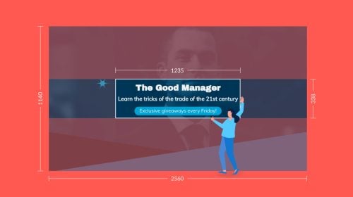
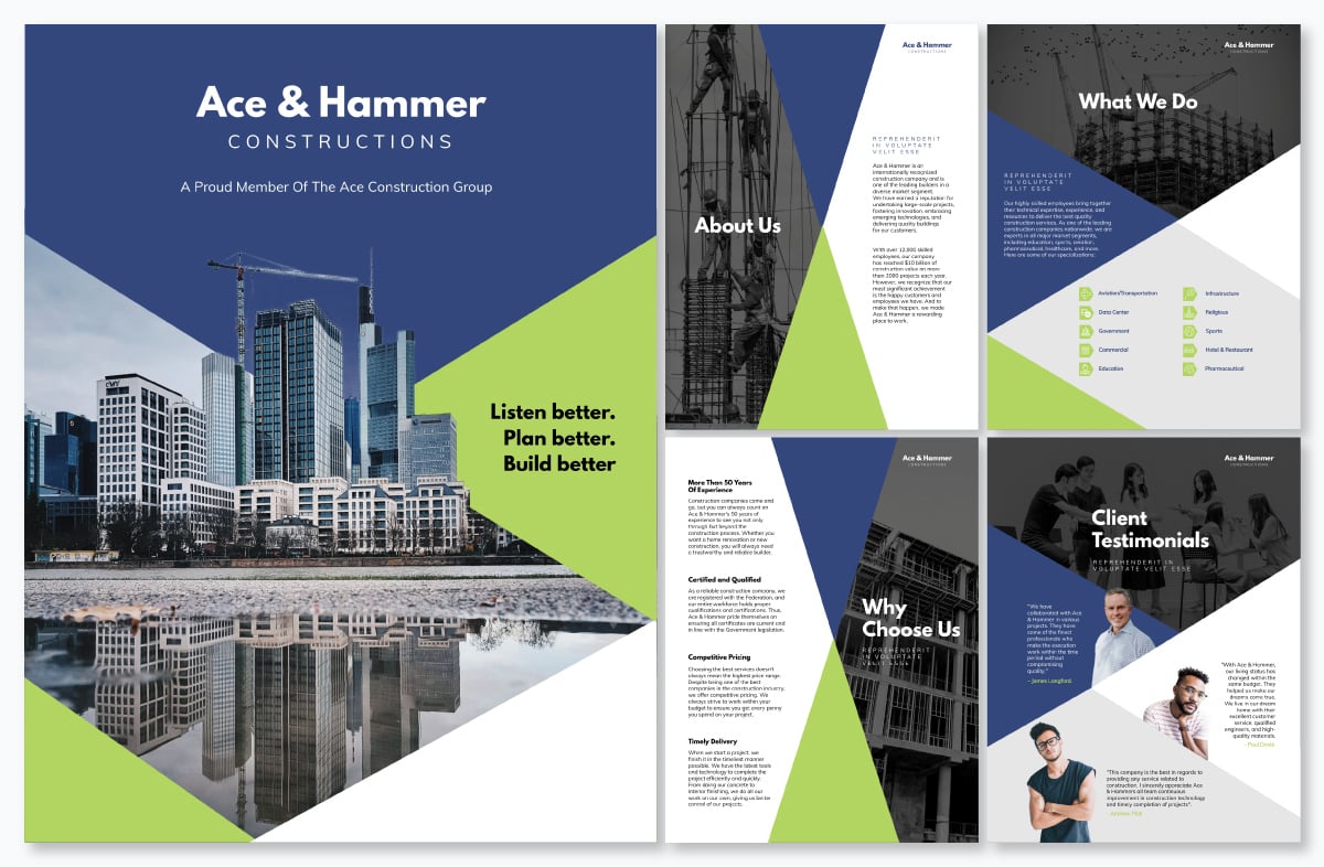
Likewise, this proposal template also uses color and size to achieve asymmetrical balance. In this case, it’s a bit different. The cover has an asymmetrical balance, with the red roof on the bottom third of the page and a bright blue sky above. The pages inside the proposal also have asymmetrical balance, contrasting the same photo with white areas.

The rule of thirds is a design technique that separates the canvas into nine equal parts by adding two vertical and two horizontal lines. Visualizing the shapes on the canvas makes it easier to place elements to achieve asymmetrical balance. Here are some templates that use this technique.
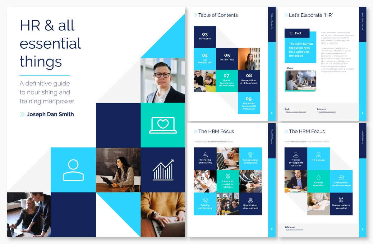
The Fitness Magazine template uses asymmetrical balance from cover to cover, but this page is the best example of using the Rule of Thirds to achieve asymmetrical balance. As you can see, the content has varying weights on each section. If you wish to use this template and keep the visual balance, try and keep the textual content the same size.

This ebook cover uses geometric shapes laid out on the cross-sections of the rule of thirds on the bottom right while leaving the top left clear and with lighter color shapes. This diagonal design is easier to achieve with the rule of thirds because it helps align the content and balance it.
Complexity and simplicity is a visual technique that contrasts to balance asymmetry, using textures and details in different capacities. The idea is that one area of the design is complex while the opposite side is simple. Here is a template to help you visualize complexity and simplicity.
Take a look at this cover for a furniture catalog. The complexity is at the bottom with the furniture and colorful decorations. Above it, the title of the catalog has a much simpler background of wall and light shining upon it. Notice how the primary color is mustard yellow, creating a unifying sense to the overall design.

Perspective is the last visual technique to help you achieve asymmetrical balance. Photography is the most straightforward visual to use as a foundation for asymmetrical balance, especially images that use perspective as the focal point.
A photograph is at the center and off to the left in this template, creating a visual perspective. The blue and green diagonal shapes reinforce the idea of perspective and asymmetrical balance. Diagonal lines and shapes are the best tools for a perspective emphasis on balance.
Using asymmetrical balance is an excellent way to turn a regular design into an exceptional one. With Visme, it’s easy to create asymmetric designs using templates, content blocks and the slide library. All you need to do is follow our design suggestions for achieving asymmetrical balance:
If you’re not sure your asymmetric design is balanced visually, click on the present button to view it over a dark background. Step back from your screen a little and let yourself feel an emotional reaction. Does it feel balanced in its asymmetry? That means you’ve achieved asymmetrical balance.
If you don’t yet have a Visme account, create one easily with your email or Facebook account. You’ll be creating designs with asymmetrical balance in no time!
Design visual brand experiences for your business whether you are a seasoned designer or a total novice.
Try Visme for free