


A Quick Guide on Sponsorship Marketing: Best Framework, Examples & Tools
The insurance industry has been collecting data for decades.
Piles of claims history, policyholder behavior, risk exposure, pricing models and regulatory filings generate enormous volumes of information every year.
The problem is that most of it never gets used in a way that helps actuaries set reserves, underwriters price complex risks or CFOs make decisions that move the business forward.
Data that isn’t easy to interpret quickly can't generate revenue, reduce loss or protect the portfolio.
That's the gap that data visualization fills.
When raw numbers become live dashboards, interactive maps, loss triangles and trend graphs, patterns that were buried in spreadsheets become visible to the people who need to act on them.
This guide covers everything you need to know about insurance data visualization. We’ll discuss how data visualization improves core insurance functions, the formats that work, and real examples from carriers and analytics platforms that are already doing it well.
Disclaimer: Visme is not a HIPAA-compliant platform and should not be used to store, process, or transmit protected health information (PHI). Users are responsible for ensuring their use of Visme complies with applicable data privacy and security regulations.
Insurance data visualization is the practice of presenting raw insurance data in visual formats such as charts, maps, dashboards and graphs.
Their objective is to make patterns, trends and anomalies immediately apparent to viewers, whether they're actuaries, brokers, agents, analysts, stakeholders or even clients.
Data visualization in insurance appears in many formats and serves several purposes. To name a few, there are policy records, claim histories, risk scores, loss ratios, regulatory filings, geographic coverage and more.
Nevertheless, the choice of visualization for your data will depend on who it’s created for and what decision it needs to support.
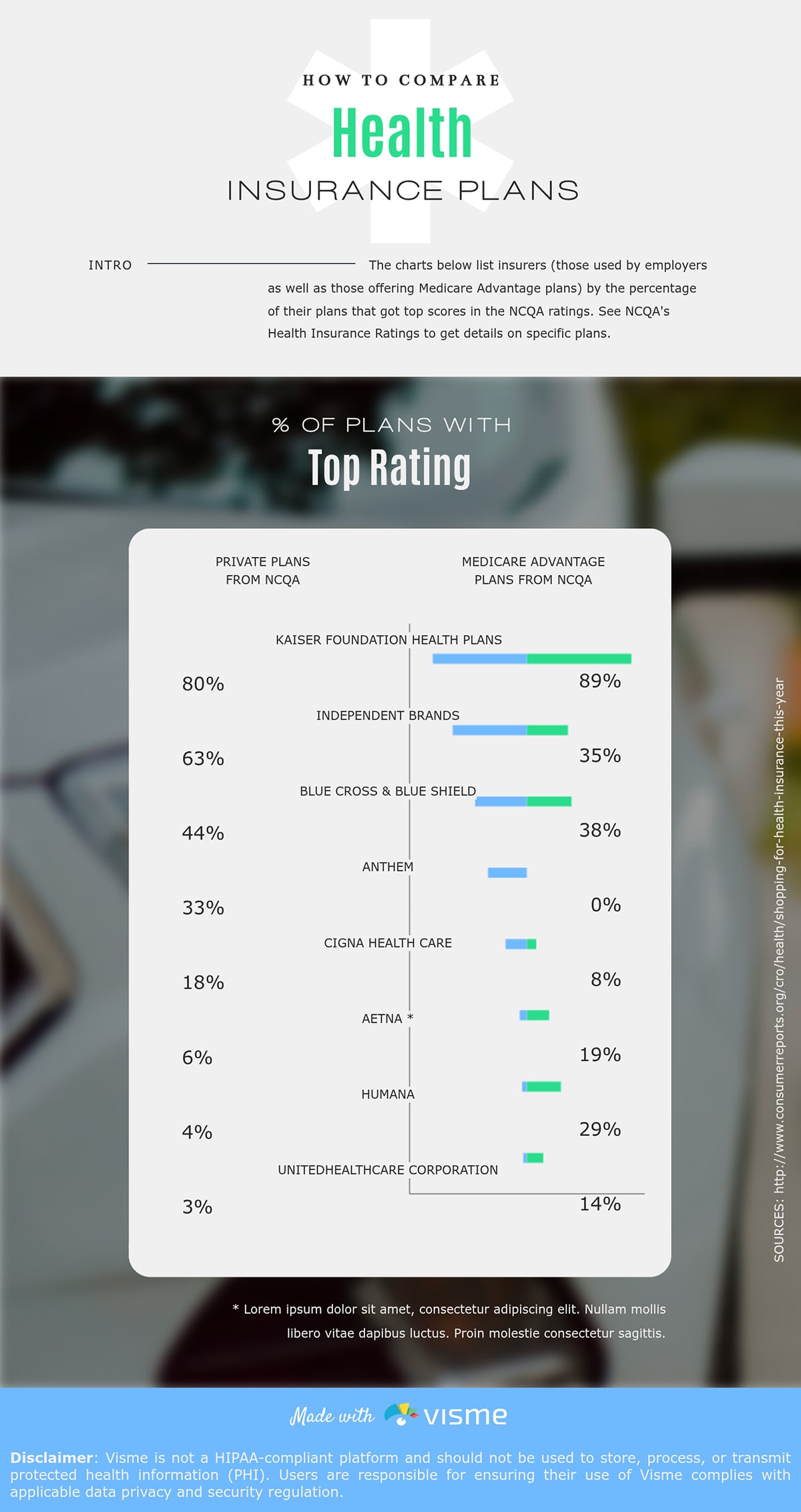
In a client-facing scenario, for instance, a comparison infographic can help them choose the right health insurance for their needs.
But there are lots of other instances:
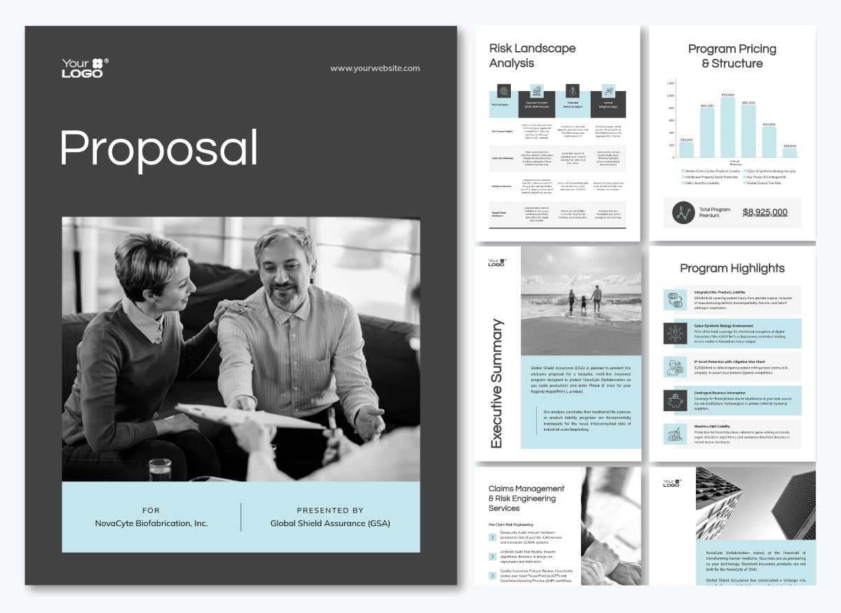
You can even include data visualization in your commercial insurance proposals, as in the one below. It’s a risk landscape analysis formatted in a table with alternating backgrounds and colors at the top. It makes skimming the content easy and quick to understand.
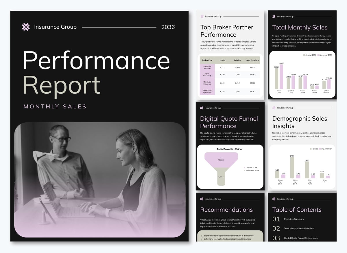
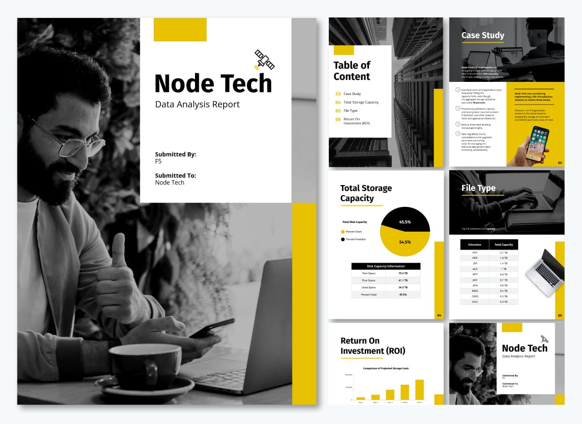
This report template also includes practical data visualization, such as bar charts and funnels.
New to data visualization? This short video covers the basics before we get into the insurance-specific formats and use cases.
I've already mentioned the ubiquity of data in insurance.
And as Eileen Garrity, Head of Claims at One80 Intermediaries, noted in a 2025 interview, "The industry has more data available than ever before; the real gap lies in turning that raw information into actionable insight."
So now, we'll discuss how this monumental amount of data has become a problem for insurance teams, beyond turning it into insight.
Because, as Dr. Michel Léonard, VP and Chief Economist at Triple-I, puts it: "The challenge is not that there's too much data; it's having an awareness of what you're looking for and then finding it."
Let’s take a look at some ways in which insurance data breaks down when it comes to visualizing it.
The data insurance companies collect is only as valuable as what teams actually do with it. Here is how visualization makes that possible across the core functions that matter most in the industry.
Underwriting is a pattern recognition process that is more critical in property and casualty insurance. The underwriter's job is to identify how a risk compares to similar risks, spot anomalies that warrant closer attention and price accordingly. But that work becomes significantly harder when the data is scattered across systems and presented only as rows in tables.
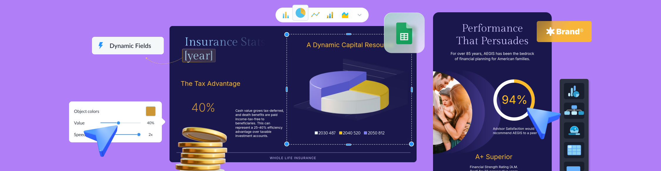
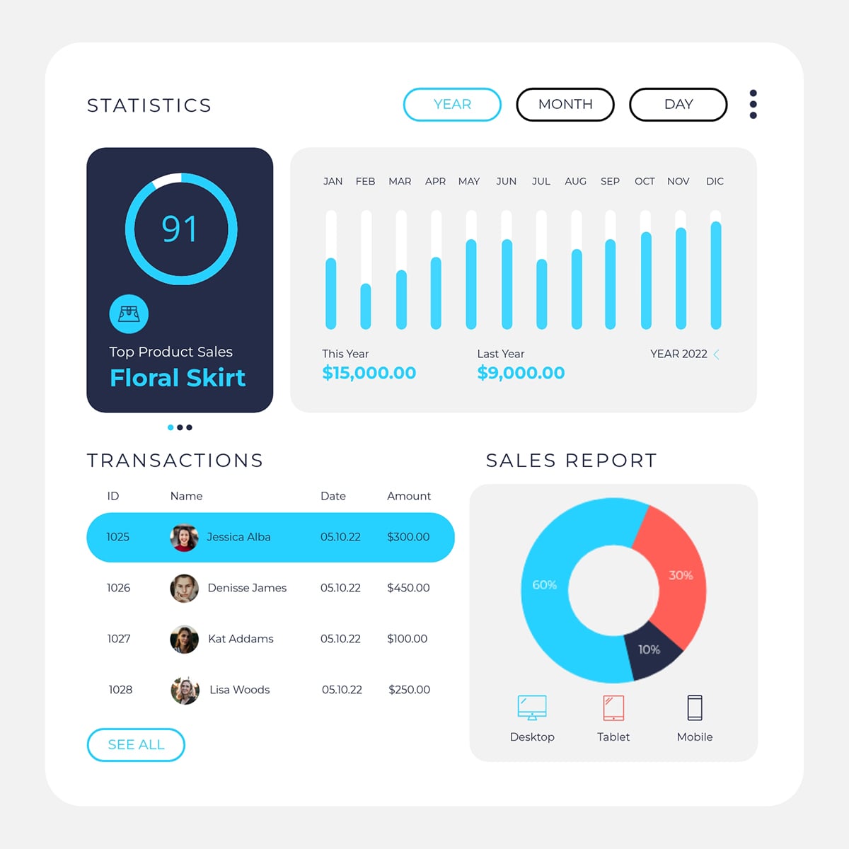
Visualizations help pull everything together, making their jobs easier and more effective. For example, real-time dashboards pull claims history, pricing data and third-party risk scores from multiple systems into a single view, like in this customizable whiteboard template from our collection.
Likewise, an interactive risk map can layer that same portfolio data against flood zones, wildfire risk scores and prior loss history geographically.
AI platforms like ZestyAI make these visualizations more effective by generating property-level risk scores for issues like wildfire, hail, wind and water. These feed directly into the map view, giving every property in the portfolio a visual risk rating backed by AI models trained on actual loss data.
The volume of open claims across multiple lines, geographies and lifecycle stages is too large to manage in a report. Visualizing the data surfaces key patterns and outliers, so special investigation units can easily decide the right course of action.
A dashboard, for instance, can track cycle time, litigation, claims and settlements. They give claims directors a live view of where the operation is running well and where it isn't. Insurance claim analytics tools make this kind of real-time operational visibility possible without custom development.
Fraud detection adds a second layer. Fraud patterns rarely appear in a single claim; they emerge as statistical anomalies across several claims. And finding them requires tools built for pattern recognition at scale.
A scatter plot, for instance, could reveal a body shop appearing across an unusually high number of claims. And a correlation matrix can flag when attorney involvement rates, claim types and geographic demographics cluster together in ways that don't occur by chance.
The CARTO flood fraud detection map covered in the examples section below shows what this looks like in practice.
A loss ratio on its own is just a number. But a loss ratio trended over four years, decomposed by frequency and severity, compared against a segment benchmark and projected forward? That's a pricing conversation and insurance data visualization makes those trends legible.
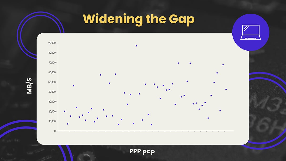
The key insight for pricing teams is segmentation. Scatter plots, for example, can map loss ratio against risk characteristics. This comparison easily reveals a cross-subsidization problem. You’ll know which segments are being charged properly, which aren’t, and which are dragging down the portfolio.
The scatter plot template below will help you get started using this visualization type.
AI-assisted pricing models can update these segmentations as new loss data comes in. This replaces the quarterly repricing cycle with a live view that reflects the book's changes.
Risk management sits at the intersection of every other function. It needs claims data, underwriting data, geographic exposure data and financial projections simultaneously.
But the challenge is synthesizing it into a view that a risk manager or CRO can use to make capital allocation and reinsurance decisions.
Scenario visualizations and interactive risk maps are the most effective formats here. One such example is a CAT (catastrophe) model that projects probable maximum loss across different return periods. It can show the range of outcomes that gives risk leadership something they can act on.
Carriers are legally required to file rate changes, maintain Solvency II documentation and submit NAIC Schedule P reports across multiple states and lines of business. They manage structured data that needs to be reviewed, checked and presented in formats regulators can audit.
Insurance data visualization makes the process more reliable. Dashboards flag rate-change variances across segments and loss triangles, making loss-development patterns visible across accident years.
When compliance data is presented visually, errors are easier to catch before they reach the filing stage.
With Visme's AI chart maker, you can describe the visualization you need in a text prompt and generate a first-draft chart in seconds. From there, connect it to live data or imported spreadsheets and save it as a reusable template for the next filing cycle.
The relationship between carriers and their agent and broker networks is based on data submissions, book performance, renewal rates, product mix and geographic concentration. The problem is that most of that data flows in one direction, arrives in bulk and lands in a format agents can't easily use.
Leslie Downs, Director of Strategic Partnerships at Victor Insurance, described the gap in a 2024 interview: "When I speak with agents, they often mention that they receive basic statistics from their carrier partners... I don't think they easily compile or analyze this information, so they may not always know where they're succeeding and what they're excelling at."
Visualization changes that dynamic. A producer dashboard that shows an agent their submission-to-bind ratio, loss ratio by product line and how their book compares to carrier targets gives them actionable information they can use to measure performance.
Likewise, brokers looking to build the best insurance data visualizations for their distribution networks can use Visme's broker-specific templates and guides to get started. Carriers that provide that visibility build stronger distribution relationships.
Not every visualization format works for every insurance function. The seven covered here are the ones that help decisions actually get made. And with AI now embedded in most platforms that produce them, the gap between raw data and actionable insights is closing fast.
As Olivier Lafontaine, Chief Product Officer at Equisoft, put it in a December 2025 interview: "We talk about AI; we don't talk too much about analytics. That's 10 years ago. But because of AI, analytics is getting so much better."
A real-time dashboard aggregates data from multiple systems into a single, continuously updated live view. The reason it works is speed: the feedback loop between what's happening and what leadership can see compresses from weeks to minutes.
What dashboards reveal isn't new data; it's the same data your teams already have, surfaced before the moment to act on it has passed. The Xceedance visualization whitepaper explains that the shift from reactive reporting to proactive monitoring separates insurers that catch problems early from those that discover them only during quarterly reviews.
If your team is building dashboards for internal reporting or board presentations, Visme's data visualization tools let you connect live data sources and build branded, shareable dashboard views without custom development. Once published, monitor your analytics to see how stakeholders are engaging with what you've shared, so you can refine what you present next quarter.
A claims heat map plots frequency, severity or both against geography, using color intensity to show where losses are concentrated. It works because the human brain instantly reads spatial patterns. For example, a red cluster in a county tells an underwriter more than a table of ZIP code loss ratios.
The insight they reveal is often not that a region is high-loss; it's that it's high-loss relative to the exposure written there. That distinction, loss ratio by geography rather than raw claim count, is what makes a heat map a decision tool rather than just a display. LexisNexis Location Intelligence found that carriers using this approach reduced flood exposure by 50% and improved new business by 8%.
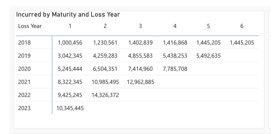
A loss triangle arranges cumulative claims data by accident year and maturity period, creating a triangular-shaped chart that shows how a book of claims develops over time toward its ultimate settled value. It works because long-tail lines, such as liability, workers' comp and medical malpractice, don't close quickly and the gap between what you've paid and what you'll eventually pay.
According to LeapFrogBI, carriers expect to pay $1.67 for every $1 paid at first maturity. That gap is what loss triangles help visualize. Then, reserves are kept to cover the full claim.
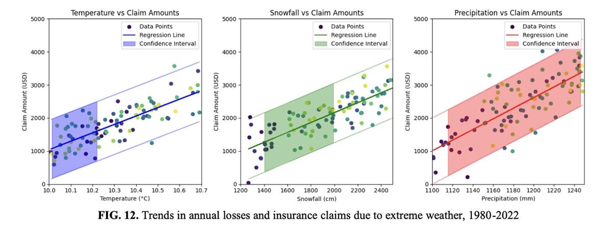
The most valuable insight a time series reveals is the separation of frequency and severity into two distinct lines. A worsening loss ratio driven by more claims requires a different response than one driven by more expensive claims. Without a chart that separates the two, it is easy to misread which problem you actually have.
A joint CAS and Triple-I study found that personal auto severity grew at a compounded annual rate of nearly 10.9% between 2019 and 2024, nearly triple the prior five-year rate. Carriers tracking severity separately caught that signal early and adjusted pricing before it damaged their combined ratio. Those reading blended loss ratios got surprised.
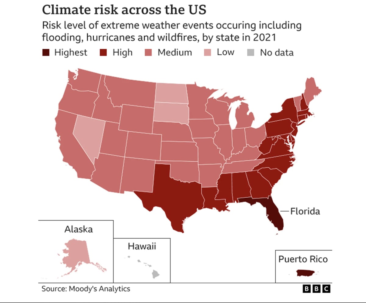
The trend series visualization below highlights annual losses and insurance claims resulting from extreme weather.
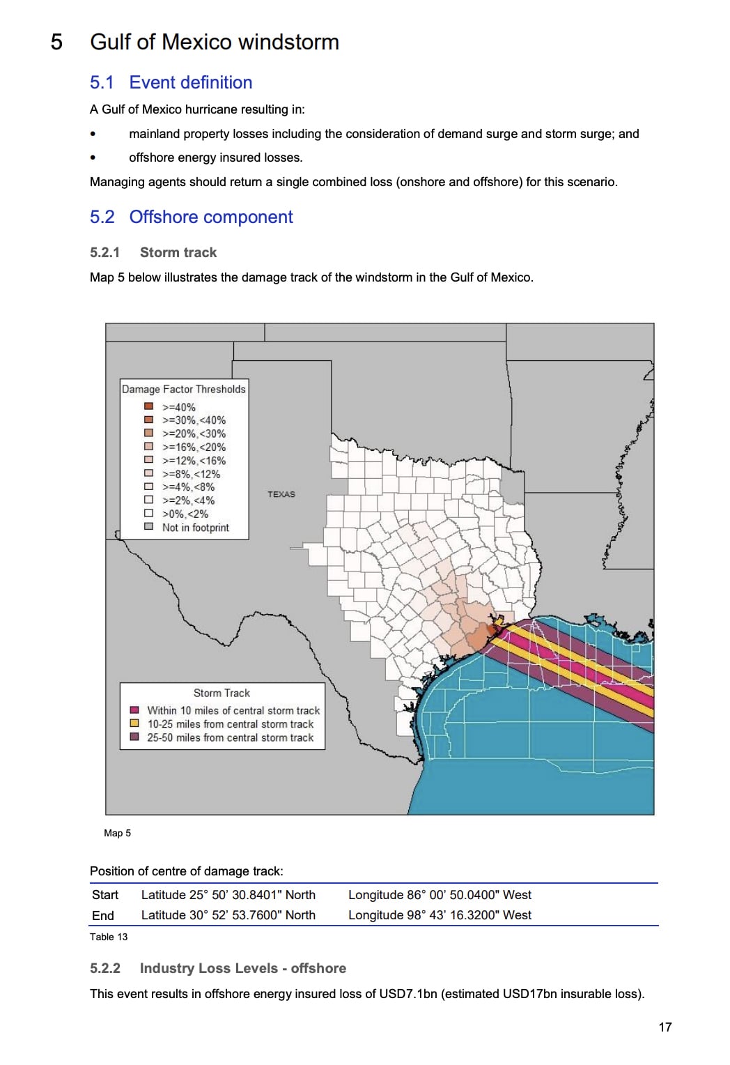
A scenario visualization runs thousands of futures through a model and displays the results as a range of probable outcomes, each with an attached probability, to simulate risk. The question it answers is: if conditions change, what happens to our loss position?
The scenario map below is from Lloyd's of London's 2025 Realistic Disaster Scenarios report. It shows the scenario of a Gulf of Mexico hurricane tracking into Texas with damage factors color-coded by county. The potential losses are calculated as what they would owe if that storm made landfall: $113bn in onshore losses and $7.1bn in offshore losses, broken down across residential, commercial, auto, and marine.
An interactive risk map goes beyond simply showing where risk is and lets users navigate the data. For instance, filtering by peril, drilling into a county, layering in flood zones or crime data.
For insurance professionals still working with static visualizations, Visme’s interactive data visualization tools offer an accessible entry point, letting teams build navigable, layered map views from existing data without requiring a GIS specialist. Visme's collection of data visualization examples includes several interactive formats and templates your team can adapt as starting templates.
A correlation matrix displays the statistical relationship between multiple variables simultaneously. Visually, it’s a color-coded grid that shows how strongly two variables move together.
A drill-down chart lets users move from a summary view into progressively granular layers of the same data: total book, then line of business, then state, then segment, then root cause. Together, they answer where the problem is and why it happened.
In relation to the other formats, dashboards show you the problem, heat maps locate it, scatter plots quantify it and correlation matrices and drill-downs diagnose it. They're the tools for investigating when something is already wrong and you need to understand exactly why.
When the analysis is complete, the findings need to be formatted for sharing with leadership. First, export the correlation matrix or drill-down chart and add it to a report. Then add narrative context that explains what the data shows and what action it calls for. Use Visme's Collaborate tools to let teams build and refine that report together in real time, with comments, approvals and version control. Once it's ready, Visme's Share and Publish features let you distribute it as an interactive link, an embedded view or a secured PDF.
Here’s a report template you can use right away for this exact purpose.
Now that we know how data visualization helps with insurance functions, what does data visualization in insurance actually look like?
In this section, we share four insurance data visualization examples from carriers, reinsurers and analytics platforms that use data visualization effectively to communicate risk, performance data and fraud detection.
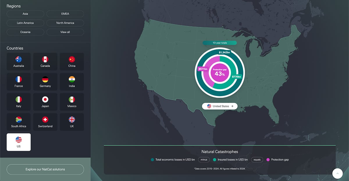
Swiss Re's NatCat protection gap infographic is an interactive map that shows the gap between total economic losses and insured losses. It spans natural catastrophes across 13 countries and all global regions, highlighting 10-year overviews and the top five catastrophes per country.
For example, in the US alone, total economic losses between 2015 and 2024 reached $1,342 billion. Insured losses covered $770 billion of that, leaving a $571 billion protection gap. Globally in 2024, only 43% of the $318 billion in economic losses were insured.
The visualization breaks it all down as a repeatable equation: total economic losses minus insured losses equals the protection gap. Users like actuaries, brokers, agents, reinsurance companies and even researchers can filter by country or region and see the same structure applied consistently across geographies. The 10-year window smooths out single-event spikes and shows the gap as a persistent structural problem, which is a harder point to make with a single year of data.
The protection gap is a number most insurance professionals know exists but rarely see presented at the country or regional level in a format they can share. According to data visualization statistics, visual formats are processed significantly faster than tables or text, which is exactly why a structured interactive like this lands harder than a spreadsheet of the same numbers. If your team works across geographies, a visual like this gives leadership a quick read on where underinsurance is highest and where opportunity lies.
Aon's 2026 Climate and Catastrophe Insight report is a free, publicly available annual report presentation covering global natural disaster losses, built almost entirely on data visualization. Across more than 100 pages, it uses world maps, regional heat maps, time-series charts, bar charts, trend lines and annotated event timelines to cover every major catastrophe of 2025.
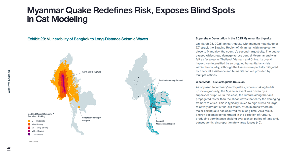
Exhibit 29 above is only one page in the report. It shows two maps explaining how the 2025 Myanmar crisis affected the region. On the left is a Modified Mercalli Intensity visualization radiating outward from the rupture zone, color-coded from moderate to violent shaking.
The map on the right shows why Bangkok suffered disproportionate damage despite being hundreds of kilometers away: the city sits on soft sedimentary ground that amplified seismic waves. Neither map makes full sense without the other. Together, they expose a common blind spot in standard CAT modeling that treats only distance from the epicenter as the primary loss driver.
A report presentation this dense, with 100+ pages of global catastrophe data, stays readable because every section leads with a visual. Readers can scan the exhibits, stop at anything that stands out and dig into the analysis beneath it.
With Visme, you can build report documents that follow the same principle using presentation templates designed for internal loss reports, renewal presentations and board updates. Visme's Brand Wizard will help ensure every visual stays on-brand throughout the entire report, using the same colors, fonts and formatting.
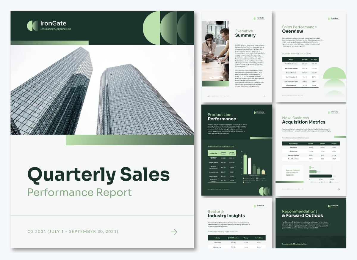
Here’s an example of a quarterly performance report for insurance companies, with data visualizations like tables and bar charts.
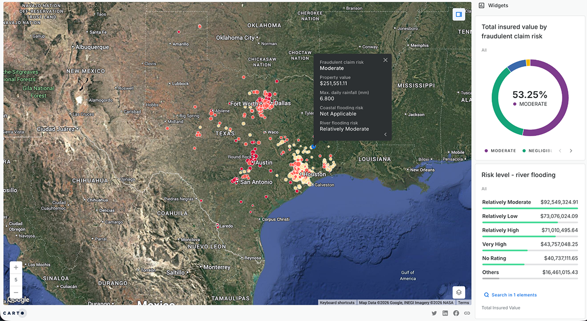
CARTO's insurance analytics showcase includes a publicly accessible interactive map designed specifically for flood-fraud detection. The map cross-references insurance claims against FEMA flood risk scores and real-time precipitation data from Google Earth Engine, then ranks each claim from negligible to high fraud risk.
The analysis runs through CARTO Workflows, a low-code pipeline tool that automates spatial analysis, enabling it to scale across an entire claims portfolio rather than requiring manual case-by-case review. AI agents surface results directly in the map interface, so adjusters can see which claims need attention without having to run the query themselves.
The visualization compresses the verification step. Instead of an adjuster manually checking weather records and FEMA maps claim by claim, the map does it simultaneously across hundreds of claims and returns a ranked, actionable list.
Fraud detection works better when environmental data is layered directly onto claims data at the geographic level. If your team is verifying flood, wind or hail claims manually, a spatial workflow that cross-references claims against third-party peril data can surface high-risk cases in minutes. See how other insurance teams are approaching similar challenges in Visme's insurance use cases.
Do you want to learn how to make interactive maps with Visme? This video will show you all the steps to create your own.
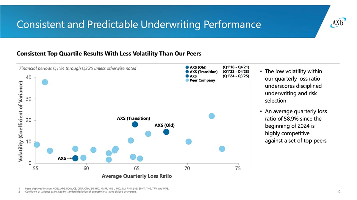
AXIS Capital's Q4 2025 investor presentation is a publicly available PDF that uses data visualization to communicate underwriting performance to investors and analysts. Slide 12 is a scatter plot that maps average quarterly loss ratio on the x-axis against loss ratio volatility on the y-axis, plotting AXIS against 20 named peer companies across three distinct time periods: Old, Transition and current. The current AXS position sits in the lower-left quadrant: a lower loss ratio than most peers and the lowest volatility among companies in the set.
In the lower-left quadrant, a lower loss ratio means claims cost less relative to premiums earned. Lower volatility means results are consistent quarter to quarter, not swinging wildly. Being further left and lower than the visualized peers means that AXIS is both more profitable and more predictable than the competition. The chart also shows three labeled AXIS data points moving progressively toward that position over time, making the improvement story easy to discern.
Investor presentations are one of the highest-stakes communication formats in insurance. When performance data is presented as a scatter plot with peer benchmarking rather than a table of ratios, the strategic case becomes readable to a board member, an analyst or a ratings agency reviewer in seconds.
If your team builds quarterly or annual investor decks from spreadsheet outputs, Visme AI can translate that data directly into benchmarked, context-rich visuals like scatter plots, line charts and comparison views, without starting from scratch each reporting cycle.
This presentation template is just what you need to get that deck started. Use Visme’s AI Hub to edit the content and visuals to match your data.
For examples of how insurance teams are already doing this, browse Visme's insurance case studies or explore our brand compliance resources to make sure every deck meets regulatory and brand standards before it goes out.
Dashboards, heat maps and trend charts are the most common across carrier functions.
In specialized functions, loss triangles are standard for reserving, scatter plots for pricing segmentation and scenario visuals for CAT modeling and capital planning.
The most effective approach is to separate the data by the decision they support. Cycle time and open claim counts belong on an operational dashboard that’s visible to claims managers daily. Loss trends by line of business belong on a time-series chart with frequency and severity decomposed. Geographic claims concentration should be shown on a heatmap. Snapshots of each visualization can then be added to a digital report.
Agents mainly use three types of visuals in client-facing conversations.
Brokers use visualization primarily in two directions: toward clients and toward carriers. In both cases, the underlying data is often the same; what changes is the framing and the level of detail appropriate to each audience.
Yes, but the improvement comes from making patterns visible by surfacing what the data already contains. The visual format helps underwriters, risk managers and executives act without needing to run the analysis themselves.
For example:
Dashboards in insurance serve as an operational monitoring layer to confirm that the business is running within expected parameters.
Their value isn’t in analytical depth like other formats, but in the speed of recognition: a dashboard showing the combined ratio trending toward 100% or claims cycle time creeping up gives leadership an early signal to investigate.
The distinction worth keeping in mind is that dashboards are monitoring tools, not diagnostic ones. They tell you that something is wrong. The drill-down charts, correlation matrices and trend analyses tell you why.
In claims, data visualization operates across several functions.
This guide covered a lot of ground: the formats insurance teams actually use, the functions they support and real examples from carriers and reinsurers already doing it. The thread running through all of it is the same one from the start:
If data isn't visualized and easy to interpret, it can't generate revenue, reduce loss or protect the portfolio.
Visme gives insurance teams the tools to change that. You and your team can build interactive dashboards, compliance-ready visuals, board presentations and agent-facing reports in one platform, without needing a design team.
Plus, Workflows help keep report production on track, so nothing gets missed. And for teams embedding visualizations in training or onboarding documentation, Visme supports SCORM and xAPI formats for direct integration with learning management systems.
So, if your team is still working from static reports and spreadsheets, Visme can help you create visualizations that stay current and support decision-making that drives revenue.
Design visual brand experiences for your business whether you are a seasoned designer or a total novice.
Try Visme for free