The Best AI Sales Tools for 2026 and How to Choose Them


Did you know that out of every 100 website visitors, a staggering 96% will leave without taking any meaningful action?
This crazy drop-off not only represents countless missed opportunities for engagement and conversion but also highlights the importance of finding ways to win back lost sales.
One way to overcome this issue is by using exit-intent popups.
These strategically timed messages appear at the precise moment a visitor is about to abandon your website, offering a last-ditch opportunity to engage them and persuade them to take action.
In this article, we’ll round up 16 of the best exit-intent popup examples to inspire your own. We’ll also show how you can create converting exit-intent popups using Visme.
An exit intent popup is a message that appears on users' screens when they’re about to leave your website. It’s designed to capture the interest of business leads, keep them on your page for longer and encourage them to take a specific action, such as availing a special discount, grabbing a free resource, or accepting an invitation to subscribe to your company's newsletter.
By sharing compelling offers and messages, exit-intent popups can help you re-engage and retain potential customers who would have otherwise been lost.
In fact, studies show that exit-intent popups can help recover 10-15% of lost visitors, making it an incredible tool to boost conversion rates.
Exit intent popups use advanced tracking technology to monitor visitor behavior and detect when they’re about to move away from the website.
This is typically triggered by specific actions, such as:
Once the exit intent technology detects these behaviors, a popup automatically appears, presenting the visitor with a targeted message and making them think twice before they leave.
With nearly 55% of website traffic generated through mobile phones, it’s only natural to question whether exit popups work on mobile devices, and how.
The short answer is yes. But these pop-ups work a bit differently than on desktops.
Instead of tracking cursor movements, exit intent popups for mobile rely on alternative triggers to detect when a user is about to leave the site. These triggers include:
Mobile-specific exit-intent popups should not only be designed with smaller screens in mind but also take into account that mobile users are often on the go. So make sure your message is clear, concise and pops up at the right time.
Pro Tip: If you're using Visme’s form-builder to create exit-intent popups, don't worry about manually formatting them for each device, as all Visme forms are fully responsive.
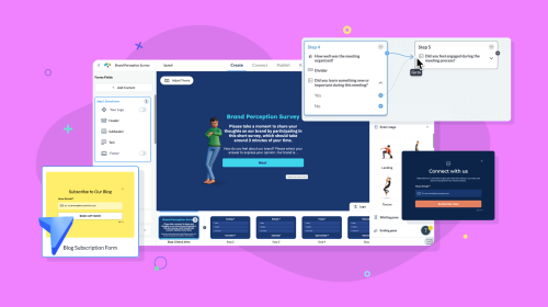
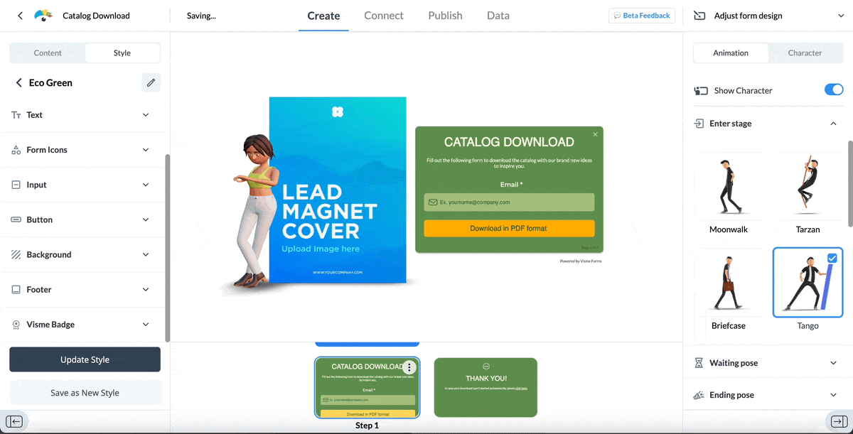
Visme is an all-in-one content creation tool with an advanced online form builder. It allows users to design unique, high-converting forms using animated characters and gestures, interactivity and engaging designs.
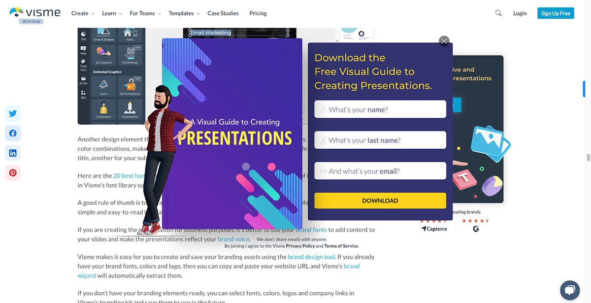
The exit-intent popup features a visually appealing design with a bold heading that immediately draws attention to the free visual guide offer. It also uses vibrant colors, easily readable fonts and a concise copy to pique visitors’ interest.
Why it works: The popup is designed using Visme’s own form builder, which has been proven to increase conversion rates by 207% and reduce form abandonment by up to 67%. It uses animated characters to capture visitors' attention, even if they were initially planning to leave the site. By offering a valuable visual guide, the popup entices visitors to engage further with the brand.
In addition to exit intent pop-ups, you can create website popups, opt in forms, responsive forms, contact forms, newsletter sign up forms and more.
Encharge is a marketing automation platform designed to help businesses create and manage complex customer journeys.
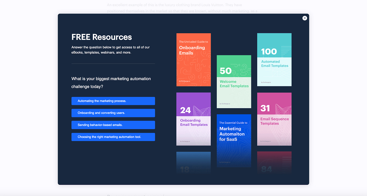
Their exit-intent popup features a simple one-question survey asking visitors about their biggest marketing automation challenge. Once they make their selection, they’re taken to the second page of the popup, where they can enter their name and email address.
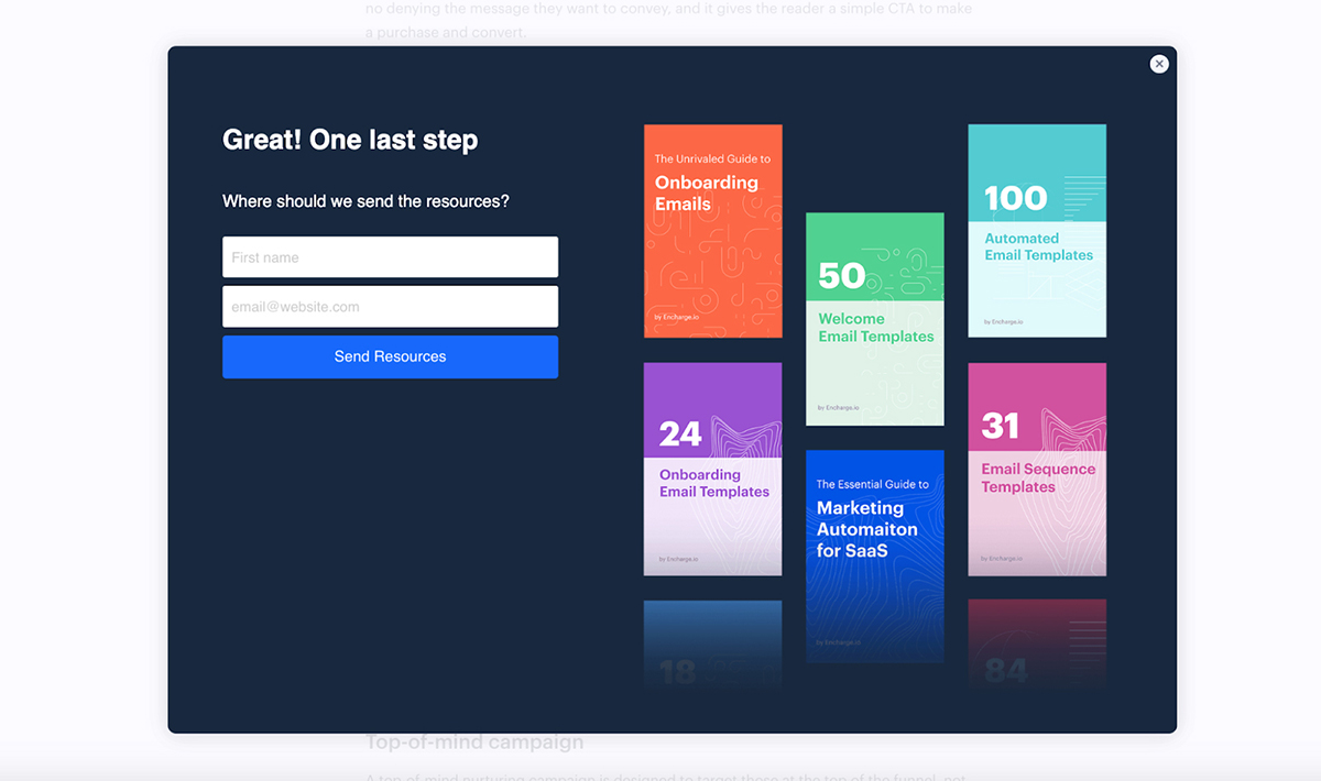
Why it works: Encharge’s exit offer is a real head-turner. They're giving visitors access to a bunch of free, valuable resources. For businesses looking to overcome marketing automation challenges, this offer is simply too good to pass on. Plus, the interactivity of this popup makes it fun to engage with.
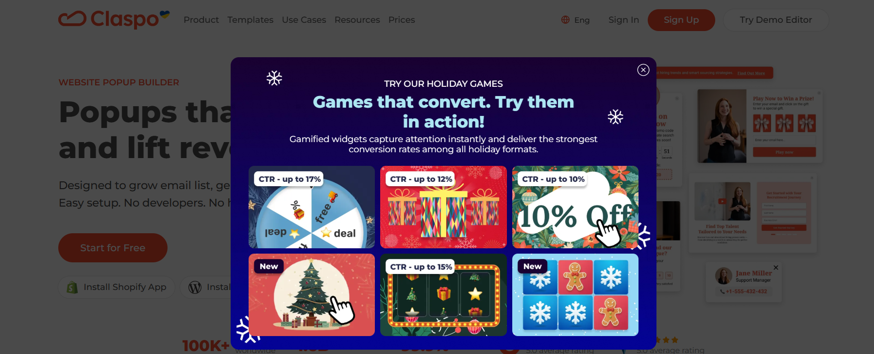
Claspo is a no-code popup builder designed to help marketers capture attention and recover abandoning visitors through behavior-driven widgets.
It specializes in exit-intent popups, gamified experiences, and conversion-focused widgets tailored to user intent.
The popup shown above promotes Claspo’s holiday gamified widgets using a bold headline, strong contrast, and a grid-based visual layout.
It showcases multiple interactive game formats such as spin-to-win and scratch cards, each labeled with expected CTR benchmarks to immediately communicate value and performance.
Why it works: By highlighting interactive formats and real conversion metrics, it reframes the interruption as inspiration. The gamified visuals spark curiosity, while the concise copy focuses on outcomes (“Games that convert”), making the message relevant for marketers who are about to leave the page.
The best part is that you can not only learn from this example but you can also use Claspo to build gamified popups, lead capture forms, announcement bars, multi-step widgets, and seasonal campaigns. It comes ready with a convenient builder, ready-made templates, advanced triggers, and audience targeting.
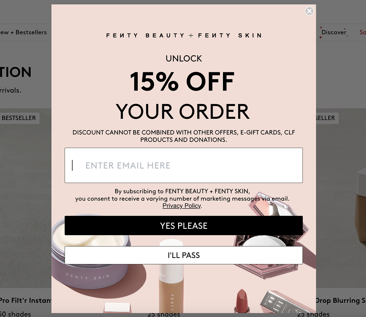
Fenty Beauty is a famous cosmetics brand known for its vast range of shades and innovative formulas that cater to all skin tones and types.
Their exit-intent popup features a minimalistic design with a soft pink background and contrasting black text—perfectly in sync with Fenty Beauty’s brand aesthetic. The bold headline, "Unlock 15% Off Your Order," immediately grabs the visitor's attention and highlights the exclusive offer.
Why it works: The popup’s clean design, on-brand colors and product photos are all on point. And the prominent CTAs let visitors opt in or out of the offer with just a click of a button.
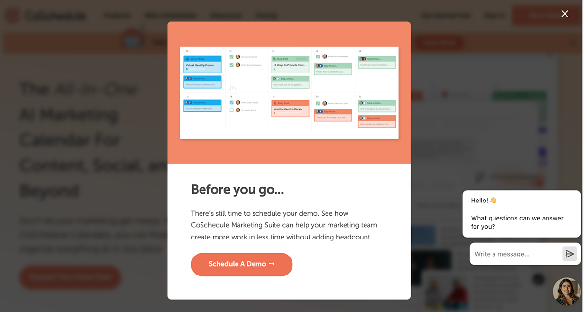
CoSchedule is an all-in-one AI marketing calendar that helps users organize, plan and execute their marketing projects and campaigns.
Their exit-intent popup features a GIF showing the tool in action, conversational copy, a well-placed CTA and on-brand colors and visuals.
Why it works: Each element used in this exit-intent popup works together to create a compelling message. The GIF shows CoSchedule’s capabilities, the copy focuses on the benefits of their marketing suite and the “Schedule a Demo” offer reinforces the value proposition and creates a sense of urgency.
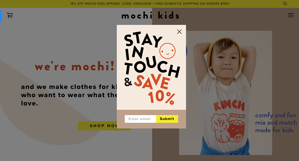
Mochi Kids also makes it to our list of the best exit-intent popup examples.
Mochi Kids is an online store specializing in high-quality, eco-friendly toys and accessories for children.
Their exit-intent popup features a fun, engaging design with vibrant colors and a smile emoji that’s guaranteed to capture parents' attention. The use of contrasting colors, such as the bright yellow "Submit" button against the brown background, ensures that the CTA is easily noticeable.
Why it works: The playful typography and bold colors create a friendly and inviting atmosphere. The concise copy and prominent CTA button make it easy for visitors to take action. And the overall design matches Mochi Kids' branding, ensuring a memorable experience for visitors.

Really Good Emails is an online repository for all things email. They have a vast collection of email examples from various industries and categories and serve as a valuable resource for marketers and designers looking for inspiration and insights to improve their email campaigns.
The exit-intent popup features a simple, effective design that encourages visitors to subscribe to their newsletter. It has a clear, actionable headline, and the copy outlines the benefits of subscribing to the company's newsletter, a concise form and a consent checkbox.
Why it works: The popup quickly communicates the value proposition to visitors. By highlighting the benefits of subscribing, such as receiving the best email designs and links twice a week, the popup provides a compelling reason for visitors to sign up. The minimalist design doesn’t overwhelm the visitor and the consent checkbox demonstrates transparency and builds trust with potential subscribers.
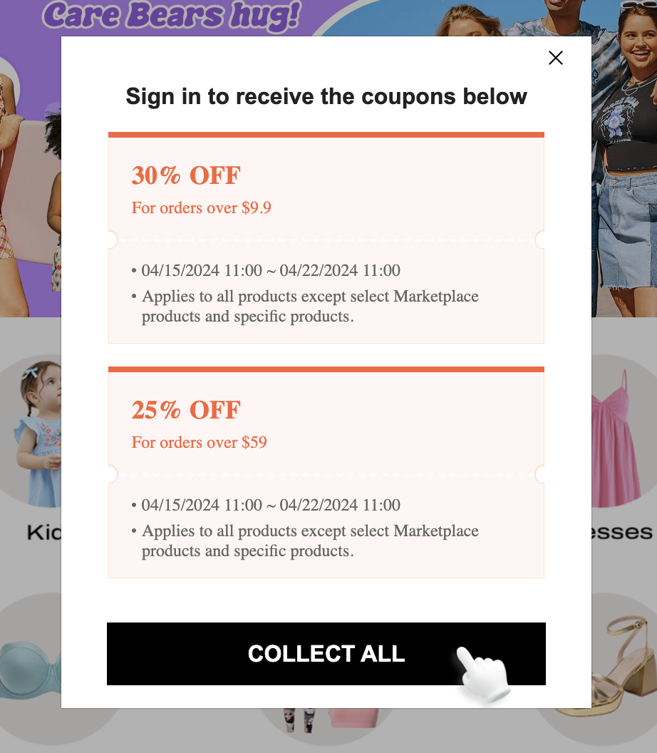
Shein is a global fashion brand known for its vast selection of clothing and accessories.
The exit-intent popup features a simple yet effective layout with a white background and bold, red text highlighting the discount offers. Visitors are presented with two coupon options: 30% off and 25% off, and the conditions and validity are clearly mentioned. The animated hand icon consistently points to the "Collect All" button, encouraging visitors to claim the coupons.
Why it works: The popup uses the power of discounts to encourage visitors to make a purchase. But what makes it so great is that by offering two different discount tiers based on order value, Shein caters to a wide range of customers.
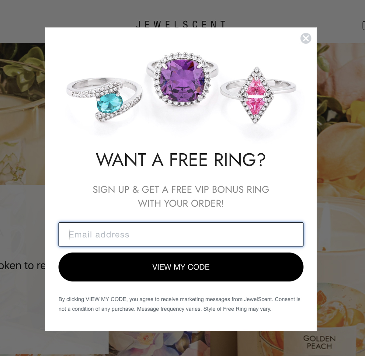
JewelScent is a unique online store that offers scented candles with hidden jewelry inside. It combines the joy of home fragrances with the excitement of discovering fashion accessories.
The exit-intent popup features an eye-catching visual of three colorful rings with a bold headline that reads "Want a Free Ring?" The design is clean and straightforward, focusing on the free VIP bonus ring offer visitors can receive by simply providing their email address.
Why it works: The visually appealing jewelry images grab attention, while the clear and concise copy communicates the value proposition effectively. And the prominent “View My Code” CTA creates a sense of personalization and exclusivity.
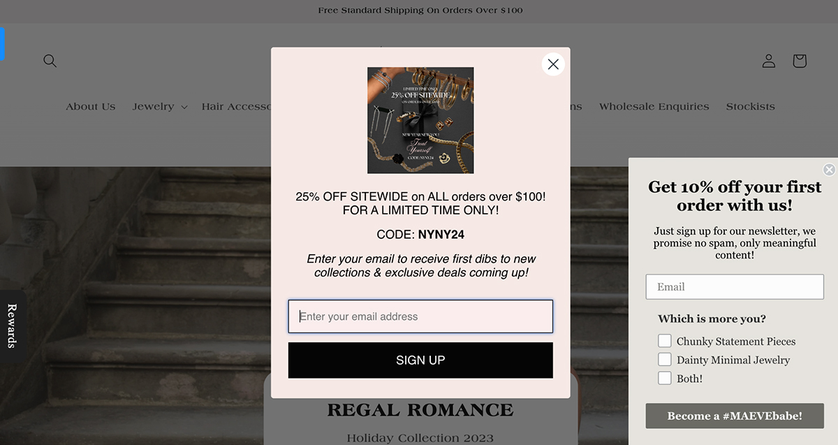
HeyMaeve is a contemporary jewelry brand that sells handcrafted pieces designed to celebrate and empower women.
The popup highlights a limited-time offer of a 25% discount that creates a sense of urgency among the visitors. It also features a high-quality image from their "New Year New You" collection that incorporates a bunch of stylish jewelry pieces.
Why it works: HeyMaeve's exit-intent popup effectively combines a time-sensitive discount, visually appealing product imagery and prominent CTAs—all of which encourage visitors to make a purchase.
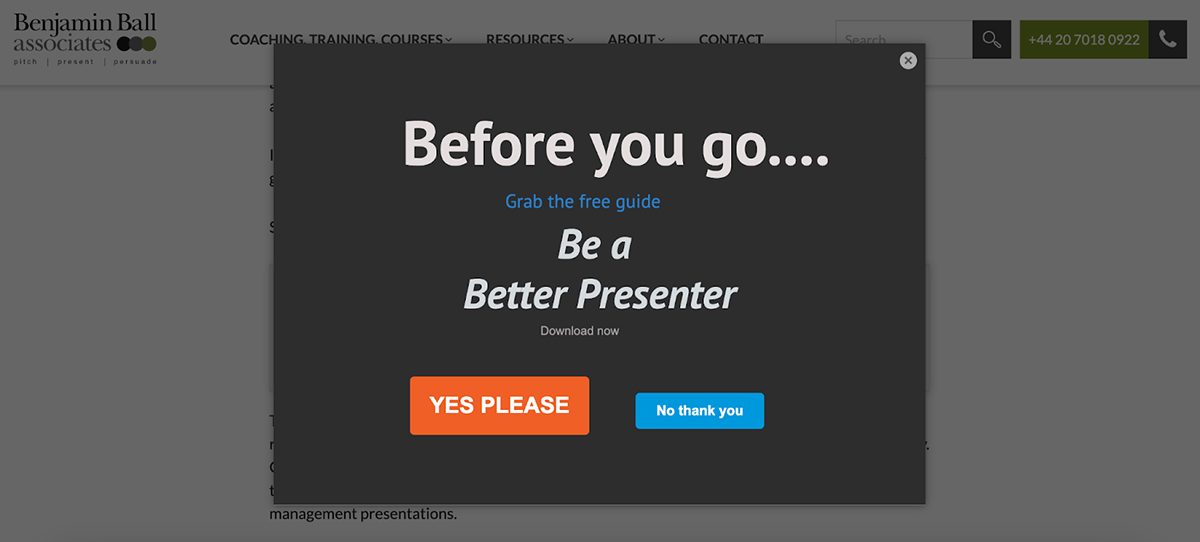
Benjamin Ball Associates is a professional coaching firm that helps individuals and businesses improve their public speaking and presentation abilities.
The exit popup on their website has a simple design with a dark background, colorful call-to-action buttons and concise copy that entices visitors with a free guide.
Why it works: The value proposition of this exit-intent popup not only aligns with the company's focus on communication, but also addresses the visitor's interest in improving their presentation skills. Additionally, the contrasting colors and conversational tone of the CTA buttons make the choices stand out.
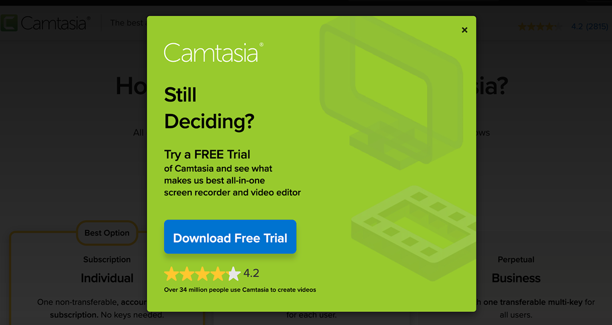
Camtasia is a popular video editing software that allows users to create high-quality screen recordings and videos.
Their exit popup features a vibrant green background, well-written copy and a prominent blue button to encourage users to download a free trial of the software.
Why it works: The popup targets undecided visitors by offering a risk-free way to experience the product, and the copy emphasizes Camtasia as the “best all-in-one screen recorder and video editor”. Also, the user rating and popularity statistics build trust in potential customers.
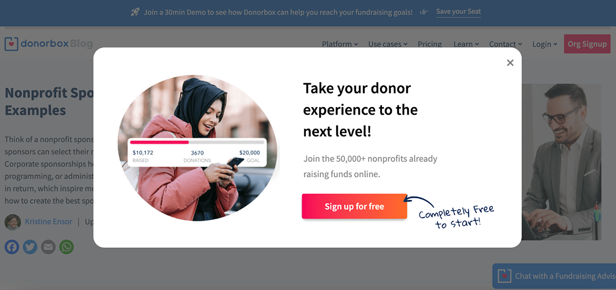
Donorbox is a fundraising platform that helps nonprofits and charities raise money online.
The exit-intent popup features a clean white background, a high-quality photo and a fundraising progress bar. It also has straightforward copy that highlights the platform’s number of users and a bright sign-up button to guide action.
Why it works: The progress bar shows users the potential of the company’s services, while the large user base helps build credibility. The emphasis on the free signup removes barriers to entry and encourages visitors to try out the platform.
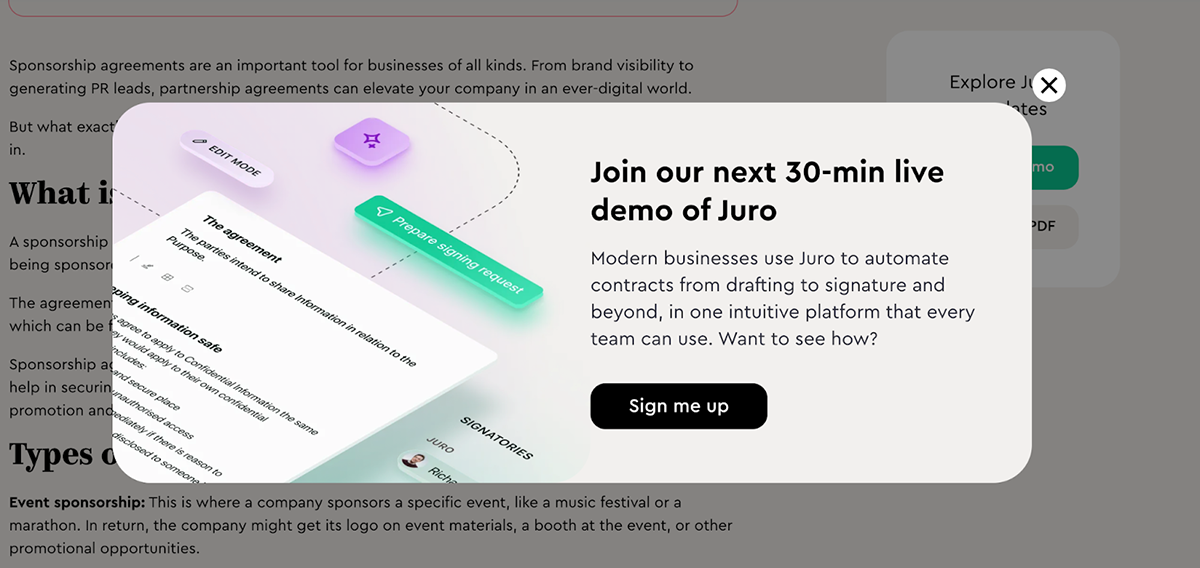
Juro is an AI-powered contract automation platform. Their exit-intent popup features a modern design with an isometric illustration of the platform's interface, professional copy to describe their value proposition and a bold, black "Sign me up" button to encourage immediate action.
Why it works: The illustration in the popup gives visitors a glimpse of Juro’s interface. Moreover, offering a live demo provides a low-commitment way for interested visitors to learn more about the product and the brief description highlights the platform's key benefits.
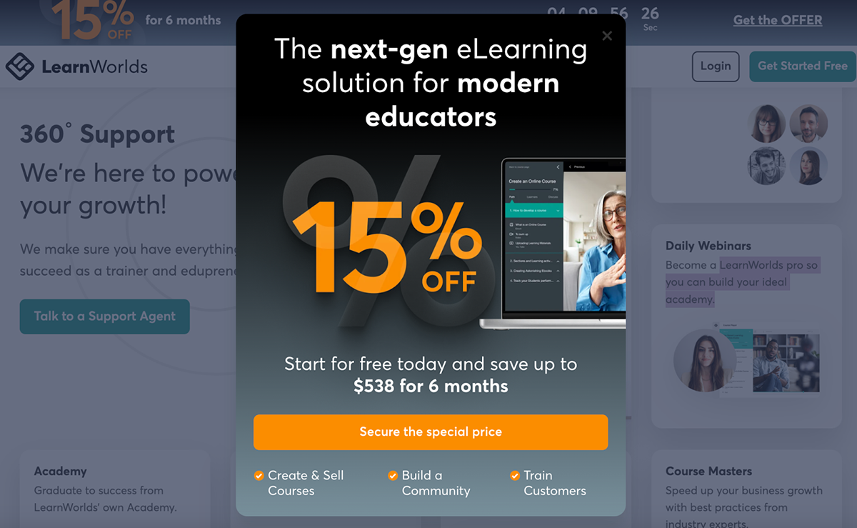
LearnWorlds, a famous eLearning platform, has also made it to our list of the best exit-intent popups.
It features a dark background, a prominent 15% discount offer and relevant product imagery. It also uses copy that positions the platform as “The next-gen eLearning solution” and lists what users can achieve with the platform.
Why it works: With a substantial discount offering that breaks down how much money users can potentially save by redeeming it, an emphasis on key features and a colorful CTA button, LearnWorld’s exit-intent popup effectively engages educators looking to create online courses.
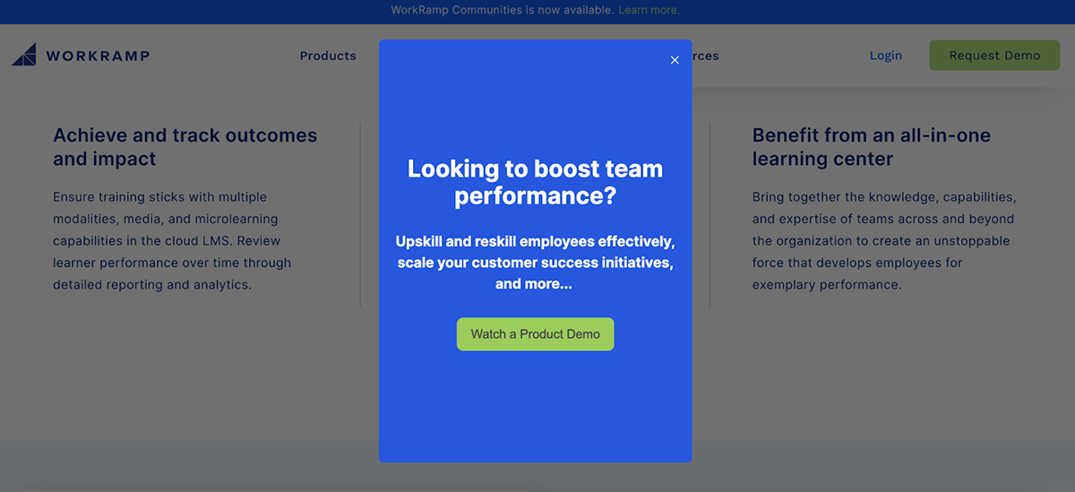
WorkRamp is a cloud-based learning management system. Their exit-intent popup features a clean design with a blue background and white text, creating a strong visual contrast. Plus, a bright green “Watch a Product Demo” helps navigate readers to a product demonstration.
Why it works: The popup works because it addresses a common pain point for businesses—improving team performance. The relevant copy, simple design and a bold CTA button are all great elements for potentially converting visitors into leads last-minute.
Wondering how to create exit-intent popups that actually convert? Simple fix—use Visme.
Follow this step-by-step guide to create effective, engaging exit intent popups for your business:
Start by logging in to your Visme account or click here to sign up for a free account.
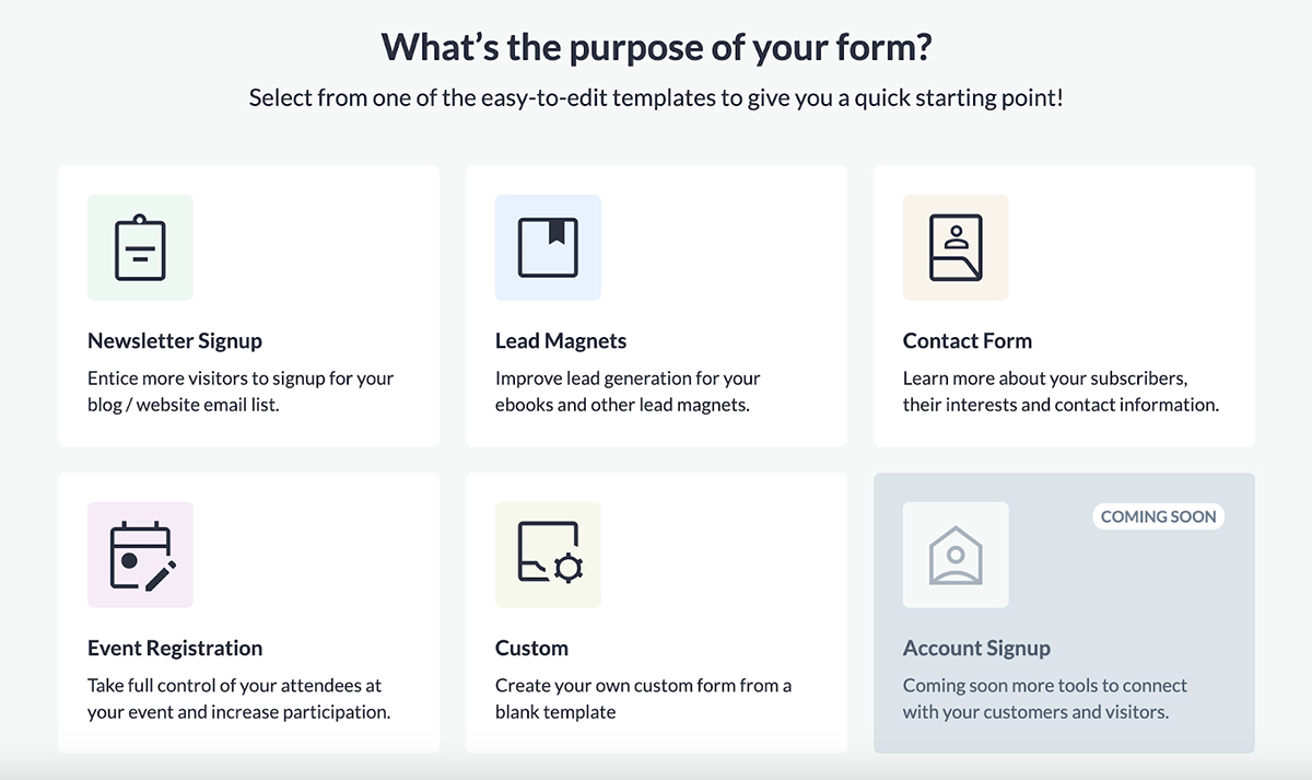
Navigate to the form builder by accessing your Visme dashboard, and click Create New → Form/Survey.
On the screen that pops up, select the type of form you want to create. Visme offers a variety of form types, including email popup forms, lead forms, contact forms, registration forms, email forms, feedback forms—all of which can be easily configured as exit-intent popups.

Visme offers dozens of professionally designed, interactive form templates you can quickly get started with. Browse through our library of exit intent popup templates and pick one that matches your brand’s aesthetic and design.
This is where the magic begins.
Every Visme template is fully editable, so you can add/remove fields, pages, images and videos, enable/disable form icons and footers, swap out characters and animations, change colors, edit text and links and much more.
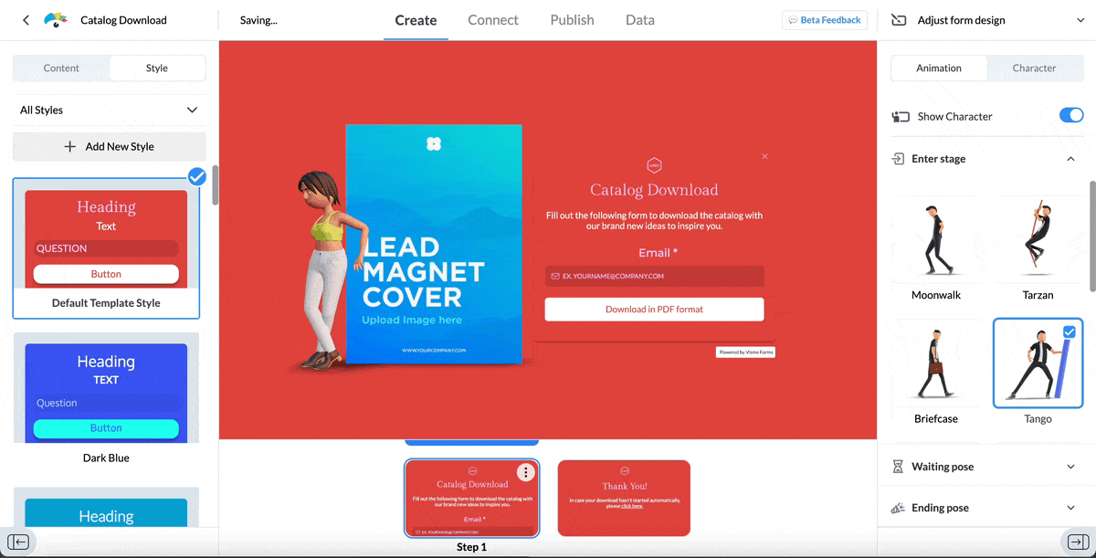
You can even create your own character inside the form editor—select gender, skin color, hair style, apparel and much more. You can also configure the animations of your characters, like how you want it to enter the screen, what you want it to do while waiting and how you want it to leave.

The copy and CTAs of your exit-intent popup forms should immediately attract your visitor's attention. Generate terrific first drafts by using Visme’s AI writer. Type in a detailed prompt and let Visme’s AI run its magic. You can edit the results as much as you want, or ask AI to regenerate content till you're happy with what you have.
Upload your branding elements, such as colors, icons, images and logos to give your popup forms a consistent look and feel as your website. Use Visme's brand design tool to automatically import your design assets by entering your website URL.
Pro Tip: Collaborate with team members to speed up the form creation process by tagging collaborators, assigning tasks and sharing comments and feedback.Once you’ve finished designing your popup, see how it’ll work on different devices by toggling between the desktop and mobile view on the top-right of the form editor. All Visme forms are fully responsive for all devices without any need for coding.
You can also enable legal consent on your forms for GDPR compliance.
Connect your Visme forms with apps like Mailchimp, HubSpot, Salesforce, GetResponse, ActiveCampaign, Google Sheets and Microsoft Excel to maximize their effectiveness.

For example, set up an integration with Salesforce to automatically send contacts collected from Visme forms directly to your Salesforce CRM, helping you streamline your lead generation and management process.
Next, it's time to publish and share your forms with the world.
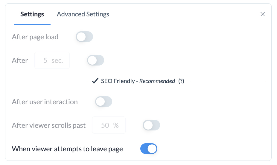
For exit-intent popups:
To enable exit-intent popups, make sure you’ve turned this on:
Visme doesn’t just help you create interactive forms, it helps you analyze and monitor their performance too.
Track your form views, submissions, completion rates and the time it takes for visitors to complete your forms—all inside Visme. Use these analytics to make changes to your offers, designs and messaging to find your ultimate fit.
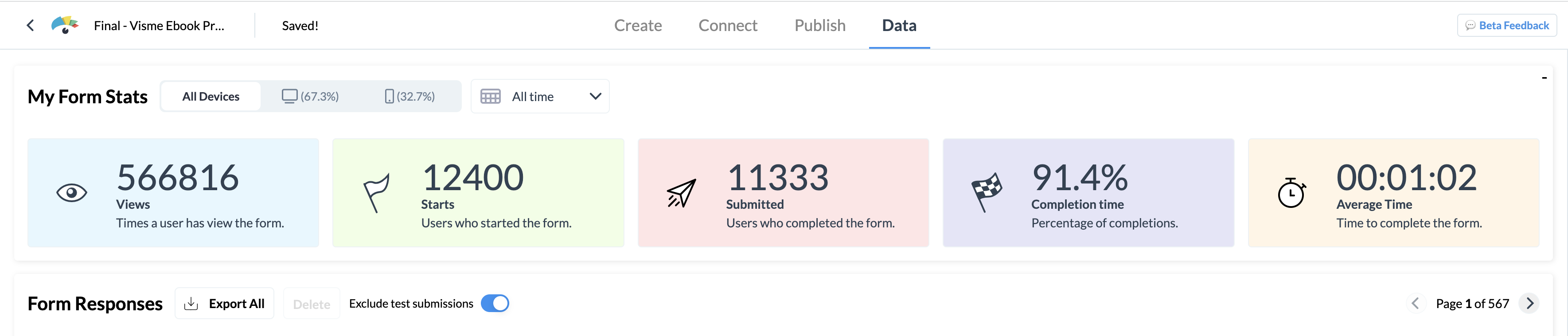
For example, if you’re seeing a drop in the completion rate of your exit-intent popup, maybe it's time to change your offer.
You can also track device-specific stats by toggling between the desktop and mobile views at the top left of your screen.
Turn your form data into engaging reports with Visme’s data visualization tools, and share them with your teams and management.
To make the most of your website popups, consider implementing these best practices:
Make your exit offer too good to pass on.
Offer a substantial incentive that compels visitors to reconsider leaving your website. This could be a special discount they can avail on their abandoned cart, access to a free, valuable resource, or anything that aligns with their interests.
Check out this exit-intent popup by Visme:
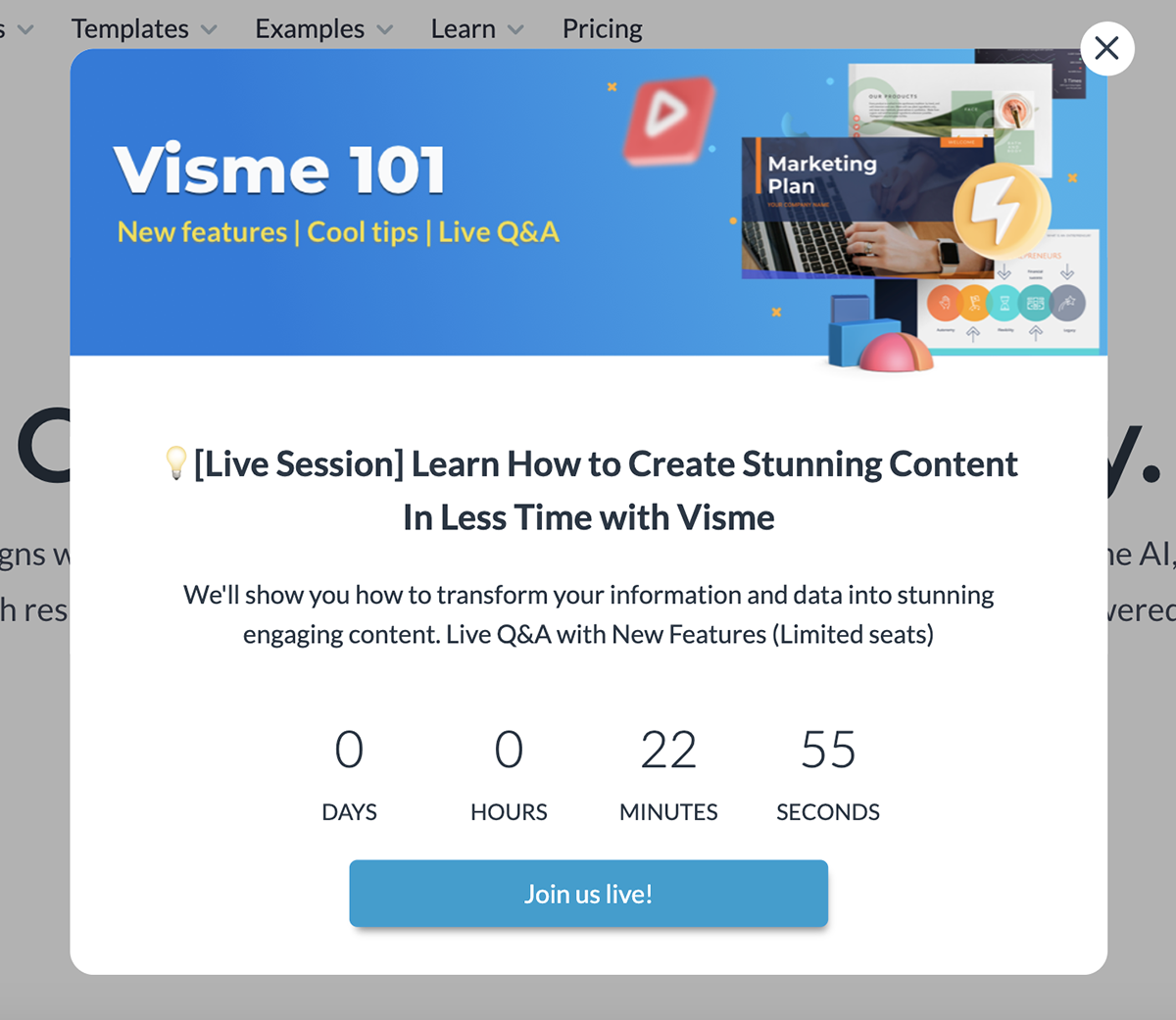
They offer to show users how Visme can be used to design stunning content. But to drive action, they create urgency by using a live ticker. The key takeaway here is that even if you have a great offer, you need to get other elements right too.
Use eye-catching images, colors, graphics, or videos that grab your visitor's attention, and make sure they’re consistent with your brand's style and color palette.
Your CTAs should be easy to find and click and use action-oriented language that encourages visitors to take the desired step.
Make sure your popup’s message is to the point and easy to understand. Keep in mind that the goal of an exit-intent popup is to quickly convey the value proposition to the visitor, so they consider taking action.
Here’s how Neil Patel does it:
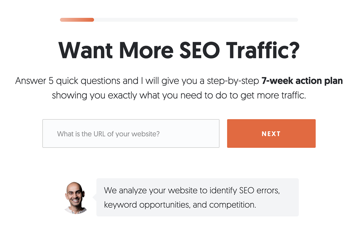
The copy is simple and speaks directly to anyone looking to boost their website’s SEO traffic.
Your exit popups should feel as natural as possible. Experiment with different placements and trigger times to find what works best for your audience.
Tailor your exit-intent popups to specific pages, visitor segments, or behaviors to deliver a more relevant and engaging experience.
While you want to encourage visitors to stay, it's important to respect their choice if they choose not to engage. Add a visible close button to your exit popups to avoid frustrating users.
Check out how HidrateSpark does it:
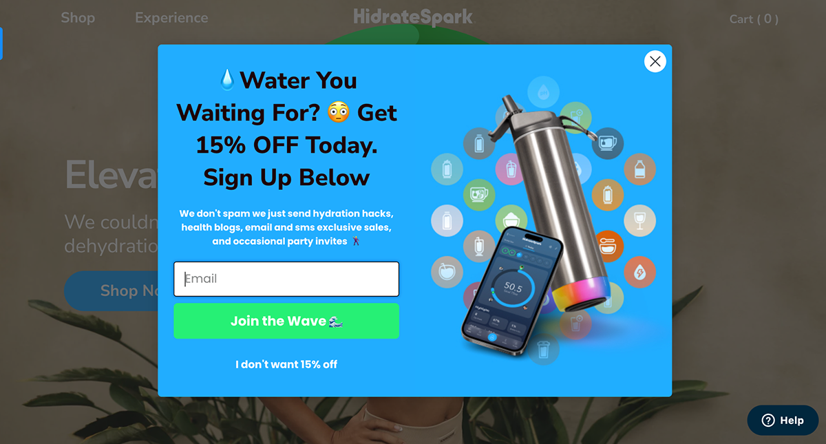
They’ve added an “I don’t want 15% off” button that gives visitors an easy way out of the exit offer. But at the same time, it compels them to think twice before skipping the deal.
Monitor the performance of your exit-intent popups by regularly conducting A/B tests. Tweak different elements like CTA placement, offers, timing and design to maximize conversions over time.
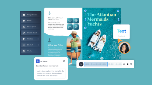
Pro Tip: Use Visme’s suite of AI tools to generate original copy and images, edit photos, whip up tailored designs and templates and much more.
Exit popups use advanced tracking technology to monitor cursor movement. When the user attempts to close the tab or navigate away, a message is automatically displayed on the screen, encouraging them to stay or take action before leaving.
Exit-intent popups are highly effective, with conversion rates typically ranging from 10-15% depending on the offer and implementation. They help recover potentially lost visitors, boost email signups and increase sales.
On mobile, popups are triggered when users quickly scroll up or down on the page, switch between tabs in their browser, swipe or press the back button or stay inactive for a certain duration.
Exit-intent popups are excellent tools for recovering lost sales and capturing a significant chunk of leads who would have otherwise left your website.
With Visme, you can create eye-catching, interactive exit-intent popups that are proven to convert. Bring your popup forms to life with animated characters you can customize easily.
Add or remove form fields, connect to your CRM or data analysis software, share and publish your form easily with an embed code, and track analytics right inside Visme. Incorporate lead magnets into your exit intent popups to make them even more attractive.
But Visme is more than just an exit intent popup software—it’s a powerful content creation tool that can help you build all kinds of visuals. Create engaging lead forms, emails, infographics, ebooks, reports, blog graphics, social media graphics and more.
Share your projects online or download them in multiple formats. Make them stand out with icons, illustrations, animations, interactive elements, characters and data visualizations that align with your brand.
Improve your data collection from emails, leads, to surveys and more, by using beautifully designed forms that convert up 2X better.
Signup Free