The Best AI Sales Tools for 2026 and How to Choose Them

Hate it or love it; there's no denying that email pop-ups work. They are effective for getting your offers in front of potential leads and getting those email sign-ups rolling in.
The results speak for themselves. Sumo's research found that the best-performing pop-ups were able to achieve an impressive 9.28% conversion rate among the top 10% of users. This conversion rate refers to those who viewed the pop-up and subsequently took action.
Are you tired of dealing with high bounce rates and losing potential leads due to poorly designed and ill-timed pop ups. This guide shares 13 email popup examples, best practices, and optimization tips to help you make the most of your lead generation strategy.
Before we get right into it, here’s a short selection of 8 customizable popup form templates you can easily edit and publish with Visme. View more templates below:


An email popup is an interactive email, contact form, lead form or button that generates leads for websites, apps and other digital platforms. It’s called a “popup” because it’s not always in sight.
Instead, it pops up at an allotted moment to surprise the viewer and invite them to sign up for something in exchange for their email, like a newsletter subscription, a monetary discount or a practical resource.
The most common opt-ins are to subscribe to a newsletter or to download a practical digital resource.
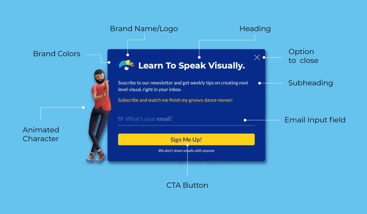
This infographic below sums up all of the elements of an email popup.
Over the years, popups have gathered a bad reputation for being annoying and disruptive. But regardless of their negative traits, they’re still efficient and highly relevant. Email popups are considered an essential part of a comprehensive email marketing strategy.
We’ve learned from the email popup contradiction that it’s definitely a good idea to use them but not abuse them. You can use an email popup to your advantage without becoming an obstacle to your web visitor’s experience.
Here’s what the numbers say about pop ups.
A successful popup combines visuals and copy, making viewers feel compelled to act. In a survey by Wisepops, they discovered that popups with images had a 4.96% conversion rate (CVR), while those without images had only 2.85%. A similar survey from Optimonk revealed the conversion numbers to be 11.07% on mobile and 9.69% on desktop.
Optimonk also measured the effectiveness of different styles of popups. The ones with the highest conversion rates were those with conversational copies at 20% and full-page visuals at 14.4%.
Another ideal companion to an email popup is the lead magnet. A study by GetSiteControl discovered that popups with lead magnets had a 7.73% CVR on mobile and 4.7% on desktop, while those without only converted 3.83% on mobile and 1.84% on desktop.
Use this data to your advantage and incorporate images and visuals that match your popup’s objective. A popup with a full-page overlay uses a bright, contrasting color or image, while a subtle side popup uses similar colors as the page. Popups for time-sensitive campaigns have more flair to make them noticeable and enticing.
An email popup can be as simple or creative as your brand permits. Always have in mind the purpose of your email popup; to capture visitors' attention and get their email. Once you’ve guaranteed it does that, impart all the creativity and uniqueness that make your brand special.
Improve email popups for your business by following best practices and using effective designs. Be sure to test different techniques over time. A/B testing will help analyze the performance of each style and make the best decisions on what works best for your brand.
In this section, we’ll look at the most common (and effective) email pop up styles and some best practices to help you get the most out of your popups.
Crafting email popups for your site doesn’t need to reinvent the wheel. You can always stick to the classics and add a lightbox popup with a full-page color overlay. Unify it with brand visuals and strategic copy; you have an efficient popup in minutes.

This newsletter sign up email popup from Klarna is simple yet effective. Signing up is easy and fast; you just need an email address. This true and tested technique is a great way to grab leads fast without much guesswork. The added snippet about unsubscribing at any time is a technique that builds trust and inspires people to sign up without commitment.
According to Nielsen Norman Group, visitors are less likely to leave a website if they stay on it for a longer period of time. To be safe, pace your popups to appear at about half the average time on the page. Alternatively, simply show the popup on the page after 30 or more seconds. Offer discounts or deals and you’re sure to get signups.
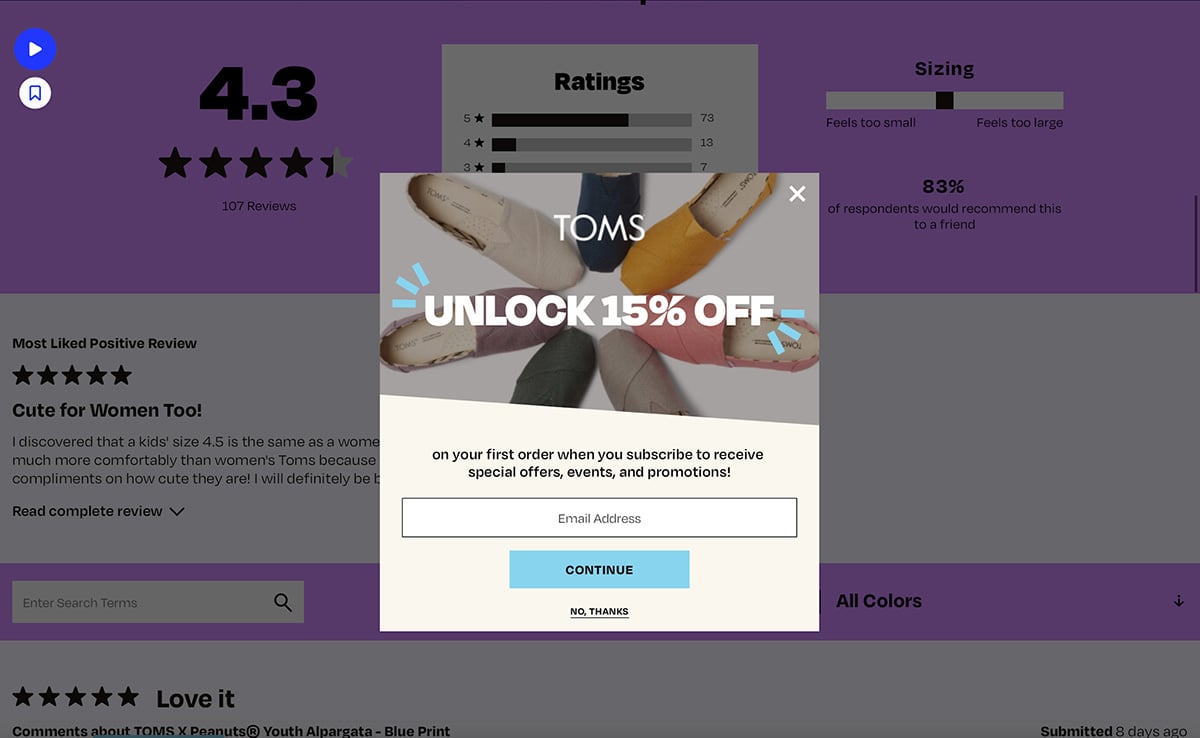
On the Tom’s website, a 15% discount popup triggers after about 20 seconds on the page. Much like other ecommerce sites, the email popup offers a discount on the first order in exchange for an email. In this example, signing up is simple and the copy is on point.
Forms with more sign up details are another option. When the company behind the website is more serious or corporate than an ecommerce site or SaaS platform, email popups become detailed forms.
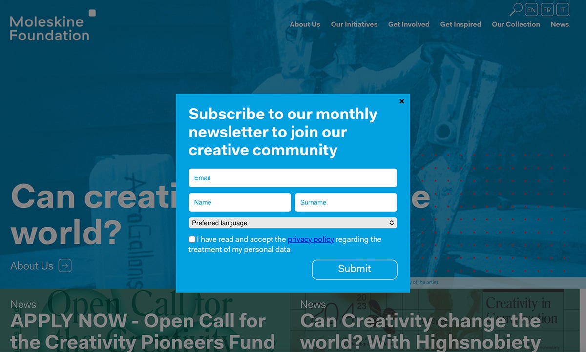
On the website for the Moleskine Foundation, their email popup has three cells, a dropdown and a checkbox. It’s more complex than others but still easy to fill in. Plus, it complies with all rules for collecting personal information. It also offers visitors the option to choose a preferred language for the monthly newsletter.
Email popups must reflect the brand with a combination of visual and copy that tells a quick story and stays true to the brand. In some cases it’s achieved with color, or an image. Society6 stays on brand on their email popup by using art from their site as the background for the sign up form.

With Visme, staying on brand is easy no matter what visual content you create. If you haven’t yet set up a Visme Brand Kit for your workspace, start with the Brand Wizard. Input your company’s website URL and follow the steps to generate a large collection of ready-to-use branded templates and a Brand Kit for your teammates to use collaboratively.
Side popups are less invasive than full page overlays but still must be eye-catching. It needs to be an attractive visual that will take the reader’s eye away from the main page content. On the Natures Fynd website, the side popup includes an enticing image and copy that inspires the viewer to “become an insider.”

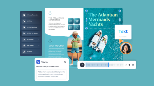
If you can’t find the perfect image for your popup, generate it with Visme’s AI image generator. Introduce a prompt into the generator and adjust it until you get the visual you like. All AI images generated in Visme and added to projects are saved in your media library.
As we mentioned, popups have gained a bad reputation over the years for being annoying and disruptive. Thankfully, we don’t see websites with three popups appearing together competing for attention. Email popup use is more mindful now.
Here’s how to keep your popups from living up to their bad rep:
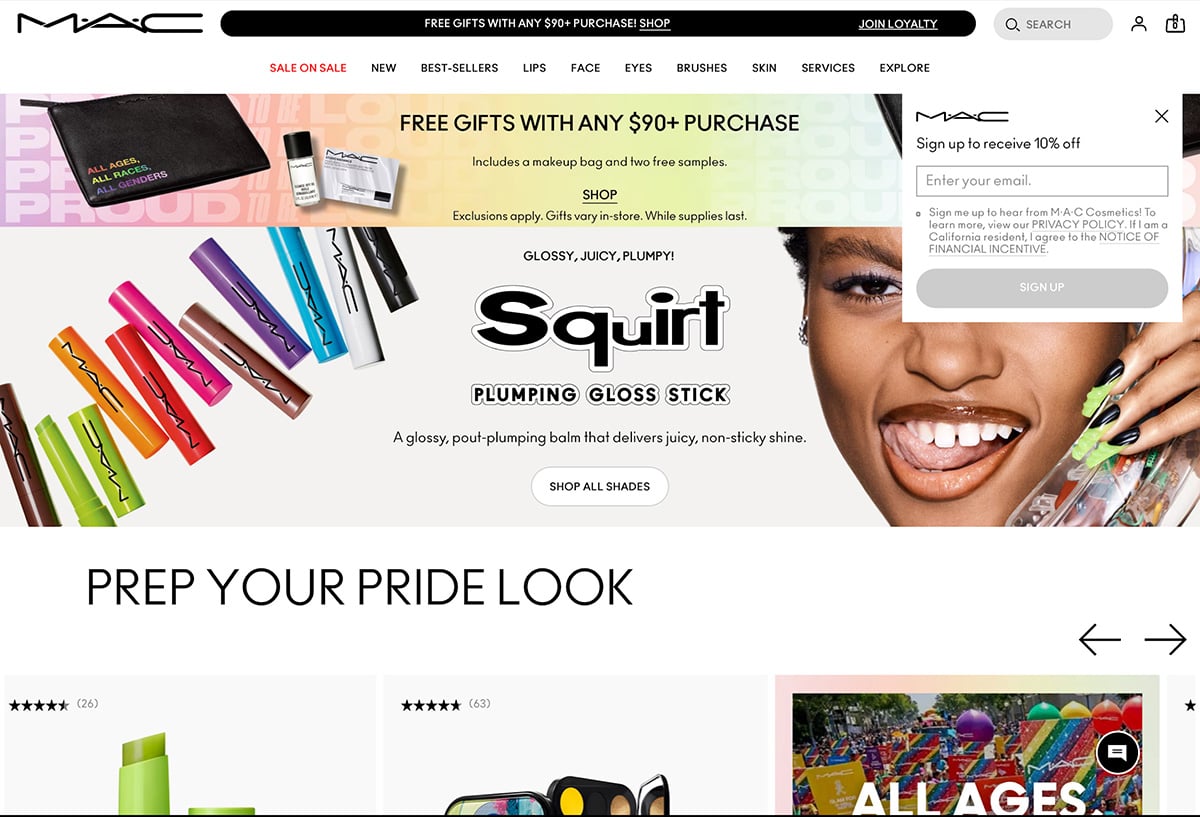
On the MAC Cosmetics website, the email pop up appears from the top below the menu and overlays the banner. When you scroll down, the popup disappears and vice versa. It’s
Email popups can start small and expand to larger forms only once you click the first popup. The two-step popup doesn’t invade the page at first. It’s typically small and includes copy that inspires curiosity and a little FOMO.
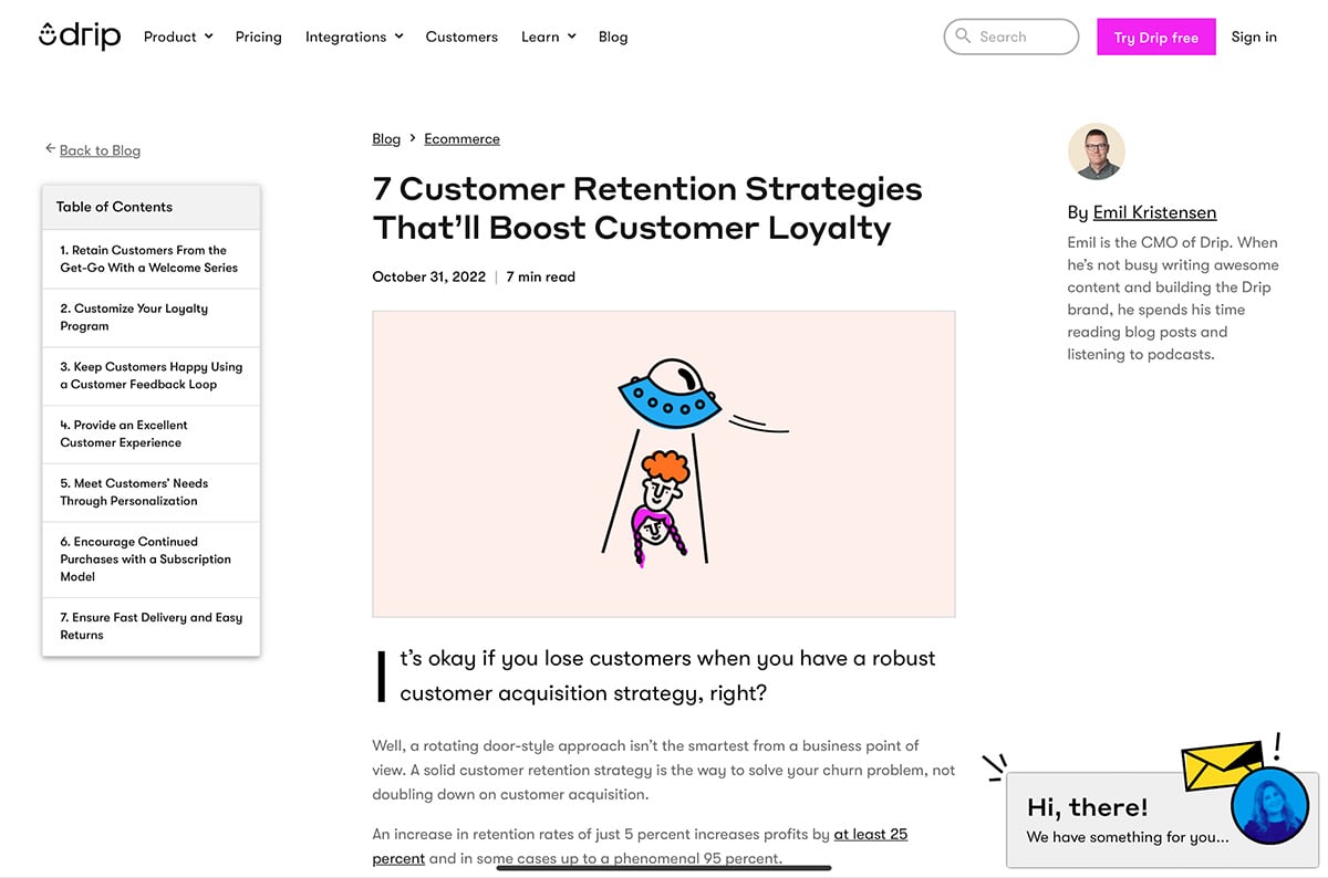
The email popup in the Drip blog is a perfect example of a two-step popup. It starts with a small notification on the bottom right that grabs your attention without getting in the way. Once you click it, a full page overlay opens with an easy form to fill out and get weekly marketing inspiration in your inbox.

Go for the bold option and create a full-page popup that covers the entire screen without transparent overlays. Full-page popups aren’t very common, but they draw attention. Timing is essential for a full-page popup; if it pops up too soon, the visitor will bounce out unless they’re fully invested in giving you their email or continuing to read your content.

On the Visme blog, there is an attention-grabbing animated lead generation form that takes up the entire page. This form is powered by Visme Forms and is used to gather email addresses from readers who are interested in subscribing to the Visme newsletter.
A recent case study revealed that Visme forms outperformed traditional forms. The numbers show that Visme Forms drives 3x more form completions, a 50% reduction in cost per acquisition and a 64% reduction in abandonment.
Not all email popups need to have a sign up form or fillable cell. Like the two step email popup above, this full page example only has a button to interact with. When you click the button, the form appears on top ready for you to fill it in.
A unique characteristic of this email popup is its timing and location on the website. Instead of popping up after a specific length of time, it shows up when you scroll all the way down to the bottom of the page and grows to fill the entire page as you scroll.
Email popups are everywhere; how will yours make the difference in opting in or out? Start with an objective. A clear goal is foundational for the rest of the choices you make regarding the email popup. Aim the creation and timing strategies to target your audience directly. You can do this with direct response copy, relatable visuals and a good understanding of your target audience.
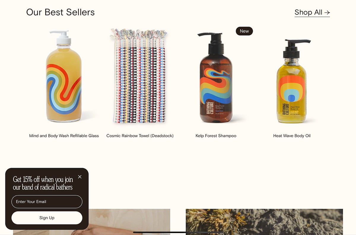
The Bathing Culture website uses a simple but visually rich email popup with an interesting font and a fun message about joining the band of radical bathers. This level of personalization creates brand loyalty and builds upon the brand story.
Fear of Missing Out (FOMO) is a psychological marketing approach that taps into the consumer’s emotional reaction to seeing how others get what’s being offered. FOMO in email popups is achievable in a variety of ways. On the Trust Pulse website, they have a pop up that appears whenever someone signs up. With many of these popping up while a visitor is browsing, it creates fear of missing out and hopefully they’ll sign up too.
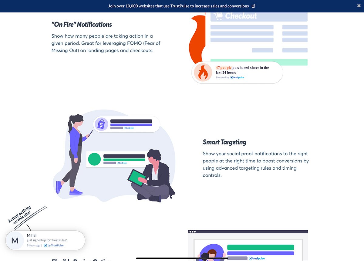
Using the FOMO strategy to convince someone to act is a classic marketing technique and works excellently on email popups.
Offering value in exchange for a sign up is an ideal way to gather leads that truly care about what you have to offer. On your email pop up, show a sneak peek at what they’ll get when they sign up on your site or form.

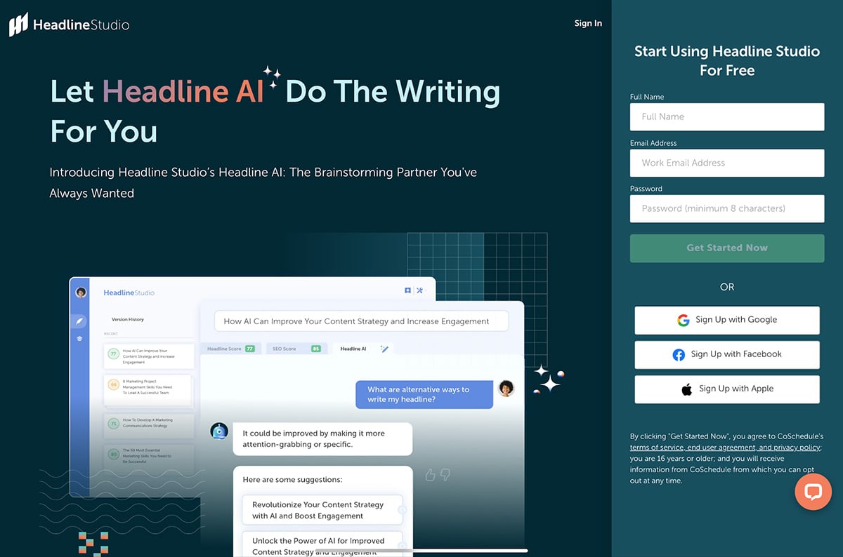
In this example, Coschedule offers their new Headline AI generator. All a user needs to do to use it for free is sign up. They also used the “two step button" technique for this email popup.
Create a lead magnet or ebook to use with your popup and don’t forget people want value. Visme will help you create valuable lead magnets, all you need is the content.
Not all popups need to call that much attention to themselves. Top or bottom popup bars are more subtle than their counterparts but are also effective. Tailor the bar content for the page it shows up on and offer targeted incentives.
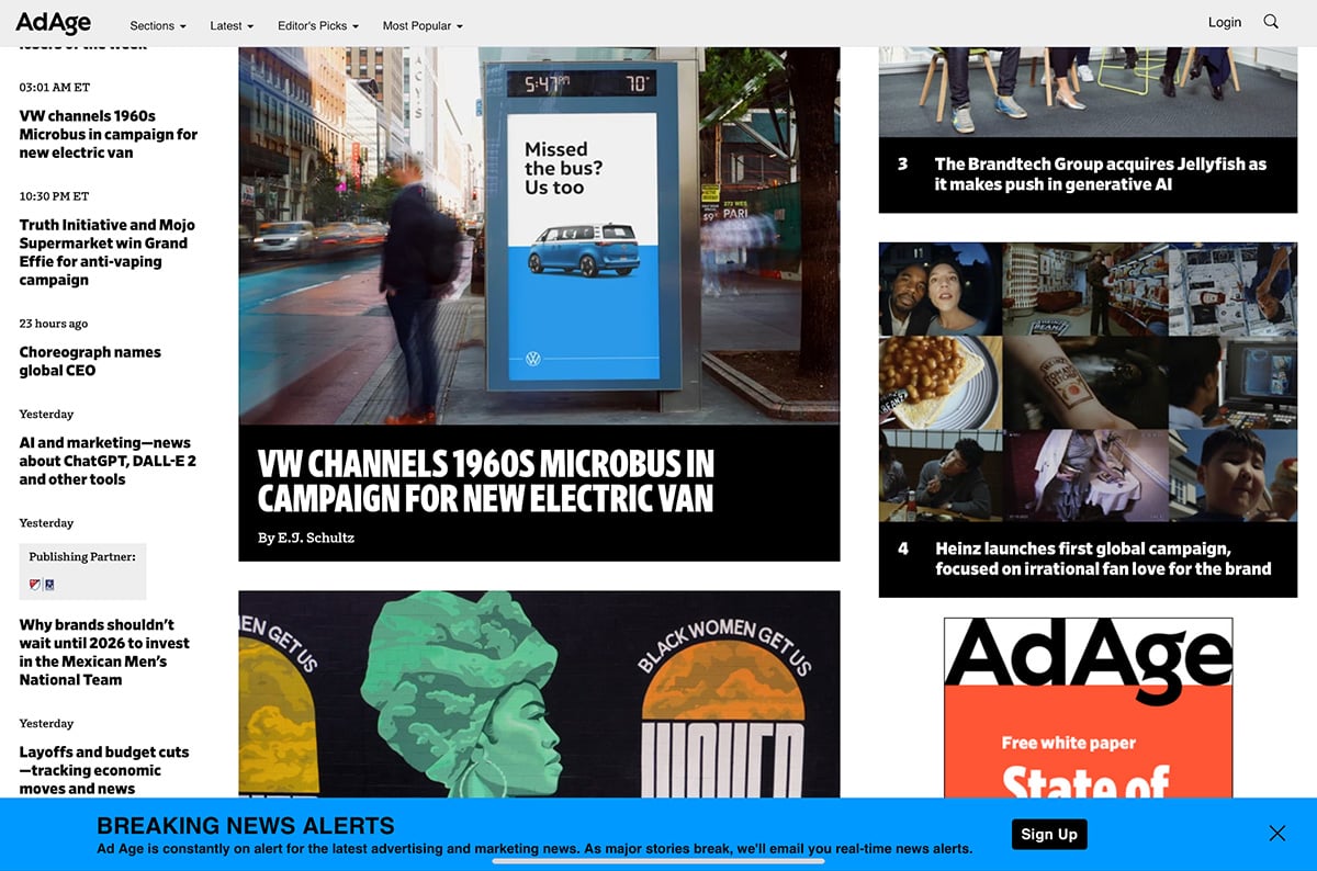
On the AdAge website, the email pop up is a simple bar in a striking color with copy that grabs your attention. There’s no form here, just a button, but it’s enough to make you interested in knowing more.
Do you still need clarification about email popups? These FAQs will shed more light on their power.
Conversion rate (CVR) is the metric that highlights how many viewers gave their email in relation to how many people saw the popup. The higher the conversion rate, the better the email popup’s performance.
Most email providers run tests to establish an average conversion rate for their email clients. These are some of the most recent results:
Email providers run tests to establish an average conversion rate for their email clients. Wisepops, for example, deduced that these were their highest converting popup types:
You can raise your email popup’s CVR by following best practices and creating a popup with a mission. Don’t take an email popup for granted; put some thought into it.
Before finalizing what style of email-pop up you’ll create for your site, try them on in a testing environment. Try the lightbox overlay, a sidebar, floating boxes with drop shadows, top and bottom bars or maybe a unique shape like a circle or star. Or go big and use A/B testing to find out what style converts best for your website.
Email popups typically have these layouts and approximate dimensions:
These dimensions aren’t hard-set rules but suggestions. You can create any of these popup styles with Visme. You can embed it on your site with a code snippet or through an email provider integration.
It all comes down to what you want to achieve.
Regardless of their bad reputation, email popups are still relevant and highly effective. The highest contender in the space is the e-commerce popup that offers discounts to new clients. In case you didn’t know, these popups work wonders on mobile.
The second most critical characteristic of effective email popups is that they are attractive and nonintrusive. They must show up when the visitor feels they want more from your brand and are willing to offer their email.
Other techniques include tailoring the content of the popup to the page the visitor is on, asking direct questions that relate to pain points or using visual metaphors to create emotional connections through association.
Use customer behavior to trigger popups at the best times. These techniques will make your email popups more effective.
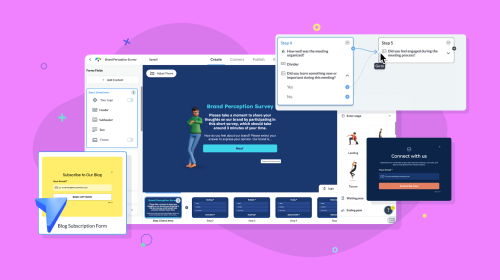
When Visme is your content-authoring tool, there are no bounds to what type of content combinations you can create. Here’s an idea, include email popups inside the interactive digital documents you create in Visme.
For example:
Plus, you can create your own email popups with the Visme Form maker. Design better forms that convert visitors into leads easily. Build email signups, short surveys and more with Visme forms.
And that’s not all. With Visme, you can create all sorts of business and marketing content like proposals, reports, whitepapers, lead magnets and all types of branding material.
Email popups aren’t the only lead-generation technique for your business website. Try using forms for a more personalized and granular lead generation collection. The good thing about forms is that they’re flexible and adaptable to what you need them to do.
Welcome new clients or users with a segmentation form to learn more about them. Add forms to digital documents or blog articles. Include a contact form in a digital product sheet. Ask presentation visitors for feedback. Forms are a fantastic tool for getting to know your audience and customer base.
Email pop-ups are only as effective as the email marketing strategy they’re a part of. What’s the use of collecting emails if you do nothing with them? Create email journeys, share promotions and ask for reviews. The pop-up is just a “hello.” It’s up to you to keep the conversation going.
With Visme Forms, you can create engaging forms and email popups to collect qualified leads. You can even add valuable lead magnets, personalize the copy and customize the design to match your branding. Take advantage of this all-in-one visual content tool that lets you create content, share it, promote it and collect leads. Get started today.
Improve your data collection from emails, leads, to surveys and more, by using beautifully designed forms that convert up 2X better.
Signup Free