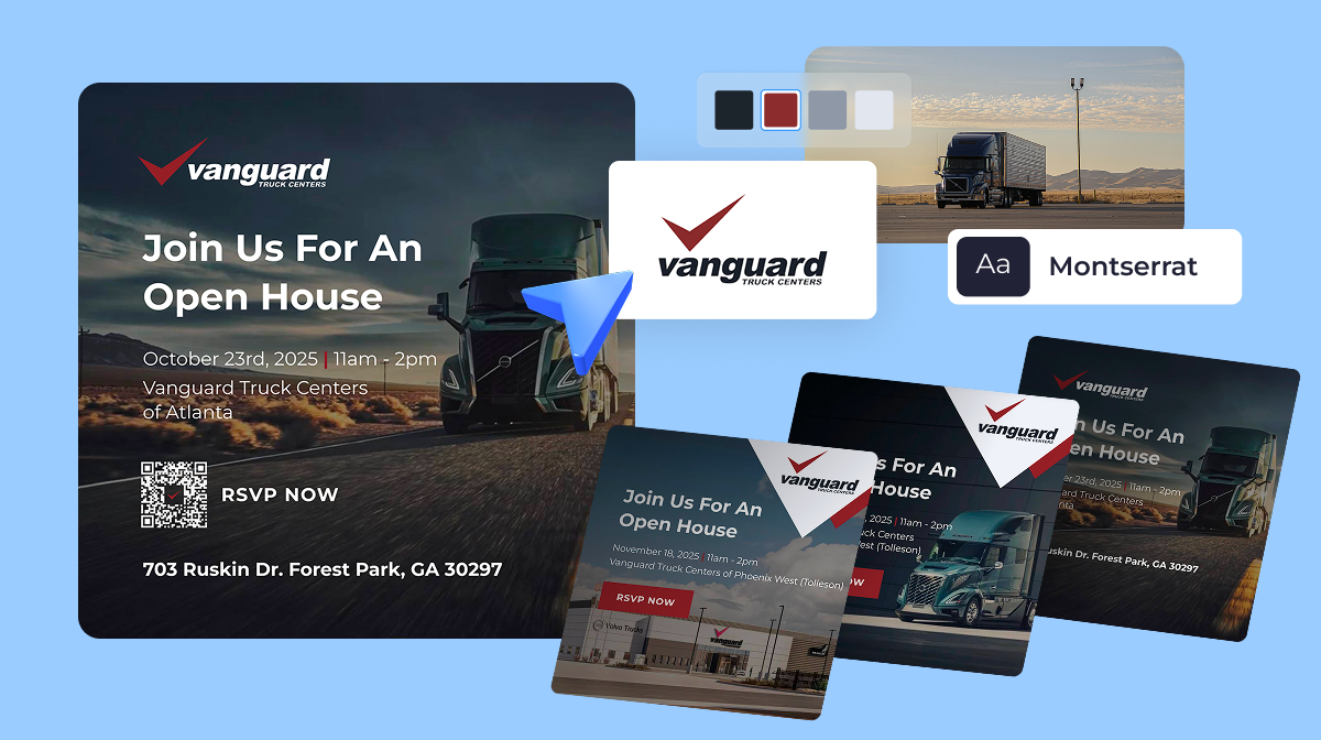
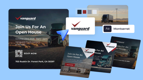
Choosing the Perfect Image for Your Presentation

Choosing the Perfect Image for Your Presentation
Sunday Avery

Written by:
Sunday Avery

Jul 15, 2015
Choosing-the-perfect-image-for-your-presentation

A picture is worth a thousand words. A bad stock photo, sadly, is worth a thousand giggles. We’ve seen these “laugh out loud” tragedies strewn across the internet, from blog post headers to presentations filled with uncomfortable smiles, awkward business meetings, and even surreal salad noshing.

But an image can be more than blatantly uncomfortable. It can overcrowd your design, distract from the overall tone, and lower the quality of the piece as a whole. Think of your presentation like a beautiful, luxury car. The content is shiny, the design engine is running smooth, but the poor photos are like a horn blaring “Cotton Eyed Joe.” It ruins everything.

How Can You Learn the Art of Selectiveness?

We’re assuming you have access to a stock photography library online that isn’t Google, which walks a line between “prison” and a “cease and desist letter.” The site should also be loaded with plenty of high-quality images to browse through, like iStock or Thinkstock.

Start with Your Philosophy

Once you have access to an enormous amount of images you can legally use, it’s time to think deeply about the purpose of your design. It’s best to keep what you want to say and the images that correspond with them as literal as possible. A study by John Hopkins University summarized this idea pretty effectively:

Irrelevant pictures accompanying text and sound effects decrease learning.” (Bartsch & Cobern, 2003)

irrelevant-pictures

It doesn’t mean the image has to be boring or forgettable. It just needs to connect the “a ha!” synapses within your audience’s brain.

For the People, by the People.

Not all stock photography models should be models. Beware of people staring directly at the camera, laughing at things that shouldn’t be laughed at, or posing unnaturally. Sometimes it’s best not to have a photo of a business person at all when another image can convey the idea in a more literal way.

For example, if you’re trying to show an increase of tablet use in business meetings, why show the business meeting? A close-up image of a hand wearing business attire holding a tablet in natural lighting will be more effective and frankly, less awful.

Nature Rules

Choose “natural” above all else. This means natural lighting, natural poses, natural settings, and even people or things that will be natural for your specific audience. That is to say, the kind of images that appear in their day-to-day lives. The closer you are to real, authentic life, the less your audience will be likely to wonder “what in the world is this?”

Space to Move

When browsing through images, use a mental filter to search for photos that have a lot of “open space” to place your text or other design elements on top of. One example of a technique that uses an ideal amount of open space is the Rule of Thirds, which essentially means that if an image is broken into three sections, the focus or “object” of the image will be located in one of the sections. The extra space gives it added emphasis and a little room to breathe. Look for photos that follow this Rule, and you’ll have no trouble designing a clean-looking slide.

the-rule-of-thirds

In general, busier images mean more colors that need to be coordinated, more distraction on the slide, and more ways for your text to get lost within the backdrop. You should look for images that don’t have texture from corner to corner. Think of a slide as a kind of frame for your typography, and be sure you have enough room in the frame to create a masterpiece (or something close enough).

But, What if You Just Love the Image?

Sometimes an image will fit perfectly within your presentation and you don’t want to give it up because it looks too busy or “stock-y.” If you are completely married to a photo, here are a few ways to spruce up your selection without sacrificing quality.

1 Creative Cropping

Let’s say you have a photo featuring a model with an awkward expression or pose. You should first consider the fine art of cropping, which allows you to move the frame of the image to focus on white space or individual aspects. You could even utilize The Rule of Thirds again here to make only one element on the existing photo stand out. Also, the higher the resolution of the photo, the more wiggle room you’ll have to zoom in and crop out the ugly excess.

Before:

cropped-before

Prior to cropping image

After:

cropped-after

After cropping image.

2 Messing With Color

Sometimes stock photography suffers from a lack of contrast or unnatural lighting. If you feel the subject of the photo doesn’t have enough “pop,” you can play with the contrast and color to add visual interest and improve on the photographer’s (somewhat lacking) skills. This is also a great way to make the overall presentation style cohesive by matching the levels of color and contrast.

Before:

messing-with-color-before

After:

messing-with-color-after

3 Overlay

Overlay is like that one accessory to a “so-so” outfit that makes the entire ensemble great. You can choose an overlay in almost any color to place over your stock photo in order to create a consistently colored background that will be ready to design on with text or other objects. This is perhaps the best way to color coordinate an image with the rest of your presentation, and tone down any unwanted elements within the photo. If in doubt, overlay!

Before:

overlay-before

Original image (untouched)

After:

overlay-after

Overlay filter applied to image.

What Does Perfection Look Like?

An image that works within a larger piece of design never detracts from the piece as a whole. Instead, it looks strong on its own and even stronger within the presentation. The photo should be as natural as possible as well as straightforward enough to connect with the content you have on slide.  

In sort, a perfect photo is sort of like a single rose on a rose bush: just one would look great by itself, but a whole blooming bush creates a more powerful experience.

Don’t let a poor image selection be a dandelion on your rose bush. Be selective, make sure you have enough space for the design, and edit the image until it fits right in. You can use various image editing programs including Visme which helps you create rich graphics or create entire Presentations on the cloud.

Create Stunning Content!

Design visual brand experiences for your business whether you are a seasoned designer or a total novice.

Try Visme for free

    We’re stingy and don’t share emails with anyone.

    About the Author

    Sunday Avery is the Content Manager at Ethos3, a presentation design company based in Nashville, TN. . They specialize in creating story-driven messaging for company presentations around the world, and then making them look really, really good.